U.S. Department of Transportation
Federal Highway Administration
1200 New Jersey Avenue, SE
Washington, DC 20590
202-366-4000
Federal Highway Administration Research and Technology
Coordinating, Developing, and Delivering Highway Transportation Innovations
 |
| This report is an archived publication and may contain dated technical, contact, and link information |
|
Publication Number: FHWA-RD-03-060 |
Previous | Table of Contents | Next
Table B-1. Factorial experiment: design by volume fraction of factors
| Std Order | Run Order | Point | Factor Aw/c | Factor B Fine Agg | Factor C Coarse Agg | Factor DHRWRA | Factor E Silica Fume |
|---|---|---|---|---|---|---|---|
| 17 | 1 | Center | 0.39525 | 0.2712 | 0.4212 | 0.0060 | 0.0200 |
| 11 | 2 | Fact | 0.3576 | 0.2853 | 0.4071 | 0.0069 | 0.0247 |
| 7 | 3 | Fact | 0.3576 | 0.2853 | 0.4353 | 0.0051 | 0.0247 |
| 10 | 4 | Fact | 0.4329 | 0.2571 | 0.4071 | 0.0069 | 0.0247 |
| 4 | 5 | Fact | 0.4329 | 0.2853 | 0.4071 | 0.0051 | 0.0247 |
| 12 | 6 | Fact | 0.4329 | 0.2853 | 0.4071 | 0.0069 | 0.0153 |
| 2 | 7 | Fact | 0.4329 | 0.2571 | 0.4071 | 0.0051 | 0.0153 |
| 1 | 8 | Fact | 0.3576 | 0.2571 | 0.4071 | 0.0051 | 0.0247 |
| 18 | 9 | Center | 0.39525 | 0.2712 | 0.4212 | 0.0060 | 0.0200 |
| 8 | 10 | Fact | 0.4329 | 0.2853 | 0.4353 | 0.0051 | 0.0153 |
| 9 | 11 | Fact | 0.3576 | 0.2571 | 0.4071 | 0.0069 | 0.0153 |
| 6 | 12 | Fact | 0.4329 | 0.2571 | 0.4353 | 0.0051 | 0.0247 |
| 3 | 13 | Fact | 0.3576 | 0.2853 | 0.4071 | 0.0051 | 0.0153 |
| 14 | 14 | Fact | 0.4329 | 0.2571 | 0.4353 | 0.0069 | 0.0153 |
| 15 | 15 | Fact | 0.3576 | 0.2853 | 0.4353 | 0.0069 | 0.0153 |
| 13 | 16 | Fact | 0.3576 | 0.2571 | 0.4353 | 0.0069 | 0.0247 |
| 19 | 17 | Center | 0.39525 | 0.2712 | 0.4212 | 0.0060 | 0.0200 |
| 5 | 18 | Fact | 0.3576 | 0.2571 | 0.4353 | 0.0051 | 0.0153 |
| 16 | 19 | Fact | 0.4329 | 0.2853 | 0.4353 | 0.0069 | 0.0247 |
| 25 | 20 | Axial | 0.39525 | 0.2712 | 0.4494 | 0.0060 | 0.0200 |
| 21 | 21 | Axial | 0.47055 | 0.2712 | 0.4212 | 0.0060 | 0.0200 |
| 23 | 22 | Axial | 0.39525 | 0.2994 | 0.4212 | 0.0060 | 0.0200 |
| 27 | 23 | Axial | 0.39525 | 0.2712 | 0.4212 | 0.0078 | 0.0200 |
| 20 | 24 | Axial | 0.31995 | 0.2712 | 0.4212 | 0.0060 | 0.0200 |
| 31 | 25 | Center | 0.39525 | 0.2712 | 0.4212 | 0.0060 | 0.0200 |
| 26 | 26 | Axial | 0.39525 | 0.2712 | 0.4212 | 0.0042 | 0.0200 |
| 28 | 27 | Axial | 0.39525 | 0.2712 | 0.4212 | 0.0060 | 0.0106 |
| 24 | 28 | Axial | 0.39525 | 0.2712 | 0.3930 | 0.0060 | 0.0200 |
| 29 | 29 | Axial | 0.39525 | 0.2712 | 0.4212 | 0.0060 | 0.0294 |
| 22 | 30 | Axial | 0.39525 | 0.243 | 0.4212 | 0.0060 | 0.0200 |
| 30 | 31 | Center | 0.39525 | 0.2712 | 0.4212 | 0.0060 | 0.0200 |
Table B-2. Factorial experiment: slump and 1-day strength data
| Run | Point | Slump (mm) | 1-Day Strength (MPa) | |||
|---|---|---|---|---|---|---|
| 1 | Center | 76 | 70 | 16.6 | 16.0 | 16.2 |
| 2 | Fact | 44 | 44 | 22.2 | 22.5 | 23.0 |
| 3 | Fact | 13 | 13 | 22.5 | 17.9 | 22.0 |
| 4 | Fact | 102 | 102 | 15.8 | 16.7 | 16.8 |
| 5 | Fact | 57 | 57 | 16.4 | 16.7 | 16.1 |
| 6 | Fact | 140 | 146 | 13.4 | 14.2 | 13.2 |
| 7 | Fact | 70 | 64 | 13.9 | 11.1 | 13.7 |
| 8 | Fact | 13 | 13 | 17.7 | 22.8 | 20.5 |
| 9 | Center | 89 | 83 | 17.9 | 18.6 | 18.7 |
| 10 | Fact | 102 | 102 | 15.2 | 15.2 | 15.2 |
| 11 | Fact | 140 | 140 | 20.9 | 20.7 | 20.4 |
| 12 | Fact | 32 | 32 | 13.8 | 18.8 | 18.9 |
| 13 | Fact | 13 | 13 | 24.5 | 23.3 | 24.7 |
| 14 | Fact | 76 | 76 | 17.3 | 17.2 | 17.2 |
| 15 | Fact | 13 | 13 | 22.7 | 19.5 | 21.8 |
| 16 | Fact | 13 | 13 | 20.8 | 20.6 | 21.4 |
| 17 | Center | 51 | 64 | 19.4 | 18.9 | 18.1 |
| 18 | Fact | 32 | 25 | 21.4 | 22.2 | 22.1 |
| 19 | Fact | 38 | 32 | 16.0 | 16.1 | 16.3 |
| 20 | Axial | 38 | 38 | 18.7 | 19.3 | 18.9 |
| 21 | Axial | 121 | 114 | 14.5 | 14.9 | 14.0 |
| 22 | Axial | 70 | 64 | 18.0 | 17.8 | 17.5 |
| 23 | Axial | 64 | 64 | 19.3 | 20.0 | 20.4 |
| 24 | Axial | 19 | 13 | 26.0 | 25.4 | 27.7 |
| 25 | Center | 83 | 76 | 20.2 | 17.3 | 19.6 |
| 26 | Axial | 64 | 64 | 18.9 | 19.5 | 18.9 |
| 27 | Axial | 152 | 152 | 16.4 | 17.0 | 16.9 |
| 28 | Axial | 95 | 95 | 20.1 | 20.8 | 19.7 |
| 29 | Axial | 38 | 32 | 17.2 | 20.1 | 18.0 |
| 30 | Axial | 102 | 102 | 17.7 | 17.0 | 17.7 |
| 31 | Center | 76 | 76 | 16.8 | 19.6 | 18.8 |
Table B-3. Factorial experiment: 28-day strength and RCT charge passed data
| Run | Point | 28-Day Strength (MPa) | RCT Charge Passed (coulombs) | |||||
|---|---|---|---|---|---|---|---|---|
| 1 | Center | 54.0 | 63.0 | - | - | 263 | 296 | 300 |
| 2 | Fact | 59.4 | 60.2 | - | - | 186 | 472 | 268 |
| 3 | Fact | 53.5 | 52.8 | 51.7 | - | 151 | 151 | 178 |
| 4 | Fact | 62.7 | 60.8 | 55.1 | 62.9 | 280 | 329 | 279 |
| 5 | Fact | 52.6 | 56.6 | 55.8 | - | 273 | 236 | 262 |
| 6 | Fact | 60.4 | 52.1 | 60.6 | 61.3 | 553 | 585 | 485 |
| 7 | Fact | 50.1 | 49.4 | 51.5 | - | 468 | 550 | 490 |
| 8 | Fact | 51.0 | 56.3 | 47.2 | 55.2 | 253 | 240 | 208 |
| 9 | Center | 63.5 | 62.5 | - | - | 247 | 315 | 305 |
| 10 | Fact | 53.8 | 54.2 | 56.3 | - | 460 | 437 | 439 |
| 11 | Fact | 61.6 | 64.5 | 60.8 | - | 415 | 427 | 393 |
| 12 | Fact | 56.5 | 55.3 | 56.8 | - | 258 | 258 | 240 |
| 13 | Fact | 58.1 | 50.2 | 54.4 | - | 343 | 362 | 317 |
| 14 | Fact | 52.3 | 46.6 | 52.1 | - | 596 | 527 | 481 |
| 15 | Fact | 60.3 | 58.7 | 58.6 | - | 218 | 288 | 330 |
| 16 | Fact | 60.2 | 58.5 | 62.9 | - | 208 | 194 | 216 |
| 17 | Center | 59.9 | 54.5 | 55.5 | - | 299 | 327 | 318 |
| 18 | Fact | 58.4 | 60.1 | 56.3 | - | 360 | 364 | 340 |
| 19 | Fact | 65.0 | 59.9 | 63.9 | - | 242 | 243 | 206 |
| 20 | Axial | 56.7 | 57.0 | 62.1 | - | 168 | 242 | 224 |
| 21 | Axial | 53.9 | 51.1 | 56.7 | - | 463 | 461 | 449 |
| 22 | Axial | 60.7 | 62.9 | 63.6 | - | 319 | 305 | 257 |
| 23 | Axial | 68.4 | 66.8 | 67.1 | - | 272 | 280 | 251 |
| 24 | Axial | 62.1 | 59.4 | 54.0 | - | 190 | 184 | 192 |
| 25 | Center | 58.2 | 55.8 | 56.8 | - | 239 | 246 | 287 |
| 26 | Axial | 52.9 | 48.2 | 51.6 | - | 258 | 281 | 280 |
| 27 | Axial | 51.3 | 55.2 | 56.8 | - | 704 | 766 | 644 |
| 28 | Axial | 50.0 | 55.2 | 54.8 | - | 268 | 302 | 351 |
| 29 | Axial | 55.5 | 53.8 | 56.2 | - | 163 | 170 | 153 |
| 30 | Axial | 50.4 | 49.0 | 51.6 | - | 340 | 304 | 351 |
| 31 | Center | 55.8 | 53.3 | 56.5 | - | 262 | 294 | 274 |
Table B-4. Factorial experiment: sequential model sum of squares for slump
| Source | Sum of Squares | DF | Mean Square | F Value | Prob > F |
|---|---|---|---|---|---|
| Mean | 130296.6 | 1 | 130296.6 | - | - |
| Linear | 31972.38 | 5 | 6394.48 | 9.10 | < 0.0001 |
| 2FI | 10539.29 | 10 | 1053.93 | 2.25 | 0.0755 |
| Quadratic | 2598.70 | 5 | 519.74 | 1.18 | 0.3856 |
| Cubic (aliased) | 2316.86 | 5 | 463.37 | 1.10 | 0.4593 |
| Residual | 2104.40 | 5 | 420.88 | - | - |
| Total | 179828.3 | 31 | 5800.91 | - | - |
Table B-5. Factorial experiment: lack-of-fit test for slump
| Source | Sum of Squares | DF | Mean Square | F Value | Prob > F |
|---|---|---|---|---|---|
| Linear | 17103.61 | 21 | 814.46 | 7.15 | 0.0345 |
| 2FI | 6564.32 | 11 | 596.76 | 5.24 | 0.0618 |
| Quadratic | 3965.62 | 6 | 660.94 | 5.80 | 0.0553 |
| Cubic (aliased) | 1648.75 | 1 | 1648.75 | 14.47 | 0.0190 |
| Pure error | 455.64 | 4 | 113.91 | - | - |
Table B-6. Factorial experiment: ANOVA for slump model
| Source | Sum of Squares | DF | Mean Square | F Value | Prob > F |
|---|---|---|---|---|---|
| Model | 40109.97 | 7 | 5730.00 | 13.99 | < 0.0001 |
| A | 12138.75 | 1 | 12138.75 | 29.63 | < 0.0001 |
| B | 606.52 | 1 | 606.52 | 1.48 | 0.2360 |
| C | 6048.38 | 1 | 6048.38 | 14.77 | 0.0008 |
| D | 2426.07 | 1 | 2426.07 | 5.92 | 0.0231 |
| E | 10752.67 | 1 | 10752.67 | 26.25 | < 0.0001 |
| AB | 1837.19 | 1 | 1837.19 | 4.48 | 0.0452 |
| CD | 6300.39 | 1 | 6300.39 | 15.38 | 0.0007 |
| Residual | 9421.67 | 23 | 409.64 | - | - |
| Lack of fit | 8966.03 | 19 | 471.90 | 4.14 | 0.0887 |
| Pure error | 455.64 | 4 | 113.91 | - | - |
| Cor total | 49531.64 | 30 | - | - | - |
Table B-7. Factorial experiment: summary statistics for slump model
| Std. Dev. | 20.24 | R-Squared | 0.8098 |
|---|---|---|---|
| Mean | 64.83 | Adj R-Squared | 0.7519 |
| C.V. | 31.22 | Pred R-Squared | 0.6275 |
| PRESS | 18452.19 | Adeq Precision | 15.6200 |
Table B-8. Factorial experiment: coefficient estimates for slump model
| Factor | Coefficient Estimate | DF | Standard Error | 95% CI Low | 95% CI High |
|---|---|---|---|---|---|
| Intercept | 64.83 | 1 | 3.64 | 57.31 | 72.35 |
| A (w/c) | 22.49 | 1 | 4.13 | 13.94 | 31.04 |
| B (fine agg) | -5.03 | 1 | 4.13 | -13.57 | 3.52 |
| C (coarse agg) | -15.87 | 1 | 4.13 | -24.42 | -7.33 |
| D (HRWRA) | 10.05 | 1 | 4.13 | 1.51 | 18.60 |
| E (silica fume) | -21.17 | 1 | 4.13 | -29.71 | -12.62 |
| AB | 10.72 | 1 | 5.06 | 0.25 | 21.18 |
| CD | -19.84 | 1 | 5.06 | -30.31 | -9.38 |
Model equation for slump in terms of coded factors:
Slump = 64.83 + 22.49*A - 5.03*B - 15.87*C + 10.05*D - 21.17*E + 10.72*A*B - 19.84*C*D
Model equation for slump in terms of actual factors:
| Slump = | -1365.5 - 4876.9*w/c - 8334.7*fine agg + 8256.5*coarse agg |
| + 6.6982 x 10⁵*HRWRA - 4503.6*silica fume + 20185*w/c*fine agg | |
| - 1.564 x 10⁶ *coarse agg*HRWRA |
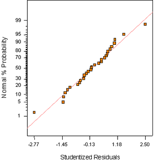
Figure B-1. Factorial experiment: normal probability plot for slump
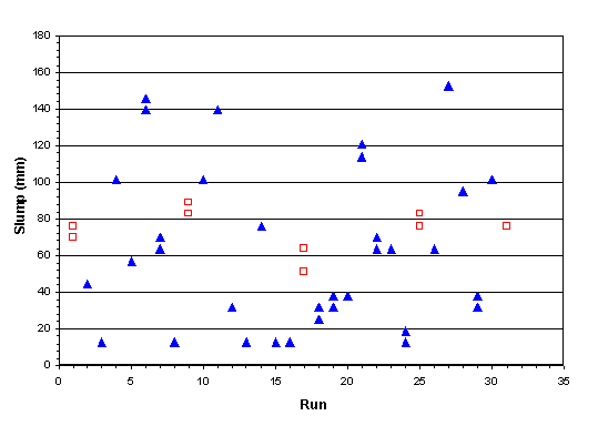
Figure B-2. Factorial experiment: raw data plot for slump (hollow squares indicate control runs)
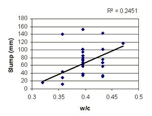
Figure B-3. Factorial experiment: scatterplot of slump vs. w/c
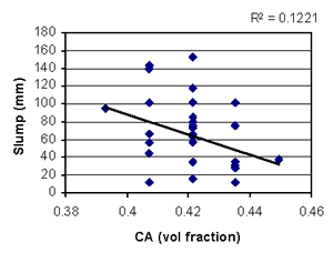
Figure B-4. Factorial experiment: scatterplot of slump vs. coarse aggregate
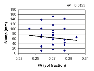
Figure B-5. Factorial experiment: scatterplot of slump vs. fine aggregate
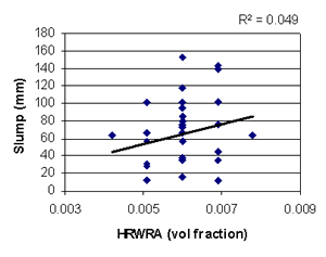
Figure B-6. Factorial experiment: scatterplot of slump vs. HRWRA
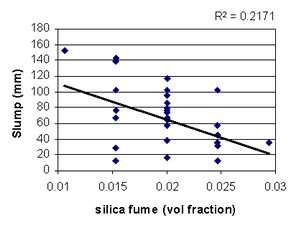
Figure B-7. Factorial experiment: scatterplot of slump vs. silica fume
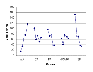
Figure B-8. Factorial experiment: means plots for slump
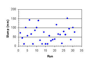
Figure B-9. Factorial experiment: slump vs. run sequence
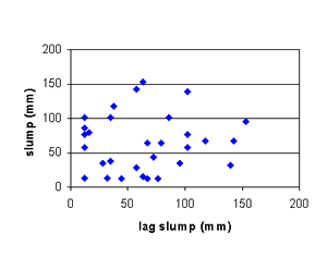
Figure B-10. Factorial experiment: lag plot for slump
Table B-9. Factorial experiment: sequential model sum of squares for 1-day strength
| Source | Sum of Squares | DF | Mean Square | F Value | Prob > F |
|---|---|---|---|---|---|
| Mean | 10780.54 | 1 | 10780.54 | - | - |
| Linear | 215.97 | 5 | 43.19 | 22.15 | < 0.0001 |
| 2FI | 27.35 | 10 | 2.73 | 1.92 | 0.1236 |
| Quadratic | 13.60 | 5 | 2.72 | 3.48 | 0.0441 |
| Cubic (aliased) | 1.86 | 5 | 0.37 | 0.31 | 0.8865 |
| Residual | 5.95 | 5 | 1.19 | - | - |
| Total | 11045.26 | 31 | 356.30 | - | - |
Table B-10. Factorial experiment: lack-of-fit test for 1-day strength
| Source | Sum of Squares | DF | Mean Square | F Value | Prob > F |
|---|---|---|---|---|---|
| Linear | 43.98 | 21 | 2.09 | 1.75 | 0.3129 |
| 2FI | 16.63 | 11 | 1.51 | 1.27 | 0.4444 |
| Quadratic | 3.03 | 6 | 0.51 | 0.42 | 0.8339 |
| Cubic (aliased) | 1.18 | 1 | 1.18 | 0.98 | 0.3772 |
| Pure error | 4.78 | 4 | 1.19 | - | - |
Table B-11. Factorial experiment: ANOVA for 1-day strength model
| Source | Sum of Squares | DF | Mean Square | F Value | Prob > F |
|---|---|---|---|---|---|
| Model | 240.87 | 8 | 30.11 | 27.76 | < 0.0001 |
| A | 213.26 | 1 | 213.26 | 196.66 | < 0.0001 |
| B | 0.48 | 1 | 0.48 | 0.45 | 0.5113 |
| C | 0.043 | 1 | 0.043 | 0.040 | 0.8433 |
| E | 2.06 | 1 | 2.06 | 1.90 | 0.1819 |
| A2 | 6.20 | 1 | 6.20 | 5.72 | 0.0257 |
| AC | 5.15 | 1 | 5.15 | 4.75 | 0.0404 |
| AE | 7.16 | 1 | 7.16 | 6.60 | 0.0175 |
| BC | 6.51 | 1 | 6.51 | 6.00 | 0.0227 |
| Residual | 23.86 | 22 | 1.08 | - | - |
| Lack of fit | 19.08 | 18 | 1.06 | 0.89 | 0.6248 |
| Pure error | 4.78 | 4 | 1.19 | - | - |
| Cor total | 264.72 | 30 | - | - | - |
Table B-12. Factorial experiment: summary statistics for 1-day strength model
| Std. Dev. | 1.04 | R-Squared | 0.9099 |
|---|---|---|---|
| Mean | 18.65 | Adj R-Squared | 0.8771 |
| C.V. | 5.58 | Pred R-Squared | 0.8294 |
| PRESS | 45.16 | Adeq Precision | 22.583 |
Table B-13. Factorial experiment: coefficient estimates for 1-day strength model
| Factor | Coefficient Estimate | DF | Standard Error | 95% CI Low | 95% CI High |
|---|---|---|---|---|---|
| Intercept | 18.29 | 1 | 0.24 | 17.80 | 18.79 |
| A (w/c) | -2.98 | 1 | 0.21 | -3.42 | -2.54 |
| B (fine agg) | 0.14 | 1 | 0.21 | -0.30 | 0.58 |
| C (coarse agg) | 0.043 | 1 | 0.21 | -0.40 | 0.48 |
| E (silica fume) | 0.29 | 1 | 0.21 | -0.15 | 0.73 |
| A2 | 0.46 | 1 | 0.19 | 0.061 | 0.86 |
| AC | 0.57 | 1 | 0.26 | 0.027 | 1.11 |
| AE | 0.67 | 1 | 0.26 | 0.13 | 1.21 |
| BC | -0.64 | 1 | 0.26 | -1.18 | -0.098 |
Model equation for 1-day strength in terms of coded factors:
1-day strength = 18.29 - 2.98*A + 0.14*B + 0.043*C + 0.29*E + 0.46*A2 + 0.57*A*C + 0.67*A*E - 0.64*B*C
Model equation for 1-day strength in terms of actual factors:
| 1-day strength = | -63.8 - 860.8*w/c + 1361.3*fine agg + 450.8*coarse agg - 1431.5*silica fume |
| + 323.9*(w/c)2 + 1068*w/c*coarse agg + 3780*w/c*silica fume | |
| - 3208*fine agg*coarse agg |
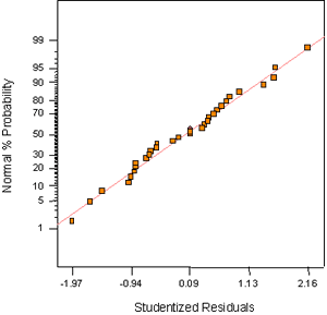
Figure B-11. Factorial experiment: normal probability plot for 1-day strength
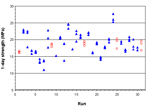
Figure B-12. Factorial experiment: raw data plot for 1-day strength (hollow squares indicate control runs)
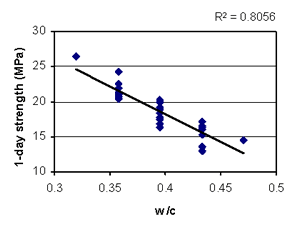
Figure B-13. Factorial experiment: scatterplot of 1-day strength vs. w/c
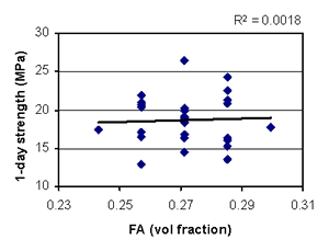
Figure B-14. Factorial experiment: scatterplot of 1-day strength vs. fine aggregate
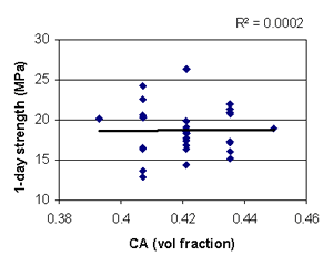
Figure B-15. Factorial experiment: scatterplot of 1-day strength vs. coarse aggregate
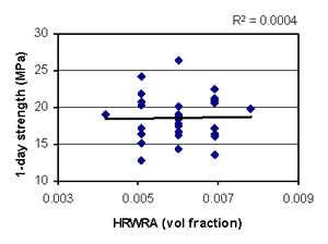
Figure B-16. Factorial experiment: scatterplot of 1-day strength vs. HRWRA
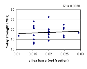
Figure B-17. Factorial experiment: scatterplot of 1-day strength vs. silica fume
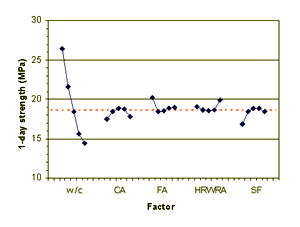
Figure B-18. Factorial experiment: means plot for 1-day strength
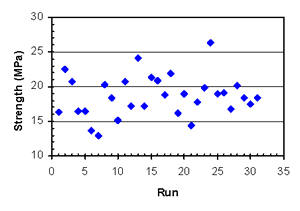
Figure B-19. Factorial experiment: 1-day strength vs. run sequence
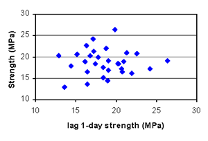
Figure B-20. Factorial experiment: lag plot for 1-day strength
Table B-14. Factorial experiment: sequential model sum of squares for 28-day strength
| Source | Sum of Squares | DF | Mean Square | F Value | Prob > F |
|---|---|---|---|---|---|
| Mean | 100300.0 | 1 | 100300.0 | - | - |
| Linear | 292.28 | 5 | 58.46 | 5.71 | 0.0012 |
| 2FI | 129.24 | 10 | 12.92 | 1.53 | 0.2208 |
| Quadratic | 27.53 | 5 | 5.51 | 0.56 | 0.7318 |
| Cubic (aliased) | 61.25 | 5 | 12.25 | 1.62 | 0.3050 |
| Residual | 37.84 | 5 | 7.57 | - | - |
| Total | 100848.1 | 31 | 3253.17 | - | - |
Table B-15. Factorial experiment: lack-of-fit test for 28-day strength
| Source | Sum of Squares | DF | Mean Square | F Value | Prob > F |
|---|---|---|---|---|---|
| Linear | 219.79 | 21 | 10.47 | 1.16 | 0.4972 |
| 2FI | 90.55 | 11 | 8.23 | 0.91 | 0.5942 |
| Quadratic | 63.02 | 6 | 10.50 | 1.16 | 0.4620 |
| Cubic (aliased) | 1.76 | 1 | 1.76 | 0.20 | 0.6813 |
| Pure error | 36.08 | 4 | 9.02 | - | - |
Table B-16. Factorial experiment: ANOVA for 28-day strength model
| Source | Sum of Squares | DF | Mean Square | F Value | Prob > F |
|---|---|---|---|---|---|
| Model | 300.21 | 4 | 75.05 | 7.87 | 0.0003 |
| A | 16.57 | 1 | 16.57 | 1.74 | 0.1990 |
| D | 223.41 | 1 | 223.41 | 23.43 | < 0.0001 |
| E | 7.47 | 1 | 7.47 | 0.78 | 0.3842 |
| AE | 52.76 | 1 | 52.76 | 5.53 | 0.0265 |
| Residual | 247.94 | 26 | 9.54 | - | - |
| Lack of fit | 211.86 | 22 | 9.63 | 1.07 | 0.5389 |
| Pure error | 36.08 | 4 | 9.02 | - | - |
| Cor total | 548.15 | 30 | - | - | - |
Table B-17. Factorial experiment: summary statistics for 28-day strength model
| Std. Dev. | 3.09 | R-Squared | 0.5477 |
|---|---|---|---|
| Mean | 56.88 | Adj R-Squared | 0.4781 |
| C.V. | 5.43 | Pred R-Squared | 0.3997 |
| PRESS | 329.05 | Adeq Precision | 9.964 |
Table B-18. Factorial experiment: coefficient estimates for 28-day strength model
| Factor | Coefficient Estimate | DF | Standard Error | 95% CI Low | 95% CI High |
|---|---|---|---|---|---|
| Intercept | 56.88 | 1 | 0.55 | 55.74 | 58.02 |
| A (w/c) | -0.83 | 1 | 0.63 | -2.13 | 0.46 |
| D (HRWRA) | 3.05 | 1 | 0.63 | 1.76 | 4.35 |
| E (silica fume) | 0.56 | 1 | 0.63 | -0.74 | 1.85 |
| AE | 1.82 | 1 | 0.77 | 0.23 | 3.40 |
Model equation for 28-day strength in terms of coded factors:
28-day strength = 56.88 - 0.83*A + 3.05*D + 0.56*E + 1.82*A*E
Model equation for 28-day strength in terms of actual factors:
28-day strength = 124.0 - 227.3*w/c + 3390*HRWRA - 3937.5*silica fume + 10262*w/c*silica fume
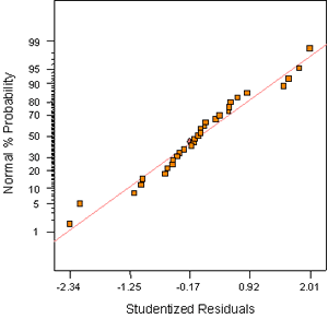
Figure B-21. Factorial experiment: normal probability plot for 28-day strength
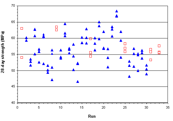
Figure B-22. Factorial experiment: raw data plot for 28-day strength (hollow squares indicate control runs)
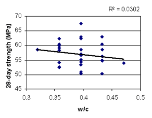
Figure B-23. Factorial experiment: scatterplot of 28-day strength vs. w/c
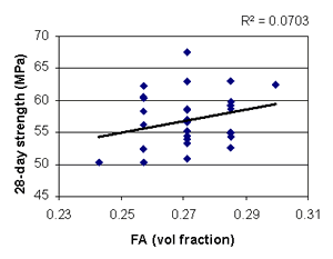
Figure B-24. Factorial experiment: scatterplot of 28-day strength vs. fine aggregate
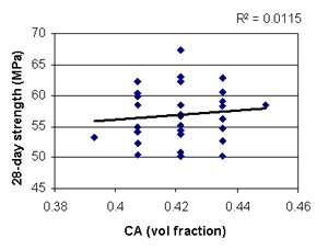
Figure B-25. Factorial experiment: scatterplot of 28-day strength vs. coarse aggregate
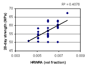
Figure B-26. Factorial experiment: scatterplot of 28-day strength vs. HRWRA
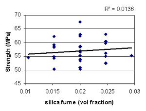
Figure B-27. Factorial experiment: scatterplot of 28-day strength vs. silica fume
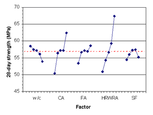
FIgure B-28. Factorial experiment: means plot for 28-day strength
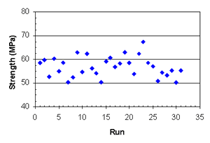
Figure B-29. Factorial experiment: 28-day strength vs. run sequence
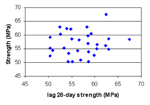
Figure B-30. Factorial experiment: lag plot for 28-day strength
Table B-19. Factorial experiment: sequential model sum of squares for RCT charge passed
| Source | Sum of Squares | DF | Mean Square | F Value | Prob > F |
|---|---|---|---|---|---|
| Mean | 3155867 | 1 | 3155867 | - | - |
| Linear | 393517.2 | 5 | 78703.43 | 27.43 | < 0.0001 |
| 2FI | 15156.50 | 10 | 1515.65 | 0.40 | 0.9252 |
| Quadratic | 44410.76 | 5 | 8882.15 | 7.31 | 0.0040 |
| Cubic (aliased) | 10046.83 | 5 | 2009.37 | 4.77 | 0.0557 |
| Residual | 2104.61 | 5 | 420.92 | - | - |
| Total | 3621103 | 31 | 116809.8 | - | - |
Table B-20. Factorial experiment: lack-of-fit test for RCT charge passed
| Source | Sum of Squares | DF | Mean Square | F Value | Prob > F |
|---|---|---|---|---|---|
| Linear | 69614.70 | 21 | 3314.99 | 6.30 | 0.0432 |
| 2FI | 54458.20 | 11 | 4950.75 | 9.41 | 0.0221 |
| Quadratic | 10047.44 | 6 | 1674.57 | 3.18 | 0.1410 |
| Cubic (aliased) | 0.61 | 1 | 0.61 | .001 | 0.9745 |
| Pure error | 2104.00 | 4 | 526.00 | - | - |
Table B-21. Factorial experiment: ANOVA for RCT charge passed model
| Source | Sum of Squares | DF | Mean Square | F Value | Prob > F |
|---|---|---|---|---|---|
| Model | 441455.3 | 6 | 73575.89 | 74.25 | < 0.0001 |
| A | 81666.67 | 1 | 81666.67 | 82.42 | < 0.0001 |
| B | 6868.17 | 1 | 6868.17 | 6.93 | 0.0146 |
| C | 11440.67 | 1 | 11440.67 | 11.55 | 0.0024 |
| E | 292604.2 | 1 | 292604.2 | 295.30 | < 0.0001 |
| E2 | 38369.41 | 1 | 38369.41 | 38.72 | < 0.0001 |
| AE | 10506.25 | 1 | 10506.25 | 10.60 | 0.0034 |
| Residual | 23780.54 | 24 | 990.86 | - | - |
| Lack of fit | 21676.54 | 20 | 1083.83 | 2.06 | 0.2537 |
| Pure error | 2104.00 | 4 | 526.00 | - | - |
| Cor total | 465235.9 | 30 | - | - | - |
Table B-22. Factorial experiment: summary statistics for RCT charge passed model
| Std. Dev. | 31.48 | R-Squared | 0.9489 |
| Mean | 319.06 | Adj R-Squared | 0.9361 |
| C.V. | 9.87 | Pred R-Squared | 0.8784 |
| PRESS | 56577.00 | Adeq Precision | 34.166 |
Table B-23. Factorial experiment: coefficient estimates for RCT charge passed model
| Factor | Coefficient Estimate | DF | Standard Error | 95% CI Low | 95% CI High |
|---|---|---|---|---|---|
| Intercept | 291.11 | 1 | 7.22 | 276.20 | 306.01 |
| A (w/c) | 58.33 | 1 | 6.43 | 45.07 | 71.59 |
| B (fine agg) | -16.92 | 1 | 6.43 | -30.18 | -3.66 |
| C (coarse agg) | -21.83 | 1 | 6.43 | -35.09 | -8.57 |
| E (silica fume) | -110.42 | 1 | 6.43 | -123.68 | -97.16 |
| E2 | 36.11 | 1 | 5.80 | 24.14 | 48.09 |
| AE | -25.63 | 1 | 7.87 | -41.87 | -9.38 |
Model equation for RCT charge passed in terms of coded factors:
RCT charge passed = 291.11 + 58.33*A - 16.92*B - 21.83*C - 110.42*E + 36.11*E2 - 25.63*A*E
Model equation for RCT charge passed in terms of actual factors:
RCT charge passed = 635.4 + 4445.6*w/c - 1199.8*fine agg - 1548.5*coarse agg - 31651*silica fume + 1.635 x 10⁶*(silica fume)2 - 1.448 x 10⁵*w/c*silica fume
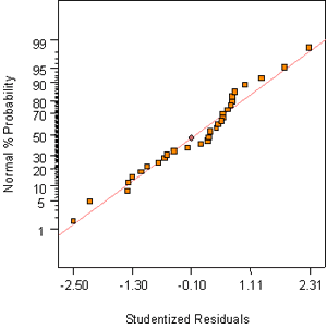
Figure B-31. Factorial experiment: normal probability plot for RCT charge passed
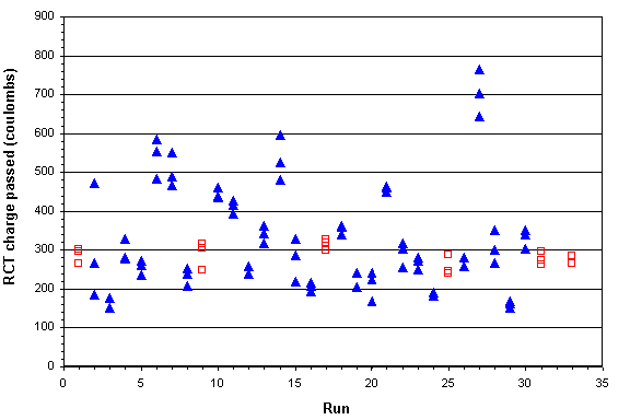
Figure B-32. Factorial experiment: raw data plot for RCT charge passed (hollow squares indicate control runs)
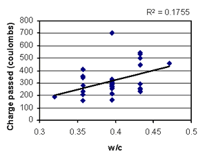
Figure B-33. Factorial experiment: scatterplot of RCT charge passed vs. w/c
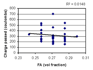
Figure B-34. Factorial experiment: scatterplot of RCT charge passed vs. fine aggregate
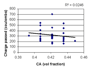
Figure B-35. Factorial experiment: scatterplot of RCT charge passed vs. coarse aggregate
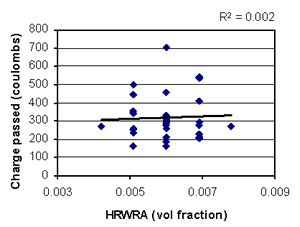
Figure B-36. Factorial experiment: scatterplot of RCT charge passed vs. HRWRA
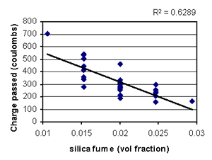
Figure B-37. Factorial experiment: scatterplot of RCT charge passed vs. silica fume
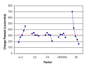
Figure B-38. Factorial experiment: means plot for RCT charge passed
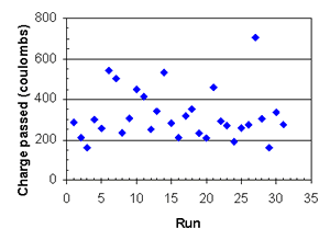
Figure B-39. Factorial experiment: RCT charge passed vs. run sequence
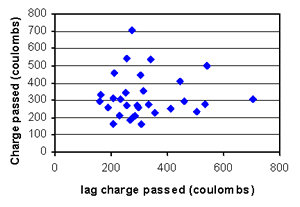
Figure B-40. Factorial experiment: lag plot for RCT charge passed

