U.S. Department of Transportation
Federal Highway Administration
1200 New Jersey Avenue, SE
Washington, DC 20590
202-366-4000
Federal Highway Administration Research and Technology
Coordinating, Developing, and Delivering Highway Transportation Innovations
 |
| This report is an archived publication and may contain dated technical, contact, and link information |
|
Publication Number: FHWA-RD-02-095 |
Previous | Table of Contents | Next
Visual Observation of Histograms
A large group of measurements and test results cannot provide any useful information until they are organized in preparation for analysis. Until the data are organized into a form that is intelligible and understandable, they are just a collection of numbers. The human mind cannot easily comprehend a large series of separate facts or numbers.
A frequency histogram for a set of observations is a diagram that shows the frequency of occurrence of the values of the variable in ordered classes. Each group of observations is called a class. The frequency for any class is the number of observations with measurements falling within that class, while the relative frequency for any class is the frequency for that class divided by the total number of observations (data values).
Individual rectangles whose heights are proportional to the frequencies in each class are erected on the horizontal axis. The base of each rectangle is set equal to the class intervals. If the class intervals are equal in width, the area of an individual rectangle represents the number of observations within the class, while the total area under the figure represents the total number of data values. Figure 56 shows an example frequency histogram for a set of data.
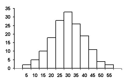
Figure 56. Example Frequency Histogram
Sometimes, a frequency histogram may be all that is needed to validate an assumption of a normally distributed data set. Figure 56, for example, appears to be approximately normally distributed. On the other hand, a frequency histogram can also show that a set of data is not normally distributed. This is the case for the histogram shown in figure 57, where the data are skewed to the left.
As mentioned above, it is reasonable to assume that most construction materials are approximately normally distributed. A study done for FHWA on both HMAC and PCC projects examined the occasions that skewed results occurred. (27) For PCC, few material properties of the 21 measured on 3 projects were significantly skewed. For the HMAC projects, out of 52 material properties measured on 3 projects, 6 (11.5 percent) had values that indicated a significant skewness. Five of these were from gradation results. One potential source of skewness is the presence of a physical barrier, such as occurs with the top size sieve. Since a gradation cannot exceed 100 percent, when the mean approaches this limiting value, the distribution will typically appear to be skewed. (See figure 57.)
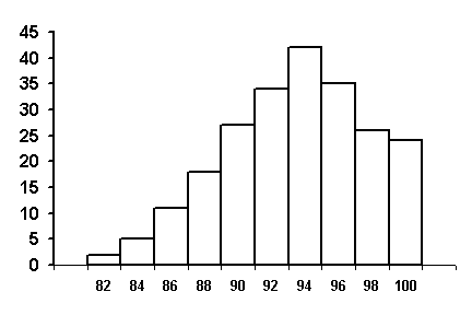
Figure 57. Example of a Skewed Frequency Histogram
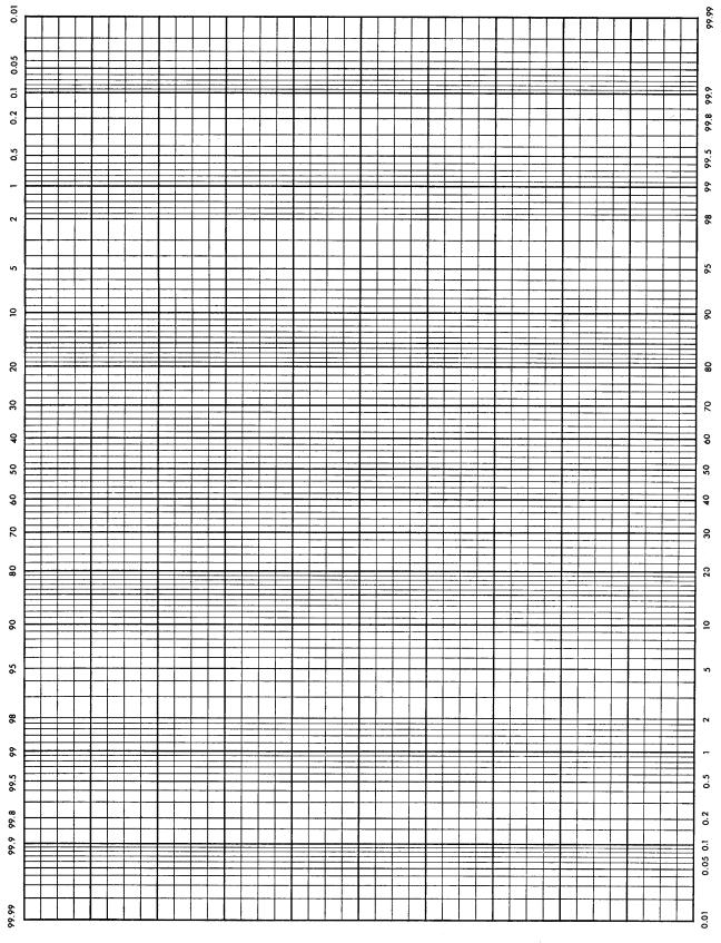
Another visual approach to assessing the normality of a set of data is to plot the data on normal probability paper. Normal probability paper is graph paper for which the scales are established such that a normal distribution will plot as a straight line. Specifically, the cumulative distribution of a normal distribution will plot as a straight line on normal probability paper. The data can be plotted on the normal probability paper either as grouped data, such as that from a histogram plot, or as individual data points. A sample of normal probability paper is shown in figure 58.
If the cumulative frequency data plot as reasonably close to a straight line on normal probability paper, then it would be assumed that a normal distribution can be used as a reasonable approximation for the data set.
Grouped Data Example
Table 41 presents a set of 25 data points that have been grouped into 5 classes. The last column shows the cumulative relative frequency values. For example, the table shows that 14/25 = 0.56, or 56 percent, of the data points are less than or equal to 100.
Table 41. Example Cumulative Frequency Table for Grouped Data
Class Limits |
Class Frequency |
Cum. Frequency |
Cum. Relative Frequency |
|---|---|---|---|
86 - 93 |
4 |
4 |
4/25 = 16% |
93 - 100 |
10 |
14 |
14/25 = 56% |
100 - 107 |
9 |
23 |
23/25 = 92% |
107 - 114 |
1 |
24 |
24/25 = 96% |
114 - 121 |
1 |
25 |
25/25 = 100% |
Figure 59 shows the results when the cumulative relatively frequency values from table 41 are plotted on normal probability paper against the respective upper class limits for each class. It should be noted that the cumulative relative frequency corresponding to the 121 upper class limit has been plotted at the 99.99 percent level. Using this approximation, the "best straight line" has been drawn through the points by ignoring the data point that represents the upper class limit of 114. Since only 5 plotted points are available, it is difficult to determine whether or not this point should be neglected. This situation can be improved, however, by either plotting all of the individual data points or by dividing the data into more classes.
Ungrouped Data Example
The plot of the grouped data in figure 59 did not clearly indicate whether or not the data could be approximated by a normal distribution. Plotting the individual data values in their ungrouped format can help to rectify this situation. The calculations for determining the cumulative relative frequencies for the individual data values are shown in table 42.
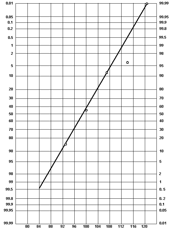 |
| Figure 59. Normal Probability Plot for Grouped Data Example |
| Data Value |
Cumulative Frequency |
Cumulative Relative Frequency |
|---|---|---|
87 |
1 |
1/26 = 4% |
89 |
2 |
2/26 = 8% |
91 |
3 |
3/26 = 12% |
92 |
4 |
4/26 = 15% |
93 |
5 |
5/26 = 19% |
94 |
6 |
6/26 = 23% |
95 |
7 |
7/26 = 27% |
96 |
- |
- |
96 |
9 |
9/26 = 35% |
97 |
10 |
10/26 = 38% |
98 |
- |
- |
98 |
12 |
12/26 = 46% |
99 |
13 |
13/26 = 50% |
100 |
14 |
14/26 = 54% |
101 |
15 |
15/26 = 58% |
102 |
16 |
16/26 = 62% |
103 |
- |
- |
103 |
18 |
18/26 = 69% |
104 |
- |
- |
104 |
20 |
20/26 = 77% |
105 |
21 |
21/26 = 81% |
106 |
22 |
22/26 = 85% |
107 |
23 |
23/26 = 88% |
112 |
24 |
24/26 = 92% |
120 |
25 |
25/26 = 96% |
It should be noted that a different method of calculation, one that is sometimes felt to provide a more realistic representation, has been used. Based on a small set of data, it would not be valid to create the impression that none (i.e., 0 percent) of the data are below 87 or that all (i.e., 100 percent) of the data are below 120. The common practice is therefore to add one more value to the number of observations (i.e., in our case 25 + 1 = 26), and then to compute the cumulative relative frequencies on that basis. As a result, there will be no 100 percent value. Typically, the plot of cumulative frequency distribution would be dotted below the lowest value and above the highest value.
The results from table 42 are plotted in figure 60. It appears, based on these data, that the assumption of normality is reasonable. A straight line fits the data reasonably well with the exception of the values in the upper tail (112 and 120 values).
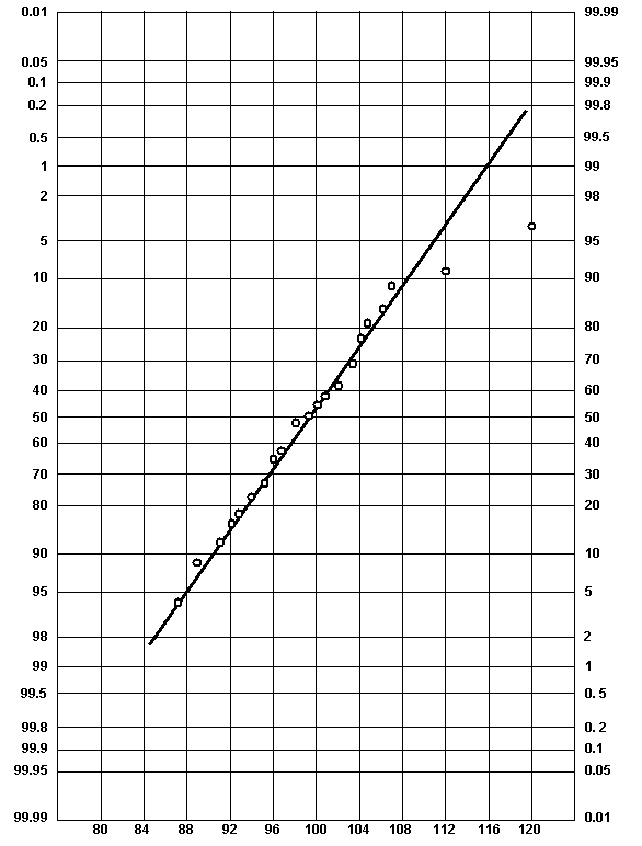 |
| Figure 60. Normal Probability Plot for Ungrouped Data Example |
The methods discussed so far are graphical in nature, and require some degree of subjectivity when deciding whether the shape of the histogram is reasonably normal or whether the data plot as a straight line on normal probability paper. There are other, more quantitative, methods available for considering whether or not a set of data is normally distributed. In many cases, the graphical methods will be sufficient since it is only necessary that the data are approximately normal.
One method for evaluating whether or not a set of data is reasonably normal is sometimes called the method of matching moments. A normality test based on moment measures was proposed in the 1920's. (28) The first and second central moments are often used in statistical analyses to calculate the mean and the variance. The third and fourth central moments are less frequently used, and represent a measure of symmetry and kurtosis, respectively. While tables of critical values for conducting normality GOF tests using moments have been developed, (29) it is not anticipated that a highway agency would choose this method for GOF testing. A Chi Square or Kolmogorov-Smirnov test would more likely be chosen if a formal GOF test procedure were desired.
The third moment is a measure of asymmetry and is called skewness. The fourth moment is a measure of kurtosis, or the "peakedness" of the distribution. Kurtosis looks at how much of the total distribution lies in the tails of the distribution. Skewness and kurtosis coefficients have been developed such that the normal distribution has skewness and kurtosis values of 0. Therefore, a highway agency could calculate the skewness and kurtosis for a data set to see how close the values for the data set are to 0.
Skewness.
The TRB glossary (2) includes the following definition:
Skewness-a measure of the symmetry of a distribution. When the distribution has a greater tendency to tail to the right, it is said to have positive skewness. When the distribution has a greater tendency to tail to the left, it is said to have negative skewness. For the normal distribution (as well as for any other symmetrical distribution), the skewness coefficient equals 0.
Population skewness coefficient: ![]() (66)
(66)
Sample skewness coefficient: ![]() (67)
(67)
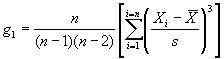
Therefore, the skewness characterizes the degree of asymmetry of a distribution around its mean. Positive skewness indicates a distribution with a long tail extending toward more positive values. Negative skewness indicates a distribution with a long tail extending toward more negative values. The calculations for skewness can be unwieldy, particularly for large data sets. It is therefore recommended that a computer program, such as the Microsoft® Excel spreadsheet program, be used for calculating the skewness. The equation for sample skewness used in Excel, which is algebraically the same as the equation used in the TRB glossary, (2) is as follows:
where: g1 = skewness.
n = total number of data values.
Xi = individual data values.
 = mean of the set of data
values.
= mean of the set of data
values.
s = standard deviation of the set of data values.
Kurtosis
The TRB glossary (2) includes the following definition:
Kurtosis- a measure of the shape of a distribution. For the normal distribution, the kurtosis coefficient equals 0. A positive kurtosis coefficient indicates that the distribution has longer tails than the normal distribution, while a negative coefficient indicates that the distribution has shorter tails.
Population kurtosis coefficient:
![]() (69)
(69)
Sample kurtosis coefficient:
![]() (70)
(70)
The above definition is a little confusing. The definition refers to distributions with tails longer or shorter than those of a normal distribution. In theory, the normal distribution runs from minus infinity to plus infinity. It is, therefore, not possible to have tails "longer" than the normal distribution.
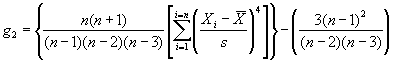
A better explanation is that kurtosis characterizes the relative amount of the distribution that is in the tails of the distribution, i.e., the "weight" of the tails of the distribution. A normal distribution has a kurtosis coefficient equal to zero. Negative kurtosis indicates distributions where a larger proportion of the values are towards the extremes, i.e., relatively "fat" or "heavy" tails compared with a normal distribution. Positive kurtosis, on the other hand, indicates distributions where the values are bunched up near the mean, i.e., relatively "thin" or "light" tails compared with a normal distribution. The calculations for kurtosis can be unwieldy, particularly for large data sets. It is therefore recommended that a computer program, such as the Microsoft® Excel spreadsheet program, be used for calculating the kurtosis. The equation for sample kurtosis used in Excel, which is algebraically the same as the equation used in the TRB glossary, (2) is as follows:
where: g2 = kurtosis.
n = total number of data values.
Xi = individual data values.
 = mean of the set of data
values.
= mean of the set of data
values.
s = standard deviation of the set of data values.
The previously mentioned methods for evaluating normality all require some degree of subjectivity on the part of the evaluator. GOF tests exist that allow for a normality decision to be made with a given level of significance, a. These GOF tests provide a more objective and rigorous method for evaluating normality. It is recommended that a highway agency first plot a histogram, consider the skewness and kurtosis, and if necessary plot their data on normal probability paper to make the decision regarding the normality of a set of data.
If a decision is not obvious from the above measures, then a formal GOF test should be conducted. GOF tests are not considered in this manual. The most common are the Chi Square test and the Kolmogorov-Smirnov (K-S) test. These are both explained and described in detail in numerous statistical texts.