U.S. Department of Transportation
Federal Highway Administration
1200 New Jersey Avenue, SE
Washington, DC 20590
202-366-4000
Federal Highway Administration Research and Technology
Coordinating, Developing, and Delivering Highway Transportation Innovations
 |
| This report is an archived publication and may contain dated technical, contact, and link information |
|
Publication Number: FHWA-RD-98-057
|
Human Factors Design Guidelines for Advanced Traveler Information Systems (ATIS)and Commercial Vehicle Operations (CVO)
CHAPTER 3: GENERAL GUIDELINES FOR ADVANCED TRAVELER INFORMATION SYSTEM (ATIS) DISPLAYSThis chapter provides human factors design guidelines relevant to the displays associated with ATIS devices. ATIS displays represent the primary method used to communicate ATIS messages to the drivers, and, therefore, their design is important to the overall usability and acceptance of ATIS devices. The following design topics are included in this chapter: SYMBOLSCOLORSGENERAL
SYMBOL CONTRASTIntroduction: Symbol contrast refers to the relationship between the luminance of a symbol and the luminance of the symbol's background. Contrast requirements have not been empirically studied under a wide range of representative driving situations and conditions, and there are few empirical data that can be directly used to specify design guidelines for the symbol contrast of automotive ATIS displays.
Here, we define contrast as a ratio between maximum and minimum luminance values or: Contrast ratio = (Luminancemax / Luminancemin) where: Luminancemax = luminance emitted by the area or element of greatest intensity Luminancemin = luminance emitted by the area or element of least intensity
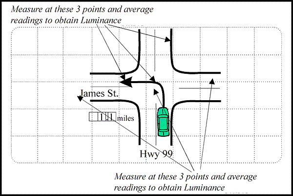
Example of Measuring Contrast The figure below may be used to aid contrast measurements. NOTE: The spot size of the photometer used to take luminance measurements must be small enough to fit inside the ATIS display elements to be measured.
Supporting Rationale: Contrast requirements can vary greatly as a function of display medium (e.g., electronic display vs. hardcopy), viewing environment (e.g., low vs. high glare), and user characteristics (e.g., young vs. older drivers). Most human factors reference sources that provide contrast recommendations do not address the effects of these, and other, variables on contrast requirements. Reference 1 describes a series of studies investigating the legibility of displays, and concludes that contrast ratios of 10:1 to 18:1 are required for Visual Display Terminal (VDT) displays. Reference 2 indicates that a contrast ratio of 10:1 has become "a generally accepted industrial standard for display design." Reference 3 suggests that a contrast ratio of 7:1 is preferred, but that 3:1 is required; the guidelines given here reflect the recommendations in Reference 3. However, other data sources suggest that far less contrast may be adequate. Daytime. An ambient background luminance of 2500 fL. is considered to be a representative "worst case" background luminance for daytime driving (see Reference 4). Reference 5 indicates that symbol contrast of 1.2:1 is sufficient for young military pilots. In Reference 6, contrast requirements for both younger and older subjects were investigated under laboratory conditions. The data from Reference 6 indicate that 1.4:1 contrast may be sufficient for older drivers under those conditions. Nighttime. Reference 7 indicates that with a background luminance of 0.01 fL., older individuals (e.g., approximately 55 years and older) will require 2:1 contrast and that with a background luminance of 10 fL., older individuals will require 1.6:1 contrast. In Reference 8, contrast requirements for both younger and older subjects were investigated under low luminance laboratory conditions. The data obtained in Reference 8 indicated that 2:1 contrast is required for older drivers under low luminance conditions; in this study, adequate legibility was not obtained at contrast levels below 2:1 (i.e., 1.25:1). Special Design Considerations: The contrast ratios provided above will lead to adequate ATIS legibility as long as other design parameters, such as symbol height and luminance, are sufficient. Cross References: Key References:
*Primarily expert judgement
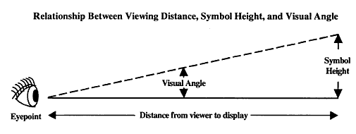
SYMBOL HEIGHTIntroduction: Symbol height refers to the vertical distance between the top and bottom edges of an unaccented letter or number. Since ATIS devices can be used at a broad range of display distances, symbol height is best defined and specified as the visual angle subtended by the symbology (at the driver's eye) in minutes of arc.
where: Symbol Height = the height of the symbology Distance = distance from viewer's eyepoint to the display Visual Angle = angle in degrees Height and Distance use the same unit of measure
Supporting Rationale: The design guidelines for other ATIS elements are consistent with the legibility requirements suggested by standard human factors reference sources (e.g., References 1 and 2). They are also supported by the empirical data obtained in References 3, 4, and 5. Briefly, these three studies were intended to investigate symbol height requirements as a function of various levels of symbol contrast and symbol luminance. Considered as a whole, the data from these studies indicate: (1) that symbols should subtend at least 20 arcminutes if they are associated with dynamic or critical display elements; (2) that legibility begins to decrease with symbol heights of less than about 18 arcminutes; and (3) that designers should avoid using symbols that subtend less than 16 arcminutes. Special Design Considerations: Driver Age. Older drivers generally have poorer visual acuity than do younger drivers. Thus, the design guidelines specified above assume that, all other factors being equal, design objectives for symbol height that meet the legibility needs of older drivers will always meet the legibility needs of younger drivers. These design guidelines have been developed to meet the needs of older drivers. Cross References: Key References:
*Primarily expert judgement
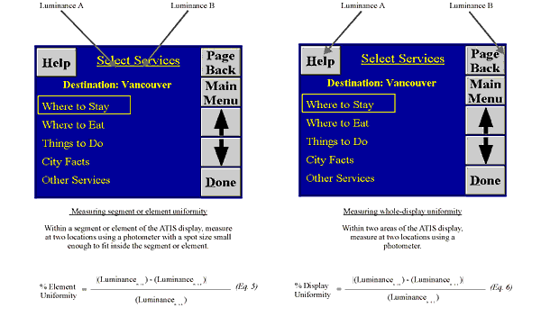
SYMBOL LUMINANCE UNIFORMITYIntroduction: Symbol luminance uniformity refers to the consistency of luminance values across a display.
Measuring Luminance Uniformity
Supporting Rationale: Threshold Luminance Discrimination Data. Although observers in Reference 1 could discriminate lights that differed in luminance by as little as 10 percent, these data were obtained when they were trying to detect a luminance difference between a background and a target under ideal laboratory conditions (see Reference 2 also). Thus, 10 percent represents a threshold luminance discrimination value and is far too conservative for ATIS use, in which the issue of concern is the driver's ability to notice luminance differences under normal driving or normal viewing conditions. Tolerance for Luminance Variations. Reference 3 indicates that luminance in cathode ray tubes (CRTs) typically varies by as much as 37 percent and is either not noticed or is considered to be acceptable by observers. Reference 4 recommends that luminance variations remain below 50 percent. Reference 5 indicates that while the preferred limit for luminance variation across optical projection displays is 33 percent, an unacceptable limit is 66 percent. Conclusions. The design objectives provided above reflect a composite of the information provided by References 3, 4, and 5. Specifically, if luminance differences up to 37 percent are not always noticed by observers and if 33 percent represents a preferred limit, then 33 percent seems to be an acceptable limit for small–area luminance nonuniformities (i.e., within an individual element or segment). Both 50 percent and 66 percent have been suggested as upper limits on luminance nonuniformities. The 50 percent value has been selected as the maximum luminance nonuniformity across the entire FOV, in an effort to be conservative. Special Design Considerations: Causes. Luminance nonuniformities are generally caused by the display itself. In vacuum fluorescent displays (VFDs) being viewed directly, for example, these might be caused by poor phosphor distribution on the inside of the anodes, or by fluctuations in the power supply output. In a head–up display (HUD), however, deficiencies in one or more of the optical elements (e.g., nonuniform reflective properties) can also lead to nonuniformities in perceived luminance. Consequences. Moderate nonuniformities in luminance may only lead to the perception, by the driver, that the display is of poor quality. With great nonuniformities in luminance, however, drivers may not be provided with sufficient luminance and contrast to ensure adequate legibility in certain areas of the display. Subjective Measurement. In operational terms, luminance uniformity refers to the concept of looking at a particular location on a display, looking at another location, and then deciding if the two locations seemed equally bright. More precise measurement procedures are described in the key references. Cross References: None. Key References:
*Primarily expert judgement
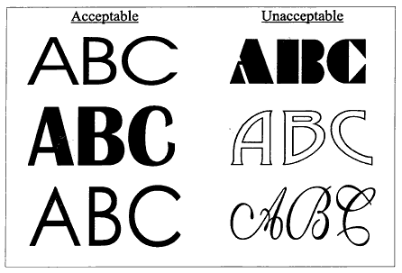
SYMBOL FONTIntroduction: Symbol font refers to the geometrical characteristics or style of symbology (Reference 1). Design goal for symbol font is to avoid extensive flourishes and embellishments of the symbols.
Examples of Acceptable and Unacceptable Fonts
Supporting Rationale: General Font Type. Most conventional fonts that are clear and simple will be legible as long as other symbol parameters, such as character size and contrast, are adequate. The design objective above is consistent with those provided for military applications (References 2 and 3) and with those provided by standard human factors references sources (References 3, 4, and 5). Dot–Matrix Display Elements. Empirical studies (e.g., References 6 and 7) indicate essentially no legibility differences between dot–matrix sizes for character heights greater than about 22 arcminutes. However, for smaller characters, References 8 and 9 indicate that a 7 x 9 matrix will lead to faster recognition time and fewer reading errors than a 5 x 7 matrix. Reference 5 indicates that a 5 x 7 matrix should only be used for numeric and uppercase presentations, and that a 7 x 9 matrix should be used for continuous reading or when individual alphabetic character legibility is important. On the whole, the literature supports the recommendation that a 7 x 9 matrix size should be used to display dynamic or critical alphanumerics. Segmented Elements. There are no published empirical data that describe the relationship between the number of character segments and legibility. Common design practice indicates that a 7–segment pattern will be sufficient to assure legibility of numeric characters. Special Design Considerations: Font Generation Techniques. There is a relationship between symbol font and the technique used to generate or construct the characters on a display. Three techniques are primarily used on electronic displays: stroke, dot–matrix, and segmented techniques. The stroke technique produces characters as whole continuous units, not as composites of dots or lines; it is used primarily on printed or silk–screen displays. The dot–matrix technique uses individual points of light (dots or pixels) to generate symbols; it is used primarily in raster, or matrix–addressable, systems. Dot–matrix characters are typically described by their size (e.g., 5 x 7, 7 x 9, or 9 x 11), as well as by their font. In the segmented technique, characters are formed by illuminating discrete segments within a basic symbol pattern. The majority of electronic displays using this technique employ 7–segment patterns to generate numerals (e.g., digital speedometers and clocks); however, 14–segment and 16–segment patterns are also available for the generation of complete alphanumeric sets. Cross References: Key References:
*Primarily expert judgement
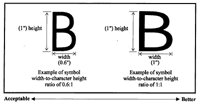
SYMBOL WIDTH–TO–HEIGHT RATIOIntroduction: Symbol width–to–height ratio refers to the ratio of the width to the height of the symbology. Design Goals: (1) Provide adequate symbol width–to–height ratios so that 95 percent of drivers can comfortably and quickly read the ATIS symbology 95 percent of the time. (2) To the extent possible, provide a wider symbol (up to a 1:1 ratio) as the criticality of the display information increases (e.g., hazard warnings). (3) To the extent possible, provide a wider symbol (up to a 1:1 ratio) as the number of alternate cues to legibility (e.g., consistent position, color) decreases. (4) To the extent possible, provide a wider symbol (up to a 1:1 ratio) for dynamic symbology (e.g., next turn) than for static symbology (e.g., legends).
Examples of Recommended Symbol Width–to–Height Ratios
Supporting Rationale: The design guideline above is consistent with the requirements for symbol width–to–height ratio suggested by standard human factors reference sources (e.g., see References 1, 2, and 3). Reference 2 indicates that while a symbol width–to–height ratio of 1:1 is best supported by empirical data, a symbol width–to–height ratio of 0.6:1 can be used without serious loss in legibility. Special Design Considerations: Relative Importance of Symbol Width–to–Height Ratio. The standard human factors reference sources do not discuss symbol width–to–height ratio in great detail and do not reference empirical data sources associated with this symbol variable. Compared to character height, contrast, and luminance, symbol width–to–height ratio will generally be a less critical ATIS design parameter. Nonetheless, it can have an impact on ATIS legibility, particularly under conditions in which the more critical design parameters (i.e., character height, contrast, or luminance) do not meet the specified guidelines. Symbol width–to–height ratio may also increase in importance when such issues as the criticality of the displayed information, the availability of alternate cues to legibility, and the nature of the information (e.g., dynamic vs. static) are taken into account. Cross References: Symbol Strokewidth–to–Height Ratio Key References:
*Primarily expert judgement
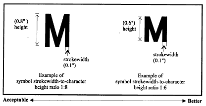
SYMBOL STROKEWIDTH–TO–HEIGHT RATIOIntroduction: Symbol strokewidth–to–height ratio refers to the ratio of the symbol stroke thickness to symbol height. Design Goals: (1) Provide adequate symbol strokewidth–to–height ratios so that 95 percent of drivers can comfortably and quickly read the ATIS symbology 95 percent of the time. (2) To the extent possible, provide a lower ratio (down to a 1:6 ratio) as the criticality of the display information increases (e.g., hazard warnings are more critical than street names). (3) To the extent possible, provide a lower ratio (down to a 1:6 ratio) as the number of alternate cues to legibility (e.g., consistent position, color) decreases. (4) To the extent possible, provide a lower ratio (down to a 1:6 ratio) for dynamic symbology (e.g., next turn) than for static symbology (e.g., legends).
Examples of Recommended Symbol Strokewidth–to–Height Ratios
Supporting Rationale: These design objectives are consistent with the legibility requirements suggested by the standard human factors reference sources (e.g., see References 1, 2, and 3). Special Design Considerations: Relative Importance of Strokewidth–to–Height Ratio on Legibility. The standard human factors reference sources do not discuss strokewidth–to–height ratio in great detail and do not reference empirical data sources associated with this symbol variable. Reference 1 indicates that the symbol strokewidth–to–height ratio is not an important determinant of legibility as long as symbol height, contrast, and luminance are adequate. Nonetheless, it can have an impact on ATIS legibility, particularly under conditions in which the more critical design parameters (i.e., character height, contrast, or luminance) do not meet the specified objectives. Symbol strokewidth–to–height ratio may also become more critical when such issues as the criticality of the displayed information, the availability of alternate cues to legibility, and the nature of the information (e.g., dynamic vs. static) are taken into account. In general, optimum ratios for black symbols on a white background are lower than those for white symbols on a black background, due to a phenomenon called "irradiation." Irradiation occurs when white features appear to "spread" into adjacent black areas, but not the reverse (Reference 4). Reference 4 also notes that highly illuminated displays and/or dark adaptation of the observer accentuate the irradiation effect. Reference 4 recommends strokewidth–to–height ratios for black on white symbols of 1:6 – 1:8 and ratios for white on black symbols of 1:8 – 1:10. Cross References: Key References:
*Primarily expert judgement
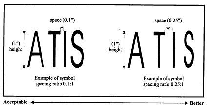
SYMBOL SPACINGIntroduction: Symbol spacing refers to the horizontal space between adjacent characters on a display. Symbol spacing is often expressed as the ratio of space–between–characters to symbol–height (space–to–symbol–height ratio). Design Goals for Symbol Spacing: (1) Provide adequate symbol space–to–height ratios so that 95 percent of drivers can comfortably and quickly read the ATIS symbology 95 percent of the time. (2) To the extent possible, provide wider spacing (up to a 0.25:1 ratio) as the criticality of the display information increases (e.g., hazard warnings). (3) To the extent possible, provide wider spacing (up to a 0.25:1 ratio) as the number of alternate cues to legibility (e.g., consistent position, color) decreases. (4) To the extent possible, provide wider spacing (up to a 0.25:1 ratio) for dynamic symbology (e.g., next turn) than for static symbology (e.g., legends).
Examples of Recommended Symbol Spacing
Supporting Rationale: The legibility data described in Reference 1 indicates that space–to–symbol–height ratios of 0.1:1 are adequate for direct viewing of most displays. Recommendations for larger spacing (up to 0.25:1) reflect data obtained under "suboptimal" conditions (see also References 2 and 3); such conditions might be representative of reduced contrast conditions or of older drivers with reduced visual acuity. Special Design Considerations: Relative Importance of Symbol Spacing. The standard human factors reference sources do not discuss symbol spacing in great detail and do not reference empirical data sources associated with this symbol variable. Compared to character height, contrast, and luminance, symbol space–to–height ratio will generally be a less critical ATIS design parameter. Nonetheless, it can have an impact on ATIS legibility, particularly under conditions in which the more critical design parameters (i.e., character height, contrast, or luminance) do not meet the specified guidelines. Symbol spacing may also increase in importance when such issues as the criticality of the displayed information, the availability of alternate cues to legibility, and the nature of the information (e.g., dynamic vs. static) are taken into account. Cross References: Symbol Strokewidth–to–Height Ratio Key References:
*Primarily expert judgement
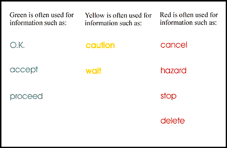
SYMBOL COLORIntroduction: Our perception of color is derived from variations in the wavelength or spectral composition of light. Color perception can be described in terms of three psychological dimensions: hue, saturation, and brightness. Hue is related to the dominant wavelength of the stimulus, saturation is somewhat more loosely related to the spectral bandwidth of the stimulus, and brightness is related to the luminance of the stimulus.
Examples of Standard Uses of Color
As seen in the examples above, legibility of symbol colors depends on background color. For example, on a white background, yellow symbols may be illegible, and on a black background, blue symbols may be illegible. Legibility is a function of both the symbol and its background. Supporting Rationale: Despite well–established differences in visual sensitivity as a function of color (wavelength), there is no consistent, empirical evidence that color has a meaningful effect on legibility (References 1, 2, and 3), and, in principle, any reasonably visible color may be used, as long as recommendations for symbol height and contrast are adhered to. It is recommended that a highly saturated blue be avoided because the central fovea is relatively insensitive to highly saturated blue (References 4 and 5); highly saturated blue has also been associated with "disruptions in accommodation" (Reference 6). Special Design Considerations: Typical Use of Color. Most human factors reference sources discuss color as a coding device (e.g., green = "O.K."; yellow = "caution"; red ="hazard"). This use of color is not applicable to the issue of the color's effect on symbol legibility for ATIS devices. Cross References: Selection of Colors for Coding Visual Displays Color Coding of Traffic Flow Information Key References:
*Primarily expert judgement
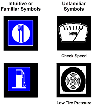
SYMBOL VERSUS TEXT PRESENTATION OF ATIS/CVO MESSAGESIntroduction: Symbol versus text presentation of ATIS/CVO messages refers to the style and format of in–vehicle visual messages. A key ATIS/CVO design issue is presenting information to the driver so that it is not distracting and is easily understood. Symbols or icons are increasingly used in the design of electronic devices under the assumption that they are preferable to text (e.g., "a picture is worth a thousand words"). However, if drivers are unfamiliar with the symbol or if the symbol is not intuitive, it may be less effective than a corresponding text message when used in an ATIS/CVO device.
Two Examples of Intuitive or Familiar Symbols (Without Text Label),
Supporting Rationale: Reference 1 investigated drivers' memory for traffic and traveler–related messages presented on an ATIS using a medium fidelity driving simulator. A range of messages from the Augmented Signage, Motorist Services, and Safety/Warning functions of ATIS were presented to subjects, using both symbol and text presentation modes. Both low and high comprehension symbols, as well as long and short text messages, were examined. (Lists of the symbols used in the study are included in Reference 1.) Reaction time to the messages and message comprehension were measured. Except for very low comprehension symbols (i.e., unfamiliar or nonintuitive), performance was similar for symbol and text message formats; these data confirmed research conducted in Reference 2. The empirical data regarding the use of symbols versus text are mixed, reflecting different empirical approaches, different types of messages, and the specific types of symbols used across empirical studies. For example, while Reference 2 found similar performance for symbols and text, Reference 3, an on–the–road study, found that drivers react faster to symbols than to text, particularly under visually degraded conditions. Special Design Considerations: ATIS designers should choose symbols that are easily comprehended by both younger and older drivers. Older drivers tend to have lower comprehension levels than younger drivers for automotive symbols, perhaps due to their greater experience, familiarity, and level of comfort with text–based messages. Familiarity and intuitiveness are key attributes associated with comprehension levels for symbols. Driver familiarity with a symbol is based on usage and experience and cannot be provided (directly) by the ATIS designer. However, designers can influence the intuitiveness of a symbol by selecting symbols that are clear and have a direct, obvious link with their associated system operation. For example, a symbol of a trash can that is used to erase or discard files is a highly intuitive symbol used in computer systems. In ATIS/CVO design, however, driver operations or system messages are often highly complex, and developing an "intuitive" symbol is not straightforward. In general, new symbols should be tested and evaluated prior to their introduction into ATIS/CVO devices, in order to maximize driver comprehension. Cross References: None. Key References:
*Primarily expert judgement
FHWA-RD-98-057
|
|||||||||||||||||||||||||||||||||||||