U.S. Department of Transportation
Federal Highway Administration
1200 New Jersey Avenue, SE
Washington, DC 20590
202-366-4000
Federal Highway Administration Research and Technology
Coordinating, Developing, and Delivering Highway Transportation Innovations
| REPORT |
| This report is an archived publication and may contain dated technical, contact, and link information |
|
| Publication Number: FHWA-HRT-13-036 Date: August 2013 |
Publication Number: FHWA-HRT-13-036 Date: August 2013 |
In today’s practice, integrated modeling generally functions less like a system and more like a series of independent activities. A key objective of the AMS data hub is to develop a systematic approach for integrating AMS tools to enable the continuous flow of data which, in turn, allows users to dedicate more time to performing modeling functions such as calibration, alternatives and sensitivity analyses, and performance evaluation.
The AMS data hub has the following four primary components, as illustrated in figure 4:
This report provides a high-level overview of a recommended database schema for unifying modeling data across commonly used AMS tools. Figure 4 provides an overview on the proposed software architecture by illustrating the information data flow procedures between different components.
The following sections describe each component in detail, including its primary function, internal relationship with other components, key characteristics, and operation environment.
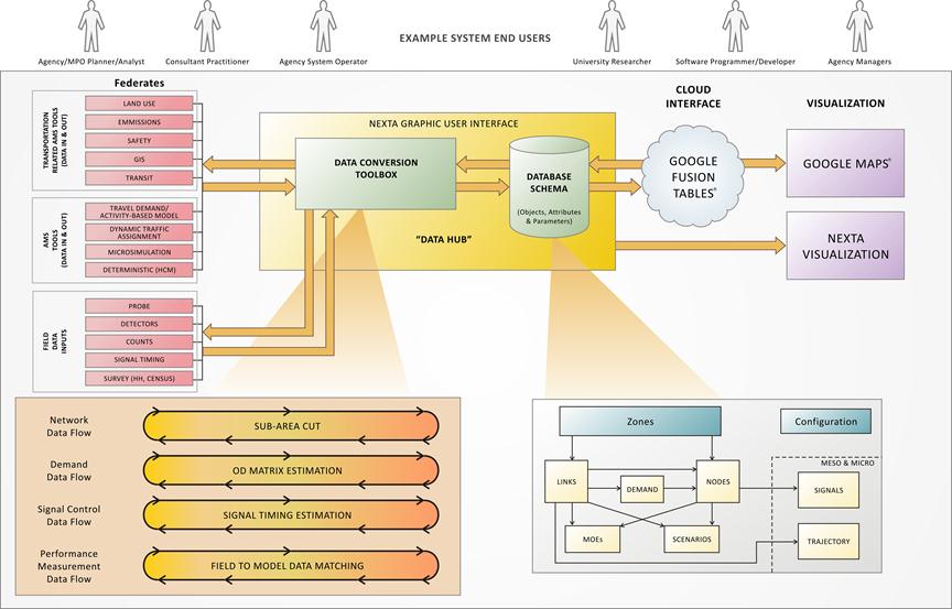
Figure 4. Illustration. AMS data hub architecture.
This component includes analysis tools and data that can be integrated to yield higher analysis fidelity. To facilitate description and presentation, analysis tools are categorized using the traditional (albeit sometimes misleading) resolution descriptions of macroscopic, mesoscopic, microscopic, and HCM to distinguish the basic levels of information required by transportation AMS tools. The descriptions are as follows:
Field data inputs include existing traffic counts, traffic information, geometric information, signal controller settings, travel time runs, etc., which can be integrated with analysis tools to facilitate data input or calibration and validation. Field data inputs include the following:
Note that this report does not provide detailed information on transportation-related analysis tools such as land use, emissions, and safety models. The AMS data hub concept can be extended in the future to include other related models.
The conversion toolbox is one of the core components of the AMS data hub. Within the current state of the practice, many conversions are required to transfer data among analysis tools. Over time, it is likely that the conversion toolbox will become less and less critical as analysis tools adopt the unified data structure and have built-in capability to import/export AMS data hub compatible format. However, for near-term applications, the conversion toolbox is essential. This section provides data hub users with a better understanding of underlying multi-resolution modeling elements, automated processes of disaggregating and aggregating data across different resolutions, and value added and data mining support tools such as subarea O-D demand matrix updating and sensor data management.
Table 4 provides a summary of typical modeling components used at different resolutions of transportation modeling and simulation tools.
Table 4. Summary of typical transportation AMS data types.
Data Type |
Data Resolution |
||
|---|---|---|---|
Macroscopic Regional Planning Models (Including Agent-Based Demand and Land Use Models) |
Mesoscopic DTA |
Microscopic Traffic Simulation, Travel Demand, and Highway Capacity Analysis Tools |
|
Node |
Coordinates turning movement permission and restriction |
Movement-specific capacity |
Turning volume and signal timing plan |
Link |
Upstream node, downstream node, length, link capacity, and number of lanes |
Number of left-turn and right-turn bays and length of bays |
Lane-to-lane connectors at intersections and detailed geometry of lanes |
Vehicle demand |
Household, population, employment of traffic analysis zones, parcel-level household data for activity origins and destinations, and peak hour O-D demand matrix by different trip purposes and vehicle types |
Time-dependent departure time profile and vehicle paths under different traveler information provision strategies |
Node-specific turning movement and vehicle routing plan in the subarea |
Transit demand |
Transit network with connectors from zone centroids |
Number of transit vehicles on network |
Individual transit stops with walk access connectors from land parcels |
Link measure of effectiveness (MOE) output from simulators/ models |
Peak hour end-to-end travel time and accessibility, link speed, and flow rate |
Link-based time-dependent flow rates and queue evolution |
Second-by-second lane-by-lane vehicle trajectory |
Observed sensor measurements |
Peak hour link count and end-to-end travel time |
Time-dependent loop detector data such as speed, flow, occupancy, and time- |
High-fidelity vehicle trajectory data (e.g., Next Generation Simulation) |
To facilitate the seamless cross resolution modeling practice and improve the modeling accuracy of simulation and planning models, the AMS data hub should consider the following guiding principles:
Table 5. Data flow for information propagation and exchange in cross domain applications.
Data Type |
Data Resolution |
||
|---|---|---|---|
Macroscopic Representation |
Mesoscopic Representation |
Microscopic Representation |
|
Domain application |
Safety impact evaluation |
Travel time reliability analysis |
Emission impact studies |
Output through data hub |
Link volume (average annual daily traffic (AADT)) and congestion level |
Time-dependent path flow pattern and link capacity variations under recurring conditions |
Second-by-second lane-by-lane vehicle trajectory |
Additional information from specific domain applications |
AADT-based crash prediction formulas for different facility types |
Link volume, capacity, and demand variations due to incidents, work zone, and severe weather conditions |
Vehicle-specific power-to-emission conversion table |
Additional MOEs |
Peak hour and daily crash rates and capacity reduction |
End-to-end travel time reliability measures under recurring and non-recurring conditions |
Regional- and project-level emissions estimates and sustainability analysis |
Network EXplorer for Traffic Analysis (NeXTA) version 3 is the prototype implementation of the AMS data hub that was developed based on the guiding principles highlighted in this section. It houses various conversion tools and provides a visualization as well as connection with the cloud storage. The following conversion tools are currently embedded in NeXTA:
Other functions provided by NeXTA include the following:
This section describes a unified data structure that facilitates input/output data conversion in the short term and promotes data consistency and exchange in the long term.
The component diagram shown in figure 4 illustrates the relationship of the series of tables in the proposed database schema: zones, nodes, links, demands, transit, household travel surveys, travel model outputs, MOEs, scenarios, signal control, vehicle trajectories, and configuration.
A few key points regarding the organization of the data hub tables are as follows:
Advantages of the database schema are as follows:
One disadvantage of such an overarching unified data schema is its size, which has an adverse effect on computational speed and efficiency. The data structure is understandably large in order to accommodate analysis models in various resolutions (i.e., a single intersection analysis using the HCM method would utilize only a small portion of the data structure).
A description of each of the components of the database schema is provided in appendix B of this report. The description is general in nature, and the database schema can be implemented in multiple ways. Regardless of the format, the AMS data hub must accommodate a wide variety of data types, some of which are quite complex (see table 6). Examples of data types are as follows:
Simple data types:
Complex data types:
The data type definitions in table 6 are proposed in the database schema.
Type |
Definition |
Range |
Notes |
|
|---|---|---|---|---|
Minimum |
Maximum |
|||
Int |
Signed 32-bit integer value |
-2,147,483,648 |
2,147,483,647 |
Other possible integer types (which are less often used): byte (8 bits), short int (16 bits), and long int (64 bits) |
Double |
Double precision floating point number |
-1.797e308 |
1.797e308 |
Used for most inputs that can take on any value, including fractional values |
Enum |
Takes on one of several prespecified values |
N/A |
N/A |
Used for categorical variables (e.g., facility type = freeway, arterial, ramp, etc.) |
Bool |
Boolean value: |
N/A |
N/A |
N/A |
String |
String of unicode characters |
N/A |
N/A |
N/A |
Extensible Markup Language (XML) |
XML formatted field |
N/A |
N/A |
Can alternately be defined as a string variable, but some DBMSs provide XML field definitions with special handling (e.g., the user may have to specify a validating schema) |
Array |
n-dimensional array |
N/A |
N/A |
An array of any simple type |
Date/time |
Date and time value |
N/A |
N/A |
N/A |
Geometry |
Geometric object |
N/A |
N/A |
Can be a point, line segment, path, or polygon |
User-defined |
User-defined data object to hold complex data types |
N/A |
N/A |
Some DBMSs allow user-defined objects, but these usually require an additional handling code to be written by the user |
N/A = Not applicable.
n = Number of dimensions in the subject array.
NeXTA version 3 is used for the test applications conducted for the AMS data hub. Its data structure is loosely based on the proposed data schema. To allow the most flexibility, readability, and compatibility with the open-source concept, NeXTA’s tables are currently stored in a series of comma-separated values (CSV) files. As a compromise, it lacks advanced capabilities such as table linkage, shared access, entry validation, etc., that are typically inherent in a database.
Google Fusion Tables® is employed to demonstrate the benefits of cloud storage. Data uploaded to Google Fusion Tables® are stored on the Google® cloud server. The tables can be shared with many users. Google Fusion Tables® is free and provides many functions to work with and manipulate data. Since it is open source, there is a growing number of add-in tools developed by others and distributed freely. Figure 5 shows link and node data from a sample network that has been exported from NeXTA and uploaded to Google Fusion Tables® . Similarly, the network data can be downloaded from Google Fusion Tables® in CSV format and imported into NeXTA or other software.
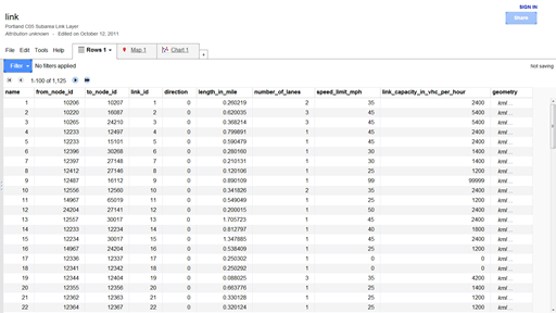
©2012 Google Fusion Tables®
Figure 5. Screenshot. Google Fusion Tables® data exported from NeXTA.(6)
Visualization is an increasingly important element of transportation analysis and should be an integral part of any AMS data hub. Analysts can apply several readily available visualization functions with Google Fusion Tables® . Figure 6 and Figure 7 illustrate two examples.
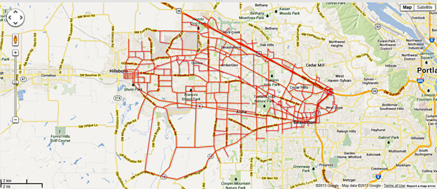
©2013 Google Maps®
Figure 6. Illustration. Example network plotted using Google Maps® .(7)
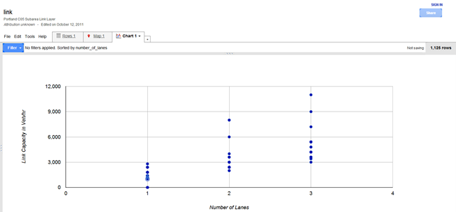
©2012 Google Fusion Tables®
Figure 7. Graph. Example scatter plot using Google Fusion Tables® .(8)
The NeXTA interface also has many useful visualization functions. Visual display of commonly used MOEs such as V/C ratio, speed, and queuing are readily available from one of the toolbars (see figure 8).
![]()
Figure 8. Illustration. NeXTA toolbar visualization options.
The V/C visualization view shows time-dependent V/C ratios for each link in the network. The color coding is user definable and allows for quantifying locations and durations of congestion in a network, as shown in figure 9.
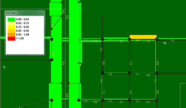
Figure 9. Illustration. V/C ratio performance by link.
The travel speeds at the link level are displayed in a time-dependent manner very similar to the V/C visualization. The speed MOE used is percentage of speed limit (or designated link speed) and is illustrated in figure 10. Again, the user may define the color coding and thresholds
for display.
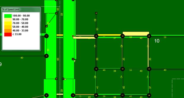
Figure 10. Illustration. Speed performance by link.
The queue is visually represented on the link using both line width and color. Links without queue are drawn with thin gray lines. When a queue is present, the portion of the link which is occupied with queued vehicles is drawn as a red line with increased line thickness. The distance over which these link visualization changes are applied represents the percentage of the link that is occupied with queued vehicles. The length of the queue on the link changes dynamically over time, corresponding to the time-dependent queue length. The numerical values are shown in terms of the percentage of the link occupied with queued vehicles. Figure 11 provides an example of the queuing visualization tool in NeXTA.
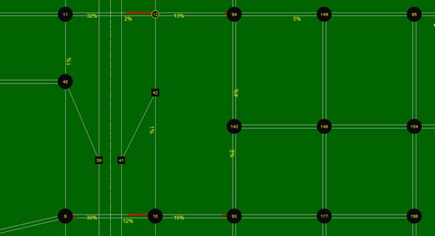
Figure 11. Illustration. Queuing performance by link.
NeXTA’s visualization tools also provide additional MOEs, some of which are more advanced and in the forefront of the transportation analysis practice. One of them is the path travel time reliability analysis tool, which is an advanced feature for investigating travel time reliability and sources of unreliability.
The research team conducted two test applications using the AMS data hub prototype. The objective of the test application is to create seamless linkages between AMS tools and multiple resolutions. The test applications aim to replicate real-world analyses and enable alternatives analyses and scenario evaluations.
The two networks selected for testing are located in Tucson, AZ, and Portland, OR. These networks were chosen due to agency interest, availability of field data, and availability of AMS models. Additionally, the two networks collectively represent a freeway (Tucson, AZ) and arterial (Portland, OR) network.
The I-10 Casa Grande Tucson Highway traverses the northwestern and eastern portions of Pima County and is an important corridor serving Tucson commuters as well as interstate traffic. The Arizona Department of Transportation (ADOT), in conjunction with the Federal Highway Administration, has identified the need to reconstruct I-10 from milepost 247.5 to milepost 253.0 to increase the roadway capacity and to improve operational efficiency. As part of the planning process, a detailed traffic study is required to establish year 2040 traffic demands and capacity needs. The study should also recommend a construction sequencing strategy with the least impact to road users. This test application presents the application of the AMS data hub to address some of the project’s traffic questions.
Objectives of the Tucson, AZ, test application are as follows:
Figure 12 depicts the study area, the I-10 corridor, and its interchanges (TIs). As shown, there are four existing interchanges within the study corridor. The I-10 mainline currently goes over the crossroads at the Ina Road, Sunset Road, and Ruthrauff Road TIs. The reconstruction will place the crossroads over I-10 and thus require complete closure of those three TIs.
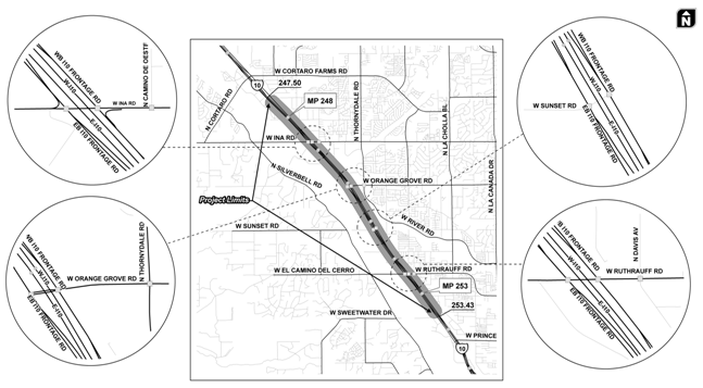
Figure 12. Illustration. Tucson, AZ, test network and intersection geometry.
Input data for the Tucson, AZ, test application are summarized in table 7.
Table 7. Source data for Tucson, AZ, test application.
Source Data Type |
AMS Tool |
Source |
|---|---|---|
Regional TDM |
TransCAD® |
PAG |
24-h segment counts, intersection turning movement counts, I-10 mainline speed data |
N/A |
Collected by quality counts for ADOT |
Regional Synchro® models |
Synchro® |
PAG |
NW 185th Avenue is located in the center of Portland’s western suburbs and bisects Beaverton and Hillsboro. The population of both communities is rising and outpacing growth in the greater Portland metro area. NW 185th Avenue is one of the longest continuous north-south major arterials in western suburban Portland. This important link has largely commercial and residential adjacent land uses and carries an average daily traffic of 30,000 across a mostly five-lane cross section.
Figure 13 shows the limits of the NW 185th Avenue corridor and locations of traffic signals. Projected future vehicular volumes warrant widening NW 185th Avenue to seven lanes or more, but regional MPO livability policy dictates no roadway widening beyond five lanes. Thus, a time-dependent, capacity constrained evaluation is needed at the link level to provide an informed decision about the likely congestion impacts and route diversion to occur if NW 185th Avenue arterial is left at five lanes or if it is widened.
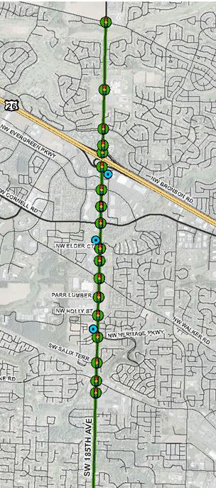
Figure 13. Illustration. NW 185th Avenue arterial test network area.
NW 185th Avenue has the following notable features that make it an interesting test network for the AMS data hub test application:
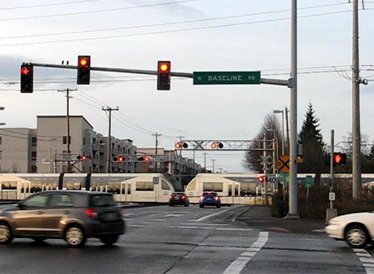
Photo Credit: Shaun Quayle, Kittelson & Associates
Figure 14. Photo. Light rail crossing on NW 185th Avenue.
For the purposes of this test application, a DTA evaluation is necessary at a larger subarea level to evaluate alternative routes due to sizing of the NW 185th Avenue arterial. For the deterministic or microsimulation evaluations, the team focused on the most congested portion of the network near the US 26 interchange, which is adjacent to the Tanasbourne regional shopping center where ramp meter spillback is most pronounced.
The source data used in this test application are summarized in table 8.
Table 8. Source data for Portland, OR, test application.
Source Data Type |
AMS Tool |
Source |
|---|---|---|
Region TDM |
PTV Visum® |
Portland Metro |
Field-measured 24-h link volumes and speeds |
N/A |
Washington County |
Peak period turning movement counts (morning, midday, afternoon, and weekend) |
N/A |
Washington County |
Signal timing plans |
Timing sheets and Synchro® |
Washington County |
Bluetooth® travel time data |
N/A |
Washington County |
Figure 15 and Figure 16 show traffic and congestion on the Portland, OR, test network.
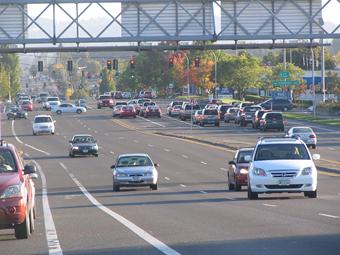
Photo credit: Shaun Quayle, Kittelson & Associates
Figure 15. Photo. NW 185th Avenue arterial test corridor traffic.
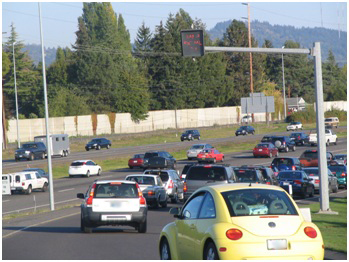
Photo credit: Shaun Quayle, Kittelson & Associates
Figure 16. Photo. Second view of NW 185th Avenue arterial test corridor traffic.
Objectives of the Portland test application are as follows:
This section describes the steps that were conducted to build a DTA subarea network to analyze the I-10 corridor and subsequently export the subarea to PTV Vissim® for microsimulation. For illustration purposes, the test application only focused on the morning peak conditions.
Step 1—Export Network from Regional TDM
PAG maintains the Tucson regional TDM in TransCAD® . This network needs to be converted to a set of shape files before importing them into NeXTA. This was accomplished by using the shape file export function in TransCAD® . The resulting shape files depict the node and link layers in the network. TransCAD® also exported the demand matrix (for morning peak period) to CSV files.
Intermediate Step—Change Map Projection to the Word Geodetic System (WGS84)
The original TransCAD® network was in the North American Datum (NAD83) coordinate system and thus required conversion to the WGS84 system for compatibility with NeXTA. This process was completed using projection tools in the Economical and Social Research Institute (ESRI® ) ArcGIS software to modify the coordinate system of the shape files.
Step 2—Import Network from Regional TDM
The second step in the network conversion process was to use NeXTA’s network import tool to convert the network shape files. In order for NeXTA to interpret the shape files for conversion, a configuration initialization (INI) file was prepared to map field names between the shape files and the NeXTA format (which includes a series of CSV files).
The network import process is divided into the following three internal steps:
1. Prepare INI Configuration File and Attribute Files for Conversion
The INI configuration file is divided into different sections depending on the type of data to be imported. The first section describes general model attributes and import options. The remaining sections are used to describe the different types of network objects that can be imported. Separate sections are used to import links and nodes, with optional sections for importing zones, zone centroids, and zonal connectors. A few key entries are shown in figure 17, and a detailed description of all entries in the INI files is included in appendix A.
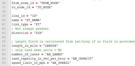
Figure 17. Screenshot. Sample INI configuration file.
In figure 17, the variables on the left side of the equal sign are NeXTA’s field names, while the variables in quotation marks are field names in the TransCAD® shape files. Some of the fields imported from TransCAD® into NeXTA were from_node, to_node, street name, segment length, capacity, and speed limit.
Two additional attribute files that required preparation were the input_link_type.csv and input_node_control_type.csv. The input_link_type maps the link types in TransCAD® with the link types in NeXTA. Since the Tucson TDM does not contain traffic control data, NeXTA applied its default control types during conversion.
2. Use NeXTA’s Import Network Tool to Convert the Network
Starting with a new empty network project in NeXTA, the conversion process was initiated by selecting the INI file. After the successful conversion process, NeXTA displayed a file loading status window as shown in figure 18.
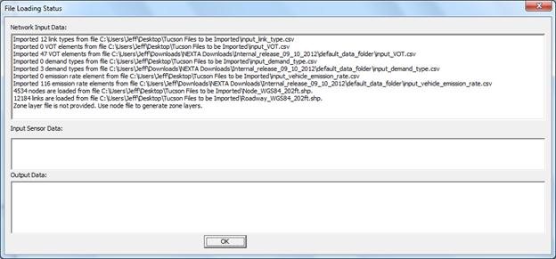
Figure 18. Screenshot. File loading status window showing import results after completion.
For the Tucson network, NeXTA imported 12,184 links rather than the 12,230 links in the TDM network. Duplicate links and extra nodes were the primary cause of discrepancy. These were corrected in the shape files, and the import process was repeated.
The final imported network in NeXTA is shown in figure 19. It should be noted that because the regional TransCAD® model does not contain traffic control information, NeXTA used its internal logic to add signal control to intersections of major arterial streets.
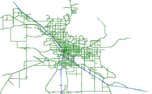
Figure 19. Illustration. Tucson regional network imported into NeXTA.
3. Save the New Network As a New Project File
The network was saved as a new transportation network project (.tnp) file.
Step 3—Read Demand Data from Regional TDM
Similar to the INI file, the input_demand_meta_data.csv file is used by NeXTA to find and read the O-D tables exported from TDMs. This metadata file requires several entries, but the relevant entries include the following:
Step 4—Run Assignment with DTALite to Equilibrium
Before a subarea was created for more detailed analyses, DTA was performed with DTALiteto ensure equilibrium network path flows and thus reasonable trips entering the subarea. Running the DTALite assignment engine requires editing the simulation settings in the input_scenario_settings.csv file and initiating the assignment engine (e.g., selecting simulation from one of the NeXTA toolbars).
DTALite is fairly efficient. For the Tucson regional network with 10 simulation runs for about 310,000 vehicles, DTALite took 5 min 22 s of computational time on an Intel® Core 2 Duo T7500 (2.2 GHz) with 3 GB RAM. It was determined that the average travel time was 14.67 min with an average trip length of 7.55 mi within the Tucson network.
Step 5—Cut a Subarea Within the Larger Model for More Detailed Analysis
To focus on the I-10 corridor from the Ina Road interchange to the Ruthrauff Road interchange, select link analyses were conducted, and it was determined that the study subarea needed to include one additional interchange to the north and three interchanges to the south. NeXTA simplifies the subarea creation process by automatically handling extraction of necessary nodes, links, zones, and O-D tables.
The subarea creation process is divided into the following four internal steps:
1. Create a Subarea Boundary in NeXTA
Using the create subarea tool in NeXTA, a subarea boundary was drawn around the I-10 study area (see figure 20). The links and nodes within the boundary are highlighted, which allows a visual assessment of the boundary so that adjustments can be made if needed.
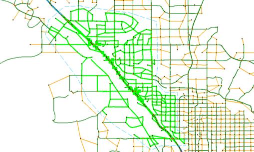
Figure 20. Illustration. Subarea boundary selection for Tucson I-10 study area.
2. Use NeXTA’s Subarea Cut Tool to Clip the Network
The subarea cut tool in NeXTA automatically removed all of the network objects (nodes and links) outside of the subarea boundary and extracted links, nodes, zones, O-D pairs, and subarea path records. The resulting subarea network is shown in figure 21.
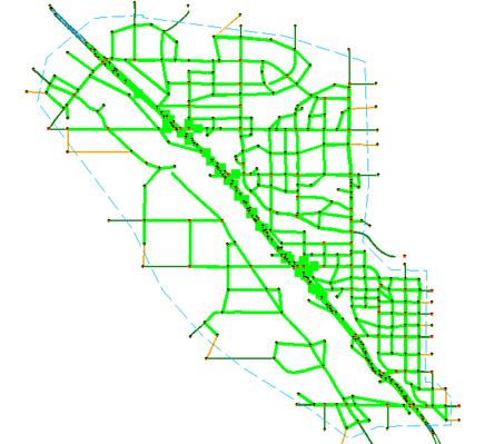
Figure 21. Illustration. Clipped subarea for the Tucson I-10 study area.
3. Convert Zonal Connectors to Side Streets Within the Subarea
The generate physical zone centroids on road network tool in NeXTA converts the zonal connectors to side streets within the network. This tool replaces zone centroids with additional nodes so that no paths can be routed through a zone centroid. While DTALite cannot use paths through zone centroids, other AMS software tools such as Synchro® and PTV Vissim® do not make such distinctions. Executing this command ensures that the resulting network is compatible with Synchro® and PTV Vissim® .
4. Save the New Subarea Network as a New Project File
The last step is to save the new subarea network as a new project file.
Step 6—Prepare Field Data for ODME
ODME is a part of the calibration process that matches link counts to simulated volumes. DTALite’s ODME model reads field data from the input_sensor.csv file, which the user must prepare before executing the ODME process. This input file uses a flexible format for reading multiple types of observed data in the network including link volume, occupancy, speed, and travel time field data for specific locations and time periods, allowing for time-dependent ODME applications. The Tucson I-10 subarea field data were prepared from link volume counts collected at 37 locations on freeways and arterials in the subarea model with hourly and 15-min link volume counts. Their locations are represented as green squares in figure 22.
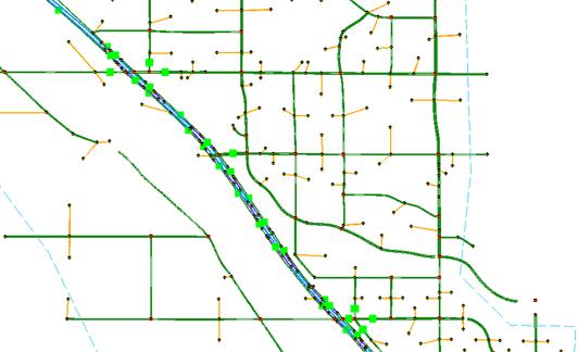
Figure 22. Illustration. Subarea field data sensor locations for ODME in DTALite.
Step 7—Run ODME Using Field Data for Calibration
To enable ODME mode in DTALite, the user must set up the input_scenario_settings.csv file and the ODME_Settings.txt file. These files specify the number of iterations, the amount of adjustment allowed per iteration, the calibration time period which can be a portion of the simulation period, and weight on historical O-Ds.
The plots in figure 23 and figure 24 compare the observed and simulated link volumes/counts at the subarea sensor locations. The initial equilibrium assignment (before ODME) produced link volumes that were relatively similar to the observed link volumes with R2 = 0.74, although under- and over-estimation was observed at multiple locations. After running ODME for 10 iterations, the under- and over-estimation was significantly reduced, and the R2 value improved to 0.89 over all observations.
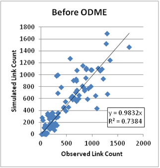
Figure 23. Graph. Results before ODME for Tucson subarea.
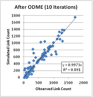
Figure 24. Graph. Results after ODME for Tucson subarea.
Step 8—Export to Synchro® /PTV Vissim® for Signal Optimization and/or Microscopic Analysis
After the ODME process, the I-10 subarea was employed to assess operations and impacts of adding new links to the network. It was also exported to Synchro® and PTV Vissim® for further analysis. Since a typical TDM does not contain signal information, NeXTA can approximate signal phasing and timing using HCM’s QEM. This approach was used in this test application before exporting the network to Synchro® . The procedure for exporting a subarea network for microscopic analysis is as follows:
1. Use QEM to Estimate Initial Signal Phasing and Timing
An automated QEM spreadsheet is used to generate initial signal phasing and timing for the subarea network. NeXTA writes the geometry and volume information to the spreadsheet, the spreadsheet calculates appropriate phasing and timing data, and then NeXTA reads that phasing and timing data back into its files.
2. Export to Synchro® Using Universal Traffic Data Format (UTDF) CSV Format
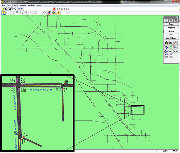
NeXTA is capable of writing its network data in UTDF that is compatible with Synchro® . Figure 25 shows the I-10 study area after it was imported into Synchro® . The Synchro® model was used to optimize the signal operation and produce traditional HCM-based delays and levels of service for intersections and arterials.
©Trafficware® LLC
Figure 25. Illustration. Tucson I-10 subarea network exported in Synchro® .
3. Export to PTV Vissim® Using Animation (ANM) Format
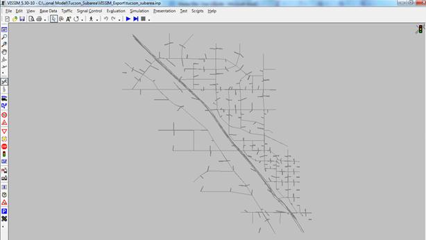
The I-10 study area was also exported into PTV Vissim® via the ANM format. ANM is a text-based format developed by PTV Group® to allow the linkage between PTV Vissim ® and other software. NeXTA is capable of generating the .anm and .anmroute files that allow PTV Vissim® to replicate the NeXTA network and vehicle path flows. The imported network in PTV Vissim® is shown in figure 26.
©PTV Group®
Figure 26. Illustration. Tucson I-10 subarea network in PTV Vissim® .
The Tucson test application demonstrated the integration of TDM, DTA, and Synchro® / PTV Vissim® as well as the successful application of NeXTA to a real-world project. Some of the positive features of the AMS data hub that were noted during the test application include the following:
©2013 Google Maps®
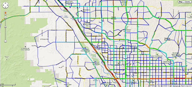
Figure 27. Illustration. Tucson network MOE visualization.(9)
In summary, the AMS data hub achieved its primary goals of creating significant time savings by producing automatic linkages across models through the use of an open source data management tool (NeXTA). The NeXTA prototype overcomes many of the challenges associated with integrated modeling applications; however, the current prototype requires familiarity with the data schema and the ability to set up initial linkages between models. This can be overcome through training and through the development of a more robust relational or object-oriented database system.