U.S. Department of Transportation
Federal Highway Administration
1200 New Jersey Avenue, SE
Washington, DC 20590
202-366-4000
Federal Highway Administration Research and Technology
Coordinating, Developing, and Delivering Highway Transportation Innovations
 |
| This report is an archived publication and may contain dated technical, contact, and link information |
|
Publication Number: FHWA-RD-03-065
Date: September 2004 |
||||||||
In-Vehicle Display Icons and Other Information Elements: Volume IPDF Version (8.33 MB)
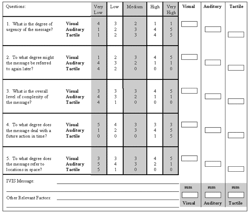
PDF files can be viewed with the Acrobat® Reader® CHAPTER 10: SENSORY MODALITY DESIGN TOOLThis section of the guidelines provides designers of in-vehicle icons with a design tool that can help determine the most appropriate display modality for presenting in-vehicle information elements. This tool was originally developed as part of the preliminary assessment of symbols and is described in more detail in Lee et al. (1998). The tool was generated based on an examination of the general design rules found in relevant literature.
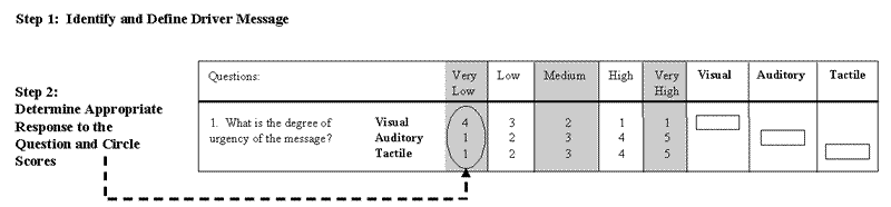
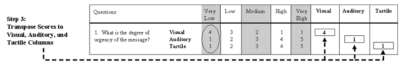
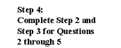
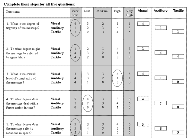
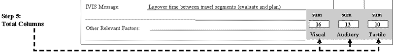
Figure 10-1. Sensory Modality Design Tool The design tool asks designers to respond to several questions independently. For each question, their response will range from "very low" to "very high." Each response is associated with a point value for the three modalities (visual, auditory, and tactile). After all five questions have been answered, the point values are totaled for each of the modalities. The steps a designer must complete to use this design tool are summarized below and shown in detail in the figure on the following page. Step 1: Identify and Define Driver Message. Step 2: Determine Appropriate Response to the Question and Circle Scores. Step 3: Transpose Scores to Visual, Auditory, and Tactile Columns. Step 4: Complete Steps 2 and 3 for Questions 2 through 5. Step 5: Total Columns.
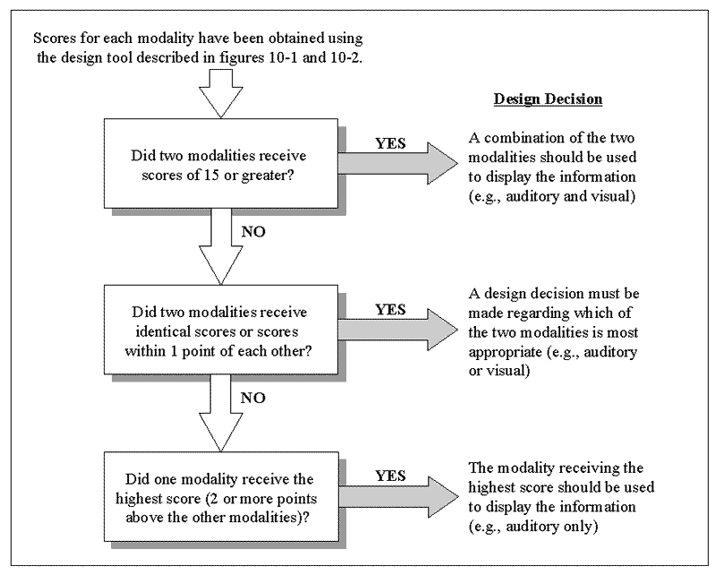
Figure 10-2. Steps for Using the Sensory Modality Design Tool Determining the most appropriate modality is not always as easy as selecting the one that receives the highest point value. In cases where two modalities receive high scores (15 or greater), it is suggested that the information be presented using some combination of the two. This will reflect the fact that both modalities are necessary to adequately present the information. In cases where two modalities receive the same score or they are only one point apart, it is suggested that the information be presented using either of the two modalities. In all other cases, the modality that receives the highest score is the suggested mode of presentation for that piece of information. Decisions regarding which one to use may be based on additional information regarding context or display constraints. If, however, two modalities receive scores that are both higher than 15 and only one point apart, then the benefits of using both modalities outweigh other design considerations and the information should be presented by combining the two modalities, instead of choosing between them. By prioritizing the rules below, the designer will know which one to use in cases where more than one is applicable. The rules for determining the most appropriate modality can be summarized as follows. Figure 10-3. Rules for Determining Display Modality |
||||||||