U.S. Department of Transportation
Federal Highway Administration
1200 New Jersey Avenue, SE
Washington, DC 20590
202-366-4000
Federal Highway Administration Research and Technology
Coordinating, Developing, and Delivering Highway Transportation Innovations
 |
| This report is an archived publication and may contain dated technical, contact, and link information |
|
Publication Number: FHWA-RD-03-049
Date: November 2005 |
||||||||||||||||||||||||||||||||||||||||||||||||||||||||||||||||||||||||||||||||||||||||||||||||||||||||||||||||||||||||||||||||||||||||||||||||||||||||||||||||||||||||||||||||||||
Improving Pavements With Long-Term Pavement Performance: Products for Today and TomorrowPaper 5. Development of A Pavement Climate Map Based on LTPP DataYuhong Wang ABSTRACTIt has long been recognized that climate factors have important influences on pavement performance. To help investigate this influence, the Strategic Highway Research Program (SHRP) Long-Term Pavement Performance (LTPP) research has been using onsite or virtual weather stations to record climate information on test sections. The data will facilitate the study of the quantitative relationship between climate and pavement performance. This paper discusses how to develop a climate map using cluster analysis on performance-related climate data from the LTPP database, which contains nearly 1,000 virtual weather stations recorded for more than 17 years. The aim of developing this map is to help researchers, who are performing data analysis on the LTPP database, to incorporate or separate climate factors in their models. Another potential use of this map is to help highway practitioners get climate pattern information for their geographical areas so that they can apply the same design criteria, construction requirements, and maintenance strategies to those regions with similar climate patterns. INTRODUCTIONIt has long been recognized that the climate factors have important influences on highway pavement performance. They can not only influence pavement structure integrity, but also cause common surface distresses. For example, temperature is widely known to have significant influence on pavement rutting and cracking. To account for its influence, the Superpave® mix design approach has incorporated temperature as an input factor of the mix design process. If highway practitioners recognize the quantitative relationship between climate factors and road performance, and have sufficient information on local climate conditions, they can reduce the negative influences of these factors through correct practices. To get extensive climate information from across the United States and some areas of Canada, the LTPP program, sponsored by SHRP, constructed a climate database to record climate information on most LTPP test sections. A quality-control check was then conducted on the raw data; these data sometimes were summarized. The database distributed by the DataPave 3.0 software contains climate information on nearly 1,000 test sections recorded from 1980 or even earlier. The aim of this paper, however, is not to examine the quantitative relationship between the climate factors and pavement performance, but to develop a climate map that will partition test sections according to their climate patterns. Test sections that have a similar climate pattern will be assigned to the same group by using a multivariate data analysis technique, cluster analysis. This climate map should help researchers who are using the LTPP data to perform statistical treatment comparison incorporate or separate the climate factors in their models. Without appropriately addressing these climate factors, one cannot get valid inferences from comparison of other controlled parameters. Another potential use of this map is to help highway practitioners get climate pattern information in their geographical areas so that they can apply the same design criteria, construction requirements, and maintenance strategies to those regions with similar climate patterns. At present, the highway climate regions in the United States and Canada are roughly divided into four major groups:
A wet region has an average annual rainfall over 508 millimeters (mm) (20 inches). A freeze region has an average freezing index of more than 83.3 degree–Celsius days (150 degree–Fahrenheit days, e.g., 10–degree days = 10 days with a mean air temperature of 1 degree below freezing or 5 days with a mean air temperature of 2 degrees below freezing). This categorizing method can be easily followed and thus widely used in practice. However, the drawback of this method is that it may miss other climate parameters that also influence pavement performance. For example, in cold areas, roads with or without a lot of snow will unlikely perform the same way. Even with the same amount of annual rainfall, roads in areas under frequent intense rains should not have the same design criteria as roads in areas with frequent drizzles, because the two precipitation patterns bring different pressures on road drainage systems. Therefore, more parameters should be included in categorizing climate regions. However, the increase of the number of parameters makes it difficult to partition data in an ordinary way. This research uses cluster analysis to group the LTPP test sections based on multiple climate variables, and uses principle components analysis and Geographic Information System (GIS) maps to verify the grouping results. RESEARCH APPROACHThe climate data in the LTPP database are organized into several tables, most of which contain large amounts of records. For example, the monthly precipitation table alone has 243,237 records with 10 fields for each record. Analysis of this large amount of data was fulfilled through the following steps:
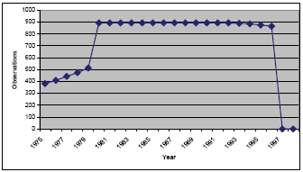
At first, this research picked climate tables from the LTPP database that were going to be used for analysis and wrote the Structured Query Language (SQL) commands to get required information from these tables. These data were processed in excel with embedded excel functions, or the researchers wrote Visual Basic Application (VBA) commands. Cluster analysis was then conducted to group the test sections based on several climate variables (parameters) after the transformation of the data. Of the many different clustering approaches, this research selected both a hierarchical clustering method (average link) and a nonhierarchical clustering method (K-means), and then combined these two methods together. After finishing the cluster analysis, this research employed another multivariate data-analysis technique, principle components analysis, to verify and compare the clustering results by the different clustering techniques. The statistical software packages SAS and SPSS were used for cluster analysis and principle component analysis. Finally, this research input the clustering results into the GIS provided by the DataPave 3.0 software. After processing by the Arcview™ software, the clustering results were presented on a GIS map, which is not only visually friendly, but can also verify the validity of the cluster results. CLIMATE DATA PREPROCESSING AND TRANSFORMATIONThe climate data used in this research were obtained from the latest update of the LTPP database distributed with the software package, DataPave 3.0. This research did not get the data through the software directly, but employed its underlying database. The climate data stored in the LTPP database can be divided into two categories according to the source of data: directly from onsite weather stations, or calculated from public climate databases. The onsite climate measurements are taken from all Seasonal Monitoring Program (SMP) test sections and Specific Pavement Studies (SPS–1 and -2), and 8 projects (LAW PCS, 1999), which involve 41 unique test sections. Data from the public climate databases, provided by the National Climatic Data Center (NCDC) and the Canadian Climatic Center (CCC), covers more than 1,000 distinctive test sections. However, this part of the data is not observed values; these values are computed by using a distanceweighted average method from up to five nearby public weather stations, so the test sections with such climate records are called "virtual" weather stations. The virtual climate data consist of monthly and annual climate parameter values, from the earliest available records to the most recent. Currently, there are 22 different climatic observation parameters and associated descriptive statistics, including minimum temperature, maximum temperature, mean temperature, precipitation, snowfall, minimum relative humidity, maximum relative humidity, average wind speed, peak gust speed, percent sunshine, and percent sky cover. Also included are derived quantities calculated from the measured data, such as air freezing index, air freeze-thaw cycles, total precipitation, total snowfall, etc. A limited set of annual statistics also is available; these include annual air freezing index, number of air freeze-thaw cycles, and snow coverage data for each of the monthly parameters (LAW PCS, 1999). Data selection in this research is very important for cluster analysis on the LTPP database. If too few data are included, the analysis results will not be very representative. On the other hand, too many data are difficult to handle and may exceed the capacity of standard software. Because cluster analysis compares the similarity among observations, the variables should also be recorded from the same source (onsite or virtual weather stations), and special attention should be paid to missing values. The virtual weather stations cover many more test sections than do the onsite weather stations; therefore, this research only selected climate data from this source. The climate tables include both monthly and annual observations. Because the size of the monthly data records is too large and they contain many missing values, this research only uses the annual summary tables. The earliest virtual climate data recorded in the database are from 1933, while the most recent are from 1996. The number of test sections that have virtual weather records along the time axis is shown in figure 1, which shows most observations concentrated between 1980 and 1996. To make the data comparable, this research preprocessed the annual data in two separate parts. The first part, which includes 867 test sections without missing values, comprises annual weather records from 1980 to 1996. This part of the data is called Type I data in this paper. The second part, which includes 894 test sections, consists of the overall average values of climate parameters for each test section since 1980, called Type II data in this paper. The reason for using Type I data is to keep the pattern of annual climate conditions. Type II data are more concise, thus more workable in data analysis, but the pattern information may be lost. After cluster analysis, a final comparison was conducted to investigate which part of the data yields the best clustering results.
Figure 1. The number of text sections having climate records each year. This research finally selected the 14 parameters in table 1 as the cluster analysis variables. Table 1. Final climate parameters in cluster analysis
For the Type I data, because each test section contains 17 years’ observations, comparing the annual pattern required that the original variables be combined with the year in which they were recorded to create new variables. After this transformation, each climate parameter becomes 17 new variables that not only show the parameter name but also indicate which year it is recorded. The process of transformation is shown in table 2. Finally, 17×14 = 238 new variables generated for each test section. Table 2. Transformation of the Type I data
1.8 x °C + 32 = °F The Type II data are the annual average value of the climate parameters recorded after the year 1980. Each test section contains only 14 calculated variables (table 3). Table 3. Preprocessing of the Type II data
CLUSTER ANALYSISCluster analysis is a multivariate data analysis (or data mining) technique to partition original observations into subgroups called clusters so that the observations that belong to the same subgroup have as much similarity as possible with respect to the measured variables (Johnson, 1998). When one wants to generate clusters, one basic question would be how to measure the "similarity" or "dissimilarity" between two points, or two observations. There are three methods for measuring the distance of similarity: Ruler Distance, Standard Ruler Distance, and Mahalanobis Distance (Johnson, 1998). Suppose the data have three variables, the distance between each of the two observations, A (x1, y1, z1) and B(x2, y2, z2) would be decided by a Euclidean distance. The smaller this distance, the more similar are the two observations. Sometimes the variables have different scales. For example, the annual total amount of precipitation is in thousands (millimeters), while the number of intense rain days is less than one hundred (days). To avoid inflating the impact of variables with larger scales, the first thing that needs to be done in the cluster analysis is to standardize the variables. This research first standardizes the climate data by replacing them with their Z scores:
Where: The distance calculated by using each data’s Z score is called the Standard Ruler Distance. The clustering methods can be categorized as nonhierarchical and hierarchical methods. The nonhierarchical method is more computational efficient and faster when running in a computer program. The disadvantage of the nonhierarchical method is that the number of clusters in the data must be known before an analysis can be conducted. Another disadvantage is that it requires initial cluster seeds (initial cluster centers) that may randomly influence the results. The hierarchical clustering method does not have such problems. However, it lacks the "global" view of the analyzed data in comparison with the nonhierarchical method; moreover, once an experimental unit (a test section) enters one group, it cannot change later. Each method has advantages and disadvantages, so some people recommend combining them by using the hierarchical clustering results as the required cluster seeds for the nonhierarchical methods. This research tried all three clustering techniques. Because the size of the data, all calculations are carried out by computer programs. There are several hierarchical clustering methods with different clustering effects and computational efficiencies. This research chose to use the average linkage clustering method that works in the following steps:
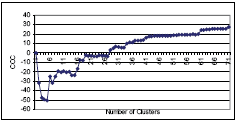
Figure 2. Distance measurement of the average linkage clustering method The true number of clusters will be between 1 and the total number of observations. The nonhierarchical method used in this research is the K-means method. Using the K-means method, at first the number of clusters (c) needs to be defined. The remaining experimental units are then allocated to the nearest seed, forming an initial set of c clusters. The centroids of these initial clusters are identified, and the experimental units are relocated to the nearest cluster centroid, providing a revised set of clusters. New centroids are then identified for the revised clusters and the process is repeated until no experimental units change clusters (Barnard, 2002). This research first performs a K-means cluster analysis using SPSS by allowing the software to pick the initial cluster seeds randomly. Then, to reduce the randomness in initial seeds selection and improve clustering accuracy, this research uses the partitioning results from the average link clustering analysis to compute the initial cluster centers for K-means (for convenience, called average link plus K-means method in the latter part of this paper). DETERMINING THE NUMBER OF CLUSTERSCluster analysis performed by computer programs does not recommend the appropriate number of clusters directly, but produces graphs and statistics that can help researchers determine it. However, the amount of data in this research produces very messy graphs that are not usable. The following statistics, produced by including the PSEUDO and CCC options in SAS, is used in deciding the number of clusters: CCC, pseudo T2 statistic, pseudo F statistic, and R square. The ordinary significance test for testing the differences among clusters, such as analysis of variance F tests, are not valid in cluster analysis. Because clustering methods attempt to maximize the separation among clusters, the assumptions of the usual significance tests, parametric or nonparametric, are drastically violated (SAS Manual, 1992). However, some asymptotic results from the within–cluster sum of the squares can be used to roughly judge the number of clusters. Sarle (1983) introduced a cubic clustering criterion (CCC) in 1983. If the CCC value is plotted against the number of clusters, the peaks on this plot that have CCC>3 are supposed to correspond to an appropriate number of clusters (Johnson, 1998). NUMBER OF CLUSTERS FOR THE TYPE I DATAThe SAS output and the plot of the CCC shows that the CCC values continue increasing with the number of clusters until 173 clusters. This implies that this many clusters are required, or that the distribution may be grainy, or that the data may have been excessively rounded or recorded with just a few digits (Sarle, 1983). Part of the CCC plot is shown in figure 3, which shows a jump in CCC value from 19.87 to 24.27 when the cluster number increases from 60 to 61. Although there are other small jumps afterwards, because this research just intends to indicate the general climate patterns in these test sections, having 61 clusters is deemed appropriate, according to the CCC criteria. However, if a very detailed climate partition is required, the cluster numbers can be increased.
Figure 3. CCC versus number of clusters (Type I data) When using the pseudo T2 statistic, one needs to start at the top of the SAS printed output and look for the relatively large value, then move back up one cluster (SAS Institute, 2002). Part of the pseudo T2 statistics are reported in table 4. The pseudo T2 statistic for 60 clusters in table 4 is 71.14, which is relatively large compared to numbers around it. Going back to 61 clusters, the pseudo T2 statistic reduces to 8.32. This indicates that having 61 clusters is more appropriate. Table 4. Pseudo T2 statistic versus number of clusters (Type I data)
Another useful statistic is the pseudo F statistic. The relatively large value (table 5) indicates the appropriate number of clusters. Table 5 shows that cluster number 61 corresponds to a regional peak in the pseudo F statistic. Table 5. Number of clusters versus pseudo F statistic (Type I data)
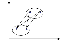
The R square does not provide any more information in this research. Considering the CCC, pseudo T2 statistic and pseudo F statistic, the author recommends 61 cluster numbers based on Type I data. NUMBER OF CLUSTERS FOR THE TYPE II DATASimilar procedures of deciding the number of clusters are performed for Type II data. The analysis indicates that having 50 clusters is appropriate for Type II data. The cluster process based on Type II data tends to produces fewer clusters compared to Type I data, which is reasonable because the data are the average climate values. VERIFICATION OF THE CLUSTERING RESULTSIf the data are two dimensional, a scatter plot is enough for validating the cluster results. For example, figure 2 clearly indicates that two clusters are enough. However, when the dimension of the data exceeds three, direct graphic plots are almost inapplicable. Principle components analysis is a multivariate data analysis technique that can reduce the dimension of the data by transforming a set of correlated variables into a new set of uncorrected variables called principle components (Johnson, 1998, p.107). If the first two or three principle components account for most of the variability in the data, their values (principle component scores) can be plotted in a two- or three-dimensional space to help people examine the cluster analysis results. If the principle components of two observations are very close to each other in a scatter plot, they should belong to the same cluster; otherwise they should belong to different clusters. The Eigenvalue is a number indicating the amount of variability accounted for by the new-formed variables that are computed from the correlation matrix of the transformed climate variables. The larger a principle component’s Eigenvalue, the more variability is accounted for by it. Principle components having large Eigenvalues can be used to represent the whole variables. Eigenvalues larger than 1 are listed in table 6. Table 6. Eigenvalues larger than one
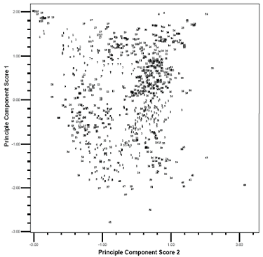
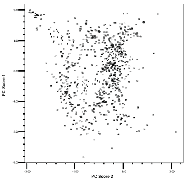
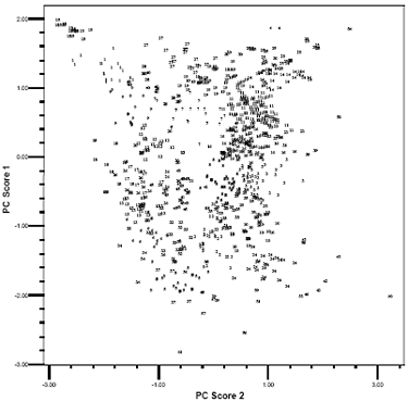
The first two principle components account for 79 percent of the total variability, while the first three principle components account for 84 percent of the total variability. Although the first three principle component scores are not so overwhelming, they may still give some indication of which clustering method is better. Both the two-dimensional and three-dimensional plots are examined in this research. Because of the paper size and the large amount of the data, the three-dimensional plot is illegible. This paper only presents the scatter plots of the first two principle component scores for Type I data using average link, K-means, and average link plus K-means approaches in figures 4, 5, and 6, respectively. In the plots, the number labels the cluster membership of a certain observation (test section) whose position is decided by its first two Eigenvalues. These plots reveal some interesting information. When an observation is very different from the others, all three clustering methods correctly assign it a distinctive cluster membership. But when the observations are not so distinctive, especially in the middle of the plots, different methods result in different clusters. In the upper left corner of these plots, some observations are very closely grouped. Both the average link method (figure 4) and the average link plus K-means method (figure 6) assign them to a distinctive cluster (labeled with "15" in these plots). The difference of these observations in cluster 15 with the others is more evident in a three-dimensional plot (not shown here). But the K-means method assigns more unnecessary observations (figure 5). To compare the effectiveness of the average link method and the average link plus K-means method, the author examines those observations labeled with "24" and "10" in the right corner of figure 4 and figure 6. The plots show that the average link plus Kmeans method outperforms the average link method by better delimiting the observations belonging to these two clusters. The plots show that the sequence of three clustering methods, in the order of validity by examining the first two principle component scores, is the average link plus K-means, the average link, and the K-means method. However, because more than 20 percent of the variability is not accounted for by the first two principle components, one cannot judge the effectiveness of these cluster methods solely depending on these scatter plots. Another way to compare is to examine the cluster memberships of the three cluster methods in separate maps and judge them by experience. The above discussion is based on Type I data. The verification process for the Type II data is also performed the same way, although it is simpler because it contains only 14 variables. The final result of the statistical cluster analysis is a table comprising the test sections and their corresponding cluster memberships. Test sections with the same cluster membership belong to one group with similar climate patterns. Because of the size of the table, it is not shown in this paper. Plot of the first two PC scores (labeled with
average link clustering result)
Figure 4. Scatter plot of the first two PC scores labeled with average link cluster analysis results Plot of the first two PC scores (labeled with
K-means clustering results)
Figure 5. Scatter plot of the first two PC scores labeled with K-means cluster analysis results Plot of the first two PC scores (labeled with
K-means clustering results)
(using hierarchical clustering results to
compute initial cluster centers)
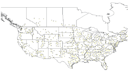
Figure 6. Scatter plot of the first two PC scores labeled with average link plus K-means cluster analysis results CLUSTER MEMBERSHIPS ON GIS MAPSBesides being a database, the DataPave 3.0 software also provides geographic information related to each LTPP test section, which includes the States or Provinces in which the test section is located, the major highway systems in the North America, the positions of the test sections in the map, detailed geographic features. The purpose of using GIS in this research is to put the cluster analysis results on a map so that they can be visually verified. And if the clustering result is acceptable, a climate map is more suitable for practical use than a cluster membership table. This research uses Arcview software to perform GIS operations, which is accomplished by the following steps:
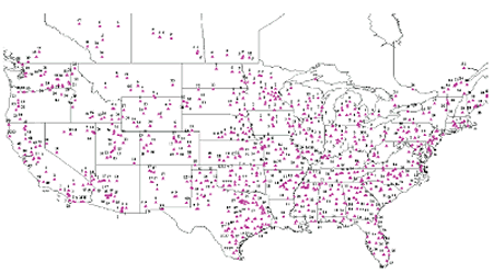
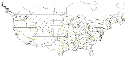
The GIS map labeled with cluster memberships generated by the average link plus K-means cluster analysis on Type I data is presented in figure 7. This research also developed cluster membership maps based on the other cluster analysis approaches and on the Type I data in figures 8 and 9. This paper does not show the cluster membership maps based on Type II data. And due to the limited paper size, maps presented in this paper must exclude some test sections and remove overlapping labels to make them legible. These maps are useful in checking the clustering results. If the test sections are geographically very close to each other, their climate characteristics, in most cases, tend to be similar. Map comparison shows that the average link plus Kmeans method based on Type I data produces better cluster results, although in general the difference between these methods is not large.
Figure 7. Cluster membership map based on the plus K-means method
Figure 8. Cluster membership map based on the average link method
Figure 9. Cluster membership map based on the K-means method SUMMARY AND CONCLUSTIONSThis paper describes the process of developing a climate map by partitioning LTPP test sections into different groups using the annual climate data recorded in the LTPP database since 1980. The test sections belonging to the same group (cluster), which are labeled with the same cluster membership on the map, have similar climate characteristics. Fourteen climate parameters have been used for comparison. To reflect the annual climate pattern and the overall climate information, this research preprocessed climate data into two separate parts: Type I data and Type II data. The Type I data comprise annual weather records while the Type II data are made up of the average of the records. Cluster analysis was conducted on both sets of data to partition test sections. Three cluster analysis approaches were employed by this research: the average link, K-means, and the combination of first two methods. The research examined cluster analysis outputs to determine the appropriate number of clusters. Based on the CCC, pseudo T2, and pseudo F statistic, this research recommends 61 clusters for Type I data and 50 clusters for Type II. The statistics also indicate that more detailed partition is possible and the number of clusters can be increased if required in practice. Scatter plots of principle components were used to verify the cluster results. Based on the plot of the first two- and threeprinciple component scores, this research found that the combination of average link and K-means method produces the best clustering results for Type I data. However, because about 20 percent of variability in the climate data is not accounted for by the first two principle components, the scatter plots should be assisted by a real cluster membership map to judge the effectiveness of the three cluster approaches. This research developed GIS climate maps for the test sections, parts of which are presented in this paper. The maps also show that the combination of average link and K-means method generates the most reasonable clustering results, but the difference between these methods is not large. The cluster membership tables and the climate maps developed in this study can help researchers incorporate or separate climate factors in their models when are using the LTPP data to perform statistical treatment comparison analysis. Another potential use of this map is to help highway practitioners get climate pattern information for their geographical areas so that they can apply the same design criteria, construction requirements, and maintenance strategies to those regions with similar climate patterns. REFERENCESBarnard Chemical Information Ltd, 2002. K-means, Non–Hierarchical Relocation Clustering Program, Version 1.3. Dallas, E., Johnson, 1998. Applied Multivariate Methods for Data Analysts, Brooks/Cole Publishing Company, California, pp. 319-327. LAW PCS, 1999. Introduction to LTPP Data. LAW PCS, a LAWGIBB Group Member, Beltsville, MD. Sarle, W.S., 1983. Cubic Clustering Criterion. SAS Technical Report A-108, Cary, NC, SAS Institute, Inc. SAS Institute, 1992. SAS/STAT User’s Guide, Volume 1, ACECLUS-FREQ, Introduction to Clustering Procedures, Cary, NC, SAS Institute, Inc. SAS Institute 2002. SAS Technical Support.
|


 is the average
of each variable and S is its standard deviation.
is the average
of each variable and S is its standard deviation.