U.S. Department of Transportation
Federal Highway Administration
1200 New Jersey Avenue, SE
Washington, DC 20590
202-366-4000
Federal Highway Administration Research and Technology
Coordinating, Developing, and Delivering Highway Transportation Innovations
 |
| This report is an archived publication and may contain dated technical, contact, and link information |
|
Publication Number: FHWA-RD-03-063
Date: September 2004 |
|||||||||||||||||||||||||||||||||||||||||||||||||||||||||||||||||||||||||||||||||||||||||||||||||||||||||||||||||||||||||||||||||||||||||||||||||||||||||||||||||||||||||||||||||||||||||||||||||||||||||||||||||||||||||||||||||||||||||||||||||||||||||||||||||||||||||||||||||||||||||||||||||||||||||||||||||||||||||||||||||||||||||||||||||||||||||||||||||||||
In-Vehicle Display Icons and Other Information Elements: Volume IIFinal ReportPDF Version (1.07 MB)
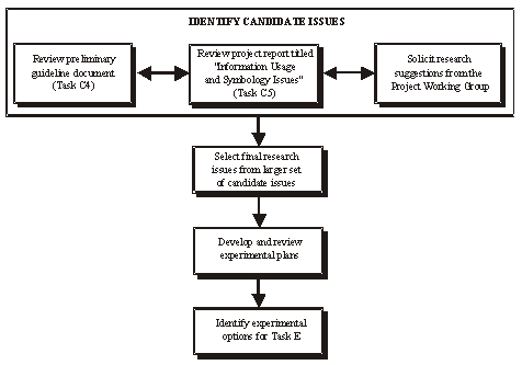
PDF files can be viewed with the Acrobat® Reader® CHAPTER 2: SUMMARY OF PROJECT TASKS (Cont'd)TASK D: DEVELOP WORKPLAN FOR FINAL GUIDELINESThe purpose of task D was to build on the results of tasks B and C to create an updated workplan that would identify critical issues associated with icon design and specify empirical evaluations for symbol alternatives. Specifically, task D provided an opportunity to consider the work that had been performed during previous project activities and to identify specific experiments that are needed to address high-priority gaps in the preliminary guidelines developed in task C4. The workplans developed during the conduct of task D were directed at key, high-priority human factors research issues for icon design, and were identified during the six task D activities described below in figure 10. The contractor made two recommendations to FHWA for the conduct of task E:
Figure 10. Flow of Task D Activities In task D, project working group members were asked to solicit ideas for task E research topics. Between the working group members and the project team, 20 candidate research issues were identified. These candidate research issues, and their sources, are shown below in table 2. Table 2. Candidate Research Issues Identified During the Early Phases of Task D
These 20 candidate research issues were reduced to six high-priority research issues through application of the following decision criteria to each of the 20 candidate issues:
Application of these decision criteria yielded the six high-priority research issues shown below in table 31. Table 3. Research Issues Developed into Workplans
For each of these six research issues, an experimental workplan was developed and then rated using a set of explicit decision criteria. Table 4 shows the table used for rating the key issues. 2 1The titles of these issues are somewhat different from those listed in table 2 because some topics were combined and slightly modified. 2Raters used a 1-5 scale to indicate how true each of the statements was, with a rating of 5 used to indicate that the statement was entirely true and a rating of 1 used to indicate that the statement was entirely not true. Table 4. Table for Rating Each of the Key Issues
The results from this workplan evaluation process are shown below in table 5. Table 5. Results of the Evaluations of the Six Workplans3
* mean value for all raters (5= true; 3= somewhat true; 1= not true) 3 Only phase 1 of experiment 3 was rated. Based on the results of the evaluations, several experimental options were developed, as shown below in table 6. Table 6. Summary of Options A, B, C, and D
TASK E: EVALUATE VISUAL SYMBOLSThe objective of task E was to implement the experimental option selected by the FHWA in task D. As recommended in the task D report, FHWA indicated that option C should be implemented during the conduct of task E. The two sets of experiments conducted in task E, Experiment 3: Urgency and Annoyance of Auditory Alerts, and Experiment 6: General versus Specific Icons: Implications for Driver Acceptance of IVIS Messages, are discussed in more detail below. Experiment 3: Urgency and Annoyance of Auditory Alerts As in-vehicle information systems proliferate, the number of auditory alerts confronting the driver may increase dramatically. Auditory alerts alone or in combination with visual displays represent a promising approach to displaying information to drivers because they do not require drivers to look away from the roadway. Although promising, these systems must communicate their messages without distracting or annoying the driver. This study includes a series of five experiments focused on how sound parameters affect perceived annoyance, urgency, and appropriateness, and how these perceptions affect driving performance. This investigation had three specific objectives:
In the first four experiments, participants read a short description of a driving scenario and then rated and compared a series of sounds according to urgency, annoyance, and appropriateness. The short scenarios described the alert as a collision alert, a navigation alert, or an e-mail message notification. The fifth experiment used a driving simulator to investigate whether the sound parameters affecting urgency and annoyance also affected driving performance. The experiments generated substantial support for the following findings:
Table 7 summarizes the effect of sound parameters on perceived annoyance and urgency. Table 7. The Rank Ordered Means of Experiments 3 and 4 Rating of Annoyance in the E-Mail Scenario
* H/i/-high harmonic series; FS-frequency series The experiments also identified the following trends that merit further investigation:
This research provides some useful design guidance, but several important research issues remain. These include identifying the most appropriate sound parameterization, investigating how perceptions change with exposure, investigating the efficacy of short sounds, and identifying the dependency on scenarios. Experiment 6: General versus Specific Icons: Implications for Driver Acceptance of IVIS Messages The experiment 6 study examined issues associated with using general vs. specific icons to present in-vehicle information to drivers. The set of experiments addressed the following empirical questions:
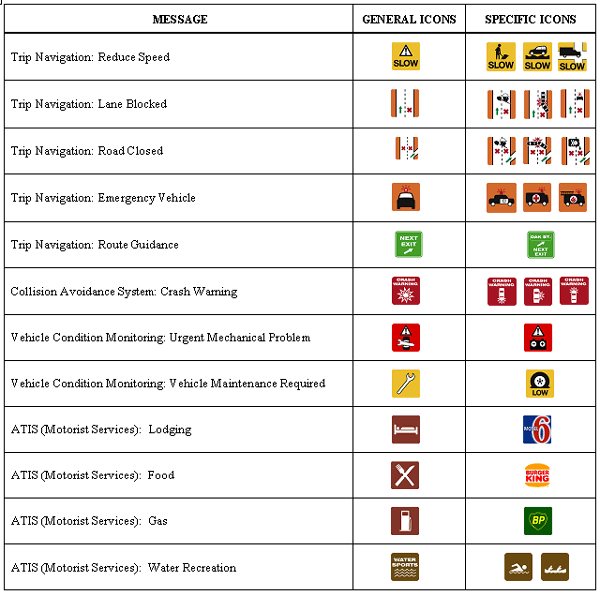
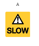
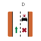
For the purposes of this research, general icons were defined as those that provide the driver with information about a broad driving situation or class of conditions without specifying detailed information about the situation or conditions. For example, a general icon for the message "crash warning" would indicate that a crash is imminent, but would not convey information regarding the precise nature of the projected crash (e.g., side, front, or rear crash). Specific icons were defined as icons that do provide more detailed information about a driving situation or conditions. For example, a family of specific crash warning icons could be used, with each icon describing the specific nature of the projected crash (e.g., side, front, or rear crash). Figure 11 shows some examples of general and specific icons for key in-vehicle message categories.
Figure 11. Examples of General and Specific Icons for Key In-Vehicle Message Categories The study focused on driver comprehension and recognition of icons in a non-driving environment. The study had two phases. The objective of Phase 1 was to develop a set of icons for Phase 2 testing that met basic comprehension requirements. This was necessary because no icons have been standardized or commonly used for many future in-vehicle messages that may use icons. Before investigating the study objectives listed above, a set of specific and general icons for a range of IVIS functions meeting reasonable comprehension requirements was needed. In Phase 1, candidate general and specific icons were generated for a number of IVIS functions and driving scenarios. Then comprehension tests were conducted to identify how well these candidate icons conveyed their intended meanings. Phase 1 had two parts: Phase 1a consisted of initial comprehension testing of candidate general and specific icons; in Phase 1b, the Phase 1a icons not meeting basic comprehension levels (50 percent comprehension) were redesigned and retested. Based on the results of the Phase 1a and 1b comprehension tests, a set of specific and general icons was identified for Phase 2 testing. The objective of Phase 2 was to assess the degree to which general vs. specific icons matched subjects' understanding of a given driving situation and would be suitable for presentation on an IVIS. In Phase 2, all icons were presented within the context of a driving scenario. Phase 2 also had two parts: In Phase 2a, subjects were asked to rate how well a given icon described a particular driving scenario as well the icon's perceived effectiveness in helping them understand the situation and respond to it with the appropriate driving action. The results from Phase 2a were somewhat equivocal. Therefore, in Phase 2b, 69 younger and 78 older subjects were asked to select, from among four candidate icons, the most appropriate icon (only one icon could be selected) for depicting a given driving situation. In a separate question, they were also asked to indicate which of the four icons (they could select up to all four icons) would be acceptable for depicting the situation. A sample page from the Phase 2b response booklet is shown in the figure below. Figure 12. Diagram. A Sample Page from the Phase 2B Response Booklet Figure 12. A Sample Page from the Phase 2b Response Booklet Experiment 6 Results Effects of Driving Scenario Description Type. The effects of the driving scenario description type variable were associated with the strongest and most consistent effects in this Phase 2b study. When given a general scenario, subjects consistently chose a general icon as the most accurate for the situation. When given a specific scenario, subjects consistently chose a specific icon as the most accurate for the situation. Some exceptions were collision avoidance and water recreation; for these categories, specific icons were viewed as most accurate regardless of scenario description. With respect to the acceptability of the icons, the driving scenario description (general or specific) had a slightly different effect. For the general scenarios, the general icons were always associated with acceptance levels above 80 percent. For the specific scenarios, the specific icons were always associated with acceptance levels above 80 percent. However, even with general scenarios, the specific icons were associated with at least 80 percent acceptance levels in 15 out of 23 message scenarios. With the specific scenarios, the general icons were associated with at least 80 percent acceptance levels in 20 out of 23 message scenarios. Overall, the subjects reactions to the icons were strongly influenced by their perception of the nature of the driving situation associated with an in-vehicle message. Effects of Icon Type. As noted above, the effects of icon type (general vs. specific) were strongly mediated by the scenario descriptions given to subjects. General icons were selected as the most accurate when subjects were presented with a general scenario, and specific icons were selected as the most accurate when subjects were presented with a specific scenario. However, for two message categories-collision avoidance and water recreation-specific icons were selected as the most accurate icons regardless of the scenario description. For the collision avoidance icons at least, this suggests that specific icons are desired where safety is an issue, perhaps because drivers want to have as much information as is available. These general findings however, should be considered in light of the question 2 (acceptability of icons) results. While the perceived accuracy of icons varied as a function of the scenario described to the subjects, high levels of acceptability were obtained for both the general and specific icons, regardless of scenario description. Specifically, the general icons resulted in 80 percent or higher levels of acceptance in 23 out of 23 messages in the general scenario description condition and in 20 out of 23 messages in the specific scenario description condition (exceptions were one of the three emergency vehicle messages and both vehicle maintenance messages). Therefore, it seems very clear that general icons can meet drivers' expectations and preferences for a broad range of IVIS messages. Effects of Icon Message Category. These results have been discussed in the context of discussions for the other independent variables, but will be summarized again here. For both the collision avoidance and water recreation icon categories, specific icons were viewed as the most accurate regardless of scenario description. Unusual results were seen for the "emergency vehicle" messages. This is likely due to the generally low comprehension scores associated with these icons (especially the generic icon) from experiments 1a and 1b. Effects of Distracter Icons. The only instance in which a distracter icon was selected as the most accurate was for the "vehicle maintenance required" message. The likely reason for this is that the distracter icon selected was a poor choice-it is the same as the generic icon used for "urgent mechanical problem." Effects of Gender and Age. In both Phase 2a and Phase 2b, there were some scattered significant effects associated with gender and age. However, these effects were small, relatively few, and did not fall into any discernible pattern. For the "specific vs. general icon" question, age and gender seem to play, at most, a very minor role that should not influence icon design recommendations. Overall, the task E, experiment 6 research resulted in the following design guidelines for icon developers:
TASK F: DEVELOP FINAL GUIDELINES FOR IN-VEHICLE VISUAL SYMBOLSThe goal of task F was to develop final guidelines, based on the results and findings from previous project tasks. The same general guideline development procedures used in task C were to be used to produce the final guidelines. In addition, in the fall of 2001, FHWA asked its contractor to develop another product from the Icon project. The preliminary guidelines from task C had included an "Icon Collection" of approximately 600 candidate icons organized by ITS functional areas, such as routing and navigation, motorist services, safety and warning information, collision avoidance, and commercial vehicle operations. With respect to this Icon Collection, a key issue of concern consistently voiced by the Icon Project Working Group was the lack of evaluative data included in the preliminary guidelines for these icons. Information regarding the degree to which these individual icons adhere to human factors design principles was not provided in the Icon Collection, nor were any suggestions made for improving individual icons. Working group members voiced concern that, without some information on the degree to which individual icons conform to human factors standards and principles, some users might inadvertently use unsuitable icons in their own in-vehicle applications. In response to this concern, FHWA asked the contractor to develop an interactive design tool for presenting individual candidate icons in the Icon Collection in a manner that also provided evaluative information about the icons. Thus, task F included two parallel activities: (1) development of the final hardcopy human factors design guidelines, and (2) development of a database software tool. Each is discussed below. Develop Final Guidelines Development of the final design guidelines handbook included the following tasks:
Figure 9 (shown earlier) illustrates the table of contents from the final design guidelines handbook. Develop the Icon IDEA Software As noted above, the goal of this effort was to develop an interactive design tool for presenting individual candidate icons in the Icon Collection in a manner that also provided evaluative information about the icons to icon developers. The database software tool (running under Microsoft® Access 1997 or 2000) developed in task F is called "Icon Interactive Development and Evaluation Assistant" or Icon IDEA. The preliminary version of Icon IDEA is complete; development included the following activities. Develop Icon Database. Software specifications were developed for the icon database, defining the content and format requirements for storing icons to allow users access to the icons based on queries for vehicle function and message content. Identifying information associated with each icon includes the system function and subfunction, the intended message, the source of the icon, and the file name. Microsoft Access has been used for development of both the database and the user interface. Develop Icon Evaluation Tool. Detailed icon evaluation procedures were developed and underwent lengthy internal testing and review. The evaluation focuses on physical, explicit icon features that have clear implications for user legibility, recognition, and interpretation. Each evaluation factor is well-supported by relevant research data. The tool consists of 28 questions that have been coded into Microsoft Access forms with active "buttons" to provide the appropriate sequencing of available user actions and input of data into the icon evaluation database. The 28 questions are organized into six categories: perceptual principles, level of detail, level of realism, use of color, prohibitive icons, and use of text. The tool allows for comparisons across raters for a given icon and supports the development of a "consensus" rater for developing final evaluation ratings. Conduct Icon Evaluations. Using the icon evaluation tool, evaluations of the entire set of icons in the Icon Collection were conducted by multiple trained reviewers. Following the completion of these independent evaluations, a consensus process resulted in a final evaluation score for each icon. Conduct Empirical Evaluations of Icon Comprehension. A separate set of comprehension evaluations was conducted for 100 of the icons in the Icon Collection. Comprehension tests were conducted using 160 paid test subjects who were representative of the driving population with respect to factors such as age, gender, and driving experience. Subjects were provided with a description of the context in which the icon would be used and then asked to describe the in-vehicle message that they believe was represented by the icon. Develop User Interface. Interface development for Icon IDEA focused primarily upon user access to individual icons, evaluation results for the icons, the icon evaluation tool, and general design guidelines for icon development and evaluation. Buttons for major IDEA functions, supplemented by pull-down menus and dialog windows, provide the primary user interface. Users may search for icons by identification number or by icon type (i.e., function, subfunction, and category); output includes icons graphics only, graphics plus details, evaluation results, design recommendations, and (for a subset of the icons) comprehension study results. The Icon IDEA software provides designers with the following basic functions and features:
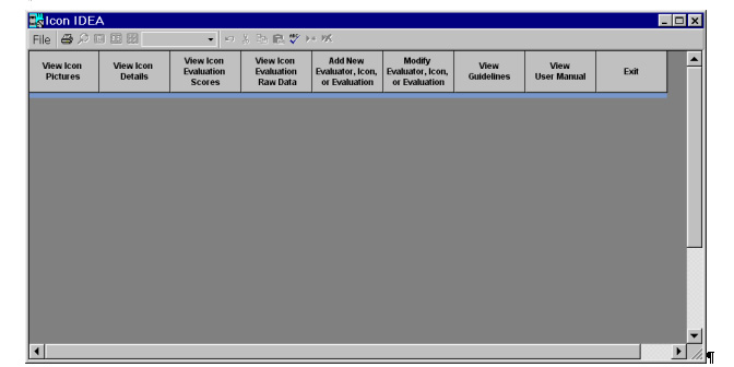
The figure below shows what Icon IDEA looks like when it is launched.
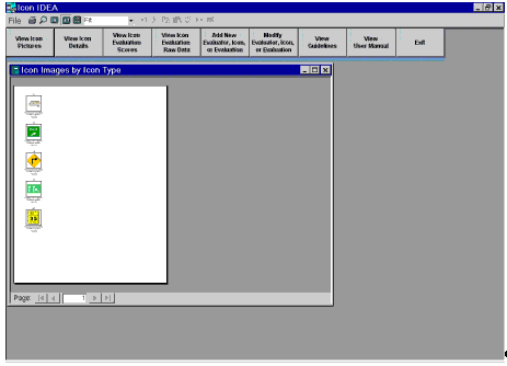
Figure 13. IDEA Start-Up Screen The top bar, with "File" on the left, provides standard Microsoft Windows® options (Page Setup, Print, About Icon IDEA, and Exit), as well as the ability to compact the Icon IDEA database. Compacting the database is helpful when icons, evaluators, or evaluations have been modified, added to the database, or deleted from the database. Using this feature helps to optimize runtimes after changes have been made to the database. A key feature of Icon IDEA is the ability to search for and to view available icons for a desired in-vehicle message. Figure 14 below shows the IDEA screen after such a search.
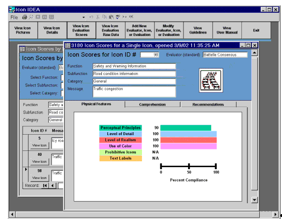
Figure 14. Results of the "View Icon Pictures" Function Evaluation scores for individual icons can also be obtained. Figure 15 below shows the results of searching for certain icon types and then requesting the IDEA software to display evaluation scores for one of the icons identified during the search.
Figure 15. Evaluation Scores for "Physical Features" for the Traffic Congestion Icon Figure 15 shows the first of three evaluation reports for the traffic congestion icon. The general procedures and specific steps associated with actually conducting a "Physical Features" evaluation are discussed in more detail in the IDEA User Manual and will not be reviewed here.(5) As seen in figure 15, the "Physical Features" evaluation addresses six areas of icon design that are important for assuring that icons are legible and recognizable. These six design areas are:
While these six areas do not capture all aspects of icon design that are important for legibility and recognizeability, they do reflect icon design guidelines that: (1) are consistently identified as central to good icon design; (2) are well supported by numerous empirical studies contained in the icon design literature; and (3) can be assessed in a reasonable and consistent fashion with a tool such as Icon IDEA. Figure 15 shows the degree to which the traffic congestion icon reflects good icon design practices within each of the six evaluation areas. As seen in the figure, the "Percent Compliance" for the "Perceptual Principles" design guidelines was 90 percent for this icon. The "Level of Detail," "Level of Realism," and "Use of Color" evaluation areas were all in 100 percent compliance with their associated design guidelines. Due to the nature of the traffic congestion icon, both the "Prohibitive Icons" and "Text Labels" evaluation areas were not applicable (N/A). Figure 16 below shows the second of three evaluation reports for the traffic congestion icon.
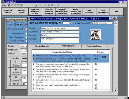
Figure 16. Comprehension Scores for the Traffic Congestion Icon. The comprehension scores shown in figure 16 reflect an empirical study involving 160 test subjects and 100 (from the more than 400 total) icons in the IDEA database. The column on the left hand side of the icon scores report in figure 16 shows the eight possible categories that could be used to score the subjects' responses in the comprehension testing. The column on the right shows the percentage of subject responses falling into each of these eight categories. Acceptable levels of comprehension are usually considered to be associated with the first two categories of this 8-point scale (i.e., either "the response matches the intended meaning of the icon exactly" or "the response captures all key informational elements of the intended meaning of the icon, but is missing one or more minor elements"). Therefore, the total percent comprehension score for the traffic congestion icon represents the sum of the subject responses falling into categories 1 and 2 (53.2 percent + 40.3 percent = 93.5 percent). This is a very high comprehension rate: Acceptable comprehension rates for icons and symbols are usually considered to be 66 percent or, in certain cases, 85 percent. It should be noted that, at this time, the Icon IDEA software does not support adding in new comprehension scores for new or existing icons, or for modifying the existing comprehension scores.
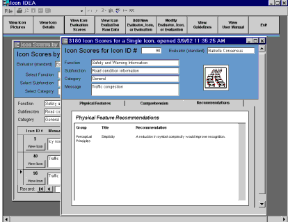
Figure 17 shows the third of three evaluation reports for the traffic congestion icon; this report provides recommended design changes for the icon. The design recommendations for all icons in the IDEA database are based on possible design problems identified during the "Physical Features" evaluations. These recommendations directly reflect less-than-100 percent compliance with any of the design guidelines associated with the "Perceptual Principles," "Level of Detail," "Level of Realism," "Use of Color," "Prohibitive Icons," or "Text Labels" evaluation areas. Therefore, any time a physical feature score for an icon is less than 100 percent, design recommendations will be provided for the icon. For the traffic congestion icon, only one design recommendation is provided. Recall (from figure 15), that the percent compliance for the Perceptual Principles evaluation area was 90 percent. In figure 17, we see that the design recommendation provided-"a reduction in symbol complexity would improve recognition"-is associated with the "Perceptual Principles" evaluation area and a design guideline for icon simplicity. |
|||||||||||||||||||||||||||||||||||||||||||||||||||||||||||||||||||||||||||||||||||||||||||||||||||||||||||||||||||||||||||||||||||||||||||||||||||||||||||||||||||||||||||||||||||||||||||||||||||||||||||||||||||||||||||||||||||||||||||||||||||||||||||||||||||||||||||||||||||||||||||||||||||||||||||||||||||||||||||||||||||||||||||||||||||||||||||||||||||||