U.S. Department of Transportation
Federal Highway Administration
1200 New Jersey Avenue, SE
Washington, DC 20590
202-366-4000
Federal Highway Administration Research and Technology
Coordinating, Developing, and Delivering Highway Transportation Innovations
 |
| This report is an archived publication and may contain dated technical, contact, and link information |
|
Publication Number: FHWA-RD-03-065
Date: September 2004 |
||||||||||||||||||||||||||||||||||||||||||||||||||||||
In-Vehicle Display Icons and Other Information Elements: Volume IPDF Version (8.33 MB)
PDF files can be viewed with the Acrobat® Reader® ENHANCING INTERPRETATION WITH TEXT LABELSIntroduction: Text labels refers to the use of text descriptions to enhance the interpretation of icons. Many icons are not immediately understood by drivers and text labels can facilitate the learning process.
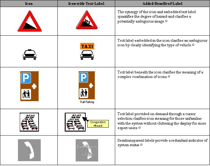
Figure 5-1. Examples of Icons that Benefit from Text Labels Discussion: Many icons may be misinterpreted because they have no commonly understood meaning and must be learned by the users (reference 1). This is particularly true of abstract icons that have no intuitive link to the message they try to communicate. The appropriate use of text labels can alleviate this problem. In fact, icons paired with text labels have been found to enhance performance, compared to icons alone, and enhance perceptions of usefulness, compared to text alone (references 2 and 3). Text labels can enhance interpretation by improving learning, identifying an appropriate action, and emphasizing hazards or important information. Even short text labels can help users learn icon meanings, which can be flawlessly recalled months after the initial exposure to the icon (reference 4). Text labels can also clarify a message and guide users to correct actions that might otherwise be obscured if the message were portrayed with only an icon or text (reference 5). Text labels also help clarify the uncertainty associated with color codes and shapes used to convey urgency. Used appropriately, text labels can address several problems of icon interpretation and provide benefits beyond those available with either text or icons alone. Design Issues: Including a text label may not be possible without reducing the size of the icon and compromising icon legibility. With this design tradeoff in mind, three placement strategies can be considered to accommodate a text label. Most simply, the icon label can be placed at the bottom or top of the icon. This alternative consumes valuable space and may reduce the icon size, but it provides a clear identification of the icon. The label can also be devised so that it appears only on command, such as when it becomes activated by the cursor. This strategy does not impinge on display space, but novice users may not be aware that the icon label can be accessed through the cursor. More expert users may not need or want this feature, so allowing users to turn off the text would support novice users until they no longer need the icon definitions. Because this strategy requires cursor movement, it is not feasible for those icons that will be displayed while a vehicle is in motion. The label can also be directly superimposed on the icon itself. This strategy does not require additional display space, but it may interfere with icon legibility because the label may occlude critical elements of the icon. Making the lettering semitransparent will reduce the occlusion of the icon, but it will also reduce the legibility of the text. Reference 6 discusses several detailed strategies for combining text and graphical information effectively. Cross References: Designing Effective Text Labels, p. 3-8; Composition of Text Labels, p. 5-4; Conveying Urgency with Icons, p. 5-14 References:
COMPOSITION OF TEXT LABELSIntroduction: The content of text labels can affect the comprehension and interpretation of an icon's text label. Words should be chosen carefully to increase clarity and take into account the vocabulary level of potential users.
Table 5-1. Examples of Text Label Composition
Discussion: Research indicates that warning text explicitness and severity has an effect on the perceived level of hazard of product warning labels (references 1, 2, 3, and 4). For example, reference 2 examined the explicitness of warning labels on infant car seats. Subjects rated their perceived hazard, likelihood and severity of possible injury, and the intent to act cautiously. Results indicate that explicit warning labels increase the perception of possible hazards and injuries as well as ratings of cautious intent. Reference 5 evaluated the comprehension of product warning labels, specifically the difference between "flammable" and "combustible." The study found that very few respondents knew the difference between the two terms, and most perceived the incorrect term as more hazardous. Similarly, terms used to describe driving situations may be misunderstood or ignored by drivers who do not comprehend the vocabulary used. Design Issues: When selecting icon text wording, using more explicit labels describing severe consequences can increase warning compliance. However, to be effective, these descriptions must consider the users' vocabulary level. A compromise between terminology simplicity and precision must be made to increase comprehension. For example, an icon alerting the driver to a malfunction of the vehicle's alternator can be described in a number of ways. A message such as "Engine Problem" may not be adequately explicit, while "Alternator Failure" may be overly precise and not understood by users who are not familiar with engine terminology. A compromise such as "Charging System Failure" may be sufficient. Under elevated stress conditions, simple instructions should be provided to reduce cognitive burden and decrease reaction time. Cross References: Designing Effective Text Labels, p. 3-8; Enhancing Icon Interpretation with Text Labels, p. 5-2; Enhancing Icon Interpretation with Color, p. 5-12; Conveying Urgency with Icons, p. 5-14 References:
CONVEYING THE EFFECT OF ACTIONS WITH ICONSIntroduction: Conveying the effect of actions with icons refers to the ability of an icon to help the driver anticipate the effect of selecting a particular system function or option.
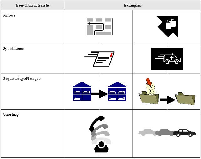
Figure 5-2. Schematic Examples on Conveying Action Discussion: Drivers may act upon icons that are used to identify system functions or options by pressing buttons or selecting menu items. Because these actions will change system modes or select a function, it is important that the icon show the driver the consequence of the action. The icon should show the "effect" or action that will occur when the control is actuated. When a symbol conveys action, it is important that the resulting action is the mechanism displayed. Actions can be displayed several ways: using arrows, speed lines, ghosting, or sequencing and animation (reference 1). Arrows indicate direction of change or movement, as in increasing volume or panning over an electronic map. Speed lines indicate activation, as in alarm or when sensors are enabled. Ghosting of an image shows an ordered sequence of states that will occur when the control is activated (reference 2) by using similar pictures with increasing levels of contrast-for example, the sequential position of a car on a route. Sequencing of images performs a similar function. By showing several images with connecting arrows, the consequence of an action can be shown, as in replying to an e-mail message (reference 3). Sequencing of images can be achieved with multiple small images shown at the same time or in animated sequences that show an icon changing over time. Each of these mechanisms for conveying action can help drivers understand the consequence of actions. For these mechanisms to be successful, the icon must provide a context to highlight the relevant change. Some important elements of context include position, orientation, and similarities in content. Regarding position, drivers will generally perceive the images on the right as occurring after the ones on the left. Ghosted images can also be overlapped to show progression, with the previous states positioned behind the more recent. Icon orientation and similarities in content can also provide a context for showing change. By retaining key features or orientation of the icon in each of the multiple images, drivers will be able to identify how the elements of a sequence relate to each other. Design Issues: Animated icons can be a very effective mechanism for describing actions, but they are not appropriate for icons displayed while the vehicle is in motion. A constantly changing icon will distract driver attention from the roadway (reference 4). References:
IDENTIFYING ICONS AS PART OF A GROUPIntroduction: Grouping icons facilitates their identification as a set of related messages or similar commands. Grouping provides the driver with cues regarding system functionality and aids icon comprehension. Grouping can be accomplished using position, design, and labeling.
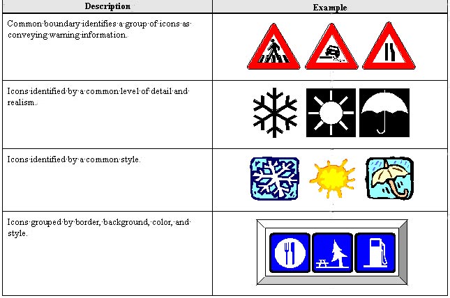
Discussion: The context in which an icon is viewed provides a powerful influence on interpretation. Context can make an ambiguous icon meaningful. Identifying an icon as part of a group provides a context that can enhance icon interpretation, so it should be used when possible. Icons can be associated with a group by their physical location or proximity, icon style, level of detail, common borders or shapes, or by the use of color. These icon characteristics can be used to group icons according to three important criteria. The first grouping criterion is relative urgency or importance. This criterion has been used for many years to group highway signs. Highly urgent signs have a distinct shape and color as shown by the examples that show warning information. The second criterion is to identify icons based on whether they invoke system functions or display status information. Icons that can be used to invoke system functions should have common characteristics that suggest that they can be acted upon, such as a raised bezel suggesting a physical button that could be depressed. The third criterion that can be used to group icons is system function. These system functions should reflect driver needs, not system architecture (reference 1). Relationships between groups can be conveyed through the use of common and distinct pictorial elements. For example, the use of similar shapes, colors, or borders can make icons appear related. This type of relation can be explained in terms of the Gestalt law of similarity, where there is a tendency for the visual system to group similar elements together as if they belong to each other. Organizing icons into groups according to their global features (i.e., shape, size, color) has also been shown to aid in discrimination. In reference 2, selection and response times for three different sets of icons were compared: a set in which the icons differed by their global features, a set in which the icons differed by their local features (i.e., lines and structures within the icon), and a word set. The results indicated that the global features of an icon elicited faster response times than local features. This phenomenon is referred to as the "global superiority effect" (references 3 and 4). In addition, reference 5 examined the use of color in icon design and found that color may be most useful for dividing icons into related subgroups and facilitating rapid identification. Design Issues: Although labeling is suggested as a means for grouping icons (reference 6) and has been shown to be helpful for increasing comprehension and overall effectiveness (references 7 and 8), it is important that it be used as a last resort in this particular application. The most important reason for this is that design space may be extremely limited. Text labels must be kept brief with no more than one or two words, and not all icon concepts may be amenable to such a succinct label. If not carefully chosen, a text label may mislead the user and reduce comprehension. Cross References: Enhancing Icon Interpretation with Text Labels, p. 5-2; Conveying the Effect of Actions with Icons, p. 5-6; Enhancing Icon Interpretation with Color, p. 5-12; Enhancing Icon Interpretation with Shape, p. 5-16 References:
CONVEYING SYSTEM STATUS WITH ICONSIntroduction: Conveying the effect of actions with icons refers to the ability of an icon to help the driver anticipate the effect of selecting a particular system function or option.
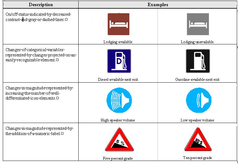
Figure 5-4. Examples of Icons that Benefit from Text Lables Discussion: Icons can be used to convey many different types of information about system status. For the purpose of icon design it is useful to describe this information in terms of urgency and information type. Information type refers to three categories of information: binary, categorical, and magnitude. Binary state information describes system state in terms of being on/off or active/inactive distinctions. Icons convey this information best through global changes to the icon, such as a uniform change in contrast. Categorical information describes the availability of amenities or features of a system that are currently engaged. To convey this information, icons must provide a uniform context upon which changes can be made to indicate changes in the categorical information. For example, a "D" can be superimposed on a gas pump to indicate the availability of diesel gas. The gas pump icon provides the uniform context for the interpretation of the "D." Magnitude information refers to continuous or discrete information that can be ordered along a dimension such as small to large, low to high, or safe to dangerous (reference 1). To convey magnitude information, icons should increase the size or number of a distinct element of the icon. Numbers can be superimposed on the icon, particularly when precision is required. Color, angle, and contrast have a very limited ability to convey magnitude information (references 2 and 3). Design Issues: For icons to convey highly urgent signals clearly, differentiating state changes is particularly important. For example, a collision avoidance icon might indicate that the system is active and functioning properly. The same icon might be used to indicate a collision situation. This state change requires a more salient and recognizable indicator than an icon that shows whether the radio is on or off. To enhance the salience, the change should be accompanied by an auditory signal, the degree of change of contrast should be greater, and the color should emphasize the urgency of the signal. Cross References: Conveying the Effect of Actions with Icons, p. 5-6; Enhancing Icon Interpretation with Color, p. 5-12; Conveying Urgency with Icons, p. 5-14; Augmenting Icons with Auditory Information, p. 6-2 References:
ENHANCING ICON INTERPRETATION WITH COLORIntroduction: Enhancing icon interpretation with color refers to how color can highlight information and enhance drivers' interpretation of icons; however, color can also confuse and mislead drivers if used incorrectly.
Figure 5.5 Schematic Examples of the Use of Color in Icons Discussion: The most common and consistent use of color for conveying information in the driving context is in traffic control devices. The use of green as permissive, amber or yellow for warning, and red for restrictive is almost universal. Red also has a powerful ability to convey urgency and hazard when used in warnings. Another important instance where color has come to hold a strong meaning is in the use of red for hot and blue for cold. These are two examples of "population stereotypes" or generally held expectations. When designing with color it is important to understand population stereotypes and conform to these expectations. Colors should not be used to convey meaning when there is not a well-established stereotype. Drivers will confuse the meaning of arbitrary color codes. Beyond conveying specific meaning, color can also effectively highlight information and enhance interpretation of complex icons (references 1 and 2). Effective use of color in this role requires careful design that considers the use of color in relation to its context. Using color to highlight specific features or to enhance the salience of an icon requires a relatively muted and conservative use of color elsewhere. If all icons are designed to be relatively salient with the use of saturated colors, the resulting collection will have no highly salient icons. Similarly, highlighting a critical element of an icon with a saturated color requires that the other elements of the icon provide a background that does not compete with the highlighted details. Color choices should be made with a clear sense for the importance of elements within the icon and priority or urgency across a set of icons. Design Issues: Color poses several problems for design. Some systems may not support color, so a monochrome design may need to be created. Gray scale can substitute for color, with the intensity of the gray conveying the meaning of the color. For example, if red were replaced by dark gray or black, then yellow and green would be replaced by corresponding lighter shades of gray. In addition, nearly 10 percent of the Caucasian male population and 4 percent of the non-Caucasian male population suffer from either color deficiencies or color blindness. The following color combinations should be avoided for these individuals: cyan and gray, yellow and light green, green and brown, red and black. Cross References: Ways to Use Icons, p. 2-6; Determining the Appropriate Contrast within an Icon, p. 3-4; The Effects of Color on Icon Legibility, p. 3-10; Identifying Icons as Part of a Group, p. 5-8; Conveying Urgency with Icons, p. 5-14; Enhancing Icon Interpretation with Shape, p. 5-16 References:
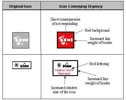
CONVEYING URGENCY WITH ICONSIntroduction: Conveying urgency with icons refers to adjusting icon characteristics so that they reflect the appropriate level of urgency of the situation. These adjustments enhance response speed and appropriateness.
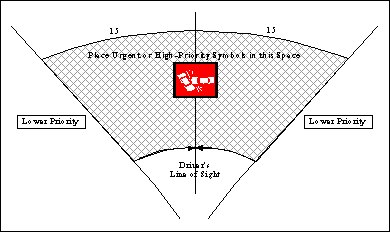
Discussion: These guidelines enhance perceived urgency by relying on population stereotypes for the interpretation of red as suggesting danger importance. This has been shown to have a particularly strong influence on perceived urgency (reference 1). In addition, these guidelines rely on several other icon features that increase their salience, such as size, border width, and the use of flashing. These characteristics all enhance the urgency of icons individually; combining them magnifies their total effect. Icon design features can have a strong effect on the perceived urgency of the icon. However, the perceived urgency and the driver's response to urgency depend on the context in which it is perceived. If all in-vehicle messages are designed to be perceived as highly urgent, the overall effect will be diluted. To enhance driver response to highly urgent messages requires the designer to consider the urgency of the message relative to other potential in-vehicle messages and tailor icon characteristics to the relative urgency. For example, notification of upcoming tourist attractions should not include characteristics appropriate for those of a collision avoidance warning. Design Issues: Color appears to be a powerful mechanism to convey urgency. Text size would need to be doubled to generate the same increase in urgency that is seen when the color is changed from black to red (reference 1). In addition, urgent symbols or icons should be located where they are most likely to be seen by the driver, thereby decreasing driver response time. According to reference 2, the area that is most easily viewed is considered to be a circular shaped or oval area roughly 10 to 15 degrees in radius around the normal line of sight (which is considered to be about 15 degrees below the horizon). The figure below indicates the optimal horizontal locations for placement of urgent symbols or icons.
Cross References: Flash Rate, p. 4-8; Enhancing Icon Interpretation with Color, p. 5-12; Augmenting Icons with Auditory Information, p. 6-2 References:
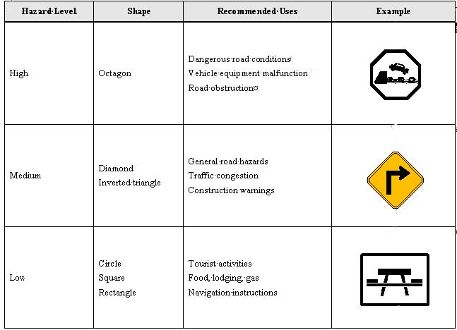
ENHANCING ICON INTERPRETATION WITH SHAPEIntroduction: Enhancing icon interpretation with shape refers to how the shape of an icon's outside edge or border can call attention to the hazard level being communicated and enhance drivers' interpretation of icons.
Table 5.8 Schematic Examples of the Use of Shape in Icons Discussion: Two warning label shape studies (references 1 and 2) presented subjects with 19 different shapes, including traffic safety sign shapes as well as other nontraditional shapes, and used a pairwise ranking procedure to determine which shapes observers rated as implying the most hazard. The studies found similar results. The inverted triangle, diamond, and octagon were perceived as the most hazardous, the circle, square, and rectangle as the least hazardous. Another study (reference 3) found analogous results with a group of industrial workers and using warning signs. Octagon and diamond shaped signs were ranked as more hazardous than circle or square signs. Using consistent icon shapes can facilitate rapid recognition (reference 4). This takes advantage of the global superiority effect (reference 5), in which the perception of global features in a figure, such as outline shape, is more rapid than the perception of local features, such as the icon pictorial. Design Issues: The shapes of icons connote different levels of hazard. Research has found that octagon, diamond, and inverted triangle shapes are perceived as the most hazardous, while circle, square, and rectangle shapes are perceived as the least hazardous (references 1, 2, and 3). These preferences are consistent with population stereotypes of American road signage displayed in the Manual on Uniform Traffic Control Devices (MUTCD). Octagon ("STOP") and diamond (warning) shaped signs require immediate action or attention. Circular ("RAILROAD CROSSING") and rectangle (regulatory) shaped signs generally are used for low priority information, such as roadside services and speed limit signs. Cross References: Composition of an Icon, p. 2-10; Identifying Icons as Part of a Group, p. 5-8; Conveying Urgency with Icons, p. 5-14 References:
|