U.S. Department of Transportation
Federal Highway Administration
1200 New Jersey Avenue, SE
Washington, DC 20590
202-366-4000
Federal Highway Administration Research and Technology
Coordinating, Developing, and Delivering Highway Transportation Innovations
 |
| This report is an archived publication and may contain dated technical, contact, and link information |
|
Publication Number: FHWA-HRT-05-137
Date: July 2006 |
Evaluation of Safety, Design, and Operation of Shared-Use PathsFinal ReportPDF Version (1172 KB) PDF files can be viewed with the Acrobat® Reader®
CHAPTER 5. OPERATIONAL DATA ANALYSISINTRODUCTIONAfter the operational data collection process described in chapter 4, the research team analyzed the data from both the static and mobile vantage points. The analysis had two main objectives. First, the team wanted to develop a series of average and default values for key parameters that it could use as it developed the LOS estimation procedure. The speed samples collected were obviously an important part of this. Other important values to be determined from the data included the PHF and the percentage of each user group that traveled in groups of two or more mode users. The second objective of the analysis was to compare the measured number of meetings and passings against the number of meetings and passings predicted from the theory developed in chapter 3. This comparison would validate the theory applicable to typical U.S. shared–path conditions. This chapter describes how the project team met both of these main objectives.
AVERAGE AND DEFAULT VALUESSpeed As was noted in chapter 4, the project team recorded speed samples at each trail for each representative user group. The measurement was manual, with a stopwatch, and the team's goal was a sample of at least 30 free–flowing bicyclists and as many other path users as appeared during the recording of the bicyclists' speeds. In the cases of the Lakefront and Sammamish River Trails, since the team collected data at two different places along the trail, we collected more than 30 bicycle speeds for the sample. The team did not collect usable speed data on the Washington, DC, area trails because of poor weather conditions. Since most bicyclists and other path users traveled the sample paths as individuals instead of in groups (as will be seen below), these free–flowing average speeds are probably quite similar to the overall average speeds. Table 14 shows a summary of the speed data we collected. The table shows the sample size, average speed, and standard deviation around that average for each mode at each trail. The table also shows, for each mode, the average of the 13 trail average speeds and the average and standard deviation of the total set of observations. The average speed for the 443 adult bicyclists observed was 20.62 km/h (12.81 mi/h), with a standard deviation of 5.49 km/h (3.41 mi/h). Average bicycle speeds on the paths ranged from almost 24.15 km/h (15 mi/h) on the Pinellas Trail in Florida–a wide, straight, and flat path used by many fitness riders to more than 16.1 km/h (10 mi/h) on the Lake Johnson Trail in Raleigh, NC–a narrow, curvy, bumpy path. The 20.60 km/h (12.8 mi/h) average is just slightly higher than values reported in the literature–perhaps because most segments studied had at least 0.80 km (0.5 mi) uninterrupted by intersections or turnouts, and because we broke out child bicyclists as a separate mode. The average speed for the 275 pedestrians observed was 5.42 km/h (3.37 mi/h); pedestrian speeds were more uniform than bicycle speeds across trails (discounting the sites with only a handful of observations). Based on samples of more than 200 users for each mode, the average inline skater speed was 16.30 km/h (10.13 mi/h), while the average jogger speed was 10.40 km/h (6.46 mi/h). The average child bicycle speed was 12.64 km/h (7.85 mi/h), but this was based on a sample of only 29 users. Overall, the speed data in table 12 are sufficient for use in an LOS procedure in cases where the trail designer or manager does not have a sample for the specific trail.
Table 12. Speeds by mode and trail (all speeds in mi/h)
* Over trails Volume and Mode Split Some trail designers and managers will have detailed counts or forecasts of the volumes of users by mode expected on their paths. However, most will not have such detailed data and will need to rely on default values for those inputs. Our data set, based on up to 8 h of observation at relatively busy (if not peak) times on each of 15 well–known paths across the United States, may serve well in providing those default values. Table 13 shows a summary of our volume and mode–split data by trail. This table includes all 15 trails, from the data recorded manually at the midpoint of the segment of interest; the volumes are from both directions of travel on the path. From table 13, we note that adult bicyclists made up the majority of the trail users overall and on most trails, with 56 percent of the user share overall. This ranged from a high of 81 percent on the Pinellas Trail to a low of 14 percent on the Lake Johnson Trail; these are the same trails that were the extremes for bicycle speeds as well. Pedestrians made up 18 percent of the trail users overall, with a range of 63 percent on the Lake Johnson Trail to 3 percent on the Sammamish River Trail. Inline skaters were 10 percent of the users observed, joggers were 13 percent of the users observed, and child bicyclists were 3 percent of the users observed. Some trails did not have any skaters, and others did not have any child bicyclists. There was a wide range of volumes exhibited across trails, ranging from an average of more than 2,300 users per hour on the four–lane Chicago Lakefront Trail during a sunny summer weekend to just 44 users per hour on the Washington and Old Dominion Trail in cold, windy, and rainy conditions. The average of the average volumes per trail was 426 users per hour, although there was a large standard deviation around that average. Table 13. Volumes and mode splits by trail.
Key to trail names: PD = Paul Dudley, M = Minuteman, P = Pinellas, HI = Honeymoon Is., FP = Forest Park, G = Grant's, SB = South Bay, LF = Lakefront, WC = White Creek, WR = White Rock, MV = Mill Valley, SR = Sammamish River, LJ = Lake Johnson, CC = Capital Crescent , WO = W&OD The research team was concerned about the wide variations in volume and mode split observed at the sample trails because users may lack confidence in using these results as default values in their analyses when local data are unavailable. In particular, the Lake Johnson Trail had a very different mode split than the other trails, the Washington and Old Dominion had much lower volumes than the other trails, and the Lakefront Trail had much higher volumes than the other trails. However, recomputing the average mode splits and volumes without these trails made very little difference in the averages, except for the case of the Lakefront Trail. Dropping the Lakefront Trail meant that the average volume declined to 291 users per hour. In the end, it appears that mode split and volume are simply parameters that will vary widely from trail to trail; consequently, trail designers and managers are going to have to consider that variation in their analyses. The User's Guide provides some suggestions as to how this can be done in some typical analyses.
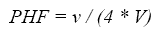
PEAK–HOUR FACTORThe PHF is an important consideration used in capacity and LOS calculations to adjust for peaking of traffic within the hour of interest. Since a 15–minute (min) timeframe is used for determining an LOS in the HCM, (4) the PHF for this procedure will also be based on 15 min. The equation for determining the PHF is:(4)
where v is the hourly volume and V is the volume of users in the peak 15–min time period within the hour. Values of PHF for shared–use paths are not readily available in practice or in the literature; therefore, using our data to find an average or default PHF should be helpful. The volume data collected manually and summarized in table 13 were not from continuous counts; instead, the data collector only counted while the bicyclist with the helmet camera was moving. This made computation of a PHF from those data very difficult. To compute an average PHF, we turned to the images recorded by the static camera. We selected tapes in which good weather and good equipment performance allowed continuous 1–h counts. Table 14 shows data that we collected from the static camera for this purpose.
Table 14. PHF data
Table 14 shows that the average hourly volume for the time periods sampled was almost equal to the average hourly volume from the full data set in table 13. Based on those time periods, an average PHF was about 0.85. The standard deviation of about 0.08 around that average PHF shows that there was some variation from trail to trail and hour to hour. One trend worth noting was that, as expected, PHF tended to rise as the hourly volume rose. Figure 9 shows the trend, which was heavily influenced by the high–volume Chicago observations.
Figure 9. PHF as a function of hourly volumne.
Users Occupying Two Lanes The researchers needed the proportion of users moving along the path while occupying two lanes as an input to the delayed passing procedure developed in chapter 3. Usually, a group of two users moving together would occupy two lanes. However, there were many cases where two users moving together occupied less than two lanes because they moved in single file, one walked or rode off the path, or they walked or rode very close to each other. There were also cases when a single path user occupied two lanes. This was typically an inline skater swinging his or her arms and legs widely, although there were also cases when a weaving, wobbling bicyclist used two lanes. Thus, to collect data on this proportion, we had to carefully examine the movements of each user or group of users. The static camera did not provide a perspective that showed how much of the path a user or group of users was occupying; therefore, we had to use the video recorded by the mobile (helmet) camera. We reviewed 21 h of runs on seven paths (all the times and trails listed in table 14, except the Chicago Lakefront, where these data were too difficult to collect). In that sample, we observed the following proportions:
We note that a "group" in this context consisted of one or more path users who seemed to be moving along the path together. Distance Needed to Pass Another factor needed as an input to the delayed passing procedure developed in chapter 3 is the distance needed to pass. To collect these data, we needed high–quality images with many passing maneuvers on paths that were of moderate width. In the end, we reviewed 50 runs in which high–quality video with passing maneuvers was available on five paths (Grant's, Forest Park, Minuteman, Sammamish River, and Honeymoon Island). These paths are 3 to 3.6 m (10 to 12 ft) wide. Table 15 shows the data for the case of the experiment bicycle passing a pedestrian. The overall average distance is 29.89 m (98 ft), and the average did not change much when the experiment bicycle was traveling from 17.71 to 22.54 km/h (11 to 14 mi/h) (near the overall average bicycle speed). We did not have nearly as large sample sizes for the bicycle passing other modes; however, the samples we recorded were:
We did not examine a case where the experiment bicycle passed a child bicyclist during the 50 runs examined. The field data for the distance needed to pass were difficult to collect and may not be representative of actual passings for several reasons. First, our data collectors were trying to maintain a constant speed, even while passing, while normal bicyclists would probably speed up during the pass. Second, our data collectors were probably much more conservative in making a passing than were the regular bicyclists, who would probably use longer gaps before and after making the pass. Third, since our runs were only 0.80 km (0.5 mi) long (or shorter in a few cases), we were only passing the slowest bicyclists.
Table 15. Distance needed for a bicycle to pass a pedestrian
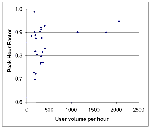
1 ft = 0.305 m To supplement the small samples of somewhat questionable field data on the distance needed to pass, the project team developed a model. The basis of the model is the simple idea that the distance needed to pass is equal to the gap before the pass, plus the gap after the pass, plus the distance traveled during the passing by the user being passed. The terms of this model are in equation 56:
where DP is the distance needed to complete a passing (in ft), BG is the gap between the passer and the user to be passed at the beginning of the passing (in ft), EG is the gap between the passer and the user that was passed at the end of the passing (in ft), PS is the speed of the passer (in ft/s), and SS is the speed of the user being passed (in ft/s). Since the mean speeds of the modes, other than bicycles given in table 14 above, are so much less than the mean bicycle speed, it is a safe assumption to use the mean speeds of those other modes as the appropriate values for SS in equation 47. However, the mean speeds of bicycles being passed would be considerably less than the overall bicycle mean speed if the passing bicycle is assumed to travel at the mean speed. To estimate SS for bicycles, then, the researchers developed a simulation of operations on a path that randomly assigned speeds to bicyclists along the path, based on the assumption that bicycle speeds are normally distributed (see later in the chapter); the researchers then tracked the speeds of bicycles that were passed by a test bicycle traveling at the overall mean speed. Based on a test bicycle and an overall bicycle mean speed of 20.6 km/h (12.8 mi/h), a standard deviation of 5.49 km/h (3.41 mi/h) around that mean speed, and a volume of 115 bicycles per hour in one direction (the average volume across all paths from table 15), the SS for passed bicycles was about 12.88 km/h (8 mi/h) or 3.66 m/s (12 ft/s). Using PS = 20.61 km/h (12.8 mi/h) or 5.73 m/s (18.8 ft/s), SS as described above, and BG = EG = 6.1 m (20 ft) (which we believe to be reasonable for many passing situations), the researchers produced the values in the column labeled "Estimated"; in table 18. As one can see, the estimated values in table 18 are about two–thirds of the field average values for bicycles, skaters, and joggers, and about one–half of the field average value for pedestrians.
Table 16. Summary of distance needed to pass values.
1 ft = 0.305 m The column labeled "Assumed" in table 16 shows the values of distance to pass that the team used in the delayed passing spreadsheet that became a part of the LOS procedure (see chapter 8). We assumed a lower value for passing bicycles because we believe that BG and EG are typically lower than 6.1 m (20 ft) when the passing user is traveling nearly the same speed as the user being passed since path users try to minimize the time that they are in the middle or opposing lane. For pedestrians, skaters, and joggers, we assumed values between the field average and estimated values, but closer to the estimated values, because the field data were based on very conservative bicycling practices. Finally, with no relevant field data on hand, we assumed that the distance required to pass a child bicyclist was nearly the same as the estimated value. Validating Theory Besides providing the important average and default values described above, the other major purpose of the operational data collection was to validate the theory developed in chapter 3 on predicting the number of meetings and passings along a path. In this section, we first show that the key assumption in chapter 3–that user speeds are normally distributed– was a sound one. We then compare the theoretical predictions of meetings and passings to the field data for a variety of paths and show that the theory generally matched the field data reasonably well.
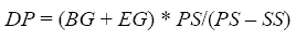
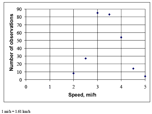
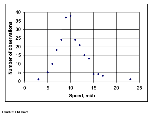
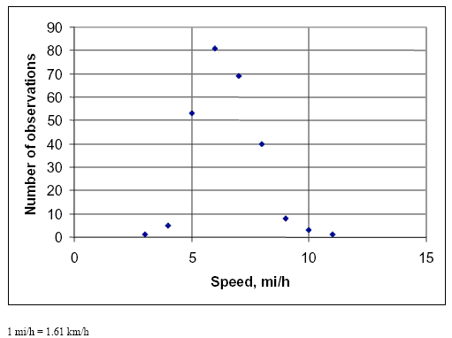
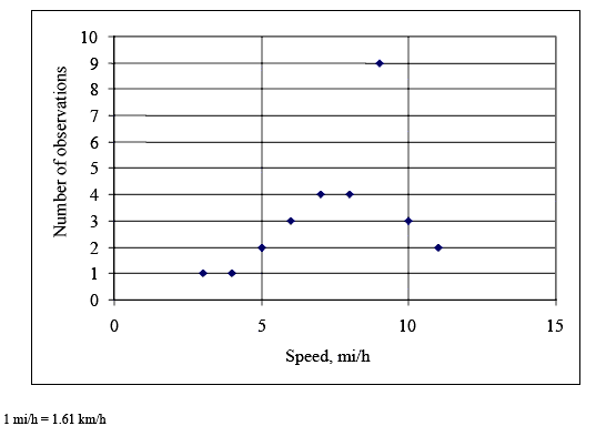
SPEEDS NORMALLY DISTRIBUTEDThe assumption that user speeds are normally distributed was key in chapter 3, and the field data we collected generally prove that the assumption was sound. Figures 10 through 14 show the distributions of the speeds observed during our data collection (the same data set as described in table 12 above) by mode. All of the distributions look normal, with the exception of a couple of points. More convincing evidence is provided in table 16 for all modes except for child bicyclists, for whom the sample size was too small. Table 16 shows the results of chi–square tests comparing the distribution of speeds collected in the field to a theoretical normal distribution of speeds with a mean and standard deviation as reported in table 12. The chi–square test is well known and commonly used for this purpose (e.g., see May's classic text, Traffic Flow Fundamentals). (60) Table 17 shows that the field and theoretical normal distributions were not significantly different at the 0.05 level for the cases of the bicycle, pedestrian, and skater modes. Joggers were the only mode for which there was a significant difference. Table 17 shows that the difference was only because of an overabundance of relatively slow (8.05 km/h (5 mi/h)) joggers. Overall, the field data provide convincing evidence that user speeds on the shared–use paths that we studied were normally distributed.
Figure 10. Distribution of bicycle speed data.
Figure 11. Distribution of pedestrian speed data.
Figure 12. Distribution of skater speed data.
Figure 13. Distribution of jogger speed data.
Figure 14. Distribution of child bicyclist speed data.
Table 17. Chi–square test results comparing field and normal distribution for speed data.
1 mi/h= 1.61 km/h
COMPARING PREDICTED MEETINGS AND PASSINGS TO FIELD DATAChapter 3 described the development of a theory on how to estimate the number of meetings and passings by a test bicyclist on a path, given the traffic volumes and speeds of the various modes on the path. To gather the field data against which those estimates will be compared, a team member viewed the videotapes recorded from the helmet camera and documented the number of meetings and active passing events that occurred during each trial. The researchers did not document passive passing events since very few of them were seen on the mobile video. Table 18 shows a summary of the meetings and passings (completed and desired) data in terms of average values per trail. Table 18 does not report data from the two Washington, DC, area trails since those sample sizes were so small and the data were so unstable that they were not helpful. Obviously, there was good variation in meetings and passings per mile. The test bicycle on the Lakefront Trail in Chicago met an average of 120 trail users per mile, while the test bicycle only met an average of nine trail users per mile on the Pinellas and Grant's trails. The test bicycle on the Lakefront Trail passed an average of 21 trail users per mile, while passing an average of 2 trail users per mile on the Pinellas and Grant's Trails.
Table 18. Average meetings and passings on each trail.
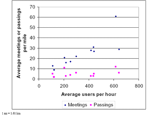
1 mi=1.61 km A quick look at table 18 shows that the number of meetings and passings were related to the user volumes on the trail. Figure 15 shows that relationship more clearly, without calculating the averages from the Lakefront Trail, which would be way off the chart. There are some variations in the relationship between meetings and volume, and passings and volume; however, generally, as volume rises, so do the meetings and passings.
Figure 15. Average meeting and passings per trail related to average user volumne.
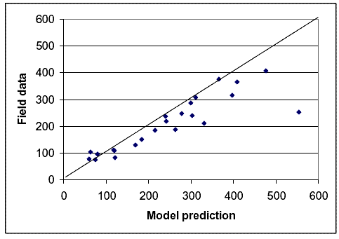
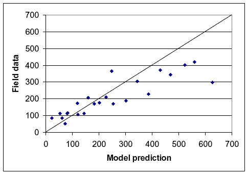
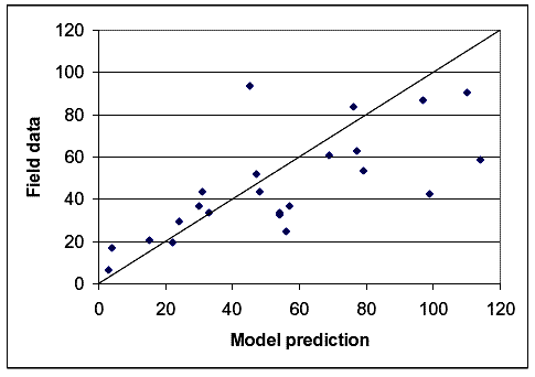
Comparing the number of meetings and (completed plus desired) passings estimated by the model developed in chapter 3 to the number recorded by the helmet camera during the operational data collection runs was a fairly straightforward task. The researchers bundled the runs from each path into two or three groups based on total user volume and test bicyclist speed because the variation in meetings and passings between the individual runs was so great. The team used the actual speed of the test bicycle during the run to make its prediction, though, rather than using the average bicycle speed for the path or for the set of paths. Figures 16 and 17 show the results for meetings, while figures 18 and 19 show the results for passings.
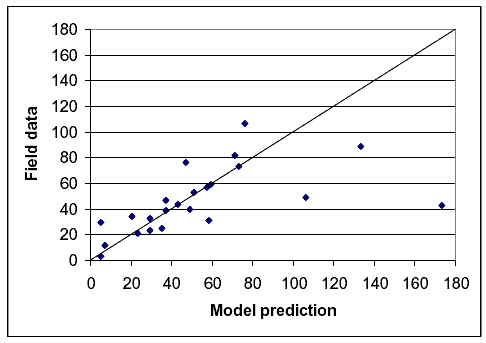
Figure 16. Model prediction versus field data for meetings based on volume groups.
Figure 17. Model prediction versus field data for meetings based on speed groups.
Figure 18. Model prediction versus field data for passings based on volumne groups.
Figure 19. Model prediction versus field data for passings based on speed groups.
Figures 16 through 19 show that, in general, the model estimates fit the field data quite well. On figures 16 and 17 for meetings, and figure 19 for passings, there is only one point that particularly stands out for which the model estimate and the field data do not match. That point was for the Mill Valley–Sausalito Trail with high volumes or high speeds. The reason for the mismatch probably relates to the fact that there were a large number of fast joggers on that path during meeting and passing data collection, and these joggers were not recorded during speed data collection.
To provide more detail on how well the model estimates matched the field data, tables 19 through 22, show the data and a statistical test on the fit of the model estimate to the field data for each bundle tested. The test was whether the field data fell within two standard deviations (shown as
Table 19. Statistical test comparing meetings estimated by model to field data for volumne groups.
1 mi=1.61 km Table 20. Statistical test comparing meetings estimated by model to field data for speed groups
1 mi=1.61 km Table 21. Statistical test comparing passings estimated by model to field data or volumne groups.
Table 22. Statistical test comparing passings estimated by model to field data for speed groups.
FHWA-HRT-05-137 |
|||||||||||||||||||||||||||||||||||||||||||||||||||||||||||||||||||||||||||||||||||||||||||||||||||||||||||||||||||||||||||||||||||||||||||||||||||||||||||||||||||||||||||||||||||||||||||||||||||||||||||||||||||||||||||||||||||||||||||||||||||||||||||||||||||||||||||||||||||||||||||||||||||||||||||||||||||||||||||||||||||||||||||||||||||||||||||||||||||||||||||||||||||||||||||||||||||||||||||||||||||||||||||||||||||||||||||||||||||||||||||||||||||||||||||||||||||||||||||||||||||||||||||||||||||||||||||||||||||||||||||||||||||||||||||||||||||||||||||||||||||||||||||||||||||||||||||||||||||||||||||||||||||||||||||||||||||||||||||||||||||||||||||||||||||||||||||||||||||||||||||||||||||||||||||||||||||||||||||||||||||||||||||||||||||||||||||||||||||||||||||||||||||||||||||||||||||||||||||||||||||||||||||||||||||||||||||||||||||||||||||||||||||||||||||||||||||||||||||||||||||||||||||||||||||||||||||||||||||||||||||||||||||||||||||||||||||||||||||||||||||||||||||||||||||||||||||||||||||||||


 in tables 19 through 22) of the mean estimated by the model. This was actually a demanding test for the higher numbers of meetings because, for a Poisson–distributed variable such as the estimated mean number of meetings or passings, the standard deviation was equal to the square root of the estimated mean. Thus, two times the standard deviation for such a variable becomes a proportionally narrower range as the estimated mean gets larger. The worst fit on the four tables was in table 19 for meetings by volume group, where only four of the 23 cases fell within the limits. However, in table 19, there was a nice balance between the 9 cases where the field data were above the limits and the 10 cases where the field data were below the limits, showing no bias. Table 20 had a better fit with 11 of the 23 cases within the limits. The balance between the cases above and below the limits was not as good for table 20, with 2 cases above the limits and 10 below. Although a look at the data in table20 shows several cases in which the field data just missed the lower limit. Tables 21 and 22 for passings show better matches between the model estimates and field data than for meetings, as might be expected, since the mean values were much lower. In the cases in tables 21 and 22 where the field data fell outside the limits, there was a good balance between lower and higher values, which showed little bias. Overall, tables 19 through 22 should reinforce the idea that the models developed in chapter 3 did well in predicting the number of meetings and passings recorded during our operational data collection effort.