U.S. Department of Transportation
Federal Highway Administration
1200 New Jersey Avenue, SE
Washington, DC 20590
202-366-4000
Federal Highway Administration Research and Technology
Coordinating, Developing, and Delivering Highway Transportation Innovations
| REPORT |
| This report is an archived publication and may contain dated technical, contact, and link information |
|
| Publication Number: FHWA-HRT-13-018 Date: April 2013 |
Publication Number: FHWA-HRT-13-018 Date: April 2013 |
This appendix contains instructions and materials provided to study participants during training and data collection. In some cases, representative samples have been provided instead of the full set of materials.
As each color sample panel is mounted in the tripod, describe your sensation of the light reflected from this particular color sample. First, divide your sensation into three parts. The first part consists of hue. You must divide your sensation of hue into red, yellow, green, or blue. These are the only words you may use to describe the hue. If you wish, you may use pairs of names to describe a hue. When you are describing your sensations of hue, please state them in percentages. If there is any hue at all, the percentages you assign to these words must add up to 100 percent. For instance, your sensation might be 40 percent red and 60 percent yellow or 86 percent green and 14 percent yellow or 95 percent blue and 5 percent red, and so on. It can also be 100 percent of one of the hues. The only limitation is that you may not pair red with green, nor pair yellow with blue; all other combinations are allowed. If there is no hue at all and the color is either black or white or some shade of gray between black and white, then the percentages you assign to the words will be 0 percent and they will add up to 0 percent.
Think carefully about your answer and try to be as precise as possible. Remember that the term hue refers to your own sensation elicited by the light reflected off the material. You are not being asked how you might create the particular hue you saw. You are being asked to describe your sensation. Please note that there are no right or wrong answers; you are simply describing your sensation.
The second part of your sensation is not hue but is related to hue. After describing the hue of your sensation, you must consider what percentage it formed of your entire sensation; that is, what is the percentage of chromatic versus achromatic-plus-chromatic sensations? This value is called apparent saturation. It refers to the strength or concentration of hue in your total sensation. A total absence of hue would be represented by 0 percent saturation, in which case a color would be white or gray or black. At the other extreme, a fully saturated color with 100 percent saturation would be as far away as possible from white or gray or black. Think of your total sensation when you see a color sample as something contained in a bucket. Now pour a little bit of a hue into the bucket and stir. What has happened to the saturation? Now add a little bit more and stir. Again, how has saturation changed?
The third part of your sensation is neither hue nor saturation. This part is achromatic; it is not sensitive to color. In this case we want you to rate the brightness of the light reflected off the material. Brightness is the sensation of the amount of light. Brightness is expressed on a scale from bright to dark, with 100 percent being the brightness of the sky on a clear day, and 0 percent being the brightness of a completely dark surface that does not appear to reflect any light at all. Zero percent brightness is what you would perceive in a completely dark room with no light whatsoever.
First, you will scale some color patches printed in a training booklet in order to get used to the task. Next, you will scale a few actual color sample panels as practice trials. This training is designed to familiarize you with the procedure. We will tell you when they end and the experimental trials begin. Do not leave any blanks on your answer sheet. It is always better to guess. The first data collection period after the practice trials will last about 30 min. Then you will have a break. Do you have any questions?
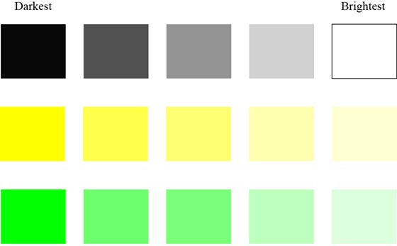
In this part of the experiment you will rank order the brightness of five color sample panels lined up in a row with the letters A–E under each panel. All of the panels will be of a similar color. On your answer sheet, please rank the five panels for their sensation of brightness only. Place the letter of the brightest sample under the number 1 on the answer sheet, and the letter of the next brightest sample under the number 2, and so on, until you have ranked all five samples. When you are done, the letter corresponding to the brightest sample will be under the number 1, the letter corresponding to the darkest sample will be under the number 5, and the other letters will be arranged in between according to their perceived brightness.
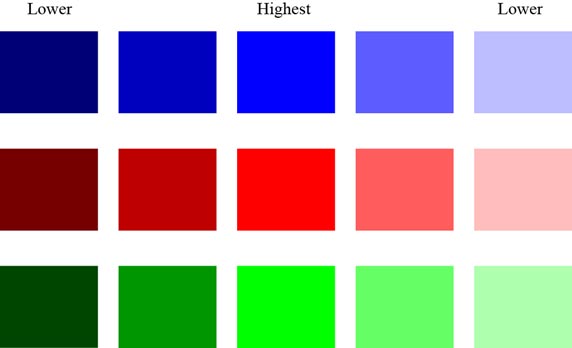
If this is still confusing, consider pink and red. Red is a highly saturated color; it would be given a high saturation score. However, if red becomes more white or gray, it becomes pink and would be given a lower saturation score. With even less saturation, it becomes a pastel pink. If the color continued changing in this manner, at some point it would turn white or gray and would get a saturation score of 0 percent. Remember that black would also have a saturation score of 0 percent.
 |
| Figure 24. Illustration. Training examples for saturation. |
 |
| Figure 25. Illustration. Training examples for brightness. |
Twenty-four color samples were provided to participants for practice in assigning percentages for the red, green, yellow, and blue in the sample as well as for saturation and brightness. An example from the participant practice is provided in figure 26.
 |
| Figure 26. Illustration. Example participant practice sample. |
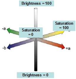
Hue = What color or colors are present in the sample, even in small amounts?
Saturation = How concentrated or strong is that color or color combination?
Brightness = If all color were to disappear, how bright or dark would the sample be?
 |
| Figure 27. Illustration. Color dimensions. |
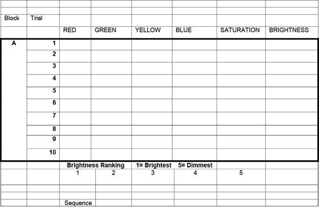
The response sheets provided to participants were in a tabular format with space to enter data for red, green, yellow, blue, saturation, and brightness percentages for each sample. Space was also provided for numbers assigned during the brightness ranking task. Figure 28 shows a representative portion of the response sheets.
 |
| Figure 28. Illustration. Response sheet sample. |