U.S. Department of Transportation
Federal Highway Administration
1200 New Jersey Avenue, SE
Washington, DC 20590
202-366-4000
Federal Highway Administration Research and Technology
Coordinating, Developing, and Delivering Highway Transportation Innovations
| REPORT |
| This report is an archived publication and may contain dated technical, contact, and link information |
|
| Publication Number: FHWA-HRT-14-067 Date: September 2014 |
Publication Number: FHWA-HRT-14-067 Date: September 2014 |
Phase 1 testing of the cable-stays on the Penobscot Narrows Bridge occurred in early December 2006. In order to achieve the largest representation of cables in only a week's allotment of test time, it was decided to test as many cables as possible in fan A, before switching over to inner cables located in fan C. Testing for each fan started with number 20, the longest cable, and proceeded to the shorter cables. Cables 20A through 12A were tested in the first 3 days, while cables 20C through 17C were tested the following day before severe winter weather prevented any testing on the final day. Figure 20 shows the arrangement of the cables tested.

Figure 20. Illustration. Arrangement of cables tested during phase 1.
To determine the fundamental mode frequencies for each cable, an estimated power spectral density (PSD) analysis was performed on the time-history series for each individual run. The density was calculated in Matlab® using Welch's averaged modified periodogram method, which produces a one-sided density of frequency versus power per frequency with an acquisition frequency of 100 Hz. The Welch function divides the input into eight segments with 50 percent overlap with each segment subjected to a Hamming window function. The average of the periodograms determines the PSD estimate. For these cable vibrations, the frequencies of interest are extremely low, in the single-digit Hz range. Appropriately, the density was graphed from 0 to 10 Hz, which contained the first 8 to10 fundamental frequencies. Figure 21 shows a sample plot of the Welch spectral density plot.
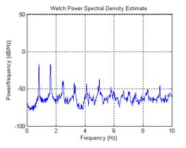
Figure 21. Graph. Phase 1 spectral density plot of cable 19A, run 3.
A cursor was placed on the plot and dragged along the points in order to determine the local maxima that correspond to the natural frequencies. The frequencies were found with an accuracy of three decimal places for the first mode, and two decimal places for the higher modes. The quality of the spectral density plots varied among the different runs. Some produced clear plots where each natural frequency could easily be recorded up to the ninth or tenth mode. Other plots were harder to interpret. Sometimes the higher frequencies would lack distinct peaks, and other times the energy would fall under a wider curve with multiple peaks. In these cases, some judgment was applied to determine which peaks were acceptable.
A table was compiled of the fundamental frequencies up to the seventh mode, if possible, for each time-series. This was done for both accelerometer boxes. Usually the frequencies would be equivalent between the two boxes and across the separate runs for each individual cable, but occasionally they would vary by a small percent. The table of frequency values can be found in appendix A. Once again, sometimes a judgment call was necessary when determining the average natural frequencies for a cable if it varied throughout the runs. If there were only a few outliers, the statistical mode was considered the average, but if there was greater variance among the runs, then the actual mean was calculated.
Once the fundamental frequencies were obtained for the first two modes, the damping ratios could then be calculated from the decay of the cable vibrations. Since the time-history for each run is the complex combination of numerous modes of vibration, a bandpass filter was used to isolate the decay associated with each mode. The pass band frequencies were determined from the spectral density plot, choosing frequencies that closely encompassed the entire energy peak for the desired mode. A fourth-order elliptic filter was utilized on the signal twice to completely suppress the unwanted noise outside the band while effectively preserving the signal within the cutoff frequencies. An example of the elliptic filter's effect on the spectral density plot of a data series is shown in figure 22.
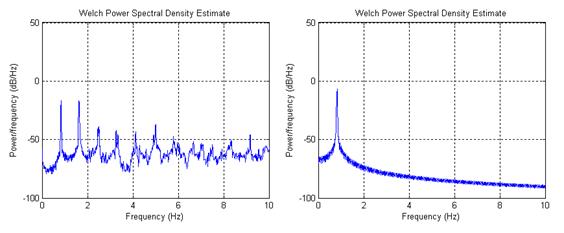
Figure 22. Graph. The effect of the bandpass filter on the spectral density,before (left) and after (right).
Once the bandpass filter had been applied, the time series resembled a more consistent logarithmic decay. A time filter was also established to eliminate the data associated with the manual excitation at the beginning of the run and the random excitations prevalent after the decay had subsided. Figure 23 shows a comparison of the time series before and after the bandpass and time filters are applied.

Figure 23. Graph. Phase 1 plots comparing the original time series (left), the bandpass
filtered time series (center), and the truncated time series (right).
After the logarithmic decay curve has been revealed, the damping ratio can then be extracted using the equation from figure 9. Software created in Matlab® marked both the positive and negative peaks along the sinusoidal curve and then proceeded to take the natural log of the peaks. Since damping is found from the ratio between two distinct, consecutive peaks, and that ratio varies throughout the run as the peaks vary, a regression line was fitted to the data to minimize random errors. An average damping ratio was then calculated from this best-fit line. A close-up of the software capturing the peaks from phase 1 testing of cable 19A, run 6 and the resulting regression lines are shown in figure 24 to figure 27.
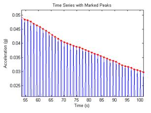
Figure 24. Graph. Marked peaks of the decay curve.
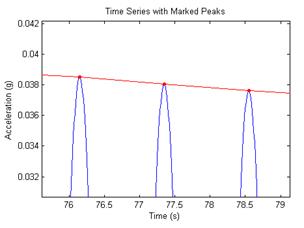
Figure 25. Graph. Closer view of the marked peaks.
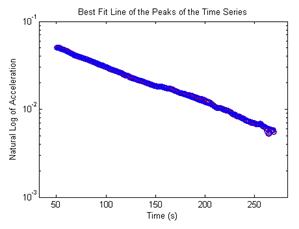
Figure 26. Graph. Best-fit line of the natural log of the peaks.
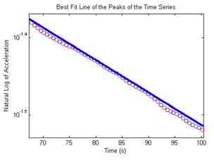
Figure 27. Graph. Closer view of a 30 second interval of the best-fit line of the peaks.
To determine the effectiveness of the best-fit line, the correlation was noted between the regression line and the actual peak data points. In general, the correlation throughout the runs was extremely high, usually averaging over 0.990 for the first mode. In most cables, the average correlation was even higher, averaging between 0.994 and 0.997, although one cable's data set only averaged 0.953. While that number still appears impressive, it was extremely difficult to accurately fit a line with that much variability in the decay.
The correlation was also important because it helped determine the length of the sample. The length of the decay was chosen to extend for as long as possible before random vibrations affected the signal. The best-fit line and correlation numbers helped determine when the damping ended and the logarithmic decay assumption was no longer valid. The length of the decay curve for the first frequency mode was longer than the second, usually averaging 50 s for the shorter cables to 260 s for the longer cables in the first mode, and 30 s to 130 s, respectively, in the second mode.
After the best-fit line was established, the damping ratio could be pulled for each cable. The number of runs performed for each cable varied between 4 and 11 with one additional run per cable used as a baseline with no manual excitation. Due to the small number of available sample data sets for each cable, and the fact that the population mean and variance are both unknown, the Student-t test was used to find a 90 percent confidence interval on the mean.(5) This statistical process was performed for every cable for both the first and second modes, and a graph of the results is shown in figure 28 to figure 31. Table 2 contains a summary of the damping ratio, correlation, and frequencies for each cable.
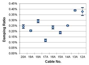
Figure 28. Graph. First mode, 90 percent confidence interval on the mean, fan A.
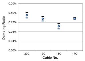
Figure 29. Graph. First mode, 90 percent confidence interval on the mean, fan C.
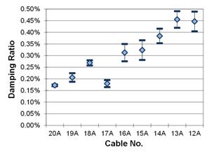
Figure 30. Graph. Second mode, 90 percent confidence interval on the mean, fan A.
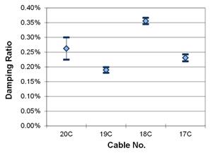
Figure 31. Graph. Second mode, 90 percent confidence interval on the mean, fan C.
Table 2 . Phase 1 summary of results data.
Cable Number |
First Mode |
Second Mode |
||||
|---|---|---|---|---|---|---|
Average Damping Ratio (percent) |
Correlation |
Average Length of Time |
Average Damping Ratio (percent) |
Correlation |
Average Length of Time |
|
20A |
0.242 |
0.9949 |
160.7 |
0.172 |
0.9919 |
101.4 |
19A |
0.205 |
0.9933 |
160.0 |
0.206 |
0.9852 |
95.0 |
18A |
0.292 |
0.9967 |
144.5 |
0.269 |
0.9949 |
92.8 |
17A |
0.118 |
0.9535 |
140.0 |
0.179 |
0.9905 |
102.7 |
16A |
0.235 |
0.9954 |
141.8 |
0.313 |
0.9902 |
64.3 |
15A |
0.188 |
0.9968 |
197.9 |
0.323 |
0.9925 |
72.5 |
14A |
0.252 |
0.9964 |
155.4 |
0.384 |
0.9973 |
54.2 |
13A |
0.389 |
0.9976 |
52.9 |
0.455 |
0.9929 |
29.2 |
12A |
0.378 |
0.9871 |
57.5 |
0.447 |
0.9872 |
26.9 |
20C |
0.151 |
0.9968 |
213.8 |
0.262 |
0.9949 |
57.7 |
19C |
0.135 |
0.9965 |
256.5 |
0.190 |
0.9940 |
116.0 |
18C |
0.104 |
0.9949 |
223.0 |
0.356 |
0.9989 |
62.0 |
17C |
0.137 |
0.9989 |
180.0 |
0.231 |
0.9952 |
135.0 |
The frequency trends obtained from the power spectral densities generally matched what would be expected. The fundamental frequencies from the cables located in fan A increased as the length of the cable decreased. The four cables tested in fan C have lower fundamental frequencies than the longest cable in fan A, which is reasonable since all four of those cables are longer than their numerical counterpart in fan A. The cables located in the inside fans support a longer portion of the bridge deck than those located in the outside fans. Cables 20C to 17C range from 594 ft (181.1 m) to 522 ft (159.0 m), while cables 20A to 12A range from 516 ft (157.3 m) to 343 ft (104.7 m). First mode frequencies obtained from testing are presented in figure 32.
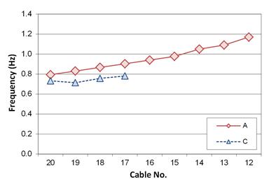
Figure 32. Graph. First mode frequencies from phase 1 testing.
Frequencies measured between the two accelerometers were usually in agreement, although they would occasionally vary by up to 6 percent. Similarly, the frequency measurements among the various runs for each cable were mainly consistent, with the maximum difference for any mode frequency for a cable in the range of 2 to 7 percent. Although the baseline runs did not have the energy necessary to produce a thorough power density spectrum, the ambient vibrations provided enough energy to mark the frequencies of at least the first two modes. These frequencies were always in line with those captured from the manual excitation runs.
The data from most cables produced clear power spectrum densities, allowing the recording of the first seven harmonic frequencies in at least one of the experimental runs, although cable 12A was one exception during the testing. Due to high winds in the 15 to 20 mi/h (24 to 32 km/h) range and its relatively short length, this cable was difficult to manually excite and the result was an extremely weak spectral density. The frequencies of the first two modes were visible, but the rest of the density produced no legible peaks. Fortunately, this cable was the only one that experienced this issue.
The damping ratios calculated for the cable-stays experienced both a wide range of values and consistency. A handful of cables had very narrow confidence interval bands indicating extremely consistent decay in their time series. Other cables did not contain equally uniform data, so their confidence bands stretched up to seven times wider. Additionally, the confidence intervals for the second mode were generally wider as their correlation tended to be worse compared to the first mode.
It is difficult to determine if the average damping values fall into any set pattern as the cable length decreased. It appears that there could be a weak linear trend connecting the damping ratio to the cable length, which is slightly more apparent for the second mode vibrations than the first. A slight negative trend indicates that the damping ratio is increasing as the cable length decreases. There are several possible factors that are hampering the ideal conditions necessary for a stronger trend to develop, including different cable diameters and masses, physical interactions between the steel strands and HDPE piping shell, and possible effects of the wind and aerodynamic damping. These factors introduce many complicated variables that could prevent theoretical values from being developed.
These complex factors may also be introducing some non-linearity to the cable vibrations. There were several measured instances where the damping ratio appeared to vary over the time of the decay, usually decreasing with time and often in a partial sinusoidal curve. In addition to the methodology described in the previous chapter to obtain the average damping ratio, alternative methods were tested in an attempt to discover an optimum way to calculate damping. The methods involved looking at the decay signal in smaller increments, averaging out the damping ratio in blocks of 10, 20, and 30 s, all the way up to half the signal length. For some of the tests, the increments overlapped, creating essentially a smoothing filter for the average damping across the data series.
When the damping ratio was averaged over these smaller intervals it became quite apparent that the ratio was not remaining steady over time. Figure 33 is an example of how the damping ratio for cable 19A, averaged in 20 and 80 s blocks, varies over time. The general trend is from higher damping to lower damping, which was true for all cables that were tested using these alternate methods. It seems that when the cable is vibrating at large amplitudes, the energy is dissipated at an unexpectedly higher rate. This could be due to the non-linear physical interactions between the steel strands and the HDPE outer piping shell.
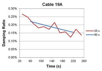
Figure 33. Graph. Cable damping varying when averaged over short intervals.
Despite the apparent existence of some non-linear trends, the damping ratio can still be estimated as an average throughout the entire decay, if properties are chosen consistently throughout the analysis. The best-fit lines from which the damping averages were originally obtained still had extremely high correlation to the actual values from the peaks of the decay curve. With the inclusion of the 90 percent confidence intervals derived from the Student-t test performed on the data, accurate comparisons can be made to vibration data obtained after the installation of dampers and other cable vibration mitigation techniques to rate their effectiveness.
Another widely used mass-damping parameter indicating the level of cable damping with respect to vibration mitigation is the Scruton number, defined by:
![]()
Figure 34. Equation. Scruton number.
where ζ = first-mode damping ratio, m = mass density per unit length of cable, ρ = mass density of air, and D = diameter of the cable pipe.(6) The Scruton number is frequently used in developing a criterion for controlling rain/wind-induced vibration of stay cables. For instance, based on Irwin's suggestion, the Post-Tensioning Institute committee on cable stayed bridges has suggested that rain/wind vibrations of stay cables can be avoided if the Scruton number is kept at a value of ten or higher.(7,8) Additionally, a reduced Scruton number of five has been suggested if the cable has an aerodynamic surface treatment.(9)
Plugging the measured damping values presented above in table 2 and the corresponding cable properties (found in appendix G) into the equation in figure 34 returns the following Scruton numbers, as shown in table 3. The Scruton numbers range from 0.6 to 2.1, far below the desired value of ten, indicating that the cable system under consideration was potentially vulnerable to rain/wind-induced (and perhaps wind-induced) vibrations. This would still be the case if a reduced Scruton number was used to account for the aerodynamic surface treatment. Based on these results, it is confirmed that an appropriate vibration mitigation measure, such as external viscous dampers, had to be incorporated into the cable system.
Table 3 . Phase 1 Scruton number.
Cable Number |
Scruton Number |
|---|---|
20A |
1.3 |
19A |
1.1 |
18A |
1.6 |
17A |
0.6 |
16A |
1.3 |
15A |
1.0 |
14A |
1.4 |
13A |
2.1 |
12A |
2.0 |
20C |
0.8 |
19C |
0.8 |
18C |
0.6 |
17C |
0.7 |
An investigation was also initiated into the effects of aerodynamic damping on the cable vibrations. If it is assumed that the average damping measured from the regression line is essentially a total damping, comprised of both aerodynamic and structural damping, then the aerodynamic damping can be subtracted out, leaving only the structural damping of the cable-stay. Wind speed and direction data were recorded along with the accelerometer data and were entered into Macdonald's formula for finding the equivalent wind speed normal to the cable axis for in-plane vibrations.(10)
![]()
Figure 35. Equation. Equivalent wind speed.
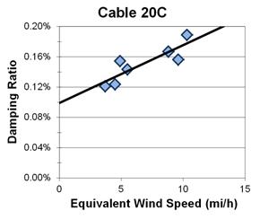
In this formula, θ is the reference wind direction normal to the vertical plane of the cable, β is the angle the cable is inclined from the horizontal, and U is the wind speed regardless of direction. For ease of calculation, both θ and U are averaged across the duration of the decay history. The equivalent wind speed is essentially a normalized value that can be directly compared between the various runs, despite the actual direction the wind is facing. Therefore, a plot can be constructed of average damping values versus equivalent wind speed. When the equivalent wind speed is zero, there is no aerodynamic damping acting on the cable, so a regression line through the data set can be traced to zero to determine the structural damping. Figure 36 is an example of this concept taken from cable 20C.
1 mi/h = 1.61 km/h
Figure 36. Graph. Damping ratio versus equivalent wind speed for cable 20C.
Plots were created for each cable, but it became readily apparent that there were several limiting factors to this approach. The biggest issue was sample size. Most cables did not have enough runs to create a regression line capable of being statistically significant. This was especially true for the cables exposed to the largest winds, which happened towards the end of the testing. Another issue was that winds were relatively calm during the first three days of testing, with average wind speeds remaining below 2 mi/h (3.2 km/h). To create an accurate plot of the aerodynamic damping, there needs to be a wider range of wind speeds during the tests. Despite these issues, the plots showed some potential for the possibility of calculating the aerodynamic damping, and being able to separate it from the structural damping of the cable-stay. Future tests require a larger sample size for significance purposes and if possible, a much wider range of wind speeds and directions.