U.S. Department of Transportation
Federal Highway Administration
1200 New Jersey Avenue, SE
Washington, DC 20590
202-366-4000
Federal Highway Administration Research and Technology
Coordinating, Developing, and Delivering Highway Transportation Innovations
 |
| This report is an archived publication and may contain dated technical, contact, and link information |
|
Publication Number: FHWA-RD-03-065
Date: September 2004 |
||||||||||||||||||||||||||||||||||||||||||||||||||||||||||||||||||
In-Vehicle Display Icons and Other Information Elements: Volume IPDF Version (8.33 MB)
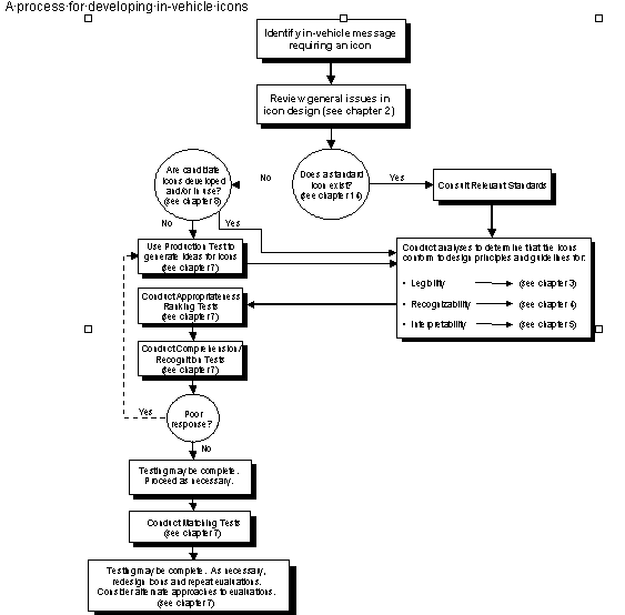
PDF files can be viewed with the Acrobat® Reader® CHAPTER 2: GENERAL ISSUES IN ICON DESIGNGENERAL DEVELOPMENT PROCESS FOR IN-VEHICLE ICONSIntroduction: Reference 1 provides a literature review of icon design principles and design practices and concludes that a chief problem in the development of most icons is the lack of a systematic, rigorous design process. Reference 2 (from ISO TC 145/SCI DIS 7001) provides a procedure for the development of public information symbols that can be useful for developing in-vehicle icons. The design guidelines below have been adapted from this procedure.
Discussion: The icon development process outlined on the previous page provides a framework for icon design that has been organized and used by ISO and is consistent with good design and evaluation practices. The empirical portions of the guideline have been suggested in a number of data sources (e.g., references 2 and 3), while the analytical aspects are consistent with a number of comprehensive sources in the icon development domain (e.g., references 4 and 5). Evaluating icons refers to the process of determining that an icon, or a set of integrated icons, meets specific criteria in areas such as legibility, recognition, interpretation, and driver preferences. Developing useful and effective icons requires evaluation. A rigorous and iterative evaluation phase in icon design increases the likelihood that the implementation of the icon in the in-vehicle environment will improve driving and system performance and not degrade driver safety. General design principles for the design of in-vehicle icons provide important information that will increase the effectiveness and utility of icons. However, they represent only a necessary first step, and cannot take the place of empirically assessing the utility of a particular icon. In particular, such principles cannot always consider issues such as the driving context, different user groups of icons, or driver workload in selecting icons. That is, using general design principles alone cannot assess "specific effectiveness with the potential user group" (reference 6). Without research, icon development becomes little more than an intuitive approximation of what constitutes a good design, and lacks the confidence that can be obtained by empirical validation. Design Issues: The development process for in-vehicle icons should reflect the specific needs, goals, and constraints associated with individual design efforts. Thus, individual icon design efforts may require additional tests, design criteria, or consideration of other development issues. Cross References: Chapter 3: Icon Legibility; Chapter 4: Icon Recognition; Chapter 5: Icon Interpretation; Chapter 6: The Auditory Presentation of In-Vehicle Information; Chapter 7: Evaluating In-Vehicle Icons; Chapter 8: Icon Collection References:
WHEN TO USE ICONSIntroduction: This section considers the criteria and issues that should be considered when determining whether an icon is the appropriate display element to use for an in-vehicle message. Determining when to use an icon is an extremely important design decision. In many instances, the use of an icon, instead of text, may be preferable. The design guideline lists several instances for which this may be true.
Figure 2-2. Examples of the Appropriate Use of Icons Discussion: Well-designed symbols are generally recognized more accurately and quickly than similarly worded signs (reference 1). Research performed in reference 2 compared subjects' ability to interpret the meaning of symbol and word highway signs. Subjects were asked to match a text sign to one of nine symbol signs they were shown on a following film segment. The results of this research showed that, overall, people were able to more accurately match symbol signs than they were word signs. Also, 65 percent of the subjects reported that the symbol signs were easier to match. Reference 3 found similar results. The researchers investigated subjects' ability to correctly identify word and symbol signs and found that they were able to more accurately identify the symbol signs. Reference 4 gives three reasons for this: (1) icons are more visually distinct than words; (2) visual symbols have names that we remember along with them, thus they are stored as both visual and verbal memories whereas text labels are stored only verbally; and (3) visual images are stored in memory in several forms and are tightly linked to one another and to other forms. Another reason to use icons is that they can be presented in a much more spatially condensed form (references 5, 6, and 7) than can most text-based messages. This is especially important to consider when designing in-vehicle displays where the amount of room available is extremely limited. Road signs also have a limited amount of space for presenting information, and must take advantage of the fact that more information can be presented to the driver via icons and symbols than can be presented textually. Research in this domain has shown that symbols can be recognized more rapidly and are legible at greater distances than information presented in other formats (references 8 and 9). Design Issues: Research has shown that while well designed symbols perform better than text (reference 1), poorly designed symbols do not (reference 5). Care should be taken to ensure that the symbols used are effective and that comprehension levels are high. Therefore, extensive testing should be done (such as that described in chapter 7 of this document) on every newly developed symbol, and even on some of those already in existence, when comprehension levels do not meet the ISO standard of 66 percent (reference 10). Cross References: Ways to Use Icons, p. 2-6 References:
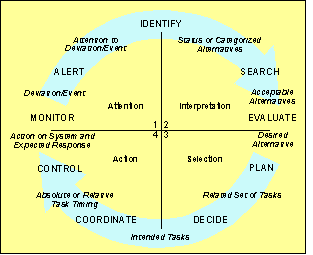
WAYS TO USE ICONSIntroduction: Icons may be used in a wide variety of ways to facilitate interaction with an in-vehicle information system (IVIS). Icons may alert drivers and guide their attention to a deviation or event. They can identify system status or acceptable alternatives, or support comparisons for selecting among alternatives. In addition, icons can help drivers take appropriate actions when used to label controls. Each of these general information processing functions has different icon-design requirements.
Discussion: The information processing perspective has long provided a useful tool to describe human-machine coordination (references 1, 2, and 3). Developed to describe human interaction with complex systems, Rasmussen's decision ladder provides one of the more detailed accounts of human-machine information processing. The decision ladder breaks the decision process into eight elements that describe the mental activities that link environmental cues to actions. More recently, reference 4 adapted Rasmussen's decision ladder and Miller's (references 5 and 6) information processing taxonomy to describe driver interaction with Advanced Traveler Information System (ATIS) devices. This description helped identify the driver limits and capabilities that are relevant for particular ATIS functions. This revised decision cycle consists of four quadrants, discussed on the previous page. IVIS messages may span more than one information processing element or quadrant of the figure, but these distinctions providean initial guide for investing icon development resources. Design Issues: The design requirements of an icon depend on the information processing it is meant to support. IVIS messages associated with "Attention" require an icon that can attract attention and direct it to the event of concern. Design issues include the size and placement of the icon, as well as the use of flashing and auditory cues to attract attention. IVIS messages associated with "Interpretation" require icons that can be easily linked to the potentially complex messages they seek to convey. Design issues include the use of text labels to avoid ambiguity and the need to use icons that are familiar to many people. IVIS messages associated with "Selection" require that icons enable drivers to clearly understand various options and alternate plans. Design issues include grouping icons so that differences can be easily seen and compared. IVIS messages associated with "Action" should indicate available options and indicate the consequences of pressing a button or selecting a menu option. Design issues include the need to convey the effect of an action or the sequence of activities that will result from enacting a system function. The figure on the previous page summarizes the four information processing functions and the associated design guidelines. Cross References: When to Use Icons, p. 2-4; Flash Rate, p. 4-8; Chapter 5: Icon Interpretation; Augmenting Icons with Auditory Information, p. 6-2 References:
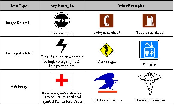
TYPES OF VISUAL ICONSIntroduction: "Types of icons" refers to the classification of a particular icon based upon its resemblance to the message or referent. An icon can be classified three ways: image-related, concept-related, or arbitrary.
These three icon types have important and different implications for icon development and design.
Figure 2-4. Types of Icons Discussion: Icons are visual representations or images used to symbolize an object, action, or concept. Several authors have classified icons into three different types: image-related (pictorial), concept-related (analogical), and arbitrary (see references 1 through 5). Image-related icons are highly pictorial representations of the object or act they represent. For these types of icons, meaning can be derived directly from the icon itself. For example, a seat belt icon usually appears whenever the ignition is started in a vehicle. This simply alerts drivers to the fact that they should be wearing their seat belt. This type of icon refers directly to the object it resembles and is therefore the easiest for people to remember and takes almost no effort to learn. Concept-related icons are based on an example or a property of a real object or action. In most instances, the meaning of these types of icons will change depending upon the context that it is presented in. For instance, a lightning bolt symbol that is shown on a camera usually represents the flash function. However, when the lightening bolt symbol is seen in a different context, perhaps while touring an electrical plant, it might be indicating a high voltage area. Because the meaning of these icons changes depending on the context they are viewed under, they are slightly more difficult for people to learn. Arbitrary icons do not resemble the object or action they represent, but become meaningful only through convention and education. A good example of an arbitrary icon is the Red Cross symbol, which generally refers to the concept of emergency first aid. To someone from another culture, however, it may have an entirely different meaning or it may have no meaning at all. For example, if you are not aware of this symbol's link to medicine or emergency first aid, you may simply see it as a symbol for addition or perhaps as a religious cross. However, if you are aware of this link, you may recognize it as the international symbol for the Red Cross. Therefore, it is necessary, in most cases, to have a particular knowledge base before being able to derive the correct meaning from these types of icons. This makes them the most difficult for people to learn and to remember. Design Issues: These distinctions among icon types are important because they allow us to make predictions about an icon's interpretation and overall utility. Interpretation of an image-related icon may be high if the icon is a clear, straightforward representation of the message it represents. Interpretation of context-related icons may be high if the user understands the situation and condition associated with presentation of the icon. Interpretation of arbitrary icons requires both context and knowledge, yet they are very powerful and flexible. Cross References: Ways to Use Icons, p. 2-6 References:
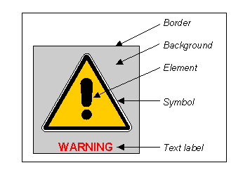
COMPOSITION OF AN ICONIntroduction: An icon comprises several parts. These components work together to increase the likelihood that users will understand the icon
Figure 2-5 Key Components of an Icon Discussion: Reference 1 has provided an overview of key parts of icons. Borders show the extent of an icon (i.e., where it begins and where it ends). This can be important to interactive systems that use icons as control buttons. In such instances, a border might help the user determine exactly where to click or point to select an icon. They also make icons appear orderly, consistent, and uniform. Borders can help clarify an icon's meaning if it resembles a familiar object (i.e., a book or an engine symbol). However, there are some drawbacks associated with using borders. They can make icons less distinctive, compete with the image, and limit the size of the image that can be used (see reference 2). The use of a background is not always seen as being an important part of icon design. However, when used appropriately, backgrounds can help emphasize the image, group or classify icons, or show the state of an icon. Shapes are also important for icon design because they can convey meaning. This is particularly true of traffic signs. According to the Manual on Uniform Traffic Control Devices (MUTCD), "STOP" signs are octagonal in shape; "YIELD" signs are equilateral triangles pointing downward; other regulatory signs are rectangular in shape with the longer dimension vertical; and warning signs are generally diamond-shaped. Having certain shapes designated for specific types of signs can help reduce both recognition and response times (references 3, 4). Design Issues: Reference 1 suggests that presenting text labels in addition to an icon is a good idea when the icon is not obvious or if it is being presented for the first time. Research has shown that presenting the two together can increase comprehension and therefore overall effectiveness. For example, in reference 5, a study compared people's ability to navigate through a database using either pictorial icons, text labels, or a combination of the two. The results showed that subjects were able to reach the target object much quicker and with fewer steps in the icon plus text condition. Another study (reference 6) found similar results when it examined the role of graphics in the selection of items from a menu. Specifically, the study found that text plus graphics greatly reduced the number of errors in the selection of the correct item. Cross References: Level of Detail, p. 4-4; Perceptual Principles of Icon Design, p. 4-6; Design of Prohibition Symbols, p. 4-10; Enhancing Icon Interpretation with Text Labels, p. 5-2; Identifying Icons as Part of a Group, p. 5-8; Conveying System Status with Icons, p. 5-10 References:
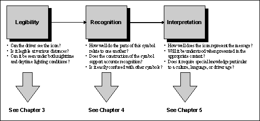
SEQUENCE OF ICON COMPREHENSIONComprehension refers to the perceptual and cognitive process by which users interpret the meaning of an icon. As discussed in reference 1, three stages appear to be associated with icon comprehension and use: legibility, recognition, and interpretation. Legibility reflects the relationships among the driver, the icon, and the environment; it is essential for the initial perception of the icon and includes parameters such as luminance uniformity, contrast, and icon size. Recognition reflects the relationships among the driver, the icon, and the other icons or visual display elements; it includes parameters such as whether or not the driver can identify the icon, especially in the context of the symbols and icons. Interpretation reflects the relationships among the driver, the icon, and the referent or message associated with the icon; it includes parameters such as whether the driver comprehends the meaning, intent, or purpose of the icon.
Figure 2-6. Sequence of Icon Comprehension and Use Discussion: Developing effective icons and symbols requires a conceptual approach that applies a theoretical understanding of driver perception and performance (reference 2). Past research has demonstrated that if they are designed appropriately, visual symbols and icons can be a very effective way to communicate information to the driver. Less definitive information is available on how to design effective icons and symbols. As shown in the graphic on the previous page, there seem to be three stages associated with icon comprehension and use. The first stage, legibility, reflects the relationship between the driver, the icon, and the environment. It includes basic issues such as whether or not the driver can see the icon, given the normal range of lighting and viewing conditions associated with driving. Legibility will depend on icon design issues such as luminance uniformity, contrast, icon size, text labels, and the effective use of color. The second stage, recognition, reflects the relationship between the driver, the icon, and other icons or visual display elements. It includes issues such as whether the driver can identify the icon, especially in the context of other symbols and icons. For example, the standard icon for fuel depicts a gas pump. Accurate recognition of this icon would mean that the driver recognizes it as a gas pump. Recognition will depend on design issues such as level of realism, level of detail, perceptual principles of icon design, and flash rate. The third stage, interpretation, reflects the relationship between the driver, the icon, and the referent or message associated with the icon. It includes issues such as whether the driver comprehends the meaning, intent, or purpose of the icon. For example, using the "gas pump" icon described above as an example, successful interpretation would mean that the driver understands what the icon's message is-the vehicle is low on fuel. Interpretation will depend on design issues such as the use of text labels, conveying the effect of actions with icons, identifying icons as part of a group, conveying system status with icons, the use of color in icons, and conveying urgency with icons. Design Issues: After periods of exposure and use, drivers can learn to recognize virtually any icon; even ones that bear little relationship to their associated message. Thus, while even "bad" icons can eventually be effective, they may promote errors, require training, or involve extensive trial-and-error learning. Cross References: Chapter 3: Icon Legibility; Chapter 4: Icon Recognition; Chapter 5: Icon Interpretation References:
|
||||||||||||||||||||||||||||||||||||||||||||||||||||||||||||||||||