U.S. Department of Transportation
Federal Highway Administration
1200 New Jersey Avenue, SE
Washington, DC 20590
202-366-4000
Federal Highway Administration Research and Technology
Coordinating, Developing, and Delivering Highway Transportation Innovations
 |
| This report is an archived publication and may contain dated technical, contact, and link information |
|
Publication Number: FHWA-RD-03-065
Date: September 2004 |
|||||||||||||||||||||||||||||||||||||||||||||||
In-Vehicle Display Icons and Other Information Elements: Volume IPDF Version (8.33 MB)
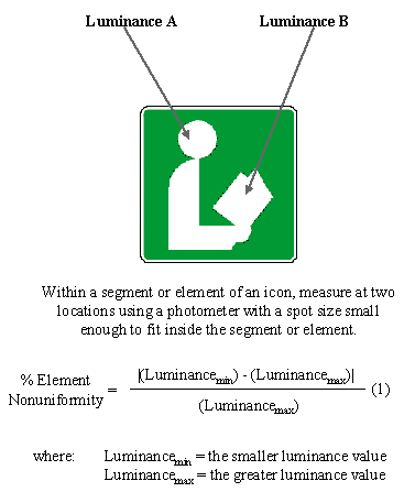
PDF files can be viewed with the Acrobat® Reader® Chapter 3: ICON LEGIBILITYDETERMINING THE APPROPRIATE LUMINANCE UNIFORMITY WITHIN AN ICONIntroduction: Luminance uniformity refers to the consistency of luminance values across an icon. Moderate nonuniformities in luminance may only lead to the driver's perception that the display is of poor quality. With great nonuniformities in luminance, however, there may not be sufficient luminance and contrast to ensure adequate legibility in certain areas of the display.
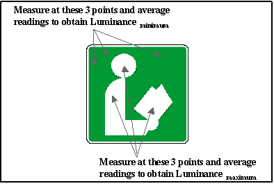
Figure 3-1. Measuring Luminance Nonuniformity (1) Discussion: Threshold Luminance Discrimination Data. Although observers in reference 1 could discriminate lights that differed in luminance by as little as 10 percent, these data were obtained when they were trying to detect a luminance difference between a background and a target under ideal laboratory conditions (also see reference 2). Thus, 10 percent represents a threshold luminance discrimination value and is far too conservative for IVIS use, in which the issue of concern is the driver's ability to notice luminance differences under normal driving or normal viewing conditions. Tolerance for Luminance Variations. Reference 3 indicates that luminance in cathode ray tubes (CRTs) typically varies by as much as 37 percent and is either not noticed or is considered to be acceptable by observers. Reference 4 recommends that luminance variations remain below 50 percent. Reference 5 indicates that while the preferred limit for luminance variation across optical projection displays is 33 percent, an unacceptable limit is 66 percent. Conclusions. The design guidelines reflect a composite of the information provided by references 3, 4, and 5. Specifically, luminance differences up to 37 percent are not always noticed by observers, and 33 percent represents a preferred limit, therefore 33 percent seems to be an acceptable limit for small-area luminance nonuniformities (i.e., within an individual element or segment). Both 50 percent and 66 percent have been suggested as absolute upper limits on luminance nonuniformities. Design Issues: Luminance nonuniformities are generally caused by the display itself. In vacuum fluorescent displays (VFDs) being viewed directly, for example, these might be caused by poor phosphor distribution on the inside of the anodes, or by fluctuations in the power supply output. Cross References: Determining the Appropriate Contrast within an Icon, p. 3-4 References:
DETERMINING THE APPROPRIATE CONTRAST WITHIN AN ICONIntroduction: Contrast refers to the relationship between the luminance of a symbol and the luminance of its background. Contrast requirements have not been empirically studied under a wide range of representative driving situations and conditions, thus few empirical data can be directly used to specify design guidelines.
The figure below may be used to aid contrast measurements.
Discussion: Contrast requirements can vary greatly as a function of display medium (e.g., electronic display vs. hardcopy), viewing environment (e.g., low vs. high glare), and user characteristics (e.g., young vs. older drivers). Most human factors reference sources that provide contrast recommendations do not address the effects of these and other variables on contrast requirements. Reference 1 describes a series of studies investigating the legibility of displays, and concludes that contrast ratios of 10:1 to 18:1 are required for visual display terminal (VDT) displays. Reference 2 indicates that a contrast ratio of 10:1 has become "a generally accepted industrial standard for display design." Reference 3 suggests that a contrast ratio of 7:1 is preferred, but that 3:1 is required; the guidelines given here reflect the recommendations in reference 3. However, other data sources suggest that far less contrast may be adequate. Daytime. An ambient background luminance of 2500 foot lamberts (fLs) is considered to be a representative "worst case" background luminance for daytime driving. Reference 4 indicates that symbol contrast of 1.2:1 is sufficient for young military pilots. In reference 5, contrast requirements for both younger and older subjects were investigated under laboratory conditions. The data from reference 5 indicate that 1.4:1 contrast may be sufficient for older drivers under those conditions. Nighttime. In reference 6, contrast requirements for both younger and older subjects were investigated under low luminance laboratory conditions. The data obtained in reference 6 indicated that 2:1 contrast is required for older drivers under low luminance conditions; in this study, adequate legibility was not obtained at contrast levels below 2:1 (i.e., 1.25:1). Design Issues: The contrast ratios provided above will lead to adequate legibility as long as other design parameters, such as icon size and luminance, are sufficient. Older drivers generally have poorer visual acuity than do younger drivers. Thus, the design guidelines specified above assume that, all other factors being equal, design objectives for contrast that meet the legibility needs of older drivers will always meet the legibility needs of younger drivers. Cross References: Determining the Appropriate Luminance Uniformity within an Icon, p. 3-2; Determining the Appropriate Size of Icon Components, p. 3-6 References:
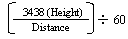
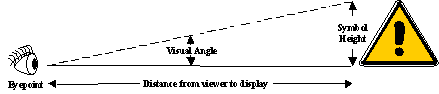
DETERMINING THE APPROPRIATE SIZE OF ICON COMPONENTSIntroduction: Size of icon components refers to the visual angle subtended (at the driver's eye) in minutes of arc, by either the symbol or the text that comprises an icon. Determining the adequate size for a legible icon is extremely important as the amount of space available for advanced in-vehicle display icons and other information elements is very limited.
Table 3-1. Determing the Appropriate Size of Icon Components
where: Symbol Height = the Height of the symbology Distance = distance from viewer's eyepoint to the display Visual Angle = angle in degrees Height and Distance use the same unit of measure Figure 3-3. Relationship Between Viewing Distance, Symbol Height, and Visual Angle Discussion: The design guidelines for symbol size are consistent with the recommendations made by reference 1, which were based on a variety of research related to detection and resolution thresholds. The maximum visual angle suggested (85 arcminutes) is aimed at ensuring conspicuity, while the minimum visual angle (41 arcminutes) simply ensures legibility. It is important to note that the recommendations made in reference 1, and therefore the guidelines on the previous page, are based on the assumption that the symbol will not be placed outside a 15-degree angular displacement from the central line of the normal direction of user's vision. Design guidelines regarding the size of text labels is supported by reference 2, which recommends an optimum character height of 24 arcminutes of visual angle. In addition, references 3, 4, and 5 investigated symbology height requirements as a function of various levels of contrast and luminance. Considered as a whole, the empirical data from these studies indicate that: (1) critical symbology should subtend at least 20 arcminutes; (2) legibility begins to decrease at less than about 18 arcminutes; and (3) designers should avoid using symbology that subtends less than 16 arcminutes. Given the consistent and static nature of text labels for icons, the minimum visual angle of text labels (16 arcminutes) reflects these recommendations. Reference 6 indicates that the minimum size of graphical symbols is 1/100th their viewing distance, which corresponds to 0.57 degrees visual angle. Icons presented using a dot-matrix display technology (e.g., CRT or LCD) are typically 16x16 or 32x32 pixels in size (reference 7). Also, reference 8 notes that selecting an appropriate size for an icon depends on the input device used within the system. For example, icons that will be selected using a mouse or a track ball should be at least 20x20 pixels, and icons that will be selected using a stylus or a pen should be at least 15x15 pixels. Design Issues: Older drivers generally have poorer visual acuity than do younger drivers. Thus, the design guidelines specified above assume that, all other factors being equal, design objectives for symbol height that meet the legibility needs of older drivers will always meet the legibility needs of younger drivers. Cross References: Determining the Appropriate Contrast within an Icon, p. 3-4; Designing Effective Text Labels, p. 3-8 References:
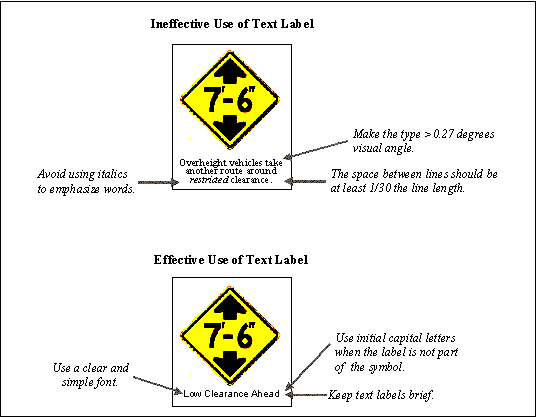
DESIGNING EFFECTIVE TEXT LABELSIntroduction: Text labels refer to words or phrases, as well as all other numerical and character symbols, provided as part of an icon that act to define or clarify its meaning.
Figure 3-4. Schematic Examples of Text Labels Discussion: Reference 1 studied the effect of character width and spacing on type legibility of warning labels. Pairwise comparisons were performed for every width and spacing combination. Results indicated that a reduction in character width had a more detrimental effect on legibility than inter-character separation. In addition, the study suggested that as character size increases, spacing may be decreased without a loss in readability. Reference 2 suggests that presenting text labels in addition to an icon is beneficial when the icon is not obvious or if it is being presented for the first time. This reference provides several suggestions for successfully using text labels (see the "Design Guidelines" on the previous page). Research indicates that presenting an icon and a text label can increase comprehension and therefore overall effectiveness. For example, a study comparing people's ability to navigate through a database using either pictorial icons, text labels, or a combination of the two discovered that subjects were able to reach the target much more quickly and with fewer steps in the icon-text combination condition (reference 3). Another study found similar results when examining the role of graphics in the selection of items from a menu. Specifically, the study found that text plus graphics greatly reduced the number of errors in selecting the desired item (see reference 4). Design Issues: The use of text labels in icon design can lead to problems, however. First, text labels should be brief, containing no more than two or three words. However, not all icon concepts are amenable to such a succinct label. If not carefully chosen, a text label may mislead the user and reduce comprehension. Second, text labels reduce the universal nature of icons, as they necessarily reflect a specific language and/or culture. Third, text labels require additional display space. Such space might be better used to increase the size and understandability of the icon. Older drivers generally have poorer visual acuity than do younger drivers. Thus, the design guidelines specified above assume that, all other factors being equal, design objectives for icon text that meet the legibility needs of older drivers will always meet the legibility needs of younger drivers. Cross References: Composition of an Icon, p. 2-10; Determining the Appropriate Size of Icon Components, p. 3-6; Enhancing Icon Interpretation with Text Labels, p. 5-2; Composition of Text Labels, p.5-4 References:
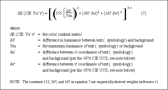
THE EFFECTS OF COLOR ON ICON LEGIBILITYIntroduction: Our perception of color is derived from variations in the wavelength or spectral composition of light. Color perception can be described in terms of three psychological dimensions: hue, saturation, and brightness. Hue is related to the dominant wavelength of the stimulus; saturation is somewhat more loosely related to the spectral bandwidth of the stimulus; and brightness is related to the luminance of the stimulus.
Figure 3-5. Equation for Determining Color Contrast NOTE: Reynolds 1 states, "The discriminability of pairs of colors depends on their differences in chrominance and luminance. While an entirely satisfactory metric does not exist which combines these attributes into a single assessment of total color difference, an estimate can be derived by calculating the weighted difference between the locations of the colors in the 1976 Commission International de l'Eclairage Uniform Chromaticity-Scale (CIE UCS L*u*v*)." Discussion: Despite well-established differences in visual sensitivity as a function of color (wavelength), there is no consistent, empirical evidence that color has a meaningful effect on legibility (references 1, 2, and 3), and, in principle, any reasonably visible color may be used as long as recommendations for symbol height and contrast are adhered to. It is recommended that a highly saturated blue be avoided because the central fovea is relatively insensitive to highly saturated blue (references 4 and 5); highly saturated blue has also been associated with "disruptions in accommodation" (reference 6) .Reference 4 has provided a metric for determining symbol colors to maximize legibility for symbols of relatively high luminance. This metric, E (CIE Yu'v'), which is shown in the figure, is derived from the 1976 CIE UCS color diagram (CIE UCS). Although the metric does not combine the different attributes of color into a single assessment of total color difference, it provides a useful estimate of color contrast. Reference 4 indicates that for legibility of colored symbols on a colored background (with relatively high luminance conditions), the colors should differ by a minimum of 100 E (CIE Yu'v') distances. If the formula is applied to figures and backgrounds that differ negligibly in u' and v', this value corresponds to approximately 80 percent luminance contrast, which is rather high in comparison with traditional contrast recommendations. Design Issues: Although E (CIE Yu'v') provides a seemingly adequate measure of color contrast, it is clear that much more research is needed in this area before specific recommendations regarding color contrast can be made for automotive applications. Reference 7 notes that different experimental tasks as well as different response measures need to be investigated. Color contrast is a sufficiently difficult concept when applied to fixed-color, fixed-background displays; it becomes more complex when applied to displays such as automotive head-up displays (HUDs). With HUDs, the background for the symbology is dynamic and can be almost any color; background luminance can range from a fraction of a fL to 6,000 or more fLs, depending on conditions. In addition, the symbology is translucent, which means that both the background color and luminance combine with the symbology's color and luminance in an additive fashion. Color contrast, therefore, is not a very meaningful parameter when applied to HUDs. It should be noted that, while color may have very little effect on icon legibility, it is extremely important for successful icon interpretation. Effective uses of color can help a driver to group information, code information, attract their attention more quickly, and facilitate interpretation via the use of population stereotypes. These issues and more are discussed in chapter 5. Cross References: Enhancing Icon Interpretation with Color, p. 5-12 References:
|
|||||||||||||||||||||||||||||||||||||||||||||||