U.S. Department of Transportation
Federal Highway Administration
1200 New Jersey Avenue, SE
Washington, DC 20590
202-366-4000
Federal Highway Administration Research and Technology
Coordinating, Developing, and Delivering Highway Transportation Innovations
| REPORT |
| This report is an archived publication and may contain dated technical, contact, and link information |
|
| Publication Number: FHWA-HRT-13-048 Date: October 2013 |
Publication Number: FHWA-HRT-13-048 Date: October 2013 |
The objective of task 7 was to use the experiment protocol developed in task 6 to collect empirical data on driver performance given various complex interchange signage and marking alternatives. The basic approach involved using a brief questionnaire to collect driver responses about lane preference or understanding lane movements in different interchange driving scenarios. The approach was similar to ones applied in previous studies and involved presenting slides of different interchange navigation scenarios and collecting driver responses about their interpretation of guide signs or how they would navigate the interchange scenario.(2)
These activities were coordinated with the driving simulator study conducted by TTI as part of a parallel project.(6) In particular, the identification of research topics was conducted jointly between a contractor and TTI, and the selection of specific research questions was also coordinated. For several of the topics presented in this section, similar scenarios were examined in both projects to obtain complementary data (i.e., driver performance measurements when following particular signs in the TTI simulator and driver interpretation/understanding of those same signs in task 7).
The general approach used in task 7 involved holding group data collection sessions to obtain driver lane preference responses and their interpretations of guide signs. A Microsoft PowerPoint® presentation showed static photographs of freeway backgrounds with overlaid fabricated interchange signs (similar to the method used by Chrysler et al.).(2) The participants were then asked specific questions about elements of the signs, lane selection, and lane permissions in relation to what was shown on the slide. They used response booklets to mark their answers.
This chapter contains the following three technical sections:
This section describes the methods used to conduct and analyze the data collected during task 7.
Demographics
A total of 183 licensed male and female drivers participated in the group data collection sessions (84 males and 99 females). The ages of participants ranged from 18 to 76 years old (median age = 44.0 years and SD = 15.2 years), and they reported living in an urban area for an average of 30.9 years (range = 1-66 years and SD = 17.3 years). Participants reported having their licenses for an average of 26.4 years (range = 1-50 years and SD = 15.3 years) and driving an average of 15.2 hours per week (range = 1-150 h and SD = 16.4 h). Most participants (161) reported driving through major interchanges similar to those presented to them weekly, daily, or multiple times per day, while the remaining participants (22) reported driving through major interchanges only about once per year or once per month. Some participants (43) indicated that they had been a professional driver, while most participants (140) had not.
Session Details
Group sessions comprised of 2 to 15 participants (depending on attendance). All of the participants were recruited using online advertisements posted on Craigslist®. An effort was made to balance the overall participant pool across the age and gender groups. In particular, researchers attempted to enroll an approximately equal number of males and females from each of the young (18-35 years old), middle (36-54 years old), and older (55+ years old) driver age groups. Individual sessions were imbalanced with regard to these groups, but that should not have affected the results since the participants did not interact with each other during the sessions. This overall balancing strategy also provided flexibility for scheduling individuals at sites that were geographically convenient for them. The composition of each group is shown in table 8.
Table 8. Demographic composition of each data collection session.
| Session | Presentation |
Women's Ages |
Men's Ages |
Total |
||||||
|---|---|---|---|---|---|---|---|---|---|---|
18-35 |
36-54 |
55+ |
18-35 |
36-54 |
55+ |
|||||
Tukwila, November 2, 1:30 p.m. |
1 |
2 |
2 |
1 |
0 |
1 |
1 |
7 |
||
Tukwila, November 2, 3 p.m. |
1 |
1 |
2 |
2 |
1 |
1 |
0 |
7 |
||
Tukwila, November 2, 4:30 p.m. |
1 |
2 |
2 |
2 |
3 |
0 |
1 |
10 |
||
Tukwila, November 2, 6 p.m. |
1 |
5 |
2 |
3 |
2 |
0 |
0 |
12 |
||
Edmonds, November 3, 11 a.m. |
1 |
0 |
1 |
1 |
3 |
4 |
2 |
11 |
||
Edmonds, November 3, 12:30 p.m. |
1 |
0 |
1 |
1 |
0 |
2 |
0 |
4 |
||
Edmonds, November 3, 2 p.m. |
1 |
0 |
2 |
0 |
0 |
0 |
0 |
2 |
||
Edmonds, November 3, 3:30 p.m. |
1 |
1 |
1 |
2 |
0 |
1 |
0 |
5 |
||
Greenwood, November 4, 1:30 p.m. |
1 |
2 |
2 |
3 |
3 |
0 |
1 |
11 |
||
Greenwood, November 4, 3 p.m. |
1 |
3 |
2 |
4 |
1 |
0 |
1 |
11 |
||
Greenwood, November 4, 4:30 p.m. |
1 |
3 |
0 |
3 |
5 |
1 |
1 |
13 |
||
Greenwood, November 4, 6 p.m. |
1 |
4 |
2 |
2 |
0 |
0 |
1 |
9 |
||
Bellevue, November 8, 11 a.m. |
2 |
0 |
2 |
2 |
0 |
2 |
2 |
8 |
||
Bellevue, November 8, 12:30 p.m. |
2 |
1 |
1 |
1 |
0 |
2 |
0 |
5 |
||
Bellevue, November 8, 2 p.m. |
2 |
0 |
1 |
0 |
2 |
2 |
0 |
5 |
||
Bellevue, November 8, 3:30 p.m. |
2 |
2 |
1 |
3 |
4 |
1 |
0 |
11 |
||
Phinney, November 15, 2 p.m. |
2 |
2 |
1 |
3 |
4 |
2 |
3 |
15 |
||
Phinney, November 15, 3:30 p.m. |
2 |
2 |
2 |
3 |
1 |
1 |
4 |
13 |
||
Phinney, November 15, 5 p.m. |
2 |
1 |
4 |
1 |
3 |
2 |
2 |
13 |
||
Phinney, November 15, 6:30 p.m. |
1 |
0 |
0 |
0 |
4 |
1 |
6 |
11 |
||
Total |
31 |
31 |
37 |
36 |
23 |
25 |
183 |
|||
Data Collection Locations
Data were collected in five locations across the metro Seattle area. Each data collection session was 30-45 min long. The sessions were held at community and senior centers with the capability of seating a medium-sized group and appropriate projection equipment. Sites were distributed across the greater Seattle area to allow participants to select a convenient site to participate. Four sessions were held at each site in a given day. Two pilot sessions were conducted for practice purposes.
Participants were seated as close to the projection screen as possible. Additionally, researchers tried to avoid having participants sit at large angles away from the center axis of the visual projection to avoid distorting their perspective of the arrows and lanes.
This section describes the methodological approach and experimental materials used for data collection.
General Approach
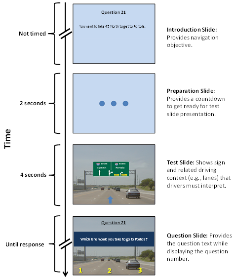
When each group began, participants were given an overview of the session and a booklet to record their responses (the moderator guide is provided in appendix D). They were then shown a three-part Microsoft PowerPoint® presentation containing either 78 or 85 questions about interchange signs. Each question followed the same presentation format (see figure 3). The questions were set up by providing drivers with a specific driving goal. Then, an image of a freeway with an overlaid sign was shown for a fixed duration. This provided conditions that mimicked some aspects of real-world driving, such as having a limited amount of time to inspect each sign and deduce its meaning. Following the image presentation, drivers were shown a question and asked to circle a response in their booklet. This series of activities was repeated until all of the questions were presented. At the end of all of the scenarios, participants were asked to respond to a short set of demographic and driving history questions.
Presentation
The presentation contained images depicting a driver's view of the freeway. These images showed the interchange sign under investigation with other contextual elements such as the roadway and pavement markings. The specific set of signs used was developed in conjunction with TTI to ensure consistency in the stimulus sets between this study and the simulator study.(6)
The overall presentation was divided into three parts. Each part contained questions that comprised of four slides that followed a similar format. These slides are further discussed in the following sections. There were some differences between presentation parts, and where applicable, the differences in format between parts are described.
Introduction Slide:
The first slide provided the navigation objective. Each of the navigation objectives was phrased in a similar format (i.e., "You want to take [exit number, freeway number, route name] to get to [destination name]"). The presentation of this slide was not timed; the experimenter read the slide aloud to participants, paused for approximately 1-2 s, and then advanced to the next slide. The introduction slide also contained the question number so that participants could follow along in their response booklets.
Preparation Slide:
The second slide was a preparation slide. The purpose of this slide was to prepare participants to see the test slide by providing a visual countdown to the slide transition. The preparation slide displayed three dots that appeared individually, from left to right, at 0.5-s intervals. The total slide presentation lasted 2 s before advancing to the test slide.
Test Slide:
The third slide was the test slide, which was shown for 4 s. The test slide showed the test sign mounted on a sign support (or overpass) with an appropriate freeway background. Each of the signs was presented on a photograph of a freeway without any indication of the upcoming interchange (e.g., no diverging exit lanes, gore areas, etc.). The background gave visual context to the sign without any additional cues. There were three groups of test slides, each of which provided a varying degree of information about the lanes. This was necessary because the questions were different in each part, and the information was tailored so that it provided the information and context required to answer the question but not information that would imply a particular response. The different lane information across parts included the following:
Note that all trials associated with each movement used the same background slide. Only the sign types and destination information varied. All trials in topic 2 used the same background slide.
Question Slide:
The final slide was the question slide. The question slide was presented until everyone had circled a response (approximately 5-10 s). If a participant took a long time to respond, he/she was asked to give the best guess, and then the moderator continued with the presentation. The question slide always displayed the same background as the test slide; however, the guide sign was always occluded by a blue box surrounding the question text. This was done to prohibit participants from using the sign to answer the question. The question slide also presented the question number to keep participants on track in their response booklets. The three parts of the presentation had different questions and lane information as follows:
Figure 45 shows an overall view of the standard slides for each question and the timing of the slide presentation.
©Sue Chrysler
Figure 45. Illustration. Timeline of stimuli slide presentation.
Slide Order
The slide order was counterbalanced to reduce the order effects of using a single presentation set. Two slide orders were created, and an effort was made to distribute the questions within each set to vary the possible start lanes, movements, and topics, as well as to reduce predictability. Another major difference between the slide sets was the number of questions. Slide order 1 contained 78 questions, while slide order 2 contained 85 questions. When creating slide order 1, a major concern was keeping the session to a reasonable length of time. After it was determined that the sessions would finish in time, seven additional questions were added to examine additional maneuvers that would provide a more complete analysis of the topics chosen. This larger set was then reordered to become the slide order 2 set.
Response Booklets
Each participant recorded his/her answers to the questions about the images in response booklets. The response options in the booklets were all multiple choice to facilitate rapid responses and easy data scoring. This also eliminated response ambiguity which could have arisen from geometric drawings or long written responses.
At the end of the questionnaire, some basic information was collected about driver demographics, such as age and gender. In addition, limited information about the participants' driving patterns and history such as how long they have been driving, how many hours they drive each week, and how frequently they drive through interchanges were also collected. The information was linked to participants' written responses from the interchange scenarios but not any personally identifying information. A copy of the demographic questions from the response booklets is included in appendix E.
The selection of scenarios was coordinated with TTI. Candidate topics were generated using three sources drawn from earlier work in both projects. These included the following:
Using these sources, both teams worked together to select relevant interchange driving scenarios. An initial list of 19 scenario topics was developed, from which a subset of questions were selected for implementation in task 7. Key considerations for selecting topics for task 7 included the following:
Table 9 lists the research question selected for each topic and indicates if the topic corresponded to a similar topic investigated in the TTI simulator study.(6) It was not possible to investigate the exact same set of topics in each project because some questions could only feasibly be addressed using one data collection approach or the other but not both. For questions covered in both projects, the information obtained in each study was largely complementary. In particular, the TTI simulator captured performance-based measures such as whether drivers executed unnecessary lane changes or when they initiated their movements. In contrast, the static photo approach used in this study captured driver comprehension and interpretation of sign information and their corresponding expectations about the upcoming interchange configuration.
There was originally an eighth topic included in the data collection. The only purpose of the eighth topic was to gather data that would supplement the data collected in the TTI simulator study.(6) The topic did not end up being a part of the simulator study and was therefore removed from the analysis in this project.
| Topic | Research Question |
Related Task 6 Topic |
1 |
How do guide sign option lane information and arrow type affect driver lane preference in exit and through movements? |
Topic 1 |
2 |
How is driver exit lane preference affected by arrow type and the degree to which option lane arrow information is spatially integrated or separated? |
None |
3 |
How effective are different sign designs for indicating left exits and how do drivers interpret the sign information? |
Topic 6 |
4 |
How does the layout of destination information on guide signs affect how drivers associate specific lanes with destinations? |
None |
5 |
How do drivers interpret different types of destination separators on guide signs that indicate where lanes go for a two-lane exit with a downstream split? |
Topic 3 |
6 |
Are there limits on the number of lanes that can be effectively communicated by diagrammatic signs? |
None |
7 |
What are effective guide sign designs for signing two interstate exits within close proximity of each other? |
Topic 2 |
The movements were selected to gather the needed data from the topic (e.g., investigating option lane usage or comprehension of left exit information). After selecting the relevant movements, it was found that for a large percentage of the trials, participants were asked to exit rather than continue to the through destination. In response, additional trials were added to balance the responses so that drivers would be less likely to anticipate their next movement. Within each part of the presentation, an effort was made to distribute the slides with signs related to the same topic and signs requiring the same movement.
This section describes the data entry and analysis process.
Data Entry and Verification
Data used in the analyses were the driver responses to scenario questions. The responses were entered into a Microsoft Excel® spreadsheet for all of the sessions. Data quality was ensured by double-checking entered responses with the original written responses in the booklets. First, discrepancies were resolved using visual inspection. Issues such as multiple responses for questions that only allowed a single lane selection were resolved. Second, for all of the topics where it was appropriate, nonsensical responses were double-checked for data entry errors (e.g., responses where the chosen lanes would not lead to the given destination). Third, a random selection of booklets was rechecked in their entirety.
Data Analysis
Descriptive statistics were calculated for all of the responses, and these are reported in summary tables in the results section of this chapter. Most of these descriptive statistics involved calculating response percentages for each slide question, which typically corresponded to a particular combination of sign set and vehicle movement. Some topics had two slides that addressed the same question (i.e., repeated trials). In these cases, the percentage correct was based on averaged responses across like trials. Pair-wise t-tests were used to determine the significance levels for comparisons of interest. Note that the researchers did not control for experiment-wise error. The complete set of t-test comparisons conducted for all research topics is provided in appendix F.
The demographic questionnaire responses were summarized using means and SDs.
Caveats
It should be noted that the broader objective of the data collection activities in task 7 was to gain an understanding of driver expectations at various complex interchanges. This task was not strictly applied research to evaluate the relative effectiveness of candidate guide sign design alternatives for implementation at specific locations. Consequently, there were instances in which the signs used in this study departed from current Manual on Uniform Traffic Control Devices (MUTCD) recommendations.(1) This was necessary to balance out potential confounds and to obtain findings that provided clearer insight about the factors underlying driver expectations and assumptions that they make. Moreover, a deliberate effort was made to relate the questions examined to the dynamic scenarios discussed in the task 4 focus groups. Consequently, some of the task 7 sign elements were based on outdated sign designs (e.g., down arrows on advance signs), but this was done to provide comparisons that were relevant to the focus group findings and baseline comparisons of sign designs that drivers were familiar with (i.e., down arrows are still common in the Pacific Northwest). This approach was justified because it provides a better understanding of the more psychological dimensions related to driver expectations at complex interchanges.
The results of the seven research topics examined are presented in the following sections.
Topic 1: Option Lane Arrow Types and Driver Lane Preference
This topic examined driver lane preference for through and exit movements at freeway exits that include exit only and option lanes. The task 4 focus group participants had a variety of opinions to choose from about option lane use during exits.(40) Some preferred to use an option lane because they could avoid last-minute lane changes if they chose not to exit. Others preferred exit only lanes because they valued the certainty that the exit only lane provided regarding taking the correct exit.
This topic also examined multiple sign types. These included the MUTCD arrow-per-lane signs (which use up arrows) and signs with down arrows.(1) Although the down arrows are not recommended for this purpose by the MUTCD, they are more common in Seattle, WA, where the data were collected, and they are consistent with the signs used in the task 4 focus groups. Additionally, they are relevant because some focus group participants reported that it was sometimes difficult to correctly match the down arrow symbol to the appropriate lane depending on the visual perspective, thereby making interchange navigation more challenging.
Additionally, two variations of the exit movement were investigated in this topic. The first involved exiting from the option lane, which could be accomplished without making a lane change. The second variation involved exiting from the through lane, which required at least one lane change regardless of whether the option lane or exit lane was selected for the exit movement. The rationale for including both types of movements was to determine if drivers preferred using a different lane to exit if they were required to make at least one lane change.
Research Question
The research question posed for this topic is as follows: how do guide sign option lane information and arrow type affect driver lane preference in exit and through movements?
Sample Slides
During data collection, drivers were given a target destination and were asked to report their preferred lane for reaching that destination. Comparisons were made between the following three signing conditions:
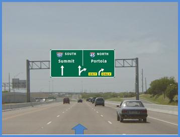
An example test slide for the option lane to exit movement is shown in figure 46. The corresponding introduction and question information presented to participants was as follows:
©Sue Chrysler
Figure 46. Photo. Example test slide from topic 1-option lane to exit movement.
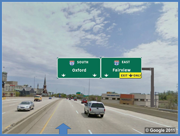
An example test slide for the through lane to exit movement is shown in figure 47. The corresponding introduction and question information presented to participants was as follows:
©2011 Google® map annotations provded by Battelle
(see "Acknowledgements")
Figure 47. Photo. Example test slide from topic 1-through lane to exit movement.(42)
Response Summary
Figure 48 through figure 50 show sign sets A through C for topic 1.

Figure 48. Illustration. Topic 1-sign set A.

Figure 49. Illustration. Topic 1-sign set B.

Figure 50. Illustration. Topic 1-sign set C.
Table 10 shows the lane preference responses for topic 1. The responses are summarized for each sign set by movement (i.e., start lane to desired destination, such as option lane to exit destination).
Table 10. Preferred lane responses for topic 1.
| Movement | Option to Exit |
Through to Exit |
Option to Through |
|||
|---|---|---|---|---|---|---|
Preferred Lane |
Option |
Exit |
Option |
Exit |
Option |
Through |
Sign set A (see figure 48) |
45.1% |
54.9% |
52.7% |
47.3% |
59.9% |
39.0% |
Sign set B (See figure 49) |
41.2% |
58.2% |
16.5% |
83.5% |
64.1% |
34.8% |
Sign set C (see figure 50) |
46.7% |
52.7% |
44.0% |
53.8% |
62.9% |
36.5% |
This topic examined whether driver lane preference while exiting was affected by information about the option lane provided by the signs. In sign set A, both possible movements from the option lane were indicated (through or exit). In sign set B, the presence of an option lane was indirectly implied by down arrows corresponding to two separate destinations pointing to the same lane. In sign set C, there was minimal indication that lane 2 was an option lane since it was not signed for multiple destinations. The findings related to driver lane preference while exiting are described for each of the three movements in the following subsections.
Option Lane to Exit:
For each sign set, just less than half of the drivers reported that they would stay in the option lane to exit the freeway, while a majority of drivers indicated that they would make an unnecessary lane change to the exit only lane even though they could have exited from their current lane. This pattern held regardless of sign set.
Through Lane to Exit:
For this movement, drivers were required to make at least one lane change because they started in the through lane in contrast to the previous movement in which they were able to exit from the option lane and avoid lane changes altogether. When comparing this difference in starting lane, the results were markedly different across sign sets. For sign set A, there was a slightly greater preference for using the option lane to exit when starting in the through lane than in the option lane (52.7 versus 45.1 percent, p < 0.05). For sign set C, the starting lane did not affect which lane drivers preferred to use for exiting the freeway (44.0 versus 46.7 percent chose the option lane).
In contrast to the results for sign sets A and C, the starting lane had a substantial effect on lane preference with sign set B. In particular, 83.5 percent of drivers preferred the exit only lane when starting in the through lane compared to 58.2 percent when starting in the option lane. Drivers in this condition overwhelmingly chose to avoid the option lane for exiting (only 16.5 percent chose it). One reason for this may have been because the visual perspective from the through lane may have made it difficult to unambiguously align both down arrows with the option lane. Consequently, drivers may have tried to avoid the corresponding uncertainty by selecting the exit only lane.
In some respects, using down arrows to communicate option-lane information resulted in poorer option lane usage than providing no option lane information at all. For example, sign set C, which only provided exit destination signing, led to significantly more distributed lane preferences for the through-to-exit movement than sign set B.
Option Lane to Through:
For the option-to-through movement, 35 to 40 percent of drivers made an unnecessary lane change for each sign set. The percentage of drivers who moved out of the option lane and into the through lane, however, was nearly the same across sign sets, and none of the differences were significant.
Findings
Overall, sign design and starting lane affected driver lane choice for different movements. The movement that showed the greatest differences in terms of lane preference across sign sets was the through-to-exit condition. In this condition, sign set B led to the fewest drivers preferring the option lane, followed by sign set C and then sign set A, which led to the most even distribution between the option and exit lanes. In some ways, this pattern matches the degree of usefulness or certainty of the information provided about the option lane by the different sign sets. In particular, sign set B provided potentially confusing or ambiguous information about the option lane, possibly due to the poor alignment of the down arrows with the option lane from the through lane visual perspective. Sign set C provided no indication about the center lane being an option lane, and sign set A provided the most complete and detailed information about the option lane. Thus, there is a correspondence between the specificity and clarity of the option lane information and the extent to which drivers were willing to stay in the option lane.
With regard to consideration of arrow type, the up arrows in sign set A led to more option lane preference than the down arrows in sign sets B and C. Note that down arrows are more common than up arrows in Seattle, WA. If driver familiarity is a factor, then an even higher performance level might be expected within a focus group comprised of drivers who have been exposed to these signs in their normal driving environment; this could be investigated in future research. The single down arrow without through destination information in sign set C, however, led to more option lane preference than sign set B. This suggests that other factors aside from arrow type are possibly affecting lane preference.
The TTI simulator study asked a similar question as the present one in their topic 1.(6) This study found that drivers also made unnecessary lane changes in all movements using comparable sign configurations to those used in the present study. However, the TTI study did not find evidence for the asymmetry between the down arrow signs (sign set B) and the other signs in the through-to-exit condition. This raises the possibility that the difference in the current study could be an artifact of the static stimulus presentation method and/or the way the visual perspective was depicted in the current study.
Another way in which the topic 1 signs differed from each other is that the arrow information in the up arrow set was integrated (i.e., the arrow branched), while the down arrows were not integrated (i.e., two distinct arrows). One explanation for the difference in lane preference observed in the through-to-exit movement is that integrated arrow information is easier to interpret. In particular, the up arrow provides direct information about the option lane, whereas drivers must determine that the two down arrows infer an option lane since each arrow indicates a separate destination. Not only is the up arrow simpler to interpret, but it probably leads to less uncertainty about the nature of the option lane.
Topic 2 was an extension of topic 1. It further examined the issue of the integration of option lane arrow information. Similar to topic 1, both up and down arrows were investigated; however, the difference in topic 2 was that integrated and separated versions of each arrow type were presented to drivers.
Note that while it was not possible to draw down arrows as a single sign element, canted down arrows were used to provide lane guidance information that was perceptually more cohesive and which could be more clearly aligned with the option lane. In addition, the start lane was always the second lane from the left to make the lane arrangement comparable to the through-to-exit condition of topic 1.
Research Question
The research question posed for this topic is as follows: how is driver exit lane preference affected by arrow type and the degree to which option lane arrow information is spatially integrated or separated?
Sample Slides
During data collection, drivers were given a target destination and asked to report their preferred lane for reaching that destination.
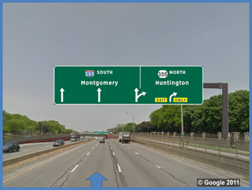
An example test slide for the through lane to exit movement is shown in figure 51. The corresponding introduction and question information presented to participants was as follows:
©2011 Google® map annotations provded by Battelle
(see "Acknowledgements")
Figure 51. Photo. Example test slide from topic 2-through lane to exit movement.(43)
Response Summary
Figure 52 through figure 55 show sign sets A through D for topic 2.

Figure 52. Illustration. Topic 2-sign set A.

Figure 53. Illustration. Topic 2-sign set B.

Figure 54. Illustration. Topic 2-sign set C.

Figure 55. Illustration. Topic 2-sign set D.
Table 11 shows a summary of the lane preference responses for topic 2 for each type of arrow and option lane arrow integration (i.e., separated or integrated). The responses are summarized for each sign set by preferred lane.
Table 11. Lane preference responses for topic 2.
|
Separated Option Lane Arrow |
Integrated Option Lane Arrow |
||||
|---|---|---|---|---|---|---|
Up Arrows |
Sign Set A |
Sign Set B |
||||
Preference |
Option (percent) |
Exit Only |
Preference |
Option |
Exit Only |
|
44.2 |
55.2 |
49.5 |
55.2 |
|||
Down Arrows |
Sign Set C |
Sign Set D |
||||
Preference |
Option |
Exit Only |
Preference |
Option |
Exit Only |
|
28.6 |
70.9 |
23.2 |
75.7 |
|||
Arrow Integration:
Overall, arrow integration was not associated with a significant difference in driver lane preference. Option lane preference for the up arrow sign sets A and B (44.2 versus 49.5 percent, p-value = not significant) and for down arrow sign sets C and D (28.6 versus 23.2 percent, p-value = not significant) were not significantly different from each other.
Arrow Type:
Arrow type was associated with significant differences in driver lane preference. In particular, for separated arrows, the up arrow sign set A led to significantly more drivers selecting the option lane than the corresponding down arrow in sign set C (44.2 versus 28.6 percent,
p < 0.0001). Similarly, for integrated arrows, the up arrow sign set B led to significantly more drivers selecting the option lane than the corresponding down arrow in sign set D (49.5 versus 23.2 percent, p < 0.0001). Overall, the up arrows led to a more equal distribution of lane preferences between the option and exit only lanes than the down arrows. Moreover, this finding is in line with the topic 1 results for a nearly identical sign with down arrows in which a strong majority of drivers preferred the exit only lane (83.5 percent in topic 1 sign set B) when making the same movement involving exiting from the through lane (70.9 percent in sign set C and 75.7 percent in sign set D in topic 2).
Findings
Arrow integration was not associated with a difference in driver lane preferences for signs with either up or down arrows. However, arrow type did make a significant difference. Specifically, up arrows led to more distributed lane preferences, while down arrows led to a greater preference for the exit only lane. This pattern of results is consistent with the findings from topic 1 where the up arrows led to the most option lane preference.
Although arrow type seems to be a consistently significant factor, another possibility is that other visual cues exclusive to up arrows facilitated the interpretation of the option lane information. For example, the up arrow above the option lane in sign set A curves to the right and is the same as the arrow above the exit lane. This visual similarity and the corresponding visual grouping of the like arrows might provide another direct indication of its association with the exit lane.
This topic examined driver understanding of different approaches for indicating left exits. It was a parallel topic to one investigated in the task 6 TTI simulator study.(6) Specifically, this topic compared the 2009 MUTCD left exit standards to a yellow left exit panel and a plain/green left exit number plaque.(1) Sign set A had a yellow left exit number plaque atop the guide sign, sign set B had a yellow panel at the bottom of the guide sign, and sign set C was similar to sign set A except the plaque was green instead of yellow (see figure 56 through figure 58). The primary differences between these signs were that the left exit panel in sign set B had a similar appearance and placement to an exit only panel, and sign set C was less conspicuous than the other sign sets because it lacked the yellow color. Note that sign set C was not included in the TTI simulator study.

Figure 56. Illustration. Example exit notation used in topic 3 questions-sign set A.

Figure 57. Illustration. Example exit notation used in topic 3 questions-sign set B.

Figure 58. Illustration. Example exit notation used in topic 3 questions-sign set C.
Research Question
This topic covered a broader research question by examining three specific sub-questions. The research question was, how effective are different sign designs for indicating left exits and how do drivers interpret the sign information? The three specific sub-questions were as follows:
Sample Slides
Drivers were given a start lane and target destination. After seeing the test slide, they were asked if they would have to change lanes to reach their destination.
An example test slide for the lane 1 to through destination movement is shown in figure 59. The corresponding introduction and question information presented to participants was as follows:
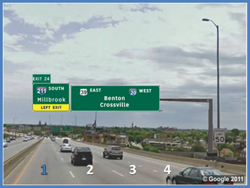
©2011 Google®; map annotations provded by Battelle
(see "Acknowledgements")
Figure 59. Photo. Example test slide from topic 3-lane 1 to through destination.(44)
An example test slide for the lane 3 to left exit movement is shown in figure 60. The corresponding introduction and question information presented to participants was as follows:
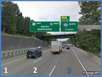
©2011 Google®; map annotations provded by Battelle
(see "Acknowledgements")
Figure 60. Photo. Example test slide from topic 3-lane 3 to left exit.(45)
Response Summary
For the first question (i.e., are drivers more likely to confuse the left exit panel (sign set B) with an exit only panel because of its similar design?), the exit sign was placed on the left side of the sign bridge, and drivers began in the left lane (lane 1). The test question asked if drivers had to leave lane 1 to continue in the through direction. The correct answer was that they did not because the sign did not indicate that the left exit was a lane drop. If drivers indicated that they had to leave the lane more frequently with sign set B (i.e., lower percent correct), then this would suggest that they were more likely to confuse it with an exit only sign. Figure 61 through figure 63 show sign sets A through C for topic 3 question 1.

Figure 61. Illustration. Topic 3 question 1-sign set A.

Figure 62. Illustration. Topic 3 question 1-sign set B.

Figure 63. Illustration. Topic 3 question 1-sign set C.
The percentage of correct responses by drivers indicating that they were not required to change lanes to continue to the through destination is as follows:
Surprisingly, the majority of drivers responded that the left lane would not go to a through destination; however, there is no clear evidence that drivers were more likely to confuse sign set B with an exit only lane than sign set A. Sign set C yielded significantly better performance than sign set A (19.1 versus 10.9 percent, p < 0.01) and sign set B (19.1 versus 6.0 percent, p < 0.001). However, this difference could be because sign set C did not contain any yellow markings, which may have made it less visible to drivers. In this case, accuracy might be higher because drivers did not adequately perceive the pertinent left exit information rather than because of any sign-specific benefit.
This question was also investigated in topic 6 of the TTI simulator study.(6) Similar to the current findings, 35 and 55 percent (sign sets A and B, respectively) of drivers made an unnecessary lane change out of the left lane after seeing the left exit sign.
For the second question (i.e., if the panel is on the right-hand side of the sign bridge, do drivers notice that the exit is on the left?), the exit sign was placed on the right side of the sign bridge, and drivers began in the right lane (lane 3). Figure 64 through figure 66 show sign sets A through C for topic 3 question 2.

Figure 64. Illustration. Topic 3 question 2-sign set A.

Figure 65. Illustration. Topic 3 question 2-sign set B.

Figure 66. Illustration. Topic 3 question 2-sign set C.
The percentage of correct responses by drivers indicating that they were required to change lanes to exit is as follows:
In general, driver understanding of the signs was still poor overall. Sign set A led to significantly better performance than sign set B (41.5 versus 28.4 percent, p < 0.001) and sign set C (41.5 versus 29.5 percent, p < 0.01). It is possible that the difference between sign sets A and C is due to the visibility of the left notation on the sign. However, sign visibility cannot explain the difference between sign sets A and B because both contain yellow markings. Moreover, in a topic 1 control condition (not shown), there is a version of sign set B that had an exit only panel (same layout and color), and drivers chose the correct exit lane almost 100 percent of the time, which suggests that panel visibility was not a limitation. In contrast, the initial hypothesis that drivers may misinterpret sign set B as being an exit only panel is consistent with the current findings because most drivers opted to stay in the right lane-which is under the panel-when instructed to exit to the left. Overall, sign set A appeared to do the best job at drawing attention to the left exit while minimizing confusion with an exit only panel.
Driver understanding in the previous two questions was low overall. In question 2, the placement of the sign on the right was incongruent with the notation of the left exit. It was possible that the poor performance was due to drivers expecting the exit sign to be positioned over the exit lane. For the third question (i.e., what information do drivers use more, the placement of the sign on the sign bridge or the left exit notation on the sign (i.e., plaque, word, or panel)?), the sign configurations were the same as in question 1 (left exit sign over the left lane); however, drivers began in lane 2 (the middle lane) and were asked to take the left exit destination. Figure 67 through figure 69 show sign sets A through C for topic 3 question 3.

Figure 67. Illustration. Topic 3 question 3-sign set A.

Figure 68. Illustration. Topic 3 question 3-sign set B.

Figure 69. Illustration. Topic 3 question 3-sign set C.
The percentage of correct responses by drivers indicating that they were required to change lanes to exit is as follows:
Performance on this question was greatly improved over that of the previous two questions. The differences between each of the three signs in this question were significant at p < 0.01. One explanation for this finding may be related to the varying levels of visual salience of the different left exit notations. In particular, the sign with the largest area of yellow shading (sign set B) performed the best, the second most yellow area performed second best (sign set A), and the sign with no yellow shading performed the worst (sign set C). Note that the comparison in question 3 provides the best measure of sign visibility because it is not confounded with sign placement on the sign bridge.
To provide a full answer to question 3, it is necessary to compare the question 3 signs with those used in the previous question. In both questions, the left exit notation was identical between the compared sign sets (which controls for visibility and notation format). The only difference between the two questions was the relationship between the exit sign placement on the sign bridge and the side of the freeway exit; they were either congruent (question 3) or incongruent (question 2). Table 12 shows the comparisons between congruent and incongruent sign placement. Driver response accuracy was consistently higher with the congruent sign placement for each sign set (all comparisons are significant at p < 0.0001).
Table 12. Sign placement comparisons between questions 2 and 3 sign sets.
| Sign Set | Question 3 |
Question 2 |
Difference |
p-value |
|---|---|---|---|---|
A |
86.9 percent |
41.5 percent |
45.4 percent |
< 0.0001 |
B |
95.6 percent |
28.4 percent |
67.2 percent |
< 0.0001 |
C |
76.0 percent |
29.5 percent |
46.5 percent |
< 0.0001 |
Since the only difference between sign sets was the placement of the exit sign on the sign bridge, it is possible that the sign placement side is a significantly stronger informational cue to drivers than the left exit notation alone.
This finding complements the results of the TTI simulator study.(6) In particular, that study found that drivers generally understood which side of the roadway that the left exit was located; however, it was unclear from the data if that difference was due to the left exit notation or the placement of the sign on the sign bridge. The findings from this task 7 study suggest that sign placement provides the information that drivers rely on the most.
Findings
This topic investigated three aspects of signing left exits. Question 1 results showed that drivers had difficulty understanding that the left lane could continue through with all sign sets. One explanation for this is that drivers' default assumption is that an exit lane is a lane drop unless the sign indicates otherwise. This is a safe assumption for drivers who want to continue through the interchange (e.g., the cost of being wrong is changing lanes rather than exiting the freeway). This is also consistent with focus group comments indicating that drivers prefer to avoid uncertainty in their interchange movements.
The results from question 2 provided support for the notion that the left exit sign panel in sign set B may be confused with an exit only panel since most drivers remained in the rightmost lane even though the sign indicated a left exit. While this interpretation was not directly supported by the question 1 results, the trend was in the right direction, and the TTI simulator results for the question 1 scenario were consistent with this interpretation. In addition, both questions 1 and 2 suggested that the green left exit number plaque was less noticeable to drivers than the other left exit notations.
Questions 2 and 3 showed that sign placement on the sign bridge was a significantly stronger cue to drivers than left exit notation. Overall performance was best with sign set A primarily because it avoided the potential for confusion with exit only signing. These findings also highlight that sign placement is an important factor in forming driver expectations.
One notable finding from the task 4 focus groups is that drivers tend to assign meaning or significance to the visual layout of guide sign elements. For example, on multiple occasions, drivers linked a destination incorrectly with a specific lane or with exit only information if they were visually adjacent on the guide sign. For example, in scenario 1 of the focus group sessions, drivers were faced with a sign bridge almost identical to sign set B (see table 16). Some drivers had a tendency to associate the destination immediately above the exit only panel with only the lane directly below it, although both exit lanes allowed drivers to travel to either destination listed on the sign.
The current topic investigated some drivers' inherent tendency for grouping elements within a sign and with roadway lanes positioned underneath. This topic also investigated whether this pattern was exclusive to down arrows or whether up arrows were also affected. The specific question compared drivers' tendency to link destinations with specific lanes using two different types of destination separators. The first was destinations separated by a hyphen (hyphen separation), and the second sign layout involved stacking destinations on multiple lines (multiline separation). In this case, destinations are not aligned with any particular lane, so the visual cues that may compel grouping are not present.
Research Question
The research question for this topic is as follows: how does the layout of destination information on guide signs affect how drivers associate specific lanes with destinations?
Sample Slides
This topic did not have a specific vehicle movement associated with the questions. For each sign set, participants were asked to circle the lane or lanes that would take them to a given destination. Their perspective was from one of the middle lanes on the roadway. All of the lanes were numbered, though the lane that they were in was not noted in any way.
An example test slide for topic 4 is shown in figure 70. The corresponding introduction and question information presented to participants was as follows:
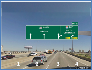
©2011 Google®; map annotations provded by Battelle
(see "Acknowledgements")
Figure 70. Photo. Example test slide from topic 4.(46)
Response Summary
Figure 71 through figure 74 show sign sets A through D for topic 4.

Figure 71. Illustration. Topic 4-sign set A.

Figure 72. Illustration. Topic 4-sign set B.

Figure 73. Illustration. Topic 4-sign set C.

Figure 74. Illustration. Topic 4-sign set D.
Table 13 shows a summary of driver lane selection responses for topic 4. The lanes are numbered to correspond with the numbering in figure 70. The responses are summarized for each sign set by the position of the destination information on the sign and the participants' lane selection(s). For each sign set, the correct response was that both the option and the exit lanes (lanes 3 and 4) would take the driver to either destination. While a response of either lane 3 or lane 4 would also lead the driver to the indicated destination, these answers suggest that drivers may have misinterpreted the sign information.
Table 13. Lane selections for topic 4.
|
Multiline Separation |
Hyphenated Separation |
|||||||||
|---|---|---|---|---|---|---|---|---|---|---|---|
Down Arrows |
Sign Set A |
Sign Set B |
|||||||||
Destination |
Lane Selection (percent) |
Destination |
Lane Selection (percent) |
||||||||
Lane 3 |
Lane 4 |
Lanes 3 and 4 |
Lane 3 |
Lane 4 |
Lanes 3 and 4 |
||||||
Top (Feria)* |
8.8 |
13.2 |
76.4 |
Left (Beacon) |
35.7 |
3.3 |
56.6 |
||||
Right (Stilwell) |
0.0 |
56.6 |
41.8 |
||||||||
Up Arrows |
Sign Set C |
Sign Set D |
|||||||||
Destination |
Lane Selection (percent) |
Destination |
Lane Selection (percent) |
||||||||
Lane 3 |
Lane 4 |
Lanes 3 and 4 |
Lane 3 |
Lane 4 |
Lanes 3 and 4 |
||||||
Top (Winona) |
5.8 |
11.6 |
79.7 |
Left (Tonda) |
31.9 |
6.0 |
59.3 |
||||
Right (Orange) |
0.0 |
46.4 |
50.7 |
||||||||
Note: Although the destinations are listed in the response summary tables, multiple signs, each with different sets of destination names, were used to examine each sign set.
Exit Destinations:
The results in table 13 indicate that drivers were significantly more accurate in determining that both exit destinations were served by lanes 3 and 4 when multiline separators were used (sign sets A and C). This holds true for both the up arrow signs (79.7 versus 59.3 percent, p < 0.0001) and the down arrow signs (76.4 versus 56.6 percent, p < 0.0001).
Examining the errors that drivers made in the hyphen separation condition provides insight about how some drivers interpreted the signs. More specifically, for drivers who incorrectly selected only one lane, the selected lane almost always corresponded to the lane located under the destination label. Also, this effect was slightly stronger with the hyphen-separated down arrows than the hyphen-separated up arrows (35.7 versus 31.9 percent for lane 3 and 56.6.versus 46.4 percent for lane 4).
Another trend is that drivers who made errors in the hyphen separation condition were somewhat more likely to do so in the exit only lane (lane 4) than in the option lane (lane 3). This trend held true for both arrow types; however, it was only significant for the down arrows (sign set B, p < 0.0001 and sign set D, p = not significant). If drivers are making this association based on position of the destination above a lane, then there should be no difference between option lane and exit lane errors. Alternatively, other factors could be influencing some drivers' interpretation of the sign information, such as the presence of the exit only panel over only one of the two exiting lanes, the destination position at the edge of the sign, or other bias toward the exit only lane.
Through Destination:
A major differentiator between the arrow types was performance with through lane destinations. The responses to these questions are shown in table 14. Lanes 1 and 2 represent the two left through lanes, while lane 3 is the option lane. Accordingly, the first row (lanes 1 and 2) shows the proportion of incorrect responses that indicate that drivers had a poor understanding that the third lane is an option lane to serve the through destination.
Table 14. Through lane selections for topic 4.
|
Arrow Type/ Destination Separation |
Sign Set A: Down Arrow |
Sign Set B: Down Arrow |
Sign Set C: Up Arrow |
Sign Set D: Up Arrow |
|---|---|---|---|---|
Lanes 1 and 2 |
81.3 percent |
89.9 percent |
15.9 percent |
14.8 percent |
Lanes 1, 2, and 3 (option) |
12.1 percent |
8.7 percent |
80.8 percent |
83.0 percent |
It is clear when looking at through destination performance that the down arrows (sign sets A and B) performed worse in terms of understanding of the option lane (i.e., only 12.1 and 8.7 percent fully correct (i.e., drivers selected all the lanes that would take them to the correct destination, including the option lane)). This may be because the up arrow signs (sign sets C and D) show a single lane leading to multiple destinations using branching arrow heads. In contrast, sign sets A and B only indirectly indicated that lane 3 is an option lane.
Findings
The results from this question suggest that the spatial relationship between the exit destinations and the arrows seems to be important for communicating lane assignment information. In particular, multiline-separated destinations caused a higher proportion of participants to associate the indicated destination with both lanes than the hyphen-separated destinations. In contrast, hyphen-separated destinations had a higher proportion of participants to associate the destination that was immediately above the arrow with solely the lane below the arrow.
Additionally, in terms of option lane understanding, the up arrows substantially outperformed the down arrows. This is perhaps due to the direct and clear communication of the two movements in a single arrow.
An interesting trend was also apparent in the errors made in the multiline separation condition. Specifically, when asked to reach the top destination, drivers who made incorrect responses tended to choose lane 4 (the exit only lane) over lane 3 (the option lane), suggesting that they associate the top destination with the first exit. This is consistent with the focus group discussion in which some participants thought that the top destination would exit before the bottom destination, perhaps motivating them to move all the way toward the anticipated exit direction.
Topic 5 examined a research question that was similar to the one in topic 4. Specifically, it investigated driver understanding of guide signs for a two-lane exit that divides after the exit. This question corresponds to topic 3 in the TTI simulator study, which examined driver lane choice in a two-lane interchange exit with a downstream split.(6) Similar to topic 4, the current question compared different methods for separating destination labels. These included the multiline and hyphenated separators used in topic 4 in addition to a vertical line separator.(1) One difference from the sign layout in topic 4 was that the exit only panel extended the full length of the guide sign so that both destinations were always above this panel.
The key question in this topic was whether participants believed the sign information indicated an immediate split (i.e., they immediately had to change lanes) or a downstream split (i.e., they could stay in either lane until after they exited; see figure 75). Each of the three sign sets used a different method of listing and separating the two destinations. Sign set A used a multiline separator, sign set B used a vertical line separator, and sign set C used a hyphen separator. The test question always asked if the participants had to immediately change lanes to reach the indicated destination. In the relevant data trials in which drivers started in one of the two rightmost lanes, the correct answer was always "No." Each sign set tested a single exit destination, except for sign set A, for which the top and bottom exit destinations were tested.

Figure 75. Illustration. Topic 5 geometry split after a two-lane exit.
Research Question
The research question for this topic is as follows: how do drivers interpret different types of destination separators on guide signs that indicate where lanes go for a two-lane exit with a downstream split?
Sample Slides
Participants were positioned in one of the two exit lanes. From their lane, drivers were asked if they had to immediately change lanes to go to one of the exit destinations.
An example test slide for the lane 3 to top exit movement is shown in figure 76. The corresponding introduction and question information presented to participants was as follows:
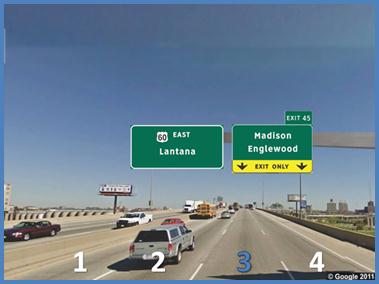
©2011 Google®; map annotations provded by Battelle
(see "Acknowledgements")
Figure 76. Photo. Example test slide from topic 5.(47)
Response Summary
Figure 77 through figure 79 show sign sets A through C for topic 5 (note that lane 1 is on the left and lane 4 is on the right for each figure).

Figure 77. Illustration. Topic 5-sign set A.

Figure 78. Illustration. Topic 5-sign set B.

Figure 79. Illustration. Topic 5-sign set C.
Table 15 shows the summary of responses for topic 5. The responses are summarized for each sign set by the movement that participants were asked to take.
Table 15. Lane restriction responses for topic 5.
| Sign Set | Movement |
Percent Correct |
|---|---|---|
A |
Lane 3 to top exit (Madison)* |
89.6 |
Lane 3 to bottom exit (Englewood) |
96.7 |
|
B |
Lane 4 to left exit (Malartic) |
33.7 |
C |
Lane 3 to right exit (Sebastian) |
90.7 |
Note: Although the destinations are listed in the response summary tables for understanding, multiple signs, each with different sets of destination names, were used to examine each sign set.
For signs with the multiline (sign set A) and hyphen separators (sign set C), almost all drivers understood that they did not have to change lanes immediately to reach their destination. These sign sets were better at communicating that both of the exiting lanes would allow drivers to reach both destinations and that the drivers would not need to change lanes right away. In contrast, drivers were more likely to respond that they needed to change lanes when the vertical line separator (sign set B) was used (p < 0.0001 for all comparisons). Unlike the other separators, the vertical line separator caused drivers to associate each destination with only the lane that was positioned under it.
The results for the hyphen separator sign design appear to contradict the results from topic 4, which found that the hyphen separation led some drivers to associate each destination with only the lane below it. This occurred with both up and down arrow signs. One possibility is that the exit only panel is a salient cue when it comes to communicating what happens to specific lanes. In particular, in topic 4, the exit only panel only covered the rightmost lane, whereas in the current topic, it covered both exiting lanes, perhaps leading to drivers' grouping together both destinations above the exit only. Following this interpretation, it would also be necessary to posit that the vertical line separator supersedes the effectiveness of the exit only panel at grouping lanes.
At this point, it seems that the spatial organization of sign elements influences driver interpretation of guide signs; however, additional information is needed to develop a clear understanding of how individual elements, such as separator type and exit panel placement, affect these interpretations.
Findings
Multiline and hyphen separators led drivers to think that they did not immediately have to change lanes to reach their destination. The vertical line separator was the only separation method that caused participants to think that they had to change lanes immediately to reach either destination. However, the exit only panel spanning the entire exit sign also gave a cue to participants that both lanes would exit together. The exit only panel appears to have a stronger effect than the hyphen separation but not the vertical line separation.
The results from the current topic are also complementary to those found in topic 3 of the TTI simulator study, which used comparable sign sets.(6) In particular, the TTI topic 3 asked the inverse question of the current topic; that is, which lane would take drivers to a specific destination (i.e., each lane was assigned to a single destination rather than both destinations to both lanes in the current topic). The TTI findings indicate that drivers were better at determining the correct single destination when they were arranged horizontally with a vertical line separator than when the destinations were stacked on multiple lines. Similar to the current findings, vertical line separators led to drivers associating destinations with the individual lanes below, whereas drivers did not make these specific lane assignments with multiline-separated destinations.
One aspect of complex interchanges that can make navigation a challenge is a large number of lanes, especially if they include multilane exits or splits. Diagrammatic signs can be used to communicate navigation information in a more literal format; however, drivers' ability to interpret these signs may be compromised when the number of lanes is high. In particular, drivers in the focus groups mentioned having difficulty reading the information provided by diagrammatic arrows. For example, the dashed lane lines on these signs are small, and some drivers reported difficulty seeing them or that they usually do not have time to see and make use of this information.(40) With regard to the cognitive aspects of reading these signs, drivers have additional mental operations to conduct, including counting the lanes, determining which lane goes to which destination, and determining which of these lanes they currently occupy. Adding more lanes to the diagrammatic arrow makes these tasks even more difficult.
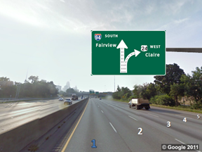
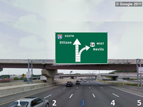
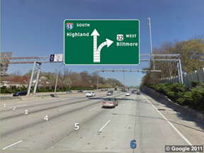
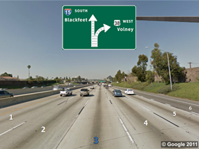
The current topic investigated if there are limits to the number of lanes that can be effectively communicated by diagrammatic arrow signs. There were two factors of interest, including the total number of lanes on the roadway and the difficulty of the navigation task decision (i.e., task difficulty). The total number of lanes on the roadway varied from four to nine, and all of the lanes were represented on the diagrammatic arrow on the sign. Task difficulty was examined by varying the drivers' lane position so that the navigation task was either easy or hard. In the easy condition, the point-of-view was from a vehicle in one of the outside lanes, which made it possible to answer the question without close examination of the diagrammatic arrow. In the hard condition, the point-of-view was the from a center lane adjacent to the split, which required additional scrutiny of the sign to determine the correct answer. Sample combinations of each of these variables are shown in table 19. For each combination, participants were asked if their lane would take them to a designated destination.
Another factor that was investigated was the presentation of an even or odd number of lanes in the diagrammatic sign. With an even number of lanes, the two branches of the arrow were the same width, whereas with an odd number of lanes, one more lane went to the through destination than the exit destination, making the through arrow branch slightly wider than the exit arrow branch. In particular, the hard condition task may be simplified with an odd number of lanes since the size difference between the two branches of the arrow is immediately apparent. There are strategies that drivers can use to make answering this question easier, including counting the number of lanes in the narrower branch of the split or determining that they are in the center lane and matching that position to the wider branch of the split. If these types of strategies are used by drivers, then their accuracy may be better on hard trials with an odd number of lanes.
Research Question
The research question for this topic is as follows: are there limits on the number of lanes that can be effectively communicated by diagrammatic signs?
Sample Slides
On each of the signs, all of the lanes on the roadway were numbered to help drivers assess the size of the roadway. This was done to more easily simulate real-world driving, where drivers presumably have a better idea of the size of the roadway that they are travelling on as well as their position on the roadway. Since the slide presentation did not provide much time to get a sense of the freeway size, the lane numbers helped facilitate this in addition to reducing variability from potential lane-counting errors.
Example test slides are show in figure 81 through figure 83. Example introduction and question information presented to participants include the following:
©2011 Google®; map annotations provded by Battelle
(see "Acknowledgements")
Figure 80. Photo. Odd number of lanes (easy task difficulty).(48)
©2011 Google®; map annotations provded by Battelle
(see "Acknowledgements")
Figure 81. Photo. Odd number of lanes (hard task difficulty).(49)
©2011 Google®; map annotations provded by Battelle
(see "Acknowledgements")
Figure 82. Photo. Even number of lanes (easy task difficulty).(50)
©2011 Google®; map annotations provded by Battelle
(see "Acknowledgements")
Figure 83. Photo. Even number of lanes (hard task difficulty).(51)
Response Summary
Table 16 shows a summary of the percent of correct responses by number of lanes for each task difficulty condition.
Table 16. Percent correct responses for easy/hard and odd/even conditions.
| Number of Lanes | Easy Task Difficulty |
Hard Task Difficulty |
|
|---|---|---|---|
Odd Lanes |
Even Lanes |
||
4 |
98.4 percent |
- |
86.9 percent |
5 |
94.5 percent |
82.5 percent |
- |
6 |
92.9 percent |
- |
72.0 percent |
7 |
97.8 percent |
82.0 percent |
- |
8 |
97.3 percent |
- |
58.2 percent |
9 |
89.6 percent |
72.7 percent |
- |
- Indicates combinations that are not possible.
Collapsing across the number of lanes on the roadway, the difference in percentage correct between the easy and hard conditions was significant (p < 0.001). The values in table 20 are shown in graphical form in figure 84. Overall performance is lower in the hard condition, and there appears to be a downward trend in accuracy as the number of lanes increases. In addition, this downward trend is more pronounced with an even number of lanes in the hard condition.
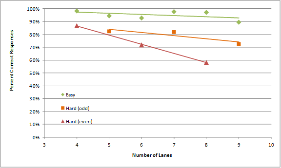
Figure 84. Graph. Percent of correct responses by total number of roadway lanes for topic 6.
Findings
When positioned in an edge lane (easy condition), drivers were able to determine if their lane would lead to a given destination with only a slight decrease in accuracy as the number of lanes on the roadway increased. When positioned in a middle lane adjacent to the split (hard condition), drivers performed better with roads with an odd number of lanes than with roads with an even number of lanes; however, it is premature to tell if this effect is relevant for actual signs. These findings are consistent with the hypothesis that reading complex diagrammatic signs imposes cognitive workload on drivers and their ability to accurately interpret the sign information within the context of their driving situation is limited.
It should be noted that none of the diagrammatic signs examined included an interior option lane, which is inconsistent with MUTCD requirements.(1) It was necessary to exclude option lanes to make it possible to have only a single correct answer to the test question. Also, the exclusion of the option lane does not detract from the main finding that for arrows with many lane markings, some drivers appeared to have difficulty matching physical interchange lanes to the lanes depicted on the diagrammatic arrow.
The research conducted as part of topic 7 was based on a research question investigated in the TTI simulator study.(6) More specifically, TTI examined methods for signing two freeway exits within close proximity when three destinations must be indicated (nearest exit, second exit, and through movement). The geometry for this interchange is shown in figure 85.
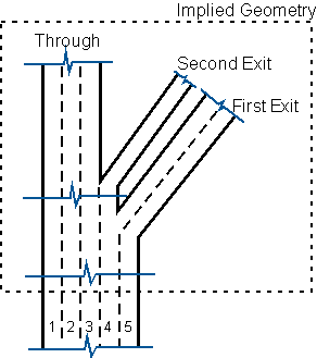
Figure 85. Illustration. Topic 7 roadway geometry-three destinations at two closely spaced exits.
TTI developed three sign alternatives to examine when drivers change lanes in addition to their use of option lanes. In the current topic, researchers tested those three sign sets in addition to two sign designs based on modifications of two of the original sign sets. The objective was to obtain additional information about driver understanding of the movements indicated by the signs and how they interpreted different sign elements.
Research Question
The research question for this topic is as follows: what are effective guide sign designs for signing two interstate exits within close proximity of each other?
Sample Slides
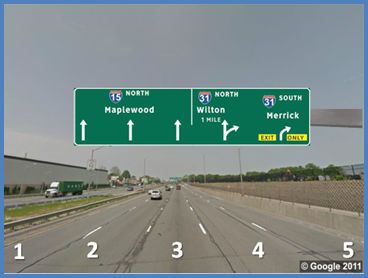
The slide questions used in this topic were the same as that in topic 4. For each slide set, participants were asked to circle the lane or lanes that would take them to a given destination. They were asked to circle multiple lanes if applicable. This approach provided a relatively complete mapping of drivers' understanding of where they expect the lanes to go based on the sign information. All of the lanes were numbered, and the drivers' perspective was from the center of the roadway, although the lane that they were in was not noted in any way.
An example test slide for topic 7 is shown in figure 86. The corresponding introduction and question information presented to participants was as follows:
©2011 Google®; map annotations provded by Battelle
(see "Acknowledgements")
Figure 86. Photo. Example test slide from topic 7.(52)
Response Summary
Figure 87 through figure 91 show sign sets A through C for topic 7. Note that the sign set numbering was selected to be consistent with the TTI driving simulator sign sets.(6) Variations on the primary sign group are indicated with the addition of the numeral 2 in the label (e.g., A2).

Figure 87. Illustration. Topic 7-sign set A.

Figure 88. Illustration. Topic 7-sign set A2.
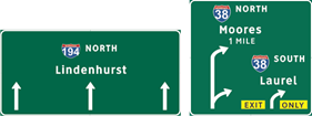
Figure 89. Illustration. Topic 7-sign set B.

Figure 90. Illustration. Topic 7-sign set B2.
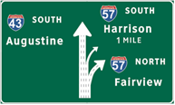
Figure 91. Illustration. Topic 7-sign set C.
Researchers initially investigated absolute performance (i.e., did drivers circle all of the correct lanes) since this is the best measure of driver understanding of the sign information. However, overall accuracy with this measure was generally poor for several of the sign sets and movements. This poor performance may have resulted from the complexity of the task overall (e.g., circling four lanes in some questions) or complexity of the sign sets in general. Specifically, there were some underlying driver-based factors likely related to the layout of the signs that may have contributed to poor absolute performance. To obtain a better understanding of the relative effectiveness of the different signs, researchers instead used a more lenient measure of accuracy that determined whether drivers would have reached the indicated destination using any of the lanes that they circled and that none of the lanes that they circled only took them to an incorrect destination. This measure is the percentage shown in parentheses in table 17.
Table 17. Lane selections for topic 7.
| Sign Set* | Through (percent) |
Second (Middle) Exit (percent) |
First (Rightmost) Exit (percent |
|---|---|---|---|
A |
14.5 |
3.8 |
82.6 |
A2 |
35.7 |
69.6 |
68.1 |
B |
96.2 |
72.0 |
21.4 |
B2 |
87.9 |
84.1 |
26.4 |
C |
59.9 |
38.5 |
42.9 |
* The sign set numbering was selected to be consistent with the TTI driving simulator sign sets. Variations on the primary sign group are indicated with the addition of the numeral 2 in the label (e.g., A2).
** Value shown in parentheses sums all responses that included at least one lane that would get to the intended destination, and no lanes that would not get drivers to their destination (i.e., respondent did not completely understand the sign but he/she would have reached his/her destination).
Findings related to different travel movements are discussed in the following subsections.
Through Movement:
For the through movement, all of the signs performed well with the exception of sign set A (p < 0.05 for all comparisons). Sign set A provided the least amount of information about the lanes for the through movement. Although the sign for the through movement was identical to that for sign set A2, in sign set A2, the second exit sign points to a particular lane (lane 4) and has an exit only panel, allowing some participants to eliminate that lane as a possible through destination lane. Since drivers were not provided with comparable information about the second exit in sign set A, it appears that without this information, they might have assumed that lane 4 was an option lane.
First Exit Movement:
For the first (rightmost) exit, none of the signs were significantly different when considering all responses that would allow drivers to reach their desired destinations (p > 0.05 for all comparisons). For sign sets B and B2, the majority of participants only circled lane 5 (73.6 and 65.9 percent, respectively) to reach the first exit. It seems that the curved first exit branch over lane 4 was not strongly associated with the first exit destination, so drivers were less certain that lane 4 would also take them to the first exit.
Second Exit Movement:
The main differentiator in sign performance for this topic was the second exit movement. The only lane that led to the second exit was lane 4, meaning that there was only one correct response. For this particular movement, sign sets A2, B, and B2 yielded similar good performance (the difference between sign sets A2 and B2 was marginally significant at p < 0.05). The differences between the groups of sign sets A2, B, and B2 and sign sets A and C were all significant (p < 0.001 for all comparisons).
Sign set A performed the worst when considering the second exit movement. This may be because it provided the least specific information regarding the movement required for the second exit, and it did not include lane arrows. It is possible that drivers made different assumptions or answered the question differently than with other signs and movements. In particular, they may have viewed the question as, "which lane(s) can you be in now and still reach Exit 2?" rather than, "which lane would take you all the way to the Exit 2 destination?" This is supported by the types of answers the drivers provided. These include selecting only lane 3 (e.g., positioning their car under sign), selecting lanes 1-3 (e.g., all through lanes but avoiding the option lane), and selecting lanes 1-4 (e.g., same as previous but with the option lane). Nevertheless, the results from sign set A suggest that there may be a substantial degree of variation in driver expectations about this type of movement if they are not provided information about lanes and lane movements.
Sign set C also yielded relatively poor driver understanding of the second exit movement. One reason for this may have been the complexity of the sign. In particular, it may be difficult to quickly determine that lane 4 is an option lane based on the visual composition of this sign. For example, drivers may have looked at the first exit and noticed that it was two lanes and then seen the second exit (noticeably narrower than the first) and guessed that it was the third lane without noticing that the through movement had three lanes. This interpretation is consistent with the findings from topic 6 where increased arrow complexity led to errors in interpreting the diagrammatic arrow. Anecdotally, sign set C was also the only sign set that elicited verbal participant reactions and comments about the complexity of the sign.
Sign set A2 yielded a reasonably high degree of accuracy for the second exit movement(69.6 percent). However, approximately half of the individuals who answered the question incorrectly responded that lane 3 could be taken to get to the second exit (15.9 percent). Lane 3 was below the exit only panel but was not the correct lane. This is consistent with the findings from topic 3 that indicated that when drivers see a yellow panel below a sign, some have a tendency to position their vehicles underneath that sign to reach the destination. In addition, sign sets B and B2 performed similarly well for this movement.
Findings
The sign sets were assessed by movement and evaluated in terms of which provided the most accurate description of which lanes led to each destination. In real driving situations, drivers can gather more information about upcoming exits as they get closer to the exits themselves; however, in situations such as this one, that approach can lead to last-minute lane changes and confusion. Looking across all of the possible movements, sign sets A2, B, and B2 seemed to perform the best. The biggest differentiating factor was the signing of the second exit since it closely followed the first exit. Sign set A2 caused some drivers to think that the second exit was reached by the third lane. Sign sets B and B2 led to some confusion with the first exit movement since drivers had difficulty associating the curved part of the option lane arrow with the first exit destination. Overall, each sign caused some specific challenges with lane assignment.
The findings from the current topic were generally similar with those from topic 2 of the TTI simulator study.(6) In particular, that study found that sign set B yielded fewer incorrect lane changes than sets A and C and that the second exit movement generally gave drivers the most difficulty. Note that sign sets A2 and B2 were not investigated in the TTI simulator study.
The spatial organization and layout of guide sign information have an important influence on driver interpretation of signs and their expectations of upcoming interchange geometry. The clearest and most consistent finding from the present study is that perceptual factors related to the organization of information on a sign influence how drivers interpret the sign. This can involve the layout of informational elements, how sign elements are grouped, and/or the position of the sign on the sign bridge. The data suggest that some drivers formed strong expectations based on the arrangement of sign information in certain situations. This is especially apparent in topic 3 in which sign placement on the bridge was a stronger cue than the specific sign notation for communicating a left exit. Also, there is evidence from this same topic that drivers confused left exit panels with exit only panels when those panels were located on the right side of the sign bridge. This suggests that the expectations that drivers had related to sign position biased their understanding of the sign. In time-constrained driving conditions, these expectations can influence their reading of signs and make the difference between correctly or incorrectly interpreting a guide sign.
Some of the other findings from this study that support the notion that perceptual factors are important for the interpretation of guide signs include the following:
Understanding the perceptual factors that influence guide sign interpretation is important because they represent attributes that can be exploited to make signs more useful to drivers. However, if signs are designed without proper consideration of these factors, it could also lead to unnecessarily complicated or confusing guide signs. This is especially important for complex interchanges because signs typically communicate more information, the interchanges are more likely to be unique and unfamiliar to drivers, and the interchanges are uncommon and are more likely to involve atypical geometric elements.
There was a high degree of variability across drivers with regard to how they interpreted the same signs. The independent variables used in this study yielded consistent and explainable trends in driver responses across the topics examined. This indicates that, overall, there are systematic factors that underlie aggregate driver responses to the research questions. However, the results also show a substantial degree of variation across drivers. While there were many signs sets for which overall driver agreement was high (i.e., average response greater than 85 to 90 percent or less than 15 to 20 percent (negative agreement)), for many other signs, the degree of agreement was much lower. This suggests that in some situations, groups of drivers had different interpretations of sign information and consequently, individual differences between drivers may play an important role in their interpretation of guide sign information. Understanding the source of these individual differences and which aspects of sign design have the potential to minimize these differences could be a valuable approach for developing effective guide signs. The current investigation did not look at response patterns within individuals or within specific types of drivers (e.g., younger versus older drivers); however, possible avenues for examining these types of findings are discussed in the Recommendations section at the end of this report.
Another key high-level finding from task 7 is that the basic data collection methodology was effective for obtaining information about driver expectations and interpretations of guide sign information. This is consistent with earlier studies that employed this approach to investigate driver exit lane preferences and with the driver behavior observed in the task 6 simulator study.(2) However, there are still clear limitations to this methodology that should be kept in mind when assessing the relevance of the current findings to guide sign design. Some of these limitations include the following:
These methodological concerns highlight the complexity that drivers face when trying to read sign information when navigating complex interchanges. The static conditions are unable to adequately capture these dynamics, and it may be necessary to confirm some of the current findings with additional data collection approaches that provide a more realistic representation of the interchange driving task.
Note that there were other task 7 conclusions that applied directly to the overall project objectives. These are discussed in chapter 5 of this report. These include the following: