U.S. Department of Transportation
Federal Highway Administration
1200 New Jersey Avenue, SE
Washington, DC 20590
202-366-4000
Federal Highway Administration Research and Technology
Coordinating, Developing, and Delivering Highway Transportation Innovations
| REPORT |
| This report is an archived publication and may contain dated technical, contact, and link information |
|
| Publication Number: FHWA-HRT-16-023 Date: March 2016 |
Publication Number: FHWA-HRT-16-023 Date: March 2016 |
Field runs were performed using three CAVs with V2I-based speed harmonization capability, which were used to control traffic streams on sections of I-66 in Northern Virginia during periods of increasing congestion. By communicating to roadside equipment capable of accessing real-time roadway speeds and volume, a surrogate traffic management center at the Turner-Fairbank Highway Research Center (TFHRC) was used to calculate variable speed recommendations. These speeds were transmitted to the CAVs. These field runs tested the impacts of optimized variable speed targets, including changes to speed oscillations, travel time, and traffic throughput. A total of 19 runs were conducted in June 2014, July 2014, September 2015, and October 2015. This chapter reviews the setup, methodology, results, and analysis of the field testing conducted on the selected test corridor.
To execute the speed harmonization experiment on a microscopic scale but in active traffic on a congested freeway, the project team built a fleet of three CAVs.(12) These vehicles were modified such that longitudinal control (e.g., vehicle set speed and gap) was accomplished from a central control center using V2I communication over a cellular digital network. Commands were sent over a V2I connection into an onboard computer. Commands generated by the onboard computer were communicated over a controller area network bus to the original equipment manufacturer (OEM)-supplied ACC system. This experimental equipment allowed remote control over the longitudinal speed of individual vehicles. The modified vehicles were operated by drivers in a mode where safety was enhanced, as the OEM-supplied ACC maintained a minimum headway (1.1 s). Vehicle operators had complete control over the latitudinal control (steering) and could override V2I recommendations using the brake and accelerator pedals. The intent for the vehicle fleet was that speed recommendations based on measurements from a variety of locations on the roadway could be used with algorithms selected for laboratory testing. These allowed algorithms were implemented in the laboratory to be used for live freeway testing in a living laboratory environment.(13)
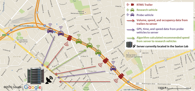
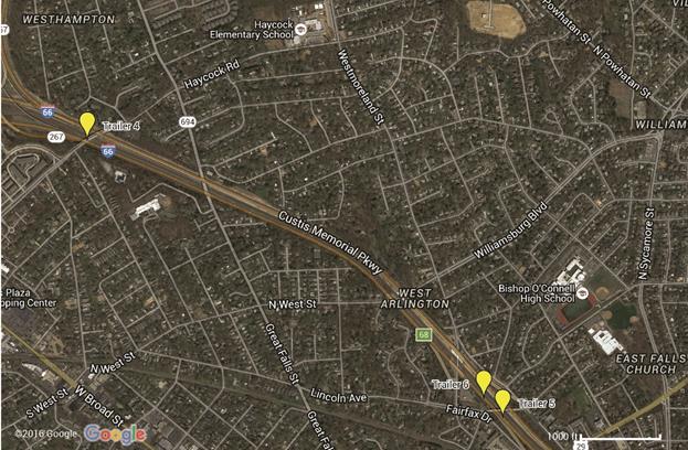
Input to the CAVs was based on corridor traffic speed measurement processing, as shown in figure 32. The project team developed a connected mobile traffic sensing (CMTS) trailer, including an RTMS measuring 15-s averaged speeds, volumes, and occupancies. These CMTS trailers were deployed along the roadway corridor. Measurements were relayed in real time to a central computer. The computer used this data to calculate recommendations to be sent to the CAVs. Figure 33 shows the CMTS trailer locations along I-66 as labeled trailers 4 through 6 containing the RTMSs used as sensors. Input to the CAVs was therefore based on macroscopic measures obtained along the test corridor.
©2016 Google® (Modifications: See Acknowldgements).
Figure 32. Map. Field experiment map of system integration.(14)
©2016 Google® (Modifications: See Acknowldgements).
Figure 33. Map. Test segment and trailer locations.(15)
The experiment hypothesized that by controlling traffic flow speeds in a congested region, traffic flows could be smoothed and that smoothing may provide operational and safety benefits. The experiment was performed on I-66 using the following:
Each vehicle had an onboard computer to record and communicate vehicle state (e.g., location, speed, acceleration, etc.) at a 10-Hz frequency to the laboratory in real time. The experiment was microscopic in nature, as the traffic flow monitoring was localized by probe vehicles to several hundred feet (meters) around the CAVs.
Mechanics of the experiment called for time periods in which the freeway would transition into congested conditions. Real-time speed data from the RTMSs were used to determine when to initiate the experiment. The experimenter at TFHRC monitored speeds recorded by the RTMSs. The experiment was initiated when speed measurements at the ends of the test corridor met threshold requirements. In this study, threshold requirements had an upstream speed recommendation approximately equal to the 60 mi/h (96.56 km/h) (i.e., free-flow speed) and a downstream speed approximately 10 mi/h (16.1 km/h) below the upstream speed. The six vehicles used in the experiment were staged near the test corridor's on-ramp so as to be launched into the traffic stream at the appropriate time.
The leading probe, which was used to measure existing traffic conditions, was sent down the roadway first. Its driver was instructed to travel in the center lane (out of three) at prevailing typical speeds. Figure 34 illustrates the experimental fleet configuration when vehicles were fully deployed on the freeway. It was assumed that on a microscopic traffic flow level, the leading probe trajectory represented typical traffic flow behavior.
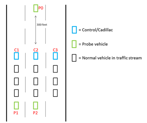
Figure 34. Illustration. Research and probe vehicle placement.
Next, the three CAVs entered the freeway as a group. They traveled at prevailing traffic speeds while adopting a parallel formation across the three lanes. The CAVs were switched into automated longitudinal control mode (speed and braking) upon entering the control section. The control section start was demarcated by location of the upstream CMTS trailer (trailer 4). The control section end was demarcated by the furthest downstream CMTS trailer (trailer 5). Drivers of the CAVs were instructed to remain in the lane assigned to each. CAV speeds were controlled from a central computer, which generated a longitudinal (along the roadway) speed profile as a function of position along the roadway. Automation within the vehicles downloaded speed recommendations every 2 s and directed the ACC to adjust speed accordingly. These vehicles traversed the control section under the automated speed recommendation algorithm executed by the central computer. At the end of the control section, the CAVs stopped downloading speed recommendations and once again mimicked the prevailing typical speeds.
The two following probes entered the freeway last. They positioned themselves in the two leftmost lanes (see figure 34) some distance 164.04 to 328.08 ft (50 to 100 m) behind the CAVs. Probe vehicle drivers were instructed to travel at prevailing typical speeds. Trajectory characteristics of the following probes, as recorded and relayed to the laboratory in real time, were the surrogate for measuring traffic impacts resulting from speed harmonization. Probe vehicle trajectory statistics were used to represent the results on a microscopic scale of the speed harmonization experiment.
The test corridor for the experiment consisted of a control section followed by a section of roadway where no control was applied. This allowed for comparing mobility benefits on nearby and similar sections of roadway, with and without speed harmonization impacts.
The algorithm created to produce speed recommendations was influenced by but differed from the work done in microscopic simulation for this corridor.(13,16) During pilot testing, the initial algorithm implementation reduced speeds too rapidly before following probes entered the congested test corridor. The three CAVs (travelling at near free-flow speeds of 50–60 mi/h (80.5–96.6 km/h)) received reduced-speed recommendations from the algorithm and adopted it as their set speed; however, the initial algorithm, upon detecting congestion in the test corridor, recommended a speed of 25 mi/h (40.2 km/h), the lowest possible set speed under cruise control. With surrounding vehicles travelling at free flow speeds, this created highly unsafe conditions. Therefore, a simplified speed-space relationship was developed. This approximated the complex relationships developed by past speed harmonization simulation efforts.
In these field experiment runs, the speed recommendation s(x,t) was a linear function of space (x) depending upon temporal (t) speed measurements from the roadside RTMSs as seen in figure 35 as follows:
![]()
Figure 35. Equation. Field experiment speed recommendation.
Where:
sn(t) = Speed measurement at trailer n at time t.
sm(t) = Speed measurement at trailer m at time t.
![]() = Distance between trailers n and m.
= Distance between trailers n and m.
This simplified speed-space relationship was used to test both performance of the CAVs and impacts on existing traffic flow. The speed recommendation has a floor value of 25 mi/h (40.2 km/h).
Data from the experimental probe and CAVs were used to answer the following basic questions:
Speed recommendations for the CAVs were generated every 2 s using the linear speed harmonization algorithm based on speed values measured by RTMSs. There was a minimum value of 25 mi/h (40.2 km/h) enforced on the recommendations.
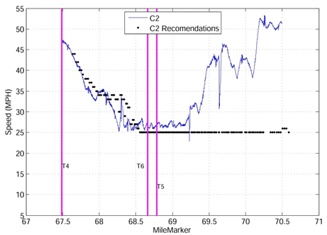
Figure 36 illustrates an example of CAV performance in this experiment. In the figure, CAV trajectory is plotted as a solid line, and the speed recommendations are plotted as points. CAVs generally followed the recommendations in all cases. The exceptions, exemplified near mile marker 68.25, occurred when CAVs were impeded by existing traffic. This is likely due to the use of radar to sense downstream vehicles, which would then set a minimum headway of 1.1 s. When the headway decreased past this threshold, the vehicular OEM systems performed braking maneuvers.
1mi/h = 1.61 km/h
Figure 36. Graph. Control vehicle trajectories and recommendations.
The conclusion, with regard to the first question in the previous list, is that CAVs operating in traffic can be expected to operate at recommended speeds (provided that speed is at or below existing traffic speed) with a small time delay. This affirmation of a positive answer to question 1 is a similar result to other CACC tests without a closed loop controller.(17)
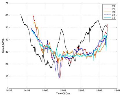
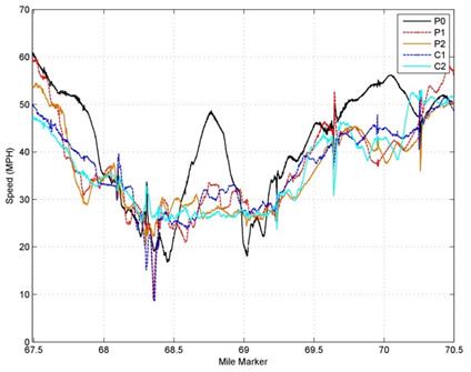
The probe vehicles were intended to act as high-resolution sensors of traffic conditions over a small region surrounding the CAVs in an effort to answer questions 2 and 3. Figure 37 shows the probe and CAV speed trajectories as a function of time. Figure 38 shows the speed trajectories as a function of mile marker. The probe and CAVs were released onto the roadway at slightly different times. As a result, the temporal and spatial relationships between experimental vehicles were not equivalent. It was asserted for this experiment that the recurring traffic congestion on this segment of roadway set up a stable but oscillatory structure along the roadway. In order to observe this behavior, the trajectories are best compared with space as the independent variable, as shown in figure 38.
1mi/h = 1.61 km/h
Figure 37. Graph. Temporal speed trajectories.
1mi/h = 1.61 km/h
Figure 38. Graph. Spatial speed trajectories.
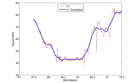
Trajectories of the probe and CAVs were impacted by both the surrounding traffic and by speed control enforced by the CAVs. CAV deviations from the programmed speed profile were primarily caused by slowing in response to exiting traffic. The resulting CAV speed profile had a large-scale spatial trend associated with control and congestion around which there were stochastic fluctuations. For example, the overall trend can be represented by a smooth version of the resulting CAV speed profile (see figure 39).
1mi/h = 1.61 km/h
Figure 39. Graph. Control speed trajectory and smoothed profile.
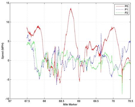
In order to characterize the trajectories, changes in the stochastic traffic flow component before and after probe vehicle passage were considered. To examine the stationary statistics of the trajectories, the overall trend was removed from the probe vehicle trajectories. The detrended trajectories are shown in figure 40.
1mi/h = 1.61 km/h
Figure 40. Graph. Detrended probe vehicle speed trajectories.
The probability density function (PDF) for a following probe trajectory is shown in figure 41, and the detrended PDF is shown in figure 42. The detrended data were approximately second-order stationary (constant temporal mean and variance for each probe) and thus could be examined using typical time series techniques in order to address question 2.
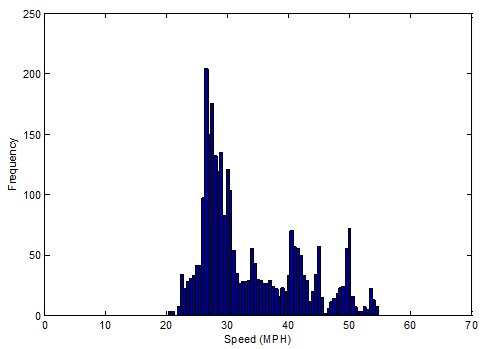
1mi/h = 1.61 km/h
Figure 41. Graph. PDF of raw data following probe speed trajectory.
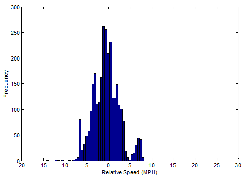
1mi/h = 1.61 km/h
Figure 42. Graph. PDF of detrended following probe speed trajectory.
The impact of speed harmonization could be observed in both the time and frequency domains. In the time domain, a stochastic process could be characterized by its PDF. In this study, the process histograms were used as a surrogate for the PDF. The PDF of the leading probe detrended speed trajectory, which characterizes traffic flow before speed harmonization is applied, is shown in figure 43. The PDFs clearly indicate different processes were measured before and after the control. The PDF shapes imply that the resulting traffic flow had lesser variability and was distributed about a single mode. In the time domain, it can thus be concluded that speed harmonization did indeed change the statistics and nature of the traffic flow.
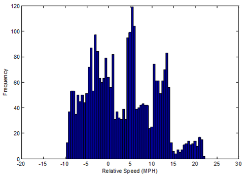
Figure 43. Graph. PDF of detrended leading probe speed trajectory.
Temporal characteristics of a stationary stochastic process are often characterized by the frequency content of the measured signals. In this study, the independent variable of distance along the roadway (i.e., mile marker) was treated as an ordered sampling base in the same way that time was used in time-series applications. The detrended speed trajectories were Fourier transformed (i.e., using a padded fast Fourier transform), and the power spectral density (PSD) was estimated.(18) PSD describes the amount of signal energy found at each frequency in the signal. For example, a signal consisting of a pure sinusoid will appear as a single peak in the PSD. A large PSD indicates oscillatory behavior. Figure 44 through figure 47 present the PSDs for the leading (P0) and following (P1 and P2) detrended trajectories on four separate field runs. In each case, the PSD for the leading probe vehicle shows large peaks. This indicates a significant oscillatory behavior in the traffic flow, which occurs on the order of one to two cycles per mile. PSDs for the following probes did not have these strong peaks at low frequencies.
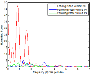
Figure 44. Graph. PSDs of detrended speed trajectories of the probe vehicles on July 8, 2014.
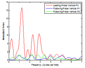
Figure 45. Graph. PSDs of detrended speed trajectories of the probe vehicles on September 29, 2015.
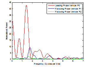
Figure 46. Graph. PSDs of detrended speed trajectories of the probe vehicles on October 15, 2015.
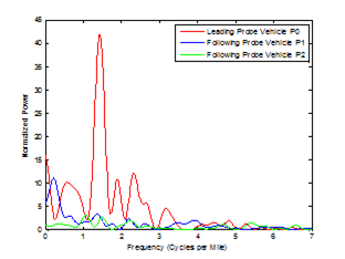
Figure 47. Graph. PSDs of detrended speed trajectories of the probe vehicles on October 21, 2015.
The PSD trends imply that speed harmonization acted effectively as a low-pass filter for speed fluctuation of the traffic stream. These PSD estimates indicate that the answer to question 2 is that traffic flow stream statistics were significantly different as a result of speed harmonization. The speed trajectories resulting from this control were indeed harmonized in the sense that measured oscillations in the traffic stream were dampened.
The answer to the third question regarding potential benefits has two aspects: first, are the impacts observed in some way beneficial, and, second, is there a disbenefit that offsets the possible benefits?
The reduction in oscillatory behavior has been shown to improve (reduce) fuel consumption in past work.(19) Results from this limited test indicate that for cases where the traffic stream was not broken down (e.g., became purely stop and go), there was a significant reduction in oscillatory traffic stream speed, implying a fuel consumption benefit.
Oscillations and large variability in traffic stream speed behavior have been associated with safety risks. This is often the underlying premise for applications such as queue warning.
On the disbenefit side of the equation, there is the potential for increasing segment travel times by applying speed harmonization. In this study, the following probes did not show a significant or consistent reduction in travel times compared to leading probe travel times, and thus the travel time disbenefit was not observed. That said, the experiment reported here was done on a microscopic traffic scale (though repeatedly), and these results are not guaranteed to materialize in a macroscopic measurement framework. This linkage of microscopic results to macroscopic outcomes for this application of CAVs has yet to be tested.