U.S. Department of Transportation
Federal Highway Administration
1200 New Jersey Avenue, SE
Washington, DC 20590
202-366-4000
Federal Highway Administration Research and Technology
Coordinating, Developing, and Delivering Highway Transportation Innovations
| REPORT |
| This report is an archived publication and may contain dated technical, contact, and link information |
|
| Publication Number: FHWA-HRT-13-018 Date: April 2013 |
Publication Number: FHWA-HRT-13-018 Date: April 2013 |
This chapter presents the results of the physical instrument measurements using the laboratory and field spectroradiometers. Human response results are also presented, including data from the hue, apparent saturation, and brightness rating tasks as well as the brightness ranking task.
The measurements taken with the spectroradiometers were used to calculate tristimulus values (X, Y, Z), which were then transformed into the L*a*b* color space. The resulting values were plotted on CIELAB plots with axes that were rotated 90 degrees clockwise. CIELAB plots have two axes (-a/+a, -b/+b). The -a/+a axis represents the approximate opponent colors of green and red. The -b/+b axis represents the approximate opponent colors of blue and yellow. While the opponent color axes in these plots are not precisely related to the named colors, there is a strong approximate relationship. The +a axis may not represent a pure red, but it is indicative of a color that is close to red. Most of the physical color measurements made in the experiment, whether in the laboratory or in the field, are expressed in terms of these CIELAB plots that have been rotated to more closely align with the UADs used to represent the perceptual color and apparent saturation judgments of the participants.
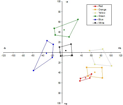
Figure 8 shows the mean laboratory and field color measurements of the white diffuse reflector plus color filters. These measurements were intended to serve as a reference against which to assess the effects of the field measurement geometry as compared to standard laboratory measurements. However, the white diffuse reflector with color filters displayed a much greater reduction in saturation than the various retroreflective samples when comparing field measurements to laboratory measurements. While the reason for this is unknown, it may have been due to the manner in which the stimuli were constructed. Plexiglas® sheets with color and neutral density filters were placed in front of the white diffuse reflector to create the diffuse color samples, while color and neutral density filters were adhered directly onto samples of the white retroreflective sheeting. Daylight entering at the edges of the Plexiglas® sheet and interreflections between the back surface of the Plexiglas® and the front surface of the white diffuse reflector may have been responsible for the measured reduction in color saturation. In any case, the reduction in saturation resulted in an inability to use the diffuse measurements as a link between laboratory and field measurements.
 at the bottom to -a (-100) at the top, representing the approximate opponent process colors of red and green, respectively. The abscissa goes from -b (-100) at the left to +b (+100) at the right, representing the approximate opponent process colors of blue and yellow, respectively. The measurements portrayed in this color space are mean physical color determinations for the white diffuse reflector with color filters. Six four-sided polygonal color boxes are shown for each of two measuring instruments: the laboratory PR-715 and field PR-650 spectroradiometers. The six pairs of color boxes are for red, orange, yellow, green, blue, and white. For each PR-715 color box, the four corners are labeled with a letter indicating the color (R, O, Y, G, B, and W), followed by a number (1, 2, 3, and 4) indicating the assignment of each corner point for a given box. The first five pairs of color boxes are roughly arranged in the provided color order counterclockwise in a radial manner around the color space, with the white color box near the origin in the center. The sizes, shapes, and orientations of the color boxes are different from color to color as well as within the same color for the two different measuring instruments.") |
| Figure 8. Graph. Mean laboratory (PR-715) and field (PR-650) physical color measurements of the white diffuse reflector with color filters. |
The labels in figure 8 identify the corners of the laboratory color areas. Each label indicates the color (red [R], yellow [Y], orange [O], green [G], blue [B], and white [W]) and filter number (1, 2, 3, and 4). Due to space considerations, the labels are only provided in this graph. However, the corners of the color areas stay in the same relational orientation for all the physical measurements. Therefore, the labels in figure 8 can be referred to when viewing subsequent CIELAB plots. Since the original field measurements were made only on every 10th trial during the determination of color ratings, not all samples were measured and some samples were measured several times. Thus, the more comprehensive field chromaticity and luminance measurements made 1 year after the perceptual experiment are presented in figure 8.
Since most of the color areas represent four-sided figures, the terms color boxes and color areas are used interchangeably. In the laboratory data from the PR-715 shown in figure 8, the color areas are typically well shaped and oriented. The exception is the red box, which is the smallest of all the boxes and is not aligned on the +a axis but skewed toward the +b axis. This illustrates the difficulty in comparing color measurements with subjective color assessments. The CIELAB +a axis does not align with the red axis of a UAD. The other CIELAB axes are oriented closer to the named color axes (yellow, green, and blue) of a UAD. The centroid for the blue box is almost exactly on the ‑b axis. The centroid for the green box is slightly shifted toward the +b axis, and the centroid for the yellow box is shifted somewhat toward the +a axis. The centroid for the white box is also shifted toward the +b axis. Since the a,b color axes cannot be specifically related to named colors, these shifts may not directly relate to color changes observed by human observers and should be regarded primarily in terms of orientation in the CIELAB color space. Thus, the only major unexpected outcome for the PR-715 measurements is the relatively small size of the red color box.
The field measurements made with the PR-650 show all of the previously discussed characteristics, with two significant exceptions. First, all of the colors measured in the field, except for white, are less saturated than their laboratory counterparts. Second, the red color box had a slight shift in hue toward the +b axis, so that it slightly overlapped the orange color box in terms of hue angle. The hue angle is the angle of a constant hue line that radiates out from the origin of the CIELAB plot from white toward any saturated color. A given hue angle represents all colors of the same hue but different saturation. The shift in the red color box is an unexpected and unexplained result.
Figure 9 shows the mean laboratory and field physical color measurements averaged over the four retroreflective sheeting types. The standard errors of the mean for the field measurements in both figure 8 and figure 9 ranged from 1.6 to 2.3; so mean differences greater than 5 scale units are likely to be statistically significant. When compared with figure 8, figure 9 reveals much less reduction in saturation.
 at the bottom to -a (-100) at the top, representing the approximate opponent process colors of red and green, respectively. The abscissa goes from -b (-100) at the left to +b (+100) at the right, representing the approximate opponent process colors of blue and yellow, respectively. The measurements portrayed in this color space are mean physical color determinations for retroreflective sign materials averaged over the four retroreflective sheeting types. Six four-sided polygonal color boxes are shown for each of two measuring instruments: the laboratory PR-715 and the field PR-650 spectroradiometers. The six pairs of color boxes are for red, orange, yellow, green, blue, and white. The first five pairs of color boxes are roughly arranged in the provided color order counterclockwise in a radial manner around the color space, with the white color box near the origin in the center. The sizes, shapes, and orientations of the color boxes are different from color to color as well as within the same color for the two different measuring instruments.") |
| Figure 9. Graph. Mean laboratory (PR-715) and field (PR-650) physical color measurements averaged over four retroreflective sheeting types. |
The PR-715 measurements of the retroreflective materials are closer to the origin (the point of zero saturation) than the measurements of the diffuse samples, and the distance between the contiguous red and orange boxes is shorter. The resulting smaller separation between the red and orange color boxes may make them more difficult to discriminate. In fact, a hypothetic constant hue line between the O2 and R3 data points indicates a slight overlap in the measured red and orange color boxes. The R4 corner of the red box has a greater level of uncertainty due to stray light concerns at long wavelengths for the PR-715.
The complete set of field measurements taken 1 year after the experiment was closely correlated to the limited set of measurements taken during the perceptual assessments (see figure 30 in appendix B). So, the results analyzed and presented are based on the more complete field measurement data set taken in 2008. The PR-650 color boxes show the same trend as the laboratory measurements, but with significantly less reduction in saturation (see figure 9). The color boxes measured in the field are in relatively the same shape and orientation as the corresponding color boxes measured in the laboratory. For field measurements of retroreflective sheeting materials, the outer boundary of each color box, except white, was shifted toward the center of the diagram relative to the laboratory measurements. The white color box was shifted slightly along the +b axis. The orange box moved closer to the red box and is considerably compressed along the b axis. The centroid of the red color box fell on the same hue line as was measured in the laboratory, indicating consistency of the spectroradiometer measurements. The absence of a shift in the hue line for the field measurements of the red retroreflective materials results in the red color remaining somewhat separated from the orange color box.
The PR-715 laboratory measurements of the O2 and R3 data points indicate a slight overlap of the red and orange color boxes, while the PR-650 field measurements indicate a slight separation between the color boxes. Taking into account the uncertainty of the measurements, this result indicates the potential for some degree of perceptual confusion at the extreme edges between the orange and red colors used on retroreflective signs. The probability of accurate discrimination between the yellow and the orange color boxes appears to be relatively better than between orange and red. The hue lines defining the long wavelength side of the yellow box and the short wavelength side of the orange box do not overlap. There is a larger separation in terms of hue angle between the blue and green color boxes and between the green and yellow color boxes, indicating that those colors of retroreflective materials are likely to produce less color confusion for people with normal color vision.
Figure 10 shows the laboratory color measurements taken with the LabScan® XE and averaged over the four sheeting types. The results are similar to the laboratory measurements taken with the PR-715. The major differences are in the red, orange, and yellow boxes. Specifically, these colors demonstrate a greater range in saturation, with the centroids of the color boxes at a greater distance from the origin. As with the measurements using the PR-715, there is overlap of the O2 and R3 data points. The increase in saturation may be due to the impact of sparkle (incomplete retroreflection) on the LabScan® XE measurements.(2) The mean color measurements for this color instrument separated by retroreflective sheeting type are shown in figure 29 in appendix B.
 |
| Figure 10. Graph. Laboratory (LabScan® XE) physical color measurements averaged over four retroreflective sheeting types. |
Figure 11 and figure 12 show the physical measurements of the four individual retroreflective sheeting types that make up the averages depicted in figure 9. For the laboratory results, the measurements are tightly nested, with the type VIII material having slightly more saturated colors and the type III material having the least saturated colors (see figure 11). For the field results, the color boxes overlap rather tightly, except for red, orange, and yellow (see figure 12). For these three colors, the same pattern emerges in the relative saturation of the type VIII and type III materials but to a lesser degree. The type VIII material, which produced the most saturated colors in the laboratory, did not produce as saturated colors in the field.
 at the bottom to -a (-100) at the top, representing the approximate opponent process colors of red and green, respectively. The abscissa goes from -b (-100) at the left to +b (+100) at the right, representing the approximate opponent process colors of blue and yellow, respectively. The measurements portrayed in this color space are mean physical color determinations for retroreflective sign materials with each of the four sheeting types shown separately. Six groups of four four-sided polygonal color boxes are shown for laboratory measurements made with the PR-715 spectroradiometer. The six groupings are for red, orange, yellow, green, blue, and white. The first five groups of color boxes are roughly arranged in the above color order counterclockwise in a radial manner around the color space, with the white color box group near the origin in the center. Within the same color, the sizes, shapes, and orientations of the color boxes differ slightly depending upon the particular sheeting type. The sheeting types are ASTM types III, VIII, IX, and Proposed (P)-XI.") |
| Figure 11. Graph. Laboratory (PR-715) physical color measurements of four retroreflective sheeting types. |
 at the bottom to -a (-100) at the top, representing the approximate opponent process colors of red and green, respectively. The abscissa goes from -b (-100) at the left to +b (+100) at the right, representing the approximate opponent process colors of blue and yellow, respectively. The measurements portrayed in this color space are mean physical color determinations for retroreflective sign materials with each of the four sheeting types shown separately. Six groups of four four-sided polygonal color boxes are shown for field measurements made with the PR-650 spectroradiometer. The six groupings are for red, orange, yellow, green, blue, and white. The first five groups of color boxes are roughly arranged in the above color order counterclockwise in a radial manner around the color space, with the white color box group near the origin in the center. Within the same color, the sizes, shapes, and orientations of the color boxes differ slightly depending upon the particular sheeting type. The sheeting types are ASTM types III, VIII, IX, and proposed (P)-XI.") |
| Figure 12. Graph. Field (PR-650) physical color measurements of four retroreflective sheeting types. |
The variability of natural daylight conditions during the course of the study affected the luminance and CCT of the illuminant (the sky) and, thus, affected the measurements. A diffuse white standard reflector was measured before and after each block of color appearance trials to capture the variability of the daylight illumination conditions (e.g., passing clouds, high overcast, etc.) Figure 13 shows the entire set of field measurements for the diffuse white standard as measured under varying sky conditions throughout the study. As expected, the chromaticity coordinates varied due to the changing daylight illumination. Higher reflected luminance tended to be correlated with lower color temperature and lower reflected luminance with higher color temperature. This relationship is depicted in the legends for the extreme data points in figure 13. Under bright conditions, with abundant sunlight, the luminance is higher and the color temperature is lower, moving toward yellow. Passing clouds or high overcast blocked direct sunlight, resulting in reduced luminance and a higher color temperature. Thus, clear sunlight conditions tended to provide more spectral power in long wavelengths than did cloudy conditions. The measured data points fall fairly closely along the Planckian black body contour in the CIE chromaticity diagram, indicating an orderly progression of CCT similar to that of a black body radiator. These diffuse white measurements were used to adjust measurements for the individual color samples to account for the variable sky conditions during the course of a single day and across different days using the X, Y, Z to L*a*b* transformation formulae.(4, 10)
 values are shown for the extreme data points. The single data point in the lower left has a luminance of 1,597 cd/m2 and a CCT of 6,628 K. The maximum data point in the upper right has a luminance of 2,147 cd/m2 and a CCT of 5,575 K.") |
| Figure 13. Graph. Individual field chromaticity measurements for the diffuse white standard reflector. |
The human response data for hue and apparent saturation were plotted using UADs, which have two axes (B-Y and R-G) that range from -100 to +100. The B-Y axis represents the opponent colors of blue (-100) and yellow (+100). The R-G axis represents the opponent colors of red (-100) and green (+100). These diagrams represent a two-dimensional perceptual color space based on orthogonal red-green (R-G) and blue-yellow (B-Y) dimensions. The UADs are derived from the opponent process theory of human vision, where green and red operate as one antagonistic color pair, and blue and yellow operate as another antagonistic color pair. These two dimensions are similar to those used in the CIELAB formulation, with one axis (+a/-a) indicating the approximate red/green dimension and the other axis (-b/+b) indicating the approximate blue/yellow dimension. In the UAD formulation, a third dimension, designated L, provides an achromatic measurement from black to white. This third dimension is associated with the “lightness,” or brightness, of the stimulus. For objective instrument measurements, the corresponding three dimensions (L, a, and b) can be combined into a three-dimensional color space, referred to as “LAB.” CIELAB, a widely used version of this formulation, was used to describe the corresponding instrument measurements in this report.(10)
Comparison of Perceptual and Physical Measurements
Figure 14 shows the mean perceptual color ratings for the standard diffuse reflector with color filters for all 17 research participants. The labels in figure 14 identify the corners of the mean perceptual rating color boxes. The labels are the same as those used in figure 8, identifying the color (R, Y, O, G, B, and W) and filter number (1, 2, 3, and 4). Because of space considerations, the labels are only provided in this UAD. However, the corners of the color boxes stay in the same basic relative orientation for all the perceptual rating judgments (unless noted), and therefore, the labels in figure 14 can be referred to when viewing subsequent UADs. The mean perceptual measurements in figure 14 may be compared with the mean field measurements in figure 8. The scales for CIELAB and the UADs are not equivalent, so no absolute comparisons can be made; however, relative comparisons, such as shifts in opposite directions, can be made.
 showing the mean perceptual color ratings given by the 17 research participants for the white diffuse reflector with color filters. The UAD shows the opponent colors of red and green along the ordinate, ranging from R (red) (-100) at the bottom to G (green) (+100) at the top. The opponent colors of blue and yellow are shown along the abscissa, ranging from B (blue) (-100) at the left to Y (yellow) (+100) at the right. Six four-sided polygonal color boxes are shown for red, orange, yellow, green, blue, and white. For each color box, the four corners are labeled with a letter indicating the color (R, O, Y, G, B, and W), followed by a number (1, 2, 3, and 4) indicating the counterclockwise progression of each corner around a given box. The first five color boxes are roughly arranged in the above color order counterclockwise in a radial manner around the color space, with the white color box near the origin in the center. The orange color box is collapsed across the Y dimension and appears as an almost vertical line. All of the color boxes are located close to the origin, with the extreme values usually closer to the origin than a rating of about -50 or +50.") |
| Figure 14. Graph. Mean perceptual color ratings for the white diffuse reflector with color filters for 17 participants. |
A comparison between figure 8 and figure 14 reveals several important differences in the instrument and perceptual measurements of the reference colors. The most prominent of these differences relates to the red color box. The perceptual measurements show an expanded red color box that is not the smallest in size. For the perceptual measurements, the yellow box is somewhat compressed along the yellow dimension, and the orange box is extremely compressed along the yellow dimension. In the case of the orange box, this extreme degree of compression along the yellow axis indicates that, although instrument measurements show differing levels of saturation along the +b axis, human observers show an insensitivity to these differences. The human observers respond with the same amount of yellow in their color ratings for all four corners of the orange box. The red, orange, and yellow color boxes are closest in terms of hue angle. In figure 14, the constant hue lines separating the orange and yellow boxes reveal no direct overlap, but the hue angle line separating the red and orange boxes indicates an overlapping of these two color designations. Some degree of perceptual color confusion might be expected in this area. The perceptual results for the white, green, and blue color boxes show distinct color separations.
The mean perceptual color measurements for all 17 participants averaged over the 4 retroreflective material types are shown in figure 15. The standard errors for the means along either dimension (R-G or B-Y) ranged from 0.61 to 0.62; so mean differences greater than 1.2 scale units are likely to be statistically significant. The mean perceptual color measurements in figure 15 may be compared to the mean laboratory color measurements for the same stimuli in figure 9. Since the scales are not equivalent, only certain relative comparisons may be made. Such a comparison of figure 9 and figure 15 for the retroreflective samples revealed many of the same basic differences found in the comparison of figure 8 and figure 14 for the diffuse color samples. The green and white boxes both changed from the yellow side to the blue side of the neutral axis. For perceptual measurements, the yellow color box and orange color box are compressed along the saturation dimension, with the orange box more compressed than the yellow box.
 showing the mean perceptual color ratings given by the 17 research participants for retroreflective materials averaged over the four sheeting types tested. The UAD shows the opponent colors of red and green along the ordinate, ranging from R (red) (-100) at the bottom to G (green) (+100) at the top. The opponent colors of blue and yellow are shown along the abscissa, ranging from B (blue) (-100) at the left to Y (yellow) (+100) at the right. Six four-sided polygonal color boxes are shown for red, orange, yellow, green, blue, and white. The first five color boxes are depicted progressing counterclockwise around the graph in the anticipated order, with the white color box located near the origin in the center. As in figure 14, the orange color box is collapsed across the Y dimension and appears as a positively sloped line slanted somewhat off of vertical. All of the color boxes are located rather close to the origin, with the extreme values usually located closer to the origin than a rating of about -40 or +40, except for the red box, which has an extreme R rating of about -47.") |
| Figure 15. Graph. Mean perceptual color ratings averaged over four retroreflective sheeting types for 17 participants. |
Comparison of Perceptual Measurements for Diffuse versus Retroreflective Samples
In addition to the data provided in figure 15, the mean color ratings given by each participant for the type VIII material are in appendix C to provide an indication of the between-participant variability inherent in the mean measurements. Figure 15 may be compared with figure 14 to reveal differences in the shapes and locations of the perceived color boxes for retroreflective materials relative to the diffuse color samples. The most prominent difference is that the red color box in figure 15 has moved significantly toward a more saturated red but its size has been substantially reduced. The yellow color box has become even more compressed along the yellow dimension. The orange box remains extremely compressed, although its orientation has changed slightly. For the retroreflective materials, the orange box is not oriented perpendicular to the B-Y axis, indicating slightly greater sensitivity to differences in yellow content. The red, orange, and yellow color boxes remain closest in terms of hue angle, but there are no direct overlaps of the mean perceptual measurements. The results for the white, green, and blue color boxes continue to show distinct color separations.
Hue Line Separation of Colors and Saturation
In figure 15, hue angle lines between the orange and yellow boxes and the red and orange boxes reveal clear hue separations between the colors. This outcome may indicate adequate perceptual discrimination among these colors despite the fact that some of the instrument measurements overlapped. A comparison of the perceptual measurements of diffuse color boxes in figure 14 and retroreflective color boxes in figure 15 does not demonstrate the same reduction in saturation for the diffuse colors as was indicated with the instrument measurements (see figure 8 and figure 9). This may indicate that human observers are not as sensitive to reductions in saturation or that the mechanism that resulted in reduced saturation for the diffuse color samples was related to the instruments used. The perceptual measurements resulted in lower overall saturation levels than the instrument measurements. This change toward the lower end of the saturation scale may also have resulted in a reduced sensitivity to changes in saturation. Finally, the tendency of human observers to attempt to maintain color constancy over a variety of different lighting and reflection variables may account for this apparent reduction in sensitivity.
Differences in the perceptually measured mean color boxes for the four individual retroreflective sheeting types are shown in figure 16. The figure reveals numerous data points close to the hue angle lines separating yellow and orange as well as orange and red. This proximity indicates the potential for perceptual color confusion. These areas, which are similar to the border regions of the FHWA color boxes, are of particular interest and were the basis for conducting further analyses.(3) The specific points of interest were comparisons of O1 to R4, O2 to R3, Y3 to O3, and Y4 to O4.
 showing the mean perceptual color ratings given by the 17 research participants for retroreflective materials with the mean values for the four types of materials shown separately. The sheeting types are ASTM types III, VIII, IX, and proposed (P)-XI. The UAD shows the opponent colors of red and green along the ordinate, ranging from R (red) (-100) at the bottom to G (green) (+100) at the top. The opponent colors of blue and yellow are shown along the abscissa, ranging from B (blue) (-100) at the left to Y (yellow) (+100) at the right. Six groupings of four color boxes each are shown for the colors red, orange, yellow, green, blue, and white. The first five groupings of color boxes are depicted progressing counterclockwise around the graph in the expected order, with the white color box group located in the center. All of the color boxes are located somewhat close to the origin, with the extreme values usually closer to the origin than a rating of about -50 or +50.") |
| Figure 16. Graph. Mean perceptual color ratings of four sheeting types. |
The data points of interest were converted from a Cartesian to a polar coordinate system. This method has been used to measure differences in hue angles in the CIELAB color space and was applied here to measure differences in hue angles in UADs.(14) The means of the hue angles for data points of interest were plotted with their respective 95 percent confidence limit (two standard errors of the mean) to determine potential color/sheeting combinations for comparison. Figure 17 shows the mean hue angle with two standard errors of the mean for red (corners 3 and 4), orange (corners 1, 2, 3, and 4), and yellow (corners 3 and 4) for all four retroreflective sheeting types.
, and retroreflective sign material type. The ordinate represents the mean hue angle, ranging from 4.75 to 6.0 radians. The abscissa shows a categorical scale of the particular selected retroreflective stimulus, identified by color, color filter, and material type. The data points are bounded by error bars representing two standard errors of the mean, or the 95 percent confidence limits for the mean. The mean hue angles are generally grouped by color and filter (quadrant of the color box), with material type having a smaller effect.") |
| Figure 17. Graph. Mean hue angle in radians with 95 percent confidence limit of two standard errors. |
Those data points in figure 17 that are located within the 95 percent confidence limit of another data point were evaluated using paired comparison t-tests. There were 13 such pairs of data points. To control the familywise error rate due to multiple t-tests, a Bonferroni post-hoc adjustment was made so that the probability required at the 0.05 significance level would be 0.004 (p = 0.05/13). The results in table 3 indicate that observed differences were not statistically significant in 11 out of 13 color/sheeting combinations. These 11 pairs were the O1 type III and R4 type VIII, O1 type III and R4 type IX, O1 type III and R4 type P-XI, O3 type P‑XI and Y3 type P-XI, O3 type VIII and Y3 type P-XI, O3 type IX and Y3 type P-XI, O4 type III and Y4 type VIII, O4 type III and Y3 type P-XI, O4 type VIII and Y3 type P-XI, O4 type IX and Y3 type P-XI, and O4 type P‑XI and Y3 type P-XI paired comparisons. For these paired comparisons, non-significant differences indicate no statistical difference, and therefore, some degree of perceptual color confusion might be expected between signs having any of these 11 unique color and sheeting combinations. Specifically, the comparisons between O1 type III and R4 type IX and between O4 type III and Y3 type P-XI had the smallest mean hue angle difference, 0.041 radians, and might be expected to produce the most color confusion. In table 3, the asterisk means that the difference was statistically significant and, therefore, of less interest.
Table 3. Paired comparison t-tests for hue angles. |
||||||||
| Paired Comparison | Paired Differences | t | Degrees of Freedom | Significance(2-tailed) | ||||
| Mean Hue Angle Difference (Radians) | Standard Deviation | Standard Error Mean | 95 Percent Confidence Interval of the Difference | |||||
| Upper | Lower | |||||||
| Orange 1 type III, Red 4 type VIII |
0.063 | 0.099 | 0.024 | 0.012 | 0.114 | 2.612 | 16 | 0.019 |
| Orange 1 type III, Red 4 type IX |
0.041 | 0.137 | 0.033 | -0.029 | 0.112 | 1.251 | 16 | 0.229 |
| Orange 1 type III, Red 4 type P-XI |
0.094 | 0.143 | 0.035 | 0.020 | 0.167 | 2.698 | 16 | 0.016 |
| Orange 1 type P-XI, Red 4 type IX |
0.103 | 0.118 | 0.029 | 0.042 | 0.164 | 3.587 | 16 | 0.003* |
| Orange 3 type P-XI, Yellow 3 type P-XI | -0.101 | 0.174 | 0.042 | -0.191 | -0.011 | -2.385 | 16 | 0.030 |
| Orange 3 type VIII, Yellow 3 type P-XI | -0.121 | 0.163 | 0.039 | -0.205 | -0.037 | -3.068 | 16 | 0.007 |
| Orange 3 type IX, Yellow 3 type P-XI | -0.147 | 0.214 | 0.052 | -0.257 | -0.037 | -2.823 | 16 | 0.012 |
| Orange 4 type III, Yellow 4 type VIII | -0.122 | 0.150 | 0.036 | -0.199 | -0.044 | -3.344 | 16 | 0.004 |
| Orange 4 type IX, Yellow 4 type VIII | -0.134 | 0.125 | 0.030 | -0.198 | -0.069 | -4.402 | 16 | 0.000* |
| Orange 4 type III, Yellow 3 type P-XI | -0.041 | 0.181 | 0.044 | -0.134 | 0.051 | -0.946 | 16 | 0.358 |
| Orange 4 type VIII, Yellow 3 type P-XI | -0.064 | 0.171 | 0.042 | -0.152 | 0.024 | -1.539 | 16 | 0.143 |
| Orange 4 type IX, Yellow 3 type P-XI | -0.054 | 0.196 | 0.048 | -0.155 | 0.047 | -1.128 | 16 | 0.276 |
| Orange 4 type P-XI, Yellow 3 type P-XI | -0.069 | 0.148 | 0.036 | -0.145 | 0.007 | -1.916 | 16 | 0.073 |
* Indicates statistically significant at adjusted 0.05 level (> 0.004). |
||||||||
In summary, laboratory physical color measurements of the white diffuse reflector with a color filter showed well-defined color boxes arranged in an orderly manner when expressed in terms of CIELAB plots. The only major unexpected outcome was the relatively small size of the red color box. In the case of retroreflective colors, the laboratory measurements revealed that retroreflective properties tend to reduce the saturation of all colors. The resulting smaller separation between some of the color boxes may make them more difficult to discriminate. The reduced size and closer proximity of the red, orange, and yellow color boxes for retroreflective materials indicate a higher probability of color confusion between certain orange and yellow signs and between certain orange and red signs. Perceptual color measurements revealed an additional consideration. For retroreflective materials, the orange color box collapsed and the yellow color box became extremely compressed along the yellow axis of a UAD. This compression along the yellow dimension indicates that the human observers were relatively insensitive to saturation changes along the yellow dimension for yellow and orange sign materials. Nevertheless, constant hue lines for perceptual measurements showed a greater separation between orange and yellow and between orange and red than in the physical measurements. The results of the study indicate that human observers are able to discriminate colors in this region of the spectrum better than might be inferred from CIELAB plots of physical measurements. The perceptual results for the white, green, and blue color boxes showed distinct color separations, as did the physical measurements.
The human response data for brightness were collected using two different methodologies. The brightness rating data were collected for each color sample presented in the color appearance portion of the experiment. Participants rated each color sample on a scale of 0–100, with 0 being the darkest and 100 being the brightest. The brightness ranking data were collected for two subsets of color samples (yellow and red). Participants ranked each of the five color samples in descending order from 1 to 5, with 1 being the brightest and 5 being the darkest.
Figure 18 shows the mean luminance of the color samples measured by the PR-650 during the color appearance portion of the study. The mean values are averaged across seven replications of the same color area corner. The error bars represent ±2 standard errors of the mean (95 percent confidence limit).
-XI retroreflective materials. Within each of the five material types, the lower level of grouping denotes the six colors: red, orange, yellow, green, blue, and white. The tops of the bars in the graph are bounded by error bands representing two standard errors of the mean, or the 95 percent confidence limits for the mean. The higher level of grouping reveals that the diffuse samples, color for color, are generally higher in mean luminance than the retroreflective samples. Within a given material type, the white sample always has the highest mean luminance, followed by the yellow sample. The red and blue samples have the lowest mean luminance. This pattern repeats itself consistently across all five material types.") |
| Figure 18. Graph. Mean field luminance measurements by sheeting type for all colors. |
The five colors in figure 18 generally followed a strict order of relative luminance, with a peak in orange and yellow and lower luminance values for red and blue, the extremes of the visibility spectrum. White had a consistently higher mean luminance than any other color within each sheeting type; however, in general, the remaining colors retained their same relative position across the sheeting types. A comparison of the white samples reveals that type III sheeting had the lowest mean luminance. The other three retroreflective types had similar luminance values, and the diffuse white sample had the highest measured mean luminance. The diffuse color samples had the highest mean luminance values for each color when compared to the respective mean luminance values of the retroreflective samples, and the type III samples had the lowest luminance values. The relatively small error bands indicate that most of these luminance differences are likely to be statistically significant.
Figure 19 shows the mean luminance values of the Y2 and R2 color samples. These were the only color samples used in the ranking portion of the color appearance determinations. The error bars represent ±2 standard errors of the mean. The relatively high variability is not surprising, given the small number of observations and the variable number of measurements for each color sample. Figure 19 illustrates that the diffuse color samples had the highest mean luminance for both yellow and red, as evidenced by the lack of overlapping error bars. The mean luminance values for the four retroreflective sheeting types for each color were similar, with no apparent differences. Overall, the red colors produced far lower luminance values than the yellow colors. A comparison of the relationships in figure 18 and figure 19 reveals similar patterns. This similarity is to be expected, given that the samples used in figure 19 represent a subset of the samples used in figure 18.
-XI retroreflective materials. Within each of the five material types, the lower level of grouping denotes the two colors: red and yellow. The tops of the bars are bounded by error bands representing two standard errors of the mean. Within each bar is the mean luminance value in cd/m2. The higher level of grouping reveals that the diffuse samples are generally higher in mean luminance than the retroreflective samples. Within a given material type, the yellow sample always has a higher mean luminance than the red sample.") |
| Figure 19. Graph. Mean field luminance measurements of the yellow and red samples used for the brightness ranking task. |
Figure 20 shows the mean brightness ratings by sheeting type for all colors from the perceptual ratings. In this case, the means are averaged across all four color areas, across all replications of measurements, and across all 17 research participants. The error bars represent ±2 standard errors of the mean (95 percent confidence limit).
-XI retroreflective materials. Within each of the five material types, the lower level of grouping denotes the six colors: red, orange, yellow, green, blue, and white. The tops of the bars in the graph are bounded by error bands representing two standard errors of the mean, or the 95 percent confidence limits for the mean. The relationships shown in the bar graph are similar to those in figure 18. The higher level of grouping reveals that the diffuse samples, color for color, are generally higher in mean brightness ratings than the retroreflective samples. Within a given material type, the white sample always has the highest mean brightness rating followed by the yellow sample. The red and blue samples have the lowest mean brightness ratings. This pattern repeats itself consistently across the five material types.") |
| Figure 20. Graph. Mean brightness ratings by sheeting type for all colors. |
Figure 20 shows the effect of color and sheeting on human brightness ratings. Based on the measured field luminance values in figure 18, it was anticipated that the diffuse samples would have higher ratings and type III sheeting would have lower ratings than types VIII, IX, and P-XI. This outcome is shown in figure 20, where the diffuse reflector is generally the brightest and the type III sheeting is generally the least bright for a given color. Consequently, no further analysis was done regarding these two materials. However, it was unclear how sheeting types VIII, IX, and P-XI would compare among each other, and so additional analyses were conducted on these materials. Within a given color, post-hoc paired-sample t-tests were conducted to determine if there were any statistically significant differences between certain pairs of sheeting types. The color-sheeting combinations chosen for paired comparisons were the types VIII, IX, and P-XI with overlapping 95 percent confidence ranges (two standard errors). Based on the results of the initial analysis, all three sheeting types for each color were compared, which resulted in 18 post-hoc paired comparison tests. To control the familywise error rate due to multiple t-tests, a Bonferroni post-hoc adjustment was made so that the probability required at the 0.05 significance level would be 0.003 (p = 0.05/18). Table 4 shows the results of the selected t-tests, of which only one was statistically different at the Bonferroni-adjusted significance of 0.003. In all of the other 17 cases, the observed differences in brightness ratings were not statistically significant. Brightness discrimination among these comparisons would not be expected to be very good. Furthermore, brightness discrimination of this sort is of less practical importance in driving situations. Overall the results indicate that the type P-XI sheeting is not different in terms of the human daytime brightness rating response than the two other microprismatic sheeting types tested (types VIII and IX).
Table 4. Paired comparison t-tests for brightness ratings. |
||||||||
| Paired Comparison | Paired Differences | t | Degrees of Freedom | Significance(2-tailed) | ||||
| Mean Rating Difference (percent) | Standard Deviation | Standard Error Mean | 95 Percent Confidence Interval of the Difference | |||||
| Upper | Lower | |||||||
| Blue type VIII, Blue type IX | 1.12 | 2.68 | 0.65 | -0.26 | 2.50 | 1.73 | 16 | 0.104 |
| Blue type VIII, Blue type P-XI | 1.197 | 3.316 | 0.804 | -0.508 | 2.901 | 1.488 | 16 | 0.156 |
| Blue type IX, Blue type P-XI | 0.074 | 2.883 | 0.699 | -1.408 | 1.556 | 0.106 | 16 | 0.917 |
| Green type VIII, Green type IX | 1.256 | 3.476 | 0.843 | -0.531 | 3.043 | 1.490 | 16 | 0.156 |
| Green type VIII, Green type P-XI | 1.186 | 2.676 | 0.649 | -0.190 | 2.562 | 1.827 | 16 | 0.086 |
| Green type IX, Green type P-XI | -0.070 | 2.974 | 0.721 | -1.600 | 1.459 | -0.098 | 16 | 0.923 |
| Orange type VIII, Orange type IX | 2.537 | 3.111 | 0.755 | 0.937 | 4.137 | 3.362 | 16 | 0.004 |
| Orange type VIII, Orange type P-XI | 0.074 | 2.304 | 0.559 | -1.111 | 1.259 | 0.132 | 16 | 0.896 |
| Orange type IX, Orange type P-XI | -2.463 | 2.694 | 0.653 | -3.848 | -1.078 | -3.770 | 16 | 0.002* |
| Red type VIII, Red type IX | 1.894 | 2.869 | 0.696 | 0.419 | 3.369 | 2.722 | 16 | 0.015 |
| Red type VIII, Red type P-XI | 1.226 | 2.950 | 0.715 | -0.291 | 2.742 | 1.713 | 16 | 0.106 |
| Red type IX, Red type P-XI | -0.669 | 2.613 | 0.634 | -2.012 | 0.675 | -1.055 | 16 | 0.307 |
| White type VIII, White type IX | 1.109 | 1.743 | 0.423 | 0.212 | 2.005 | 2.622 | 16 | 0.019 |
| White type VIII, White type P-XI | 0.487 | 1.574 | 0.382 | -0.322 | 1.296 | 1.276 | 16 | 0.22 |
| White type IX, White type P-XI | -0.621 | 1.654 | 0.401 | -1.472 | 0.229 | -1.549 | 16 | 0.141 |
| Yellow type VIII, Yellow type IX | 1.434 | 3.076 | 0.746 | -0.148 | 3.015 | 1.922 | 16 | 0.073 |
| Yellow type VIII, Yellow type P-XI | 1.488 | 2.669 | 0.647 | 0.116 | 2.860 | 2.299 | 16 | 0.035 |
| Yellow type IX, Yellow type P-XI | 0.054 | 2.676 | 0.649 | -1.322 | 1.430 | 0.083 | 16 | 0.935 |
* Indicates statistically significant at adjusted 0.05 level (> 0.003). |
||||||||
The preselection process for the paired comparison t-tests eliminated type III sheeting, which was determined to be significantly different from the other types of sheeting in terms of brightness ratings. This determination is supported by figure 20. For any given color, the brightness rating of the type III material was consistently lower than the rating for any of the other materials.
In general, the mean brightness ratings in figure 20 show similar patterns to the mean field luminance measurements in figure 18. They both reveal the same general shape among the five colors in strict order from lowest to highest: blue, red, green, orange, and yellow. For the white color, type III sheeting had the lowest mean brightness rating followed by the other three retroreflective types, which all had similar intermediate ratings, and the diffuse color samples, which had the highest brightness rating. A high degree of similarity was observed between the field instrument measurements of mean luminance in figure 18 and the mean brightness ratings in figure 20.
Figure 21 shows the mean brightness rankings for the Y2 and R2 samples. The brightness rankings have been inverted to be comparable to the brightness ratings in figure 19. In the actual testing, a rank of 1 represented the brightest sample and a rank of 5 represented the darkest sample. The diffuse samples had the highest mean brightness (lowest mean rank), and type III sheeting had the lowest mean brightness (highest mean rank) for both colors. Sheeting types VIII, IX, and P‑XI tended to represent an intermediate brightness. These relationships are similar to those found for the mean field luminance measurements for this same subset of stimuli and for the mean brightness ratings given by the participants (see figure 19 and figure 20). Thus, field luminance measurements are predictive of both brightness ratings and brightness rankings, which were in themselves similar. In short, the two perceptual response modes tended to complement each other, and both could be predicted from physical measurements of stimulus luminance. The small error bands in figure 21 reveal the overall consistency in the observed brightness ranking judgments. Since the samples were placed side-by-side in the brightness rankings, the rankings might be expected to show more sensitivity to differences in luminance than the brightness ratings, where the samples were presented one at a time. The mean luminance values for each of the samples are given in figure 21, as well as the mean rankings. For red, the mean rankings track the mean luminance values closely. For yellow, the same close tracking is present, with a small deviation for type IX, which has a mean ranking somewhat lower than might be expected based on the mean luminance.
-XI retroreflective materials. Within each of the five material types, the lower level of grouping denotes the two colors: red and yellow. The tops of the bars in the graph are bounded by error bands representing two standard errors of the mean. Within each bar is the mean brightness ranking value and the mean luminance value in cd/m2. The higher level of grouping reveals that the diffuse samples are generally higher in brightness ranking than the retroreflective samples and the type III sheeting has the lowest brightness rankings for both red and yellow. The three microprismatic sheeting materials have intermediate brightness rankings, with no significant differences between the red stimuli and the yellow stimuli.") |
| Figure 21. Graph. Mean brightness rankings for yellow and red samples. |
In terms of the effects of retroreflective sheeting material, both the brightness rating and ranking methods revealed that the diffuse color samples had the highest brightness. Instrument measurements also revealed this condition to have the highest luminance. The presence of any retroreflective property decreased the overall brightness of the color sample, with encapsulated glass beads (type III) having the strongest effect on reducing brightness. Instrument measurements of luminance generally confirmed these relationships.
Figure 22 shows the mean brightness ratings portrayed in figure 20 as a function of the mean luminance by type of material for each of the six colors tested. Linear regression lines are drawn for the quadrant samples constituting a given color area. In general, the colors with higher mean luminance values had higher mean brightness ratings. Thus, across colors, the brightness rating of a particular color could be predicted to some degree by the overall luminance of the color, as previously described. However, there was a substantially weaker relationship between brightness and luminance within a given color, except in blue and green. For all other colors, large changes in luminance produced only small changes in brightness within the color. The slopes of the curves for each of these four remaining colors were relatively shallow and approximately equal in magnitude. The relative strengths of the linear regression fits within each color are given by the R2 values at the right side of the figure. The general shape of the function across colors illustrates the expected logarithmic relationship between perceptual brightness and physical luminance. Thus, a logarithmic function was fit to all of the data for all five colors plus white and is shown as a dashed line.
 |
| Figure 22. Graph. Mean brightness rating as a function of mean luminance for six colors. |
Figure 23 shows the mean brightness ratings portrayed in figure 20 as a function of the mean lightness (L*) of each sample for each of the six colors tested. The dashed line represents a linear function fit to all of the data for all five colors plus white. Comparing the dashed lines in figure 22 and figure 23, figure 22 shows the anticipated logarithmic function for a physical measure of the stimulus luminance, and figure 23 shows the anticipated linear function for a subjective measure of the stimulus lightness (brightness).
 of the stimulus. The ordinate represents the mean brightness rating, ranging from 0 to 100. The abscissa represents the calculated mean L*, ranging from 0 to 100. The data for the six colors are color coded and tend to group together by color. As in figure 22, a separate least-squares straight line is fit to the data points for each color grouping. Within a given color, the linear relationship fits the data well. The slopes of all of the lines are positive and all approximately equally steep. To characterize the relationship of brightness to luminance across all six colors, a positively sloped dashed line is shown representing a linear function that was fit to all of the data. Although there are deviations, the linear function seems to fit the overall data well.") |
| Figure 23. Graph. Mean brightness rating as a function of mean lightness (L*) for six colors. |
In summary, as concerns perceptual measures of brightness, the diffuse samples were always judged the brightest for any given color. Retroreflective properties tend to make colors appear darker relative to this reference condition, and the use of encapsulated glass beads (type III) had the greatest dimming effect. Instrument measurements of luminance generally confirmed these relationships. Thus, perceptual brightness relationships can be predicted by physical measurements of luminance. The overall reduction in luminance that accompanies retroreflective materials may partially explain the loss of saturation of these colors when compared to the diffuse reference condition. As the luminance of the sample is reduced, chromatic saturation is also reduced.

