U.S. Department of Transportation
Federal Highway Administration
1200 New Jersey Avenue, SE
Washington, DC 20590
202-366-4000
Federal Highway Administration Research and Technology
Coordinating, Developing, and Delivering Highway Transportation Innovations
 |
| This report is an archived publication and may contain dated technical, contact, and link information |
|
Publication Number: FHWA-RD-98-057
|
Human Factors Design Guidelines for Advanced Traveler Information Systems (ATIS)and Commercial Vehicle Operations (CVO)
CHAPTER 3: GENERAL GUIDELINES FOR ADVANCED TRAVELER INFORMATION SYSTEM (ATIS) DISPLAYS
SELECTION OF COLORS FOR CODING VISUAL DISPLAYSIntroduction: Selection of colors for coding visual displays refers to the use of different colors either to bring information to the attention of a driver, or to aid the driver in distinguishing between items on a display. Color coding may be used to make absolute or relative discriminations, and should be used in a way that is redundant with other coding dimensions (e.g., shape, size, brightness).
Recommended CIE Color Set for Maximum Discrimination
Supporting Rationale: A set of seven colors (plus white) that are maximally discriminable has been identified (Reference 1). Reference 1 also identified a more subdued set of colors that are highly discriminable. The names of the colors and the CIE 1976 Uniform Chromaticity–Scale (UCS) units for both the saturated and desaturated color sets are given above. Either of these color sets is suitable for use in situations where absolute or relative discriminations are required. Research has shown that color coding reduces both the time required to make discriminations and the number of errors, particularly on dense displays (Reference 2). Analysis of an in–vehicle navigation system showed that differences in traffic congestion were more easily discriminated when color coded than when coded using varying line widths (Reference 3). Reference 3 also found that color coding of the recommended route was considered helpful by drivers when using other, comparable systems. Additionally, they report that color coding is useful to distinguish between portions of a route already completed and the portion remaining to the destination. Special Design Considerations: (1) Approximately 8 percent of the population, mostly males, does not have normal color vision, and color deficient vision does not disqualify an individual from driving. Therefore, when critical information must be presented to drivers, color coding should be redundant with other coding (e.g., shape coding). (2) The ability to perceive and distinguish colors is mediated by the cones in the retina. Therefore, the ability to discriminate colors is reduced in twilight and full nighttime conditions compared to daytime conditions. In the guidelines above, both saturated and desaturated color sets are provided, to reflect different approaches that ATIS designers might take regarding the use of color. Cross References: Color Coding of Traffic Flow Information Key References:
*Primarily expert judgement
USE OF COLOR CODINGIntroduction: Color coding refers to the use of chromaticity to differentially identify items in a display systematically. The categories used to color code objects on a display depend upon the tasks required of the operators.
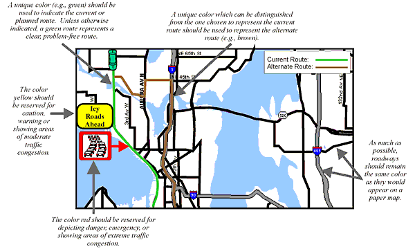
Schematic Example of the Use of Color Coding
Important Note: The map display depicted above is provided solely to augment this Design Guideline by illustrating general design principles. It may not be suitable for your immediate application without modification. Supporting Rationale: These guidelines represent a collection of guidelines from the human factors literature as presented in References 1–4. Special Design Considerations: (1) Approximately 8 percent of the population, mostly males, does not have normal color vision, and color deficient vision does not disqualify an individual from driving. The most common deficiency is an inability to distinguish between red and green. Therefore, when critical information must be presented to drivers, color coding should be redundant with other coding (e.g., shape coding). (2) The ability to discriminate colors is reduced in twilight and full nighttime conditions compared to daytime conditions. Cross References: Selection of Colors for Coding Visual Displays Color Coding of Traffic Flow Information Key References:
*Primarily expert judgement
COLOR CONTRASTIntroduction: Color contrast refers to the relationship between symbol and background associated with chromatic differences such as hue and saturation. Determining the amount of contrast provided to the driver becomes a more complex problem when the symbology and/or the background are colored.
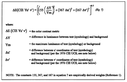
Equation for Determining Color Contrast
NOTE: Reference 1 states, "The discriminability of pairs of colors depends on their differences in chrominance and luminance. While an entirely satisfactory metric does not exist which combines these attributes into a single assessment of total color difference, an estimate can be derived by calculating the weighted difference between the locations of the colors in the 1976 CIE UCS (CIE UCS L*u*v*)." "Note that this estimate should be used only to ensure discriminability of colors of relatively high luminance. Severe nonlinearities in the UCS limit the usefulness of this metric for colors having small luminance differences. In addition, the specification of small color differences should be treated with caution due to the inherent lack of color uniformity on most CRTs." Supporting Rationale: The interested reader is referred to Reference 2 or Reference 1 for a review of both color contrast issues and the research that has been done in this area (see also References 3 and 4). In brief, color contrast research has been aimed at developing a measure of color contrast that can be related to human visual functioning. Such research has attempted to develop a UCS (i.e., one in which equal distances on a color diagram correspond to equal perceptions regarding color differences, where the color difference within a UCS is used to indicate the magnitude of color contrast). The measure of color contrast (or difference) is then correlated with human performance (Reference 2). Reference 1 has provided a metric for determining symbol colors to maximize legibility for symbols of relatively high luminance. This metric, DE (CIE Yu'v'), which is shown in the figure, is derived from the 1976 CIE UCS color diagram (CIE UCS). Although the metric does not combine the different attributes of color into a single assessment of total color difference, it provides a useful estimate of color contrast. Reference 1 indicates that for legibility of colored symbols on a colored background (with relatively high luminance conditions), the colors should differ by a minimum of 100DE (CIE Yu'v') distances. If the formula is applied to figures and background that differ negligibly in u' and v', this value corresponds to approximately 80 percent luminance contrast, which is rather high in comparison with traditional contrast recommendations. Specific applications may be able to use less than 100DE (CIE Yu'v') distances. Special Design Considerations: Although DE (CIE Yu'v') provides a seemingly adequate measure of color contrast, it is clear that much more research is needed in this area before specific recommendations regarding color contrast can be made for automotive applications. Reference 2 notes that different experimental tasks as well as different response measures need to be investigated. Color contrast is a sufficiently difficult concept when applied to fixed–color, fixed–background displays; it becomes more complex when applied to displays such as automotive HUDs. With HUDs, the background for the symbology is dynamic and can be almost any color; background luminance can range from a fraction of a footlambert to 6,000 or more footlamberts, depending on conditions. In addition, the symbology is translucent, which means that both the background color and luminance combine with the symbology's color and luminance in an additive fashion. Color contrast, therefore, is not a very meaningful parameter when applied to head–up displays. Cross References: Selection of Colors for Coding Visual Displays Sensory Modality for Presenting ATIS/CVO Messages Color Coding of Traffic Flow Information Key References:
*Primarily expert judgement
FHWA-RD-98-057
|
||||||||||||||||||||||||||||||||||||||||||||||||||||||||