U.S. Department of Transportation
Federal Highway Administration
1200 New Jersey Avenue, SE
Washington, DC 20590
202-366-4000
Federal Highway Administration Research and Technology
Coordinating, Developing, and Delivering Highway Transportation Innovations
 |
| This report is an archived publication and may contain dated technical, contact, and link information |
|
Publication Number: FHWA-RD-98-057
|
Human Factors Design Guidelines for Advanced Traveler Information Systems (ATIS)and Commercial Vehicle Operations (CVO)
CHAPTER 5: ROUTING AND NAVIGATION GUIDELINESThis chapter provides human factors design guidelines relevant to Routing and Navigation Functions of ATIS devices. Routing and Navigation Functions provide drivers with information about how to get from one place to another. When integrated with an Advanced Traffic Management System (ATMS), Routing and Navigation provides information on recurrent and nonrecurrent traffic congestion and is capable of calculating, selecting, and displaying optimum routes based on real–time traffic data. The following design topics are included in this chapter: GENERAL GUIDELINESSPECIFIC ROUTING & NAVIGATION MESSAGES
ACCURACY OF ROUTING INFORMATIONIntroduction: The accuracy of routing information refers to the correctness, usually expressed as a percentage, of traffic information presented to motorists. In this context, accuracy is considered to be a binary concept; i.e., the information is either accurate or inaccurate. Although accuracy is most often discussed with respect to congestion levels associated with various routing options, it may also refer to total travel time estimates, estimates of time delays due to congestion, and presentation of accident information.
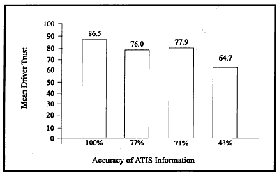
Driver Trust in an ATIS at Different Levels of Information Accuracy
Supporting Rationale: In Reference 1, a study was conducted which measured driver's trust in a simulated ATIS at different levels of system accuracy. Results showed that while 100 percent accurate information yields the best driver performance and subjective opinion, information that is 71 percent accurate remains acceptable and useful. Drivers are willing to tolerate some error in simulated ATIS. However, when information accuracy drops to 43 percent, driver performance and opinion suffer. Thus, information accuracy below 71 percent is not recommended to system designers. Future research is needed to evaluate information accuracy between 44 and 70 percent. It was also found that giving a driver inaccurate information in a familiar setting was more harmful than giving inaccurate information in an unfamiliar setting. Special Design Considerations: One thing to consider when presenting route information to a driver is that there may be special design trade–offs between the accuracy of presented information and the timeliness of such information. For example, information accuracy may be increased by using multiple, independent sources of raw traffic data to derive estimates of congestion levels. However, such increases in accuracy may increase the time between the onset or occurrence of a traffic situation or condition, and the presentation of this information on an ATIS device. Another thing to consider is that drivers have greater self–confidence in familiar settings; they are more critical of ATIS and hold to a higher standard of user acceptability when they know the area geography. Thus, to achieve user acceptance, in–vehicle systems intended for purchase by a driver in a private passenger vehicle will likely have to meet higher standards than systems intended for commercial use. Cross References: Color Coding of Traffic Flow Information Presentation of Route and Destination Selection Information Presentation of Dynamic Route Selection Information Presentation of Route Guidance Information Presentation of Route Information Involving Incidents Key References:
*Primarily expert judgement
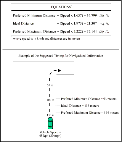
TIMING OF AUDITORY NAVIGATION INFORMATIONIntroduction: The timing of auditory navigation information refers to the time or distance at which the ATIS should present an auditory instruction to the driver before an approaching navigation maneuver (e.g., a required turn).
Equations for Determining the Appropriate Timing of an Instruction
Supporting Rationale: In Reference 1, subjects were asked to give a subjective rating of the timeliness of auditory navigation instructions (1 = much too early to 6 = much too late). From the subjects ratings, regression lines were plotted. Three separate equations were developed for calculating the distance at which navigation information should be given regarding an approaching turn onto a side road, while traveling at different speeds. Reference 2 conducted a similar study aimed at determining the last possible moment at which a subject would feel comfortable hearing an auditory navigational instruction. The results of this study indicated that, traveling at speeds of 40 mph, the recommended distance for giving navigational instructions before a turn is 450 feet. However, it is necessary to make adjustments for other speeds (15 feet for each mile per hour); age of driver (up to 119 feet); the direction of turn, left or right (left turns require more warning distance); and gender of the driver. The results of this study are similar to those found in Reference 1 but were determined to be more difficult to apply to the general driver population. Special Design Considerations: The applicability of these guidelines to visual guidance messages is uncertain. Since visual information (with no accompanying auditory alert) is likely to be perceived later than auditory messages, the distances recommended above may have to be increased somewhat to account for this delay. Turning off the current route is only one type of maneuver. There are many other types (i.e., turning at a T–intersection, or an existing freeway) which should be studied separately to determine the factors which will affect them. The results of these studies could then be combined with the above guidelines to determine the appropriate timings for any possible type of combination of maneuvers. In Reference 3, it was recommended that if two maneuvers are less than 10 seconds apart, the two instructions should be given together, prior to the first maneuver. This is referred to as "stacking" the messages. Reference 1 gave a similar recommendation, stating that when the distance between two subsequent maneuvers is less than the minimum preferred distance for that speed, the instructions should be stacked. Cross References: Sensory Modality for Presenting ATIS/CVO Messages Key References:
*Primarily expert judgement
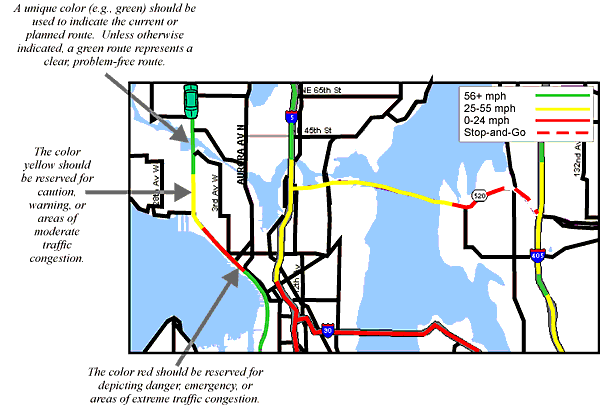
COLOR CODING OF TRAFFIC FLOW INFORMATIONIntroduction: Color coding of traffic flow information refers to the use of colors to represent the mean speed of traffic flows on different road segments along a particular route. This type of information might help drivers make more informed decisions regarding alternate routes, departure times, or modes of transportation, if necessary.
Examples of Color Coding for Four Levels of Traffic Information
Important Note: The map display depicted above is provided solely to augment this Design Guideline by illustrating general design principles. It may not be suitable for your immediate application without modification. Supporting Rationale: The results of usability tests reported in Reference 1 confirmed that there is an intuitive link between traffic light colors and traffic speed. Drivers consistently used the colors on the freeway lanes as well as a color key to correctly identify traffic speeds and make decisions regarding alternate routes. Reference 2 agrees with the color choices and states that it is not conflicting to use red, which normally means danger (International Standards Organization (ISO) 2575), to indicate heavy traffic, as heavier traffic does represent a more dangerous situation for the driver. Also, the color red is already used to indicate traffic congestion in some other countries (i.e., France). Reference 3 provides definitions and descriptions for the various levels of service used to describe traffic conditions in terms of factors such as speed, travel time, safety, and freedom to maneuver. Special Design Considerations: Choosing the best background color for the display is important. Colors that are generally good (i.e., yellow) may be poor choices for such a complex color map. Reference 1 conducted a usability study to determine the background color which would be easiest on the driver's eyes while displaying the information in the most effective manner. The results showed that most people preferred a gray background, found it easier to read, and thought that the other features of the map stood out the best with a gray background. Roadway lines need to be thick enough so that the colors of roadways indicating the traffic conditions can be easily and quickly identified by the driver. A study conducted in Reference 4 used color coded lines that were 2 mm wide. Although line width was not an independent variable of interest in this study, lesser widths were found to be problematic. This would especially be true for older drivers. It should also be noted that, in order to enhance contrast, the background color used for this display was gray. Cross References: Key References:
*Primarily expert judgement
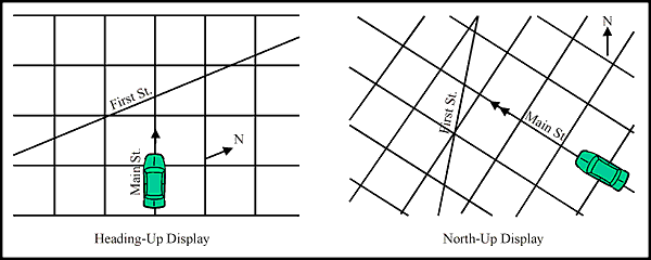
ORIENTATION OF MOVING MAP DISPLAYSIntroduction: The orientation of a moving map display refers to the angle that the map is rotated relative to the electronic display surface. Moving map displays may be oriented in a number of ways. The most common orientations are north–up and heading–up (sometimes referred to as track–up). Paper maps used by motorists are typically drawn north–up, following traditional cartographic convention, that is, with true north being towards the top of the page. With a north–up moving map, the orientation of the symbol of the vehicle on the screen changes as the vehicle turns left and right; the symbol points towards the top of the map display only when the vehicle is pointing north. In contrast, with a heading–up map the vehicle symbol remains pointed towards the top of the screen regardless of the vehicle's heading. As the vehicle turns left and right, the map display rotates clockwise and counterclockwise, respectively, so that the symbol remains pointed towards the top of the screen. Variations of these two orientations are possible.
Schematic Example of Heading–Up and North–Up Displays
Supporting Rationale: Reference 1 found that geographic orientation and map interpretation were considerably better when the map and the map user are oriented in the same direction. These data argue for aligning maps with the direction the driver is facing; i.e., a heading–up orientation. Experience with advanced aviation tactical and mission planning displays (Reference 2) has shown that users commonly select north–up mode when planning a route and heading–up mode when flying, when there are no constraints on mode selection. Special Design Considerations: If multiple display orientations are possible, the user should be able to select between any of those modes for route planning or for route guidance modes of operations. Reference 3 describes a heading separated map orientation scheme which is an alternative to the north– and heading–up modes commonly used. Allowing experienced users to specify the default map orientations may be considered. Cross References: Key References:
*Primarily expert judgement
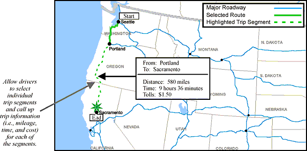
PRESENTATION OF GENERAL TRIP PLANNING INFORMATIONIntroduction: General trip planning information refers to information which would assist drivers in the coordination of long and/or multiple–destination journeys. Coordination of these journeys may involve identifying scenic routes and historical sites. However, the general purpose of this information is to provide the driver with an estimate of journey time, mileage, and costs.
Schematic Example of Presenting General Trip Planning Information
Important Note: The map display depicted above is provided solely to augment this Design Guideline by illustrating general design principles. It may not be suitable for your immediate application without modification. Supporting Rationale: In Reference 1, a literature review, an analysis, and the results of applying a research–based design tool were used to identify the most appropriate display type, trip status, and display format to use when displaying general trip planning information. It was determined that, due to the amount of attention potentially required by an ATIS visual display, it might be necessary to display some part of a complex message through the auditory channel. Also, the presentation of information regarding an entire route may be overwhelming in actual driving situations and should therefore be avoided. An alternative might be to break the trip down into succinct "chunks" associated with salient waypoints within the total trip. Because this information may be complex and require time and driver attention to assimilate, this type of information should be employed as a pretrip planning tool, available only when the vehicle is stationary. Special Design Considerations: Activities performed before the trip has begun are not constrained by many of the safety considerations that apply to in–transit displays. This means that designers can place less emphasis on reducing visual and mental attention, and that they should focus their display considerations on standard HCI issues. Cross References: None. Key References:
*Primarily expert judgement
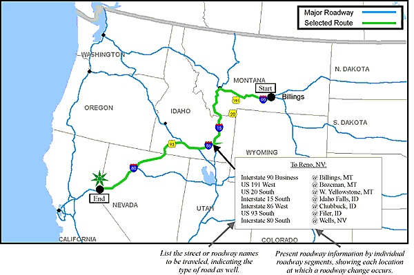
PRESENTATION OF ROADWAY INFORMATIONIntroduction: Roadway information refers to information presented to a driver during trip planning. It may include the street or roadway names, the types of roads used, and the number of turns or roadway changes required along the route. This information will give the driver a general overview of the trip he/she is about to take, as well as familiarize them with the overall route.
Schematic Example of Presenting Roadway Information
Important Note: The map display depicted above is provided solely to augment this Design Guideline by illustrating general design principles. It may not be suitable for your immediate application without modification. Supporting Rationale: In Reference 1, a literature review, an analysis, and the results of applying a research–based design tool were used to identify the most appropriate display type, trip status, and display format to use when displaying roadway information. It was determined that when providing the driver with location, pathway, or position type information that is in either a simple or complex format, it is most desirable to use a full or partial route map. However, adding text can be beneficial in complex situations where the information might not be fully understood with just a picture. It was also determined that the presentation of roadway information for the entire route could be overwhelming in actual driving situations and should therefore be avoided. However, because pictorial full–route maps can offer drivers a valuable preview, they should be employed as a pretrip planning tool but made available only when the vehicle is stationary. Special Design Considerations: Reference 2 discusses a study which tested subjects' ability to plan a bus route using either a list or a map. The subjects who used a map made their decisions more quickly than those who used a list. However, Reference 3 found that subjects who studied a map of a driving route made more errors when actually driving the route than did subjects who studied a textual list of turns. The above studies indicate that textual lists are easier to use than maps, but that maps provide additional information that textual lists do not. Therefore, the choice of a map or a list must depend on the desired task and required information. Depending on the requirements of the system under design, the inclusion of both display formats may provide the most useful overall system for drivers. Cross References: Presentation of Point of Interest Information Key References:
*Primarily expert judgement
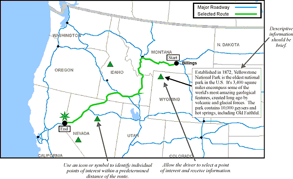
PRESENTATION OF POINT OF INTEREST INFORMATIONIntroduction: Point of interest information refers to information presented to the driver that identifies scenic routes, historical sites, national parks, and recreational areas within a predetermined radius surrounding the route. Having this information will allow drivers to choose whether or not they wish to adjust their route and travel plans to include a specific point of interest. Other information that might be presented includes states, regions, communities, and districts along the route.
Schematic Example of Presenting Point of Interest Information
Important Note: The map display depicted above is provided solely to augment this Design Guideline by illustrating general design principles. It may not be suitable for your immediate application without modification. Supporting Rationale: In Reference 1, a literature review, an analysis, and the results of applying a research–based design tool were used to identify the most appropriate display type, trip status, and display format to use when displaying point of interest information. While it was determined that any information a well–designed ATIS can present will be considered useful, the system does not need to present all of it to drivers while they are operating the vehicle. The value and cost (in terms of information processing and control requirements) of providing the information during any given trip mode must be determined. Some types of information, such as guidance instructions, should be presented in–transit, because they have a high value while driving. Other types of information, such as many trip planning functions, are complex, require more attention, and are therefore high cost to driver attention. Such information should be displayed only when the vehicle is stationary. Special Design Considerations: Allowing the driver to enter information regarding the trip goals (i.e., personal interests, cost constraints, distance willing to divert, etc.) would allow the computer to search a database and identify relevant travel information. This information could then be presented to the driver so that he/she could make a selection from among the possible alternatives. Cross References: Presentation of Roadway Information Key References:
*Primarily expert judgement
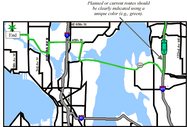
CLEAR DEPICTION OF ROUTE ON ELECTRONIC MAPSIntroduction: Route information displayed on an electronic map must be clearly distinguishable from normal map features in both route planning and guidance modes. In paper maps, a planned route can be clearly indicated by highlighting it with a colored marker. Similarly, on electronic maps, the user must be able to immediately discriminate the route from the variety of line shapes, sizes, and colors that may be used on the electronic map to depict local streets, arterials, highways, interstates, rivers, and other features.
Schematic Example of Map Showing Color Coded Route
Important Note: The map display depicted above is provided solely to augment this Design Guideline by illustrating general design principles. It may not be suitable for your immediate application without modification. Supporting Rationale: As described in Reference 1, route guidance on an electronic map is beneficial only if the user can easily identify the indicated route. The user, often the driver, may not have time available to search the map display. Highlighting the route will reduce this search time. Inadequate highlighting of the recommended route increases driver workload and leads to increased time with eyes on the display rather than on the road. Reference 2 recommends that colored symbols should differ from their colored background by a minimum of 100DE (CIE Yu'v') distances (see also the design guideline entitled "Color Contrast" in Chapter 3 of this document). Special Design Considerations: The method chosen to highlight the route must not detract from other information depicted on the map. The route highlighting also must have the same dynamic characteristics as all other map features, i.e., it must move correctly in both north–up and heading–up modes. The route highlighting must be robust over a wide range of ambient lighting, from night to direct sunlight. Redundant coding techniques, e.g., color codes in addition to bolder, thicker route lines, may also improve comprehension. Cross References: Selection of Colors for Coding Visual Displays Key References:
*Primarily expert judgement
FHWA-RD-98-057
|
||||||||||||||||||||||||||||||||||||||||||||||||||||||||||||||||||||||||||||||||||