U.S. Department of Transportation
Federal Highway Administration
1200 New Jersey Avenue, SE
Washington, DC 20590
202-366-4000
Federal Highway Administration Research and Technology
Coordinating, Developing, and Delivering Highway Transportation Innovations
| REPORT |
| This report is an archived publication and may contain dated technical, contact, and link information |
|
| Publication Number: FHWA-HRT-14-088 Date: March 2015 |
Publication Number: FHWA-HRT-14-088 Date: March 2015 |
This section presents a step-by-step approach of the study methodology used to process the Ohio SPS-1 and SPS-2 DLR data using Matlab®.(8) For the SPS-1 data that had relatively distinct pavement deflection signal peaks and valleys, a peak finding algorithm was developed using the tools available in Matlab® to perform the first five steps of the methodology. For the SPS-2 data that had indistinctive pavement deflection signal peaks and valleys with significant noise, a bandpass filter algorithm was developed using the Matlab® toolbox to perform the methodology. The methodology was as follows:
The Ohio SPS-1 DLR data had two sensor types in need of data calibration: LVDTs and PCs. Calibration factors were obtained from OU, and the LTPP team clarified that all LVDT calibrations (approximately 600 LVDTs) were linear and passed through the origin with slopes ranging from 19.5 to 20.5 V/inch. Therefore, an average value of 20.0 V/inch was used to convert LVDT traces from voltage to pavement deflection in inches. For all the PC sensors, a factor of 10 psi/V was used, which was generally correct to within ±2 percent according to OU.(9) Dynatest® strain gauges were calibrated using the MEGADAC data acquisition system in the one-fourth Wheatstone bridge setup and did not require any calibrations. Units of strain gauge traces were in microstrain (µe). All calibrations for LVDT and PC sensors were computed in Matlab®.(8)
For the Ohio SPS-2 data, only the LVDT sensor type was in need of data calibration. As with LVDT calibration in the SPS-1 data, LVDT calibration factors with an average value of 20.0 V/inch were used to convert LVDT traces from voltage to pavement deflection in inches. LVDT data calibrations were also completed using Matlab®.(8)
Following calibration, the sensor traces were normalized to base zero on the y-axis (pavement deflection) so that the resulting peak values represented the change due to load response. Base zero was under no load conditions. A gain adjustment factor was calculated as the average of the first 500 data points in a calibrated raw trace. The factor was subtracted from each trace data point to normalize the trace to zero on the y-axis. Theoretically, the number of data points needed to determine a gain adjustment factor is about 10 percent of the data collection frequency for each sensor. If data collection frequency is 2,000 Hz, the number of data points needed to determine a gain adjustment factor is 10 percent of 2,000 Hz, or 200 data points per second. If data collection frequency is 500 Hz, the number of data points needed to determine a gain adjustment factor is 10 percent of 500 Hz, or 50 data points per second. In this study, the DLR study team decided to use the first 500 data points to average a gain adjustment because the SPS-1 gain adjustment factors appeared to stabilize when the number of data points was about 500. Similarly, the team used the first 500 data points to determine a gain adjustment factor for the SPS-2 data.
Ohio SPS-1 Gain Adjustment Factor
Each SPS-1 time history dataset in the majority of the DLR raw trace files contained, on average, 5,000 data points. A sample size of 10 percent (500 data points) of the time history measurements was considered reasonable to calculate the gain adjustment factor. The DLR study team also computed the gain adjustment factor considering 200, 300, and 400 data points at the start of the trace, but there was not any significant difference in mean values for these sets of data points. For example, the computed mean values for the AJ2A.007 test run were -1.0470, -1.1168, -1.1345, and -1.1326 for 200, 300, 400, and 500 data points, respectively. The mean value of the first 500 data observations was subtracted from each observation of a sensor raw trace to normalize the trace to zero on the y-axis (pavement deflection). For example, assuming that the Dyn12 strain gauge trace in test J2F had a total of 6,000 observations, the mean value of the first 500 observations was subtracted from each observation of the total 6,000 observations. The algorithm adjusted all sensor traces to base zero on the y-axis for all files in test J2F.
Ohio SPS-2 Gain Adjustment Factor
Each SPS-2 time history dataset in the majority of the DLR raw trace files contained, on average, close to 7,000 data points. Due to stiffer PCC sections compared to the SPS-1 AC sections, the SPS-2 data had significantly more noise and lower pavement deflection magnitudes. Nevertheless, the mean value of the first 500 data observations-the same number used to normalize the SPS-1 datasets-was subtracted from each observation of a sensor raw trace to normalize the trace to zero on the y-axis (pavement deflection). In retrospect, due to significant noise in the SPS-2 data, the first 500 data points may not have been sufficient. In future research, the first 700 data points is recommended for determining a gain adjustment factor for the SPS-2 data. A total of 700 data points amount to approximately 10 percent of each SPS-2 time history dataset. Furthermore, due to significant noise in the SPS-2 data, it is extremely difficult to identify peaks and valleys in raw traces of the data. Thus, smoothing the SPS-2 raw traces become necessary; only from a smoothed trace can peaks and valleys be extracted.
Smoothing SPS-1 DLR Data Traces
Smoothing of raw sensor traces was necessary to eliminate redundant local minima, local maxima, and noise. The DLR tables in SDR 22.0 have time stamp columns and location (pavement deflection value) stamp columns for both raw and smoothed traces for all strain gauge, LVDT, and PC sensors. In this study, the mslowess function available in the Matlab® bioinformatics toolbox was explored to smooth sensor traces, where "ms" stands for mass spectrometry and "lowess" stands for locally weighted scatterplot smoothing method and assumes a default span of 10 data samples.(10) For the SPS-1 raw traces collected by strain gauge, LVDT, or PC, the mslowess function was used for smoothing.
Smoothing SPS-2 DLR Data Traces
The SPS-2 strain gauge raw traces were significantly noisier and of lower deflection magnitude due to stiffer PCC sections. Thus, it was extremely difficult to extract pavement deflection peaks and valleys. Figure 7 shows a comparison plot of a normalized raw trace in red versus a moving median-smoothed trace in blue versus a bandpass filter-smoothed trace in green as sampled from Dyn8 strain gauge in SPS-2 test section 390201 test J1A run 27. The figure demonstrates the level of noise and magnitude of the signal associated with a typical SPS-2 raw trace collected from a strain gauge compared to the signals associated with smoothed traces. The SPS-2 LVDT raw traces did not appear to be as noisy as did the strain gauge traces; therefore, the moving median function was used to smooth SPS-2 LVDT raw traces.
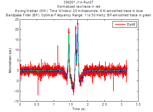
Figure 7. Graph. Normalized Dyn8 strain gauge raw traces for Ohio SPS-2 test section 390201 test J1A run 27
The bandpass filter function in Matlab® appears to be a feasible solution for filtering out the significant noise in SPS-2 strain gauge raw traces, as shown in figure 8. Before the noise is filtered, the power density function in Matlab® can be used to identify an optimal bandpass filtering frequency range by plotting the power density of a raw trace. The optimal range can be further tightened by comparing bandpass filter-smoothed trace plots created within various narrower frequency ranges. In general for the SPS-2 strain gauge raw traces, 1 to 50 Hz appeared to be the optimal filtering frequency range for the bandpass filter. Thus, it was the filtering frequency range chosen for the bandpass filter to smooth the SPS-2 strain gauge raw traces. Figure 8 shows a magnified view of the three trace peaks in figure 7: a normalized raw trace (red), a moving median-smoothed (with a moving average window of 20 ms) trace (blue), and a bandpass filter-smoothed trace (green). The bandpass filter-smoothed trace in green appears to approximate the raw trace peaks in red better than the moving median-smoothed trace in blue. Also, the bandpass filter-smoothed trace in green appears to demonstrate the least noise.
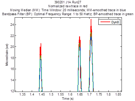
Figure 8. Graph. Magnified view of the three trace peaks in figure 7
Extraction of Ohio SPS-1 Trace Peaks and Valleys
The mspeaks function of Matlab® was used to extract the trace peaks and valleys from both the raw and smoothed traces from strain gauges, LVDTs, and PCs for the SPS-1 data.(11) The function finds the relevant peaks in raw noisy peak trace data and creates a peak list, which is a two-column matrix containing the time stamp value and magnitude (location stamp) value for each peak. The mspeaks function has input arguments such as height filter value and over-segmentation filter value to locate peaks. The height filter value is a positive real value that specifies the minimum height for reported peaks, and the over-segmentation filter value is a positive real value that specifies the minimum distance in time stamp units between neighboring peaks. When a trace is not smoothed appropriately, multiple maxima can appear to represent the same peak. Increasing the filter value helps to join over-segmented peaks into a single peak. The default value for both arguments is zero. The extracted trace peaks and valleys identified from the mspeaks function are used in QC analysis to categorize the sensor traces. Figure 9 shows the extracted peaks (red stars), valleys (green stars) and identifying information for a smoothed longitudinal trace from a Dyn11strain gauge sensor.
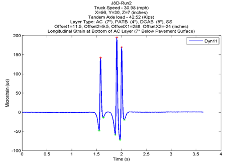
Figure 9. Graph. Extracted trace peaks and valleys from an Ohio SPS-1 test run
Extraction of Ohio SPS-2 Trace Peaks and Valleys
The mspeaks function of Matlab® was used to extract the trace peaks and valleys from only the smoothed traces for the SPS-2 data because the raw traces were too noisy for extraction.(11) Figure 10 shows the bandpass filter-smoothed trace from test J1A run 27 for Dyn8. The red stars in the figure indicate the pavement deflection signal peaks, and the blue stars indicate the signal valleys. The local valley (blue star) near 2 s was manually removed before incorporating the extracted peaks and valleys and their time stamps into the DLR_STRAIN_TRACE_SUM_PCC table in SDR 27.0 database.(1)
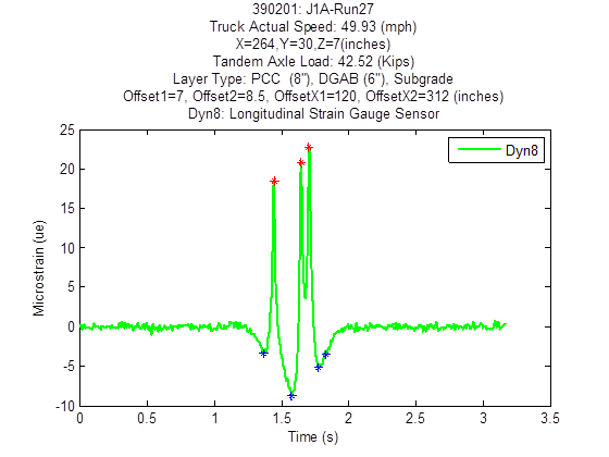
Figure 10. Graph. Extracted trace peaks and valleys from an Ohio SPS-2 test run
QC analysis is a process used to assess data quality. It provides insight into data quality issues and helps in decisionmaking. In this study, a QC analysis was performed to categorize the sensor raw and smoothed traces into three quality categories: good, maybe, and not good. The QC analysis was based on the number of peaks and the difference between the beginning and the ending offset of a trace. A peak occurs with the passage of an axle. Thus, the passage of a single-axle dump truck ideally produces two peaks (the single front axle and the single rear axle), and the passage of a tandem-axle dump truck ideally produces three peaks (the single front axle and the two rear axles). An offset is a reference point of value averaging two hundred data points in a trace.
The three criteria used to categorize DLR raw and smoothed traces include the following:
Figure 11 has three transverse strain gauge trace charts for good, maybe, and not good traces. The graph on the left satisfied the good trace criterion: the number of peaks (two) was equal to the number of test truck axles (a single-axle truck (two axles) made the test run), and the difference in the beginning and ending offset was less than 10 percent of the first peak. The middle graph satisfied the number of peaks (three; a tandem-axle truck with a total of three axles made the test run) but failed to satisfy the difference in the beginning and ending offset of less than 10 percent of the first peak. The difference in the beginning and ending offset was more than 10 percent, satisfying the maybe trace criterion. The graph on the right did not satisfy the number of peaks (three) for a tandem-axle truck; it had multiple peaks. Thus, it was categorized as a not good trace.
Figure 12 shows SPS-1 LVDT trace categorization. There is no figure for SPS-1 PC traces; almost all (99 percent) of the raw and smoothed traces from SPS-1 PCs were categorized as good traces.
Due to significant noise in SPS-2 strain gauge and LVDT raw traces, only smoothed SPS-2 strain gauge and LVDT traces were categorized using the trace categorization approach. Figure 13 and figure 14 show sample categorization results for longitudinal strain gauge and LVDT traces, respectively.
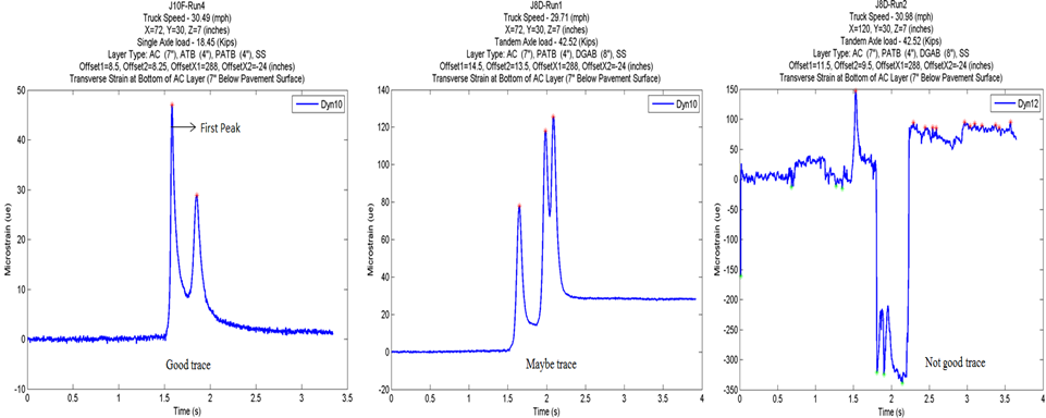
Figure 11. Graph. Ohio SPS-1 transverse strain gauge trace categorization
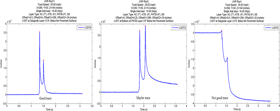
Figure 12. Graph. Ohio SPS-1 LVDT trace categorization
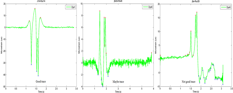
Figure 13. Graph. Ohio SPS-2 longitudinal strain gauge trace categorization
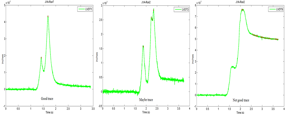
Figure 14. Graph. Ohio SPS-2 LVDT trace categorization
Inconsistent sensor locations between SPS-1 and SPS-2 data and SDR 22.0 were corrected using the embedded sensor data in the OU dataset (EmbeddedSensor.txt). An inner join procedure, based SDR 22.0 tables on STATE_CODE, SHRP_ID, and TAG_ID as matching columns, was used that joined all the columns in the DLR_STRAIN_CONFIG_AC table with the strain gauge sensor location (columns X, Y, and Z) in the embedded sensor data. LVDT and PC sensor locations in the DLR_LVDT_CONFIG_AC and DLR_PC_CONFIG_AC tables were also corrected using the same embedded sensor data.(6)
Similarly, the inconsistent wheelpath offset data in DLR_TEST_MATRIX table were updated using the OU truck pass (TruckPass.txt) data, OU truck run (TruckRun.txt) data, and raw DLR ASCII data.(6) However, the DLR_TEST_MATRIX table in SDR 22.0 has wheelpath offset records for both Ohio and North Carolina test sections. Only Ohio wheelpath offset records were inner joined with STATE_CODE, SHRP_ID, SUBSERIES, and RUN_NUMBER as matching columns in the Ohio TruckPass.txt data. Since the wheelpath offset data for North Carolina test sections were not available, the North Carolina wheelpath offset records were not updated.