U.S. Department of Transportation
Federal Highway Administration
1200 New Jersey Avenue, SE
Washington, DC 20590
202-366-4000
Federal Highway Administration Research and Technology
Coordinating, Developing, and Delivering Highway Transportation Innovations
| REPORT |
| This report is an archived publication and may contain dated technical, contact, and link information |
|
| Publication Number: FHWA-HRT-15-019 Date: May 2015 |
Publication Number: FHWA-HRT-15-019 Date: May 2015 |
A series of analyses were performed to evaluate the suitability of using MERRA for pavement and other infrastructure applications. Because the MEPDG is the most demanding current application in terms of climate inputs as well as a major focus of many LTPP and other research efforts, the evaluation of MERRA focuses on its suitability for use in predicting pavement performance using the MEPDG. The following three sets of evaluation analyses have been performed:
SENSITIVITY OF MEPDG Performance PREDICTIONS TO CLIMATE PARAMETERS
The analysis methodology developed in the AASHTO MEPDG and accompanying software places great emphasis on the influence of climate on pavement performance.(3) Hourly measured values of air temperature, precipitation, wind speed, percentage sunshine, and relative humidity over multiple years are required as climate inputs. Data from more than 800OWSs across the United States were obtained for this purpose from the NCDC and incorporated into a weather station database that accompanies the MEPDG software.
Current understanding of the sensitivity of MEPDG predicted pavement performance to environmental factors is limited. Zaghloul et al., in a study of the New Jersey Turnpike, found that MEPDG predictions were surprisingly sensitive to the subset of weather stations used to derive the project-specific VWS data.(9) Tighe et al. used the MEPDG to quantify the impacts of climatic change on low traffic flexible pavement performance in southern Canada and found that rutting (asphalt, base, and subbase layers) and both longitudinal and alligator cracking are exacerbated by climate change, with transverse cracking becoming less of a problem.(50) Li et al. made a rudimentary attempt to systematically evaluate the influence of climate on MEPDG predictions by studying the effects of changes in average temperature and monthly precipitation on the performance of a flexible and rigid pavement section for Arkansas conditions.(29) They found that the increase in average temperature increased asphalt rutting significantly and rigid pavement faulting slightly. The increase in average monthly precipitation increased rigid pavement faulting slightly but had a nearly negligible effect on flexible pavement rutting. Systematic sensitivity studies of flexible and rigid pavement performance have found that material environmental properties (e.g., thermal conductivity, hydraulic conductivity) generally have only a small influence on predicted performance; the exception is the high sensitivity of nearly all predicted performance to surface shortwave absorptivity. (See references 51 through54.)
The objective of this evaluation was to quantify systematically the sensitivity of MEPDG pavement performance predictions to specific characteristics of the climate inputs. The pavement performance measures considered included longitudinal cracking, alligator cracking, asphalt concrete (AC) rutting, total rutting, and international roughness index (IRI) for flexible pavements and faulting, slab cracking, and IRI for rigid jointed plain concrete pavements (JPCP). The characteristics of the climate inputs examined in the study were the average annual temperature, average annual temperature range, average daily temperature range, wind speed, percent sunshine (or cloud cover), precipitation, and relative humidity. Pavement scenarios were examined for three generic climate conditions (cold-wet, hot-dry, and temperate) and three traffic levels (low, medium, and high) to assess sensitivity over a broad domain. More than 300 MEPDG (v1.100) runs were conducted for this study. The procedures and the results of the sensitivity analyses described in this study provide guidance on the conditions under which the various climate properties significantly influence pavement performance.
Sensitivity Analysis Methodology
Formalized rigorous approaches for sensitivity analyses of complex models have evolved substantially in recent years. Recent surveys of many of the sensitivity analysis techniques can be found in Cacuci, Saltelli et al.,, and elsewhere.(55,56) Most sensitivity studies of the MEPDG to date have focused largely on confirmation that the model is a realistic simulation of pavement system performance—i.e., to verify that the model is fundamentally sound. Most of these past studies have employed a “one at a time” (OAT) methodology in which one or more baseline cases are defined, and each input (e.g., average annual temperature) is then varied individually for each case to evaluate its effect on the output (e.g., quantity of fatigue cracking). Only the sensitivities around the reference input values for the baseline cases are evaluated—i.e., the evaluation is only for very small regions of the overall solution space. This provides only a “local” as opposed to a “global” sensitivity evaluation. Although global sensitivity analyses are more appropriate for complex nonlinear models with many inputs, local OAT evaluations are suitable for exploratory analyses and/or for simpler models having relatively few input parameters.(52) The local OAT sensitivity analysis approach has been adopted for the present exploratory study.
A wide variety of metrics have been used to quantify sensitivity of model outputs to model inputs. These include coefficients from multivariate linear regressions, correlation coefficients (Pearson linear and Spearman rank), and a variety of partial derivative formulations.(52)
Although no individual metric is “perfect,” the best for interpreting the OAT analysis results in this study was a “design limit” normalized sensitivity index ![]() as shown in figure 10.
as shown in figure 10.

Figure 10. Equation. Design limit normalized sensitivity index.
Where:
Xk = baseline value of design input k.
ΔXk = change in design input k about the baseline.
ΔYj = change in predicted distress j corresponding to
ΔXk
DLj = design limit for distress j.
This design limit normalized sensitivity index was notated more simply as NSI. The NSI always used the design limit as the normalizing factor for the predicted distress. NSI can be interpreted as the percentage change in predicted distress relative to the design limit caused by a given percentage change in the design input. The sensitivity of NSI follows: Hypersensitive, NSI > 5; Very Sensitive, 1 < NSI < 5; Sensitive, 0.1 < NSI < 1; and Non-Sensitive, NSI < 0.1. For example, consider total rutting as the predicted distress with a design limit of 0.75 inches. An NSI of -0.25 for the sensitivity of total rutting to average wind speed implies that a 10-percent reduction in average wind speed will increase total rutting ΔYj by NSI*(ΔXk/Xk)*DLj = -0.25*-0.1*0.75 = 0.01875 inches.
The sensitivity analysis was conducted for a wide range of the model inputs and outputs. However, not all the combinations of model input values are physically plausible. For example, a thin asphalt layer on a thin granular base layer subjected to high traffic volume does not represent a realistic scenario likely to be encountered in practice. Therefore, a set of base cases were developed to cover the ranges of commonly encountered climatic conditions and traffic levels with associated surface layer and base layer thickness. A total of nine base cases encompassing three climatic zones, and three traffic levels were developed for each of the flexible pavement scenarios and the rigid pavement scenarios.
The three climatic zones used for base cases were cold-wet, hot-dry, and temperate. Table 4 summarizes the specific locations and the weather stations used to generate the reference climate files for each of the three climatic zones.
Table 4. Climate categories for base cases.
| Climate Category | Location | Weather Station |
| Cold-Wet | Portland, ME | PORTLAND INTL JETPORT ARPT |
| Hot-Dry | Phoenix, AZ | PHOENIX SKY HARBOR INTL AP |
| Temperate | Los Angeles, CA | LOS ANGELES INTL AIRPORT |
The three traffic levels analyzed are summarized in table 5. The ranges of average annual daily truck traffic (AADTT) values span the low (< 5,000), medium (5,000–10,000), and high (>15,000) truck volume categories in Alam et al.(57) To put these traffic volumes into a more familiar context, estimates of the approximate numbers of equivalent single axle loads are also included in table 5. The surface layer and base layer thicknesses for each traffic category are also listed. Higher traffic levels require correspondingly thicker surface and base layers.
Table 5. Traffic and pavement layer thickness for base cases.
| Traffic Properties | Traffic Level | ||
| Low Traffic | Medium Traffic | High Traffic | |
| Nominal AADTT1 | 1,000 |
7,500 |
25,000 |
| Flexible ESALs (millions)2 | 1.79 |
9.82 |
29.77 |
| AC Thickness | 6.5 |
10 |
12.5 |
| Base Thickness | 6 |
7 |
9 |
| Rigid ESALs (millions)2 | 4.69 |
25.78 |
78.13 |
| JPCP Thickness | 8 |
10 |
12 |
| Base Thickness | 4 |
6 |
8 |
| 1Based on MEPDG Interstate Highway TTC4 Level 3 default vehicle distribution. 2Based on design life of 15 years for flexible pavements/25 years for rigid pavements. AADTT = Average Annual Daily Truck Traffic ESAL = Equivalent Single-Axle Load AC = Asphalt Concrete JPCP = Jointed Plain Concrete Pavement |
|||
Table 6 and table 7 summarize the values of the major pavement design inputs required by the MEPDG. All analyses were performed using v1.100 of the public domain MEPDG software. Note that reliability was set at 50 percent, which means the mean predictions of pavement distresses from the MEPDG were directly used without any adjustments.
Table 6. Pavement design properties for base cases.
| Input Parameter | Value |
| Design Life | 15 years for flexible pavements/25 years for rigid pavements |
| Construction Month | August 2006 |
| Reliability | 50 percent for all distresses |
| AADTT Category | Principal Arterials—Interstate and Defense Rout |
| TTC | 4 |
| Number of Lanes in Design Direction | 2 for low traffic/3 for medium and high traffic |
| Truck Direction Factor | 50 |
| Truck Lane Factor | 75 for low traffic/55 for medium traffic/50 for high traffic |
| Default Growth Rate | No growth |
| First Layer Material Type | HMA for flexible pavements/ PCC for flexible pavements |
| Second Layer Material Type | Granular Base |
| Subgrade Material Type | Soil |
| Base Resilient Modulus | 25,000 |
| Base Poisson’s Ratio | 0.35 |
| Subgrade Resilient Modulus | 15,000 |
| Subgrade Poisson’s Ratio | 0.35 |
| AADTT = Average Annual Daily Truck Traffic HMA = Hot Mix Asphalt PCC = Portland Cement Concrete TCC = Truck Traffic Classification |
|
Table 7. Surface layer properties for base cases.
| Material | Properties | Baseline Value |
Hot Mix Asphalt (HMA) |
Surface Shortwave Absorption | 0.85 |
| Endurance Limit | 100 µ | |
| HMA Unit Weight | 149.9 lb/ft3 | |
| HMA Poisson’s Ratio | 0.35 | |
| HMA Thermal Conductivity | 0.67 Btu/(ft)(fr)(ºF) | |
| HMA Heat Capacity | 0.23 Btu/(lb)(ºF) | |
| Delta in HMA Sigmoidal Curve | 2.83 | |
| Alpha in HMA Sigmoidal Curve | 3.90 | |
| Effective Binder Content in HMA | 10.1 percent | |
| Air Void in HMA | 6.5 percent | |
| Tensile Strength at 14 °F | 500 psi | |
| Aggregate Coefficient of Contraction in HMA | 5E-6 (1/ºF) | |
| Design Lane Width | 12 ft | |
Portland Cement Concrete (PCC) |
Joint Spacing | 15 ft |
| Dowel Diameter | Various | |
| Edge Support—LTE | 5 (no support) | |
| Edge Support—Widened Slab | 12 (no support) | |
| Erodibility Index | 3 | |
| Surface Shortwave Absorption | 0.85 | |
| PCC Unit Weight | 150 lb/ft3 | |
| PCC Poisson Ratio | 0.15 | |
| PCC Coefficient of Thermal Expansion | 5.0E-6 1/ºF | |
| PCC Thermal Conductivity | 1.25 Btu/(ft)(fr)(ºF) | |
| PCC Cement Content | 500 lb/yd3 | |
| PCC W/C | Various | |
| PCC 7-Day MOR | 572 psi | |
| PCC 7-Day E | 3,650,255 psi | |
| LTE = Load Transfer Efficiency W/C = Water to Cement MOR = Modulus of Rupture E = Modulus of Elasticity |
||
A total of three weather stations in the MEPDG were selected to represent the three different climatic zones. Details for the selected weather stations are summarized in table 8. All of the weather stations have more than 9 years of continuous climate data.
The EICM in the MEPDG requires five climate elements at hourly intervals: air temperature, percent sunshine, wind speed, precipitation, and relative humidity. These hourly values are directly adjusted in the climate input files in the sensitivity analyses. Seven climate characteristics were considered in the sensitivity analyses: average annual temperature, average annual temperature range, average daily temperature range, percent sunshine, wind speed, precipitation, and relative humidity. Hourly percent sunshine, wind speed, precipitation, and relative humidity values were varied by a fixed percentage across the entire weather history. Changes in average annual air temperature were implemented by shifting each hourly temperature value by a prescribed offset across the entire weather history. In addition to average air temperature, the amplitudes of the daily and annual temperature variations can also influence pavement performance. Consequently, the average daily and annual temperature ranges were included in the sensitivity analyses. For each day/year, the average temperature values were first calculated. Then a fixed small percentage variation was applied to the difference between each hourly value and the average value for that day/year. In other words, the daily/annual air temperature variations were extended or shrunk by a defined percentage relative to the center of the variation. Table 9 summarizes the manipulations of climate inputs used in the sensitivity analyses.
Table 8. Details of weather stations in MEPDG.
| Weather Station | Portland International Jetport Airport | Phoenix Sky Harbor International Airport | Los Angeles International Airport |
| Climatic Zone | Cold-Wet |
Hot-Dry |
Temperate |
| Associated .hcd file | 14764.hcd |
23183.hcd |
23174.hcd |
| Data starts at | 19960701 |
19960701 |
19970301 |
| Data ends at | 20060228 |
20060208 |
20060228 |
| Location | Portland, ME |
Phoenix, AZ |
Los Angeles, CA |
| Elevation (ft) | 72 |
1,106 |
326 |
| Latitude | 43.38 |
33.26 |
33.56 |
| Longitude | 70.18 |
111.59 |
118.25 |
| Months available data | 116 |
116 |
108 |
Table 9. Climate property inputs and treatments.
| Climate Property Input | Treatments |
| Average Annual Temperature | 5 percent of the average temperature over the entire weather history is added to/subtracted from each hourly value |
| Average Annual Temperature Range | The difference between each hourly value and the annual average value is varied by ±5 percent |
| Average Daily Temperature Range | The difference between each hourly value and the daily average value is varied by ±10 percent |
| Percent Sunshine | Each hourly value is varied by ±5 percent |
| Wind Speed | Each hourly value is varied by ±5 percent |
| Precipitation | Each hourly value is varied by ±5 percent |
| Relative Humidity | Each hourly value is varied by ±5 percent |
Because there is no direct way to vary these climate property inputs in the MEPDG, the systematic changes in the climate characteristics were incorporated by modifying the MEPDG climate data input file for a given weather station using the following procedures:
The design limit normalized sensitivity index values for each distress and climate parameter combination as computed from the OAT analysis results are shown in figure 11 for the flexible pavement cases. The following abbreviations are used because of space limitations: longitudinal cracking (LC), alligator cracking (AC), AC rutting (AR), TR total rutting (TR), and international roughness index (IRI). The results are based on three climatic zones and three traffic levels. Each column of subplots represents one climatic factor of interest, e.g., precipitation, and each row represents one traffic level. Note that relative humidity is not included in these plots, because it is used neither in the EICM nor in the distress models for flexible pavements. The different climate zones are represented by the different bars in each subplot. For example, the highest grey bar in the subplot in row 3 and column 5 means that the NSI of AC rutting to average annual temperature is slightly greater than 5 (hypersensitive) for the hot-dry climatic zone and high traffic condition.
Key observations from the flexible pavement sensitivity analysis results were as follows:
The OAT sensitivity analysis results for JPCP rigid pavements are shown in figure 12. Again, these results are based on three climatic zones and three traffic levels. Similar to figure 11, each column of subplots represents one climatic factor of interest, each row of subplots represents one traffic level, and the bars represent the different climate zones. The rigid pavement distress abbreviations are F for faulting, SC for slab cracking, and IRI for international roughness index.
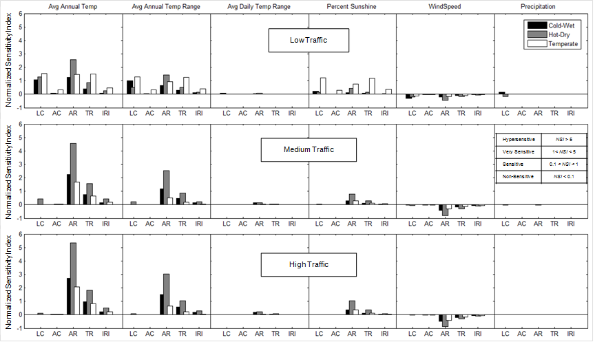
Figure 11. Graph. Sensitivity analysis results for flexible pavements.
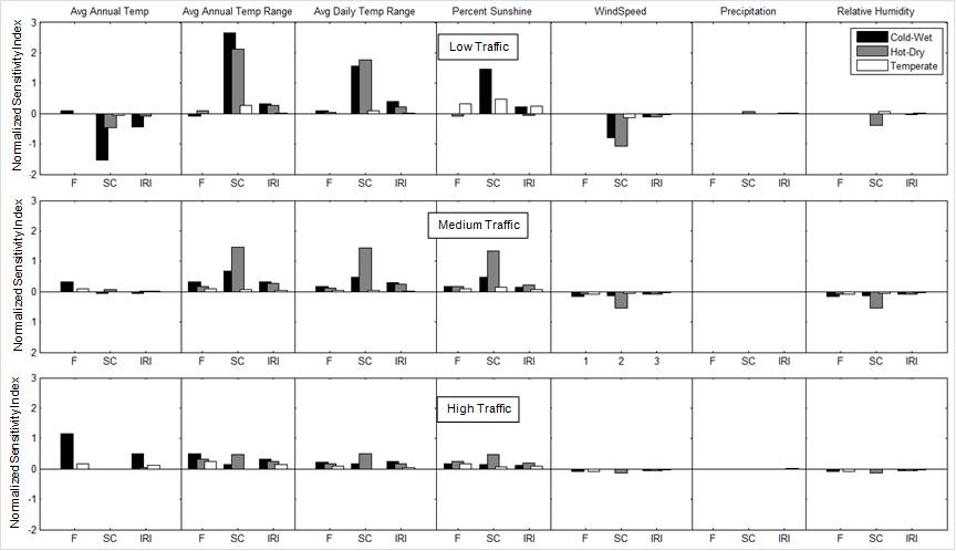
Figure 12. Graph. Sensitivity analysis results for rigid pavements.
Key observations from the JPCP rigid pavement analyses are as follows:
Sensitivity Analysis Conclusions
The sensitivity of MEPDG pavement performance predictions to key climate characteristics was systematically and quantitatively evaluated. Three climate zones and three traffic levels were considered to assess sensitivity over an extended MEPDG problem domain. Sensitivity of predicted pavement distress to change in climate characteristic was quantified in terms of NSI that relates the change in distress relative to its design limit to the percentage change in the climate characteristic from its baseline value. Key conclusions from the results include the following:
STATISTICAL COMPARISON OF MERRA VERSUS AWS/OWS WEATHER DATA
Hourly weather histories were obtained from three different data sources: MEDPG OWSs, LTPP AWSs, and MERRA. Statistical evaluations of the MEPDG-related climate inputs from these three sources provided an initial assessment of their similarities and differences and helped identify any potential data issues. The MEPDG hourly climate inputs are air temperature, wind speed, percent sunshine, relative humidity, and precipitation.
The hourly weather data in the MEPDG OWS files are based on first-order ASOS climate stations described previously in chapter 3. Most of the MEPDG climate data are obtained from the Unedited Local Climatological Data (ULCD) product, which covers the period of July 1996 through December 2004. Only minimal quality checks have been performed by the NCDC for most of these historical data. As described later, additional quality checking of the MEDPG OWS data was performed as part of this study. Beginning in January 2005, data are available from the Quality Controlled Local Climatological Data (QCLCD) product (http://www.ncdc.noaa.gov/land-based-insitu-station-data/quality-controlled-local-climatological-data-qclcd).
The MEPDG requires a minimum of 24 months of actual weather station data; for many of the 800OWSs in the MEPDG database, there is approximately 10 years of data. Pavement performance prediction periods longer than the weather time series length are accommodated by “recycling” the weather history—i.e., once the end of the weather time series is reached, it is repeated again from the start.
LTPP collected hourly weather data from AWSs at SPS sites (1994 through 2008) and SMP sites (1993 through 2004) across the United States. Most AWSs have hourly weather series longer than 10 years. Significant quality checks are applied to the AWS data before they are uploaded into the LTPP database. However, as described later, data gaps and time misalignments are not rare, and these issues can create problems when trying to use AWS data as weather inputs to the MEDPG.
One weather input required by the MEPDG, percent sunshine, is not collected by the LTPP AWS; instead, the actual incoming shortwave solar radiation is measured and recorded. Although solar radiation is more directly relevant to daytime pavement temperature modeling than percent sunshine, estimation of net longwave radiation fluxes requires percent sunshine information (or percent cloudiness at night, where percent cloudiness is the complement of percent sunshine). To address this data limitation, synthetic percent sunshine data were generated by using the shortwave radiation regression equation incorporated in the MEPDG as shown in figure 13.(58)

Figure 13. Equation. Shortwave radiation regression equation.
Where:
Qi = incoming shortwave radiation received at ground level.
R* = shortwave radiation incident on a horizontal surface at the top of the atmosphere; this depends on the latitude of the site and the seasonally varying solar declination.
A, B = empirical constants that account for diffuse scattering and adsorption by the atmosphere; the values of A and B incorporated in the MEPDG, which are based on data for the upper Midwest and Alaska, equal 0.202 and 0.539, respectively.(58)
Sc = average percent sunshine.
The Qi values from the LTPP AWS data and the R* values provided by MERRA can be used in the equation in figure 13 to solve for Sc. The average percent cloudiness at night is assumed equal to the average percent cloudiness during the day, computed as 100 – Sc.
Note that R* could also be estimated using the algorithms and data incorporated in the EICM. These estimates are generally close to the measured values from MERRA; this is discussed further later.
The MERRA data were obtained electronically from the servers at NASA. The hourly MERRA data are provided at 0.5 degrees (latitude) by 0.67 degrees (longitude) horizontal spatial grid point resolution (approximately 31.1 by 37.3 mi at mid-latitudes) and at 72 atmospheric elevations, including the ground surface. In this study, MERRA data were obtained from the surface grid point closest horizontally to the corresponding AWS or OWS location. The raw MERRA data were used to define the hourly temperature, wind speed, percent sunshine, precipitation, and relative humidity values. If there is a difference between MERRA grid point elevation and the target ground-based meteorological station, the MERRA air temperature is adjusted using the adiabatic lapse rate, defined as the rate of temperature change with respect to elevation. If the weather station elevation is greater than the MERRA elevation, the lapse rate is assumed to equal ‑8.0 °C/km—i.e., the MERRA temperature values are adjusted downward. Conversely, if the weather station elevation is lower than the MERRA elevation, the ambient lapse rate is assumed to equal 6.5 oC/km—i.e., the MERRA temperature values are adjusted upward.(59) The difference between the two lapse rates accounts for the possibility of condensation during adiabatic cooling with increasing elevation. Adiabatic air temperature adjustments were typically small (less than 33.8 °F) because the majority of locations used in this study had elevation differences smaller than 328 ft. However, a few study locations in complex terrain contained elevations differences upwards of 1,640 ft, which can result in temperature adjustments as large as 39.2 °F.
All data were subjected to extensive quality checks prior to performing the comparison analyses.
OWS From MEDPG Database
Data quality checks for the MEPDG OWS weather files included the following:
Any OWS file that failed any of these data quality checks was eliminated from further consideration. All of the 851 OWS weather files in the MEPDG database were checked, and only 21 stations passed all quality checks. Figure 14 summarizes the distribution of data quality errors in the MEPDG OWS files.

Figure 14. Graph. Data quality error distribution for OWS climate files in MEPDG database.
AWS From LTPP Database
The weather data from the LTPP AWSs are time-referenced using the local time at each site. All of the AWS weather files had problems accommodating the change to/from daylight savings time (DST) properly. When DST starts each year and the local time jumps forward from 2:00a.m. to 3:00 a.m., no 2:00 a.m. data are stored in the database. When DST ends each year and the local time jumps backward from 2:00 a.m. to 1:00 a.m., there should be a duplicate 1:00a.m. weather record. However, because the date and time fields in the LTPP database are key fields that prohibit duplicate values, only one of the 1:00 a.m. data records can be stored. This was corrected by shifting all DST records back to standard time and inserting the missing data values at the end of DST by interpolating adjacent records.
In addition to the DST issues, time gaps ranging from several hours to several days were found in many AWS weather files. These may be the result of equipment malfunctions or routine maintenance. Corrections were applied where possible. The time period for the analyses was selected to minimize the number of record gaps. One AWS site had to be dropped from consideration because of excessive record gaps.
MERRA Data
No quality-related issues were found in the MERRA data when the OWS and AWS quality checks were applied.
A total of 12 sites were selected for the study after all quality checks and possible corrections to weather files were applied. Figure 15 shows the site locations. Table 10 summarizes the coordinates and other identifying information for each station. The stations beginning with “M” are OWSs from the MEPDG software. All other stations are AWSs from the LTPP database.
These stations spanned a range of topographical conditions. For example, sites 300800, 490800, and 040200 were located in topographical challenging mountainous locations while sites M94982, 530200, and M93817 were in more benign flat topography far from major water bodies.
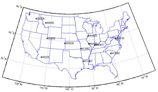
Figure 15. Map. Locations of ground-based weather stations investigated in this study.
Hourly weather histories for congruent time periods were selected from MERRA and the AWS and/or OWS at each site. Two sets of MEPDG runs were then performed for each site, one using the weather history from MERRA and the other using either the AWS or OWS data for the site. Each set of analyses contained one flexible and one rigid pavement scenario. The MEPDG predicted results at the end of design life (20 years for flexible pavements and 25 years for rigid pavements) were recorded and compared. Details of the MEPDG analyses are presented later. The overall agreement between the predicted MEDPG distresses using the MERRA versus AWS/OWS data was categorized as good, fair, or poor. The sites in each category were as follows:
Table 10. Details of ground-based weather stations.
| Site ID | Latitude | Longitude | Elevation (ft) | Weather Sources | Ground-Based Weather Station Location |
M93738 |
38.95 |
-77.45 |
312 |
OWS, MERRA |
DULLES ITL AIRPORT, VA |
040200 |
33.43 |
-112.70 |
1096 |
AWS, MERRA |
BUCKEYE MUNICIPAL AIRPORT, AZ |
300800 |
46.14 |
-112.89 |
4006 |
AWS, MERRA |
near ANACONDA, MT |
490800 |
40.56 |
-111.13 |
6486 |
AWS, MERRA |
near WOODLAND, UT |
530200 |
47.12 |
-118.38 |
1811 |
AWS, MERRA |
near RITZVILLE, WA |
M03026 |
39.23 |
-102.28 |
4199 |
OWS, MERRA |
KIT CARSON COUNTY AIRPORT, CO |
M03966 |
38.67 |
-90.67 |
492 |
OWS, MERRA |
SPIRIT OF ST LOUIS AIRPORT, MO |
M13883 |
33.93 |
-81.12 |
243 |
OWS, MERRA |
COLUMBIA METROPOLITAN ARPT, SC |
M13957 |
32.45 |
-93.82 |
276 |
OWS, MERRA |
SHREVEPORT REGIONAL ARPT, LA |
M13987 |
37.15 |
-94.50 |
984 |
OWS, MERRA |
JOPLIN REGIONAL AIRPORT, MO |
M93817 |
38.03 |
-87.53 |
420 |
OWS, MERRA |
EVANSVILLE REGIONAL ARPT, IN |
M94982 |
41.62 |
-90.58 |
751 |
OWS, MERRA |
DAVENPORT MUNICIPAL AIRPT, IA |
Statistical analyses of hourly air temperature, wind speed, percent sunshine, precipitation, and relative humidity were performed for each of the weather history datasets. Example frequency distributions and comparisons of means and standard deviations are given in figure 16 through figure 25 and figure 26 through figure 35 for the respective sites having good (Evansville, IN, M93817) and poor (Shreveport, LA, M13957) agreement in MEPDG distresses using the different weather data time series. The differences in the weather statistics between these two sites were generally small except for wind speed and percent sunshine. The differences in MEPDG predicted distresses using MERRA versus OWS weather histories were most probably the consequence of the differences in the wind speed and percent sunshine in the two datasets. Examination of the similar figures at the other 10 sites confirms that the agreement between MERRA and AWS/OWS weather statistics is consistently quite close for temperature, precipitation, and relative humidity, and relatively larger for wind speed and percent sunshine.
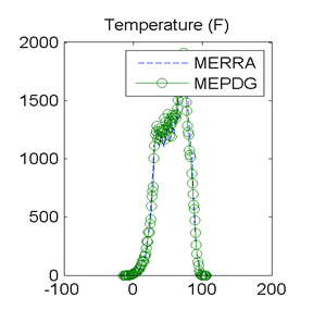
Figure 16. Graph. Site M93817 (Evansville, IN) with good agreement in MEPDG predicted distresses: distributions of hourly temperature.
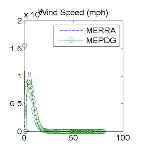
Figure 17. Graph. Site M93817 (Evansville, IN) with good agreement in MEPDG predicted distresses: distributions of hourly wind speeds.
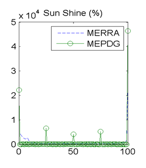
Figure 18. Graph. Site M93817 (Evansville, IN) with good agreement in MEPDG predicted distresses: distributions of hourly percent sunshine values.
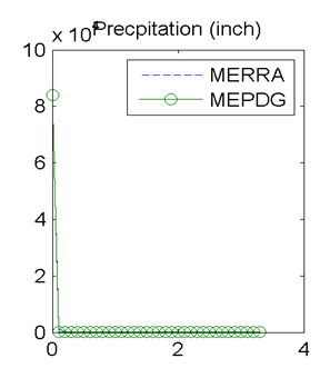
Figure 19. Graph. Site M93817 (Evansville, IN) with good agreement in MEPDG predicted distresses: distributions of hourly precipitation.
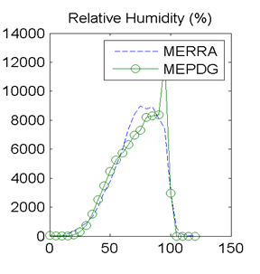
Figure 20. Graph. Site M93817 (Evansville, IN) with good agreement in MEPDG predicted distresses: distributions of hourly relative humidity values.
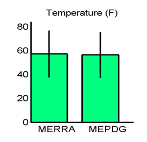
Figure 21. Graph. Site M93817 (Evansville, IN) with good agreement in MEPDG predicted distresses: hourly temperature means and standard deviations.
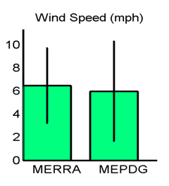
Figure 22. Graph. Site M93817 (Evansville, IN) with good agreement in MEPDG predicted distresses: hourly wind speed means and standard deviations.
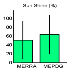
Figure 23. Graph. Site M93817 (Evansville, IN) with good agreement in MEPDG predicted distresses: hourly percent sunshine means and standard deviations.
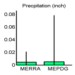
Figure 24. Graph. Site M93817 (Evansville, IN) with good agreement in MEPDG predicted distresses: hourly precipitation means and standard deviations.
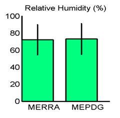
Figure 25. Graph. Site M93817 (Evansville, IN) with good agreement in MEPDG predicted distresses: hourly relative humidity means and standard deviations.
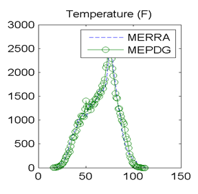
Figure 26. Graph. Site M13957 (Shreveport, LA) with poor agreement in MEPDG predicted distresses: distributions of hourly temperatures.
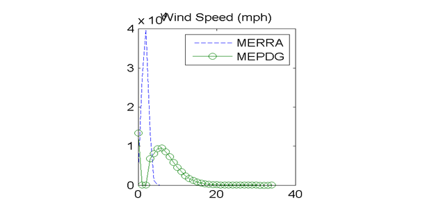
Figure 27. Graph. Site M13957 (Shreveport, LA) with poor agreement in MEPDG predicted distresses: distributions of hourly wind speeds.
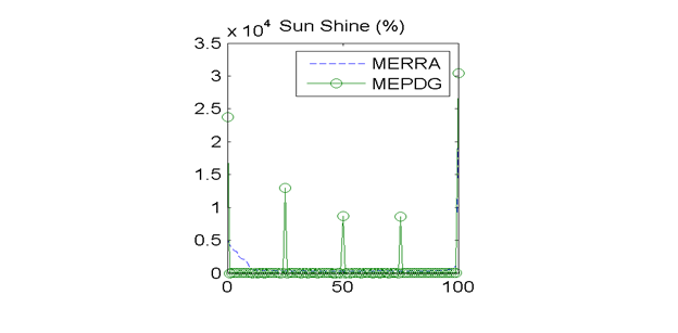
Figure 28. Graph. Site M13957 (Shreveport, LA) with poor agreement in MEPDG predicted distresses: distributions of hourly percent sunshine values.
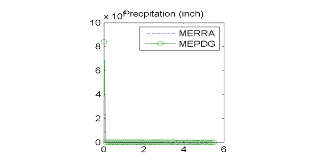
Figure 29. Graph. Site M13957 (Shreveport, LA) with poor agreement in MEPDG predicted distresses: distributions of hourly precipitation.
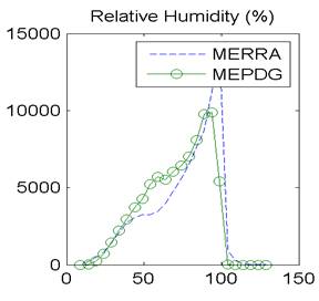
Figure 30. Graph. Site M13957 (Shreveport, LA) with poor agreement in MEPDG predicted distresses: distributions of hourly relative humidity.
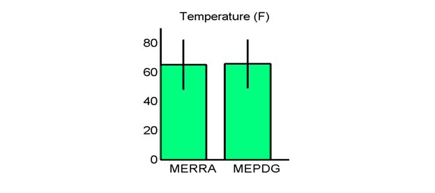
Figure 31. Graph. Site M13957 (Shreveport, LA) with poor agreement in MEPDG predicted distresses: hourly temperature means and standard deviations.
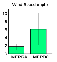
Figure 32. Graph. Site M13957 (Shreveport, LA) with poor agreement in MEPDG predicted distresses: hourly wind speed means and standard deviations.
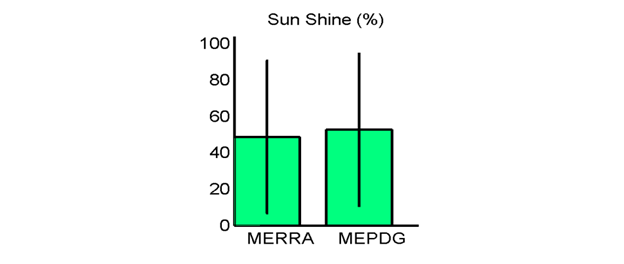
Figure 33. Graph. Site M13957 (Shreveport, LA) with poor agreement in MEPDG predicted distresses: hourly percent sunshine means and standard deviations.
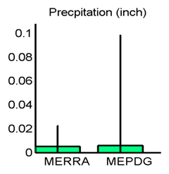
Figure 34. Graph. Site M13957 (Shreveport, LA) with poor agreement in MEPDG predicted distresses: hourly precipitation means and standard deviations.
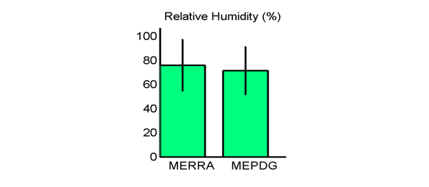
Figure 35. Graph. Site M13957 (Shreveport, LA) with poor agreement in MEPDG predicted distresses: hourly relative humidity means and standard deviations.
The discrepancies in hourly wind speed and percent sunshine values merited further evaluation. In general, mean wind speeds from the MERRA data tended to be lower than from AWSs/OWSs. The frequency distributions of hourly wind speed data from the MERRA and AWS/OWS data sources provided additional insights. Hourly wind speed frequency distributions are shown in figure 17 for site 93817 in Evansville, IN, and figure 27 for site 13957 in Shreveport, LA. These respectively had very good and very poor agreement in the MEDPG predicted distresses using the MERRA versus AWS/OWS weather data. The frequency distributions in figure 17 show very similar wind speed frequency distributions and statistics for the site with good agreement in MEPDG predicted distresses. However, figure 27 for the poor distress agreement site shows a frequency distribution for the MERRA data that is smooth with a well-defined single peak while the distribution for the OWS data from the MEPDG database is bimodal and has almost zero measurements of wind speed in the range of about 1 to 3 mi/h. This “dropout” in the OWS wind speed data corresponds to the exact location of the peak frequency in the MERRA data. This “dropout” is also reflected in the discrepancies in the wind speed mean and standard deviations as shown in the bar chart in figure 32. Further examination of all OWSs in the current MEPDG database revealed that nearly all OWS weather files have almost zero measurements over the wind speed range of about 1 to 3 mi/h. The reason for this is unknown and difficult to hypothesize.
There were also issues with the percent sunshine measurements in both the AWS and OWS data sources. As described previously, the AWSs do not measure percent sunshine and thus the values of percent sunshine (and cloud cover) must be inferred. Percent sunshine is measured on an hourly basis at the OWSs, but the values are recorded as five discrete categories of 0, 25, 50, 75, and 100 percent. This is clearly evident in the OWS percent sunshine frequency distributions in figure 18 and figure 28. The hourly MERRA percent sunshine values, on the other hand, are recorded on a continuous scale from 0 to 100 percent.
There is a second potential issue with the OWS percent sunshine values. The OWS data in the MEPDG database are obtained primarily from ASOS ground stations. The ASOS ground stations measure percent sky cover based on reflections from a laser beam ceilometer).(60) The processing of this reflection data to determine sky cover is complex, but the end result is a reporting of sky cover in one of five categories. The five sky condition categories reported in the ASOS data, the ranges of electronically measured sky cover corresponding to each, and the human equivalent in oktas (one of eight increments of visual sky cover) are summarized in table 11. The presumed MEPDG OWS percent sky cover values (computed as 100 minus the percent sunshine) corresponding to the five reported percent sunshine categories are also given in the last column of table 11. These MEPDG values are presumed because there is no relevant documentation available for the MEDPG OWS files, but it seems plausible that the five MEPDG percent sunshine categories correspond to the five ASOS sky condition categories. If this is true, the data in table 11 suggest that there is an inconsistent mapping between ASOS and MEPDG OWS percent sky cover values for the various categories, which may introduce biases into the MEDPG OWS percent sunshine data.
Table 11. ASOS sky condition categories.
Sky Condition Category |
ASOS Measured Percent Sky Cover (Range) |
ASOS Measured Percent Sky Cover (Midpoint) |
Human Equivalent (Oktas) |
MEDPG OWS Percent Sky Cover |
Clear (CLR) |
0 to < 5 |
2.5 |
0 |
0 |
Few Clouds (FEW) |
> 5 to < 25 |
15 |
> 0 to < 2/8 |
25 |
Scattered Clouds (SCT) |
> 25 to < 50 |
37.5 |
> 2/8 to < 4/8 |
50 |
Broken Clouds (BKN) |
> 50 to < 87 |
68.5 |
> 4/8 to < 8/8 |
75 |
Overcast (OVC) |
> 87 to < 100 |
93.5 |
8/8 |
100 |
Figure 36 summarizes comparisons of statistics on the differences of selected weather inputs for the four sites that had full sets of data from AWS, MERRA, and two or more nearby OWSs. VWS weather histories were also generated from the OWS data using the MEPDG interpolation algorithms. Although the MEPDG VWS algorithm is not documented, through reverse engineering, it appears to be based on an inverse square distance relationship with an elevation temperature correction using a 0.00349 °F/ft lapse rate in both the upward and downward directions. For the purposes of these comparisons, the AWS data were regarded as ground truth, and the evaluation was in terms of how well the weather statistics for the other data sources agree with those from the AWS. The data in figure 36 confirmed the earlier observation of generally good agreement in hourly temperature statistics among the different weather data sources. Although not shown in figure 36, this observation applies to precipitation and relative humidity statistics as well. Bar heights indicates mean value of the differences in weather parameters, error bars indicate standard deviations of the differences. Mean and standard deviation values of zero imply complete agreement between datasets. The largest discrepancies were again in the statistics for daily wind speed and percent sunshine. However, there were no patterns in these discrepancies. The MERRA data agreed best with the AWS in some cases (temperature for site 490800; wind speed for sites 300800, 490800). In other cases, the MERRA data agreed best with the VWS/OWS statistics but none of these agree very well with the AWS (wind speed for 040200, 530200; percent sunshine for sites 300800, 530200). Examination of all of these results suggests that the match between MERRA and AWS data in overall terms was at least as good as the agreement between VWS/OWS and AWS data.
Influence of site terrain and latitude were investigated in a final attempt to find some systematic explanation for the effect of the weather data source on MEPDG distress predictions. Agreement of MEPDG distress predictions using MERRA versus OWS weather inputs was classified into the three categories of good, fair, and poor, as described previously. Site terrain is categorized as flat, varying elevation, or mountainous. Latitude represents how far north/south the site was located. Trends between the agreement of MEPDG distress predictions and site terrain and latitude are illustrated in figure 37. Although the trends were weak, the data in figure 37 suggest that good agreement of MEPDG distress predictions is more likely for flat terrain and northern sites while poorer agreement is more likely for varying/mountainous terrain and southern sites. The influence of latitude on MEPDG distress predictions is addressed further in a later section.
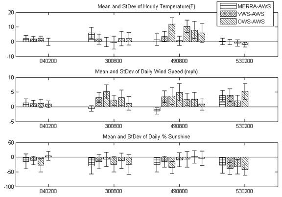
Figure 36. Graph. Comparison of key weather statistics: differences among MERRA versus AWS versus VWS versus OWS datasets.
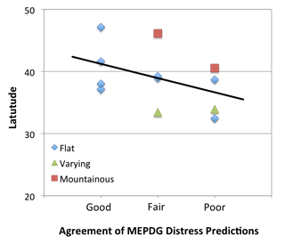
Figure 37. Graph. Influence of site terrain and latitude on agreement of MEPDG distress predictions using MERRA versus OWS weather inputs.
Statistical Comparison Conclusions
The following key conclusions were reached from the statistical comparison of MERRA versus AWS/OWS hourly weather data:
Overall, these conclusions support the use of MERRA as a source of weather data inputs for the MEPDG and other infrastructure applications.
Comparison of MEPDG Distress Predictions Using MERRA versus OWS Weather Data
The influences of different weather histories on MEPDG predicted distresses were examined in a preliminary statistical fashion previously. These influences are scrutinized from a more rigorously mechanistic perspective in this section. The suitability of MERRA as an alternative weather data source was evaluated by comparing the MEPDG prediction results using MERRA weather data inputs with predictions at the same location using conventional ground-based historical weather data. The ground-based historical weather data were obtained from the OWSs provided with the MEPDG software and the AWSs available in the LTPP database. Differences in absorbed solar energy at the pavement surface using these different weather history sources were examined as the possible cause for the differences in predicted distresses.
Enhanced Integrated Climate Model
Modeling of temperature and moisture conditions in the pavement structure in response to weather inputs is modeled in the MEDPG using the EICM. The EICM is a one-dimensional heat and moisture flow model that simulates pavement temperatures and moisture over depth and time in response to environmental inputs from the pavement surface. The analysis approach was originally developed for the FHWA in the 1980s, revised in the 1990s, and then subsequently enhanced for implementation in the MEPDG. (See references 62, 63, 6, and 64.) The EICM requires the user to input the following weather data at hourly intervals over the entire design life of the project: air temperature, wind speed, percentage sunshine, relative humidity, and precipitation. The air temperature is used in the EICM heat balance equation for calculating longwave radiation and convective heat transfer. It is also used to define freeze–thaw periods, to determine the number of freeze–thaw cycles, and to estimate the TMI for setting the equilibrium saturation and matric suction conditions in the unbound layers. Wind speed is required for computing the convective heat transfer coefficient at the pavement surface. The percentage sunshine, along with latitude and date for computing solar declination, is needed for estimating the incoming solar radiation during the day and reflected longwave radiation at night. Relative humidity is used indirectly in the EICM to estimate net longwave radiation heat fluxes and in the MEPDG empirical distress models to compute the drying shrinkage of JPCP and continuously reinforced concrete pavement (CRCP) and also to determine the crack spacing and initial crack width in CRCP. Precipitation was required in early versions of the EICM to compute infiltration through the surface. However, infiltration modeling is disabled in the current version of the EICM, and any influence of surface moisture on surface heat flux is also neglected.
Although the MEPDG requires weather data inputs on an hourly basis, these values are interpolated and/or aggregated in different ways during the pavement prediction calculations. Hourly air temperatures are interpolated to the 0.1-h actual time interval used internally in the EICM finite difference integrations. Hourly wind speed is aggregated to a daily average value. Hourly percent sunshine (or its complement, percent cloud cover) is converted to average daytime and nighttime values. Relative humidity is converted to a daily average for estimating the longwave radiation heat losses from the pavement surface and to a monthly average for use in the MEPDG JPCP and CRCP distress models. Precipitation is not used in the current version of the EICM, but the hourly input values are converted to annual averages for use in the MEPDG distress models to determine the IRI site factor for flexible pavements and the erosion/loss of base support for rigid pavements.
Pavement distresses for the 12 sites identified previously in table 10 were predicted using the MEPDG and the MERRA and AWS/OWS weather histories. Both flexible and rigid pavement scenarios were investigated. The flexible pavement section consisted of 8 inches of asphalt concrete over 8 inches of A-1-a granular base layer over a semi-infinite A-6 subgrade layer. Traffic was set at an initial AADTT of 1,500 with 95 percent of trucks in the design lane and a compound traffic growth rate of 4 percent. The binder PG grade was selected using the LTPPBind program for the climate conditions at each site. The rigid pavement section consisted of 10 inches of JPCP over an A-2-4 granular base over an A-7-5 semi-infinite subgrade. Traffic was set at an initial AADTT of 7,500 with 55 percent of truck in design lane and no traffic growth.
A total of eight distresses (five for flexible pavements, three for rigid JPCP) were predicted by the MEPDG. For the flexible pavement scenario, AR was found to be the dominant distress, while slab cracking was the dominant distress for the rigid pavement scenario. Consequently, the subsequent discussion focuses on just these two distresses.
A design limit normalized difference (DLND) was used to present the differences of distress predictions between AWSs/OWSs and MERRA. The DLND is expressed in figure 38:

Figure 38. Equation. Design limit normalized difference.
Where:
DLNDis = design limit normalized difference of distress i for site s.
Dis,MERRA = predicted value of distress i for site s when using weather history from MERRA.
Dis,AWS|OWS = predicted value of distress i for site s when using weather history from AWSs or OWSs.
DLi = design limit for distress i-0.25 inches for AR and 15 for percent slab cracking.
The DLND represents the size of the differences in predicted distress using MERRA versus AWS/OWS weather data compared with the respective distress design limit. For example, if the DLND of AR is 0.5, this means that the MERRA data gave a predicted AR value that was higher than the predicted AR value using AWSs/OWSs by an amount equal to 0.5 times the design limit of AR, i.e., 0.5*0.25 inches = 0.125 inches.
Figure 39 summarizes the differences in predicted distresses as well as the statistics of the hourly weather input data for all sites. From left to right in figure 39 are 12 sets of bars, with each set corresponding to one site. The first row shows the DLND for AR and slab cracking at each station. The subsequent rows show the means and standard deviations for key weather parameters from each data source. Precipitation is not included because it is not an influential factor in the current EICM model. The DLND generally increases from left to right in the figure; in other words, the differences in predicted distress using MERRA weather data versus AWS or OWS data increases when going from left to right. The OWS in the legend represents the ground-based weather station, which in the context of the discussion in this section can be either AWS or OWS.
Noteworthy observations from figure 39 include the following:
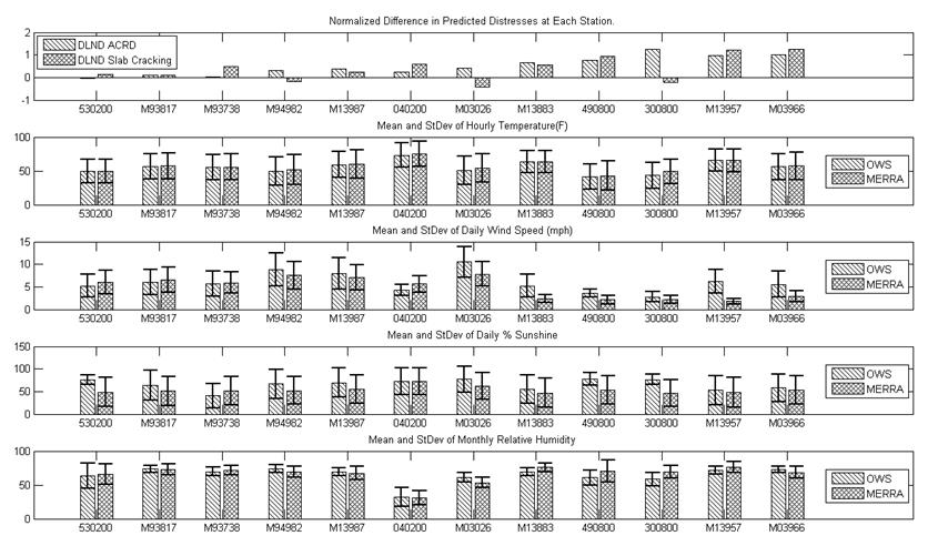
Figure 39. Graph. Summary of analysis results.
The results in figure 39 were insufficient to explain the differences between the MERRA- and AWS/OWS-based distress predictions even for the cases where these differences were substantial. The results are also insufficient to establish which weather data source is more “correct.” A more detailed examination of distress prediction agreement versus the weather data from the alternative sources is required. This additional analysis was completed and discussed in chapter 6.
Although the air temperature mean and standard deviation values for the MERRA and AWS/OWS data generally agreed quite well, there were some exceptions. As shown in figure 39, sites M03026 and 300800 exhibited the largest temperature differences between MERRA and AWS/OWS data and also had moderate to large differences in predicted AR and slab cracking. Both of these sites are located in topographically challenging mountainous regions. Even though the MERRA air temperatures are corrected for elevation differences between the MERRA grid point and the AWS/OWS location, this was not sufficient to match the ground-based weather station data. More than just elevation varies rapidly over short distances in mountainous terrain; for example, the MERRA grid point might be on one side of a ridge and the AWS/OWS on the other side in a different microclimate. This will always be an issue in these types of terrain and will also plague ground-based weather data from stations that are not collocated with the pavement site. In other words, the only source for truly accurate weather data at pavement sites in topographically challenging areas is an onsite OWS.
In general, mean wind speed from the MERRA data tended to be lower than from AWS/OWS data. As described previously, the frequency distributions for the MERRA data tend to be smooth with well-defined single peaks while the distributions for the OWS data from the MEPDG database are frequently bimodal with almost zero measurements of wind speed in the range of about 1 to 3 mi/h (figure 27 and figure 32). This “dropout” in the OWS wind speed data corresponds to the exact location of the peak frequency in the MERRA data.
Figure 40 and figure 41 depicts the trends of DLND for AR and slab cracking versus the difference between MERRA and AWS/OWS average hourly wind speeds, respectively. The different shapes of the data points correspond to the level of prediction agreement (good, fair, and poor). Overall, DLND decreases with increasing difference in average wind speed (in an absolute value sense). This is more pronounced for AR than for slab cracking. Although the R2 values are low, the trends nevertheless suggest that biases in wind speed will produce biases in the MEPDG pavement predictions. Given the dropout in low wind velocities in the OWS data (figure 27 and figure 32), it would appear that the ground-based wind speed data are more suspect.
One additional note regarding wind speed: The wind speed used in the convection boundary condition for the EICM is defined at an elevation of 6.5 ft above the ground surface.(65) The MERRA data wind speed data are reported at this 6.5-ft elevation, but the precise elevations for OWS measurements are not known.
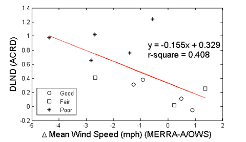
Figure 40. Graph. DLND in predicted asphalt concrete rut depth (ACRD) versus mean hourly wind speed difference.
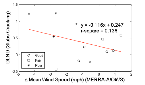
Figure 41. Graph. DLND in predicted slab cracking versus mean hourly wind speed difference.
As described earlier, there were issues with the percent sunshine measurements in both the AWS and OWS data sources. The AWSs do not measure percent sunshine and thus the values of percent sunshine (and cloud cover) must be inferred. Percent sunshine is measured on an hourly basis at the OWS, but the values are recorded as five discrete categories (0, 25, 50,75, and 100percent—see figure 18 and figure 28), and there is some question whether these categories are mapped correctly from the underlying ASOS categories (table 11). The hourly MERRA percent sunshine values are recorded on a continuous scale from 0 to 100 percent.
Figure 42 and figure 43 depicts the trends of DLND for AR and slab cracking versus the difference between MERRA and OWS average percent sunshine, respectively. The meaning of the shapes of the points is the same as in figure 40 and figure 41. Censoring the one outlier on the far right, the results suggest that the differences in the MEPDG predicted distress are correlated quite strongly with the differences in the percent sunshine values in the weather data sets. Because there were issues with the AWS and OWS measurement of this parameter, these data would appear to be the most suspect.
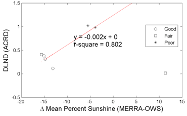
Figure 42. Graph. DLND in predicted ACRD versus mean hourly percent sunshine difference.
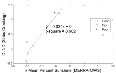
Figure 43. Graph. DLND in predicted slab cracking versus mean hourly percent sunshine difference.
Combined Effects of Wind Speed and Percent Sunshine
Wind speed and percent sunshine both have a strong influence on pavement temperature distributions and thus on AR and PCC slab cracking. Higher wind speed increases convective losses at the surface and thus decreases the solar radiation available to heat the pavement. Higher percent sunshine, on the other hand, increases the solar radiation reaching the pavement surface and thus increases pavement temperatures. As described in the preceding section, MERRA tended to have lower wind speeds and lower percent sunshine values than for ground-based weather data. Given the physics of the heat transfer at the pavement surface, these two trends will cancel each other to some unknown extent.
To evaluate the combined effects of wind speed and percent sunshine, the relevant components of the EICM formulation can be employed to evaluate the net energy absorbed by the pavement surface. The relevant equations are given in the NCHRP Project 1-37A final report.(6) The net heat flux available for absorption through the pavement surface Qg is shown in figure 44.

Figure 44. Equation. Net heat flux available for absorption.
Where:
Qi = heat flux due to incoming shortwave radiation.
Qr = heat loss due to reflected shortwave radiation.
Qa = heat flux due to incoming longwave radiation.
Qe = heat loss due to outgoing longwave radiation.
Qh= heat loss due to transpiration, condensation, evaporation, and sublimation.
Qc = heat loss due to convection.
Transpiration, condensation, evaporation, and sublimation heat losses are ignored in the EICM, i.e., Qh = 0. All heat fluxes and losses are in units of energy per time and area, e.g., Btu/hr-ft2. (Note on units: The derivations in this section are based on the NCHRP Project 1-37A documentation of the EICM. This documentation employs a variety of mixed and often inconsistent units. No attempt has been made here to remedy this.)
The net incoming shortwave solar radiation heat flux Qi at the pavement surface is estimated indirectly in the EICM using the equation in figure 13, which is repeated here for convenience in figure 45.

Figure 45. Equation. Shortwave radiation regression equation.
As before, R* is the extraterrestrial radiation incident on a horizontal surface at the outer atmosphere; A and B are empirical coefficients that account for diffuse scattering and adsorption by the atmosphere; and Sc is the percent sunshine, equivalent to 100 minus the percent cloud cover. Values of A and B incorporated in the EICM are based on 10 years of data for the upper Midwest and Alaska and are equal 0.202 and 0.539, respectively.(58) Only EICM OWS data are considered here because the AWSs do not provide a direct measurement of Sc.
There are two choices for determining Qi in MERRA. The first, similar to what is done in the EICM, is to estimate it from the equation in figure 45 using Sc values derived from the MERRA cloud cover data. However, MERRA also provides a direct measure of incoming shortwave heat flux as the Rsw data element in units of W/m2. This latter approach, which eliminates the need for the empirical A and B parameters in the equation in figure 45, was employed for the present analyses.
The net incoming shortwave radiation heat flux Qs after subtracting reflected radiation, is calculated from the OWS data as shown in figure 46:

Figure 46. Equation. Shortwave radiation heat flux from OWS data.
Qs can also be calculated from the MERRA data as (after appropriate unit conversions) using the equation shown in figure 47:

Figure 47. Equation. Shortwave radiation heat flux from MERRA data.
Where as is the surface shortwave absorptivity (the complement of albedo) set equal to 0.85 for both asphalt and PCC surfaces and the other terms are as previously defined. Note that the Qs values for the MERRA and OWS/EICM approaches will not be identical.
The incoming and outgoing longwave radiation heat fluxes are given in figure 48 and figure 49 respectively.

Figure 48. Equation. Incoming longwave radiation heat flux.

Figure 49. Equation. Outgoing longwave radiation heat flux.
Where:
N = cloud base factor; 0.9 to 0.8 for cloud heights of 1,000 to 6,000 ft.(66)
W = average cloud cover during day or night.
Qz = heat flux due to incoming longwave radiation without correction for cloud cover.
Qx = heat loss due to outgoing longwave radiation without correction for cloud cover.
Note that both the incoming and outgoing longwave radiation heat fluxes in the equations found in figure 48 and figure 49 are functions of the average cloud cover, which will in general be different for the MERRA and OWS weather histories.
The uncorrected incoming longwave radiation heat flux Qz is computed in figure 50:

Figure 50. Equation. Uncorrected incoming longwave radiation heat flux.
Where:
σsb = Stefan-Boltzman constant, 0.172x10⁻⁸ Btu/(hr-ft2-°F4).
Tair = air temperature in degrees Rankine (°R).
G = 0.77.
J = 0.28.
ρ = 0.074.
p = vapor pressure of the air (1 to 10 mm Hg), which is related to relative humidity.
The uncorrected outgoing longwave radiation heat loss Qx is computed in figure 51:

Figure 51. Equation. Uncorrected outgoing longwave radiation heat loss.
Where:
ε = emissivity of the pavement, which depends on pavement color, texture, and temperature; a typical value is 0.93.
Ts = pavement surface temperature in °R.
The final term remaining in the equation in figure 44 is the convective heat loss Qc, which is given by figure 52:

Figure 52. Equation. Convective heat loss.
Where Tair and Ts are as defined previously, and H is the convection heat transfer coefficient. The convective heat transfer coefficient depends on many variables and is thus difficult to define. The expression employed in the EICM is shown in figure 53:(65)

Figure 53. Equation. Convection heat transfer coefficient.
Where:
Ts = pavement surface temperature, in °K.
Tair = air temperature, in °K.
Tm = average of surface and air temperatures, in °K.
U = average daily wind speed at an elevation of 2 m above the surface, in m/sec.
The EICM documentation recommends a maximum value for H of 3.0 Btu/(hr-ft2-°F). Note that the average daily wind speed U will in general be different for the MERRA and OWS weather histories.
The equations in figure 44 through figure 53 enable comparisons of the net heat flux Qg into the pavement for both the MERRA and OWS weather histories. This net heat flux, when integrated over time, gives the energy density absorbed into the pavement. To simplify these exploratory analyses, only the daily average values of the hourly air temperatures were used, and the difference between the pavement surface temperature and the air temperature was assumed constant at 30 °F.
Figure 54 through figure 59 illustrate the effect of absorbed energy density on predicted pavement performance. The daily absorbed energy densities over 1 year are summarized in the graph at the top of each figure; the frequency distribution of the daily absorbed energy density is given in the lower right; and the mean and standard deviation of daily absorbed energy density are given in the bar chart in the lower left. The daily absorbed energy densities predicted using the MERRA data agree well with those using the OWS weather histories for site M93817 (Evansville, IN) in figure 54. However, the agreement is not as good for site M13957 (Shreveport, LA) in figure 57; this can be seen most clearly in the mean and standard deviation comparisons in the lower left, where the mean daily absorbed energy density for the MERRA data is about 10 to 15 percent greater than the mean for the OWS weather history. Comparing these results with the differences in predicted distresses given at the top of figure 39 shows very good correlation between distress prediction agreement and absorbed energy agreement. Site M93187, which had the closest agreement in the absorbed energy densities using MERRA versus OWS, also had among the closest agreement in predicted distresses using the two weather data sources. Conversely, site M13957 had the worst agreement between absorbed energy densities and also had among the worst differences in predicted distresses using the MERRA versus OWS weather histories.
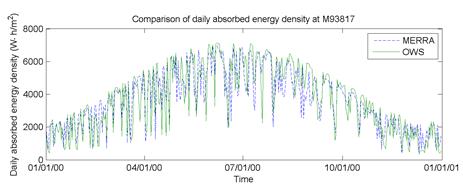
Figure 54. Graph. Absorbed energy density versus time during a typical day at site M93817 (Evansville, IN).
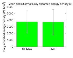
Figure 55. Graph. Mean and standard deviation of daily absorbed energy density at site M93817 (Evansville, IN).
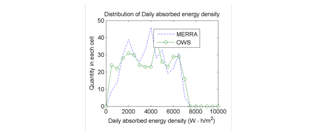
Figure 56. Graph. Distribution of daily absorbed energy density at site M93817 (Evansville, IN).
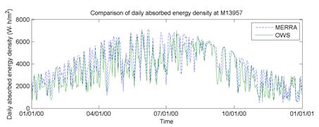
Figure 57. Graph. Absorbed energy density versus time during a typical day at site M13957 (Shreveport, LA).
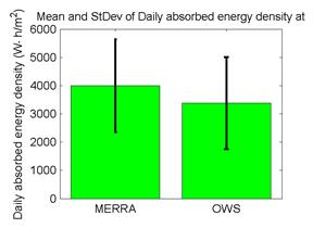
Figure 58. Graph. Mean and standard deviation of daily absorbed energy density at site M13957 (Shreveport, LA).
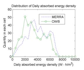
Figure 59. Graph. Distribution of daily absorbed energy density at site M13957 (Shreveport, LA).
Figure 60 and figure 61 depict the trend between DLND in predicted distresses (ACRD and slab cracking, respectively) and the mean daily absorbed energy density for all of the OWS sites analyzed. The prediction differences for both AR and PCC slab cracking consistently increase with increased differences in the mean daily absorbed energy density from the MERRA versus OWS weather histories. These differences are due to the combined effects of differences in estimates of total incoming solar radiation and differences in measured wind speed and percent cloud cover (or conversely percent sunshine). The MERRA data for these parameters are judged to be the most reliable for the following reasons:
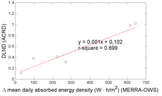
Figure 60. Graph. DLND in predicted ACRD versus absorbed energy differences.
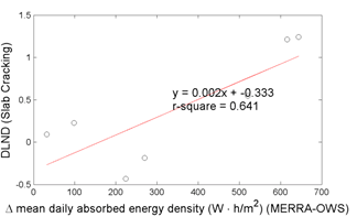
Figure 61. Graph. DLND in predicted slab cracking versus absorbed energy differences.
The first bullet point above supports the more qualitative observations made in the previous section. Figure 37 suggested that the discrepancies in MEPDG distress predictions tended to increase at lower latitudes—i.e., at more southerly site locations. The A and B calibration coefficients in the empirical relation for atmospheric diffused scattering and absorption in equation in figure 45 are based on conditions in the northern continental United States (including Alaska). This calibration becomes less appropriate for southern States, which is consistent with the observed increased differences in absorbed energy density and consequent differences in MEPDG distress predictions for the MERRA versus OWS weather histories.
The next chapter provides details on a more in-depth statistical and pavement performance comparison than contained in this chapter.