U.S. Department of Transportation
Federal Highway Administration
1200 New Jersey Avenue, SE
Washington, DC 20590
202-366-4000
Federal Highway Administration Research and Technology
Coordinating, Developing, and Delivering Highway Transportation Innovations
| REPORT |
| This report is an archived publication and may contain dated technical, contact, and link information |
|
| Publication Number: FHWA-HRT-16-064 Date: November 2016 |
Publication Number: FHWA-HRT-16-064 Date: November 2016 |
Precise bottleneck identification is one of the best ways that traffic engineers can demonstrate the need for, and the benefits of, investing in transportation improvements. However, conventional methods are limited and/or outdated, and improved methods are needed to make it more cost-effective, precise, and scientific. Regarding the conventional methods, they all have certain drawbacks. In the 1990s, most traffic engineers were modeling the peak 15-min period using the peak hour factor. However this paradigm did not take into account the significant factors that come into play throughout the year, such as seasonal demand volume fluctuation, weather, and incidents. Currently, improved procedures are available for analyzing the entire year; however, they are extremely data-intensive, which makes them difficult to use. Improved data sources such as INRIX® are available; however, some INRIX®-based bottleneck rankings have focused on traffic intensity without accounting for variability, reliability, or throughput.(9) This report describes some recent improvements in bottleneck identification, which leverage the latest advances in both research and ITS technology.
According to TTI’s 2012 Urban Mobility Report, in 2011, congestion in the top 85 U.S. urban areas caused 5.5 billion h of travel delay and 2.9 billion gal of excessive fuel consumption, totaling $121 billion in costs to the public.(1) This figure would be substantially higher if it accounted for the significant cost of environmental impacts associated with idle-related auto emissions and high gasoline prices.(1) The concept of congestion deals with the relationship between the quality and quantity of use of the transportation system. Congestion results when vehicles in a given road system exceed capacity, regardless of the size of the road system, which includes small (i.e., localized), medium (i.e., by facility or neighborhood), or large (i.e., regional). Congestion should be considered in two dimensions: spatial and temporal, including where (i.e., location, such as an intersection, roadway segment, or transit route) and when (i.e., time of day or year). Predicting either the where or when (or ideally, both) can be a huge first step in combating congestion, as agencies can mobilize appropriate dynamic responses to shortcut the delay. In the widest context, congestion results when traffic demand approaches or exceeds the available capacity of the system. However, traffic demand fluctuates significantly across seasons, days of the week, and time of day. Similarly, capacity changes dynamically based on the degree of weather (e.g., ponding, snow drifts, wind debris, etc.), degree of work zone interference, degree of traffic incident severity, and other nonrecurring events.
Although the cost of congestion to society is high[1], the precise definition of congestion is still vague, which muddies how the costs are calculated. Academia, engineers, and lay persons have different perceptions and expectations of how the system should perform based on whether they are in rural or urban areas, peak/off-peak periods, or prior experiences on that road. For example, the three prior groups might use such terms as volume/capacity (v/c), vehicle-hours, or buffer time needed, respectively. To capture the heterogeneity between people/agencies in defining congestion, Bertini conducted an extensive survey to identify the different definitions of metropolitan traffic congestion.(10) The survey included the following four qualitative questions:
Figure 6 summarizes the responses for more than 500 participants from different professional backgrounds.(10) Respondents were provided an opportunity to comment on congestion in general to establish the future research guidelines. One of the survey comments noted that “If we want to reduce congestion we need to be able to define it and quantify it.”(pg. 4)(10) Some people defined congestion as “anything below the posted speed limit” or below some “speed threshold (e.g., < 35 mi/h).”(pg. 4)(10) Others noted that “congestion is relative,” “a perception,” and “I know it when I see it.”(pg. 4)(10) Therefore, in addition to addressing the question of how significant a breakdown must be to warrant bottleneck classification, there are also other questions about how to assess congestion at all levels. This report focuses on methods of bottleneck identification and mitigation as opposed to methods of identifying and mitigating congestion at all levels.
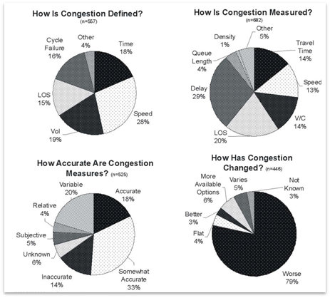
Figure 6. Graph. Survey results for defining congestion.(10)
The following four major dimensions or attributes can be used to quantify bottlenecks:
This report uses the acronym D.I.V.E. to reference these attributes.
Skabardonis et al. summarized several approaches to define and measure both recurrent and nonrecurrent bottlenecks.(11) They reported that recurrent bottlenecks are caused by demand fluctuations, roadway operation strategies, and physical geometries. Luo reported that recurrent bottlenecks are predictable from excessive peak-hour demands, while the 2010 HCM notes that recurrent demands follow day-of-week and month-of-year patterns.(12,6) Nonrecurrent bottlenecks are said to be caused by random and unpredictable events, including accidents and bad weather. Cambridge Systematics aggregated actions to relieve both recurrent and nonrecurrent bottlenecks, as shown in table 1.(5)The report indicates that both forms of congestion can be quantified by travel time, throughput, and queue characteristics.
| Mitigation Strategy | Action | Example Resources |
|---|---|---|
| Mitigating nonrecurring bottlenecks | Traffic incident management | See references 13–17 |
| Work zone management | See references 18 and 19 | |
| Road weather management | See references 20 and 21 and “Fundamentals of Road Weather Management” training course sponsored by FHWA | |
| Special events traffic management | See reference 22 and “Managing Travel for Planned Special Events” training course sponsored by FHWA and the National Highway Institute (NHI) | |
| Mitigating recurring bottlenecks | Freeway management | See references 23, 24, and “Freeway Management & Operations” training course sponsored by NHI |
| Arterial management | See reference 25 and “Access Management, Location and Design” training course sponsored by FHWA and NHI | |
| Corridor traffic management | See references 26 and 27 and HOV Facilities training course sponsored by FHWA | |
| Travel demand management | See reference 28 |
Data-driven methods and models now make it possible to pursue a more precise quantification of bottlenecks. Big data are a hot topic in not just the transportation industry but in other industries as well. STM can be considered a step in the direction of big data compared to traditional traffic engineering analyses. STM facilitates monthly and annual analyses instead of just peak-hour analyses, providing a more comprehensive picture of what the traffic problems are. STM makes it possible to put a more precise price tag on transportation investments. As stated previously, bottlenecks can now be quantified according to D.I.V.E. STM is a fundamental prerequisite to generating these measures for congestion identification. Various types of measured data (e.g., from INRIX®, loop detectors, performance measurement system (PeMS), TomTomTM, HERE™, etc.) could be used to generate STMs. Figure 7 illustrates that STMs can also be generated by traffic models, like micro-simulation, or HCM procedures.(6)
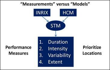
Figure 7. Flowchart. Generation of STMs via measurements or models.
In the case of HCM modeled data, traditional capacity analysis generates results for a single STM cell.(6) However, a recent HCM advancement is to generate STM results throughout the analysis year(s). The first step of the HCM procedure is to define a reliability analysis box. Figure 8 shows that two-dimensional heat charts, illustrating daily traffic performance on a space-time continuum, can be expanded into a third reliability dimension by modeling a significant number of days. Red cells within figure 8 represent congested conditions, yellow cells denote at-capacity conditions, and green cells indicate the uncongested regime. This HCM-generated STM may appear identical to an INRIX®-generated STM at first glance, although fundamental differences in how they were generated (i.e., projected versus measured conditions) should be carefully considered by the analyst. Regardless of whether derived from measurements (like INRIX®) or models (like the HCM), the STM is an important first step towards a more precise identification of congestion and bottlenecks.
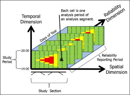
Figure 8. Graph. Reliability analysis box.(6)
Automatic identification of traffic congestion is an important first step toward identifying and ranking bottlenecks.(29) However, improved methods of bottleneck identification are needed. The conventional methods are either limited or incomplete. Bottleneck identification needs to be cost-effective, precise, and scientific. By comparing before-and-after scenarios in terms of their bottleneck measurements, precise bottleneck identification is one of the best ways that traffic engineers can demonstrate a solid return on investment in a time of tight budgets. When considering the conventional methods, it is possible to associate each one of them with one or more fundamental disadvantages. These disadvantages can be summarized into the following categories:
This section describes recent improvements in bottleneck identification, which leverage recent advances in transportation research and technology. The research project that produced this report also produced an INRIX®-based software tool for CBI, which displays a typical STM. One of the tool’s main performance measures is called “bottleneck intensity.” For example, in figure 9, the red area represents vehicles traveling below 45 mi/h, which means the cutoff speed used here is 45 mi/h. Bottleneck intensity can thus be computed as the red area divided by the total area.
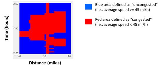
Figure 9. Graph. Concept of bottleneck intensity (percentage of analysis box that is congested).
Although average vehicle speed is used in the example in figure 9, other measures (e.g., travel time, percentage of stopped vehicles, and density) could be used to identify congested sections. Obtaining the bottleneck intensity is a good first step in assessing bottlenecks, but it is not sufficient because it does not take into account annual variability or reliability.
The Regional Integrated Transportation Information System (RITIS) Web site has rich functionality for congestion identification.(9) It is capable of generating STMs for a number of different performance measures. It has a slider feature to easily adjust thresholds for different colors in the heat map and a second slider for specifying which hours of the day will be plotted. Figure 10 illustrates a sample RITIS heat map for congestion identification.
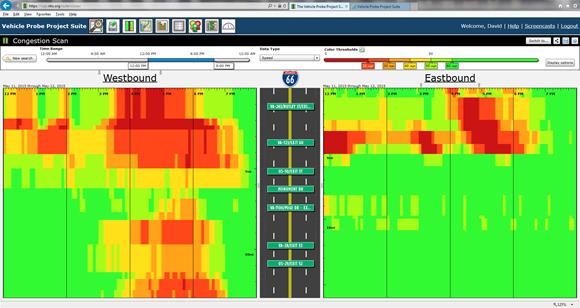
Figure 10. Screenshot. Congestion identification heat map from the RITIS Web site.(9)
The RITIS Web site also provides bottleneck rankings (see figure 11) based on an impact factor.(9) The RITIS formula for computing impact factors is shown in figure 12. Assuming consistent thresholds (e.g., 45 mi/h) for differentiating between congested and uncongested conditions, the impact factor computed by this formula is essentially equivalent to the bottleneck intensity from figure 9 aggregated for all days of the analysis period (e.g., 1 year).

Figure 11. Screenshot. Bottleneck rankings from the RITIS Web site.(9)

Figure 12. Equation. Impact factors for bottleneck rankings.
Where:
IF = Impact factor for ranking bottlenecks (dimensionless).
N = Number of days in the analysis period (e.g., 365 days).
n = Number of bottleneck occurrences.
Dn = Duration of congestion (minutes) (i.e., continuous vertical red distance in figure 9).
Ln = Length of congestion (miles) (i.e., continuous horizontal red distance in figure 9).
The RITIS impact factor is a reasonable method for comparing and ranking bottlenecks because it simultaneously accounts for the average duration and extent of congestion throughout the year. However, it does not account for the instability of congestion throughout the year. In statistics, instability is often quantified through the variance and/or standard deviation. In reliability modeling, which is a relatively new concept in transportation operations, instability is often quantified through the Travel Time Index. As stated in the Executive Summary, a problematic trend in this country is the decreasing reliability of surface transportation. When the Nation’s transportation facilities become less reliable, “we have to allow increasingly more time to ensure an on-time arrival.”(pg. 1)(31) In order to integrate the reliability concept into the comparison and ranking of traffic bottlenecks, the annual reliability matrix (ARM) was developed.
The ability to compute bottleneck intensity for every relevant day of the year, as shown in figure 9, is a prerequisite to ARM. All bottleneck intensities are plotted left to right onto a two-dimensional X-Y graph. The y-axis represents the bottleneck intensity value, which ranges between 0 and 100 percent. The x-axis represents all relevant days of the year, with the far left containing the best day of the year and the far right containing the worst day of the year. Once the annual values have been plotted in this manner, it becomes possible to visualize traffic bottlenecks in terms of both intensity and reliability.
Figure 13 and figure 14 compare STM to ARM. Whereas STM displays a bottleneck intensity for one day, ARM can display hundreds of bottleneck intensities throughout the year or across multiple years. By displaying and storing a distribution of bottleneck intensities in this manner, ARM facilitates visualization and computation of useful performance measures. For example, the red area under the curve in figure 14 is essentially equivalent to the impact factor from RITIS. However, the 85th percentile day of the year in the figure can now be visualized fairly easily as having an intensity of approximately 50 percent. The 85th percentile intensity would be a reasonable way to compare and rank bottlenecks because it reflects some of the most congested days of the year. By contrast, the 100th percentile intensity might reflect a fluke accident, and the 50th percentile intensity might not reveal how congested the worst days are.
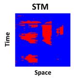
Figure 13. Graph. STM used to compute bottleneck intensity.
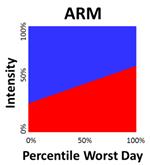
Figure 14. Graph. ARM based on bottleneck intensity.
As stated previously, ARM was developed to integrate reliability into the assessment of traffic bottlenecks. Figure 15 and figure 16 illustrate ARM diagrams for two known bottlenecks. Each ARM diagram has approximately the same amount of red area. According to the RITIS bottleneck ranking formula, both bottlenecks would produce approximately the same impact factor and would thus be considered approximately equal priority. However, ARM is intended to show that for bottleneck #2 on the right, roughly one-third of its days exhibit more delay than will ever be experienced at bottleneck #1. This means that a driver of bottleneck #2 will need to allow more time to ensure an on-time arrival in comparison to bottleneck #1. Bottleneck #2 is thus less reliable and should be considered a higher priority for mitigation efforts.
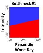
Figure 15. Graph. ARM illustrating relatively good bottleneck reliability.
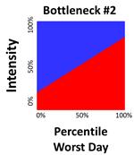
Figure 16. Graph. ARM illustrating relatively poor bottleneck reliability.
The ability to generate both STMs and ARMs was implemented within the CBI software tool. It was believed that the STMs would be valuable for inspecting bottleneck intensity on any given day, whereas ARM would be valuable for assessing annual intensity and reliability. One limitation that was noticed in the ARM concept was the inability to quantify speed drops. For example, if two bottlenecks exhibit a similar ARM shape, it is quite possible that one of the two bottlenecks may in fact be much more serious than the other one because their vehicle speeds in the congested red region might be much lower. The inability to quantify speed drop is apparently one of the fundamental disadvantages of bottleneck intensity as a performance measure. The first step taken to address this disadvantage was to compute daily and annual average speed drops in the CBI tool and to display these speed drop values as numeric performance measures. In this manner, the speed drop values could conceivably be used as a tiebreaker when comparing two bottlenecks with similar ARMs. One of the original versions of the CBI tool is shown in figure 17. Software controls on the left side of the screen are used to toggle between daily STM displays and annual ARM displays.
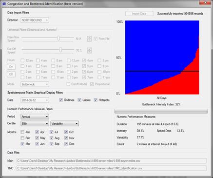
Figure 17. Screenshot. CBI tool with ARM (upper right) and speed drop (lower right).
A series of workshops were conducted across the United States to share the concepts and information in this report. At a workshop in Oakland, CA, hosted on April 2, 2015, local participants shared a method for evaluating bottlenecks on the basis of vehicle-hours of delay. One of the main advantages of this method is the ability for bottleneck rankings to explicitly reflect traffic volume demands. For example, a four-lane freeway would tend to exhibit twice as much delay as a two-lane freeway and would thus become a greater priority for mitigation than the two-lane freeway. Indeed, both the RITIS impact factor and intensity-based ARM would potentially give similar priority ratings to a four-lane freeway and a two-lane freeway as long as they had similar traffic density levels. This provided an incentive for integrating this “California method” into the CBI tool. Vehicle delay is computed according to the 2013 Most Congested Freeways Report and Methodology.(32) The equations in figure 18 and figure 19 illustrate California’s use of the 35-mi/h cutoff speed. When integrating this method into the CBI tool, instead of assuming a fixed value of 35 mi/h, cutoff speeds were obtained from a flexible set of CBI software features.
![]()
Figure 18. Equation. Delay per vehicle on each traffic message channel (TMC).
![]()
Figure 19. Equation. Vehicle-hours of delay on each TMC.
The California method also requires specification of a bottleneck volume. According to an Iteris report, bottleneck volumes should be measured immediately downstream of the downstream end of congestion.(32) The CBI tool was upgraded to allow users to enter a measured or estimated bottleneck volume. In addition, the software was upgraded to display vehicle-hours of delay as a numeric performance measure. Vehicle delay is thus believed to be an important performance measure for comparing and ranking bottlenecks because it explicitly captures the effects of both speed drops and demand volumes. In contrast to the previous intensity-based ARMs in figure 15 through figure 17, figure 20 through figure 22 illustrate the same ARMs based on vehicle-hours of delay.
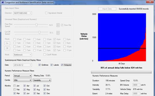
Figure 20. Screenshot. Newer CBI software tool featuring vehicle-hours of delay.
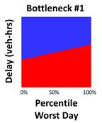
Figure 21. Graph. ARM illustrating relatively good bottleneck reliability based on vehicle-hours of delay.
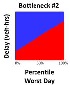
Figure 22. Graph. ARM illustrating relatively poor bottleneck reliability based on vehicle-hours of delay.
Although the shape and size of delay-based ARMs are useful for simultaneously visualizing bottleneck intensity and variability, respectively, it was believed that a numerical performance measure was needed to quantify the ARM into a single number because matrices and graphs allow room for human interpretation or might be confusing to some engineers. By contrast, a single number could conceivably avoid any errors in interpretation. In other words, the highest congestion number could be much more easily interpreted as the worst number. In response, an ARM-based performance measure called the BII was implemented within the CBI tool. This value represents a delay level below which 85 percent of the ARM’s red area exists. The BII is an attempt to capture the size and shape of the ARM into a single number. As shown in figure 20, the checkbox labeled “Hotspots” can be used to superimpose the BII as a horizontal black line across the ARM. If the “Hotspots” checkbox is turned off, this horizontal line will be hidden. Also in figure 20, the BII is reported as 824 vehicle-h because 85 percent of the annual red area falls below the 824-vehicle-h mark. Other numeric performance measures on the screen are daily values as opposed to annual values.
The 85th percentile BII appears to be more effective than 85th percentile delay for comparing bottlenecks. This is because the BII computation explicitly takes a summation of delay values throughout the year, whereas the percentile delay simply needs to be larger than a portion of other days’ delays. This relationship of 85th percentile BII to 85th percentile delay is similar to the relationship of mean to median. The 85th percentile BII explicitly reflects 85 percent of the red area.The 85th percentile delay simply says that 85 percent of the days had a lower delay.
The 85th percentile BII appears to be more effective than the 100th percentile BII because the 100th percentile BII only reveals which bottleneck experiences the highest-delay day of the year, which may have been caused by a fluke accident or event. The 85th percentile BII appears to be more effective than the 50th percentile BII because the 50th percentile BII focuses on 50 percent of the best days of the year. The 85th percentile level provides a reasonable number for focusing on some of the worst days of the year without overemphasizing a small number of absolute worst days. Because of this, the BII is always an 85th percentile value regardless of what is selected in the CBI tool’s centile control. By contrast, the standard D.I.V.E. performance measures all use the chosen percentile from the centile control.
Finally, the CBI tool encourages intelligent specification of cutoff speeds, which can be sensitive to a number of factors. Popular reliability performance measures, like the Travel Time Index, assume inflexible comparisons to the free-flow speed, but the perception of congested conditions depends on more than the free-flow speed. As pointed out by Elhenawy et al., drivers affected by severe weather and/or limited visibility conditions may not consider themselves delayed at speeds well below the posted limit.(29) In some areas, factors like lane width, lateral clearance, and pavement quality may not be properly reflected in the posted speed limit. In some areas, cutoff speeds should vary significantly on different segments within the same corridor. The important point is that engineering judgment must be used in properly defining cutoff speeds on a case-by-case basis. Without this judgment, a roadway severely impacted by weather could mistakenly be judged as having the same congestion as a corridor unaffected by weather.
Once the cutoff speeds have been properly chosen for each corridor, a fair comparison of known bottleneck locations can take place. As a prerequisite to a fair comparison, a consistent analysis box should be chosen for each bottleneck in terms of both time and distance. For example, each bottleneck could be analyzed for the same months of the year, days of the week, hours of the day, and interval duration. Most testing of the CBI tool was performed under 5-min interval durations. Larger interval durations of 15 or 30 min could be used, but this might compromise accuracy of the results. Smaller interval durations of 1 min could be used, but this might cause the software to become slow in performance. Once a consistent analysis box and interval duration have been chosen, the direct comparisons can occur. Figure 23 through figure 25 illustrate a comparison of three real-world bottleneck locations along three different freeway corridors. In this example, the I-695 bottleneck exhibits the worst score, with a BII of 3,840 vehicle-h.
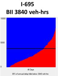
Figure 23. Graph. Comparison of bottleneck locations based on BII—I-695 example.
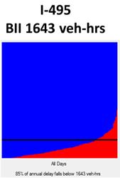
Figure 24. Graph. Comparison of bottleneck locations based on BII—I-495 example.
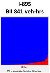
Figure 25. Graph. Comparison of bottleneck locations based on BII—I-895 example.
If mitigation strategies are going to be implemented, before-and-after use of the CBI tool could help to carefully quantify the improvements. It is also conceivable that the tool could compare multiple bottlenecks along the same freeway corridor to see which part of the corridor should be mitigated first or to determine whether upstream mitigation strategies would activate hidden bottlenecks downstream. However, the tool has not yet been tested for such analyses.
It is also possible to evaluate surface arterial corridors in this manner. Some researchers have expressed concern over the application of this type of congestion identification along signalized arterials. To be sure, the software tools can easily apply the same models in exactly the same way on both arterials and freeways. However, along signalized arterials, spotty patterns in the STM can be caused by the stop-and-go action at intersections. These spotty patterns make it more difficult to identify contiguous bottleneck locations caused by dense traffic. Another concern is that speeds and travel times might be harder to measure on signalized arterials. Regarding the ITS technologies used to measure traffic flows and speeds on surface arterials, there is a lack of standards and uniformity among various cities and States. This means that vehicle speeds will be measured more accurately in some cities and less accurately in others. Speed measurement technology will hopefully improve over time. In response to the concern about identifying arterial bottlenecks within the STM, FHWA researchers recommend the wavelet concept for filtering out portions of delay that appear to be unrelated to congestion.(33) In the CBI tool, clicking on the “Signalized Arterial” checkbox automatically invokes the wavelet method, which adjusts INRIX® speed readings during the import process.
Use of segment-specific free-flow speeds is also recommended for arterials. The free-flow speed slider control can be used to specify one free-flow speed for the entire analysis. Alternatively, it is possible to apply different free-flow speeds for each segment using the “From File” checkbox. When this checkbox is turned on, free-flow speeds from the INRIX® file are applied in the analysis. The “From File” checkbox should only be enabled if the INRIX® files contain reference speed data. When the “Reference Speed” checkbox is turned on, the cutoff speed slider will transform from absolute values into percentages. These percentages will be applied to free-flow speeds from the INRIX® file, which can differ for each segment. Percentage values will be displayed right next to the slider.
Figure 26 and figure 27 illustrate STMs for a signalized arterial before and after wavelet filtering. As shown in the leftmost figure, delays caused by recurring red phases produce a spotty pattern, making it more difficult to identify bottlenecks caused by traffic congestion. As shown in the rightmost figure, the number of false negatives and false positives has been reduced, making it easier to identify bottlenecks. As a result, the wavelet filtering mechanism is desirable for eliminating recurrent and unavoidable signal delays from the bottleneck identification process.
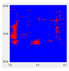
Figure 26. Graph. STM before wavelet filtering.
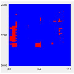
Figure 27. Graph. STM after wavelet filtering.
The initial version of the CBI tool emphasized annual bottleneck intensities similar to the RITIS Web site. When the ARM concept was implemented, it integrated reliability (variability) into the comparison and ranking of traffic bottlenecks. However, it was noticed that the ARM concept was unable to quantify speed drops, so the overall bottleneck rankings could not be fully trusted. Next, this disadvantage was addressed by computing daily and annual average speed drops in the CBI tool and displaying these speed drop values as numeric performance measures. In this manner, the speed drop values could conceivably be used as a tie breaker when comparing two bottlenecks with similar ARMs. However, at the Oakland, CA, workshop, local participants recommended vehicle-hours of delay to explicitly reflect traffic volume demands, such that four-lane freeways would nominally become doubly higher priorities for mitigation than two-lane freeways. When the California method was integrated into the CBI tool, this allowed bottleneck rankings to explicitly reflect throughput impacts. Finally, along signalized arterials, some portions of delay might be completely unrelated to congestion. In response, the wavelet concept was incorporated for filtering out unavoidable portions of delay. Table 2 summarizes the evolution of the CBI tool in terms of the new elements that can now affect bottleneck rankings. These elements are operational in nature and do not reflect safety issues that could further affect bottleneck prioritization.
| Type of Analysis | Before | After |
|---|---|---|
| Intensity | X | X |
| Variability | X | |
| Speed drop | X | |
| Throughput | X | |
| Wavelet | X | |
| Note: Blank cells indicate that this concept was not used to determine bottleneck rankings. | ||
These methods provide a new level of robustness in identifying congestion and bottlenecks, both spatially and temporally. They also provide an important first step toward prioritizing problem areas and selecting countermeasures. Unlike subjective assessments of congestion that rely on experience and judgment, these automated methods offer scientific justifications for transportation investments. Unlike prior research, these methods reflect the impacts of important elements (e.g., weather, visibility, etc.), are more transferable to various regions, and are better for identifying important bottleneck characteristics. Once the bottleneck locations have been precisely identified and prioritized, an assessment of mitigation strategies can then begin.
The CBI tool has its own unpublished internal user’s guide, which explains each feature in detail. Some notable recommendations for proper use of the CBI tool include the following:
Figure 28 illustrates an analysis where all dates between January 1 and February 17 exhibited large chunks of blue in the STM, even when the cutoff speed was set to 75 mi/h. Thus, January and February were excluded from the annual analysis results, as shown by checkboxes in the lower left corner of the screen. The Second Strategic Highway Research Project (SHRP2) report Establishing Monitoring Programs for Travel Time Reliability recommends the use of imputation (i.e., the process by which voids in the data are filled by estimation based on data from nearby or similar detectors) to fill voids caused by missing data, but the CBI tool does not currently contain automated imputation methods.(34) This discussion of bad data sectors illustrates the importance of proper analysis practices, which can inform good decisions. It is not up to the software tools to make important decisions. Software is sometimes misused, and results are sometimes misinterpreted. There are usually more factors to consider than a software tool can incorporate. Moreover, the tool only analyzes operational performance. To effectively prioritize bottlenecks and select countermeasures, decisionmakers must consider additional factors (e.g., safety, impacts, costs, etc.).
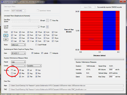
Figure 28. Screenshot. Example of missing data in the CBI tool.
Note that in figure 28, all graphical and numeric performance measures are applicable to the date February 17, 2014, as shown under the “Spatiotemporal Matrix Graphical Display Filters” box. However if the analysis period were changed from daily to annual under “Numeric Performance Measure Filters,” subsequent numeric performance measures would reflect the selected months only.
The CBI tool and its unpublished internal user’s guide may soon be available on the FHWA Web site. Additionally, they can also be obtained by contacting the Saxton Transportation Operations Laboratory (STOL) at FHWA’s Turner-Fairbank Highway Research Center (TFHRC).