U.S. Department of Transportation
Federal Highway Administration
1200 New Jersey Avenue, SE
Washington, DC 20590
202-366-4000
Federal Highway Administration Research and Technology
Coordinating, Developing, and Delivering Highway Transportation Innovations
| REPORT |
| This report is an archived publication and may contain dated technical, contact, and link information |
|
| Publication Number: FHWA-HRT-14-020 Date: January 2015 |
Publication Number: FHWA-HRT-14-020 Date: January 2015 |
This section describes the OSB site selection criteria, design, site characteristics, and data collection and analysis methods used for evaluation.
OSBs are 18-inch-long and 12-inch-wide white transverse markings placed on both sides of the lane perpendicular to the centerline, edge line, or lane line in a pattern of progressively reduced spacing. The pattern gives drivers the impression that their speed is increasing. The intended outcome of the treatment is to reduce vehicle-operating speeds.
The initial and final spacing between the OSBs depends on the initial speed (approach speed) and desired speed in the curve (advisory speed). The length of roadway treated with the OSBs depends on the speed difference between the initial and final speed. FHWA recommends that drivers be in the OSB segment for at least 4 s.
OSBs can be painted on the roadway or a thermoplastic material is used to improve durability and increase longevity of the markings. OSBs are typically installed in school zones, at horizontal curve locations, or on tangent roadway segments. This project analyzed the effects of OSBs on vehicle operating speeds on horizontal curves using an observational before-after study. Figure 58 shows an example of an OSB treatment.
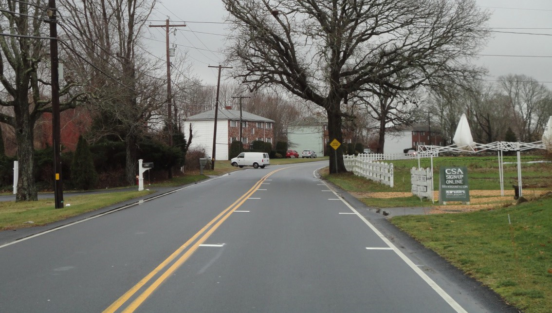
Source: KLS Engineering, LLC
Figure 58. Photo. OSB example.
The research team used extensive outreach with several State and local transportation agencies to identify potential locations for installing OSB treatment on two-lane rural/suburban horizontal curves. The research team contacted more than 40 agencies to determine their willingness to install the treatment, 3 of which came forward to install or assist in installing the treatment for the study purposes. The three agencies are Massachusetts Southeastern Regional Planning and Economic Development District (SRPEDD), Mohave County (Arizona), and the Alabama Department of Transportation (ALDOT).
SRPEDD conducted road safety audits (RSA) in 2009 on eight roadways in suburban/rural areas of southeastern Massachusetts. The roadways were selected based on the number of lane-departure crashes resulting in injury or death. OSBs were one of the treatments recommended in the RSA, especially on the approaches to the many dangerous curves. Initially, the research team selected 11 curved segments on 6 different two-lane roadways for OSB consideration. Based on further discussions with SRPEDD and the counties, the initial list of 11 was narrowed to 8locations on 4 roadways. During site visit, one location was found not to have an edge line and was thus eliminated, bringing the total number of sites in Massachusetts to seven. Table 40 shows the Massachusetts OSB treatment site(s) characteristics and location details.
Mohave County previously experimented with OSB at one location (Stockton Hill Road between MM 21 and 20) in July 2007, and was familiar with the OSB considerations. Mohave County examined speed and crash data maintained for its regional highway network and recommended four two-lane rural roadways as candidates. The locations had been the sites of a significant number of crashes, 85th percentile speeds significantly above posted, or both. Table 40 shows the Arizona OSB treatment site(s) characteristics and location details.
ALDOT provided 10 two-way rural roadways for OSB consideration. The roadways were selected based on crash data, at least three crashes on average per year over the last 10 years, on the approach, within, or immediately following a horizontal curve. Five roadways were deemed inappropriate for study purposes (residential streets, vicinity of major intersection, etc.). Eight curve segments on five different roadways were selected for OSB installation. Table 40 shows the Alabama OSB treatment site(s) characteristics. The identifying location information (e.g., route, milepost, county name) is not listed at the counties’ request.
To summarize, a total of 19 treatment sites (7 in Massachusetts, 4 in Arizona, and 8 in Alabama) were selected for field evaluations.
The research team used two different types of OSB designs, as discussed in the following sections.
Design for Massachusetts and Arizona Sites
This layout was based on an experimental design by Mohave County Public Works (MCPW), which yielded positive results. The MCPW optical speed zone contained three speed-bar patterns―downstream, transition, and upstream―designed to convey to road users a sensory perception of increased speed while traveling through the zone. The MCPW design used a driver perception time of .75 s. The MCPW design layout involved computing the downstream bar-pattern spacing by multiplying the site-measured 85th percentile speed by 1 s and upstream bar spacing by 1.5 s (targeting a 50-percent increase in spacing from downstream to upstream). The transition pattern provided an incremental reduction in bar spacing, from upstream to downstream pattern spacing distance, between successive bars to disguise the physical change in bar spacing from the passing road user. The design used a fixed set of five bars in the upstream and downstream patterns while the transition set contained four bars.
To normalize the effects of differing PSLs, the research team slightly modified the MCPW design as follows:
This approach is demonstrated below using an example 40 mph, 85th percentile speed:
The design principle adopted for the Alabama sites was the same design used in studies by Katz and Arnold et al.(56,75) This design methodology considered an initial speed and a desired ending speed at each location. Based on these speeds, the length of OSB treatment is determined based on deceleration from the initial to the ending speed, and the bars are spaced such that a driver decelerating at a constant rate from the initial speed to the ending speed crosses four bars per second. The equation shown in figure 59 is used to determine the required length of the OSB treatment, and the equation shown in figure 60, developed by Katz, is used to find the spacing of the optical speed bar throughout the treatment.(76) A frequency of four bars per second was adopted for OSB design.
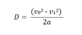
Figure 59. Equation. Length of OSB treatment.
Where:
D = distance traveled in slowing from v0 to v1.
α = deceleration rate.
v0 = initial speed at the beginning of the treatment.
v1 = final speed.
 '
'
Figure 60. Equation. Individual placement of the OSBs.
Where:
x = placement of the optical speed bars.
x0 = initial placement of the first bar. The value of 𝑥𝑥0 is set to zero when a first bar is placed at the beginning of the treatment.
n = number of the optical speed bar for which the placement is determined.
f = required frequency of the bars, which is the number of OSBs seen in a second by motorists travelling through the treatment.
The dimensions of the OSB installed were in accordance with the 2009 Manual on Uniform Traffic Control Devices (MUTCD) (Part 3B.22) recommended guidelines. The markings were 12inches wide by 18 inches long, installed on both sides of the lane perpendicular to the center line and edge line.
The range of features of the 19 study sites was quite broad. The characteristics of the study sites included the following:
Table 40 summarizes the site characteristics of the 19 treatment sites. The Before Period Data Summary section describes specific characteristics of each treatment site.
Table 40. OSB treatment location site characteristics.
City/County |
Route Name/ Number |
Curve Direction/ Grade |
AADT |
PSL (mph) |
Lane Width (ft) |
Lc (ft) |
Approx.Radius (ft) | |
1 |
Dolan Springs/ Mohave County, AZ |
Pierce Ferry Road (northbound) |
Left/Uphill |
750 |
55/50a |
12 |
993 |
497 |
2 |
Golden Valley/ Mohave County, AZ |
Shinarump Road (southbound) |
Left/Level |
450 |
45 |
12 |
887 |
1,865 |
3 |
Meadview/Mohave County, AZ |
Diamond Bar Road (southbound) |
Right/Level |
470 |
45 |
12 |
875 |
1,067 |
4 |
Golden Shores/ Mohave County, AZ |
County Route 1 (southbound) |
Right/Uphill |
850 |
35 |
13 |
332 |
1,095 |
5 |
Alabama location #1 |
N/A |
Right/Level |
1,050 |
55 |
10 |
666 |
673 |
6 |
Alabama location #2 |
N/A |
Right/Level |
1,065 |
55 |
11 |
303 |
273 |
7 |
Alabama location #3 |
N/A |
Right/Level |
2,770 |
55 |
12 |
546 |
635 |
8 |
Alabama location #4 |
N/A |
Right/Uphill |
1,570 |
35 |
10 |
278 |
236 |
9 |
Alabama location #5 |
N/A |
Right/ Downhill |
380 |
40 |
10 |
1060 |
710 |
10 |
Alabama location #6 |
N/A |
Right/Level |
390 |
40 |
10 |
885 |
710 |
11 |
Alabama location #7 |
N/A |
Right/Level |
1,275 |
35 |
10 |
457 |
602 |
12 |
Alabama location #8 |
N/A |
Right/ Downhill |
1,370 |
35 |
11 |
223 |
486 |
13 |
Dartmouth/Bristol County, MA |
Tucker Road (southbound) |
Right/Level |
2,900 |
30 |
13 |
817 |
1,099 |
14 |
Dartmouth/Bristol County, MA |
Tucker Road (northbound) |
Left/Level |
3,950 |
35 |
12 |
293 |
569 |
15 |
Dartmouth/Bristol County, MA |
Reed Road (southbound) |
Left/Level |
5,450 |
25 |
12 |
459 |
683 |
16 |
Fairhaven/Bristol County, MA |
New Boston Road (southbound) |
Left/Level |
750 |
35 |
11 |
226 |
596 |
17 |
Fairhaven/Bristol County, MA |
New Boston Road (northbound) |
Right/Level |
750 |
35 |
11 |
186 |
471 |
18 |
Rochester /Plymouth County, MA |
Braley Hill Road (southbound) |
Right/Level |
1,150 |
30 |
11 |
673 |
695 |
19 |
Rochester/Plymouth County, MA |
Braley Hill Road (northbound) |
Right/Level |
1,050 |
40 |
10 |
662 |
2,097 |
a-50 mph is nighttime PSL
AADT = Annual Average Daily Traffic
PSL = Posted Speed Limit
Lc = Length of Curve
Approx. = Approximate
In all three States, thermoplastic tape, applied with heat, was used to install the OSBs. Glass beads were added while the tape was being placed to increase visibility. Spacing of the bars was measured prior to their installation.
Installation at the four sites in Mohave County, AZ, occurred between October 25 and 30, 2012. Installation at the seven Massachusetts sites occurred between November 19 and 23, 2012. Each county installed the OSBs in their areas. The eight Alabama locations were installed between September 25 and October 1, 2013, and contractors performed the installation for ALDOT.
Operating Speed Evaluation Methodology
The OSB treatments started on the tangent approaching the horizontal curves and ended near the beginning of the curve (PC station). An observational before-after study was employed to evaluate the OSB treatment. Speed data were collected before and after OSBs were applied to four sites in Arizona, eight sites in Alabama, and seven sites in Massachusetts. The before period data were collected prior to applying the OSBs. Two after-period data collection efforts were undertaken. The first after-period data were collected approximately 1 month after the OSBs were installed in Alabama, Arizona, and Massachusetts. The second after-period data were collected approximately 6 months after the first after period in Arizona and 3 months after the first after period in Alabama. There was no second after-period data collected at the Massachusetts sites. The second after period was performed to assess long-term novelty effects of the OSBs and to determine whether they became less effective in reducing vehicle operating speeds over time.
The research team used a control point on the same roadway to determine whether vehicle operating speeds remained constant at a location that was not treated to ensure that another factor was not influencing vehicle speeds. The control point locations for the OSB evaluation were points located between 0.2 and 0.8 mi upstream of the treatment site location, on a tangent segment. The control point location was far enough upstream of the treatment so drivers were unable to see the treatment from that location.
Data were collected using on-pavement traffic sensors. A total of six sensors, four in the OSB travel direction and two in the opposing lane, were placed to allow vehicles to be tracked throughout the study site, thus enabling the determination of speed changes for individual vehicles. The first sensor in the travel direction was placed at the control point. The second sensor in the travel direction was placed at the first transverse marking that delineated the OSBs, which was located on the curve approach. The third sensor in the travel direction was placed at the last transverse marking that delineated the OSBs, which was near the PC. The fourth sensor was placed at the curve midpoint to determine whether any speed reduction was maintained throughout the curve. Two sensors were placed in the opposing lane to determine whether the presence of a vehicle travelling in the opposite direction influenced driver speed choice.
Figure 61 shows the layout of the speed data-collection equipment in relation to the OSB treatment.
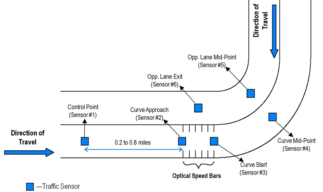
Figure 61. Diagram. OSB data-collection setup (not to scale).
Speed data were collected during both daytime and nighttime periods at each site. At each study site, the research team collected data during favorable driving conditions: clear weather with normal visibility (no fog) and dry roadway conditions, without the presence of standing water from an earlier rain. The data were screened to include only free-flow vehicles, defined as those vehicles traveling with a minimum headway of 5 s.(70,71) The analysis included only passenger vehicles, which were defined as vehicles having a length less than 24 ft.
The research team attempted to obtain the recommended 110 free-flow passenger car speeds for both the daytime and nighttime periods at each data-collection site in accordance with the sample size requirement described in table 7 and table 8. The 110 free-flow passenger car speeds recommended for each data-collection period based on the equation in figure 20 would yield 95‑percent statistical significance and more than 90-percent statistical power, if a 2.0-mph difference in means was computed among the before and after samples. At sites where data were collected over 2 days/nights, and 1 day/night did not provide the recommended sample of free-flow passenger cars, a two-sample t-test was performed to compare the mean speeds between the 2days/nights. If there was no statistically significant difference between the 2 days/nights, then they were combined to provide more free-flow speed observations for analysis.
An important data-collection condition to note relates to possible measurement error from the on-road sensors at several data-collection sites in the OSB evaluation. Outliers in the speed data were identified using the following process:
Performance Measures and Analysis Methods
The performance measures used to assess the speed effects of the OSB treatment included the mean speed, difference in speeds between the beginning and end OSB speed measurement locations (delta v as described in the HFST Statistical Analysis section), speed variance, and proportion of vehicles exceeding the PSL. Details of the statistical analysis methods are the same as for HFST. The mean speed will be evaluated using the equation in figure 21. The proportion of vehicles exceeding the PSL will be assessed using the equations shown in figure 22 through figure 25, and the speed variance will be appraised using the equation shown in figure 26.
This section of the report describes the before period speeds at each data-collection location.
This section describes the characteristics of the four treatment sites in Arizona.
Northbound Pierce Ferry Road, AZ
The research team collected data on Pierce Ferry Road in Meadview, AZ. The direction of travel for the data collection was northbound, and the curve direction was to the left. The radius of curve and the curve length, calculated using Google Earth™, were 497.40 ft and 992.78 ft, respectively. There was a substantial cut-slope on the inside of the curve, which limits horizontal sight distance along the curve. The daytime PSL was 55 mph, and nighttime PSL was 50 mph. As figure 62 shows, there was a curve warning sign (W1-2) with an advisory speed plaque of 35mph (W13-1P) located prior to the PC. The travel lanes were 12 ft wide, and there were no paved shoulders on either side of the road. However, there was a gravel shoulder on both sides of the road approximately 5 ft wide.
The team collected speed data in the before period at the control point 0.4 mi before the curve approach, which was 800 ft before the PC. The research team also collected speed data at the PC and midpoint of the curve. One sensor in the opposing direction of travel was placed at the midpoint of the curve, and the other one was placed 660 ft downstream of the first sensor to determine whether vehicles were present in the opposing lane. Figure 62 shows the horizontal curve layout and the speed data-collection locations.
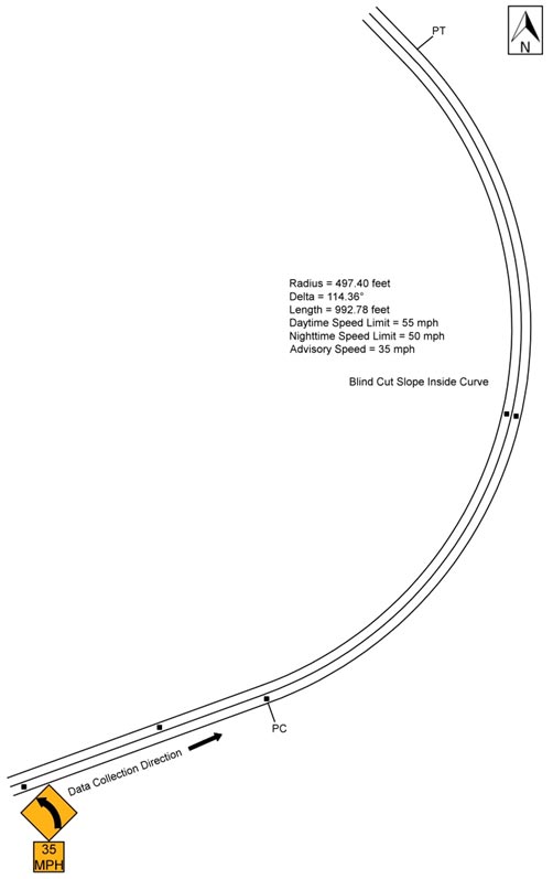
Figure 62. Diagram. Geometric layout of northbound Pierce Ferry Road (not to scale).
Table 41 shows the speed data collected in the before period. The data are shown as all observations, passenger car versus heavy trucks, daytime versus nighttime speeds for passenger cars, and opposed (a vehicle present in the opposing lane) versus unopposed passenger cars. All of the comparisons exclude vehicles with high accelerations. The research team performed a simple t-test for each of these comparisons at each of the curve locations. For this treatment site, there was a statistically significant difference in speeds at the control point, approach, PC, and curve midpoint for passenger cars versus heavy vehicles. There was also a statistically significant difference in speeds at the control point, approach, and PC for daytime passenger cars versus nighttime passenger cars. The nighttime speed was significantly lower at every data-collection point.
Table 41. Northbound Pierce Ferry Road before data.
| Speed Metric | Control Point Speed | Control Point SD | Approach Speed | Approach SD | PC Speed | PC SD | Mid Speed | Mid SD | N1 | N2 | N3 |
| All observations | 48.532 |
7.764 |
46.165 |
8.162 |
46.432 |
6.817 |
38.056 |
6.841 |
218 | 176 | 214 |
| Passenger cars | 48.867 |
7.565 |
46.793 |
7.855 |
46.789 |
6.628 |
38.513 |
6.739 |
203 | 166 | 199 |
| Heavy trucks | 44.000 |
9.220 |
37.667 |
7.697 |
40.500 |
7.546 |
32.000 |
5.237 |
15 | 10 | 15 |
| Daytime passenger cars | 49.577 |
7.116 |
47.521 |
7.429 |
47.669 |
6.277 |
39.271 |
6.744 |
142 | 118 | 140 |
| Nighttime passenger cars | 47.213 |
8.347 |
45.098 |
8.594 |
44.625 |
7.028 |
36.712 |
6.430 |
61 | 48 | 59 |
| Opposed passenger cars | 47.806 |
6.122 |
46.444 |
8.833 |
47.621 |
7.683 |
38.029 |
6.671 |
36 | 29 | 35 |
| Unopposed passenger cars | 49.096 |
7.838 |
46.868 |
7.655 |
46.613 |
6.400 |
38.616 |
6.769 |
167 | 137 | 164 |
Bold indicates significance at the 95-percent confidence level (α=0.05)
SD = Standard Deviation
PC = Point of Curvature
N1 = Number of observations at the control point and approach
N2 = Number of observations at the PC
N3 = Number of observations at the midpoint
Figure 63 shows the observed mean, 15th percentile, and 85th percentile operating speeds for passenger cars along the study section. Figure 63 also shows the mean speed for trucks within the study section. The figure shows that mean speeds for both heavy trucks and passenger cars remain relatively stable from the approach to the PC, but decrease substantially from the PC to the midpoint of the curve. The heavy-truck mean speeds align more with the 15th percentile passenger car speeds. Both the passenger car and truck mean speeds are consistent with the advisory speed of 35 mph at the midpoint of the curve. The mean acceleration rate from the PC to the midpoint of the curve was -3.534 ft/s for passenger cars and -3.803 ft/s for trucks. A negative value indicates deceleration.
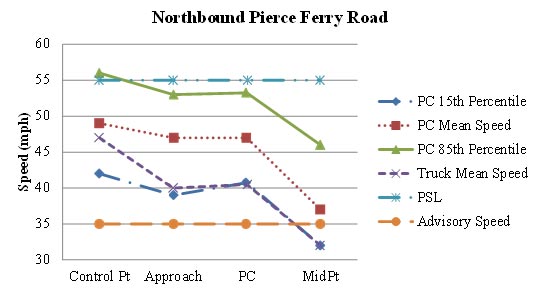
Figure 63. Graph. Graphical representation of speeds on northbound Pierce Ferry Road.
Southbound Shinarump Road, AZ
The research team collected data on Shinarump Road in Golden Valley, AZ. The direction of travel for the data collection was southbound, and the curve direction was to the left. The radius of curve and the curve length, calculated using Google Earth™, were 1,865.05 ft and 887.35 ft, respectively. The PSL was 45 mph. The travel lanes were 12 ft wide, and there was no shoulder on either side of the road.
The team collected speed data at the control point, 0.6 mi before the curve approach, which was 800 ft before the PC. The research team also collected speed data at the PC and midpoint of the curve. One sensor was placed in the opposing direction of travel at the midpoint of the curve, and the other was placed 618 ft downstream of the first sensor to determine whether vehicles were present in the opposing lane. Figure 64 shows the horizontal curve layout, along with the speed collection locations.

Figure 64. Diagram. Geometric layout of southbound Shinarump Road (not to scale).
Table 42 shows the speed data for the before period. The data are shown as all observations, passenger car versus heavy trucks, daytime versus nighttime speeds for passenger cars, and opposed versus unopposed passenger cars. All comparisons exclude vehicles with high accelerations. The research team performed a simple t-test for each of these comparisons at each curve location. For this treatment site, there was a statistically significant difference in speeds at the PC location for passenger cars versus heavy vehicles. There was also a statistically significant difference at the control point and PC for daytime versus nighttime passenger cars. There was a statistically significant difference at the approach and PC locations for opposed versus unopposed passenger cars.
Table 42. Southbound Shinarump Road before data.
| Speed Metric | Control Point Speed | Control Point SD | Approach Speed | Approach SD | PC Speed | PC SD | Mid Speed | Mid SD | N1 | N2 | N3 |
| All observations | 47.317 |
6.928 |
51.099 |
8.603 |
47.299 |
6.864 |
51.100 |
8.042 |
303 | 288 | 209 |
| Passenger cars | 47.566 |
6.768 |
51.241 |
8.023 |
48.017 |
6.341 |
51.537 |
7.773 |
249 | 238 | 175 |
| Heavy trucks | 46.167 |
7.583 |
50.444 |
10.956 |
43.880 |
8.188 |
48.853 |
9.099 |
54 | 50 | 34 |
| Daytime passenger cars | 46.686 |
7.001 |
50.777 |
8.431 |
47.009 |
6.033 |
50.894 |
7.375 |
121 | 115 | 94 |
| Nighttime passenger cars | 48.398 |
6.458 |
51.680 |
7.624 |
48.959 |
6.500 |
52.284 |
8.193 |
128 | 123 | 81 |
| Opposed passenger cars | 45.967 |
6.646 |
48.200 |
5.580 |
45.933 |
4.982 |
50.875 |
6.556 |
30 | 30 | 24 |
| Unopposed passenger cars | 47.785 |
6.770 |
51.658 |
8.224 |
48.317 |
6.468 |
51.642 |
7.964 |
219 | 208 | 151 |
Bold indicates significance at the 95-percent confidence level (α=0.05)
SD = Standard Deviation
PC = Point of Curvature
N1 = Number of observations at the control point and approach
N2 = Number of observations at the PC
N3 = Number of observations at the midpoint
Figure 65 shows the observed mean, 15th percentile, and 85th percentile operating speeds for passenger cars along the study section. Figure 65 also shows the mean speed for trucks within the study section. As the figure shows, the patterns of the speed changes were similar for the passenger car speeds and the truck mean speeds on the approach to curve. The speeds for passenger cars and the truck mean speeds increased from the control point to the approach of the curve, decreased from the approach to the PC, and then increased again from the PC to the midpoint of the curve. The 85th percentile speeds and the mean speeds for passenger cars along the curve were higher than the PSL of 45 mph. The mean acceleration rate from the PC to the midpoint of the curve was 4 ft/s for passenger cars and 6 ft/s for trucks.
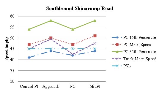
Figure 65. Graph. Graphical representation of speeds on southbound Shinarump Road.
Southbound Diamond Bar Road, AZ
The research team collected data on Diamond Bar Road in Meadview, AZ. The direction of travel for the data collection was in the southbound direction, and the curve direction was to the right. The radius of curve and the curve length, calculated using Google Earth™, were 1,067.25 ft 875.32 ft, respectively. There were desert plants on the inside of the curve, which limited horizontal sight distance along the curve. The PSL was 45 mph. As figure 66 shows, there was a curve warning sign (W1-2) located after the PC. The travel lanes were 12 ft wide, and there were 5-ft paved shoulders on both sides of the road.
The team collected speed data at the control point, 0.4 mi before the curve approach, which was 800 ft before the PC. Speed data were also collected at the PC and midpoint of the curve. One sensor in the opposing direction of travel was placed at the midpoint of the curve, and the other one was placed 640 ft downstream of the first sensor to determine whether vehicles were present in the opposing lane. Figure 66 shows the horizontal curve layout, along with the speed collection locations.
The OSBs were installed differently at this site compared with the other sites. The OSB treatment started 400 ft upstream of the curve start, compared with beginning at the curve start at the other Arizona, Massachusetts, and Alabama sites. Because the treatment was offset from the curve PC location, an additional sensor was placed at the end of the OSB treatment. Figure 67 shows the layout of the sensors in the after periods.
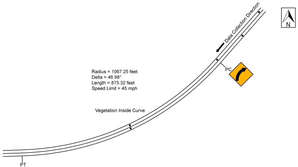
Figure 66. Diagram. Geometric layout of southbound Diamond Bar Road in the before period (not to scale).
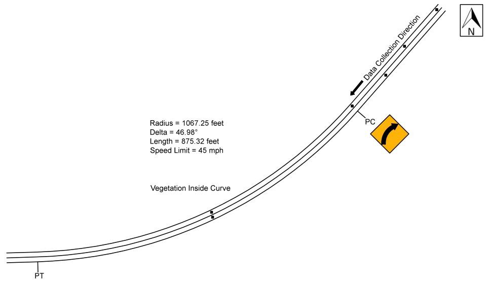
Figure 67. Diagram. Geometric layout of southbound Diamond Bar Road in the after periods (not to scale).
Table 43 shows the speed data for the before period. The data are shown as all observations, passenger car versus heavy trucks, daytime versus nighttime speeds for passenger cars, and opposed versus unopposed passenger cars. All of the comparisons exclude vehicles with high accelerations. The research team again performed a simple t-test for each of these comparisons at each of the curve locations. For this treatment site, there was a statistically significant difference in speeds at the control point, approach, PC, and curve midpoint for passenger cars versus heavy vehicles. The heavy vehicle speed was lower than the passenger car speed at all the data-collection points. There also was a significant difference at the PC for daytime versus nighttime passenger cars.
Table 43. Southbound Diamond Bar Road before data.
| Speed Metric | Control Point Speed | Control Point SD | Approach Speed | Approach SD | PC Speed | PC SD | Mid Speed | Mid SD | N1 | N2 | N3 |
| All observations | 53.421 |
8.312 |
49.171 |
6.730 |
50.299 |
7.116 |
50.435 |
7.621 |
292 | 214 | 209 |
| Passenger cars | 53.867 |
8.389 |
49.516 |
6.675 |
50.874 |
6.996 |
50.703 |
7.611 |
256 | 182 | 182 |
| Heavy trucks | 50.250 |
7.064 |
46.722 |
6.704 |
47.031 |
7.014 |
48.630 |
7.581 |
36 | 32 | 27 |
| Daytime passenger cars | 54.061 |
8.582 |
49.873 |
7.057 |
51.706 |
7.113 |
51.109 |
7.876 |
181 | 126 | 128 |
| Nighttime passenger cars | 53.400 |
7.939 |
48.653 |
5.598 |
49.000 |
6.399 |
49.741 |
6.918 |
75 | 56 | 54 |
| Opposed passenger cars | 53.472 |
9.376 |
50.057 |
6.320 |
51.000 |
8.218 |
50.057 |
8.359 |
53 | 35 | 35 |
| Unopposed passenger cars | 53.970 |
8.134 |
49.374 |
6.773 |
50.844 |
6.705 |
50.857 |
7.445 |
203 | 147 | 147 |
Bold indicates significance at the 95-percent confidence level (α=0.05)
SD = Standard Deviation
PC = Point of Curvature
N1 = Number of observations at the control point and approach
N2 = Number of observations at the PC
N3 = Number of observations at the midpoint
Figure 68 shows the observed mean, 15th percentile, and 85th percentile operating speeds for passenger cars along the study section. Figure 68 also shows the mean speed for trucks within the study section. As the figure shows, the passenger car speeds and the truck mean speeds were relatively stable along the curve. The speed changes between points were minor. The truck mean speeds were consistent from the control point to the PC; however, the speeds increased slightly from the PC to midpoint of the curve. The 85th percentile speeds and mean speeds for passenger cars are higher than the PSL of 45 mph. The mean acceleration rate from the PC to the midpoint of the curve was 1 ft/s for passenger cars and 2.835 ft/s for trucks.
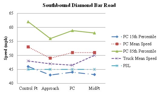
Figure 68. Graph. Graphical representation of speeds on southbound Diamond Bar Road.
Southbound County Route 1, AZ
The research team collected data on County Route 1 in Golden Shores, AZ. The direction of travel for the data collection was southbound, and the curve direction was to the right. The curve was located on a moderate upgrade. The radius of curve and the curve length, calculated using Google Earth, were 1,095.39 ft and 332.27 ft, respectively. The PSL was 35 mph. The travel lanes were 13 ft wide, and there was a 4- to 5-ft paved shoulder on both sides of the road.
The team collected speed data at the control point, 0.8 mi before the curve approach, which was 800ft before the PC. The research team also collected speed data at the PC and midpoint of the curve. One sensor in the opposing direction of travel was placed at the midpoint of the curve, and the other one was placed 732 ft downstream of the first sensor to determine whether vehicles were present in the opposing lane. Figure 69 shows the horizontal curve layout, along with the speed collection locations.
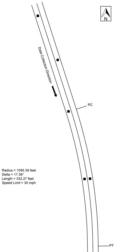
Figure 69. Diagram. Geometric layout of southbound County Route 1 (not to scale).
Table 44 shows the speed data for the before period. The data are shown as all observations, passenger car versus heavy trucks, daytime versus nighttime speeds for passenger cars, and opposed versus unopposed passenger cars. All of the comparisons exclude vehicles with high accelerations. The research team performed a simple t-test for each of these comparisons at each curve location. For this treatment site, there was a statistically significant difference in speeds at the approach, PC, and midpoint for daytime versus nighttime passenger cars. There was also a significant difference at the midpoint for opposed versus unopposed passenger cars.
Table 44. Southbound County Route 1 before data.
| Speed Metric | Control Point Speed | Control Point SD | Approach Speed | Approach SD | PC Speed | PC SD | Mid Speed | Mid SD | N1 | N2 | N3 |
| All observations | 53.471 |
8.882 |
47.731 |
5.559 |
44.021 |
5.211 |
43.919 |
7.259 |
342 | 329 | 307 |
| Passenger cars | 53.532 |
8.901 |
47.810 |
5.515 |
44.134 |
5.125 |
43.918 |
7.262 |
327 | 314 | 292 |
| Heavy trucks | 52.133 |
8.651 |
46.000 |
6.414 |
41.667 |
6.532 |
43.933 |
7.450 |
15 | 15 | 15 |
| Daytime passenger cars | 53.847 |
9.266 |
49.038 |
5.430 |
44.977 |
4.895 |
44.599 |
7.081 |
183 | 174 | 162 |
| Nighttime passenger cars | 53.132 |
8.428 |
46.250 |
5.238 |
43.086 |
5.228 |
43.069 |
7.421 |
144 | 140 | 130 |
| Opposed passenger cars | 53.479 |
9.299 |
47.125 |
5.354 |
44.111 |
4.900 |
41.091 |
7.844 |
48 | 45 | 44 |
| Unopposed passenger cars | 53.541 |
8.848 |
47.928 |
5.543 |
44.138 |
5.171 |
44.419 |
7.053 |
279 | 269 | 248 |
Bold indicates significance at the 95-percent confidence level (α=0.05)
SD = Standard Deviation
PC = Point of Curvature
N1 = Number of observations at the control point and approach
N2 = Number of observations at the PC
N3 = Number of observations at the midpoint
Figure 70 shows the observed mean, 15th percentile, and 85th percentile operating speeds for passenger cars along the study section. Figure 70 also shows the mean speed for trucks within the study section. The figure shows the passenger car speeds decelerated substantially from the control point to the PC and then stabilized from the PC to the midpoint of the curve. The truck mean speeds decreased from the control point to the midpoint of the curve. The passenger car speeds and the truck mean speeds along the curve were higher than the PSL of 35mph. The mean acceleration rate from the PC to the midpoint of the curve was 0.581 ft/s for passenger cars and 0.668 ft/s for trucks.
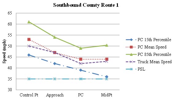
Figure 70. Graph. Graphical representation of speeds on southbound County Route 1.
This section describes the characteristics of the eight treatment sites in Alabama. ALDOT had an agreement with the counties that route information would not be disclosed. Thus, in the discussion below all eight Alabama locations are referenced numerically (1 through 8).
Alabama Location #1
The direction of travel for the data collection was northbound, and the curve direction was to the right. The radius of curve and the curve length, calculated using Google Earth™, were 672.84 ft and 665.84 ft, respectively. The PSL was 55 mph. As figure 71 shows, there was a winding road sign (W1-5) 365 ft before the curve approach. The travel lanes were 11 ft wide, and there were 2‑ft paved shoulders on both sides of the road. There were trees offset approximately 10 ft from the inside edge of pavement, which limited horizontal sight distance along the curve.
The research team collected speed data at the control point, 0.4 mi before the curve approach, which was 500 ft before the PC. The team also collected speed data at the PC and midpoint of the curve. One sensor in the opposing direction of travel was placed at the midpoint of the curve, and the other one was placed 515 ft downstream of the first sensor to determine whether vehicles were present in the opposing lane. Figure 71 shows the horizontal curve layout, along with the speed data-collection locations.
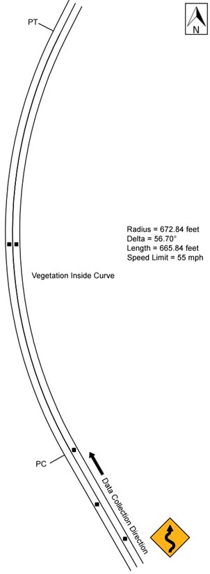
Figure 71. Diagram. Geometric layout of Alabama Location #1 (not to scale).
Table 45 shows the speed data for the before period. The data are shown as all observations, passenger car versus heavy trucks, daytime versus nighttime speeds for passenger cars, and opposed versus unopposed passenger cars. All of the comparisons exclude vehicles with high accelerations. The research team performed a simple t-test for each of these comparisons at each of the curve locations. For this treatment site, there was a statistically significant difference in speeds at the midpoint for passenger cars versus heavy trucks. The only other statistically significant difference in speeds was at the PC for opposed versus unopposed passenger cars.
Table 45. Alabama Location #1 before data.
| Speed Metric | Control Point Speed | Control Point SD | Approach Speed | Approach SD | PC Speed | PC SD | Mid Speed | Mid SD | N1 | N2 | N3 |
| All observations | 47.883 |
9.368 |
49.208 |
7.596 |
50.136 |
8.725 |
42.323 |
6.912 |
375 | 88 | 353 |
| Passenger cars | 47.917 |
9.380 |
49.218 |
7.540 |
50.429 |
8.700 |
42.516 |
6.892 |
362 | 84 | 341 |
| Heavy trucks | 46.923 |
9.332 |
48.923 |
9.394 |
44.000 |
7.789 |
36.833 |
5.132 |
13 | 4 | 12 |
| Daytime passenger cars | 47.638 |
9.418 |
48.805 |
7.641 |
50.795 |
8.551 |
42.288 |
6.764 |
174 | 39 | 160 |
| Nighttime passenger cars | 48.176 |
9.362 |
49.601 |
7.444 |
50.111 |
8.912 |
42.718 |
7.016 |
188 | 45 | 181 |
| Opposed passenger cars | 47.529 |
10.661 |
48.793 |
7.385 |
46.833 |
7.648 |
42.037 |
6.512 |
87 | 24 | 82 |
| Unopposed passenger cars | 48.040 |
8.955 |
49.353 |
7.596 |
51.867 |
8.736 |
42.668 |
7.014 |
275 | 60 | 259 |
Bold indicates significance at the 95-percent confidence level (α=0.05)
SD = Standard Deviation
PC = Point of Curvature
N1 = Number of observations at the control point and approach
N2 = Number of observations at the PC
N3 = Number of observations at the midpoint
Figure 72 shows the observed mean, 15th percentile, and 85th percentile operating speeds for passenger cars along the study section. Figure 72 also shows the mean speed for trucks within the study section. The figure shows the speeds for passenger cars increased slightly from the control point to the PC and decreased substantially from the PC to the midpoint of the curve. The truck mean speeds were relatively consistent from the control point the PC and dropped substantially from the PC to the midpoint of the curve. The 85th percentile speeds for passenger cars at the control point, the approach, and the PC were higher than the PSL of 55 mph. Only at the midpoint of the curve were the 85th percentile speeds for passenger cars lower than the PSL of 55 mph. The mean speeds and 15th percentile speeds for passenger cars and the truck mean speeds along the curve were all lower than the PSL of 55mph. The mean acceleration rate from the PC to the midpoint of the curve was -8.726 ft/s for passenger cars and -6.304 ft/s for trucks. A negative value indicates deceleration.
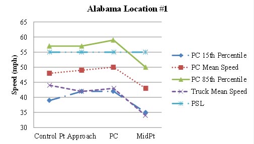
Figure 72. Graph. Graphical representation of speeds at Alabama Location #1.
Alabama Location #2
This curve was located approximately 0.4 mi upstream of the Alabama Location #1 curve. The direction of travel for the data collection was southbound, and the curve direction was to the right. The curve approach and curve were located on a downgrade. The radius of curve and the curve length, calculated using Google Earth™, were 272.92 ft and 303.38 ft. respectively. There was a substantial cut slope with trees on the inside of the curve, which limited horizontal sight distance along the curve. The PSL was 55 mph. As figure 73 shows, there was a winding road sign (W1-5) with an advisory speed plaque (W13-1P) of 30 mph 175 ft before the PC. The travel lanes were 11 ft wide, and there were 2-ft paved shoulders on both sides of the road. There was a drainage ditch located on the inside of the curve and guardrail on the outside of the curve with chevron markers.
The research team collected speed data at the control point, 800 ft before the curve approach, which was 500 ft before the PC. The team also collected speed data at the PC and midpoint of the curve. One sensor in the opposing direction of travel was placed at the midpoint of the curve, and the other one was placed 440 ft downstream of the first sensor to determine whether vehicles were present in the opposing lane. Figure 73 shows the horizontal curve layout, along with the speed data-collection locations.
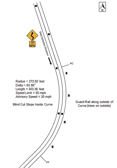
Figure 73. Diagram. Geometric layout of Alabama Location #2 (not to scale).
Table 46 shows the speed data for the before period. The data are shown as all observations, passenger car versus heavy trucks, daytime versus nighttime speeds for passenger cars, and opposed versus unopposed passenger cars. All of the comparisons exclude vehicles with high accelerations. The research team performed a simple t-test for each of these comparisons at each of the curve locations. For this treatment site, there was a statistically significant difference in speeds at the control point and approach for passenger cars versus heavy vehicles. There was also a statistically significant difference in speeds at the control point, approach, and curve midpoint for unopposed passenger cars versus opposed passenger cars.
Table 46. Alabama Location #2 before data.
| Speed Metric | Control Point Speed | Control Point SD | Approach Speed | Approach SD | PC Speed | PC SD | Mid Speed | Mid SD | N1 | N2 | N3 |
| All observations | 49.269 |
7.604 |
44.291 |
5.822 |
42.472 |
5.747 |
38.337 |
7.101 |
398 | 290 | 359 |
| Passenger cars | 49.569 |
7.238 |
44.479 |
5.623 |
42.630 |
5.554 |
38.418 |
7.137 |
376 | 273 | 337 |
| Heavy trucks | 44.136 |
11.319 |
41.091 |
8.053 |
39.941 |
8.050 |
37.091 |
6.560 |
22 | 17 | 22 |
| Daytime passenger cars | 49.884 |
8.070 |
45.072 |
5.722 |
43.263 |
5.737 |
37.821 |
7.802 |
138 | 99 | 123 |
| Nighttime passenger cars | 49.387 |
6.721 |
44.134 |
5.548 |
42.270 |
5.432 |
38.762 |
6.720 |
238 | 174 | 214 |
| Opposed passenger cars | 47.809 |
7.949 |
43.022 |
6.312 |
41.721 |
5.057 |
36.378 |
7.241 |
89 | 61 | 82 |
| Unopposed passenger cars | 50.115 |
6.928 |
44.930 |
5.323 |
42.892 |
5.674 |
39.075 |
6.991 |
287 | 212 | 255 |
Bold indicates significance at the 95-percent confidence level (α=0.05)
SD = Standard Deviation
PC = Point of Curvature
N1 = Number of observations at the control point and approach
N2 = Number of observations at the PC
N3 = Number of observations at the midpoint
Figure 74 shows the observed mean, 15th percentile, and 85th percentile operating speeds for passenger cars along the study section. Figure 74 also shows the mean speed for trucks within the study section. The figure shows the patterns of the speed changes were similar for the passenger car speeds and the truck mean speeds at this curve location. The speeds for passenger cars and the truck mean speeds decreased consistently from the control point to the midpoint of the curve. The speeds for passenger cars and the truck mean speeds along the curve were lower than the PSL of 55 mph but higher than the advisory speed of 30 mph. The mean acceleration rate from the PC to the midpoint of the curve was -2.128 ft/s for passenger cars and -2.211 ft/s for trucks. A negative value indicates deceleration.
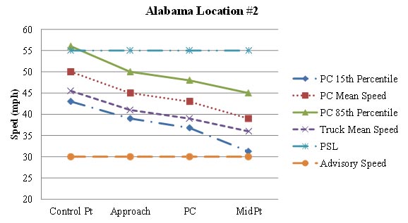
Figure 74. Graph. Graphical representation of speeds at Alabama Location #2.
Alabama Location #3
The direction of travel for the data collection was southbound, and the curve direction was to the right. This curve to the right was part of a reverse curve, with a curve back to the left immediately after. The radius of curve and the curve length, calculated using Google Earth™, were 635.15 ft and 545.62 ft, respectively. The PSL was 55 mph. As figure 75 shows, there was a winding road sign (W1-5) with an advisory speed plaque (W13-1P) of 35 mph positioned 460ft before the PC; there were also chevrons on the outside of the curve. The travel lanes were 12 ft wide, and there were 2-ft paved shoulders on either side of the road.
The research team collected speed data at the control point, 0.2 mi before the curve approach, which was 500 ft before the PC. The team also collected speed data at the PC and midpoint of the curve. One sensor in the opposing direction of travel was placed at the midpoint of the curve, and the other one was placed 500 ft downstream of the first sensor to determine whether vehicles were present in the opposing lane. Figure 75 shows the horizontal curve layout, along with the speed data-collection locations.
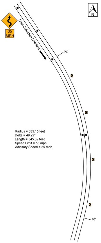
Figure 75. Diagram. Geometric layout of Alabama Location #3 (not to scale).
Table 47 shows the speed data for the before period. The data are shown as all observations, passenger car versus heavy trucks, daytime versus nighttime speeds for passenger cars, and opposed versus unopposed passenger cars. All of the comparisons exclude vehicles with high accelerations. The research team performed a simple t-test for each of these comparisons at each of the curve locations. For this treatment site, there was a statistically significant difference in speeds at the approach, PC, and the curve midpoint for passenger cars versus heavy vehicles. There was also a statistically significant difference in speeds at the approach for daytime passenger cars versus nighttime passenger cars.
Table 47. Alabama Location #3 before data.
| Speed Metric | Control Point Speed | Control Point SD | Approach Speed | Approach SD | PC Speed | PC SD | Mid Speed | Mid SD | N1 | N2 | N3 |
| All observations | 65.122 |
13.222 |
49.842 |
6.461 |
41.329 |
4.665 |
41.192 |
5.936 |
499 | 474 | 474 |
| Passenger cars | 65.372 |
13.359 |
50.011 |
6.519 |
41.652 |
4.653 |
41.691 |
5.714 |
441 | 417 | 417 |
| Heavy trucks | 63.224 |
12.070 |
48.552 |
5.891 |
38.965 |
4.066 |
37.544 |
6.299 |
58 | 57 | 57 |
| Daytime passenger cars | 66.174 |
13.109 |
50.566 |
6.965 |
41.960 |
4.681 |
41.609 |
6.025 |
265 | 248 | 253 |
| Nighttime passenger cars | 64.165 |
13.675 |
49.176 |
5.702 |
41.201 |
4.589 |
41.817 |
5.214 |
176 | 169 | 164 |
| Opposed passenger cars | 65.516 |
13.031 |
49.979 |
6.684 |
41.449 |
5.061 |
41.928 |
6.036 |
188 | 176 | 180 |
| Unopposed passenger cars | 65.265 |
13.622 |
50.036 |
6.408 |
41.801 |
4.336 |
41.511 |
5.463 |
253 | 241 | 237 |
Bold indicates significance at the 95-percent confidence level (α=0.05)
SD = Standard Deviation
PC = Point of Curvature
N1 = Number of observations at the control point and approach
N2 = Number of observations at the PC
N3 = Number of observations at the midpoint
Figure 76 shows the observed mean, 15th percentile, and 85th percentile operating speeds for passenger cars along the study section. Figure 76 also shows the mean speed for trucks within the study section. As the figure shows, the passenger car speeds and truck mean speeds decelerated substantially from the control point to the PC. Both passenger car speeds and the truck mean speeds then stabilized from the PC to midpoint of the curve. The passenger car speeds and the truck mean speeds along the curve were all higher than the advisory speed of 35mph. The mean acceleration rate from the PC to the midpoint of the curve was 0.321ft/s for passenger cars. The truck acceleration rate remained the same from the PC to the midpoint.
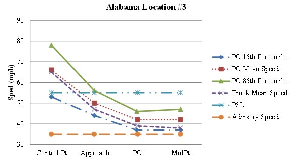
Figure 76. Graph. Graphical representation of speeds at Alabama Location #3.
Alabama Location #4
The direction of travel for the data collection was southbound, and the curve direction was to the right. The radius of curve and the curve length, calculated using Google Earth™, were 236.38 ft and 277.70 ft, respectively. There was a substantial cut slope on the inside of the curve, which limited horizontal sight distance along the curve. There was guardrail and also chevrons on the outside of the curve. The PSL was 35 mph. As Figure 77 shows, there was a turn warning sign (W1-1) with an advisory speed plaque (W13-1P) of 20 mph and flashing amber beacons above the sign located at the curve approach. The travel lanes were 10 ft wide, and there was no shoulder on either side of the road.
The research team collected speed data at the control point, 0.3 mi before the curve approach, which was 500ft before the PC. The team also collected speed data at the PC and midpoint of the curve. One sensor in the opposing direction of travel was placed at the midpoint of the curve. The other one was placed 440 ft downstream of the first sensor to determine whether vehicles were present in the opposing lane. Figure 77 shows the horizontal curve layout, along with the speed data-collection locations.
\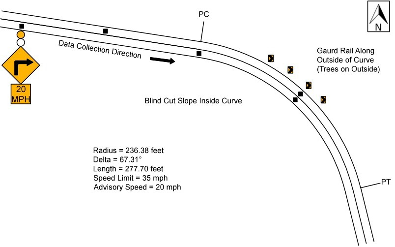
Figure 77. Diagram. Geometric layout of Alabama Location #4 (not to scale).
Table 48 shows the speed data for the before period. The data are shown as all observations, passenger car versus heavy trucks, daytime versus nighttime speeds for passenger cars, and opposed versus unopposed passenger cars. All comparisons exclude vehicles with high accelerations. The research team performed a simple t-test for each of these comparisons at each of the curve locations. For this treatment site, there was only a statistically significant difference in speeds at the curve midpoint for passenger cars versus heavy trucks and daytime versus nighttime passenger cars.
Table 48. Alabama Location #4 before data.
| Speed Metric | Control Point Speed | Control Point SD | Approach Speed | Approach SD | PC Speed | PC SD | Mid Speed | Mid SD | N1 | N2 | N3 |
| All observations | 50.785 |
9.441 |
46.478 |
7.630 |
39.042 |
4.961 |
34.213 |
9.051 |
502 | 478 | 461 |
| Passenger cars | 50.660 |
9.345 |
46.506 |
7.597 |
39.100 |
4.908 |
34.038 |
9.068 |
480 | 459 | 443 |
| Heavy trucks | 53.500 |
11.237 |
45.864 |
8.481 |
37.632 |
6.103 |
38.500 |
7.649 |
22 | 19 | 18 |
| Daytime passenger cars | 50.656 |
8.996 |
46.149 |
8.725 |
39.462 |
4.987 |
32.726 |
10.008 |
195 | 182 | 179 |
| Nighttime passenger cars | 50.663 |
9.592 |
46.751 |
6.723 |
38.863 |
4.849 |
34.928 |
8.273 |
285 | 277 | 264 |
| Opposed passenger cars | 51.007 |
9.307 |
46.188 |
9.237 |
39.053 |
5.305 |
33.523 |
9.955 |
144 | 132 | 128 |
| Unopposed passenger cars | 50.512 |
9.371 |
46.643 |
6.786 |
39.119 |
4.746 |
34.248 |
8.690 |
336 | 327 | 315 |
Bold indicates significance at the 95-percent confidence level (α=0.05)
SD = Standard Deviation
PC = Point of Curvature
N1 = Number of observations at the control point and approach
N2 = Number of observations at the PC
N3 = Number of observations at the midpoint
Figure 78 shows the observed mean, 15th percentile, and 85th percentile operating speeds for passenger cars along the study section. Figure 78 also shows the mean speed for passenger cars and trucks within the study section. The figure shows the passenger car speeds and truck speeds decelerated substantially from the approach to the midpoint of the curve. The passenger car speeds and the truck mean speeds along the curve were closer to the 35 mph PSL than the advisory speed of 20 mph. The mean acceleration rate from the PC to the midpoint of the curve was -0.931 ft/s for passenger cars and -0.183 ft/s for trucks. A negative value indicates deceleration.
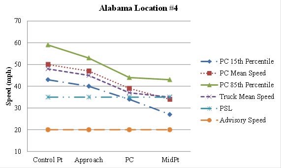
Figure 78. Graph. Graphical representation of speeds at Alabama Location #4.
Alabama Location #5
The direction of travel for the data collection was southbound, and the curve direction was to the right. The curve approach and curve were located on a downgrade. This curve to the right was part of a reverse curve, with the site for Alabama Location #6 located immediately downstream. The radius of curve and the curve length, calculated using Google Earth™, were 709.81 ft and 1,059.71 ft, respectively. The PSL was 40 mph. The travel lanes were 9 ft wide, and there was no shoulder on either side of the road.
The research team collected speed data at the control point, 1,000 ft before the curve approach, which was 250 ft before the PC. The team also collected speed data at the PC and midpoint of the curve. One sensor in the opposing direction of travel was placed at the midpoint of the curve, and the other one was placed 455 ft downstream of the first sensor to determine whether vehicles were present in the opposing lane. Figure 79 shows the horizontal curve layout, along with the speed data-collection locations.
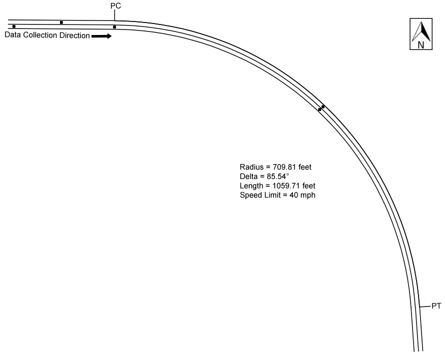
Figure 79. Diagram. Geometric layout of Alabama Location #5 (not to scale).
Table 49 shows the speed data for the before period. The data are shown as all observations, passenger car versus heavy trucks, daytime versus nighttime speeds for passenger cars, and opposed versus unopposed passenger cars. All of the comparisons exclude vehicles with high accelerations. The research team performed a simple t-test for each of these comparisons at each of the curve locations. For this treatment site, there was a statistically significant difference in speeds at the control point, approach, and the curve midpoint for daytime versus nighttime passenger cars. There was also a statistically significant difference in speeds at the PC and midpoint of the curve for opposed versus unopposed passenger cars.
Table 49. Alabama Location #5 before data.
| Speed Metric | Control Point Speed | Control Point SD | Approach Speed | Approach SD | PC Speed | PC SD | Mid Speed | Mid SD | N1 | N2 | N3 |
| All observations | 41.944 |
7.212 |
43.742 |
8.327 |
45.781 |
7.524 |
39.810 |
6.842 |
233 | 64 | 221 |
| Passenger cars | 42.299 |
7.094 |
44.054 |
8.250 |
45.794 |
7.584 |
40.028 |
6.782 |
224 | 63 | 212 |
| Heavy trucks | 33.111 |
3.822 |
36.000 |
6.614 |
45.000 |
N/A |
34.667 |
6.557 |
9 | 1 | 9 |
| Daytime passenger cars | 41.947 |
6.887 |
44.405 |
7.941 |
45.619 |
7.450 |
39.787 |
6.772 |
131 | 42 | 122 |
| Nighttime passenger cars | 42.796 |
7.383 |
43.559 |
8.686 |
46.143 |
8.021 |
40.356 |
6.821 |
93 | 21 | 90 |
| Opposed passenger cars | 40.235 |
7.242 |
41.353 |
11.045 |
38.833 |
7.333 |
34.933 |
7.045 |
17 | 6 | 15 |
| Unopposed passenger cars | 42.469 |
7.072 |
44.275 |
7.972 |
46.526 |
7.290 |
40.416 |
6.621 |
207 | 57 | 197 |
Bold indicates significance at the 95-percent confidence level (α=0.05)
SD = Standard Deviation
PC = Point of Curvature
N1 = Number of observations at the control point and approach
N2 = Number of observations at the PC
N3 = Number of observations at the midpoint
N/A = Not Applicable
Figure 80 shows the observed mean, 15th percentile, and 85th percentile operating speeds for passenger cars along the study section. Figure 80 also shows the mean speed for trucks within the study section. As the figure shows, the speeds for passenger cars and the truck mean speeds gradually increased from the control point to the PC of the curve and decreased from the PC to the midpoint of the curve. The 85th percentile speeds of passenger cars along the curve were higher than the PSL of 40 mph. The mean acceleration rate from the PC to the midpoint of the curve was -7.817 ft/s for passenger cars and -0.369 ft/s for trucks. A negative value indicates deceleration.
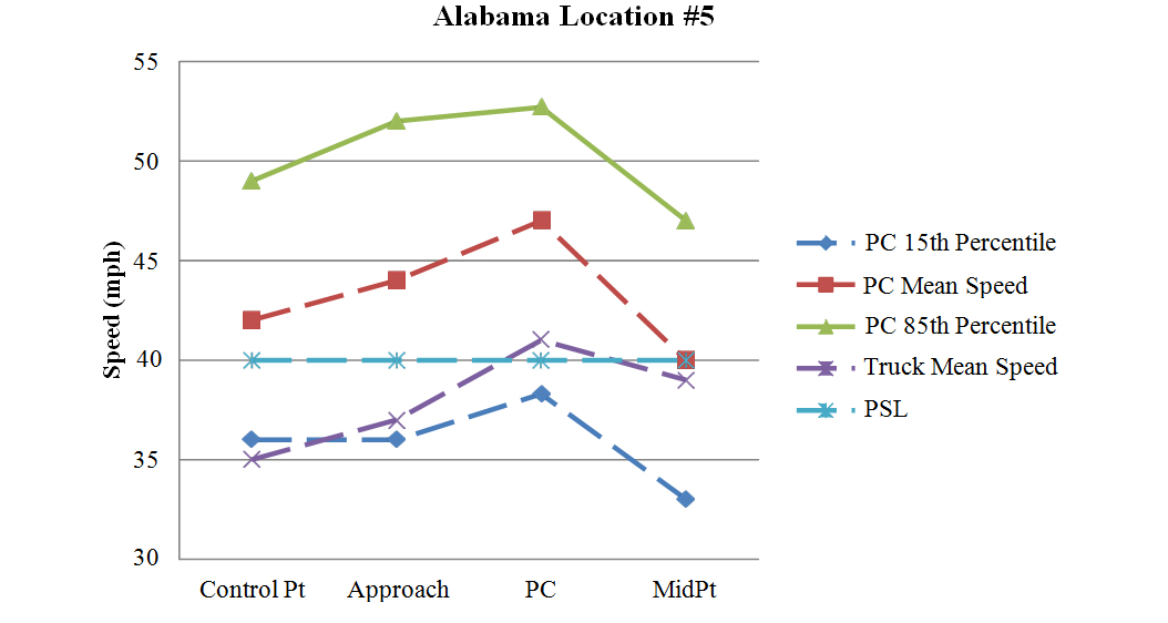
Figure 80. Graph. Graphical representation of speeds at Alabama Location #5.
Alabama Location #6
This curve to the right was part of a reverse curve associated with the site for Alabama Location #5 located immediately upstream. The direction of travel for the data collection was northbound, and the curve direction was to the right. The radius of curve and the curve length, calculated using Google Earth™, were 710.84 ft and 885.08 ft, respectively. At the midpoint of the curve, the curve starts to go upgrade with a driveway located on the outside of the curve. The PSL was 40 mph. The travel lanes were approximately 9 ft wide, and there was no shoulder on either side of the road.
The research team collected speed data at the control point, 750 ft before the curve approach, which was 500ft before the PC. The team also collected speed data at the PC and midpoint of the curve. One sensor in the opposing direction of travel was placed at the midpoint of the curve, and the other one was placed 490 ft downstream of the first sensor to determine whether vehicles were present in the opposing lane. Figure 81 shows the horizontal curve layout, along with the speed data-collection locations.
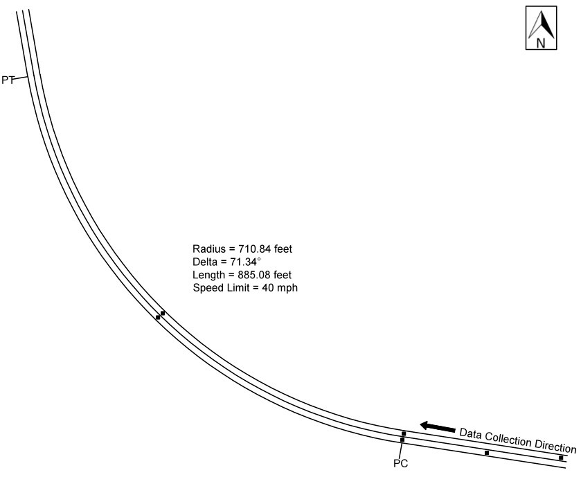
Figure 81. Diagram. Geometric layout of Alabama Location #6 (not to scale).
Table 50 shows the speed data for the before period. The data are shown as all observations, passenger car versus heavy trucks, daytime versus nighttime speeds for passenger cars, and opposed versus unopposed passenger cars. All of the comparisons exclude vehicles with high accelerations. The research team performed a simple t-test for each of these comparisons at each curve location. For this treatment site, there was a statistically significant difference in speeds at the approach for passenger cars versus heavy trucks. There was also a statistically significant difference at the PC for opposed versus unopposed passenger cars.
Table 50. Alabama Location #6 before data.
| Speed Metric | Control Point Speed | Control Point SD | Approach Speed | Approach SD | PC Speed | PC SD | Mid Speed | Mid SD | N1 | N2 | N3 |
| All observations | 43.386 |
9.196 |
45.081 |
7.189 |
46.442 |
6.431 |
45.031 |
8.436 |
197 | 86 | 98 |
| Passenger cars | 43.370 |
9.277 |
45.402 |
6.928 |
46.447 |
6.469 |
45.128 |
8.568 |
189 | 85 | 94 |
| Heavy trucks | 43.750 |
7.498 |
37.500 |
9.457 |
46.000 |
N/A |
42.750 |
4.272 |
8 | 1 | 4 |
| Daytime passenger cars | 43.462 |
9.112 |
45.400 |
6.716 |
46.586 |
6.489 |
44.317 |
9.561 |
130 | 58 | 63 |
| Nighttime passenger cars | 43.169 |
9.708 |
45.407 |
7.433 |
46.148 |
6.538 |
46.774 |
5.869 |
59 | 27 | 31 |
| Opposed passenger cars | 41.056 |
7.565 |
42.944 |
10.067 |
43.400 |
4.881 |
46.750 |
4.070 |
18 | 10 | 12 |
| Unopposed passenger cars | 43.614 |
9.425 |
45.661 |
6.499 |
46.853 |
6.571 |
44.890 |
9.032 |
171 | 75 | 82 |
Bold indicates significance at the 95-percent confidence level (α=0.05)
SD = Standard Deviation
PC = Point of Curvature
N1 = Number of observations at the control point and approach
N2 = Number of observations at the PC
N3 = Number of observations at the midpoint
N/A = Not Applicable
Figure 82 shows the observed mean, 15th percentile, and 85th percentile operating speeds for passenger cars along the study section. Figure 82 also shows the mean speed for trucks within the study section. The figure shows that the 85th percentile and the mean speeds for passenger cars remain relatively stable from the control point to the midpoint of the curve. The 15th percentile speeds for passenger cars increased substantially from the control point to the approach of the curve and stabilized from the approach to the midpoint of the curve. The truck mean speeds were not consistent; the speeds decreased from the control point to the approach of the curve and increased from the approach to the PC and then decreased from the PC to the midpoint of the curve. The 85th percentile speeds and the mean speeds for passenger and the truck mean speeds along the curve were all higher than the PSL of 40 mph. The mean acceleration rate from the PC to the midpoint of the curve was 0.627 ft/s for passenger cars and -1.038 ft/s for trucks. A negative value indicates deceleration.
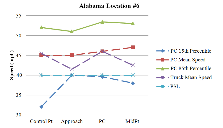
Figure 82. Graph. Graphical representation of speeds at Alabama Location #6.
Alabama Location #7
This curve to the right was part of a reverse curve, with a curve back to the left immediately after. The direction of travel for the data collection was southbound, and the curve direction was to the right. The white edge lines and yellow centerline were severely faded on the tangent and throughout the curve. The radius of curve and the curve length, calculated using Google Earth™, were 601.93 ft and 456.89 ft, respectively. The PSL was 35 mph. The travel lanes were 10 ft wide, and there was no shoulder on either side of the road. There was a driveway located on the right side of the road approximately 100 ft before the PC. As figure 83 shows, there was a SCHOOL BUS STOP AHEAD sign (S3-1), with a REDUCED SPEED AHEAD sign (R2-5) above it, located on the curve approach. There was also a winding road sign (W1-5) with a speed limit sign (R2-1) of 35 mph 250 ft before the PC.
The research team collected speed data at the control point, 0.3 mi before the curve approach, which was 500 ft before the PC. The team also collected speed data at the PC and midpoint of the curve. One sensor in the opposing direction of travel was placed at the midpoint of the curve, and the other one was placed 450 ft downstream of the first sensor to determine whether vehicles were present in the opposing lane. Figure 83 shows the horizontal curve layout, along with the speed data-collection locations.
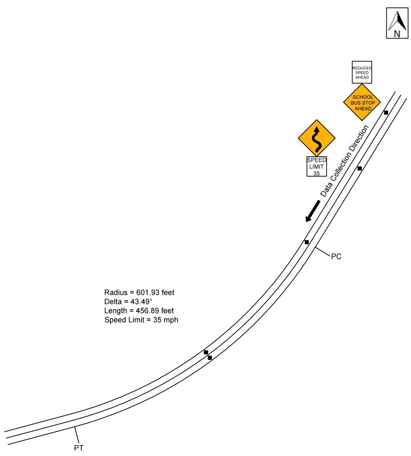
Figure 83. Diagram. Geometric layout of Alabama Location #7 (not to scale).
Table 51 shows the speed data for the before period. The data are shown as all observations, passenger car versus heavy trucks, daytime versus nighttime speeds for passenger cars, and opposed versus unopposed passenger cars. All of the comparisons exclude vehicles with high accelerations. The research team also conducted simple t-tests for each of these comparisons at each curve location. For this treatment site, there was a statistically significant difference in speeds at the control point for passenger cars versus heavy vehicles. There was also a statistically significant difference in speeds at the approach and PC for daytime versus nighttime passenger cars.
Table 51. Alabama Location #7 before data.
| Speed Metric | Control Point Speed | Control Point SD | Approach Speed | Approach SD | PC Speed | PC SD | Mid Speed | Mid SD | N1 | N2 | N3 |
| All observations | 52.977 |
9.890 |
43.666 |
5.396 |
36.953 |
4.288 |
38.806 |
5.266 |
431 | 423 | 422 |
| Passenger cars | 52.850 |
9.896 |
43.653 |
5.388 |
36.973 |
4.305 |
38.755 |
5.239 |
421 | 413 | 412 |
| Heavy trucks | 58.300 |
8.433 |
44.200 |
6.033 |
36.100 |
3.604 |
40.900 |
6.208 |
10 | 10 | 10 |
| Daytime passenger cars | 53.000 |
9.668 |
44.420 |
5.224 |
37.647 |
4.536 |
39.188 |
5.310 |
193 | 190 | 191 |
| Nighttime passenger cars | 52.724 |
10.104 |
43.004 |
5.450 |
36.399 |
4.020 |
38.380 |
5.160 |
228 | 223 | 221 |
| Opposed passenger cars | 52.148 |
8.668 |
43.241 |
5.701 |
36.657 |
4.310 |
38.355 |
4.989 |
108 | 105 | 107 |
| Unopposed passenger cars | 53.093 |
10.287 |
43.796 |
5.277 |
37.081 |
4.306 |
38.895 |
5.325 |
313 | 308 | 305 |
Bold indicates significance at the 95-percent confidence level (α=0.05)
SD = Standard Deviation
PC = Point of Curvature
N1 = Number of observations at the control point and approach
N2 = Number of observations at the PC
N3 = Number of observations at the midpoint
Figure 84 shows the observed mean, 15th percentile, and 85th percentile operating speeds for passenger cars along the study section. Figure 84 also shows the mean speed for trucks within the study section. As the figure shows, the passenger car speeds and the truck mean speeds decelerated substantially from the control point to the PC of the curve. Passenger car speeds and the truck mean speeds remained relatively constant from the PC through the curve, averaging between 35 and 40 mph. The 85th percentile speeds and mean speeds of passenger cars and the truck mean speeds along the curve were higher than the PSL of 35 mph. The mean acceleration rate from the PC to the midpoint of the curve was 0.885 ft/s for passenger cars and 0.713 ft/s for trucks.
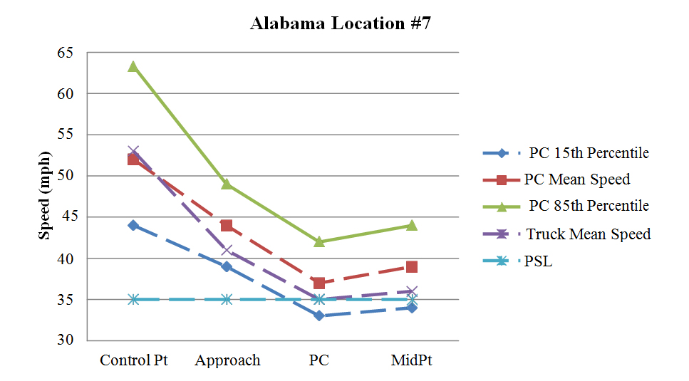
Figure 84. Graph. Graphical representation of speeds at Alabama Location #7.
Alabama Location #8
This curve was located approximately 1,000 ft downstream of Alabama Location #7 in the opposite direction. The direction of travel for the data collection was northbound, and the curve direction was to the right. There was a cut slope on the inside of the curve, which partially restricted horizontal sight distance entering the curve. The white edge lines and yellow centerline were severely faded on the tangent and throughout the curve. The radius of curve and the curve length, calculated using Google Earth, were 486.26 ft and 222.95 ft, respectively. The PSL was 35 mph. The travel lanes were 10 ft wide and there was no shoulder on either side of the road. There was a driveway on the outside of the curve at the midpoint. As figure 85 shows, there was a winding road sign (W1-5) with a speed limit sign (R2-1) of 35 mph located 700 ft before the curve approach. The end of a 280 ft concrete bridge crossing a ravine ended approximately 180ft before the PC.
The research team collected speed data at the control point, 1,500 ft before the curve approach, which was 500 ft before the PC. The team also collected speed data at the PC and midpoint of the curve. One sensor in the opposing direction of travel was placed at the midpoint of the curve, The other one was placed 415 ft downstream of the first sensor to determine whether vehicles were present in the opposing lane. Figure 85 shows the horizontal curve layout, along with the speed data-collection locations.
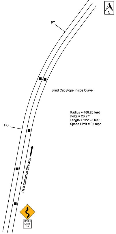
Figure 85. Diagram. Geometric layout of Alabama Location #8 (not to scale).
Table 52 shows the speed data for the before period. The data are shown as all observations, passenger car versus heavy trucks, daytime versus nighttime speeds for passenger cars, and opposed versus unopposed passenger cars. All of the comparisons exclude vehicles with high accelerations. The research team again performed a simple t-test for each of these comparisons at each curve location. For this treatment site, there was a statistically significant difference in speeds at the PC and curve midpoint for passenger cars versus heavy vehicles. There was also a statistically significant difference in speeds at the control point for daytime versus nighttime passenger cars. There was also a statistically significant difference in speeds at the approach for opposed versus unopposed passenger cars.
Table 52. Alabama Location #8 before data.
| Speed Metric | Control Point Speed | Control Point SD | Approach Speed | Approach SD | PC Speed | PC SD | Mid Speed | Mid SD | N1 | N2 | N3 |
| All observations | 41.540 |
6.029 |
44.644 |
8.437 |
40.661 |
5.324 |
42.266 |
6.329 |
376 | 342 | 312 |
| Passenger cars | 41.566 |
6.053 |
44.672 |
8.317 |
40.754 |
5.326 |
42.375 |
6.337 |
366 | 334 | 304 |
| Heavy trucks | 40.600 |
5.254 |
43.600 |
12.624 |
36.750 |
3.655 |
38.125 |
4.612 |
10 | 8 | 8 |
| Daytime passenger cars | 43.145 |
5.833 |
44.612 |
8.251 |
40.842 |
4.928 |
42.401 |
5.908 |
165 | 146 | 137 |
| Nighttime passenger cars | 40.269 |
5.934 |
44.721 |
8.391 |
40.686 |
5.628 |
42.353 |
6.686 |
201 | 188 | 167 |
| Opposed passenger cars | 41.750 |
6.708 |
42.841 |
7.546 |
40.823 |
6.354 |
42.000 |
7.255 |
88 | 79 | 71 |
| Unopposed passenger cars | 41.507 |
5.842 |
45.252 |
8.477 |
40.733 |
4.979 |
42.489 |
6.042 |
278 | 255 | 233 |
Bold indicates significance at the 95-percent confidence level (α=0.05)
SD = Standard Deviation
PC = Point of Curvature
N1 = Number of observations at the control point and approach
N2 = Number of observations at the PC
N3 = Number of observations at the midpoint
Figure 86 shows the observed mean, 15th percentile, and 85th percentile operating speeds for passenger cars along the study section. Figure 86 also shows the mean speed for trucks within the study section. As the figure shows, the patterns of the speed changes were similar for the passenger car speeds and the truck mean speeds at this curve location. The speeds for passenger cars and the truck mean speeds increased from the control point to the approach of the curve, decreased from the approach to the PC of the curve, and then increased again from the PC to the midpoint of the curve. The speeds of passenger cars and the truck mean speeds along the curve were both higher than the PSL of 35 mph. The mean acceleration rate from the PC to the midpoint of the curve was 1.94 ft/s for passenger cars and -0.153 ft/s for trucks. A negative value indicates deceleration.
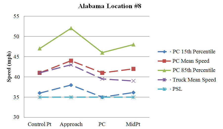
Figure 86. Graph. Graphical representation of speeds at Alabama Location #8.
This section describes the characteristics of the seven treatment sites in Massachusetts.
Southbound Tucker Road, MA
The research team collected data on Tucker Road in Dartmouth, MA. The direction of travel for the data collection was southbound, and the curve direction was to the right. The radius of curve and the curve length, calculated using Google Earth™, were 1,098.66 ft and 816.67 ft, respectively. The PSL was 30 mph. The travel lanes were 13 ft wide, and there was no shoulder on either side of the road.
The team collected speed data at the control point, 0.2 mi before the curve approach, which was 319 ft before the PC. The research team also collected speed data at the PC and midpoint of the curve. One sensor in the opposing direction of travel was placed at the midpoint of the curve, and the other one was placed 347 ft downstream of the first sensor to determine whether vehicles were present in the opposing lane. Figure 87 shows the horizontal curve layout, along with the speed data-collection locations.

Figure 87. Diagram. Geometric layout of southbound Tucker Road (not to scale).
Table 53 shows the speed data for the before period. The data are shown as all observations, passenger car versus heavy trucks, daytime versus nighttime speeds for passenger cars, and opposed versus unopposed passenger cars. All of the comparisons exclude vehicles with high accelerations. The research team performed a simple t-test for each of these comparisons at each of the curve locations. For this treatment site, there was a statistically significant difference in speeds at the control point and PC for passenger cars versus heavy trucks. There also was a statistically significant difference in speeds at the control point for daytime versus nighttime passenger cars, and also at the approach for opposed versus unopposed passenger cars.
Table 53. Southbound Tucker Road before data.
| Speed Metric | Control Point Speed | Control Point SD | Approach Speed | Approach SD | PC Speed | PC SD | Mid Speed | Mid SD | N1 | N2 | N3 |
| All observations | 44.458 |
7.485 |
36.492 |
5.228 |
35.223 |
4.467 |
35.329 |
5.014 |
577 | 539 | 514 |
| Passenger cars | 44.466 |
7.510 |
36.506 |
5.236 |
35.241 |
4.475 |
35.334 |
5.022 |
573 | 535 | 512 |
| Heavy trucks | 43.250 |
0.957 |
34.500 |
3.873 |
32.750 |
2.500 |
34.000 |
1.414 |
4 | 4 | 2 |
| Daytime passenger cars | 45.136 |
6.983 |
36.782 |
5.064 |
35.488 |
4.127 |
35.420 |
4.809 |
316 | 293 | 286 |
| Nighttime passenger cars | 43.642 |
8.048 |
36.167 |
5.431 |
34.942 |
4.855 |
35.226 |
5.289 |
257 | 242 | 226 |
| Opposed passenger cars | 44.306 |
7.210 |
36.972 |
5.543 |
35.272 |
3.792 |
35.036 |
5.203 |
252 | 235 | 224 |
| Unopposed passenger cars | 44.592 |
7.745 |
36.140 |
4.960 |
35.217 |
4.951 |
35.566 |
4.874 |
321 | 300 | 288 |
Bold indicates significance at the 95-percent confidence level (α=0.05)
SD = Standard Deviation
PC = Point of Curvature
N1 = Number of observations at the control point and approach
N2 = Number of observations at the PC
N3 = Number of observations at the midpoint
Figure 88 shows the observed mean, 15th percentile, and 85th percentile operating speeds for passenger cars along the study section. Figure 88 also shows the mean speed for trucks within the study section. As the figure shows, the passenger car speeds and truck speeds decelerated substantially from the control point to the approach of the curve. Both passenger car speeds and the truck mean speeds were relatively stable with minimal speed changes between the approach and the midpoint of the curve. The mean acceleration rate from the PC to the midpoint of the curve was 0.604 ft/s for passenger cars and 2.7 ft/s for trucks.
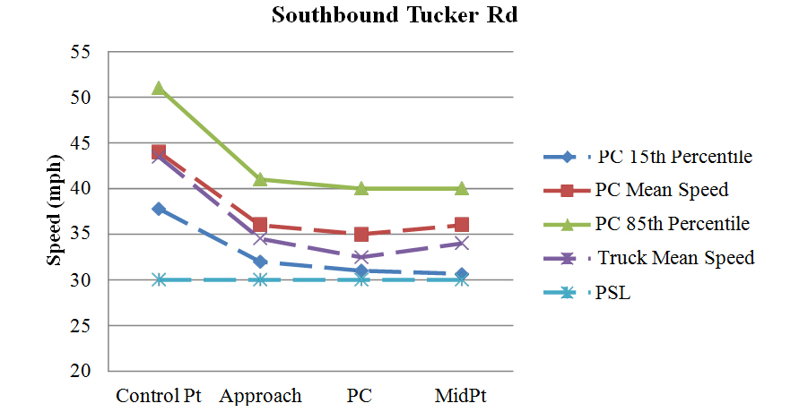
Figure 88. Graph. Graphical representation of speeds on southbound Tucker Road.
Northbound Tucker Road, MA
This curve was located approximately 0.9 mi upstream of the southbound Tucker Road curve. The direction of travel for the data collection was northbound, and the curve direction was to the left. This curve to the left was part of a reverse curve, with a curve back to the right. The radius of curve and the curve length, calculated using Google Earth™, were 568.76 ft and 293.24 ft, respectively. The PSL was 35 mph. The travel lanes were 12 ft wide, and there was no shoulder on either side of the road. There was a winding road sign (W1-5) located approximately 125 ft before the PC. An advisory speed plaque (W13-1P) of 25 mph was located approximately 100 ft upstream of the winding road sign. As figure 89 shows, there was one chevron on the outside of the curve at approximately the curve midpoint.
The research team collected speed data at the control point, 0.4 mi before the curve approach, which was 270 ft before the PC. The team also collected speed data at the PC and midpoint of the curve. One sensor in the opposing direction of travel was placed at the midpoint of the curve, and the other one was placed 262 ft downstream of the first sensor to determine whether vehicles were present in the opposing lane. Figure 89 shows the horizontal curve layout, along with the speed data-collection locations.
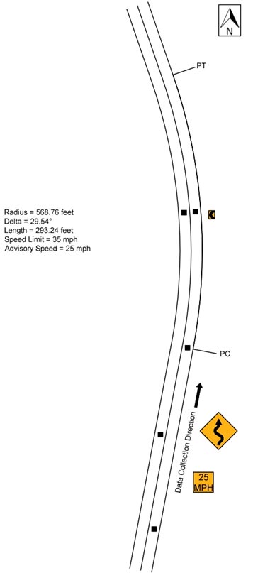
Figure 89. Diagram. Geometric layout of northbound Tucker Road (not to scale).
Table 54 shows the speed data for the before period. The data are shown as all observations, passenger car versus heavy trucks, daytime versus nighttime speeds for passenger cars, and opposed versus unopposed passenger cars. All of the comparisons exclude vehicles with high accelerations. The research team performed a simple t-test for each of these comparisons at each of the curve locations. For this treatment site, there was a statistically significant difference in speeds at the control point, approach, and PC for passenger cars versus heavy trucks, with the heavy truck speed lower at these points. There also was a statistically significant difference in speeds at the PC and curve midpoint for daytime versus nighttime passenger cars. There also was a difference at the curve midpoint for opposed versus unopposed passenger cars.
Table 54. Northbound Tucker Road before data.
| Speed Metric | Control Point Speed | Control Point SD | Approach Speed | Approach SD | PC Speed | PC SD | Mid Speed | Mid SD | N1 | N2 | N3 |
| All observations | 33.895 |
4.361 |
37.609 |
4.247 |
33.381 |
3.820 |
35.507 |
4.852 |
573 | 565 | 458 |
| Passenger cars | 33.919 |
4.361 |
37.633 |
4.251 |
33.403 |
3.820 |
35.525 |
4.858 |
569 | 561 | 455 |
| Heavy trucks | 30.500 |
3.000 |
34.250 |
1.500 |
30.250 |
2.500 |
32.667 |
3.055 |
4 | 4 | 3 |
| Daytime passenger cars | 34.135 |
4.263 |
37.768 |
4.219 |
33.683 |
3.551 |
36.145 |
4.549 |
341 | 338 | 276 |
| Nighttime passenger cars | 33.596 |
4.495 |
37.430 |
4.300 |
32.978 |
4.167 |
34.570 |
5.168 |
228 | 223 | 179 |
| Opposed passenger cars | 33.681 |
4.172 |
37.453 |
4.207 |
33.369 |
3.635 |
35.839 |
4.758 |
351 | 347 | 280 |
| Unopposed passenger cars | 34.303 |
4.634 |
37.922 |
4.315 |
33.458 |
4.111 |
35.023 |
4.986 |
218 | 214 | 175 |
Bold indicates significance at the 95-percent confidence level (α=0.05)
SD = Standard Deviation
PC = Point of Curvature
N1 = Number of observations at the control point and approach
N2 = Number of observations at the PC
N3 = Number of observations at the midpoint
Figure 90 shows the observed mean, 15th percentile, and 85th percentile operating speeds for passenger cars along the study section. Figure 90 also shows the mean speed for trucks within the study section. As the figure shows, the patterns of the speed changes were similar for the passenger car speeds and the truck mean speeds at this curve location. The speeds for passenger cars and the truck mean speeds increased from the control point to the approach of the curve, decreased from the approach to the PC of the curve, and then increasing again from the PC to the midpoint of the curve. The speeds for passenger cars and the truck mean speeds along the curve were both higher than the PSL of 30 mph. The mean acceleration rate from the PC to the midpoint of the curve was 2.928 ft/s for passenger cars and 2.35 ft/s for trucks. A negative value indicates deceleration.
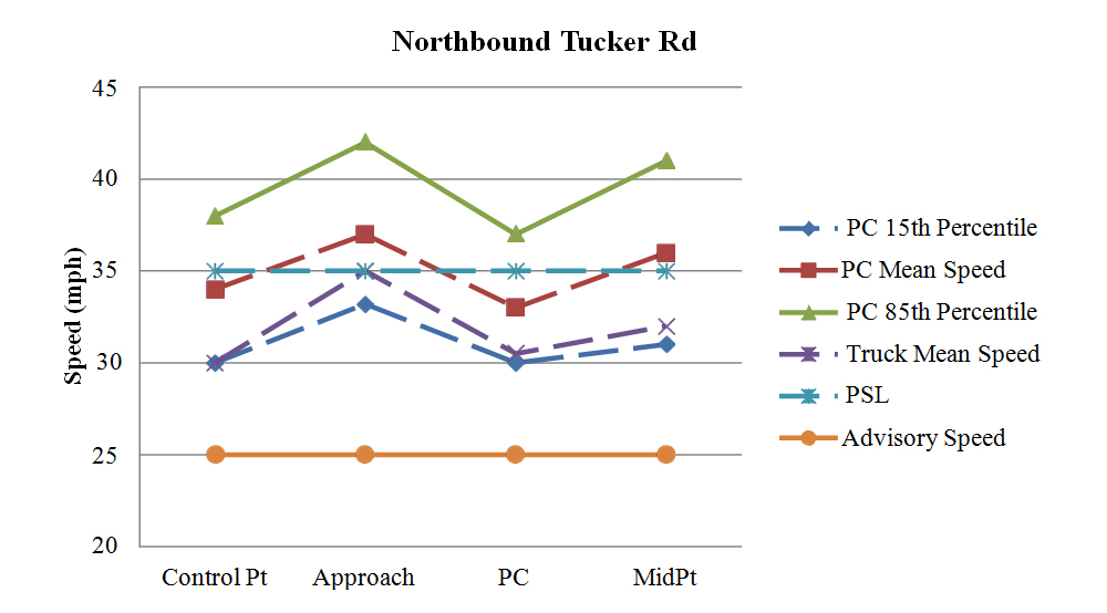
Figure 90. Graph. Graphical representation of speeds on northbound Tucker Road.
Southbound Reed Road, MA
The research team collected data on Reed Road in Dartmouth, MA. The direction of travel for the data collection was southbound and the curve direction was to the left. The radius of curve and the curve length, calculated using Google Earth™, were 683.31 ft and 458.56 ft, respectively. The PSL was 40 mph until 150 ft before the curve approach, where it changed to 25mph. The travel lanes were 13 ft wide, and there was a 4-ft shoulder on both sides of the road. As figure 91 shows, there was a curve warning sign (W1-2) located between the curve approach and the PC. There were also three chevrons on the outside of the curve.
The team collected speed data at the control point, 0.3 mi before the curve approach, which was 431ft before the PC. The research team also collected speed data at the PC and midpoint of the curve. One sensor in the opposing direction of travel was placed at the midpoint of the curve, and the other one was placed 311 ft downstream of the first sensor to determine whether vehicles were present in the opposing lane. Figure 91 shows the horizontal curve layout, along with the speed data-collection locations.
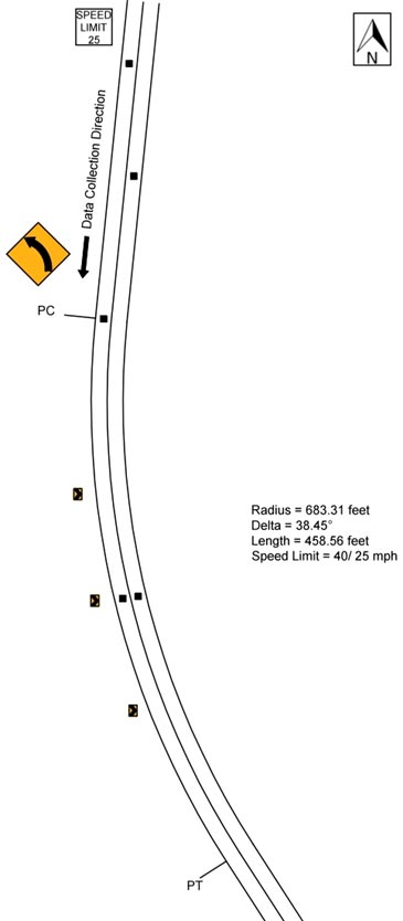
Figure 91. Diagram. Geometric layout of southbound Reed Road (not to scale).
Table 55 shows the speed data for the before period. The data are shown as all observations, passenger car versus heavy trucks, daytime versus nighttime speeds for passenger cars, and opposed versus unopposed passenger cars. All of the comparisons exclude vehicles with high accelerations. The research team performed a simple t-test for each of these comparisons at each of the curve locations. For this treatment site, there was only a statistically significant difference in speeds at the control point and approach speed for passenger cars versus heavy trucks, with the heavy truck speed lower at these points.
Table 55. Southbound Reed Road before data.
| Speed Metric | Control Point Speed | Control Point SD | Approach Speed | Approach SD | PC Speed | PC SD | Mid Speed | Mid SD | N1 | N2 | N3 |
| All Observations | 39.966 |
5.426 |
39.382 |
6.015 |
38.826 |
4.288 |
39.363 |
4.990 |
775 | 482 | 590 |
| Passenger cars | 40.036 |
5.395 |
39.450 |
5.985 |
38.811 |
4.227 |
39.416 |
4.945 |
756 | 471 | 575 |
| Heavy trucks | 37.211 |
6.070 |
36.684 |
6.758 |
39.455 |
6.654 |
37.333 |
6.355 |
19 | 11 | 15 |
| Daytime passenger cars | 39.754 |
5.282 |
39.249 |
6.262 |
38.558 |
3.773 |
39.692 |
4.767 |
337 | 224 | 247 |
| Nighttime passenger cars | 40.263 |
5.481 |
39.611 |
5.754 |
39.040 |
4.596 |
39.207 |
5.072 |
419 | 247 | 328 |
| Opposed passenger cars | 39.971 |
5.365 |
39.753 |
6.653 |
38.669 |
3.911 |
39.469 |
4.916 |
377 | 242 | 275 |
| Unopposed passenger cars | 40.100 |
5.432 |
39.148 |
5.227 |
38.961 |
4.542 |
39.367 |
4.979 |
379 | 229 | 300 |
Bold indicates significance at the 95-percent confidence level (α=0.05)
SD = Standard Deviation
PC = Point of Curvature
N1 = Number of observations at the control point and approach
N2 = Number of observations at the PC
N3 = Number of observations at the midpoint
Figure 92 shows the observed mean, 15th percentile, and 85th percentile operating speeds for passenger cars along the study section. Figure 92 also shows the mean speed for trucks within the study section. The figure shows that the speeds for passenger cars remained relatively stable along the curve, and the speed changes were minimal. The truck mean speeds increased slightly from the control point to the PC and decreased slightly from the PC to the midpoint of the curve. The passenger car speeds and the truck mean speeds along the curve were higher than the PSL of 25 mph, averaging between 37 to 39 mph. The mean acceleration rate from the PC to the midpoint of the curve was -0.092 ft/s for passenger cars and -1.863 ft/s for trucks. A negative value indicates deceleration.
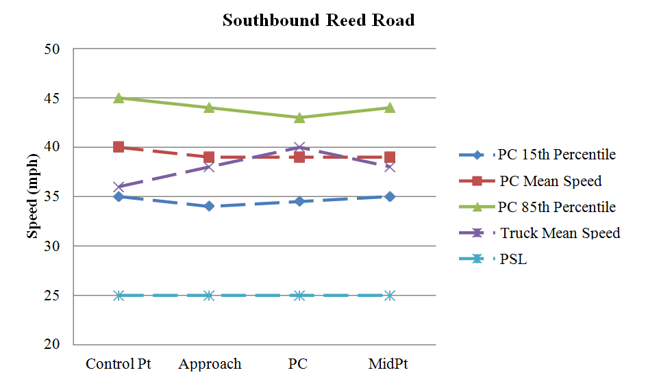
Figure 92. Graph. Graphical representation of speeds on southbound Reed Road.
Southbound New Boston Road, MA
The research team collected data on New Boston Road in Fairhaven, MA. The direction of travel for the data collection was southbound, and the curve direction was to the left. The radius of curve and the curve length, calculated using Google Earth™, were 592.52 ft and 226.37 ft, respectively. The PSL was 35 mph. The travel lanes were 11 ft wide, and there was no shoulder on either side of the road.
The team collected speed data at the control point, 0.2 mi before the curve approach, which was 530 ft before the PC. The research team also collected speed data at the PC and midpoint of the curve. One sensor in the opposing direction of travel was placed at the midpoint of the curve, and the other one was placed 460 ft downstream of the first sensor to determine whether vehicles were present in the opposing lane. Figure 93 shows the horizontal curve layout, along with the speed data-collection locations.
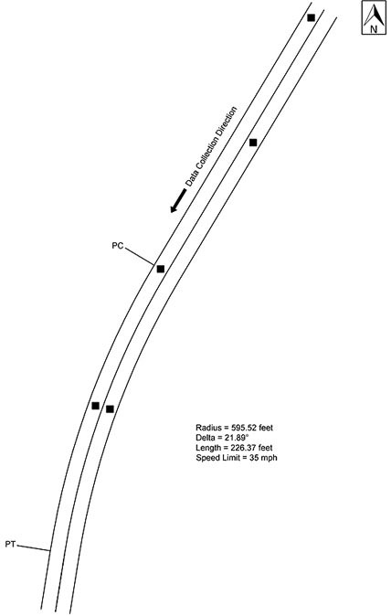
Figure 93. Diagram. Geometric layout of southbound New Boston Road (not to scale).
Table 56 shows the speed data for the before period. The data are shown as all observations, passenger car versus heavy trucks, daytime versus nighttime speeds for passenger cars, and opposed versus unopposed passenger cars. All of the comparisons exclude vehicles with high accelerations. The research team performed a simple t-test for each of these comparisons at each of the curve locations. For this treatment site, there was a statistically significant difference in speeds at curve midpoint for passenger cars versus heavy trucks. There also was a statistically significant difference in speeds at the control point and approach for opposed versus unopposed passenger cars.
Table 56. Southbound New Boston Road before data.
| Speed Metric | Control Point Speed | Control Point SD | Approach Speed | Approach SD | PC Speed | PC SD | Mid Speed | Mid SD | N1 | N2 | N3 |
| All observations | 37.004 |
6.532 |
37.704 |
5.967 |
37.489 |
5.607 |
36.624 |
6.206 |
257 | 229 | 229 |
| Passenger cars | 36.968 |
6.565 |
37.766 |
5.980 |
37.465 |
5.636 |
36.656 |
6.224 |
252 | 226 | 227 |
| Heavy trucks | 38.800 |
4.712 |
34.600 |
4.722 |
39.333 |
2.082 |
33.000 |
0.000 |
5 | 3 | 2 |
| Daytime passenger cars | 36.690 |
5.930 |
37.655 |
5.583 |
37.576 |
4.603 |
36.760 |
5.551 |
113 | 99 | 100 |
| Nighttime passenger cars | 37.194 |
7.052 |
37.856 |
6.302 |
37.378 |
6.343 |
36.575 |
6.728 |
139 | 127 | 127 |
| Opposed passenger cars | 35.638 |
5.307 |
36.259 |
5.872 |
36.788 |
5.410 |
35.962 |
6.145 |
58 | 52 | 52 |
| Unopposed passenger cars | 37.366 |
6.859 |
38.216 |
5.953 |
37.667 |
5.702 |
36.863 |
6.250 |
194 | 174 | 175 |
Bold indicates significance at the 95-percent confidence level (α=0.05)
SD = Standard Deviation
PC = Point of Curvature
N1 = Number of observations at the control point and approach
N2 = Number of observations at the PC
N3 = Number of observations at the midpoint
Figure 94 shows the observed mean, 15th percentile, and 85th percentile operating speeds for passenger cars along the study section. Figure 94 also shows the mean speed for trucks within the study section. The figure shows that the speeds for passenger cars remained relatively stable along the curve, and the speed changes were minimal. The truck mean speeds decreased slightly between the control point and the approach of the curve, increased significantly from the approach to the PC of the curve, and then decreased substantially from the PC to the midpoint of the curve. The 85th percentile speeds and the mean speeds for passenger cars along the curve were higher than the PSL of 35 mph. The mean acceleration rate from the PC to the midpoint of the curve was -0.490 ft/s for passenger cars and -0.960 ft/s for trucks. A negative value indicates deceleration.
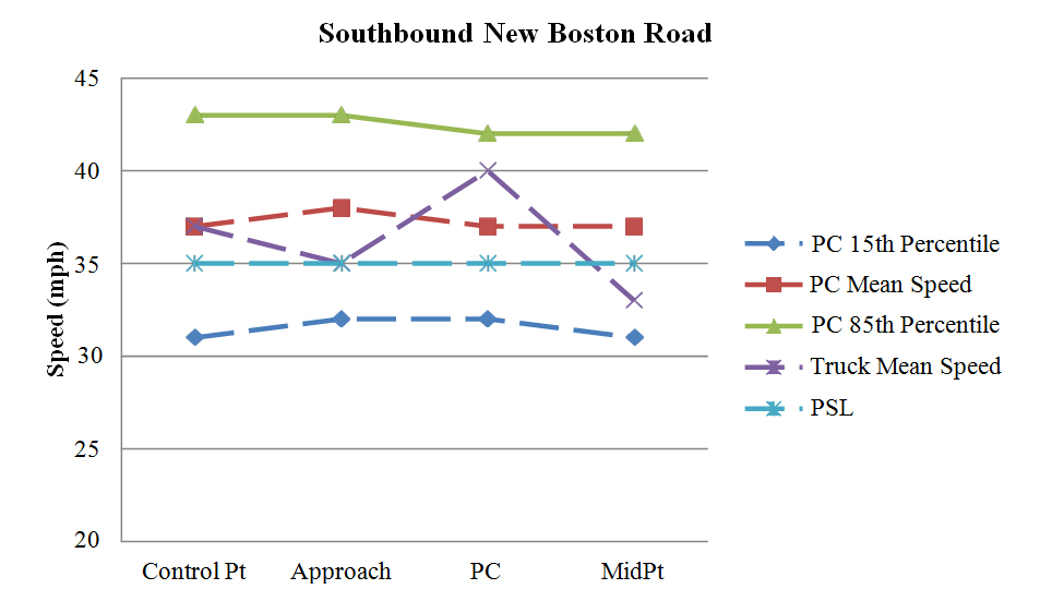
Figure 94. Graph. Graphical representation of speeds on southbound New Boston Road.
Northbound New Boston Road, MA
This curve was located approximately 800 ft downstream of the southbound New Boston Road curve. The direction of travel for the data collection was northbound, and the curve direction was to the right. The radius of curve and the curve length, calculated using Google Earth™, were 470.83 ft and 186.21 ft, respectively. The PSL was 35 mph. The travel lanes were 11 ft wide, and there was no shoulder on either side of the road.
The research team collected speed data at the control point, 0.4 mi before the curve approach, which was 470 ft before the PC. The team also collected speed data at the PC and midpoint of the curve. One sensor in the opposing direction of travel was placed at the midpoint of the curve, and the other one was placed 464 ft downstream of the first sensor to determine whether vehicles were present in the opposing lane. Figure 95 shows the horizontal curve layout, along with the speed data-collection locations.
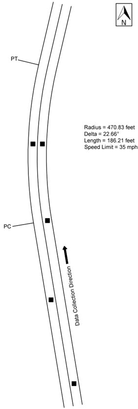
Figure 95. Diagram. Geometric layout of northbound New Boston Road (not to scale).
Table 57 shows the speed data for the before period. The data are shown as all observations, passenger car versus heavy trucks, daytime versus nighttime speeds for passenger cars, and opposed versus unopposed passenger cars. All of the comparisons exclude vehicles with high accelerations. The research team performed a simple t-test for each of these comparisons at each of the curve locations. For this treatment site, there was a statistically significant difference in speeds at the control point and approach for passenger cars versus heavy trucks, with the truck speed lower at these points. There also was a statistically significant difference in speeds at the curve midpoint for daytime versus nighttime passenger cars.
Table 57. Northbound New Boston Road before data.
| Speed Metric | Control Point Speed | Control Point SD | Approach Speed | Approach SD | PC Speed | PC SD | Mid Speed | Mid SD | N1 | N2 | N3 |
| All observations | 39.796 |
5.704 |
36.876 |
5.691 |
39.500 |
4.955 |
33.742 |
6.553 |
225 | 114 | 209 |
| Passenger cars | 39.857 |
5.680 |
36.928 |
5.686 |
39.558 |
4.939 |
33.720 |
6.563 |
223 | 113 | 207 |
| Heavy trucks | 33.000 |
5.657 |
31.000 |
2.828 |
33.000 |
N/A |
36.000 |
7.071 |
2 | 1 | 2 |
| Daytime passenger cars | 40.074 |
5.352 |
37.475 |
5.801 |
40.066 |
4.694 |
34.627 |
6.531 |
122 | 61 | 110 |
| Nighttime passenger cars | 39.594 |
6.070 |
36.267 |
5.499 |
38.962 |
5.194 |
32.691 |
6.478 |
101 | 52 | 97 |
| Opposed passenger cars | 40.119 |
4.835 |
36.810 |
4.830 |
39.714 |
3.989 |
32.789 |
4.911 |
42 | 21 | 38 |
| Unopposed passenger cars | 39.796 |
5.870 |
36.956 |
5.878 |
39.522 |
5.149 |
33.929 |
6.874 |
181 | 92 | 169 |
Bold indicates significance at the 95-percent confidence level (α=0.05)
SD = Standard Deviation
PC = Point of Curvature
N1 = Number of observations at the control point and approach
N2 = Number of observations at the PC
N3 = Number of observations at the midpoint
N/A = Not Applicable
Figure 96 shows the observed mean, 15th percentile, and 85th percentile operating speeds for passenger cars along the study section. Figure 96 also shows the mean speed for trucks within the study section. The figure shows that the speeds for passenger cars remained relatively stable from the control point to the PC of the curve, but decreased substantially from the PC to the midpoint of the curve. The truck mean speeds decreased slightly from the control point to the approach of the curve and increased slightly from the approach through the curve. The 85th percentile speeds for passenger cars along the curve were higher than the PSL of 35 mph. The mean acceleration rate from the PC to the midpoint of the curve was -5.478 ft/s for passenger cars and -0.2 ft/s for trucks. A negative value indicates deceleration.
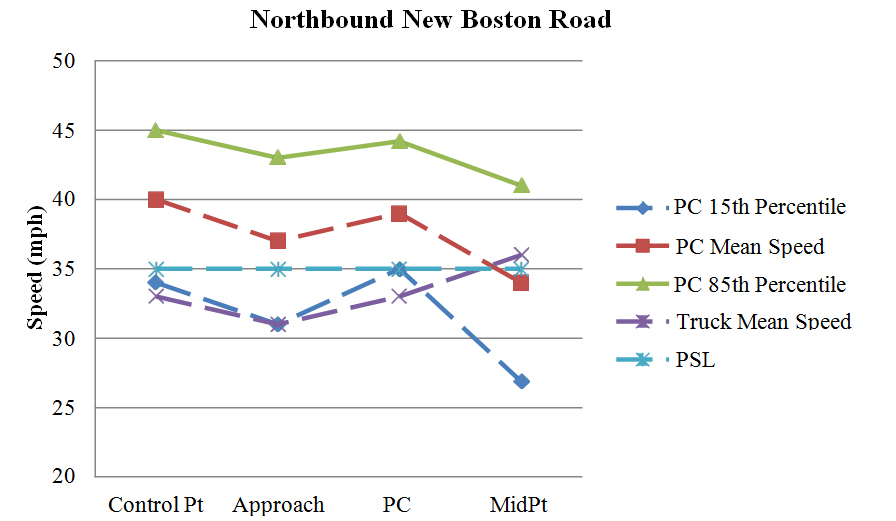
Figure 96. Graph. Graphical representation of speeds on northbound New Boston Road.
Southbound Braley Hill Road, MA
The research team collected data on Braley Hill Road in Rochester, MA. The direction of travel for the data collection was southbound, and the curve direction was to the right. The radius of curve and the curve length, calculated using Google Earth™, were 695.24 ft and 672.97 ft, respectively. There were trees and other growth on the inside of the curve, which partially restricted horizontal sight distance. The PSL was 30 mph. The travel lanes were 11 ft wide, and there was no shoulder on either side of the road. As figure 97 shows, there was a Dangerous Curves sign with a 30-mph speed limit sign (R2-1) located between the curve approach and the PC.
The research team collected speed data at the control point, 0.4 mi before the curve approach, which was 461 ft before the PC. The team also collected speed data at the PC and midpoint of the curve. One sensor in the opposing direction of travel was placed at the midpoint of the curve, and the other one was placed 410 ft downstream of the first sensor to determine whether vehicles were present in the opposing lane. Figure 97 shows the horizontal curve layout, along with the speed data-collection locations.
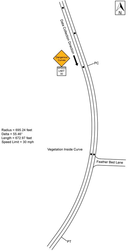
Figure 97. Diagram. Geometric layout of southbound Braley Hill Road (not to scale).
Table 58 shows the speed data for the before period. The data are shown as all observations, passenger car versus heavy trucks, daytime versus nighttime speeds for passenger cars, and opposed versus unopposed passenger cars. All of the comparisons exclude vehicles with high accelerations. The research team performed a simple t-test for each of these comparisons at each of the curve locations. For this treatment site, there was a statistically significant difference in speeds at the control point and approach for passenger cars versus heavy vehicles, with the truck speed lower at these points. There also was a statistically significant difference in speeds at the control point, approach, and curve midpoint for daytime versus nighttime passenger cars, with the nighttime speeds higher at these points. There also was a statistically significant difference in speeds at the curve midpoint for opposed versus unopposed passenger cars.
Table 58. Southbound Braley Hill Road before data.
| Speed Metric | Control Point Speed | Control Point SD | Approach Speed | Approach SD | PC Speed | PC SD | Mid Speed | Mid SD | N1 | N2 | N3 |
| All observations | 39.360 |
5.097 |
38.508 |
5.835 |
34.585 |
4.791 |
36.365 |
6.947 |
317 | 294 | 252 |
| Passenger cars | 39.472 |
5.136 |
38.600 |
5.872 |
34.665 |
4.693 |
36.502 |
6.905 |
305 | 284 | 243 |
| Heavy trucks | 36.500 |
2.844 |
36.167 |
4.345 |
32.300 |
6.977 |
32.667 |
7.483 |
12 | 10 | 9 |
| Daytime passenger cars | 38.640 |
4.423 |
37.953 |
4.997 |
34.433 |
4.591 |
35.697 |
7.398 |
150 | 141 | 122 |
| Nighttime passenger cars | 40.277 |
5.640 |
39.226 |
6.566 |
34.895 |
4.797 |
37.314 |
6.297 |
155 | 143 | 121 |
| Opposed passenger cars | 39.211 |
4.485 |
37.958 |
5.247 |
34.758 |
4.736 |
35.185 |
6.355 |
71 | 66 | 54 |
| Unopposed passenger cars | 39.551 |
5.324 |
38.795 |
6.046 |
34.638 |
4.691 |
36.878 |
7.025 |
234 | 218 | 189 |
Bold indicates significance at the 95-percent confidence level (α=0.05)
SD = Standard Deviation
PC = Point of Curvature
N1 = Number of observations at the control point and approach
N2 = Number of observations at the PC
N3 = Number of observations at the midpointe
Figure 98 shows the observed mean, 15th percentile, and 85th percentile operating speeds for passenger cars along the study section. Figure 98 also shows the mean speed for trucks within the study section. The figure shows that the 85th percentile speeds and the mean speeds for passenger cars decreased slightly from the control point to the PC and then increased from the PC to the midpoint of the curve. The 15th percentile speeds of passenger car decreased slightly along the curve. The truck mean speeds increased slightly between the control point and the approach of the curve, decreased from the approach to the PC of the curve, and then increased significantly from the PC to the midpoint of the curve. The passenger car speeds and the truck mean speeds along the curve were higher than the PSL of 30 mph. The mean acceleration rate from the PC to the midpoint of the curve was 3.544 ft/s for passenger cars and 4.908 ft/s for trucks.
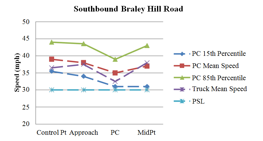 '
'
Figure 98. Graph. Graphical representation of speeds on southbound Braley Hill Road.
Northbound Braley Hill Road, MA
The northbound Braley Hill Road curve was located approximately 0.4 mi downstream of the southbound Braley Hill Road curve. The curve is located at the start of a broken back curve and compound curve. The direction of travel for the data collection was northbound, and the curve direction was to the right. The radius of curve and the curve length, calculated using Google Earth™, were 2,097.07 ft and 661.74 ft, respectively. There were trees and other growth approximately 5 to 10 ft off the inside of the curve, but horizontal sight distance was not restricted because of the large radius. The PSL was 40 mph. The travel lanes were 10 ft wide, and there was no shoulder on either side of the road. There were driveways spaced approximately 100 to 400 ft on both sides of the road on the curve approach and on the left side throughout the curve.
The research team collected speed data at the control point, 0.4 mi before the curve approach, which was 575 ft before the PC. Speed data were also collected at the PC and midpoint of the curve. One sensor in the opposing direction of travel was placed at the midpoint of the curve, and the other one was placed 415 ft downstream of the first sensor to determine whether vehicles were present in the opposing lane. Figure 99 shows the horizontal curve layout, along with the speed data-collection locations.

Figure 99. Diagram. Geometric layout of northbound Braley Hill Road (not to scale).
Table 59 shows the speed data for the before period. The data are shown as all observations, passenger car versus heavy trucks, daytime versus nighttime speeds for passenger cars, and opposed versus unopposed passenger cars. All of the comparisons exclude vehicles with high accelerations. The research team performed a simple t-test for each of these comparisons at each of the curve locations. For this treatment site, there was a statistically significant difference in speeds at the approach, PC, and curve midpoint for passenger cars versus heavy vehicles, with the truck speeds lower at these points.
Table 59. Northbound Braley Hill Road before data.
| Speed Metric | Control Point Speed | Control Point SD | Approach Speed | Approach SD | PC Speed | PC SD | Mid Speed | Mid SD | N1 | N2 | N3 |
| All observations | 44.188 |
7.842 |
38.650 |
4.290 |
37.565 |
3.981 |
38.530 |
3.990 |
277 | 271 | 268 |
| Passenger cars | 44.169 |
7.738 |
38.692 |
4.294 |
37.603 |
3.993 |
38.572 |
3.992 |
273 | 267 | 264 |
| Heavy trucks | 45.500 |
15.022 |
35.750 |
3.096 |
35.000 |
1.826 |
35.750 |
3.096 |
4 | 4 | 4 |
| Daytime passenger cars | 44.238 |
6.538 |
38.524 |
4.084 |
37.431 |
3.703 |
38.565 |
3.823 |
147 | 144 | 147 |
| Nighttime passenger cars | 44.087 |
8.965 |
38.889 |
4.536 |
37.805 |
4.315 |
38.581 |
4.210 |
126 | 123 | 117 |
| Opposed passenger cars | 43.794 |
7.456 |
38.730 |
4.178 |
36.983 |
4.312 |
38.381 |
4.046 |
63 | 60 | 63 |
| Unopposed passenger cars | 44.281 |
7.835 |
38.681 |
4.338 |
37.783 |
3.889 |
38.632 |
3.983 |
210 | 207 | 201 |
Bold indicates significance at the 95-percent confidence level (α=0.05)
SD = Standard Deviation
PC = Point of Curvature
N1 = Number of observations at the control point and approach
N2 = Number of observations at the PC
N3 = Number of observations at the midpoint
Figure 100 shows the observed mean, 15th percentile, and 85th percentile operating speeds for passenger cars along the study section. Figure 100 also shows the mean speed for trucks within the study section. As the figure shows, the passenger car speeds and truck speeds decelerated from the control point to the approach of the curve and then stabilized from the approach to midpoint of the curve. The 85th percentile speeds for passenger cars along the curve were higher than the PSL of 40 mph. Both the passenger car and truck mean speeds along the curve were lower than the PSL of 40 mph. The mean acceleration rate from the PC to the midpoint of the curve was 0.634 ft/s for passenger cars and 0.425 ft/s for trucks.
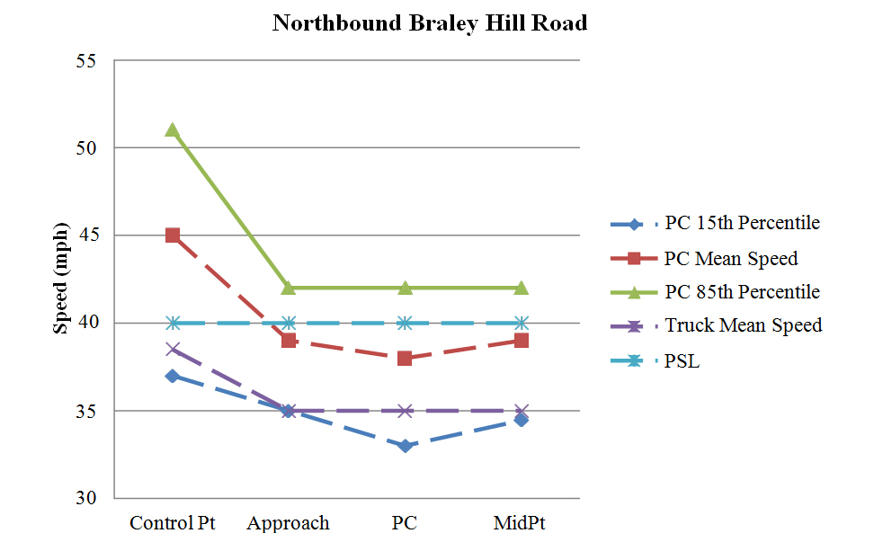
Figure 100. Graph. Graphical representation of speeds on northbound Braley Hill Road.
Comparison of Before and After Period Speed Data
After applying the OSBs, the research team collected the first after period data in Arizona in November 2012 and the second after period data in April 2013. In Massachusetts, the research team collected after period data in December 2012. In Alabama, the research team collected the first after period data in October 2013 and the second after period data in December 2013. The following sections describe the results of statistical comparisons between the before and after conditions at these sites.
Before beginning the data analysis, the research team screened all raw data to exclude vehicles that could not be tracked completely from the control point to the curve midpoint. The analysis considered only free-flow vehicles. As previously defined, a vehicle was considered free-flow if it had headway of 5 s or greater. It was anticipated that vehicles present in the opposing travel lane would influence the speed of free-flow vehicles in the subject travel lane; therefore, the research team added an indicator variable to the data files to identify free-flow vehicles in the subject travel lane that were measured in the presence of an opposing vehicle. Missing data values were excluded from the analysis. Data points considered outliers were carefully evaluated to determine whether they should be eliminated or included in the analysis. Examples of outliers include vehicles traveling at very low speeds prior to entering or exiting nearby driveways.
After data screening, the research team calculated mean operating speeds at each sensor location for all sites and all data-collection periods. The research team also performed an initial comparison between corresponding speed parameters at each site for each data-collection period by calculating the numerical differences in these speed parameters. The t-statistic for independent samples was then applied to determine if the differences in mean speeds were statistically significant. The mean operating speed comparisons were identified for each data-collection site, organized by the State.
This section of the report presents the before-after comparisons for the four Arizona OSB sites.
Northbound Pierce Ferry Road, AZ
As table 60 shows, in the first after period at northbound Pierce Ferry Road, operating speeds remained the same for most metrics. The only metric that changed at the control point was nighttime passenger car speeds, which decreased by approximately 3.6 mph, while all other metrics did not change from the before to after period. The speeds at the other data-collection points remained the same for nighttime passenger cars. The only other significant differences between the before and first after period were daytime passenger cars and unopposed passenger cars speeds at the curve midpoint, which decreased by approximately 1.4 and 1.5 mph, respectively.
In the second after period, there were several additional significant changes between the before and second after period and between the two after periods. The only change at the control point was for opposed passenger cars, where speeds significantly increased by 3.1 mph in the second after period from the first after period. The speeds at the approach significantly increased for the following speed metrics: all observations, passenger cars, heavy trucks, nighttime passenger cars, and unopposed passenger cars, with speed increases of 1.7, 1.4, 6.8, 4.4, and 1.4 mph, respectively. Despite these significant increases at the approach, the speeds at the PC significantly decreased for all speed metrics, except for heavy trucks. These reductions ranged from approximately 4.6 to 5.6 mph. However, these reductions were not maintained throughout the curve, and speeds actually significantly increased at the curve midpoint for all speed metrics. These increases ranged from approximately 5.1 to 11.0 mph.
Overall, the OSBs significantly reduced speeds at the PC (end of the OSB), but these reductions were not observed throughout the curve, and speeds actually increased at the curve midpoint after the application of the OSBs. It is possible that drivers adjusted their speeds upward to compensate for the slower speeds on the approach to the curve.
Table 60. Before-after operating speeds at northbound Pierce Ferry Road.
| Speed Metric | Control Point Speed | Control Point SD | Approach Speed | Approach SD | PC Speed | PC SD | Mid Speed | Mid SD | N1 | N2 | N3 |
| All observations before | 48.532 |
7.764 |
46.165 |
8.162 |
46.432 |
6.817 |
38.056 |
6.841 |
218 | 176 | 214 |
| All observations 1st after | 48.777 |
8.326 |
47.179 |
8.799 |
46.416 |
7.597 |
37.233 |
6.347 |
296 | 173 | 288 |
| All observations 2nd after | 49.318 |
7.503 |
47.860 |
6.765 |
41.763 |
4.879 |
44.271 |
6.737 |
258 | 253 | 240 |
| Passenger cars before | 48.867 |
7.565 |
46.793 |
7.855 |
46.789 |
6.628 |
38.513 |
6.739 |
203 | 166 | 199 |
| Passenger cars 1st after | 49.411 |
8.095 |
47.863 |
8.559 |
46.873 |
7.625 |
37.536 |
6.327 |
270 | 157 | 263 |
| Passenger cars 2nd after | 49.868 |
7.405 |
48.209 |
6.768 |
41.969 |
4.943 |
44.395 |
6.954 |
234 | 229 | 218 |
| Heavy trucks before | 44.000 |
9.220 |
37.667 |
7.697 |
40.500 |
7.546 |
32.000 |
5.237 |
15 | 10 | 15 |
| Heavy trucks 1st after | 42.192 |
7.965 |
40.077 |
8.236 |
41.938 |
5.802 |
34.040 |
5.755 |
26 | 16 | 25 |
| Heavy trucks 2nd after | 43.958 |
6.355 |
44.458 |
5.831 |
39.792 |
3.753 |
43.045 |
3.885 |
24 | 24 | 22 |
| Daytime passenger cars before | 49.577 |
7.116 |
47.521 |
7.429 |
47.669 |
6.277 |
39.271 |
6.744 |
142 | 118 | 140 |
| Daytime passenger cars 1st after | 50.353 |
7.825 |
48.263 |
8.303 |
47.519 |
7.133 |
37.836 |
6.204 |
232 | 129 | 225 |
| Daytime passenger cars 2nd after | 50.117 |
7.318 |
48.089 |
6.534 |
42.133 |
4.912 |
44.414 |
6.913 |
214 | 211 | 198 |
| Nighttime passenger cars before | 47.213 |
8.347 |
45.098 |
8.594 |
44.625 |
7.028 |
36.712 |
6.430 |
61 | 48 | 59 |
| Nighttime passenger cars 1st after | 43.658 |
7.390 |
45.421 |
9.747 |
43.893 |
9.138 |
35.763 |
6.832 |
38 | 28 | 38 |
| Nighttime passenger cars 2nd after | 47.200 |
7.997 |
49.500 |
9.012 |
40.056 |
5.047 |
44.200 |
7.537 |
20 | 18 | 20 |
| Opposed passenger cars before | 47.806 |
6.122 |
46.444 |
8.833 |
47.621 |
7.683 |
38.029 |
6.671 |
36 | 29 | 35 |
| Opposed passenger cars 1st after | 49.787 |
8.172 |
47.872 |
7.881 |
47.536 |
7.923 |
39.370 |
6.839 |
47 | 28 | 46 |
| Opposed passenger cars 2nd after | 50.870 |
7.589 |
48.130 |
7.055 |
41.981 |
5.443 |
43.731 |
6.754 |
54 | 52 | 52 |
| Unopposed passenger cars before | 49.096 |
7.838 |
46.868 |
7.655 |
46.613 |
6.400 |
38.616 |
6.769 |
167 | 137 | 164 |
| Unopposed passenger cars 1st after | 49.332 |
8.096 |
47.861 |
8.712 |
46.729 |
7.583 |
37.147 |
6.160 |
223 | 129 | 217 |
| Unopposed passenger cars 2nd after | 49.567 |
7.344 |
48.233 |
6.700 |
41.966 |
4.803 |
44.602 |
7.023 |
180 | 177 | 166 |
Bold indicates significance at the 95-percent confidence level (α=0.05) between the 1st/2nd after period and before
period
Italics indicates significance at the 95-percent confidence level (α=0.05) between the 1st and 2nd after periods
SD = Standard Deviation
PC = Point of Curvature
N1 = Number of observations at the control point and approach
N2 = Number of observations at the PC
N3 = Number of observations at the midpoint
Figure 101 shows a graphical representation of the speed profiles for northbound Pierce Ferry Road. At the approach point and PC, the general shape of the speed profiles for the three collection periods remained relatively similar. At the midpoint, the mean and 85th percentile speeds showed an increase in the second after period.
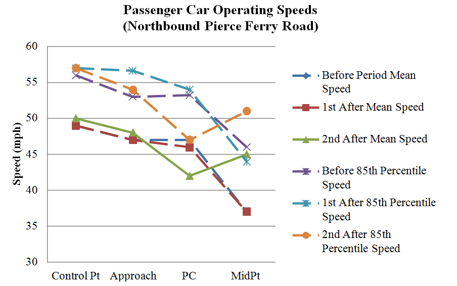
Figure 101. Graph. Operating speeds comparison on northbound Pierce Ferry Road (PSL = 55 mph).
Southbound Shinarump Road, AZ
Table 61 shows speeds increased at the control point for the following speed metrics: all observations, passenger cars, nighttime passenger cars, and unopposed passenger cars, with the increases being 1.2, 1.4, 2.2, and 1.4 mph, respectively. All observations and heavy truck speeds decreased at the control point by 1.4 and 5.8 mph, respectively. The only other change in the first after period was heavy truck speeds, which decreased at the PC by 3.8 mph and at the curve midpoint by 4.7 mph. There was no strong trend initially in speed changes after the OSBs were installed, with only heavy truck speeds decreasing at the PC and curve midpoint.
There were more changes in speeds during the second after period. Speeds remained relatively similar at the control point, with only daytime passenger car speeds increasing by approximately 1.6 mph. There were no speed changes at the approach. Speeds increased at the PC for all observations, heavy trucks, and daytime passenger cars, with speed increases of approximately 1.9, 6.1, and 2.0 mph, respectively. However, the 2.0 mph increase for daytime passenger cars was not significant after accounting for the speed increase at the control point. Speeds at the curve midpoint significantly decreased for every speed metric. The speed reductions ranged from 6.0 to 8.2 mph. Based on the second after period, speeds at the curve midpoint significantly decreased after the application of the OSBs, with a practical decrease (greater than 5 mph).
Table 61. Before-after operating speeds at southbound Shinarump Road.
| Speed Metric | Control Point Speed | Control Point SD | Approach Speed | Approach SD | PC Speed | PC SD | Mid Speed | Mid SD | N1 | N2 | N3 |
| All observations before | 47.317 |
6.928 |
51.099 |
8.603 |
47.299 |
6.864 |
51.100 |
8.042 |
303 | 288 | 209 |
| All observations 1st after | 48.542 |
6.689 |
49.716 |
7.630 |
46.393 |
6.947 |
49.838 |
8.216 |
236 | 224 | 154 |
| All observations 2nd after | 47.979 |
8.414 |
51.277 |
9.756 |
49.244 |
9.528 |
44.662 |
6.987 |
242 | 176 | 225 |
| Passenger cars before | 47.566 |
6.768 |
51.241 |
8.023 |
48.017 |
6.341 |
51.537 |
7.773 |
249 | 238 | 175 |
| Passenger cars 1st after | 48.930 |
6.887 |
50.592 |
7.471 |
47.409 |
6.490 |
50.780 |
8.036 |
201 | 193 | 132 |
| Passenger cars 2nd after | 48.375 |
8.105 |
51.491 |
9.502 |
49.158 |
9.245 |
45.099 |
6.954 |
216 | 158 | 203 |
| Heavy trucks before | 46.167 |
7.583 |
50.444 |
10.956 |
43.880 |
8.188 |
48.853 |
9.099 |
54 | 50 | 34 |
| Heavy trucks 1st after | 46.314 |
4.928 |
44.686 |
6.597 |
40.065 |
6.413 |
44.182 |
7.062 |
35 | 31 | 22 |
| Heavy trucks 2nd after | 44.692 |
10.248 |
49.500 |
11.724 |
50.000 |
12.020 |
40.636 |
6.067 |
26 | 18 | 22 |
| Daytime passenger cars before | 46.686 |
7.001 |
50.777 |
8.431 |
47.009 |
6.033 |
50.894 |
7.375 |
121 | 115 | 94 |
| Daytime passenger cars 1st after | 47.571 |
6.276 |
50.420 |
7.582 |
46.654 |
6.513 |
50.759 |
7.871 |
112 | 107 | 79 |
| Daytime passenger cars 2nd after | 48.316 |
8.146 |
51.181 |
9.422 |
49.017 |
9.247 |
44.805 |
6.618 |
171 | 119 | 159 |
| Nighttime passenger cars before | 48.398 |
6.458 |
51.680 |
7.624 |
48.959 |
6.500 |
52.284 |
8.193 |
128 | 123 | 81 |
| Nighttime passenger cars 1st after | 50.640 |
7.266 |
50.809 |
7.365 |
48.349 |
6.374 |
50.811 |
8.353 |
89 | 86 | 53 |
| Nighttime passenger cars 2nd after | 48.600 |
8.032 |
52.667 |
9.819 |
49.590 |
9.346 |
46.159 |
8.046 |
45 | 39 | 44 |
| Opposed passenger cars before | 45.967 |
6.646 |
48.200 |
5.580 |
45.933 |
4.982 |
50.875 |
6.556 |
30 | 30 | 24 |
| Opposed passenger cars 1st after | 46.263 |
5.086 |
49.211 |
5.127 |
46.105 |
5.259 |
52.636 |
5.608 |
19 | 19 | 11 |
| Opposed passenger cars 2nd after | 47.889 |
7.192 |
49.741 |
5.769 |
48.526 |
7.516 |
44.400 |
5.276 |
27 | 19 | 25 |
| Unopposed passenger cars before | 47.785 |
6.770 |
51.658 |
8.224 |
48.317 |
6.468 |
51.642 |
7.964 |
219 | 208 | 151 |
| Unopposed passenger cars 1st after | 49.209 |
7.000 |
50.736 |
7.670 |
47.552 |
6.608 |
50.612 |
8.218 |
182 | 174 | 121 |
| Unopposed passenger cars 2nd after | 48.444 |
8.242 |
51.741 |
9.907 |
49.245 |
9.477 |
45.197 |
7.165 |
189 | 139 | 178 |
Bold indicates significance at the 95-percent confidence level (α=0.05) between the 1st/2nd after period and before
period
Italics indicates significance at the 95-percent confidence level (α=0.05) between the 1st and 2nd after periods
SD = Standard Deviation
PC = Point of Curvature
N1 = Number of observations at the control point and approach
N2 = Number of observations at the PC
N3 = Number of observations at the midpoint
Figure 102 shows a graphical representation of the speed profiles for southbound Shinarump Road. The general shape of the mean and 85th percentile speed profiles remained relatively similar in the before and first after period. In the second after period, the mean and 85th percentile speeds increased at the midpoint.
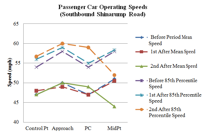
Figure 102. Graph. Operating speeds comparison on southbound Shinarump Road (PSL = 45 mph).
Southbound Diamond Bar Road, AZ
As table 62 shows, in the first after period at southbound Diamond Bar Road, operating speeds remained the same for most metrics. The only significant change at the control point was heavy truck speeds decreased by approximately 4.0 mph. Heavy truck speeds also decreased at the approach by approximately 2.7 mph, while all other speed metrics did not change significantly. The only speed metric at the PC that changed was nighttime passenger car speeds, which decreased by approximately 4.9 mph. The only speed metric at the curve midpoint that changed was heavy truck speeds, which decreased by approximately 4.7 mph. After taking into account the reduction in heavy truck speeds at the control point speed, truck speeds did not decrease in the first after period at the curve midpoint. The OSBs had virtually no effect on any of the other speed metrics in the first after period.
There were more speed changes in the second after period when compared with the before period, than there were between the first after period and before period. The only change at the control point was heavy truck speeds, which decreased from both the before period and first after period. These speed reductions were 4.0 and 6.9 mph, respectively. Speeds for all metrics increased at the approach, except heavy truck speeds did not change from the before period. Speed increases ranged between approximately 3.7 and 6.7 mph at this data-collection point. Speeds did not significantly increase at the PC, except heavy truck speeds decreased by approximately 5.2 mph. All measured speed metrics decreased at the curve midpoint, with speed decreases ranging between approximately 5.0 and 10.6 mph.
Based on the second after period, speeds at the curve midpoint significantly decreased after the application of the optical speed bars, with a practical decrease (greater than 5 mph).
Table 62. Before-after operating speeds at southbound Diamond Bar Road.
| Speed Metric | Control Point Speed | Control Point SD | Approach Speed | Approach SD | PC Speed | PC SD | Mid Speed | Mid SD | N1 | N2 | N3 |
| All observations before | 53.421 |
8.312 |
49.171 |
6.730 |
50.299 |
7.116 |
50.435 |
7.621 |
292 | 214 | 209 |
| All observations 1st after | 52.111 |
9.266 |
48.144 |
6.865 |
49.969 |
8.313 |
49.091 |
8.654 |
153 | 64 | 110 |
| All observations 2nd after | 53.317 |
8.817 |
54.410 |
7.940 |
51.506 |
6.705 |
42.695 |
6.953 |
183 | 89 | 177 |
| Passenger cars before | 53.867 |
8.389 |
49.516 |
6.675 |
50.874 |
6.996 |
50.703 |
7.611 |
256 | 182 | 182 |
| Passenger cars 1st after | 53.476 |
9.418 |
49.097 |
7.084 |
50.925 |
8.655 |
50.375 |
8.743 |
124 | 53 | 88 |
| Passenger cars 2nd after | 54.071 |
8.616 |
55.035 |
7.831 |
52.083 |
6.446 |
43.061 |
7.017 |
170 | 84 | 164 |
| Heavy trucks before | 50.250 |
7.064 |
46.722 |
6.704 |
47.031 |
7.014 |
48.630 |
7.581 |
36 | 32 | 27 |
| Heavy trucks 1st after | 46.276 |
5.738 |
44.069 |
3.760 |
45.364 |
4.202 |
43.955 |
6.122 |
29 | 11 | 22 |
| Heavy trucks 2nd after | 43.462 |
4.502 |
46.231 |
3.811 |
41.800 |
1.483 |
38.077 |
3.904 |
13 | 5 | 13 |
| Daytime passenger cars before | 54.061 |
8.582 |
49.873 |
7.057 |
51.706 |
7.113 |
51.109 |
7.876 |
181 | 126 | 128 |
| Daytime passenger cars 1st after | 53.718 |
9.678 |
49.500 |
7.121 |
52.318 |
8.596 |
50.831 |
9.011 |
110 | 44 | 77 |
| Daytime passenger cars 2nd after | 53.832 |
8.857 |
54.904 |
8.035 |
52.576 |
6.361 |
42.475 |
7.134 |
125 | 66 | 122 |
| Nighttime passenger cars before | 53.400 |
7.939 |
48.653 |
5.598 |
49.000 |
6.399 |
49.741 |
6.918 |
75 | 56 | 54 |
| Nighttime passenger cars 1st after | 51.571 |
7.035 |
45.929 |
6.120 |
44.111 |
5.183 |
47.182 |
5.930 |
14 | 14 | 11 |
| Nighttime passenger cars 2nd after | 54.733 |
7.964 |
55.400 |
7.309 |
50.278 |
6.614 |
44.762 |
6.446 |
45 | 18 | 42 |
| Opposed passenger cars before | 53.472 |
9.376 |
50.057 |
6.320 |
51.000 |
8.218 |
50.057 |
8.359 |
53 | 35 | 35 |
| Opposed passenger cars 1st after | 52.500 |
10.988 |
48.611 |
7.047 |
52.714 |
9.050 |
52.077 |
9.996 |
18 | 7 | 13 |
| Opposed passenger cars 2nd after | 53.889 |
5.989 |
53.722 |
6.115 |
52.692 |
4.461 |
42.588 |
6.820 |
18 | 13 | 17 |
| Unopposed passenger cars before | 53.970 |
8.134 |
49.374 |
6.773 |
50.844 |
6.705 |
50.857 |
7.445 |
203 | 147 | 147 |
| Unopposed passenger cars 1st after | 53.642 |
9.175 |
49.179 |
7.120 |
50.652 |
8.665 |
50.080 |
8.548 |
106 | 46 | 75 |
| Unopposed passenger cars 2nd after | 54.092 |
8.890 |
55.191 |
8.012 |
51.972 |
6.765 |
43.116 |
7.060 |
152 | 71 | 147 |
Bold indicates significance at the 95-percent confidence level (α=0.05) between the 1st/2nd after period and before
period
Italics indicates significance at the 95-percent confidence level (α=0.05) between the 1st and 2nd after periods
SD = Standard Deviation
PC = Point of Curvature
N1 = Number of observations at the control point and approach
N2 = Number of observations at the PC
N3 = Number of observations at the midpoint
Figure 103 shows a graphical representation of the speed profiles for southbound Diamond Bar Road. The general shape of the mean and 85th percentile speed profiles remained relatively similar in the before and first after period. In the second after period, the mean and 85th percentile speeds increased at the approach and midpoints.
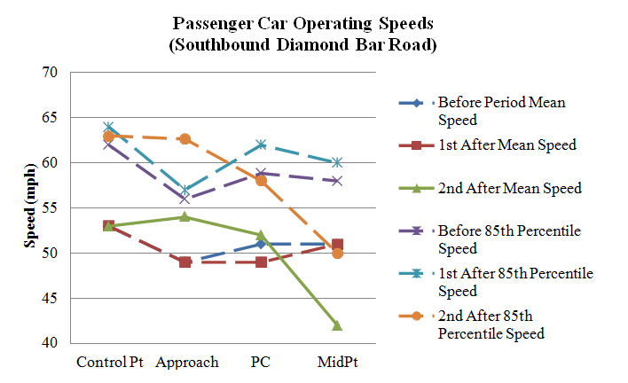
Figure 103. Graph. Operating speeds comparison on southbound Diamond Bar Road (PSL = 45 mph).
Southbound County Route 1, AZ
As table 63 shows, in the first after period at southbound County Route 1, operating speeds remained the same for most metrics. There was a significant increase at the control point for the following speed metrics: all observations, passenger cars, daytime passenger cars, nighttime passenger cars, and unopposed passenger cars, with speed increases of approximately 2.0, 2.2, 2.8, and 2.1 mph, respectively. There were no significant speed changes at the approach. Speeds at the PC remained the same in the first after period, except daytime passenger car speeds significantly decreased by approximately 1.1 mph. Speeds also remained constant at the curve midpoint, with the exception that opposed passenger car speeds significantly increased by approximately 3.4 mph. The optical speed bars had virtually no effect on speeds in the first after period.
There were more speed changes in the second after period when compared with the before period than there were between the first after period and before period. There were no significant speed differences at the control point between the second after period and before period. Speeds generally decreased from the first to second after period, with speeds returning closer to the before period. Speeds remained the same at the approach, except speeds significantly increased for all observations, passenger cars, and unopposed passenger cars, increasing by approximately 1.1, 1.0, and 1.1 mph, respectively. Speeds significantly increased at the PC for all measured speed metrics, expect opposed passenger car speeds remained the same. Speed increases ranged between approximately 1.8 and 6.3 mph. These speed increases were also observed at the curve midpoint, with all measured speed metrics, except heavy trucks, increasing significantly by approximately 3.5 to 7.1 mph.
The OSBs did not have a strong effect on operating speeds in the first after period, but after several months, the speeds at the PC and curve midpoint significantly increased between 2.1 and 7.1 mph. It is possible that drivers decelerated on the curve approach but increased speeds through the curve influenced by the large curve radii.
Table 63. Before-after operating speeds at southbound County Route 1.
| Speed Metric | Control Point Speed | Control Point SD | Approach Speed | Approach SD | PC Speed | PC SD | Mid Speed | Mid SD | N1 | N2 | N3 |
| All observations before | 53.471 |
8.882 |
47.731 |
5.559 |
44.021 |
5.211 |
43.919 |
7.259 |
342 | 329 | 307 |
| All observations 1st after | 55.448 |
9.376 |
47.924 |
5.972 |
43.565 |
5.031 |
43.677 |
7.210 |
382 | 363 | 341 |
| All observations 2nd after | 53.622 |
9.856 |
48.820 |
5.650 |
46.521 |
5.742 |
48.014 |
7.115 |
233 | 219 | 145 |
| Passenger cars before | 53.532 |
8.901 |
47.810 |
5.515 |
44.134 |
5.125 |
43.918 |
7.262 |
327 | 314 | 292 |
| Passenger cars 1st after |
55.746 |
9.419 |
48.045 |
5.896 |
43.635 |
5.013 |
43.877 |
7.147 |
355 | 337 | 316 |
| Passenger cars 2nd after | 53.532 |
9.792 |
48.792 |
5.656 |
46.417 |
5.719 |
47.986 |
7.166 |
216 | 204 | 138 |
| Heavy trucks before | 52.133 |
8.651 |
46.000 |
6.414 |
41.667 |
6.532 |
43.933 |
7.450 |
15 | 15 | 15 |
| Heavy trucks 1st after |
51.519 |
7.939 |
46.333 |
6.811 |
42.654 |
5.284 |
41.160 |
7.679 |
27 | 26 | 25 |
| Heavy trucks 2nd after |
54.765 |
10.889 |
49.176 |
5.736 |
47.933 |
6.076 |
48.571 |
6.477 |
17 | 15 | 7 |
| Daytime passenger cars before | 53.847 |
9.266 |
49.038 |
5.430 |
44.977 |
4.895 |
44.599 |
7.081 |
183 | 174 | 162 |
| Daytime passenger cars 1st after |
55.689 |
9.357 |
48.222 |
5.420 |
43.895 |
4.746 |
43.969 |
7.107 |
257 | 248 | 229 |
| Daytime passenger cars 2nd after |
54.046 |
9.582 |
49.408 |
5.225 |
47.034 |
5.326 |
48.316 |
7.149 |
152 | 145 | 98 |
| Nighttime passenger cars before | 53.132 |
8.428 |
46.250 |
5.238 |
43.086 |
5.228 |
43.069 |
7.421 |
144 | 140 | 130 |
| Nighttime passenger cars 1st after |
55.898 |
9.628 |
47.582 |
7.004 |
42.910 |
5.656 |
43.632 |
7.287 |
98 | 89 | 87 |
| Nighttime passenger cars 2nd after |
52.313 |
10.249 |
47.328 |
6.375 |
44.898 |
6.383 |
47.175 |
7.236 |
64 | 59 | 40 |
| Opposed passenger cars before | 53.479 |
9.299 |
47.125 |
5.354 |
44.111 |
4.900 |
41.091 |
7.844 |
48 | 45 | 44 |
| Opposed passenger cars 1st after |
56.000 |
9.372 |
48.301 |
5.721 |
43.843 |
5.029 |
44.506 |
6.613 |
93 | 89 | 85 |
| Opposed passenger cars 2nd after |
53.407 |
9.616 |
47.963 |
4.642 |
45.373 |
5.564 |
48.171 |
6.667 |
54 | 51 | 41 |
| Unopposed passenger cars before | 53.541 |
8.848 |
47.928 |
5.543 |
44.138 |
5.171 |
44.419 |
7.053 |
279 | 269 | 248 |
| Unopposed passenger cars 1st after |
55.656 |
9.452 |
47.954 |
5.965 |
43.560 |
5.015 |
43.645 |
7.333 |
262 | 248 | 231 |
| Unopposed passenger cars 2nd after |
53.574 |
9.879 |
49.068 |
5.943 |
46.765 |
5.745 |
47.907 |
7.399 |
162 | 153 | 97 |
Bold indicates significance at the 95-percent confidence level (α=0.05) between the 1st/2nd after period and before
period
Italics indicates significance at the 95-percent confidence level (α=0.05) between the 1st and 2nd after periods
SD = Standard Deviation
PC = Point of Curvature
N1 = Number of observations at the control point and approach
N2 = Number of observations at the PC
N3 = Number of observations at the midpoint
Figure 104 shows a graphical representation of the speed profiles for southbound County Route1. The general shape of the mean and 85th percentile speed profiles, at the curve approach point and PC, for the three collection periods remained relatively similar in the before and first after period. However, the midpoint speeds increased in the second after period.
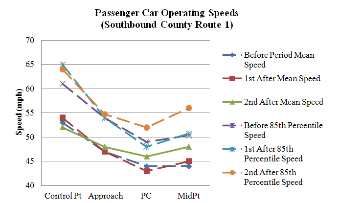
Figure 104. Graph. Operating speeds comparison on southbound County Route 1 (PSL = 35 mph).
Arizona Summary of Results
Overall, the OSBs did not have an effect on operating speeds at the Arizona sites. There were no changes in speeds that were consistent across all of the sites.
This section of the report presents the before-after comparisons for the eight Alabama OSB sites.
Alabama Location #1
As table 64 shows, in the first after period at Alabama Location #1, operating speeds decreased for several speed metrics. There was a significant decrease at the control point for all speed metrics. These speed decreases ranged between approximately 2.1 and 6.7 mph. Speeds at the approach significantly decreased for all speed metrics. However, after accounting for the speed decrease at the control point, none of these reductions were significant, and speeds for passenger cars, daytime passenger cars, and unopposed passenger cars actually increased. Speeds at the PC significantly decreased for the following speed metrics: all observations, passenger cars, daytime passenger cars, and unopposed passenger cars. However, after accounting for the speed decrease at the control point, none of these reductions were significant, and speeds for passenger cars and opposed passenger cars actually increased. Speeds at the curve midpoint did not change significantly from the before period. If the speed reduction at the control point was taken into account, speeds increased slightly at the curve midpoint.
There were more speed changes in the second after period when compared with the before period, than there were between the first after period and before period. Speeds at the control point increased for all speed metrics, except for heavy trucks. The range of speed increases was between approximately 1.7 and 2.7 mph. Not taking the speed increase at the control point into account, speeds at the approach increased from the first after period, but they remained the same when compared with the before period, except all observations significantly decreased by approximately 0.8 mph. Not taking into account the speed increase at the control point, speeds at the PC increased from the first after period, but remained the same when compared with the before period, except opposed passenger cars significantly increased by approximately 3.3 mph. Speeds significantly decreased at the curve midpoint for all speed metrics, except for heavy trucks. The speed decreases were between approximately 1.4 and 2.6 mph. If the speed increases at the control point were taken into account, these decreases became more significant.
The OSBs did not have a strong effect on operating speeds in the first after period, but after several months, the speeds at the curve midpoint significantly decreased between 1.4 and 2.6mph.
Table 64. Before-after operating speeds at Alabama Location #1.
| Speed Metric | Control Point Speed | Control Point SD | Approach Speed | Approach SD | PC Speed | PC SD | Mid Speed | Mid SD | N1 | N2 | N3 |
| All observations before | 47.883 |
9.368 |
49.208 |
7.596 |
50.103 |
8.770 |
42.323 |
6.912 |
375 | 87 | 353 |
| All observations 1st after | 43.306 |
6.928 |
45.497 |
6.752 |
47.431 |
5.886 |
41.691 |
6.951 |
340 | 204 | 333 |
| All observations 2nd after | 50.190 |
7.863 |
48.380 |
6.788 |
49.776 |
6.830 |
40.364 |
9.437 |
822 | 223 | 733 |
| Passenger cars before | 47.917 |
9.380 |
49.218 |
7.540 |
50.429 |
8.700 |
42.516 |
6.892 |
362 | 84 | 341 |
| Passenger cars 1st after | 43.575 |
6.880 |
46.134 |
6.490 |
48.148 |
5.530 |
42.523 |
6.342 |
313 | 183 | 306 |
| Passenger cars 2nd after | 50.226 |
7.931 |
48.522 |
6.792 |
49.906 |
6.914 |
40.475 |
9.413 |
793 | 213 | 710 |
| Heavy trucks before | 46.923 |
9.332 |
48.923 |
9.394 |
41.000 |
6.083 |
36.833 |
5.132 |
13 | 3 | 12 |
| Heavy trucks 1st after | 40.185 |
6.850 |
38.111 |
5.243 |
41.190 |
5.269 |
32.259 |
6.671 |
27 | 21 | 27 |
| Heavy trucks 2nd after | 49.207 |
5.722 |
44.483 |
5.468 |
47.000 |
3.944 |
36.957 |
9.740 |
29 | 10 | 23 |
| Daytime passenger cars before | 47.638 |
9.418 |
48.805 |
7.641 |
50.795 |
8.551 |
42.288 |
6.764 |
174 | 39 | 160 |
| Daytime passenger cars 1st after | 42.964 |
6.865 |
46.016 |
6.568 |
48.020 |
5.060 |
42.470 |
6.112 |
252 | 151 | 247 |
| Daytime passenger cars 2nd after | 49.417 |
7.985 |
48.296 |
6.904 |
49.578 |
7.058 |
40.840 |
9.469 |
348 | 102 | 306 |
| Nighttime passenger cars before | 48.176 |
9.362 |
49.601 |
7.444 |
50.111 |
8.912 |
42.718 |
7.016 |
188 | 45 | 181 |
| Nighttime passenger cars 1st after | 46.098 |
6.395 |
46.623 |
6.186 |
48.750 |
7.427 |
42.746 |
7.282 |
61 | 32 | 59 |
| Nighttime passenger cars 2nd after | 50.858 |
7.838 |
48.699 |
6.705 |
50.207 |
6.797 |
40.198 |
9.373 |
445 | 111 | 404 |
| Opposed passenger cars before | 47.529 |
10.661 |
48.793 |
7.385 |
46.833 |
7.648 |
42.037 |
6.512 |
87 | 24 | 82 |
| Opposed passenger cars 1st after | 43.250 |
5.583 |
44.775 |
4.699 |
46.667 |
4.151 |
41.725 |
6.345 |
40 | 21 | 40 |
| Opposed passenger cars 2nd after | 49.228 |
7.986 |
47.772 |
6.816 |
50.130 |
5.361 |
39.479 |
10.074 |
158 | 46 | 142 |
| Unopposed passenger cars before | 48.040 |
8.955 |
49.353 |
7.596 |
51.867 |
8.736 |
42.668 |
7.014 |
275 | 60 | 259 |
| Unopposed passenger cars 1st after | 43.623 |
7.057 |
46.333 |
6.696 |
48.340 |
5.666 |
42.643 |
6.345 |
273 | 162 | 266 |
| Unopposed passenger cars 2nd after | 50.474 |
7.904 |
48.709 |
6.778 |
49.844 |
7.297 |
40.724 |
9.233 |
635 | 167 | 568 |
Bold indicates significance at the 95-percent confidence level (α=0.05) between the 1st/2nd after period and before
period
Italics indicates significance at the 95-percent confidence level (α=0.05) between the 1st and 2nd after periods
SD = Standard Deviation
PC = Point of Curvature
N1 = Number of observations at the control point and approach
N2 = Number of observations at the PC
N3 = Number of observations at the midpoint
Figure 105 shows a graphical representation of the speed profiles for Alabama Location #1. The mean and 85th percentile operating speeds increased in the first after period but remained relatively similar during the before and second after data-collection periods.
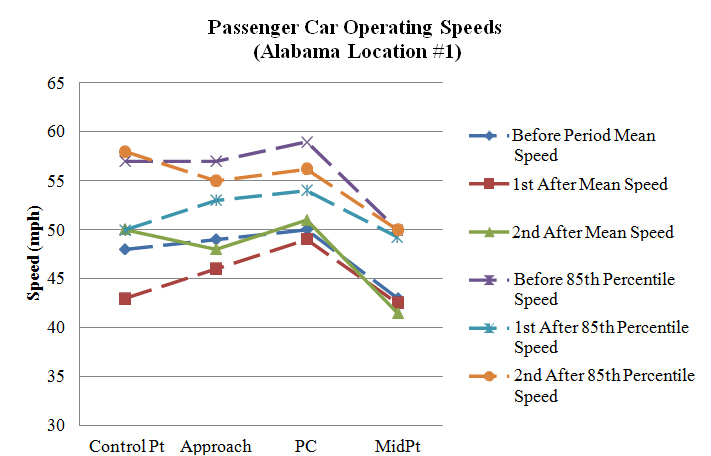
Figure 105. Graph. Operating speeds comparison at Alabama Location #1 (PSL = 55 mph).
Alabama Location #2
As table 65 shows, in the first after period at Alabama Location #2, operating speeds remained the same for most metrics. The only significant change at the control point was unopposed passenger car speeds decreased by approximately 1.1 mph. Speeds at the approach increased for the following speed metrics: all observations, passenger cars, and opposed passenger cars, with speed increases of 1.0, 1.1, and 2.4 mph, respectively. There were no significant speed changes at the PC. Speeds at the curve midpoint significantly increased for the following speed metrics: all observations, passenger cars, daytime passenger cars, and opposed passenger cars, with speed increases of approximately 1.0, 1.1, 1.9, and 3.4 mph, respectively. After installing the OSBs, speeds significantly increased at the curve midpoint during the first after period, but most of the speed increases were not practically significant.
The speed changes that occurred in the first after period continued through the second after period, and speeds in the second after period were similar to the first after period. The only significant change at the control point was opposed passenger car speeds increased by approximately 2.1 mph. Speeds at the approach increased for the same speed metrics as in the first after period: all observations, passenger cars, and opposed passenger cars, with speed increases of approximately 1.0, 0.9, and 3.5 mph, respectively. There were no significant speed changes at the PC. Speeds increased at the curve midpoint for the following speed metrics: all observations, daytime passenger cars, and opposed passenger cars, with speed increases of approximately 5.6, 1.5, and 3.0 mph, respectively. However, if the speed increase at the control point was taken into account, the speed increase at the curve midpoint for opposed passenger cars was no longer significant. Speeds significantly increased for several speed metrics in both after periods at the curve midpoint, but many speed metrics did not increase.
Table 65. Before-after operating speeds at Alabama Location #2.
| Speed Metric | Control Point Speed | Control Point SD | Approach Speed | Approach SD | PC Speed | PC SD | Mid Speed | Mid SD | N1 | N2 | N3 |
| All observations before | 49.269 |
7.604 |
44.291 |
5.822 |
42.472 |
5.747 |
38.363 |
7.094 |
398 | 290 | 358 |
| All observations 1st after | 48.843 |
6.991 |
45.328 |
5.034 |
42.245 |
4.882 |
39.310 |
5.429 |
470 | 413 | 462 |
| All observations 2nd after | 49.374 |
6.823 |
45.335 |
5.407 |
43.163 |
5.419 |
43.949 |
6.719 |
495 | 307 | 316 |
| Passenger cars before | 49.569 |
7.238 |
44.479 |
5.623 |
42.630 |
5.554 |
38.418 |
7.129 |
376 | 273 | 336 |
| Passenger cars 1st after | 49.039 |
6.984 |
45.549 |
4.977 |
42.552 |
4.742 |
39.556 |
5.325 |
439 | 386 | 432 |
| Passenger cars 2nd after | 49.472 |
6.787 |
45.413 |
5.181 |
43.192 |
5.263 |
39.003 |
5.624 |
632 | 499 | 585 |
| Heavy trucks before | 44.136 |
11.319 |
41.091 |
8.053 |
39.941 |
8.050 |
37.091 |
6.560 |
22 | 17 | 22 |
| Heavy trucks 1st after | 46.065 |
6.582 |
42.194 |
4.861 |
37.852 |
4.825 |
35.767 |
5.764 |
31 | 27 | 30 |
| Heavy trucks 2nd after | 46.429 |
7.386 |
43.000 |
10.015 |
42.200 |
9.466 |
37.111 |
8.345 |
21 | 15 | 18 |
| Daytime passenger cars before | 49.884 |
8.070 |
45.072 |
5.722 |
43.263 |
5.737 |
37.821 |
7.802 |
138 | 99 | 122 |
| Daytime passenger cars 1st after | 49.302 |
6.916 |
45.764 |
4.782 |
42.782 |
4.626 |
39.770 |
5.158 |
318 | 280 | 313 |
| Daytime passenger cars 2nd after | 49.584 |
6.915 |
45.776 |
5.031 |
43.692 |
5.102 |
39.381 |
5.647 |
375 | 295 | 344 |
| Nighttime passenger cars before | 49.387 |
6.721 |
44.134 |
5.548 |
42.270 |
5.432 |
38.762 |
6.720 |
238 | 174 | 214 |
| Nighttime passenger cars 1st after | 48.347 |
7.143 |
44.983 |
5.437 |
41.943 |
5.008 |
38.992 |
5.725 |
121 | 106 | 119 |
| Nighttime passenger cars 2nd after | 49.307 |
6.607 |
44.883 |
5.359 |
42.471 |
5.419 |
38.465 |
5.557 |
257 | 204 | 241 |
| Opposed passenger cars before | 47.809 |
7.949 |
43.022 |
6.312 |
41.721 |
5.057 |
36.378 |
7.241 |
89 | 61 | 82 |
| Opposed passenger cars 1st after | 49.026 |
6.713 |
45.421 |
4.674 |
42.338 |
5.027 |
39.787 |
5.602 |
76 | 68 | 75 |
| Opposed passenger cars 2nd after | 49.918 |
6.386 |
46.541 |
4.829 |
44.012 |
4.633 |
39.337 |
5.721 |
98 | 81 | 92 |
| Unopposed passenger cars before | 50.115 |
6.928 |
44.930 |
5.323 |
42.892 |
5.674 |
39.075 |
6.976 |
287 | 212 | 254 |
| Unopposed passenger cars 1st after | 49.041 |
7.048 |
45.576 |
5.044 |
42.597 |
4.686 |
39.507 |
5.272 |
363 | 318 | 357 |
| Unopposed passenger cars 2nd after | 49.390 |
6.861 |
45.206 |
5.221 |
43.033 |
5.367 |
38.941 |
5.609 |
534 | 418 | 493 |
Bold indicates significance at the 95-percent confidence level (α=0.05) between the 1st/2nd after period and before
period
Italics indicates significance at the 95-percent confidence level (α=0.05) between the 1st and 2nd after periods
SD = Standard Deviation
PC = Point of Curvature
N1 = Number of observations at the control point and approach
N2 = Number of observations at the PC
N3 = Number of observations at the midpoint
Figure 106 shows a graphical representation of the speed profiles for Alabama Location #2. The general shape of the speed profiles for the three collection periods remained relatively similar.
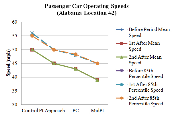
Figure 106. Graph. Operating speeds comparison at Alabama Location #2 (PSL = 55 mph).
Alabama Location #3
As table 66 shows, in the first after period at Alabama Location #3, operating speeds changed for many speed metrics. As in the before period, operating speeds at the control point were high. It was originally thought that a sensor malfunction caused these high speed measurements, but these high speeds persisted through all three time periods. Speeds at the control point increased for all speed metrics, except nighttime passenger cars. These speed increases were between 2.5and 3.4 mph. Speeds at the approach decreased for all speed metrics, except nighttime passenger cars and opposed passenger cars. These speed decreases were between approximately 1.0 and 3.0 mph. The only change at the PC was passenger car speeds, which increased by approximately 0.6 mph. Speeds at the curve midpoint decreased for all speed metrics, except heavy trucks. These speed reductions were between approximately 1.9 and 2.8 mph. Speeds at the curve midpoint were slightly lower immediately after the OSBs were installed.
Most of the changes in speeds from the first after period did not persist through the second after period. Speeds at the control point increased for all speed metrics, with speed increases between approximately 2.0 and 3.5 mph. Speeds at the approach remained the same, except all observations decreased by approximately 0.6 mph. There were no significant speed changes at the PC. Speeds at the curve midpoint increased from the first after period and returned closer to the before period. There were no significant speed changes at the curve midpoint.
Speeds slightly decreased at the curve midpoint immediately after installing the OSBs, but the decrease was not maintained through the second after period.
Table 66. Before-after operating speeds at Alabama Location #3.
| Speed Metric | Control Point Speed | Control Point SD | Approach Speed | Approach SD | PC Speed | PC SD | Mid Speed | Mid SD | N1 | N2 | N3 |
| All observations before | 65.253 |
12.908 |
49.831 |
6.463 |
41.307 |
4.663 |
41.233 |
5.914 |
498 | 472 | 472 |
| All observations 1st after | 67.813 |
11.357 |
48.246 |
5.062 |
41.365 |
4.737 |
38.677 |
6.919 |
513 | 493 | 511 |
| All observations 2nd after | 68.027 |
11.822 |
49.208 |
5.335 |
41.622 |
4.770 |
41.085 |
6.888 |
960 | 891 | 879 |
| Passenger cars before | 65.520 |
13.004 |
50.000 |
6.522 |
41.629 |
4.652 |
41.740 |
5.683 |
440 | 415 | 415 |
| Passenger cars 1st after | 68.215 |
11.509 |
49.018 |
4.728 |
42.239 |
4.371 |
39.085 |
7.219 |
400 | 381 | 398 |
| Passenger cars 2nd after | 68.302 |
11.785 |
49.606 |
5.297 |
42.065 |
4.712 |
41.571 |
6.823 |
819 | 752 | 748 |
| Heavy trucks before | 63.224 |
12.070 |
48.552 |
5.891 |
38.965 |
4.066 |
37.544 |
6.299 |
58 | 57 | 57 |
| Heavy trucks 1st after | 66.389 |
10.732 |
45.513 |
5.276 |
38.393 |
4.748 |
37.239 |
5.534 |
113 | 112 | 113 |
| Heavy trucks 2nd after | 66.433 |
11.955 |
46.901 |
4.969 |
39.223 |
4.366 |
38.313 |
6.618 |
141 | 139 | 131 |
| Daytime passenger cars before | 66.424 |
12.482 |
50.549 |
6.973 |
41.923 |
4.682 |
41.689 |
5.979 |
264 | 246 | 251 |
| Daytime passenger cars 1st after | 68.880 |
11.622 |
49.098 |
4.733 |
42.278 |
4.364 |
38.861 |
7.470 |
317 | 302 | 316 |
| Daytime passenger cars 2nd after | 69.931 |
11.578 |
50.006 |
5.282 |
42.450 |
4.634 |
41.924 |
6.831 |
466 | 436 | 432 |
| Nighttime passenger cars before | 64.165 |
13.675 |
49.176 |
5.702 |
41.201 |
4.589 |
41.817 |
5.214 |
176 | 169 | 164 |
| Nighttime passenger cars 1st after | 65.675 |
10.759 |
48.711 |
4.725 |
42.089 |
4.421 |
39.951 |
6.118 |
83 | 79 | 82 |
| Nighttime passenger cars 2nd after | 66.150 |
11.726 |
49.076 |
5.278 |
41.535 |
4.774 |
41.089 |
6.793 |
353 | 316 | 316 |
| Opposed passenger cars before | 65.516 |
13.031 |
49.979 |
6.684 |
41.423 |
5.063 |
41.928 |
6.036 |
188 | 175 | 180 |
| Opposed passenger cars 1st after | 68.953 |
11.438 |
48.929 |
5.002 |
41.900 |
4.482 |
39.318 |
6.634 |
85 | 80 | 85 |
| Opposed passenger cars 2nd after | 68.935 |
12.198 |
49.245 |
5.109 |
41.894 |
4.961 |
42.335 |
7.003 |
200 | 180 | 185 |
| Unopposed passenger cars before | 65.524 |
13.010 |
50.016 |
6.413 |
41.779 |
4.332 |
41.596 |
5.405 |
252 | 240 | 235 |
| Unopposed passenger cars 1st after | 68.016 |
11.538 |
49.041 |
4.659 |
42.329 |
4.344 |
39.022 |
7.378 |
315 | 301 | 313 |
| Unopposed passenger cars 2nd after | 68.097 |
11.651 |
49.722 |
5.355 |
42.119 |
4.634 |
41.320 |
6.751 |
619 | 572 | 563 |
Bold indicates significance at the 95-percent confidence level (α=0.05) between the 1st/2nd after period and before
period
Italics indicates significance at the 95-percent confidence level (α=0.05) between the 1st and 2nd after periods
SD = Standard Deviation
PC = Point of Curvature
N1 = Number of observations at the control point and approach
N2 = Number of observations at the PC
N3 = Number of observations at the midpoint
Figure 107 shows a graphical representation of the speed profiles for Alabama Location #3. The general shape of the speed profiles for the three collection periods remained relatively similar.
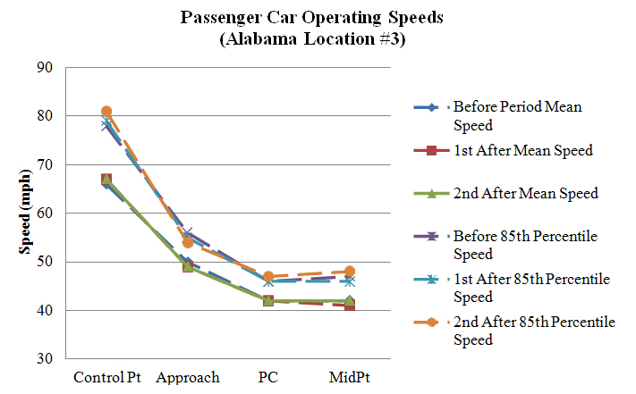
Figure 107. Graph. Operating speeds comparison at Alabama Location #3 (PSL = 55 mph).
Alabama Location #4
As Table 67 shows, in the first after period at Alabama Location #4, operating speeds decreased for many speed metrics. There was a significant decrease at the control point for all measured speed metrics. Speed decreases were between approximately 1.6 and 3.3 mph for passenger cars and 5.3 mph for heavy trucks. There was a significant decrease at the approach for all speed metrics, except heavy trucks and opposed passenger cars. These speed decreases were all approximately 1.5 mph. However, if the decrease in speed at the control point was taken into account, the speed decreases at the approach were no longer significant. There was a significant decrease at the PC for all measured speed metrics, except heavy trucks. Speed decreases were between 2.0and 2.5 mph. However, if the speed decreases at the control point were taken into account, the only speed decrease at the PC that was significant was for daytime passenger cars, and nighttime speeds actually increase slightly. Speeds were also significantly lower at the curve midpoint for all measured speed metrics. However, if the speed decreases at the control point were taken into account, none of the speed decreases at the curve midpoint were significant. Overall, installing the OSBs did not have an effect on operating speeds in the first after period.
Most of the speed changes in the first after period were no longer present in the second after period. Speeds at the control point were closer to speeds in the before period, and there were no significant speed changes. Speeds at the approach were also closer to speeds in the before period, and there were no significant speed changes, except daytime passenger speeds increased by approximately 1.1 mph. Speeds at the PC significantly decreased for the following speed metrics: all observations, passenger cars, and opposed passenger cars, with speed decreases of approximately 0.6, 0.7, and 1.2 mph, respectively. Speeds at the curve midpoint did not significantly change, except nighttime speeds were approximately 1.5 mph lower.
Speeds slightly decreased at the curve midpoint after installing the OSBs, but the decrease was not maintained through the second after period.
Table 67. Before-after operating speeds at Alabama Location #4.
| Speed Metric | Control Point Speed | Control Point SD | Approach Speed | Approach SD | PC Speed | PC SD | Mid Speed | Mid SD | N1 | N2 | N3 |
| All observations before | 50.761 |
9.466 |
46.666 |
7.082 |
39.091 |
4.939 |
34.664 |
8.205 |
494 | 471 | 455 |
| All observations 1st after | 48.515 |
8.022 |
45.152 |
5.409 |
36.891 |
4.357 |
31.938 |
6.086 |
513 | 512 | 513 |
| All observations 2nd after | 50.322 |
7.655 |
47.172 |
6.128 |
38.469 |
4.754 |
34.433 |
8.094 |
615 | 603 | 564 |
| Passenger cars before | 50.633 |
9.369 |
46.703 |
7.019 |
39.153 |
4.883 |
34.506 |
8.197 |
472 | 452 | 437 |
| Passenger cars 1st after | 48.541 |
7.986 |
45.242 |
5.431 |
37.000 |
4.330 |
31.819 |
6.162 |
475 | 474 | 475 |
| Passenger cars 2nd after | 50.381 |
7.664 |
47.155 |
6.038 |
38.455 |
4.709 |
34.434 |
8.125 |
582 | 571 | 535 |
| Heavy trucks before | 53.500 |
11.237 |
45.864 |
8.481 |
37.632 |
6.103 |
38.500 |
7.649 |
22 | 19 | 18 |
| Heavy trucks 1st after | 48.184 |
8.561 |
44.026 |
5.059 |
35.526 |
4.519 |
33.421 |
4.864 |
38 | 38 | 38 |
| Heavy trucks 2nd after | 49.273 |
7.543 |
47.485 |
7.649 |
38.719 |
5.566 |
34.414 |
7.623 |
33 | 32 | 29 |
| Daytime passenger cars before | 50.588 |
9.045 |
46.631 |
7.464 |
39.528 |
5.023 |
33.861 |
8.062 |
187 | 176 | 173 |
| Daytime passenger cars 1st after | 48.966 |
8.241 |
45.564 |
5.389 |
37.020 |
4.325 |
31.969 |
5.975 |
351 | 350 | 351 |
| Daytime passenger cars 2nd after | 50.324 |
7.331 |
47.770 |
6.113 |
38.953 |
4.793 |
35.084 |
8.230 |
343 | 338 | 320 |
| Nighttime passenger cars before | 50.663 |
9.592 |
46.751 |
6.723 |
38.913 |
4.786 |
34.928 |
8.273 |
285 | 276 | 264 |
| Nighttime passenger cars 1st after | 47.339 |
7.111 |
44.331 |
5.466 |
36.944 |
4.362 |
31.395 |
6.668 |
124 | 124 | 124 |
| Nighttime passenger cars 2nd after | 50.464 |
8.132 |
46.272 |
5.829 |
37.734 |
4.499 |
33.465 |
7.887 |
239 | 233 | 215 |
| Opposed passenger cars before | 50.886 |
9.349 |
46.429 |
8.484 |
39.141 |
5.234 |
34.328 |
8.582 |
140 | 128 | 125 |
| Opposed passenger cars 1st after | 49.156 |
8.039 |
45.227 |
5.317 |
36.836 |
4.814 |
31.953 |
6.551 |
128 | 128 | 128 |
| Opposed passenger cars 2nd after | 51.089 |
7.337 |
47.274 |
6.375 |
37.910 |
4.802 |
34.535 |
8.608 |
124 | 122 | 114 |
| Unopposed passenger cars before | 50.527 |
9.390 |
46.819 |
6.311 |
39.157 |
4.746 |
34.577 |
8.051 |
332 | 324 | 312 |
| Unopposed passenger cars 1st after | 48.314 |
7.966 |
45.248 |
5.480 |
37.061 |
4.143 |
31.769 |
6.021 |
347 | 346 | 347 |
| Unopposed passenger cars 2nd after | 50.190 |
7.746 |
47.122 |
5.950 |
38.604 |
4.678 |
34.406 |
8.000 |
458 | 449 | 421 |
Bold indicates significance at the 95-percent confidence level (α=0.05) between the 1st/2nd after period and before
period
Italics indicates significance at the 95-percent confidence level (α=0.05) between the 1st and 2nd after periods
SD = Standard Deviation
PC = Point of Curvature
N1 = Number of observations at the control point and approach
N2 = Number of observations at the PC
N3 = Number of observations at the midpoint
Figure 108 shows a graphical representation of the speed profiles for Alabama Location #4. The general shape of the speed profiles for the three collection periods remained relatively similar.
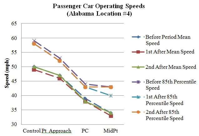
Figure 108. Graph. Operating speeds comparison at Alabama Location #4 (PSL = 35 mph).
Alabama Location #5
As table 68 shows, in the first after period at Alabama Location #5, operating speeds changed for several speed metrics. There were no significant speed changes at the control point or approach. Speeds at the PC significantly decreased for the following speed metrics: all observations, passenger cars, and unopposed passenger cars, with speed decreases of approximately
2.2, 2.1, and 2.9 mph, respectively. Speeds for opposed passenger cars significantly increased by approximately 5.4 mph. Speeds at the curve midpoint significantly increased for all speed metrics, except heavy trucks. These speed increases were between approximately 4.2 and 7.8mph. Speeds at the PC significantly decreased after the installation of the OSBs, but vehicles maintained a more constant speed throughout the curve, and speeds increased at the curve midpoint.
The speed changes that occurred in the first after period continued through the second after period, and speeds in the second after period were similar to the first after period. There were no significant speed changes at the control point or approach. Speeds at the PC significantly decreased for the following speed metrics: all observations, passenger cars, heavy trucks, and unopposed passenger cars, with speed decreases of approximately 1.9, 1.8, 5.2, 1.7, and 2.6 mph. Speeds for opposed passenger cars significantly increased by approximately 6.5 mph. Speeds at the curve midpoint significantly increased for all speed metrics. Speed increases were between approximately 3.6 and 8.5 mph for passenger cars and 7.8 mph for heavy trucks.
Installing the OSBs decreased operating speeds at the PC during both after periods between approximately 1.7 and 2.9 mph for passenger cars, while speeds at the curve midpoint increased during both after periods between approximately 3.6 and 8.5 mph.
Table 68. Before-after operating speeds at Alabama Location #5.
| Speed Metric | Control Point Speed | Control Point SD | Approach Speed | Approach SD | PC Speed | PC SD | Mid Speed | Mid SD | N1 | N2 | N3 |
| All observations before | 41.944 |
7.212 |
43.742 |
8.327 |
45.781 |
7.524 |
39.810 |
6.842 |
233 | 64 | 221 |
| All observations 1st after | 41.467 |
7.184 |
43.170 |
7.194 |
43.636 |
6.437 |
44.182 |
7.264 |
353 | 236 | 242 |
| All observations 2nd after | 41.889 |
7.277 |
43.069 |
7.426 |
43.847 |
6.047 |
43.949 |
6.719 |
495 | 307 | 316 |
| Passenger cars before | 42.299 |
7.094 |
44.054 |
8.250 |
45.794 |
7.584 |
40.028 |
6.782 |
224 | 63 | 212 |
| Passenger cars 1st after | 41.851 |
7.086 |
43.460 |
7.037 |
43.689 |
6.435 |
44.384 |
7.164 |
335 | 222 | 232 |
| Passenger cars 2nd after | 42.185 |
7.110 |
43.344 |
7.168 |
44.024 |
5.960 |
44.020 |
6.672 |
471 | 294 | 302 |
| Heavy trucks before | 33.111 |
3.822 |
36.000 |
6.614 |
45.000 |
0.000 |
34.667 |
6.557 |
9 | 1 | 9 |
| Heavy trucks 1st after | 34.333 |
5.018 |
37.778 |
8.128 |
42.786 |
6.647 |
39.500 |
8.383 |
18 | 14 | 10 |
| Heavy trucks 2nd after | 36.083 |
8.214 |
37.667 |
10.120 |
39.846 |
6.842 |
42.429 |
7.773 |
24 | 13 | 14 |
| Daytime passenger cars before | 41.947 |
6.887 |
44.405 |
7.941 |
45.619 |
7.450 |
39.787 |
6.772 |
131 | 42 | 122 |
| Daytime passenger cars 1st after | 41.644 |
6.846 |
43.222 |
7.071 |
43.668 |
6.212 |
44.273 |
7.151 |
284 | 193 | 198 |
| Daytime passenger cars 2nd after | 42.272 |
6.988 |
43.276 |
7.003 |
43.921 |
6.131 |
43.858 |
7.030 |
301 | 190 | 204 |
| Nighttime passenger cars before | 42.796 |
7.383 |
43.559 |
8.686 |
46.143 |
8.021 |
40.356 |
6.821 |
93 | 21 | 90 |
| Nighttime passenger cars 1st after | 43.000 |
8.280 |
44.784 |
6.763 |
43.828 |
7.888 |
45.029 |
7.309 |
51 | 29 | 34 |
| Nighttime passenger cars 2nd after | 42.029 |
7.340 |
43.465 |
7.471 |
44.212 |
5.660 |
44.357 |
5.877 |
170 | 104 | 98 |
| Opposed passenger cars before | 40.235 |
7.242 |
41.353 |
11.045 |
38.833 |
7.333 |
34.933 |
7.045 |
17 | 6 | 15 |
| Opposed passenger cars 1st after | 41.905 |
9.286 |
42.762 |
8.630 |
44.200 |
6.609 |
42.692 |
6.851 |
42 | 30 | 26 |
| Opposed passenger cars 2nd after | 41.867 |
10.281 |
44.567 |
8.063 |
45.294 |
5.828 |
43.389 |
5.782 |
30 | 17 | 18 |
| Unopposed passenger cars before | 42.469 |
7.072 |
44.275 |
7.972 |
46.526 |
7.290 |
40.416 |
6.621 |
207 | 57 | 197 |
| Unopposed passenger cars 1st after | 41.843 |
6.733 |
43.560 |
6.790 |
43.609 |
6.421 |
44.597 |
7.190 |
293 | 192 | 206 |
| Unopposed passenger cars 2nd after | 42.206 |
6.858 |
43.261 |
7.106 |
43.946 |
5.970 |
44.060 |
6.732 |
441 | 277 | 284 |
Bold indicates significance at the 95-percent confidence level (α=0.05) between the 1st/2nd after period and before
period
Italics indicates significance at the 95-percent confidence level (α=0.05) between the 1st and 2nd after periods
SD = Standard Deviation
PC = Point of Curvature
N1 = Number of observations at the control point and approach
N2 = Number of observations at the PC
N3 = Number of observations at the midpoint
Figure 109 shows a graphical representation of the speed profiles for Alabama Location #5. The PC mean operating speeds decreased in the two after periods while the midpoint speeds increased. The midpoint 85th percentile speeds increased in the two after periods.
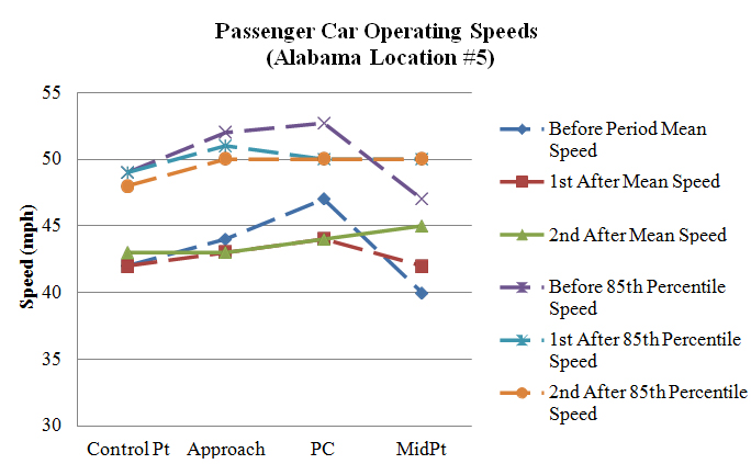
Figure 109. Graph. Operating speeds comparison at Alabama Location #5 (PSL = 40 mph).
Alabama Location #6
As table 69 shows, in the first after period at Alabama Location #6, operating speeds decreased for many speed metrics. There was a significant decrease at the control point for the following speed metrics: all observations, passenger cars, nighttime passenger cars, and unopposed passenger cars, with speed decreases of approximately 2.0, 2.0, 4.4, and 2.2 mph, respectively. There was a significant increase at the approach for all speed metrics. These increases ranged from approximately 8.3 to 9.5 mph for passenger cars. However, these increased speeds were not maintained, and speeds at the PC significantly decreased for the following speed metrics: all observations, passenger cars, heavy trucks, and unopposed passenger cars, with speed decreases of approximately 1.6, 1.4, 4.4, and 1.8 mph, respectively. Speeds were also significantly lower at the curve midpoint for all passenger car speed metrics. These speed reductions were approximately 3.9 to 8.8 mph. Speeds throughout the curve decreased between 1.4 and 8.8 mph at this site after installing the OSBs.
In the second after period, there were several additional significant changes between the before and second after period and between the two after periods. Speeds generally remained the same at the control point. Only all observations and heavy trucks had a significant reduction in speeds, with speed reductions of approximately 1.3 and 7.0 mph, respectively. Speeds at the approach were lower than in the first after period, but they were still significantly higher in the second after period for the following speed metrics: all observations, passenger cars, nighttime passenger cars, and opposed passenger cars, with speed increases of approximately 1.3, 1.2, 1.9, and 4.3 mph, respectively. Despite these significant increases at the approach, the speeds at the PC remained constant from the before to second after period with the exception of nighttime passenger cars. There was a significant increase of approximately 2.9 mph; however, after accounting for the speed increase at the approach, this increase was no longer significant. Speeds increased slightly at the curve midpoint in the second after period when compared with the first after period for several speed metrics, but speeds were lower than the before period for all speed metrics. These speed reductions were approximately 3.2 to 4.75 mph.
Overall, the OSBs significantly reduced speeds at the curve midpoint in both the first and second after periods.
Table 69. Before-after operating speeds at Alabama Location #6.
| Speed Metric | Control Point Speed | Control Point SD | Approach Speed | Approach SD | PC Speed | PC SD | Mid Speed | Mid SD | N1 | N2 | N3 |
| All observations before | 43.413 |
9.211 |
45.102 |
7.201 |
46.442 |
6.431 |
45.495 |
7.111 |
196 |
86 |
97 |
| All observations 1st after | 41.382 |
9.064 |
54.627 |
8.674 |
44.879 |
6.628 |
40.780 |
7.109 |
220 |
190 |
205 |
| All observations 2nd after | 42.082 |
10.108 |
46.412 |
7.360 |
47.644 |
7.706 |
41.762 |
7.679 |
478 |
104 |
433 |
| Passenger cars before | 43.399 |
9.294 |
45.426 |
6.939 |
46.447 |
6.469 |
45.613 |
7.199 |
188 |
85 |
93 |
| Passenger cars 1st after | 41.371 |
9.028 |
54.709 |
8.760 |
45.005 |
6.642 |
40.848 |
7.159 |
213 |
183 |
198 |
| Passenger cars 2nd after | 42.326 |
10.069 |
46.652 |
7.339 |
47.859 |
7.775 |
41.925 |
7.674 |
457 |
99 |
415 |
| Heavy trucks before | 43.750 |
7.498 |
37.500 |
9.457 |
46.000 |
0.000 |
42.750 |
4.272 |
8 |
1 |
4 |
| Heavy trucks 1st after | 41.714 |
10.889 |
52.143 |
5.242 |
41.571 |
5.682 |
38.857 |
5.581 |
7 |
7 |
7 |
| Heavy trucks 2nd after | 36.762 |
9.705 |
41.190 |
5.828 |
43.400 |
4.930 |
38.000 |
6.979 |
21 |
5 |
18 |
| Daytime passenger cars before | 43.504 |
9.135 |
45.434 |
6.731 |
46.586 |
6.489 |
45.032 |
7.759 |
129 |
58 |
62 |
| Daytime passenger cars 1st after | 41.937 |
8.633 |
54.931 |
8.493 |
45.219 |
6.581 |
40.810 |
7.160 |
175 |
151 |
163 |
| Daytime passenger cars 2nd after | 42.604 |
9.832 |
46.247 |
7.189 |
46.725 |
7.582 |
41.664 |
7.769 |
283 |
51 |
253 |
| Nighttime passenger cars before | 43.169 |
9.708 |
45.407 |
7.433 |
46.148 |
6.538 |
46.774 |
5.869 |
59 |
27 |
31 |
| Nighttime passenger cars 1st after | 38.763 |
10.393 |
53.684 |
9.957 |
44.000 |
6.942 |
41.029 |
7.258 |
38 |
32 |
35 |
| Nighttime passenger cars 2nd after | 41.874 |
10.455 |
47.310 |
7.552 |
49.063 |
7.875 |
42.333 |
7.530 |
174 |
48 |
162 |
| Opposed passenger cars before | 41.056 |
7.565 |
42.944 |
10.067 |
43.400 |
4.881 |
46.750 |
4.070 |
18 |
10 |
12 |
| Opposed passenger cars 1st after | 40.273 |
10.612 |
52.545 |
6.743 |
43.545 |
6.362 |
37.909 |
7.368 |
11 |
11 |
11 |
| Opposed passenger cars 2nd after | 42.824 |
11.301 |
47.235 |
6.602 |
44.800 |
6.301 |
43.605 |
6.670 |
51 |
5 |
43 |
| Unopposed passenger cars before | 43.647 |
9.443 |
45.688 |
6.508 |
46.853 |
6.571 |
45.444 |
7.556 |
170 |
75 |
81 |
| Unopposed passenger cars 1st after | 41.431 |
8.961 |
54.827 |
8.855 |
45.099 |
6.666 |
41.021 |
7.129 |
202 |
172 |
187 |
| Unopposed passenger cars 2nd after | 42.264 |
9.917 |
46.579 |
7.431 |
48.021 |
7.840 |
41.731 |
7.767 |
406 |
94 |
372 |
Bold indicates significance at the 95-percent confidence level (α=0.05) between the 1st/2nd after period and before
period
Italics indicates significance at the 95-percent confidence level (α=0.05) between the 1st and 2nd after periods
SD = Standard Deviation
PC = Point of Curvature
N1 = Number of observations at the control point and approach
N2 = Number of observations at the PC
N3 = Number of observations at the midpoint
Figure 110 shows a graphical representation of the speed profiles for Alabama Location #6. The general shape of the speed profiles for the three collection periods remained relatively similar.
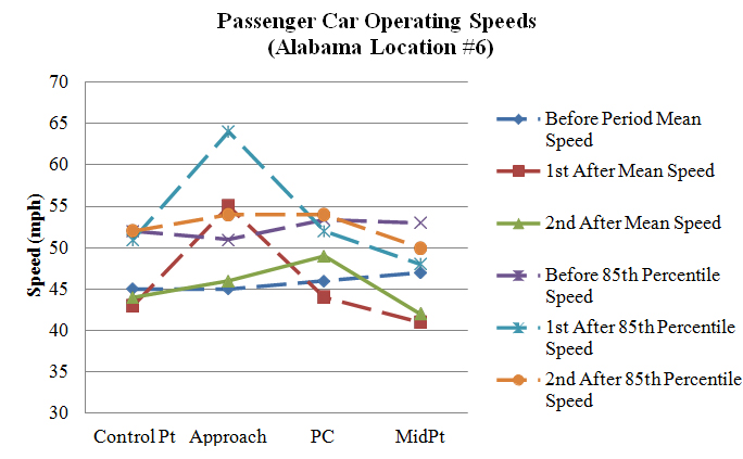
Figure 110. Graph. Operating speeds comparison at Alabama Location #6 (PSL = 40 mph).
Alabama Location #7
As table 70 shows, in the first after period at Alabama Location #7, operating speeds changed for many speed metrics. The only significant change at the control point was heavy truck speeds, which decreased by approximately 6.0 mph. Speeds at the approach decreased for all measured speed metrics. These speed decreases were between approximately 2.2 and 2.9 mph for passenger cars and 5.6 mph for heavy trucks. However, if the speed decrease at the control point was taken into account, this speed decrease was no longer significant. Speeds at the PC significantly decreased for the following speed metrics: all observations, passenger cars, daytime passenger cars, opposed passenger cars, and unopposed passenger cars. Speed decreases were practically insignificant, with speed decreases between approximately 0.7 and 1.3 mph. Speeds at the curve midpoint significantly decreased for all measured speed metrics. These speed decreases were between approximately 2.8 and 3.6 mph for passenger cars. Speeds for heavy trucks decreased by approximately 7.3 mph. However, if the speed decrease at the control point was taken into account, this speed decrease was no longer significant. After installing the OSBs, speeds initially decreased through the curve.
Many of the changes in the first after period were also present in the second after period. There were no significant speed changes at the control point. Speeds at the approach increased from the first after period, but speeds were still significantly lower than the before period for all speed metrics, except heavy trucks. Speed decreases were between approximately 1.4 and 1.7 mph. Speeds at the PC were similar to speeds in the first after period and were significantly lower for all passenger car speed metrics, except opposed passenger cars. These speed decreases were small, with decreases between approximately 0.8 and 1.2 mph. Passenger car speeds at the curve midpoint increased from the first after period, but they were all still lower than the before period, except opposed passenger car speeds were not significantly lower. These speed decreases were between approximately 1.2 and 1.9 mph.
Overall, speeds decreased at the approach, PC, and curve midpoint after the installation of the OSBs. However, these speed decreases were not practically significant.
Table 70. Before-after operating speeds at Alabama Location #7.
| Speed Metric | Control Point Speed | Control Point SD | Approach Speed | Approach SD | PC Speed | PC SD | Mid Speed | Mid SD | N1 | N2 | N3 |
| All Observations before | 53.159 |
9.499 |
43.648 |
5.400 |
36.950 |
4.293 |
38.819 |
5.257 |
429 |
422 |
419 |
| All Observations 1st after | 52.538 |
9.914 |
41.247 |
5.013 |
36.176 |
4.156 |
35.527 |
4.771 |
580 |
574 |
579 |
| All Observations 2nd after | 53.113 |
9.203 |
42.260 |
5.270 |
36.148 |
4.034 |
37.234 |
5.337 |
795 |
764 |
745 |
| Passenger cars before | 53.036 |
9.497 |
43.635 |
5.391 |
36.971 |
4.310 |
38.768 |
5.230 |
419 |
412 |
409 |
| Passenger cars 1st after | 52.546 |
9.918 |
41.341 |
4.992 |
36.249 |
4.150 |
35.594 |
4.777 |
560 |
554 |
559 |
| Passenger cars 2nd after | 53.127 |
9.141 |
42.285 |
5.234 |
36.164 |
4.048 |
37.225 |
5.259 |
780 |
751 |
730 |
| Heavy trucks before | 58.300 |
8.433 |
44.200 |
6.033 |
36.100 |
3.604 |
40.900 |
6.208 |
10 |
10 |
10 |
| Heavy trucks 1st after | 52.300 |
10.069 |
38.600 |
5.020 |
34.150 |
3.884 |
33.650 |
4.320 |
20 |
20 |
20 |
| Heavy trucks 2nd after | 52.400 |
12.362 |
41.000 |
7.000 |
35.231 |
3.059 |
37.667 |
8.566 |
15 |
13 |
15 |
| Daytime passenger cars before | 53.408 |
8.731 |
44.387 |
5.235 |
37.646 |
4.548 |
39.175 |
5.316 |
191 |
189 |
189 |
| Daytime passenger cars 1st after | 52.361 |
9.748 |
41.537 |
5.062 |
36.360 |
4.189 |
35.566 |
4.962 |
402 |
397 |
401 |
| Daytime passenger cars 2nd after | 53.165 |
9.232 |
42.644 |
5.289 |
36.448 |
4.154 |
37.260 |
5.336 |
514 |
500 |
481 |
| Nighttime passenger cars before | 52.724 |
10.104 |
43.004 |
5.450 |
36.399 |
4.020 |
38.418 |
5.141 |
228 |
223 |
220 |
| Nighttime passenger cars 1st after | 53.019 |
10.354 |
40.842 |
4.788 |
35.968 |
4.048 |
35.665 |
4.284 |
158 |
157 |
158 |
| Nighttime passenger cars 2nd after | 53.053 |
8.980 |
41.590 |
5.065 |
35.598 |
3.773 |
37.157 |
5.118 |
266 |
251 |
249 |
| Opposed passenger cars before | 52.148 |
8.668 |
43.241 |
5.701 |
36.657 |
4.310 |
38.355 |
4.989 |
108 |
105 |
107 |
| Opposed passenger cars 1st after | 51.773 |
10.502 |
41.000 |
4.558 |
35.625 |
3.671 |
35.042 |
4.632 |
97 |
96 |
96 |
| Opposed passenger cars 2nd after | 53.025 |
8.605 |
41.893 |
5.107 |
36.182 |
3.870 |
37.514 |
4.969 |
159 |
154 |
148 |
| Unopposed passenger cars before | 53.344 |
9.763 |
43.772 |
5.282 |
37.078 |
4.312 |
38.914 |
5.313 |
311 |
307 |
302 |
| Unopposed passenger cars 1st after | 52.708 |
9.795 |
41.413 |
5.079 |
36.380 |
4.235 |
35.708 |
4.803 |
463 |
458 |
463 |
| Unopposed passenger cars 2nd after | 53.153 |
9.280 |
42.385 |
5.266 |
36.159 |
4.096 |
37.151 |
5.332 |
621 |
597 |
582 |
Bold indicates significance at the 95-percent confidence level (α=0.05) between the 1st/2nd after period and before
period
Italics indicates significance at the 95-percent confidence level (α=0.05) between the 1st and 2nd after periods
SD = Standard Deviation
PC = Point of Curvature
N1 = Number of observations at the control point and approach
N2 = Number of observations at the PC
N3 = Number of observations at the midpoint
Figure 111 shows a graphical representation of the speed profiles for Alabama Location #7. The general shape of the speed profiles for the three collection periods remained relatively similar.
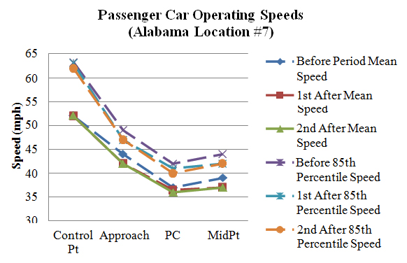
Figure 111. Graph. Operating speeds comparison at Alabama Location #7 (PSL = 35 mph).
Alabama Location #8
As table 71 shows, in the first after period at Alabama Location #8, operating speeds remained the same for most metrics. The only significant change at the control point was daytime passenger car speeds, which decreased by approximately 1.9 mph. There were no significant speed changes at the approach or PC for any speed metric. Speeds decreased at the curve midpoint for all speed metrics, except heavy trucks. The speed decreases were between approximately 2.7 and 3.5 mph. After the OSBs were installed, speeds significantly decreased at the curve midpoint during the first after period.
There were more speed changes in the second after period, but most these changes were from the first after period and not the before period. The only significant changes at the control point compared with the before period were speeds for all observations, passenger cars, and nighttime passenger cars increased, with increases of approximately 0.9, 0.9, and 1.2 mph, respectively. There were no significant speed changes at the approach when compared with the before period. Speeds did not significantly change at the PC, except heavy truck speeds increased by approximately 4.0 mph. Speeds at the curve midpoint decreased for the following speed metrics: all observations, passenger cars, daytime passenger cars, and unopposed passenger cars, with speed decreases of approximately 1.0, 1.0, 1.3, and 1.5 mph. Based on the second after period, speeds at the curve midpoint slightly decreased after applying the OSBs, but these speed reductions were not practical, with less than a 2.0-mph reduction.
Table 71. Before-after operating speeds at Alabama Location #8.
| Speed Metric | Control Point Speed | Control Point SD | Approach Speed | Approach SD | PC Speed | PC SD | Mid Speed | Mid SD | N1 | N2 | N3 |
| All observations before | 41.540 |
6.029 |
44.644 |
8.437 |
40.657 |
5.331 |
42.239 |
6.340 |
376 |
341 |
310 |
| All observations 1st after | 41.095 |
6.122 |
43.958 |
6.022 |
40.503 |
4.697 |
39.032 |
5.118 |
379 |
370 |
375 |
| All observations 2nd after | 42.467 |
5.824 |
45.129 |
6.511 |
41.091 |
4.821 |
41.275 |
6.115 |
614 |
571 |
538 |
| Passenger cars before | 41.566 |
6.053 |
44.672 |
8.317 |
40.751 |
5.334 |
42.348 |
6.349 |
366 |
333 |
302 |
| Passenger cars 1st after | 41.108 |
6.173 |
43.919 |
5.967 |
40.560 |
4.701 |
39.058 |
5.138 |
369 |
361 |
365 |
| Passenger cars 2nd after | 42.416 |
5.734 |
45.213 |
6.434 |
41.106 |
4.798 |
41.320 |
6.144 |
587 |
548 |
515 |
| Heavy trucks before | 40.600 |
5.254 |
43.600 |
12.624 |
36.750 |
3.655 |
38.125 |
4.612 |
10 |
8 |
8 |
| Heavy trucks 1st after | 40.600 |
3.978 |
45.400 |
8.072 |
38.222 |
4.116 |
38.100 |
4.458 |
10 |
9 |
10 |
| Heavy trucks 2nd after | 43.593 |
7.582 |
43.296 |
7.927 |
40.739 |
5.429 |
40.261 |
5.446 |
27 |
23 |
23 |
| Daytime passenger cars before | 43.145 |
5.833 |
44.612 |
8.251 |
40.842 |
4.928 |
42.375 |
5.922 |
165 |
146 |
136 |
| Daytime passenger cars 1st after | 41.245 |
6.185 |
43.931 |
5.902 |
40.428 |
4.732 |
38.951 |
5.148 |
306 |
299 |
303 |
| Daytime passenger cars 2nd after | 42.984 |
5.802 |
45.665 |
6.153 |
40.865 |
4.563 |
41.108 |
6.125 |
367 |
347 |
334 |
| Nighttime passenger cars before | 40.269 |
5.934 |
44.721 |
8.391 |
40.679 |
5.642 |
42.325 |
6.696 |
201 |
187 |
166 |
| Nighttime passenger cars 1st after | 40.444 |
6.117 |
43.857 |
6.319 |
41.194 |
4.533 |
39.581 |
5.101 |
63 |
63 |
62 |
| Nighttime passenger cars 2nd after | 41.468 |
5.502 |
44.459 |
6.825 |
41.522 |
5.164 |
41.713 |
6.177 |
220 |
201 |
181 |
| Opposed passenger cars before | 41.750 |
6.708 |
42.841 |
7.546 |
40.823 |
6.354 |
42.000 |
7.255 |
88 |
79 |
71 |
| Opposed passenger cars 1st after | 40.991 |
6.438 |
42.616 |
5.091 |
39.773 |
4.692 |
38.545 |
4.781 |
112 |
110 |
110 |
| Opposed passenger cars 2nd after | 42.582 |
5.029 |
45.277 |
6.065 |
40.983 |
4.497 |
42.173 |
5.403 |
184 |
177 |
168 |
| Unopposed passenger cars before | 41.507 |
5.842 |
45.252 |
8.477 |
40.728 |
4.988 |
42.455 |
6.057 |
278 |
254 |
231 |
| Unopposed passenger cars 1st after | 41.160 |
6.066 |
44.486 |
6.235 |
40.904 |
4.673 |
39.278 |
5.279 |
257 |
251 |
255 |
| Unopposed passenger cars 2nd after | 42.340 |
6.032 |
45.184 |
6.603 |
41.164 |
4.940 |
40.908 |
6.439 |
403 |
371 |
347 |
Bold indicates significance at the 95-percent confidence level (α=0.05) between the 1st/2nd after period and before
period
Italics indicates significance at the 95-percent confidence level (α=0.05) between the 1st and 2nd after periods
SD = Standard Deviation
PC = Point of Curvature
N1 = Number of observations at the control point and approach
N2 = Number of observations at the PC
N3 = Number of observations at the midpoint
Figure 112 shows a graphical representation of the speed profiles for Alabama Location #8. The general shape of the speed profiles for the three collection periods remained relatively similar.
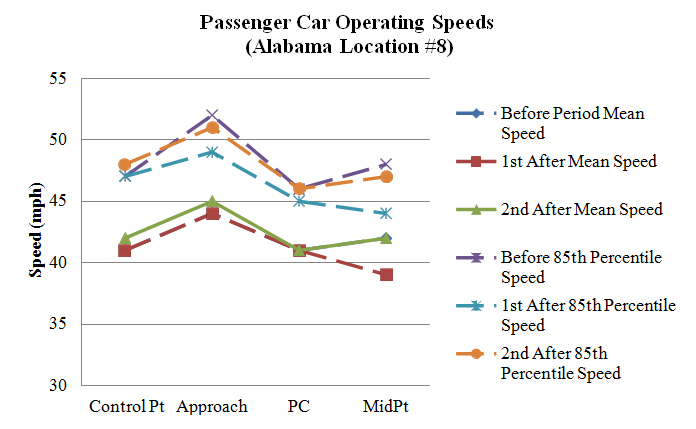
Figure 112. Graph. Operating speeds comparison at Alabama Location #8 (PSL = 35 mph).
Alabama Summary of Results
Overall, the optical speed bars had no effect on operating speeds at the Alabama sites. There were no changes in speeds that were consistent across all sites.
This section of the report presents the before-after comparisons for the seven Massachusetts OSB sites.
Southbound Tucker Road, MA
As table 72 shows, operating speeds changed significantly at the southbound Tucker Road site in the after period. Oddly, speeds at the control point decreased between approximately 5.6 and 7.3mph for all passenger car speed metrics, and approximately 9.4 mph for heavy trucks. This difference in operating speeds at the control point cannot be explained, except it may be a result of a measurement error caused by the on-pavement sensor. Speeds in the after period remained relatively constant from the control point to the approach. Speeds increased slightly at the approach for the following speed metrics: all observations, passenger cars, daytime passenger cars, and unopposed passenger cars, with speed increases of approximately 0.8, 0.9, 1.2, and 1.1mph, respectively. These speed increases were minimal and were not practically significant. Speeds also increased at the PC for all measured speed metrics, with speeds increasing between approximately 3.0 and 3.7 mph for all passenger car speed metrics, and approximately 4.3 mph for heavy trucks. Speeds in the first after period remained relatively constant from the control point to the approach. There was a sensor malfunction at the curve midpoint, and no speeds were collected and no t-test was performed. Speeds at the PC increased between 3.0 and 3.7 mph for passenger cars after the OSBs were installed at this site.
Table 72. Before-after operating speeds at southbound Tucker Road.
| Speed Metric | Control Point Speed | Control Point SD | Approach Speed | Approach SD | PC Speed | PC SD | Mid Speed | Mid SD | N1 | N2 | N3 |
| All observations before | 44.458 |
7.485 |
36.492 |
5.228 |
35.223 |
4.467 |
35.329 |
5.014 |
577 |
539 |
514 |
| All observations after | 37.651 |
5.164 |
37.337 |
5.164 |
38.547 |
6.650 |
0.000 |
0.000 |
341 |
139 |
0 |
| Passenger cars before | 44.466 |
7.510 |
36.506 |
5.236 |
35.241 |
4.475 |
35.334 |
5.022 |
573 |
535 |
512 |
| Passenger cars after | 37.753 |
5.147 |
37.428 |
5.169 |
38.569 |
6.692 |
0.000 |
0.000 |
332 |
137 |
0 |
| Heavy trucks before | 43.250 |
0.957 |
34.500 |
3.873 |
32.750 |
2.500 |
34.000 |
1.414 |
4 |
4 |
2 |
| Heavy trucks after | 33.889 |
4.567 |
34.000 |
3.873 |
37.000 |
2.828 |
0.000 |
0.000 |
9 |
2 |
0 |
| Daytime passenger cars before | 45.136 |
6.983 |
36.782 |
5.064 |
35.488 |
4.127 |
35.420 |
4.809 |
316 |
293 |
286 |
| Daytime passenger cars after | 38.616 |
5.033 |
37.966 |
5.145 |
38.493 |
7.690 |
0.000 |
0.000 |
203 |
71 |
0 |
| Nighttime passenger cars before | 43.642 |
8.048 |
36.167 |
5.431 |
34.942 |
4.855 |
35.226 |
5.289 |
257 |
242 |
226 |
| Nighttime passenger cars after | 36.395 |
5.049 |
36.581 |
5.114 |
38.652 |
5.476 |
0.000 |
0.000 |
129 |
66 |
0 |
| Opposed passenger cars before | 44.306 |
7.210 |
36.972 |
5.543 |
35.272 |
3.792 |
35.036 |
5.203 |
252 |
235 |
224 |
| Opposed passenger cars after | 38.686 |
5.503 |
37.822 |
5.583 |
38.390 |
8.812 |
0.000 |
0.000 |
118 |
41 |
0 |
| Unopposed passenger cars before | 44.592 |
7.745 |
36.140 |
4.960 |
35.217 |
4.951 |
35.566 |
4.874 |
321 |
300 |
288 |
| Unopposed passenger cars after | 37.238 |
4.876 |
37.210 |
4.926 |
38.646 |
5.603 |
0.000 |
0.000 |
214 |
96 |
0 |
Bold indicates significance at the 95-percent confidence level (α=0.05)
SD = Standard Deviation
PC = Point of Curvature
N1 = Number of observations at the control point and approach
N2 = Number of observations at the PC
N3 = Number of observations at the midpoint
Figure 113 shows a graphical representation of the speed profiles for southbound Tucker Road. In the after period, mean and 85th percentile speeds decreased significantly at the control point while they increased at the PC. Midpoint speeds were not available because of a sensor malfunction.
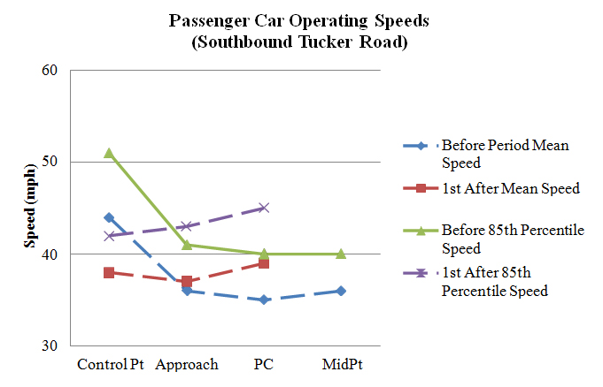
Figure 113. Graph. Operating speeds comparison at southbound Tucker Road
(PSL = 30 mph).
Northbound Tucker Road, MA
As table 73 shows, operating speeds significantly changed at northbound Tucker Road, but the changes did not follow a clear trend. Speeds at the control point did not change in the first after period. Speeds decreased slightly at the approach for the following speed metrics: all observations, heavy trucks, daytime passenger cars, and opposed passenger cars, with speed decreases of approximately 0.8, 0.7, 0.7, and 0.9 mph, respectively. These changes in speeds were minimal and not practically significant. Speeds at the PC increased between approximately 1.8 and 3.1 mph for all speed metrics. However, speeds at the curve then decreased for all speed metrics, except heavy trucks. Speeds at the curve midpoint decreased between approximately 1.1and 1.7 mph. There was no strong trend in the effects of the OSBs at this site, with speeds significantly increasing at the PC but then decreasing at the curve midpoint.
Table 73. Before-after operating speeds at northbound Tucker Road.
| Speed Metric | Control Point Speed | Control Point SD | Approach Speed | Approach SD | PC Speed | PC SD | Mid Speed | Mid SD | N1 | N2 | N3 |
| All observations before | 33.895 |
4.361 |
37.609 |
4.247 |
33.381 |
3.820 |
35.507 |
4.852 |
573 |
565 |
458 |
| All observations after | 33.761 |
4.403 |
36.850 |
5.004 |
35.768 |
4.249 |
33.904 |
5.674 |
394 |
367 |
355 |
| Passenger cars before | 33.919 |
4.361 |
37.633 |
4.251 |
33.403 |
3.820 |
35.525 |
4.858 |
569 |
561 |
455 |
| Passenger cars after | 33.903 |
4.347 |
36.911 |
5.037 |
35.821 |
4.230 |
33.980 |
5.645 |
383 |
358 |
348 |
| Heavy trucks before | 30.500 |
3.000 |
34.250 |
1.500 |
30.250 |
2.500 |
32.667 |
3.055 |
4 |
4 |
3 |
| Heavy trucks after | 28.818 |
3.516 |
34.727 |
3.133 |
33.667 |
4.743 |
30.143 |
6.283 |
11 |
9 |
7 |
| Daytime passenger cars before | 34.135 |
4.263 |
37.768 |
4.219 |
33.683 |
3.551 |
36.145 |
4.549 |
341 |
338 |
276 |
| Daytime passenger cars after | 34.416 |
3.787 |
37.024 |
4.764 |
36.771 |
3.545 |
34.455 |
5.391 |
209 |
192 |
187 |
| Nighttime passenger cars before | 33.596 |
4.495 |
37.430 |
4.300 |
32.978 |
4.167 |
34.570 |
5.168 |
228 |
223 |
179 |
| Nighttime passenger cars after | 33.287 |
4.877 |
36.776 |
5.358 |
34.723 |
4.680 |
33.429 |
5.896 |
174 |
166 |
161 |
| Opposed passenger cars before | 33.681 |
4.172 |
37.453 |
4.207 |
33.369 |
3.635 |
35.839 |
4.758 |
351 |
347 |
280 |
| Opposed passenger cars after | 34.126 |
4.032 |
36.581 |
4.621 |
36.017 |
3.937 |
34.320 |
4.864 |
191 |
179 |
172 |
| Unopposed passenger cars before | 34.303 |
4.634 |
37.922 |
4.315 |
33.458 |
4.111 |
35.023 |
4.986 |
218 |
214 |
175 |
| Unopposed passenger cars after | 33.682 |
4.640 |
37.240 |
5.412 |
35.626 |
4.506 |
33.648 |
6.313 |
192 |
179 |
176 |
Bold indicates significance at the 95-percent confidence level (α=0.05)
SD = Standard Deviation
PC = Point of Curvature
N1 = Number of observations at the control point and approach
N2 = Number of observations at the PC
N3 = Number of observations at the midpoint
Figure 114 shows a graphical representation of the speed profiles for northbound Tucker Road. In the after period, the mean and 85th percentile speeds increased slightly at the PC and midpoints. The control point and approach speeds remained relatively similar during both the before and after data-collection periods.
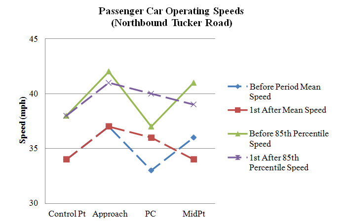
Figure 114. Graph. Operating speeds comparison at northbound Tucker Road
(PSL = 35 mph).
Southbound Reed Road, Massachusetts
As table 74 shows, operating speeds changed significantly at the southbound Reed Road site in the first after period. Operating speeds decreased slightly at the control point for the following speed metrics: all observations, passenger cars, nighttime passenger cars, opposed passenger cars, and unopposed passenger cars, with speed decreases of approximately 1.2, 1.2, 2.7, 1.2, and 1.1 mph, respectively. These speed decreases were not practically significant, except for the nighttime speed decrease of 2.7 mph. There was a sensor malfunction at the approach, so no speeds were collected, but the research team performed a t-test. Speeds increased significantly for all passenger car speed metrics at the PC, with speed increases between approximately 1.4and 3.8 mph. These speed increases become more significant and larger in magnitude if the speed decrease at the control point was taken into account. However, speeds were then significantly lower at the curve midpoint for all passenger car speed metrics. These speed decreases were approximately 2.7 to 4 mph. There was no clear trend in operating speeds at this site after the OSBs were installed. Operating speeds increased at the PC in the after period, but then operating speeds decreased at the curve midpoint.
Table 74. Before-after operating speeds at southbound Reed Road.
| Speed Metric | Control Point Speed | Control Point SD | Approach Speed | Approach SD | PC Speed | PC SD | Mid Speed | Mid SD | N1 | N2 | N3 |
| All observations before | 39.966 |
5.426 |
39.382 |
6.015 |
38.826 |
4.288 |
39.363 |
4.990 |
775 |
482 |
590 |
| All observations after | 38.723 |
4.995 |
0.000 |
0.000 |
41.525 |
6.728 |
36.190 |
5.133 |
328 |
324 |
327 |
| Passenger cars before | 40.036 |
5.395 |
39.450 |
5.985 |
38.811 |
4.227 |
39.416 |
4.945 |
756 |
471 |
575 |
| Passenger cars after | 38.831 |
4.957 |
0.000 |
0.000 |
41.541 |
6.732 |
36.232 |
5.111 |
320 |
316 |
319 |
| Heavy trucks before | 37.211 |
6.070 |
36.684 |
6.758 |
39.455 |
6.654 |
37.333 |
6.355 |
19 |
11 |
15 |
| Heavy trucks after | 34.375 |
4.868 |
0.000 |
0.000 |
40.875 |
6.978 |
34.500 |
6.094 |
8 |
8 |
8 |
| Daytime passenger cars before | 39.754 |
5.282 |
39.249 |
6.262 |
38.558 |
3.773 |
39.692 |
4.767 |
337 |
224 |
247 |
| Daytime passenger cars after | 39.691 |
4.417 |
0.000 |
0.000 |
42.326 |
7.233 |
36.963 |
4.597 |
188 |
184 |
187 |
| Nighttime passenger cars before | 40.263 |
5.481 |
39.611 |
5.754 |
39.040 |
4.596 |
39.207 |
5.072 |
419 |
247 |
328 |
| Nighttime passenger cars after | 37.606 |
5.422 |
0.000 |
0.000 |
40.447 |
5.816 |
35.197 |
5.618 |
132 |
132 |
132 |
| Opposed passenger cars before | 39.971 |
5.365 |
39.753 |
6.653 |
38.669 |
3.911 |
39.469 |
4.916 |
377 |
242 |
275 |
| Opposed passenger cars after | 38.781 |
4.926 |
0.000 |
0.000 |
41.372 |
6.445 |
36.445 |
4.910 |
228 |
226 |
227 |
| Unopposed passenger cars before | 40.100 |
5.432 |
39.148 |
5.227 |
38.961 |
4.542 |
39.367 |
4.979 |
379 |
229 |
300 |
| Unopposed passenger cars after | 38.957 |
5.056 |
0.000 |
0.000 |
41.967 |
7.427 |
35.707 |
5.570 |
92 |
90 |
92 |
Bold indicates significance at the 95-percent confidence level (α=0.05)
SD = Standard Deviation
PC = Point of Curvature
N1 = Number of observations at the control point and approach
N2 = Number of observations at the PC
N3 = Number of observations at the midpoint
Figure 115 shows a graphical representation of the speed profiles for southbound Reed Road. In the after period, mean speeds increased at the midpoint while 85th percentile speeds increased at the PC point. Approach speeds were not available because of a malfunctioning sensor.
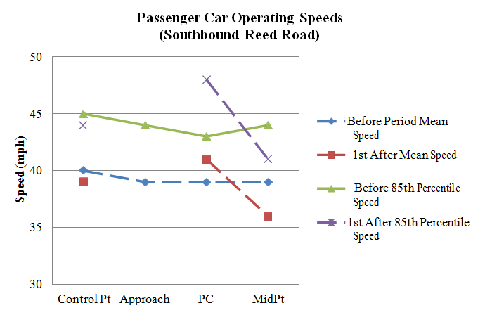
Figure 115. Graph. Operating speeds comparison at southbound Reed Road
(PSL = 25 mph).
Southbound New Boston Road, MA
Overall, operating speeds were higher in the after period at southbound New Boston Road. As table 75 shows, operating speeds increased for all passenger car speed metrics, with speed increases between approximately 1.3 to 4.2 mph. Speeds increased at the approach for the following speed metrics: all observations, passenger cars, heavy trucks, and opposed passenger cars, with speed increases of approximately 1.0, 0.9, 6.1, and 3.2 mph, respectively. However, if the speed increase at the control point was taken into account, speeds at the approach for all observations and passenger cars actually decreased slightly. Speeds increased at the PC for all passenger car speed metrics, with speed increases between approximately 1.6 and 2.7 mph. However, if the speed increase at the control point was taken into accounted, the speeds at the PC did not change from the before period for any passenger car speed metric. Speeds at the curve midpoint increased for all speed metrics, with speed increases between approximately 0.9 and 2.6 mph for passenger cars and 5.6 mph for heavy trucks. Once again, none of these speed increases for passenger cars were significant if the speed increase at the control point was taken into accounted. Operating speeds were higher at southbound New Boston Road in the after period, but the OSBs had no effect on speeds after accounting for higher speeds at the control point.
Table 75. Before-after operating speeds at southbound New Boston Road.
| Speed Metric | Control Point Speed | Control Point SD | Approach Speed | Approach SD | PC Speed | PC SD | Mid Speed | Mid SD | N1 | N2 | N3 |
| All observations before | 37.004 |
6.532 |
37.704 |
5.967 |
37.489 |
5.607 |
36.624 |
6.206 |
257 |
229 |
229 |
| All observations after | 39.003 |
6.359 |
38.675 |
5.154 |
39.345 |
5.446 |
38.025 |
6.192 |
381 |
293 |
325 |
| Passenger cars before | 36.968 |
6.565 |
37.766 |
5.980 |
37.465 |
5.636 |
36.656 |
6.224 |
252 |
226 |
227 |
| Passenger cars after | 38.962 |
6.366 |
38.630 |
5.160 |
39.323 |
5.470 |
38.013 |
6.211 |
373 |
288 |
318 |
| Heavy trucks before | 38.800 |
4.712 |
34.600 |
4.722 |
39.333 |
2.082 |
33.000 |
0.000 |
5 |
3 |
2 |
| Heavy trucks after | 40.875 |
6.081 |
40.750 |
4.713 |
40.600 |
4.037 |
38.571 |
5.653 |
8 |
5 |
7 |
| Daytime passenger cars before | 36.690 |
5.930 |
37.655 |
5.583 |
37.576 |
4.603 |
36.760 |
5.551 |
113 |
99 |
100 |
| Daytime passenger cars after | 38.567 |
6.228 |
38.424 |
5.389 |
39.403 |
5.390 |
38.073 |
6.152 |
210 |
154 |
178 |
| Nighttime passenger cars before | 37.194 |
7.052 |
37.856 |
6.302 |
37.378 |
6.343 |
36.575 |
6.728 |
139 |
127 |
127 |
| Nighttime passenger cars after | 39.472 |
6.525 |
38.896 |
4.852 |
39.231 |
5.579 |
37.936 |
6.307 |
163 |
134 |
140 |
| Opposed passenger cars before | 35.638 |
5.307 |
36.259 |
5.872 |
36.788 |
5.410 |
35.962 |
6.145 |
58 |
52 |
52 |
| Opposed passenger cars after | 39.796 |
6.541 |
39.500 |
5.061 |
39.500 |
5.780 |
38.525 |
6.375 |
108 |
86 |
99 |
| Unopposed passenger cars before | 37.366 |
6.859 |
38.216 |
5.953 |
37.667 |
5.702 |
36.863 |
6.250 |
194 |
174 |
175 |
| Unopposed passenger cars after | 38.623 |
6.275 |
38.275 |
5.167 |
39.248 |
5.346 |
37.781 |
6.136 |
265 |
202 |
219 |
Bold indicates significance at the 95-percent confidence level (α=0.05)
SD = Standard Deviation
PC = Point of Curvature
N1 = Number of observations at the control point and approach
N2 = Number of observations at the PC
N3 = Number of observations at the midpoint
Figure 116 shows a graphical representation of the speed profiles for southbound New Boston Road. In the after period, 85th percentile speeds increased at the PC and midpoint. All other speed profiles remained relatively similar in the before and after data-collection periods.
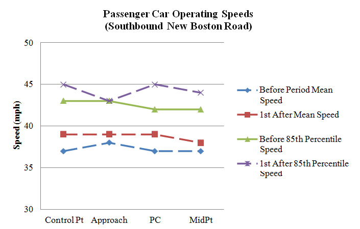
Figure 116. Graph. Operating speeds comparison on southbound New Boston Road (PSL = 35 mph).
Northbound New Boston Road, MA
As table 76 shows, operating speeds changed significantly at the northbound New Boston Road site in the after period. All observations and passenger car speeds increased at the control point by approximately 1.0 and 0.9 mph, respectively. These slight speed increases do not have any practical significance. Approach speeds increased for the following speed metrics: all observations, passenger cars, heavy trucks, nighttime passenger cars, and unopposed passenger cars, with speed increases of approximately 1.5, 1.4, 6.8, 2.3, and 1.5 mph, respectively. Speeds at the PC did not change in the after period. Speeds at the curve midpoint increased between approximately 2.8 and 4.5 mph for all speed metrics, except heavy trucks. Speeds significantly increased at the curve midpoint after the application of the OSBs at this site. Overall, the installation of the OSBs did not result in reduced operating speed at this site.
Table 76. Before-after operating speeds at northbound New Boston Road.
| Speed Metric | Control Point Speed | Control Point SD | Approach Speed | Approach SD | PC Speed | PC SD | Mid Speed | Mid SD | N1 | N2 | N3 |
| All observations before | 39.796 |
5.704 |
36.876 |
5.691 |
39.500 |
4.955 |
33.742 |
6.553 |
225 |
114 |
209 |
| All observations after | 40.769 |
7.248 |
38.356 |
6.573 |
39.559 |
6.720 |
37.568 |
7.593 |
320 |
118 |
229 |
| Passenger cars before | 39.857 |
5.680 |
36.928 |
5.686 |
39.558 |
4.939 |
33.720 |
6.563 |
223 |
113 |
207 |
| Passenger cars after | 40.780 |
7.267 |
38.366 |
6.555 |
39.535 |
6.781 |
37.546 |
7.608 |
314 |
114 |
227 |
| Heavy trucks before | 33.000 |
5.657 |
31.000 |
2.828 |
33.000 |
0.000 |
36.000 |
7.071 |
2 |
1 |
2 |
| Heavy trucks after | 40.167 |
6.706 |
37.833 |
8.159 |
40.250 |
5.315 |
40.000 |
7.071 |
6 |
4 |
2 |
| Daytime passenger cars before | 40.074 |
5.352 |
37.475 |
5.801 |
40.066 |
4.694 |
34.627 |
6.531 |
122 |
61 |
110 |
| Daytime passenger cars after | 40.719 |
7.186 |
38.270 |
6.268 |
39.134 |
6.080 |
37.443 |
7.915 |
196 |
67 |
131 |
| Nighttime passenger cars before | 39.594 |
6.070 |
36.267 |
5.499 |
38.962 |
5.194 |
32.691 |
6.478 |
101 |
52 |
97 |
| Nighttime passenger cars after | 40.881 |
7.430 |
38.525 |
7.031 |
40.106 |
7.704 |
37.688 |
7.207 |
118 |
47 |
96 |
| Opposed passenger cars before | 40.119 |
4.835 |
36.810 |
4.830 |
39.714 |
3.989 |
32.789 |
4.911 |
42 |
21 |
38 |
| Opposed passenger cars after | 40.662 |
8.230 |
37.954 |
5.792 |
38.048 |
6.561 |
37.289 |
7.884 |
65 |
21 |
38 |
| Unopposed passenger cars before | 39.796 |
5.870 |
36.956 |
5.878 |
39.522 |
5.149 |
33.929 |
6.874 |
181 |
92 |
169 |
| Unopposed passenger cars after | 40.811 |
7.012 |
38.474 |
6.747 |
39.871 |
6.819 |
37.598 |
7.572 |
249 |
93 |
189 |
Bold indicates significance at the 95-percent confidence level (α=0.05)
SD = Standard Deviation
PC = Point of Curvature
N1 = Number of observations at the control point and approach
N2 = Number of observations at the PC
N3 = Number of observations at the midpoint
Figure 117 shows a graphical representation of the speed profiles for northbound New Boston Road. Mean and 85th percentile speeds increased at the midpoint in the after period. The general shape of the speed profiles at all other locations remained relatively similar.
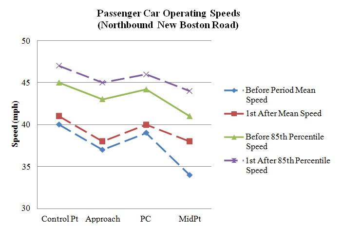
Figure 117. Graph. Operating speeds comparison on northbound New Boston Road
(PSL = 35 mph).
Southbound Braley Hill Road, MA
As table 77 shows, operating speeds changed significantly at the southbound Braley Hill Road site in the after period. At the control point, daytime passenger car speeds increased by approximately 1.2 mph, and nighttime passenger car speeds decreased by approximately 1.7mph. Speeds at the approach were significantly higher for all speed metrics, with increases between 5.6 and 7.3 mph for the different passenger car speed metrics and 11.6 mph for heavy trucks. The speeds at the approach were approximately 5 to 6 mph higher than speeds at the control point in the after period. This does not reflect how drivers typically drive, so this significant increase at the approach may have resulted from a measurement error from the on-pavement sensor. Speeds then decreased at the PC for the following speed metrics: all observations, passenger cards, nighttime passenger cars, opposed passenger cars, and unopposed passenger cars, with speed decreases of approximately 1.2, 1.2, 1.6, 1.9, and 1.0 mph, respectively. The speed decreases at the PC were small in magnitude and not practically significant. Speeds at the curve midpoint also decreased in the after period for the following speed metrics: all observations, passenger cars, daytime passenger cars, nighttime passenger cars, and unopposed passenger cars, with speed decreases of approximately 2.2, 2.3. 1.7, 2.8, and 2.5 mph, respectively. Speeds throughout the curve decreased between 1 and 3 mph at this site after the application of the OSBs; this did not consider the significant increase at the approach speed because that appears to be the result of a measurement error.
Table 77. Before-after operating speeds at southbound Braley Hill Road.
| Speed Metric | Control Point Speed | Control Point SD | Approach Speed | Approach SD | PC Speed | PC SD | Mid Speed | Mid SD | N1 | N2 | N3 |
| All observations before | 39.360 |
5.097 |
38.508 |
5.835 |
34.585 |
4.791 |
36.365 |
6.947 |
317 |
294 |
252 |
| All observations after | 39.040 |
5.667 |
45.191 |
7.031 |
33.415 |
4.160 |
34.176 |
7.407 |
277 |
260 |
256 |
| Passenger cars before | 39.472 |
5.136 |
38.600 |
5.872 |
34.665 |
4.693 |
36.502 |
6.905 |
305 |
284 |
243 |
| Passenger cars after | 39.208 |
5.645 |
45.075 |
6.760 |
33.520 |
4.174 |
34.244 |
7.497 |
265 |
250 |
246 |
| Heavy trucks before | 36.500 |
2.844 |
36.167 |
4.345 |
32.300 |
6.977 |
32.667 |
7.483 |
12 |
10 |
9 |
| Heavy trucks after | 35.333 |
5.033 |
47.750 |
11.671 |
30.800 |
2.821 |
32.500 |
4.577 |
12 |
10 |
10 |
| Daytime passenger cars before | 38.640 |
4.423 |
37.953 |
4.997 |
34.433 |
4.591 |
35.697 |
7.398 |
150 |
141 |
122 |
| Daytime passenger cars after | 39.801 |
4.950 |
45.298 |
6.401 |
33.701 |
4.205 |
34.038 |
7.345 |
141 |
134 |
132 |
| Nighttime passenger cars before | 40.277 |
5.640 |
39.226 |
6.566 |
34.895 |
4.797 |
37.314 |
6.297 |
155 |
143 |
121 |
| Nighttime passenger cars after | 38.532 |
6.297 |
44.823 |
7.164 |
33.310 |
4.146 |
34.482 |
7.696 |
124 |
116 |
114 |
| Opposed passenger cars before | 39.211 |
4.485 |
37.958 |
5.247 |
34.758 |
4.736 |
35.185 |
6.355 |
71 |
66 |
54 |
| Opposed passenger cars after | 38.981 |
5.634 |
44.096 |
7.604 |
32.837 |
4.520 |
33.820 |
7.176 |
52 |
49 |
50 |
| Unopposed passenger cars before | 39.551 |
5.324 |
38.795 |
6.046 |
34.638 |
4.691 |
36.878 |
7.025 |
234 |
218 |
189 |
| Unopposed passenger cars after | 39.263 |
5.660 |
45.315 |
6.534 |
33.687 |
4.080 |
34.352 |
7.591 |
213 |
201 |
196 |
Bold indicates significance at the 95-percent confidence level (α=0.05)
SD = Standard Deviation
PC = Point of Curvature
N1 = Number of observations at the control point and approach
N2 = Number of observations at the PC
N3 = Number of observations at the midpoint
Figure 118 shows a graphical representation of the speed profiles for southbound Braley Hill Road. In the after period, the mean and 85th percentile speeds increased significantly at the PC point. Speed profiles at all other points remained relatively similar during both the before and after data-collection periods.
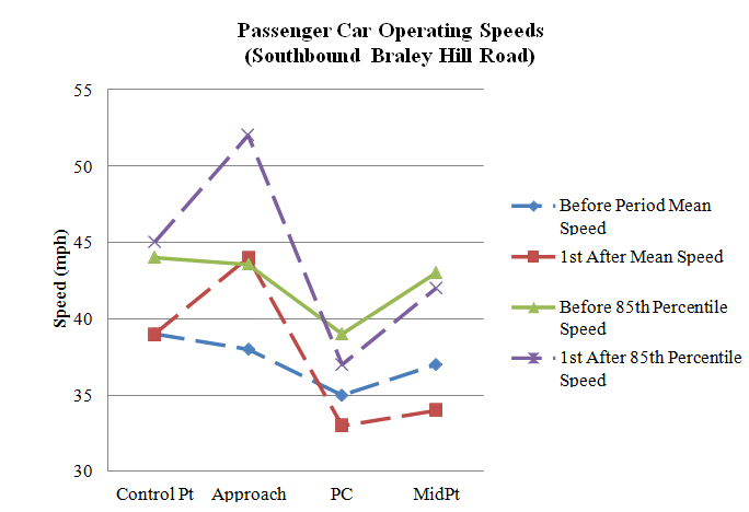
Figure 118. Graph. Operating speeds comparison at southbound Braley Hill Road
(PSL = 30 mph).
Northbound Braley Hill Road, MA
As table 78 shows, operating speeds changed significantly at the northbound Braley Hill Road site in the after period. Oddly, speeds at the control point decreased between approximately 6.1and 7.8 mph for all speed metrics, except heavy trucks. Heavy truck speeds decreased by approximately 9.2 mph, but this was not significant because the SD was so high and there were few observations in both periods. This difference in operating speeds at the control point cannot be explained, except that it may be a result of a measurement error caused by the on-pavement sensor. Speeds at the approach did not change for any speed metric if the significant reductions in speeds at the control point were not taken into account. Speeds at the PC increased between approximately 2.8 and 4 mph for all speed metrics. These speed increases at the PC increase in magnitude and become more significant if the speed decreases at the control were taken into accounted. Speeds at the curve midpoint also increased between approximately 1.0 and 1.4 mph for all speed metrics, except heavy trucks. Heavy truck speeds decreased by approximately 2.7mph, but this was not significant because there were few observations in both periods. These speed increases at the curve midpoint increased in magnitude and become more significant if the speed decreases at the control were taken into account. Based on the first after period, speeds at the PC and curve midpoint significantly increased after the application of the OSBs. The speed increase at the PC was higher than at the curve midpoint, with the speed increase at the curve midpoint not being practically significant at a maximum speed increase of 1.4 mph for all speed metrics.
Table 78. Before-after operating speeds at northbound Braley Hill Road.
| Speed Metric | Control Point Speed | Control Point SD | Approach Speed | Approach SD | PC Speed | PC SD | Mid Speed | Mid SD | N1 | N2 | N3 |
| All observations before | 44.188 |
7.842 |
38.650 |
4.290 |
37.565 |
3.981 |
38.530 |
3.990 |
277 |
271 |
268 |
| All observations after | 37.166 |
6.209 |
38.456 |
4.774 |
40.500 |
4.758 |
39.719 |
4.198 |
331 |
224 |
320 |
| Passenger cars before | 44.169 |
7.738 |
38.692 |
4.294 |
37.603 |
3.993 |
38.572 |
3.992 |
273 |
267 |
264 |
| Passenger cars after | 37.185 |
6.201 |
38.469 |
4.759 |
40.541 |
4.795 |
39.748 |
4.168 |
324 |
218 |
313 |
| Heavy trucks before | 45.500 |
15.022 |
35.750 |
3.096 |
35.000 |
1.826 |
35.750 |
3.096 |
4 |
4 |
4 |
| Heavy trucks after | 36.286 |
7.017 |
37.857 |
5.815 |
39.000 |
2.966 |
38.429 |
5.623 |
7 |
6 |
7 |
| Daytime passenger cars before | 44.238 |
6.538 |
38.524 |
4.084 |
37.431 |
3.703 |
38.565 |
3.823 |
147 |
144 |
147 |
| Daytime passenger cars after | 37.994 |
5.366 |
38.893 |
4.567 |
40.518 |
4.922 |
39.921 |
4.115 |
169 |
137 |
164 |
| Nighttime passenger cars before | 44.087 |
8.965 |
38.889 |
4.536 |
37.805 |
4.315 |
38.581 |
4.210 |
126 |
123 |
117 |
| Nighttime passenger cars after | 36.303 |
6.910 |
38.006 |
4.934 |
40.580 |
4.604 |
39.557 |
4.230 |
155 |
81 |
149 |
| Opposed passenger cars before | 43.794 |
7.456 |
38.730 |
4.178 |
36.983 |
4.312 |
38.381 |
4.046 |
63 |
60 |
63 |
| Opposed passenger cars after | 37.703 |
5.891 |
38.099 |
3.981 |
40.457 |
5.413 |
39.644 |
4.193 |
91 |
70 |
90 |
| Unopposed passenger cars before | 44.281 |
7.835 |
38.681 |
4.338 |
37.783 |
3.889 |
38.632 |
3.983 |
210 |
207 |
201 |
| Unopposed passenger cars after | 36.983 |
6.319 |
38.614 |
5.031 |
40.581 |
4.493 |
39.789 |
4.166 |
233 |
148 |
223 |
Bold indicates significance at the 95-percent confidence level (α=0.05)
SD = Standard Deviation
PC = Point of Curvature
N1 = Number of observations at the control point and approach
N2 = Number of observations at the PC
N3 = Number of observations at the midpoint
Figure 119 shows a graphical representation of the speed profiles for northbound Braley Hill Road. The mean and 85th percentile control point speeds decreased in the after period while speed profiles at all points remained relatively similar in both the before and after period.
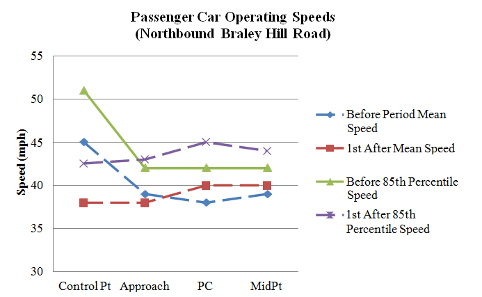
Figure 119. Graph. Operating speeds comparison at northbound Braley Hill Road
(PSL = 40 mph).
Massachusetts Results Summary
Overall, the OSBs did not have an effect on operating speeds at the Massachusetts sites. There were no changes in speeds that were consistent across all of the sites.
The next measures computed using the speed data were the change in speed from the approach to PC and the change in speed from the control point to the midpoint of the horizontal curve. These measures were taken in the before and both after periods at each of the treatment sites. As discussed previously, the research team used a t-test for independent samples to compare the two after periods with the before period and to each other. A positive value of delta speed indicates that a mean decrease in speed occurred from the approach to PC or from the control point to the curve midpoint. A negative value represents a mean increase in the speed difference between the two locations.
Arizona
Table 79 shows the change in speed (delta) from the approach to the PC and from the control point to the curve midpoint.
Table 79. Change in speeds for Arizona sites.
| Speed Metric | Delta Speed (Approach to PC) | Standard Deviation | Delta Speed (Control Point to Midpoint) | Standard Deviation | N1 | N2 |
| NB Pierce Ferry Road before | 0.267 |
4.527 |
10.514 |
7.776 |
90 |
107 |
| NB Pierce Ferry Road 1st after | 1.059 |
5.513 |
12.806 |
8.689 |
102 |
180 |
| NB Pierce Ferry Road 2nd after | 5.733 |
4.654 |
5.392 |
7.379 |
161 |
148 |
| SB County Route 1 before | 4.142 |
3.903 |
8.907 |
9.947 |
141 |
129 |
| SB County Route 1 1st after | 4.243 |
4.167 |
12.123 |
10.490 |
169 |
154 |
| SB County Route 1 2nd after | 2.216 |
3.438 |
5.183 |
10.640 |
97 |
60 |
| SB Diamond Bar Road before | -1.535 |
4.277 |
3.152 |
7.979 |
99 |
99 |
| SB Diamond Bar Road 1st after | -1.676 |
5.662 |
2.031 |
9.751 |
37 |
64 |
| SB Diamond Bar Road 2nd after | 1.547 |
3.856 |
11.600 |
8.375 |
53 |
105 |
| SB Shinarump Road before | 4.656 |
6.367 |
-3.973 |
7.219 |
90 |
73 |
| SB Shinarump Road 1st after | 4.043 |
4.798 |
-3.056 |
6.111 |
93 |
72 |
| SB Shinarump Road 2nd after | 3.149 |
6.500 |
3.566 |
9.846 |
101 |
136 |
Bold indicates significance at the 95-percent confidence level (α = 0.05) between the 1st/2nd after period and before period
Italics indicates significance at the 95-percent confidence level (α = 0.05) between the 1st and 2nd after periods
NB = Northbound
SB = Southbound
PC = Point of Curvature
N1 = Number of observations approach to PC
N2 = Number of observations control point to midpoint
As table 79 shows, there was no difference in delta speed from the approach to the PC for any sites in the first after period. There was a significant increase in delta speed (control point to midpoint) of approximately 2.3 mph on northbound Pierce Ferry Road in the first after period. This was a result of vehicles having a slower speed at the curve midpoint in the first after period. There was also a significant increase in delta speed (control point to midpoint) of approximately 3.2 mph on southbound County Route 1. This was a result of vehicles travelling faster at the control point in the first after period.
There were more significant changes in delta speed in the second after period than there were in the first after period, with delta speed changing at every site. Delta speed (approach to PC) from the approach to the PC increased by approximately 5.5 mph on northbound Pierce Ferry Road, which was a result of higher speeds at the PC in the second after period. Conversely, delta speed (control point to midpoint) decreased by approximately 5.1 mph on northbound Pierce Ferry Road, which was a result of higher speeds at the curve midpoint in the second after period. Speeds significantly decreased at this site at the PC on northbound Pierce Ferry Road, but then they significantly increased at the curve midpoint in the second after period. Delta speed (approach to PC) decreased by approximately 1.9 mph on southbound County Route 1, which was a result of higher speeds at the curve approach, but even higher speeds at the PC. Delta speed (control point to midpoint) also decreased by approximately 3.7 mph on southbound County Route 1, which resulted from vehicles accelerating out of the curve. Delta speed (approach to PC) was actually negative in the before period on southbound Diamond Bar Road, representing speeds increased from the approach to PC. However, delta speed (approach to PC) was positive in the second after period at this site. There was a significant increase of approximately 3.1 mph in delta speed, which was a result of vehicles accelerating slightly from the control point to the approach in the second after period. Delta speed (control point to midpoint) changed drastically in the second after period on southbound Diamond Bar Road. Delta speed increased by approximately 8.4 mph, which was a result of vehicles decelerating at a much greater rate from the PC to the curve midpoint in the second after period. Finally, delta speed (control point to midpoint) was actually negative in the before period, but delta speed was positive in the second after period. Delta speed (control point to midpoint) increased by approximately 7.5 mph on southbound Shinarump Road, which resulted from vehicles decelerating from the PC to the curve midpoint in the second after period, where vehicles accelerated from the PC to the curve midpoint in the before period.
Overall, delta speed did not change in the first after period after the OSBs were installed at the Arizona sites, but delta speeds were significantly different at all sites in the second after period. However, there was no clear trend in the change in delta speed as a result of installing the OSBs. Delta speed from the PC to the approach increased by approximately 5.5 and 3.1 mph at two sites, while delta speed decreased by approximately 1.9 mph at another site. Delta speed from the control point to the curve midpoint decreased by approximately 5.1 and 3.7 mph at two sites, while delta speed increased by approximately 8.4 and 7.5 mph at two other sites. The change in delta speed varied both in direction and magnitude across the different Arizona sites, with no strong trend present. Overall, the OSBs did not have an effect on operating speeds at the Arizona sites. There were no changes in speeds that were consistent across all of the sites.
Alabama
Table 80 shows the change in speed (delta) from the approach to the PC and from the control point to the curve midpoint.
Table 80. Change in speeds for Alabama sites.
| Speed Metric | Delta Speed (Approach to PC) | Standard Deviation | Delta Speed (Control Point to Midpoint) | Standard Deviation | N1 | N2 |
| Alabama Location #1 before | 0.037 |
3.653 |
5.252 |
8.817 |
27 |
115 |
| Alabama Location #1 1st after | -0.933 |
4.173 |
0.549 |
7.154 |
134 |
213 |
| Alabama Location #1 2nd after | -0.685 |
3.947 |
8.695 |
10.378 |
73 |
226 |
| Alabama Location #2 before | 3.068 |
5.175 |
11.612 |
9.533 |
74 |
85 |
| Alabama Location #2 1st after | 3.127 |
3.909 |
9.533 |
7.555 |
220 |
246 |
| Alabama Location #2 2nd after | 2.526 |
3.984 |
10.210 |
7.864 |
234 |
276 |
| Alabama Location #3 before | 8.796 |
4.115 |
24.444 |
13.239 |
142 |
144 |
| Alabama Location #3 1st after | 6.418 |
3.244 |
30.227 |
13.700 |
225 |
234 |
| Alabama Location #3 2nd after | 7.160 |
3.253 |
27.872 |
12.219 |
306 |
298 |
| Alabama Location #4 before | 7.253 |
4.303 |
16.891 |
11.210 |
99 |
101 |
| Alabama Location #4 1st after | 8.534 |
3.981 |
16.823 |
9.590 |
236 |
237 |
| Alabama Location #4 2nd after | 8.560 |
4.400 |
14.489 |
10.179 |
241 |
229 |
| Alabama Location #5 before | 0.541 |
5.450 |
1.820 |
8.132 |
37 |
111 |
| Alabama Location #5 1st after | 0.097 |
4.304 |
-3.264 |
6.864 |
165 |
174 |
| Alabama Location #5 2nd after | -0.210 |
3.920 |
-1.738 |
6.337 |
176 |
191 |
| Alabama Location #6 before | -0.611 |
3.568 |
-0.964 |
12.250 |
54 |
56 |
| Alabama Location #6 1st after | 7.915 |
4.975 |
0.732 |
9.227 |
141 |
153 |
| Alabama Location #6 2nd after | 0.327 |
4.516 |
1.197 |
10.233 |
49 |
228 |
| Alabama Location #7 before | 6.827 |
3.501 |
14.381 |
8.213 |
127 |
126 |
| Alabama Location #7 1st after | 4.925 |
2.926 |
16.709 |
9.636 |
319 |
323 |
| Alabama Location #7 2nd after | 6.089 |
2.951 |
15.883 |
8.963 |
382 |
369 |
| Alabama Location #8 before | 3.838 |
4.295 |
0.290 |
6.497 |
105 |
100 |
| Alabama Location #8 1st after | 3.607 |
3.797 |
2.405 |
6.296 |
196 |
200 |
| Alabama Location #8 2nd after | 4.479 |
3.945 |
2.308 |
7.735 |
217 |
211 |
Bold indicates significance at the 95-percent confidence level (α=0.05) between the 1st/2nd after period and before
period
Italics indicates significance at the 95-percent confidence level (α=0.05) between the 1st and 2nd after periods
PC = Point of Curvature
N1 = Number of observations at the PC
N2 = Number of observations at the control point and approach
As table 80 shows, there were many changes in the delta speed between the approach and the PC and the delta speed between the control point and the curve midpoint in Alabama. As table 80 shows, the speed difference from the approach to the PC increased for two sites in the first after period, while the difference also decreased for two sites. The difference increased by approximately 8.5 mph at Alabama Location #6. This was a result of vehicles having a higher speed at the approach in the first after period. There was also a significant increase in delta speed of approximately 1.3 mph at Alabama Location #6. This was a result of vehicles having a slower speed at the PC in the first after period. The difference decreased by approximately 2.4 mph at Alabama Location #3. This was a result of vehicles having a slower speed at the approach in the first after period. There was also a significant decrease of approximately 1.9 mph at Alabama Location #7. This was a result of vehicles having a slower speed at the approach in the first after period.
Most of the significant changes in delta speed (approach to PC) from the first after period were also significant in the second after period. The delta speed at Alabama Location #6 returned closer to the before period, and the difference was no longer significant in the second after period. The delta speed at Alabama Location #3 returned closer to the before period, but the difference was still significant, with a decrease of approximately 1.6 mph. The delta speed at Alabama Location #4 was similar to the first after period, with a delta increase of approximately 1.3 mph from the before period. The delta speed at Alabama Location #7 returned closer to the before period, but the difference was still significant, with an increase of approximately 0.7 mph.
As table 80 shows, the speed difference from the control point to the curve midpoint increased for three sites in the first after period, while the difference also decreased for three sites. The delta speed at Alabama Location #1 significantly decreased by approximately 4.7 mph. This was a result of vehicles having a slower speed at the control point. There was also a decrease in delta speed at Alabama Location #5 of approximately 5.1 mph. This was a result of speeds actually being higher at the curve midpoint than at the control point. Delta speed also decreased at Alabama Location #2 by approximately 2.1 mph. This was a result speeds at the curve midpoint increasing in the first after period.
In addition to the sites where there was a delta speed (control point to midpoint) difference from the before to first after period, there were also other sites where there was a change in delta speed in the second after period. Delta speed actually increased at Alabama Location #1 by approximately 3.4 mph, while there was a decrease in the first after period. This was a result of vehicles having a higher speed at the control point. The delta speed at Alabama Location #8 of was similar to the first after period, with a delta increase of approximately 2.0 mph from the before period. This was a result of vehicles having a higher speed at the control point and a lower speed at the curve midpoint. There was an increase in delta speed at Alabama Location #3 of approximately 3.4 mph. This was a result of vehicles having a higher speed at the control point. There was a decrease in delta speed at Alabama Location #4 of approximately 2.4 mph. This was a result of control point speeds being slightly lower. There was a decrease in delta speed at Alabama Location #5 of approximately 3.6 mph. Speeds actually increased from the control point to the curve midpoint. There was an increase in delta speed at Alabama Location #7 of approximately 1.5 mph. This was a result of vehicles having a slower speed at the curve midpoint.
There were many changes in delta speed, but there was no clear trend in the change. Delta speed increased at several sites, while it also decreased at other sites. Many of the speed changes were a result of control point speeds changing from the before to after periods. These changes at the control point make it difficult to determine whether the OSBs had an effect on delta speed. The change in delta speed varied both in direction and magnitude across the different Alabama sites, with no strong trend present.
Massachusetts
Table 81 shows the change in speed (delta) from the approach to the PC and from the control point to the curve midpoint.
Table 81. Change in speeds for Massachusetts sites.
| Speed Metric | Delta Speed (Approach to PC) | Standard Deviation | Delta Speed (Control Point to Midpoint) | Standard Deviation | N1 | N2 |
| NB Braley Hill Road before | 0.714 |
2.685 |
5.769 |
5.783 |
91 |
91 |
| NB Braley Hill Road after | -1.313 |
3.009 |
-2.042 |
5.485 |
80 |
96 |
| NB New Boston Road before | -1.409 |
3.472 |
4.805 |
6.582 |
44 |
77 |
| NB New Boston Road after | -0.551 |
3.731 |
3.373 |
9.249 |
49 |
102 |
| NB Reed Road before | 0.380 |
2.432 |
11.155 |
7.481 |
50 |
110 |
| NB Tucker Road before | 3.889 |
2.603 |
-1.931 |
5.164 |
72 |
58 |
| NB Tucker Road after | 1.027 |
3.820 |
0.293 |
6.415 |
75 |
75 |
| SB Braley Hill Road before | 4.021 |
4.786 |
2.402 |
7.960 |
94 |
82 |
| SB Braley Hill Road after | 11.126 |
5.021 |
5.765 |
7.726 |
103 |
102 |
| SB Tucker Road before | 0.957 |
3.440 |
9.717 |
7.580 |
117 |
120 |
| SB Tucker Road after | 0.976 |
5.015 |
- |
- |
42 |
- |
| SB Reed Road before | 1.563 |
3.956 |
0.343 |
5.573 |
64 |
73 |
| SB Reed Road after | - |
- |
3.566 |
6.116 |
- |
53 |
| SB New Boston Road before | 0.125 |
3.485 |
-0.167 |
7.053 |
64 |
66 |
| SB New Boston Road after | -0.809 |
3.465 |
0.1 |
6.208 |
110 |
120 |
Bold indicates significance at the 95-percent confidence level (α = 0.05) between the 1st/2nd after period and before period
Italics indicates significance at the 95-percent confidence level (α = 0.05) between the 1st and 2nd after periods
NB = Northbound
SB = Southbound
PC = Point of Curvature
N1 = Number of observations approach to PC
N2 = Number of observations control point to midpoint
As table 81 shows, there were many changes in the delta speed between the approach and the PC and the delta speed between the control point and the curve midpoint in Massachusetts. Delta speed (approach to PC) on northbound Braley Hill Road decreased by approximately 2.0 mph. In the before period delta speed was positive, which represents a decrease in speed from the approach to the PC. However, in the after period delta speed (approach to PC) was negative. Delta speed (control point to midpoint) also decreased in the after period on northbound Braley Hill Road by approximately 7.8 mph. Delta speed (control point to midpoint) was also negative in the second after period, which was a result from the control point speed being significantly lower and vehicles maintaining a more constant speed throughout the curve. As previously discussed, this was most likely a result of measurement error with the on-pavement sensor at the control point. There was also a decrease in delta speed (approach to PC) on northbound Tucker Road of approximately 2.9 mph. However, delta speed (control point to midpoint) increased in the first after period by approximately 2.2 mph. Delta speed was negative in the before period, but was positive in the first after period. Next, delta speed (approach to PC) and delta speed (control point to midpoint) increased by approximately 7.1 and 3.4 mph, respectively, on southbound Braley Hill Road. The large increase in delta speed (approach to PC) was the result of a significant increase in speeds at the approach, which was most likely the result of a measurement error with the on-pavement sensor, as previously discussed. Delta speed (control point to midpoint) increased as a result of speeds being lower at the curve midpoint in the first after period. Next, there was an increase in delta speed (control point to midpoint) on southbound Reed Road of approximately 3.2 mph. This was a result of lower speeds at the curve midpoint in the after period. Because approach speeds were not collected at this site in the first after period, a delta speed between the approach and PC was not calculated. Finally, delta speed (approach to PC) on southbound New Boston Road decreased by approximately 0.9 mph. This was a minimal decrease, and vehicles essentially maintained their speed from the approach to PC in both the before and first after period.
Unlike the Arizona sites, there was a weak trend in the change of delta speed at the Massachusetts sites. If the change in delta speed between the approach and PC on southbound Braley Hill Road was ignored because there most likely was a problem with the on-pavement sensor, the delta speed between the approach and PC decreased at three sites and remained the same at two others. If the change in delta speed between the control point and curve midpoint on southbound Braley Hill Road was ignored because there most likely was a problem with the on-pavement sensor, the delta speed between the control point and curve midpoint decreased at two sites, increased at one site, and remained the same at two sites. The OSBs may have a small effect on the delta speed between the approach and the PC and the delta speed between the control point and curve midpoint by decreasing the difference slightly.
Analysis of Variance for Speed Differences
An analysis of variance was used to compare speed differences in the before and after periods. The results are organized and grouped by State.
Arizona
As table 82 shows, the speed difference between the control point and the curve midpoint in the first after period significantly increased by 2.82 mph, which was a result of speeds at the curve midpoint decreasing and speeds at the control point increasing. The speed difference also increased in the second after period; however, this increase was not statistically significant. After installing the additional OSBs, the speed difference did not decrease from the control point to curve midpoint after the novelty effect period.
Table 82. Speed difference between the control point and the curve midpoint.
| Time Period | F Statistic | Significance |
Magnitude of Difference (mph) |
| First after period | 35.62 |
< 0.001 |
2.82 |
| Second after period | 1.35 |
0.246 |
0.57 |
| Second after period (additional OSBs installed) | 2.71 |
0.100 |
-0.92 |
Bold indicates significance at the 95-percent confidence level (α=0.05)
OSB = Optical Speed Bar
As table 83 shows, there was an increase in the speed difference from the approach to the PC in the first after period; however, this increase was not significant. There was a significant increase in the speed difference in the second after period and after installing the additional OSBs of 1.33and 1.41 mph, respectively. The increase in the difference from the approach to the PC in the second after period may show that the OSBs were effective in reducing drivers’ speeds while in the OSBs.
Table 83. Speed difference between the approach and the PC.
| Time Period | F Statistic | Significance |
Magnitude of Difference (mph) |
| First after period | 8.39 |
0.004 |
0.73 |
| Second after period | 26.11 |
<0.001 |
1.33 |
| Second after period (additional OSBs installed) | 23.08 |
<0.001 |
1.41 |
Bold indicates significance at the 95-percent confidence level (α=0.05)
OSB = Optical Speed Bar
As table 84 shows, the speed difference from the control point to the PC in the first before period significantly increased by 2.20 mph. The speed difference also increased in the second after period and after installing the additional OSBs; however, these increases were not significant.
Table 84. Speed difference between the control point and the PC.
| Time Period | F Statistic | Significance | Magnitude of Difference (mph) |
| First after period | 26.00 |
<0.001 |
2.20 |
| Second after period | 1.11 |
0.292 |
0.47 |
| Second after period (additional OSBs installed) | 0.35 |
0.552 |
0.30 |
Bold indicates significance at the 95-percent confidence level (α=0.05)
Alabama
As table 85 shows, the speed difference from the control point to the curve midpoint in the first after period did not significantly change. The speed difference significantly increased in the second after period by approximately 0.68 mph. After installing the additional OSBs, the speed difference decreased slightly from the control point to the curve midpoint. This decrease was not practically significant.
Table 85. Speed difference between the control point and the curve midpoint.
| Time Period | F Statistic | Significance | Magnitude of Difference (mph) |
| First after period | 2.14 | 0.143 | 0.51 |
| Second after period | 4.38 | 0.036 | 0.68 |
Bold indicates significance at the 95-percent confidence level (α=0.05)
As table 86 shows, the speed difference from the approach to the PC significantly decreased in the after periods, which means that vehicles maintained a more constant speed as they approached the curve.
Table 86. Speed difference between the approach and the PC.
| Time Period | F Statistic | Significance | Magnitude of Difference (mph) |
| First after period | 34.65 | <0.001 | -0.81 |
| Second after period | 28.68 | <0.001 | -0.7 |
Bold indicates significance at the 95-percent confidence level (α=0.05)
As table 87 shows, the speed difference from the control point to the PC significantly decreased in the first after period, but there was no significant change in the second after period. The decrease in the first after period was approximately 1.68 mph. This corresponds with the decrease in the difference from the approach to the PC, and vehicles maintained a more constant speed from the control point to the PC.
Table 87. Speed difference control Point to PC.
| Time Period | F Statistic | Significance | Magnitude of Difference (mph) |
| First after period | 20.93 | <0.001 | -1.68 |
| Second after period | 0.05 | 0.829 | 0.08 |
Bold indicates significance at the 95-percent confidence level (α=0.05)
Massachusetts
As table 88, table 89, and table 90 show, all three speed differences decreased in the after period at the Massachusetts sites, with speed becoming more uniform throughout the horizontal curves. There was much variability in the speed changes at the different sites in Massachusetts, with the speed differences increasing at some sites, while decreasing at others. Overall, the analysis of variance shows the speed difference decreased from the control point to the curve midpoint, the approach to the PC, and the control point to the PC, with speed difference decreases of 1.80,1.88, and 4.87 mph, respectively.
Table 88. Difference between the control point and the curve midpoint.
| Time Period | F Statistic | Significance | Magnitude of Difference (mph) |
| After period | 48.78 | <0.001 | -1.80 |
Bold indicates significance at the 95-percent confidence level (α=0.05)
Table 89. Difference between the approach and the PC.
| Time Period | F Statistic | Significance | Magnitude of Difference (mph) |
| After period | 71.87 | <0.001 | -1.88 |
Bold indicates significance at the 95-percent confidence level (α=0.05)
Table 90. Difference between the control point and the PC.
| Time Period | F Statistic | Significance | Magnitude of Difference (mph) |
| After period | 508.45 | <0.001 | -4.87 |
Bold indicates significance at the 95-percent confidence level (α=0.05)
Vehicles Exceeding the Posted Speed Limit
Finally, in addition to the t-test, the percentage of vehicles exceeding the PSL and the advisory speed at the treatment and control sites was calculated and compared between data-collection periods. The following sections present the results for each State.
Arizona
Table 91 shows the number of passenger cars observed as exceeding the speed limit at each location at every site in Arizona in the before and both after periods. A test of proportions was used to determine whether the proportion of speeding vehicles changed at each location of every site from the before to after treatment application. From table 91, it was clear there were no visible trends from the before period to after treatment application. There was no change in the proportion of passenger cars exceeding the speed limit at the control point at any site, in any analysis period. The only change in proportion of passenger cars exceeding the speed limit at the approach was in the second after period on southbound Diamond Bar Road, where slightly fewer vehicles exceeded the speed limit. These results were expected because these data collection points were before or at the beginning of the OSBs, so no change would be expected. The only change at the PC between the before and after periods was the proportion of vehicles exceeding the PSL on northbound Pierce Ferry Road decreased in the second after period. The effect of the OSBs on the proportion of vehicles exceeding the speed limit varies from site to site and from the first to second after period. On northbound Pierce Ferry Road, the proportion decreased in the first after period, but then it increased in the second after period. On southbound County Route 1, the proportion decreased in the first after period, but then returned to the proportion in the before period. On southbound Diamond Bar Road, the proportion increased in the first after period, but then decreased in the second after period. On southbound Shinarump Road, the proportion decreased in the second after period. The fact that there was no trend in the change of the proportion of vehicles exceeding the speed limit and those with decreased speeds, while others increased, probably means the OSBs had no effect.
Table 91. Number of vehicles exceeding the PSL in Arizona.
| Location and Data Collection Period | Speed Observation Site | ||||
NB Pierce Ferry Rd |
SB County Route 1 |
SB Diamond Bar Rd |
SB Shinarump Rd | ||
| Control Point PCs |
Before |
83 |
145 |
115 |
55 |
1st after |
138 |
173 |
73 |
62 | |
2nd after |
127 |
100 |
89 |
90 | |
| Approach PCs |
Before |
69 |
147 |
95 |
71 |
1st after |
106 |
174 |
63 |
70 | |
2nd after |
101 |
102 |
96 |
101 | |
| PC PCs |
Before |
57 |
139 |
80 |
59 |
1st after |
60 |
166 |
25 |
52 | |
2nd after |
39 |
97 |
47 |
61 | |
| Midpoint PCs |
Before |
21 |
122 |
80 |
55 |
1st after |
15 |
135 |
43 |
56 | |
2nd after |
77 |
58 |
30 |
62 | |
| Number of PCs at Control Point and Approach |
Before |
108 |
147 |
136 |
96 |
1st after |
186 |
175 |
92 |
98 | |
2nd after |
162 |
102 |
108 |
146 | |
| Number of PCs at PC |
Before |
90 |
141 |
99 |
90 |
1st after |
102 |
169 |
37 |
93 | |
2nd after |
161 |
97 |
53 |
101 | |
| Number of PCs at Midpoint |
Before |
107 |
129 |
99 |
73 |
1st after |
180 |
154 |
64 |
72 | |
2nd after |
148 |
60 |
105 |
136 | |
Bold indicates significance at the 95-percent confidence level (α=0.05) between the 1st/2nd after period and before
period
Italics indicates significance at the 95-percent confidence level (α=0.05) between the 1st and 2nd after periods
NB = Northbound
SB = Southbound
PC = Point of Curvature
Alabama
Table 92 shows the number of passenger cars observed to exceed the speed limit at each location at every site in Alabama in the before and both after periods. A test of proportions was used to determine whether the proportion of speeding vehicles changed at each location of every site from the before to after treatment application. From table 92, it was clear there were no long-term effects on the number of vehicles speeding after the application of the OSBs.
Alabama locations #1, #2, and #3 were the only sites where there was a change in the proportion of vehicles exceeding the speed limit at the control point. The proportion decreased at Alabama Location #1 in the first after period, but returned to the before period proportion in the second after period. The proportion decreased at Alabama Location #2 in the second after period, but increased at Alabama Location #3. The proportion of vehicles exceeding the speed limit at the approach decreased in the first after period at Alabama locations #1, #3, and #7, but the decreased proportions were only maintained through the second after period at Alabama Location #3. The proportion of vehicles exceeding the speed limit at the approach increased for Alabama Location #6 in the first after period and Alabama Location #8 in the second after period. The only change in the proportion of vehicles exceeding the speed limit at the PC was a decrease as in the first after period. The proportion of vehicles exceeding the speed limit decreased during the first after period at the following locations: #6, #8, #4, #2, and #7. However, the reductions were only maintained through the second after period at locations #6 and #7. The proportion of vehicles exceeding the speed limit increased at Location #5 during both after periods. There was no visible long-term trend in the effects of the OSBs on the proportion of vehicles exceeding the PSL. There was a decrease at the curve midpoint for only two sites in the second after period, but there was also an increase at another site. The fact that there was no consistent trend in the change of the proportion of vehicles exceeding the speed limit, but no change at most sites, probably means the OSBs had no effect.
Table 92. Number of vehicles exceeding the PSL in Alabama.
| Location and Data Collection Period | Speed Observation Site | ||||||||
Alabama Location #6 |
Alabama Location #1 |
Alabama Location #8 |
Alabama Location #3 |
Alabama Location #4 |
Alabama Location #5 |
Alabama Location #2 |
Alabama Location #7 | ||
| Control Point PCs |
Before |
85 |
28 |
107 |
131 |
100 |
75 |
22 |
126 |
1st after |
109 |
5 |
171 |
214 |
226 |
135 |
40 |
314 | |
2nd after |
180 |
50 |
216 |
302 |
239 |
177 |
43 |
383 | |
| Approach PCs |
Before |
96 |
24 |
109 |
31 |
99 |
90 |
2 |
122 |
1st after |
156 |
14 |
193 |
19 |
231 |
165 |
7 |
284 | |
2nd after |
196 |
26 |
229 |
42 |
238 |
192 |
7 |
364 | |
| PC PCs |
Before |
47 |
9 |
92 |
0 |
86 |
30 |
0 |
89 |
1st after |
110 |
8 |
174 |
1 |
157 |
117 |
2 |
197 | |
2nd after |
38 |
13 |
193 |
4 |
199 |
125 |
3 |
236 | |
| Midpoint PCs |
Before |
42 |
5 |
92 |
1 |
44 |
50 |
2 |
105 |
1st after |
79 |
3 |
152 |
0 |
62 |
128 |
0 |
168 | |
2nd after |
119 |
7 |
178 |
7 |
108 |
143 |
1 |
230 | |
| Number of PCs at Control Point & Approach |
Before |
118 |
125 |
117 |
152 |
103 |
118 |
97 |
128 |
1st after |
165 |
218 |
201 |
235 |
237 |
244 |
250 |
323 | |
2nd after |
253 |
256 |
234 |
323 |
244 |
277 |
303 |
393 | |
| Number of PCs at PC |
Before |
54 |
27 |
105 |
142 |
99 |
37 |
74 |
127 |
1st after |
141 |
134 |
196 |
225 |
236 |
165 |
220 |
319 | |
2nd after |
49 |
73 |
217 |
306 |
241 |
176 |
303 |
382 | |
| Number of PCs at Midpoint |
Before |
56 |
115 |
100 |
144 |
101 |
111 |
85 |
126 |
1st after |
153 |
213 |
200 |
234 |
237 |
174 |
246 |
323 | |
2nd after |
228 |
226 |
211 |
298 |
229 |
191 |
234 |
369 | |
Bold indicates significance at the 95-percent confidence level (α=0.05) between the 1st/2nd after period and before
period
Italics indicates significance at the 95-percent confidence level (α=0.05) between the 1st and 2nd after periods
PC = Point of Curvature
Massachusetts
Table 93 shows the number of passenger cars observed that exceeded the speed limit at each location at every site in Massachusetts in the before and both after periods. A test of proportions was used to determine whether the proportion of speeding vehicles changed at each location of every site from the before to after treatment application. From table 93, it was clear there were no visible trends from the before period to after treatment application. Northbound Braley Hill Road and northbound Tucker Road were the only sites where there was a change in the proportion of vehicles exceeding the speed limit at the control point. The proportion decreased on northbound Braley Hill Road, but increased on northbound Tucker Road. Northbound Tucker Road was the only site where there was a change in the proportion of vehicles exceeding the speed limit at the approach. The proportion increased, which corresponds with the increase in the proportion at the control point. Northbound Braley Hill Road and northbound Tucker Road were the only sites where there was a change in the proportion of vehicles exceeding the speed limit at the PC. The proportion increased at both sites, which corresponds with the increase in the proportion at the control point of northbound Tucker Road. The increase on northbound Braley Hill Road does not correspond with the change at the control point because the proportion decreased there. Finally, these two sites were the only sites where there was a change in the proportion of vehicles exceeding the speed limit at the curve midpoint. The proportion increased at both sites, which corresponds with the increase in the proportion at the control point of northbound Tucker Road. Again, the increase does not correspond with the change at the control point, because the proportion decreased there. There was no visible trend in the effects of the OSBs on the proportion of vehicles exceeding the PSL. There was a change at two sites only, and at one site, there was also an increase in the proportion at the control point. The fact that there was no trend in the change of the proportion of vehicles exceeding the speed limit, with an increase at several sites but no change at most sites, probably means the OSBs had no effect.
Table 93. Number of vehicles exceeding the PSL in Massachusetts.
| Location and Data Collection Period |
Speed Observation Site |
||||||||
NB Braley Hill Rd |
NB New Boston Rd |
NB Reed Rd |
NB Tucker Rd |
SB Braley Hill Rd |
SB Tucker Rd |
SB Reed Rd |
SB New Boston Rd |
||
| Control Point PCs |
Before |
69 |
69 |
116 |
27 |
95 |
124 |
102 |
49 |
1st after |
33 |
116 |
- |
68 |
106 |
110 |
53 |
110 | |
2nd after |
0 |
0 |
0 |
0 |
0 |
0 |
0 |
0 | |
| Approach PCs |
Before |
28 |
54 |
114 |
51 |
95 |
116 |
101 |
56 |
1st after |
39 |
97 |
- |
77 |
109 |
108 |
- |
104 | |
2nd after |
0 |
0 |
0 |
0 |
0 |
0 |
0 |
0 | |
| PC PCs |
Before |
18 |
38 |
50 |
27 |
79 |
103 |
64 |
43 |
1st after |
40 |
37 |
- |
72 |
90 |
38 |
49 |
85 | |
2nd after |
0 |
0 |
0 |
0 |
0 |
0 |
0 |
0 | |
| Midpoint PCs |
Before |
28 |
38 |
72 |
32 |
69 |
106 |
72 |
42 |
1st after |
45 |
64 |
- |
58 |
77 |
- |
51 |
85 | |
2nd after |
0 |
0 |
0 |
0 |
0 |
0 |
0 |
0 | |
| Number of PCs at Control Point & Approach |
Before |
91 |
85 |
116 |
73 |
98 |
127 |
103 |
75 |
1st after |
100 |
143 |
- |
81 |
109 |
114 |
53 |
148 | |
2nd after |
0 |
0 |
0 |
0 |
0 |
0 |
0 |
0 | |
| Number of PCs at PC |
Before |
91 |
44 |
50 |
72 |
94 |
117 |
64 |
64 |
1st after |
80 |
49 |
- |
75 |
103 |
42 |
51 |
110 | |
2nd after |
0 |
0 |
0 |
0 |
0 |
0 |
0 |
0 | |
| Number of PCs at Midpoint |
Before |
91 |
77 |
110 |
58 |
82 |
120 |
73 |
66 |
1st after |
96 |
102 |
- |
75 |
102 |
- |
53 |
120 | |
2nd after |
0 |
0 |
0 |
0 |
0 |
0 |
0 |
0 | |
Bold indicates significance at the 95-percent confidence level (α=0.05) between the 1st/2nd after period and before
period
Italics indicates significance at the 95-percent confidence level (α=0.05) between the 1st and 2nd after periods
SD = Standard Deviation
NB = Northbound
SB = Southbound
PC = Point of Curvature
The final speed performance metric considered in the current study was speed variance. A two-sided F-test was used to compare the variances of vehicle operating speeds in the before and after periods for passenger cars and heavy trucks. The results are organized by State.
Arizona
Table 94 shows the SD of speeds at each location at every site in Arizona for the before and both after periods. From table 93, it was clear there were no visible trends in a change in SD from the before period to first after period. The SD of control point speeds did not change at any site in the first after period. Northbound Pierce Ferry Road was the only site where there was a change in the SD of approach speeds, which was an increase of approximately 1.3 mph. There was also an increase of approximately 1.2 mph in the SD of speeds at the PC of northbound Pierce Ferry Road. There was no change in the SD of speeds at the PC at any other site. Finally, there was no change in the SD of speeds at the curve midpoint of any site.
As in the first after period, there were no visible trends in the change in SD from the before to second after period. The only change at the control point was on southbound Shinarump Road, where the SD increased by approximately 1.3 mph. There was no change in the SD of the speeds at the approach. There was a change in the SD of speeds at the PC for both northbound Pierce Ferry Road and southbound Shinarump Road. The SD decreased by approximately 1.0 mph on northbound Pierce Ferry Road and increased by approximately 3.3 mph on southbound Shinarump Road. The increase on southbound Shinarump Road was still significant even after accounting for the increase at the control point. Finally, there was no change in the SD of speeds at the curve midpoint between the second after period and the before period. If the OSBs had any effect on the speed deviation, it would have been most prevalent at the PC and curve midpoint, because these were after the OSBs. The fact that there was no consistent trend in the change of the SD of speeds at most sites probably means the OSBs had no effect.
Table 94. Change in standard deviation of speed in Arizona.
| Site | Control Point SD | Approach SD | PC SD | Midpoint SD | N1 | N2 | N3 |
| NB Pierce Ferry Road before | 7.308 |
7.121 |
5.795 |
6.695 |
108 | 90 | 107 |
| NB Pierce Ferry Road 1st after | 7.836 |
8.415 |
6.970 |
5.989 |
186 | 102 | 180 |
| NB Pierce Ferry Road 2nd after | 7.377 |
6.373 |
4.753 |
7.012 |
162 | 161 | 148 |
| SB County Route 1 before | 9.132 |
5.325 |
4.846 |
6.655 |
147 | 141 | 129 |
| SB County Route 1st after | 9.497 |
5.280 |
4.544 |
7.241 |
175 | 169 | 154 |
| SB County Route 2nd after | 9.920 |
5.562 |
5.347 |
7.531 |
102 | 97 | 60 |
| SB Diamond Bar Road before | 8.543 |
7.230 |
6.758 |
7.590 |
136 | 99 | 99 |
| SB Diamond Bar 1st after | 9.450 |
7.161 |
8.636 |
8.862 |
92 | 37 | 64 |
| SB Diamond Bar 2nd after | 9.244 |
8.364 |
6.781 |
7.215 |
108 | 53 | 105 |
| SB Shinarump Road before | 7.047 |
8.893 |
6.248 |
7.692 |
96 | 90 | 73 |
| SB Shinarump Road 1st after | 6.374 |
7.863 |
6.713 |
8.109 |
98 | 93 | 72 |
| SB Shinarump Road 2nd after | 8.309 |
9.902 |
9.530 |
6.813 |
146 | 101 | 136 |
Bold indicates significance at the 95-percent confidence level (α=0.05) between the 1st/2nd after period and before
period
Italics indicates significance at the 95-percent confidence level (α=0.05) between the 1st and 2nd after periods
SD = Standard Deviation
NB = Northbound
SB = Southbound
PC = Point of Curvature
N1 = Number of observations at the control point and approach
N2 = Number of observations at the PC
N3 = Number of observations at the midpoint
Alabama
Table 95 shows the SD of speeds at each location at every site in Alabama for the before and both after periods. From table 95, it was clear there were no visible trends in the change in SD from the before period to first after period. The only change in the SD at the control point was at Location #1, which was a decrease of approximately 1.8 mph. The OSBs were not visible at this location, which corresponds to the SDs remaining the same as the before period. The SD decreased at the approach at locations #8 and #4 by approximately 2.1 and 2.2 mph, respectively. The SD also decreased at the PC at Location #1 and Location #2 by approximately 3.4 and 1.5mph, respectively. The SD decreased at the curve midpoint at Location #4 and Location #2 by approximately 2.0 and 2.4 mph, respectively. However, the SD increased at the curve midpoint at Location #3 by approximately 2.4 mph.
As in the first after period, there were no visible trends in the change in the SD from the before to second after period. The SD decreased at the control point at Location #4 by approximately 1.7 mph. As in the first after period, the SD decreased at the approach at Location #8 and Location #3 by approximately 1.9 and 1.5 mph, respectively. The SD also increased at the approach at Location #6 by approximately 1.3 mph. The only change at the PC was the SD increased at Location #3 by approximately 0.6 mph. The SD increased at the curve midpoint at Location #1 by approximately 2.4 mph. As in the first after period, the SD increased at the curve midpoint at Location #3 by approximately 1.3 mph. The SD decreased at the curve midpoint at Location #2 by approximately 1.8 mph. If the OSBs had any effect on the speed deviation, it would have been most prevalent at the PC and curve midpoint, because these were after the OSBs. The SD decreased at the PC for two sites in the first after period, but these decreases did not persist throughout the second after period. The fact that there was no consistent trend in the change of the SD of speeds at most sites, with an increase at some sites, probably means the OSBs had no effect.
Table 95. Change in standard deviation of speed in Alabama.
| Site | Control Point SD | Approach SD | PC SD | Midpoint SD | N1 | N2 | N3 |
Alabama Location #1 before |
8.953 |
7.773 |
8.541 |
6.979 |
125 | 27 | 115 |
Alabama Location #11st after |
7.113 |
6.823 |
5.181 |
6.102 |
218 | 134 | 213 |
Alabama Location #1 2nd after |
7.959 |
6.901 |
7.593 |
9.344 |
256 | 73 | 226 |
Alabama Location #2 before |
7.218 |
5.239 |
5.980 |
7.485 |
97 | 74 | 85 |
Alabama Location #2 1st after |
6.986 |
4.882 |
4.532 |
5.038 |
250 | 220 | 246 |
Alabama Location #2 2nd after |
7.132 |
5.105 |
5.221 |
5.651 |
303 | 234 | 276 |
Alabama Location #3 before |
12.267 |
6.872 |
4.058 |
5.495 |
152 | 142 | 144 |
Alabama Location #3 1st after |
11.686 |
4.676 |
4.349 |
7.731 |
235 | 225 | 234 |
Alabama Location #3 2nd after |
11.413 |
5.385 |
4.655 |
6.809 |
323 | 306 | 298 |
Alabama Location #4 before |
9.000 |
5.784 |
4.627 |
7.770 |
103 | 99 | 101 |
Alabama Location #4 1st after |
8.434 |
5.462 |
4.126 |
5.790 |
237 | 236 | 237 |
Alabama Location #4 2nd after |
7.286 |
5.883 |
4.677 |
8.131 |
244 | 241 | 229 |
Alabama Location #5 before |
6.783 |
7.346 |
6.959 |
6.603 |
118 | 37 | 111 |
Alabama Location #5 1st after |
6.687 |
6.808 |
6.126 |
7.155 |
244 | 165 | 174 |
Alabama Location #5 2nd after |
6.704 |
7.059 |
6.159 |
7.098 |
277 | 176 | 191 |
Alabama Location #6 before |
9.141 |
5.970 |
6.466 |
8.027 |
118 | 54 | 56 |
Alabama Location #6 1st after |
8.521 |
8.573 |
6.578 |
7.108 |
165 | 141 | 153 |
Alabama Location #6 2nd after |
9.615 |
7.279 |
7.619 |
7.857 |
253 | 49 | 228 |
Alabama Location #7 before |
9.446 |
5.276 |
4.730 |
5.497 |
128 | 127 | 126 |
Alabama Location #7 1st after |
9.866 |
5.229 |
4.307 |
5.052 |
323 | 319 | 323 |
Alabama Location #7 2nd after |
9.392 |
5.449 |
4.246 |
5.431 |
393 | 382 | 369 |
Alabama Location #8 before |
5.742 |
8.262 |
4.442 |
5.804 |
117 | 105 | 100 |
Alabama Location #8 1st after |
6.192 |
6.198 |
4.723 |
5.335 |
201 | 196 | 200 |
Alabama Location #8 2nd after |
6.249 |
6.372 |
4.895 |
6.486 |
234 | 217 | 211 |
Bold indicates significance at the 95-percent confidence level (α=0.05) between the 1st/2nd after period and before
period
Italics indicates significance at the 95-percent confidence level (α=0.05) between the 1st and 2nd after periods
SD = Standard Deviation
PC = Point of Curvature
N1 = Number of observations at the control point and approach
N2 = Number of observations at the PC
N3 = Number of observations at the midpoint
Massachusetts
Table 96 shows the SD of speeds at each location at every site in Massachusetts for the before and both after periods. Unlike at the Arizona sites, there may have been a change in the SD of speeds after installing the OSBs. The SD of speeds at the control point increased by approximately 1.6 mph on northbound New Boston Road, decreased by approximately 0.6 mph on northbound Tucker Road, and decreased by approximately 2.4 mph on southbound Tucker Road. These changes were not the result of applying the OSBs because they were not visible from the control point. The SD of speeds at the approach increased by approximately 1.0 mph on northbound Braley Hill Road, 1.3 mph on northbound Tucker Road, and 1.5 mph on southbound Braley Hill Road. The optical speeds bars may have affected these SDs as they would be visible prior to reaching the approach. The SD of speeds at the PC increased by approximately 1.1 mph on northbound Braley Hill Road, 4.1 mph at southbound Reed Road, and 0.8 mph on southbound New Boston Road. Finally, the SD of speeds at the curve midpoint increased by approximately 2.2 mph on northbound Tucker Road. All of these changes were still significant after accounting for the changes at the control point, because there was no change at the control point for any of these sites, except northbound Tucker Road, but the SD decreased at that site. The SD at the approach increased between 1.0 and 1.5 mph at three sites and remained the same at the other three in the after period. The SD at the PC increased between 0.8 and 4.1 mph at three sites and remained the same at the other four sites in the after period. The SD at the curve midpoint increased by 2.2 mph at one site and remained the same at the five other sites. It appears the SD may increase slightly at the approach and PC, while remaining the same at the curve midpoint after installing the OSBs.
Table 96. Change in standard deviation of speed in Massachusetts.
| Site | Control Point SD | Approach SD | PC SD | Midpoint SD | N1 | N2 | N3 |
| NB Braley Hill Road before | 5.855 |
3.912 |
3.202 |
3.698 |
91 | 91 | 91 |
| NB Braley Hill Road 1st after | 5.390 |
4.908 |
4.269 |
3.891 |
100 | 80 | 96 |
| NB New Boston Road before | 5.523 |
6.106 |
4.877 |
7.002 |
85 | 44 | 77 |
| NB New Boston Road 1st after | 6.820 |
6.336 |
5.826 |
8.009 |
143 | 49 | 102 |
| NB Tucker Road before | 4.471 |
3.708 |
3.388 |
4.059 |
73 | 72 | 58 |
| NB Tucker Road 1st after | 3.653 |
5.005 |
3.625 |
6.242 |
81 | 75 | 75 |
| SB Braley Hill Road before | 4.519 |
4.577 |
4.536 |
7.847 |
98 | 94 | 82 |
| SB Braley Hill Road 1st after | 4.856 |
6.085 |
3.957 |
7.277 |
109 | 103 | 102 |
| SB Tucker Road before | 7.357 |
4.281 |
4.870 |
4.579 |
127 | 117 | 120 |
| SB Tucker Road 1st after | 4.964 |
4.673 |
5.861 |
0.000 |
114 | 42 | 0 |
| SB Reed Road before | 5.203 |
5.096 |
4.094 |
5.093 |
103 | 64 | 73 |
| SB Reed Road 1st after | 4.587 |
0.000 |
8.267 |
4.757 |
53 | 51 | 53 |
| SB New Boston Road before | 6.132 |
5.332 |
4.496 |
5.412 |
75 | 64 | 66 |
| SB New Boston Road 1st after | 5.952 |
5.376 |
5.277 |
6.162 |
148 | 110 | 120 |
Bold indicates significance at the 95-percent confidence level (α=0.05)
SD = Standard Deviation
NB = Northbound
SB = Southbound
PC = Point of Curvature
N1 = Number of observations at the control point and approach
N2 = Number of observations at the PC
N3 = Number of observations at the midpoint
Results of this study showed that OSBs may have some minor effects on vehicle speeds. However, the magnitude of speed reductions was generally small, and because of the inconsistent magnitude of speed reductions at all the test sites, no conclusion can be drawn regarding the effect of OSB treatment to reduce speeds. Even though minor speed reductions occurred at some locations, average and 85th percentile speeds observed at all the sites were still higher than the PSLs, indicating the OSBs were not effective enough in providing the desired speed limit compliance. Future analyses may consider featuring an enforcement component, which was out of the scope of this study.
It is clear from the data that driver operating speeds are influenced by the curve radius. Further, the benefits gained by a reduction in driver operating speeds before the PC may be lost as drivers compensate and accelerate through the curve (for treatments that end prior to the PC). While this study did not show any consistent benefits as a result of installing the OSBs, consideration should be given to extending the treatment through the curve—keeping in mind that the entrance and midpoint are the most severe areas.