U.S. Department of Transportation
Federal Highway Administration
1200 New Jersey Avenue, SE
Washington, DC 20590
202-366-4000
Federal Highway Administration Research and Technology
Coordinating, Developing, and Delivering Highway Transportation Innovations
| REPORT |
| This report is an archived publication and may contain dated technical, contact, and link information |
|
| Publication Number: FHWA-HRT-17-106 Date: April 2018 |
Publication Number: FHWA-HRT-17-106 Date: April 2018 |
This chapter presents several supplemental material examples and uses them to illustrate the method undertaken to identify locations of interest. The chapter also includes a discussion of the advantages and disadvantages for the more common assessment methods.
Los Angeles uses an index that considers the following:
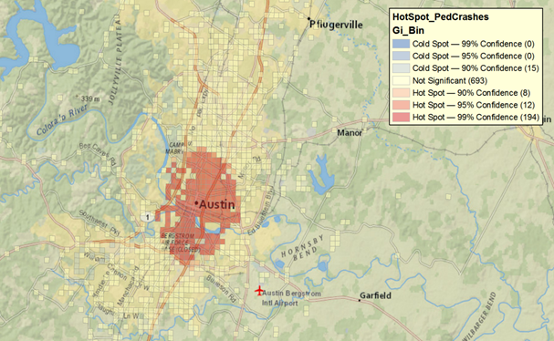
Identification of points or segments is readily available in certain GIS packages, such as ArcGIS. The optimized version of this package analyzes a layer of data (pedestrian crashes in this case), creates a grid to group the data in the context of their extent, and computes the Getis-Ord Gi statistic, which is useful to find areas in the grid with high (and low) representation of a variable of interest (pedestrian crashes in this case). Figure 16 shows the output of running this tool with its default parameters. The area near the center of Austin clearly has more pedestrian crashes relative to the whole county. However, the size of the squares of the grid is relatively large for further, more nuanced decisions.
Screen capture ©Texas A&M Transportation Institute using ArcGIS software by ESRI. ArcGIS Desktop: Release 10.4.1. Service Layer Credits: Esri, HERE, DeLorme, USGS, Intermap, INCREMENT P, NRCan, METI, NGCC, ©OpenStreetMap. Crash data provided by the Texas Department of Transportation.
Figure 16. Graphic. Pedestrian preliminary assessment of Austin-area pedestrian crashes.
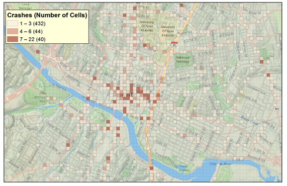
A grid of higher resolution can be set for increased detail by limiting the analysis to the area previously identified as being the primary location with a higher number of crashes. In this case, the reduced grid is set to have cells of 328 by 328 ft. Figure 17 shows the distribution of the cells with at least one crash inside. There is a clear concentration of pedestrian crashes in the Austin downtown area and, more specifically, along a west/northwest–east/southeast corridor that includes 6th Street. This visualization presents smaller areas with a high number of pedestrian crashes. To further focus the attention to more problematic subregions, the Getis-Ord Gi analysis can be run again on a different variable: the crash frequency per square. Figure 18 shows the result of this action.
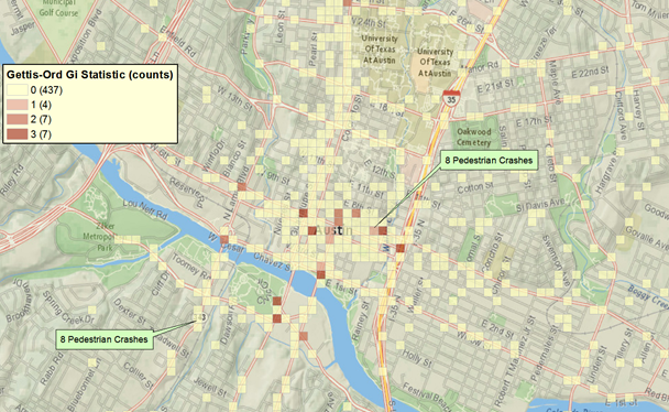
Figure 18 displays two cells whose counts are exactly eight pedestrian crashes in 5 yr, yet one of those cells is flagged as a hot spot (Neches Street and East 7th Street), while the other one is not (South Lamar Boulevard and Lamar Square Drive). The difference between these two sites is their Getis-Ord local statistic. For Neches Street and East 7th Street, that statistic amounts to 3.0598; in contrast, the Getis-Ord statistic is slightly smaller (2.854) for South Lamar Boulevard and Lamar Square Drive.
Screen capture ©Texas A&M Transportation Institute using ArcGIS software by ESRI. ArcGIS Desktop: Release 10.4.1.4.1 Service Layer Credits: Esri, HERE, DeLorme, USGS, Intermap, INCREMENT P, NRCan, METI, NGCC, ©OpenStreetMap. Crash data provided by the Texas Department of Transportation.
Figure 17. Graphic. Pedestrian preliminary assessment of area near downtown Austin, TX.
A higher Getis-Ord statistic indicates a higher count of events (crashes) within a context of cells with high counts. Thus, given a high count of crashes, the cell with a lower statistic may be an isolated case of high crashes, but the cell flagged as a hot spot by the higher Getis-Ord statistic indicates overrepresentation of pedestrian crashes at that cell and its neighbor cells. Only a handful of sites were labeled as hot spots after this step (16 cells, as shown in figure 18). Interestingly, 4 out of 16 hot-spot cells are along the axis of 6th Street. The following example utilizes only the crashes on this arterial to demonstrate sliding window crash screening.
Screen capture ©Texas A&M Transportation Institute using ArcGIS software by ESRI. ArcGIS Desktop: Release 10.4.1. Service Layer Credits: Esri, HERE, DeLorme, USGS, Intermap, INCREMENT P, NRCan, METI, NGCC, ©OpenStreetMap. Crash data provided by the Texas Department of Transportation.
Figure 18. Graphic. Identification of locations of concern using small grids.
The sliding window approach uses overlapping windows for smoothing any errors in crash location reporting. For this screening method, a window length of 984 ft is selected, performance measures are calculated for that window, the window is then moved for a given smaller offset (e.g., 328 ft), and the analysis is repeated for the shifted window. This procedure is repeated multiple times for as many windows as it takes to cover the complete corridor. An example application of this technique using the 6th Street corridor in Austin, TX, is discussed next.
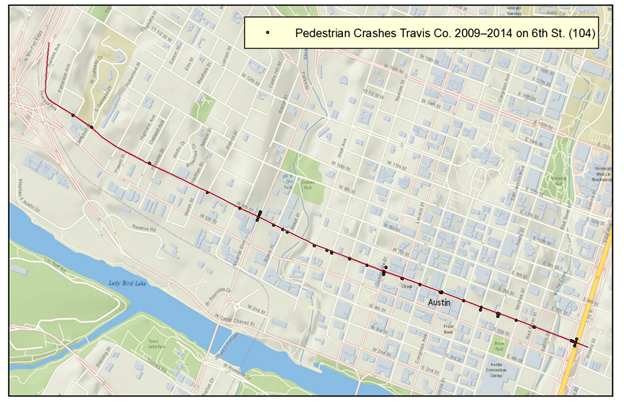
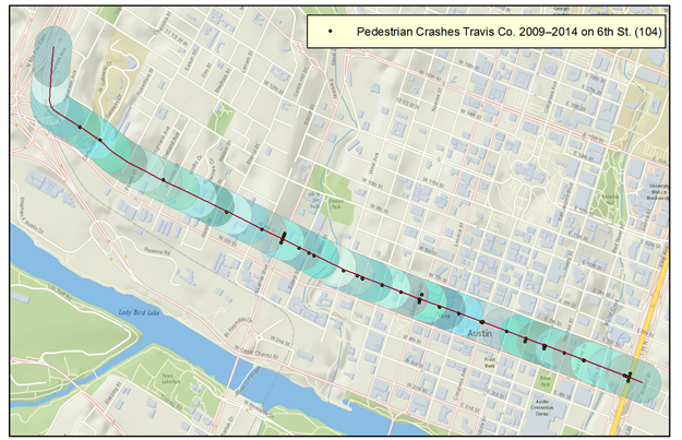
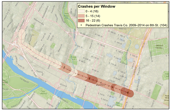
As shown in figure 19, the corridor of 6th Street between Mopac Expressway and Interstate (I)-35 is roughly 2.2 mi long and had 104 pedestrian crashes between 2009 and 2014. Thirty-seven sliding windows of 984 ft can be defined for this corridor. Figure 20 shows the resulting windows. The crash frequency was computed per sliding window, resulting in the map shown in figure 21.
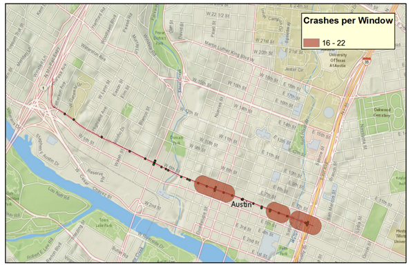
There are 6 windows with 16 or more pedestrian crashes, as shown in figure 22.
Screen capture ©Texas A&M Transportation Institute using ArcGIS software by ESRI. ArcGIS Desktop: Release 10.4.1. Service Layer Credits: Esri, HERE, DeLorme, USGS, Intermap, INCREMENT P, NRCan, METI, NGCC, ©OpenStreetMap. Crash data provided by the Texas Department of Transportation.
Figure 19. Graphic. 6th Street corridor area of analysis.
Screen capture ©Texas A&M Transportation Institute using ArcGIS software by ESRI. ArcGIS Desktop: Release 10.4.1. Service Layer Credits: Esri, HERE, DeLorme, USGS, Intermap, INCREMENT P, NRCan, METI, NGCC, ©OpenStreetMap. Crash data provided by the Texas Department of Transportation.
Figure 20. Graphic. Sliding windows shown as transparent, overlapping oblongs for 6th Street corridor analysis.
Screen capture ©Texas A&M Transportation Institute using ArcGIS software by ESRI. ArcGIS Desktop: Release 10.4.1. Service Layer Credits: Esri, HERE, DeLorme, USGS, Intermap, INCREMENT P, NRCan, METI, NGCC, ©OpenStreetMap. Crash data provided by the Texas Department of Transportation.
Figure 21. Graphic. Sliding window analysis results.
Screen capture ©Texas A&M Transportation Institute using ArcGIS software by ESRI. ArcGIS Desktop: Release 10.4.1. Service Layer Credits: Esri, HERE, DeLorme, USGS, Intermap, INCREMENT P, NRCan, METI, NGCC, ©OpenStreetMap. Crash data provided by the Texas Department of Transportation.
Figure 22. Graphic. Segments of concern identified from the sliding window analysis.
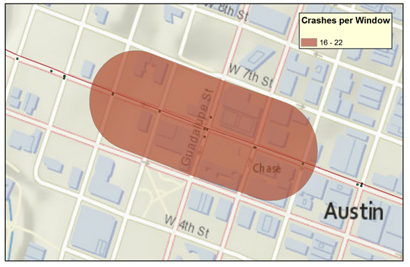
Since the six critical windows identified overlap, these windows define three areas suited for more granular assessments. Figure 23 shows the first area of concern. This area of interest ranges through five intersections, from Nueces Street to Colorado Street. It is clear from figure 23 that the communality between these three windows is that they all contain the intersection of Guadalupe Street. Incidentally, the previous analysis identified this intersection as one of the top four sites of concern along 6th Street. One can conclude from these two analyses that the intersection of 6th Street and Guadalupe Street has an overrepresentation of pedestrian crashes compared to the rest of the 6th Street corridor (from the sliding window analysis) and that its surroundings also tend to have overrepresentation of pedestrian crashes (from the site identification analysis).
Screen capture ©Texas A&M Transportation Institute using ArcGIS software by ESRI. ArcGIS Desktop: Release 10.4.1. Service Layer Credits: Esri, HERE, DeLorme, USGS, Intermap, INCREMENT P, NRCan, METI, NGCC, ©OpenStreetMap. Crash data provided by the Texas Department of Transportation.
Figure 23. Graphic. One of the areas of concern—includes critical intersections on 6th Street at Nueces Street, San Antonio Street, Guadalupe Street, Lavaca Street, and Colorado Street.
Figure 24 shows the other two segments identified from the sliding window analysis: the single window from Trinity to Red River Street and the two overlapping windows from Sabine Street to the I-35 Service Road. The site identification analysis identified the latter as a location of concern as well.
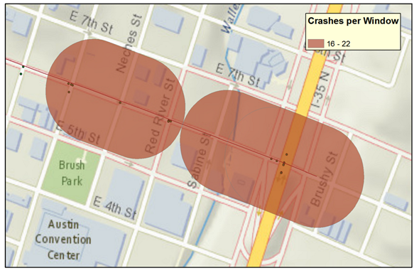
Screen capture ©Texas A&M Transportation Institute using ArcGIS software by ESRI. ArcGIS Desktop: Release 10.4.1. Service Layer Credits: Esri, HERE, DeLorme, USGS, Intermap, INCREMENT P, NRCan, METI, NGCC, ©OpenStreetMap. Crash data provided by the Texas Department of Transportation.
Figure 24. Graphic. Two segments of interest along 6th Street: Trinity through Red River Street and Sabine Street to I-35 Service Road.
Numerous city and State transportation departments along with FHWA are making pedestrian crash data available online through interactive maps. These online maps allow anyone with access to a Web browser to perform a variety of functions with regard to pedestrian crashes, including the following:
The following are examples of such maps:
Several previous studies have documented analyses to identify high crash locations, and these studies have used different approaches to identify and rank locations. Examples of approaches used and lessons learned include the following: