U.S. Department of Transportation
Federal Highway Administration
1200 New Jersey Avenue, SE
Washington, DC 20590
202-366-4000
Federal Highway Administration Research and Technology
Coordinating, Developing, and Delivering Highway Transportation Innovations
| REPORT |
| This report is an archived publication and may contain dated technical, contact, and link information |
|
| Publication Number: FHWA-HRT-17-106 Date: April 2018 |
Publication Number: FHWA-HRT-17-106 Date: April 2018 |
Just as a skilled carpenter measures twice and cuts once, a safety analyst should plan ahead and make key analysis decisions in order to get the most out of the available data. Time spent planning can yield more useful results. A motivation for the analysis could be to identify problems that the community wants to address, for example, improving safety for older or younger pedestrians. For communities with Vision Zero programs, identifying sites for treatment is critical to achieve the goal of eliminating fatal crashes. The planning of the assessment includes the following three substeps as shown in figure 3:
An initial step is to determine the type of the network elements being studied or the scale of the network. This decision could affect how the crash and roadway data are gathered and processed along with the type of performance measure(s) used to identify sites. The preference is to select a performance measure that does not have a known bias or that can minimize known biases. After the performance measure is selected, the type of screening method needs to be identified.
The scale of the network being studied along with the type of site(s) for a safety assessment can vary. The scale and type may be related to the anticipated treatment. For example, an advertising campaign regarding driving under the influence may want to target the entire community if the message is being distributed by radio or target select intersections if the message is being distributed using a print medium.
The network element scale may start with the smallest increment, typically an intersection or a marked crosswalk (point), and then be grouped into larger scales to form a facility or an area. In general, a network element is typically one of the following:
Figure 4 shows examples of the network elements. The following sections provide additional descriptions.
Points are places along a facility where (1) conflicting traffic streams cross, merge, or diverge; (2) a single traffic stream is regulated by a traffic control device; or (3) there is a significant change in the segment capacity (e.g., lane drop, lane addition).
Points (more commonly called intersections) can be subdivided as the following:
Depending on the variables included in an agency’s database, a crash may be coded as being “intersection related” or “not intersection related.” Such a variable could help determine if the crash should be associated with the characteristics of an intersection or of a segment.
A segment is the length of roadway between two points with similar geometric, operational, and vehicular characteristics. Traffic volumes and physical characteristics generally remain the same over the length of a segment, although small variations may occur (e.g., changes in traffic volumes on a segment resulting from a low-volume driveway). Segments are generally considered to be the roadway between intersections and are homogeneous throughout the segment; otherwise, the distance would be subdivided. A homogeneous segment includes consistent design characteristics (i.e., cross section) and uniform traffic volumes. Homogeneous segments allow for consistent application of the evaluation and similar countermeasures to be selected.
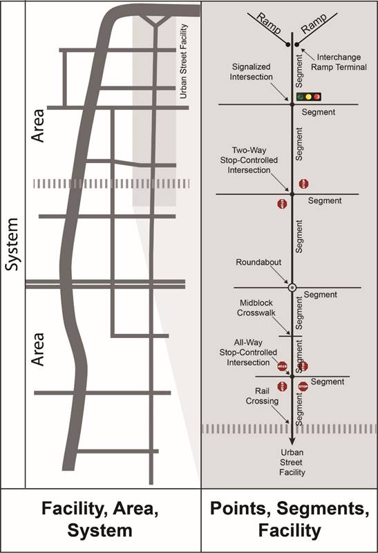
Source: Inspired by the 2016 Highway Capacity Manual Volume I, Exhibit 2-1, but developed to reflect system elements of interest to this document.
Figure 4. Graphic. Examples of system elements.(18)
There is no clear definition of road segment length that should be considered as a site within a safety analysis. Segment length does not need to be consistent for the entire dataset; however, the analysis should account for segment length. Using very short segments could result in incorrect assumptions about whether any crashes occurred on the segment or the total crash frequency on the segment, or could result in inflated crash frequency per mile. The segmentation efforts may need additional checks along with flexibility to appropriately consider potentially imprecise location information.
Facilities represent multiple points (intersections) and segments. Per the 2016 Highway Capacity Manual (HCM), facilities are lengths of roadways, bicycle paths, and pedestrian walkways composed of a connected series of points and segments.(18) The HCM defines freeway facilities, multilane highway facilities, two-lane highway facilities, urban street facilities, and pedestrian and bicycle facilities.
Per the HCM, areas consist of an interconnected set of transportation facilities serving movements within a specified geographic space, as well as movements to and from adjoining areas.(18) The facilities within an area do not need to be parallel to each other.
Because of the limited number of pedestrian crashes at a specific location, areas could be used to identify a section of a community where improvements may be needed. Another advantage to identifying an area rather than unique points or segments is that the appropriate correction for a pedestrian concern, such as increased enforcement or education, may be more appropriate for an area with a particular land use rather than just a single intersection.
Per the HCM, systems are composed of all the transportation facilities and modes within a particular region.(18)
The HSM discusses 13 problem-identification methods, along with each method’s data needs, strengths, and weaknesses.(2) The HSM notes that agencies should use the performance measure that best suits their purpose and/or available data. Interviews with several agencies revealed that, if they were not pursuing a systemic approach, most agencies used pedestrian crash frequency as their measure, with a few combining other performance measures with crash frequency. This guidebook focuses on the most common methods.
Several performance measures are available, and using more than one may provide more certainty in site selection, especially when different performance measures result in the same sites having similar ranks. Measures that are commonly used in pedestrian safety analyses include the following:
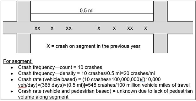
The following sections provide additional details about each of the above performance measures. Figure 5 shows an example of crash frequency and crash rate calculations for a segment.
©Texas A&M Transportation Institute.
Figure 5. Graphic. Examples of performance measures for crashes on a segment.
Crash frequency is the total count (or number) of crashes for a given network element (e.g., segment, point/intersection) for a specified time period. Supplemental data, such as exposure or roadway geometry, are not required.
Using only the crash frequency could introduce a bias toward locations with higher volumes, and using volume to generate a crash rate could help to address this bias. The lack of reliable pedestrian volume data, however, limits the ability to calculate crash rates.
Sites are ranked based on the total crash frequency or crash frequency for a particular crash severity or crash type during a given time period. The site with the highest crash frequency is ranked first.
Density methods identify high concentration of pedestrian crashes, calculated as pedestrian crash frequency per unit area (e.g., square miles) or unit length (e.g., mile). Density could reflect the selected segment length, resulting in pedestrian crashes per mile as the performance measure, or density could reflect an area. The size of the area could be predetermined and reflect established U.S. Census geographic areas of block, block group, or tract or reflect established geographic regions such as city, county, or metropolitan statistical area. The size of the area could also vary. Several examples on calculating density are available (see the following recent Florida DOT (FDOT) report, Comprehensive Study to Reduce Pedestrian Crashes in Florida, for examples), including the simple density method, which uses a circular search area.(19)
Crash rate is the number of crashes per unit of exposure. It can be expressed as the ratio of the crash frequency to exposure (e.g., traffic volume at a location or population for an area). The crash rate normalizes the crash frequency based on exposure. Crash rate is intuitive, and if traffic volume is known, it can be easy to apply. A typical crash rate calculation is shown in figure 6.
Where:
CR = crash rate for the road segment expressed as crashes per 100 million vehicle miles of travel.
C = total number of crashes in the study period.
V = traffic volumes using AADT volumes.
N = number of years of data.
L = length of the roadway segment in miles.
The equation in figure 6 relies on having traffic volume information. For evaluating pedestrian crash locations, exposure should also consider pedestrian volume in addition to vehicle volume. (See additional discussion in the Exposure Data section of chapter 3.) The availability of pedestrian or bicycle volume data, however, is generally rare. An FHWA project is developing the Scalable Risk Assessment Methodology, which will be able to help estimate pedestrian exposure.(5)
For several reasons, the use of crash rate values should be reserved for safety comparisons of locations with similar traffic volumes. For example, a limitation with crash rate is that it has bias toward low-volume locations. The ratio format of crash rate also implies that the relationship between the crash frequency and the crash volume is linear (i.e., the crash rate calculation equates to the slope of a line). Safety research efforts have determined that the sometimes-complex relationship between the crash frequency and traffic volume is usually nonlinear (i.e., the curve generally flattens as traffic volume increases). Additional information regarding these issues are available in the HSM.(2) Other recent research studies have also expands on these concerns.(20–22)
Crash type has been used to separate crashes into categories so that a more focused evaluation can be conducted on a given type. Crash type has also been used to compare the distribution (or proportion) of crashes within each crash type.
Crash type reflects the actions of those involved in the crash. Identifying the crash type can help with identifying the problem and then the countermeasures appropriate to address the crash type. An analysis to identify high crash locations may focus on a particular crash type if targeted funding or a specific program is available.
Typical crash types for pedestrian crashes include dart/dash, multiple threat/trapped, through vehicle at unsignalized location, turning vehicle, through vehicle at signalized location, and walking along road. Additional information on pedestrian crash types is available on the Pedestrian and Bicycle Information Center website as part of the Pedestrian and Bicycle Crash Analysis Tool (see http://www.pedbikeinfo.org/pbcat_us/ped_images.cfm).
Another approach for using crash type is to review the proportions of crash type for a specific location to a typical proportion of crash type for similar types of locations. For example, this approach could reveal if a specific signalized intersection is having more crashes involving turning vehicles than other signalized intersections with similar volume and roadway cross section.
The degree of severity for the crash (e.g., injury or fatality rather than property damage only) can be a factor in identifying high crash locations. Because of potential inconsistencies in reporting of property-damage-only crashes between regions, the preference is to focus on the more severe crashes. Due to the low number of pedestrian crashes, however, many agencies include all severity levels in the evaluation.
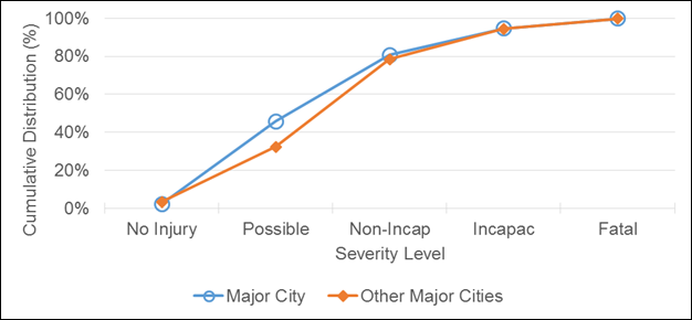
The distribution of crash severity can also be used to rank sites. Sites with similar characteristics within a region can be compared to a systemwide proportion for similar sites. Figure 7 illustrates the cumulative distribution of pedestrian crashes for a major city as compared to other major cities. In this example, the major city (shown with open circles) appears to have more severe crashes than the reference group of other major cities (shown with closed diamonds). A statistical analysis should be conducted to verify this visual observation (e.g., odds ratio in a contingency table with counts of severe/nonsevere crashes versus major city/other major cities).
The distribution of crash severity could also be used to identify sites (or regions) with the most severe crashes as the method to rank sites. The data in table 1 show the severity distribution for five major cities. The cities with the greatest proportion of severe crashes are city C and city B with 29 and 28 percent of severe crashes (fatal and incapacitating injury), respectively.
©Texas A&M Transportation Institute.
Figure 7. Graph. Example of severity-level differences between a major city and other similar major cities.
aScenario I identifies the distribution when considering the percent of crashes by each severity level, while scenario II identifies the distribution by combining fatal and incapacitating injuries to identify cities with the most severe pedestrian crashes.
bRepresents combined fatal and incapacitating injury crashes.
Different performance measures can be combined to form a safety index. The intent of a safety index measure is to minimize known biases in the analysis procedure. For example, using crash frequencies as a sole method for determining safety needs would introduce a bias toward locations with higher volumes. One suggested index is to combine the following four crash-related attributes: crash frequency, crash rate, crash severity, and/or crash type (excessive proportion of specific type).
Another type of index is when crash data are combined with other data to identify locations of highest concern for the community. An example is other data being used to subdivide the community into geographic regions to ensure that each region receives a similar number of treatment dollars. Another example of other data could be the consideration of where sidewalk gaps exist. An example of an index being used by the City of Los Angeles, CA, is included in Supplemental Material A in chapter 7.
There are several alternatives to handling the bias incurred by only using crash frequency or only using crash rates. Depending on their characteristics and objectives, an agency could (1) develop an SPF for pedestrian crashes using their available exposure data and base the index on that, (2) include both frequency and rate in an index and weight them differently, or (3) include crash frequency or crash rate for various ranges of exposure and then rank within each range.
Concerns with various performance measures include the following:
Depending on the preferred performance measure, the calculated performance measure of a given site could be compared to a reference population. Establishing a reference population permits the comparison of a particular site with the expected safety of the reference population. The reference population norms could take the form of crash frequency, crash rate (if exposure is known), crash-severity distribution, or crash-type distribution. The comparison of similar elements could help eliminate some of the biases attributed to traffic volume or other characteristics for the element. For example, a comparison between an intersection with four legs (where turning crashes may be more common) and an intersection with three legs (where fewer turning conflicts exist) could result in a missed opportunity to identify a specific safety need. If only intersections with three legs are compared, then those three-legged intersections with a greater proportion of turning crashes involving pedestrians could be identified.
Intersections could be grouped into reference populations based on traffic volume, traffic control, number of approaches (legs), functional class, area type, number of lanes (including the presence of turn lanes), and terrain. Segments could be grouped into reference populations based on traffic volume, area type, number of lanes, functional class, access density, median type and width, operating speed, and terrain.
Once performance measures have been chosen for the evaluation, the next step is to select the screening method. The screening method can vary depending on whether the focus of the evaluation is on segments or points (e.g., intersections or ramp terminal intersections). Typical screening methods include simple ranking for points and sliding window or peak searching for segments. Other screening methods for a network can include grid and polygons. The selected performance measure can influence which screening method is to be used. Supplemental Material B shows examples of results based on different screening methods.
Simple ranking orders the intersections, segments, or facilities based on the numerical value calculated from the selected performance measure. Sites with the highest value are identified for further study.
When ranking by crash frequency, a bias may be present for high-volume intersections or segments. Grouping and then ranking within an intersection or segment type could help eliminate some of the biases attributed to traffic volumes. For example, a high-vehicle-volume signalized intersection (where rear-end collisions may be prominent) merits unique evaluation, and a direct comparison between this intersection and a low-vehicle-volume intersection (where angle crashes may be prominent) could mask critical safety enhancement needs. The following are potential categories for intersections:
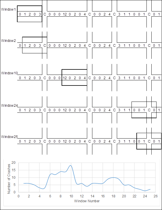
Sliding window is only applicable for segment-based screening and is used to identify locations within a roadway facility that show the most potential for safety improvements. The selected performance measure is calculated for a specified segment length (e.g., 0.3 to 0.5 mi), and then the window is moved by specified incremental distance (e.g., 0.1 mi) and the value is recalculated for the next increment. By evaluating an individual location multiple times (for example, the segment between the 0.4- and 0.5-mi location would be evaluated five times), inaccurate crash reporting locations are minimized. The windows with the highest values for the segment or facility are identified. This technique can be automated using geographic information system (GIS) tools or spreadsheet tools.
An example application of this method is illustrated in figure 8. In this example, the increments were assumed to be 0.1 mi and the window length 0.5 mi, resulting in five increments being included in each window. Also assumed was that the width of each intersection was equal to the increment distance (e.g., 0.1 mi) and that there were no segment crashes within those intersections. The number of crashes at an intersection would be screened using another screening tool, such as with the simple ranking method. For the example in figure 8, the window with the highest number of crashes is window 10.
©Texas A&M Transportation Institute.
X = number of segment crashes on a 0.1-mi segment; C = intersection.
Figure 8. Graphic. Example of sliding window screening.
Similar to the sliding window, peak searching is only applicable for segment-based screening. In peak searching, the segments are subdivided into windows of similar length, typically 0.1 mi initially, where the windows do not overlap. The performance measures are calculated for each window, and the resulting value is compared to a desired level of precision. If none of the 0.1-mi segments meets the desired level of precision, the segment window is increased, for example, to 0.2 mi, and the process is repeated until a desired precision is reached or the window equals the entire segment length.
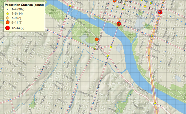
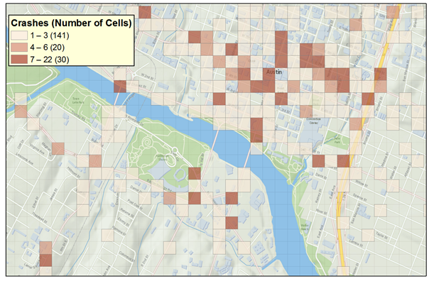
The grid method creates a grid for the entire network. All the crashes could be summed within the cell to create pedestrian crashes per area, or a more detailed approach could be used that assigns a score for each cell. The score could be based on a number of characteristics, such as crash severity, age of pedestrian, or the crash frequency within the cell in combination with the crash frequency in neighboring cells. The scores can be shown as a crash density map, where cells of a given color (e.g., red) are those with higher-than-average crashes and cells of another color (e.g., blue) represent lower-than-average crash conditions. Figure 9 shows the grid superimposed on an area, while figure 10 shows the crash density for that area.
Screen capture ©Texas A&M Transportation Institute using ArcGIS software by ESRI. ArcGIS Desktop: Release 10.4.1. Service Layer Credits: Esri, HERE, DeLorme, USGS, Intermap, INCREMENT P, NRCan, METI, NGCC, ©OpenStreetMap. Crash data provided by the Texas Department of Transportation.
Figure 9. Graphic. Example of a grid over Austin, TX.
Screen capture ©Texas A&M Transportation Institute using ArcGIS software by ESRI. ArcGIS Desktop: Release 10.4.1. Service Layer Credits: Esri, HERE, DeLorme, USGS, Intermap, INCREMENT P, NRCan, METI, NGCC, ©OpenStreetMap. Crash data provided by the Texas Department of Transportation.
Figure 10. Graphic. Example of a crash-density grid.
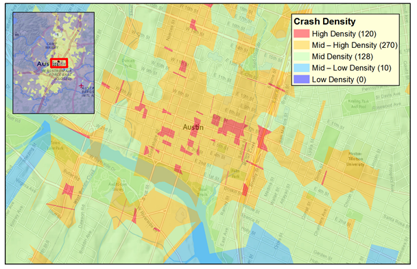
Most GIS tools provide a tool to draw proximity polygons (e.g., ArcGIS calls this tool Thiessen Polygons, and QGIS calls it Voronoi Polygons). The use of these tools can help visualize crash concentration more fairly. These tools can be used to easily represent crash density from a layer with crashes. These polygons are defined as the largest area around an event (i.e., crash) where there is no closer event than the event inside the area. Therefore, the smaller the polygon, the higher the concentration of crashes around that area. Given the definition of these polygons, the smaller the area, the closer the adjacent crashes are to the crashes within the polygon. The smallest areas would represent the areas with the highest crash densities.
Proximity polygons can be used when there are a significant number of instances with two or more crashes geocoded to the same latitude and longitude (i.e., “stacked” crashes). To account for those situations, the area of each polygon can be adjusted to represent area per crash: (polygon area)/(crash frequency). Figure 11 shows proximity polygons in the downtown area in Austin, TX, after adjusting for event stacking. Polygons are color coded by the adjusted area (smallest polygons in red, largest polygons in blue).
Screen capture ©Texas A&M Transportation Institute using ArcGIS software by ESRI. ArcGIS Desktop: Release 10.4.1. Service Layer Credits: Esri, HERE, DeLorme, USGS, Intermap, INCREMENT P, NRCan, METI, NGCC, ©OpenStreetMap. Crash data provided by the Texas Department of Transportation.
Figure 11. Graphic. Example of proximity polygons.
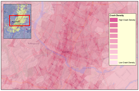
Visualization of locations of concern can be done by reviewing a plot of the crash locations. To adequately account for the crashes that occur at a single location, a technique to provide an appreciation for the multiple crashes is needed. Heat maps are one technique, and different symbols representing number of crashes is another. Figure 12 shows the same Austin data presented in the previous examples to provide an appreciation of locations with the highest crash densities. Heat maps can be prepared in several ways. Most online applications use a kernel smoothing over an uploaded cloud of points. The presentation in figure 12 is based on the proximity polygons discussed in the Polygons section.
Screen capture ©Texas A&M Transportation Institute using ArcGIS software by ESRI. ArcGIS Desktop: Release 10.4.1. Service Layer Credits: Esri, HERE, DeLorme, USGS, Intermap, INCREMENT P, NRCan, METI, NGCC, ©OpenStreetMap. Crash data provided by the Texas Department of Transportation.
Figure 12. Graphic. Example of a heat map.