U.S. Department of Transportation
Federal Highway Administration
1200 New Jersey Avenue, SE
Washington, DC 20590
202-366-4000
Federal Highway Administration Research and Technology
Coordinating, Developing, and Delivering Highway Transportation Innovations
 |
| This report is an archived publication and may contain dated technical, contact, and link information |
|
Publication Number: FHWA-RD-95-197
Date: December 1996 |
Development of Human Factors Guidelines for Advanced Traveler Information Systems and Commercial Vehicle Operations: Comparable Systems Analysis
CHAPTER 4. UNIVERSITY OF MICHIGAN TRANSPORTATION RESEARCH INSTITUTE (UMTRI)
GENERAL SYSTEM DESCRIPTION AND OBJECTIVESUSER INTERFACEDESIGN GUIDELINES USEDLESSONS LEARNED
GENERAL SYSTEM DESCRIPTION AND OBJECTIVESIn accordance with the Task D SOW for the current contract, UMTRI was designated as one of the comparable systems to be analyzed. Information about the UMTRI research program was obtained primarily in a meeting with Dr. Paul Green at the UMTRI Human Factors Division and in subsequent telephone interviews. A variety of techniques have been used in the UMTRI research program, including literature review, focus groups, identification of functions and features of driver information systems, analysis of methods for assessing safety and usability, laboratory development of prototype in–vehicle displays, and on–the–road testing in an instrumented vehicle. After the literature review, focus groups with drivers, and human factors evaluations in the laboratory, UMTRI identified five categories of information for further study:
Various information display methods and formats were developed and evaluated using rapid prototyping techniques. Analyses using the Goals, Operator, Method, and Selection (GOMS) model addressed the effectiveness of the various displays (Card, Moran, and Newell, 1983). Usability studies were conducted on various types of interface designs and the best features were incorporated into a field study investigating the navigation and route guidance aspects of ATIS systems. The culmination of the UMTRI effort was the on–the–road test of this IRANS system. (See table 3 for the ATIS functional characteristics that apply to the on–the–road system.) That system will be emphasized in the present report, since the authors were able to gain direct experience with the system while acting as pseudo–subjects in the test procedure. Three members of the Battelle team drove the test vehicle with the simulated route guidance system.
Table 3. Comparison of UMTRI functions with those from ATIS/CVO systems.
The test vehicle is an instrumented Honda station wagon. It has a lane tracker built into the left side mirror and collects data from the steering wheel, brake, gas pedal, and turn signals. A microphone and two video cameras captured the driver's face and the front view from the car. In previous studies, UMTRI emulated a head–up display (HUD) by using a small mirror attached to the windshield that enabled the driver to view a reversed–video, 23–cm CRT mounted between the front seats. The HUD was not implemented for this study. The UMTRI Research Assistant sat in the back seat on the passenger's side. She had two keyboards available to control the pages displayed by the route guidance system. In effect, she was using the "Wizard of Oz" technique to replace global positioning systems (GPS) or other navigation data sources to control the display of route guidance information. The technique was very effective in achieving the look and feel of a dynamic in–vehicle display of route guidance, given the constraint that the route was predetermined. The Wizard of Oz technique was entirely successful in emulating a fully functional in–vehicle navigation system. The test route was approximately a 25–minute drive and included a variety of driving conditions, with semi–rural, residential, multi–lane business, and interstate roadway segments.
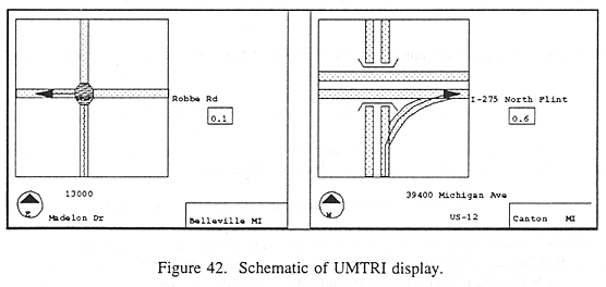
USER INTERFACEVisual Information DisplayThe in-vehicle display was a 13–cm LCD, located on top of and in the middle of the dashboard. A rudimentary road map was displayed, showing the route to be followed, with an arrow representing heading direction (figure 42).
The display also indicated the name of the current street, name of the next turn street, and distance to the turn in tenths of a mile. The display was presented in a heading–up mode. The system did not incorporate voice output. The display was helpful in route guidance and it was easy to interpret next–turn information. It seemed very similar to the Navmate (Chapter 5) route guidance display, without the auditory information.
Auditory Information DisplayNo auditory information was given in this on–road study. Prior laboratory work at UMTRI included the development of auditory display for route guidance. The system was developed after analysis of the TravTek auditory information. A given maneuver, such as a turn, was communicated to the driver in three stages: Early, Prepare, and Final. In all the stages, a similar format or syntax was used:
Early communication was given soon after completion of the prior maneuver. An example of an early communication is: "In 2 miles at Pine Street, turn right." The early communication omits the "landmark" feature and gives distance, location, and action. The middle or "Prepare" communication was given 1.6 km prior to the action. An example is: "Prepare in 1 mile, at the Shell Station at Pine Street, to turn right." The final communication used the word "approaching" to indicate that the action is required soon. Normally, it was given 0.16 km in advance. An example is: "Approaching the Shell Station at Pine Street, turn right." The UMTRI research indicated the importance of using a term such as "approaching" to indicate that the action is imminent, but not necessarily immediate. One or more right turns might exist before Pine Street, so a communication such as "turn right now" would not necessarily be correct. The landmark gives the driver a visual cue to supplement street signs, which are sometimes difficult to locate or are poorly illuminated at night. The UMTRI work on auditory displays was done first in the laboratory, then it was tested on the road. In the road test, the error rate (e.g., failure to make the correct turn) was less than 5 percent with the auditory route guidance. This is an excellent success rate for auditory guidance only, using no visual display.
User Input (Controls)The UMTRI research did not include work on driver input or control actions related to an in–vehicle display system.
Communications SystemsThe UMTRI research did not include work on driver communications with a Traffic Management Center or dispatcher.
Cognitive DemandsEye–fixation data were obtained in the UMTRI instrumented vehicle during road tests. These data provide a foundation for the analysis of driver time–sharing behavior and they supplement more direct measures of driving performance such as lane tracking and speed variance. However, these data have not been analyzed to date. At UMTRI, the prevailing design philosophy with respect to attention and workload seems to be that drivers may become overloaded if they attempt to interact with an in–vehicle system while driving. Therefore, the favored concept is to allow the driver to interact with the system only in the pre–drive phase, while the vehicle is in PARK.
System Temporal RequirementsThe temporal requirements of the system were circumvented in this test by the Wizard of Oz technique. The human operator (research assistant) could account for computer lags or other temporal factors in presentation of the display pages.
DESIGN GUIDELINES USEDAccording to Dr. Green, no human factors or other guidelines were used as reference documents in the development of the ATIS displays at UMTRI. He suggested that traditional human factors guidelines usually are developed either for human-computer interaction (e.g., Smith and Mosier, 1988) or for military systems (e.g., MIL–STD 1472) and are not helpful for the design of in–vehicle displays for ATIS systems. He suggests that the preferred method is to develop in-vehicle displays using a pragmatic approach of iterative designing and testing. This technique was used, for example, to decide on the typeface and character size used in the UMTRI in–vehicle display.
LESSONS LEARNED[UM 01] PRAGMATIC, ITERATIVE DESIGN METHODS ARE EFFECTIVE IN DEVELOPING CRITICAL DESIGN FEATURES
[UM 02] INTERFACE CONSISTENCY IS ESSENTIAL
[UM 03] DISPLAY CHARACTER SIZE SHOULD BE LEGIBLE FROM NORMAL DRIVING POSITION
[UM 04] DRIVER INPUT REQUIREMENTS MAY DISTRACT THE DRIVER FROM THE DRIVING TASK
[UM 05] VERBAL INFORMATION ON VEHICLE STATUS IS BETTER THAN "MIMIC" OR ICON
[UM 06] THE LOCATION OF HAZARDS SHOULD BE STATED VERBALLY FROM THE DRIVER'S PERSPECTIVE
[UM 07] DRIVER INFORMATION REQUIREMENTS FOR ATIS SHOULD INCLUDE ROADWAY HAZARDS AND TRAFFIC CONGESTION INFORMATION
[UM 08] KNOWLEDGE OF HOW DRIVERS USE PAPER MAPS SHOULD BE USED AS BASELINE FOR ATIS DESIGN
[UM 09] DRIVER INFORMATION NEEDS DEPEND UPON THE DRIVING TASK
[UM 10] TRAFFIC CONGESTION IS BETTER CODED WITH COLOR THAN WITH DIFFERENTIAL LINE WIDTH
[UM 11] USE A DIGITAL SPEED INDICATOR RATHER THAN MOVING GRAPHIC ELEMENTS (e.g., DASHED LINES) FOR DISPLAYING TRAFFIC SPEED INFORMATION
[UM 12] MAP ORIENTATION DEPENDS ON ATIS MODE
[UM 13] ROUTE GUIDANCE DISPLAYS SHOULD AVOID DETAIL
[UM 14] LANDMARKS SHOULD BE SHOWN ON NAVIGATION DISPLAYS
[UM 15] APPROPRIATE MEASURES OF DRIVER AND SYSTEM PERFORMANCE FOR EVALUATING IN–VEHICLE DISPLAYS MUST BE DEVELOPED AND USED
[UM 16] SEVERAL ATIS-USER RESEARCH ISSUES NEED TO BE ADDRESSED
FHWA-RD-95-197 |