
Major Elements
Coordinate Elements
Variable Factors
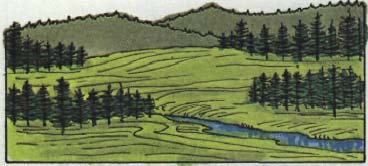
It has been said that 87 percent of our perception is based on sight. What we see is a combination of masses and spaces. The art of design revolves around the composition of masses and spaces. Space itself is endless, having limits only when interrupted by a mass. There are two types of spaces: open space and enclosed space. The sensation that accompanies open space is one of exhilaration, the feeling one gets when standing on a mountaintop with an uninterrupted view. Enclosed space imparts a feeling of retreat, or shelter, to one within its boundaries. Enclosure tends to heighten the senses, and one becomes aware of details and movement. Masses are the solid objects one normally associates with design. A skillful designer coordinates the use of mass and space to create a visually pleasant experience for the viewer.
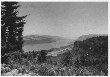
"Open space exists when an open space is large in relation to the height of its boundaries."
"An enclosed space exists when an open area is small or the boundaries high. . . . We are essentially within its volume."
"We experience masses from outside, spaces from inside. A space is our temporary environment."
Quotes from . . .
Nan Fairbrother
Line
Color
Form
Texture
Visual perception of mass and space consists of four major elements: line, form, color, and texture. The characteristics of each element are identifiable in any visual composition, although one or more elements may dominate the composition.
Lines in the environment
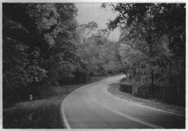
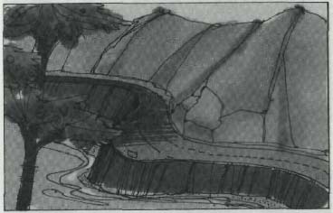
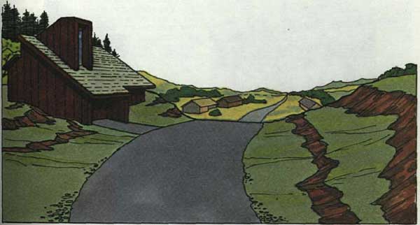
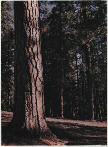
Line is a direct link between two points. Line may be actual or implied, such as an arrangement of two or more objects in a row. Lines exist in nature as silhouettes of objects. Examples are a ridge line of a mountain, the banks of a river, or the trunk of a tree. The horizon is a distinct natural line. Man-made lines on the landscape include roads, fences, bridges, and the outlines of structures. The straight line was developed for convenience and economy in design. Long straight lines rarely occur in nature.
Lines which are long and straight tend to dominate in a natural setting, which consists mainly of short segments of straight lines and curvilinear or free-form lines.
A line in the environment tends to direct the eye.
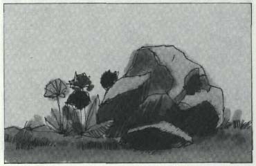
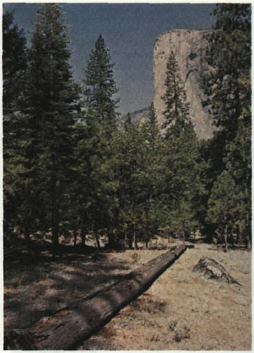
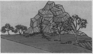
Form is closely related to the term, mass. The bulk that comprises an object, or mass, is arranged in such a way as to create shape, or form. Form exists in nature, as mountains, trees, boulders, pebbles. Man creates form in buildings, cars, structures of any type. Separate objects can create forms when viewed from a distance such as several trees forming a clump or many buildings forming a single cityscape.
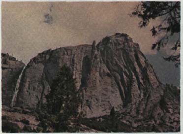
Natural form
Manmade form blended with natural form
Color
Color is the breakdown of light into distinct visual elements. When an individual sees a color, an optical reaction is recorded in the memory as an aid to identification. Each color has a separate reaction and is recorded as such. Each future experience with a color triggers the same reaction to a common stimulus - identical colors. Color reaction is automatic and intuitive in most humans and occurs without our conscious awareness. As we become educated, we are taught to identify the reaction with a name - red, yellow, blue. Pure white, we are taught, is the absence of color.
Colors that occur most frequently in nature are greens, blues, and browns in varying shades. Man produces and uses a wide range of colors because of the strong sensations they produce. Colors that harmonize well seem to belong together and produce pleasing visual effects. Colors that do not harmonize are disturbing to the viewer. Colors are further broken down into light and dark and into intensity ranges from vivid to dull. Generally, bright vivid color combinations produce startling dramatic effects, and less bright colors tend to produce quiet and restful moods.
EARTH COLORS found in natural materials
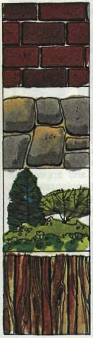 Brick
Brick
Rock
Foliage
Weathered wood
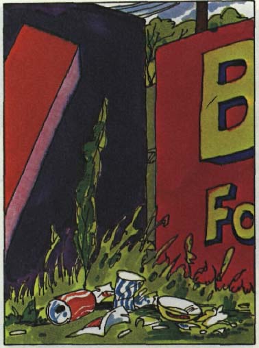
Non-harmonious colors, often used on billboards to attract attention
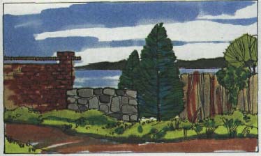
Earth colors harmonize well in the environment
Texture is exhibited on the surface of all objects. It may be described as the relative coarseness of the surface. This varies from a relatively smooth, or fine texture, to a very rough, or coarse texture. A surface with a rough texture varies in depth and is often called a raised surface. A raised surface causes minute shadows to be cast on other parts of the surface which produces an interesting, three-dimensional effect. Skillful use of textural differences in design results in subtle but definitely pleasant visual effects.
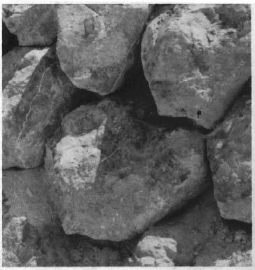
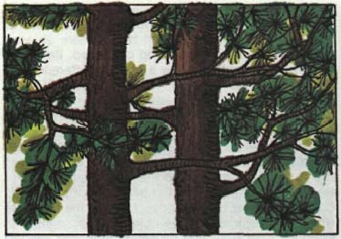
Textural differences in nature cover a broad range; therefore, they must be grouped into fine textures, medium textures, and coarse textures. Distance alters our perception of texture; one must view fine textured objects at close range in order to see the texture. When viewed from a distance, fine textured surfaces blend into a single tone and appear flat. Coarse textured objects are distinguishable from greater distances. The infinite variety of textures that we experience in our daily lives is responsible for a great deal of our perception of objects and our visual interest in both natural and manmade features.
Texture varies with distance
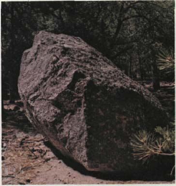
Fine and coarse textures in nature, exhibited by the rock and pine branch
Coarse texture in plant materials
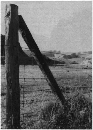
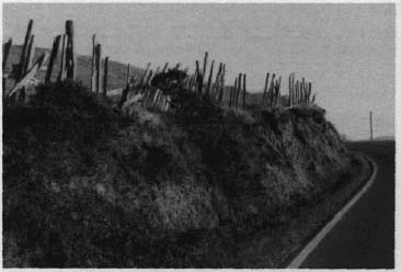
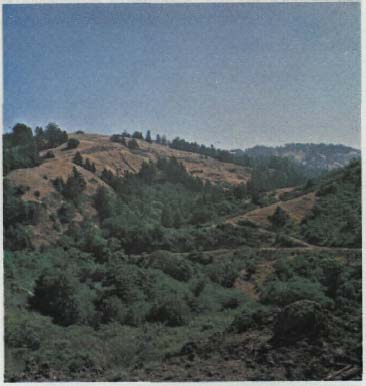
Visual perception of major elements is further controlled by four coordinate elements: contrast, sequence, axis, and dominance. These elements exist singly or in combinations, and produce varying effects on the viewer.
Contrast is a visible difference, usually associated with color. The degree of contrast is the amount of noticeable difference between two or more objects, colors, surfaces or units being compared. Items exhibiting high contrast show a marked difference between each other even when viewed at great distances. Items of low contrast are difficult to distinguish even at close range. The natural environment is generally of low to medium contrast since natural features tend to be similar in color intensity. Manmade objects in the environment are often of high contrast compared to their surroundings. This tends xo call attention to the presence of an object. Contrast may be used to advantage by the designer when it is desired to have objects easily seen. For example, road signs and pavement markings employ contrasting colors for safety reasons. High contrast can be detrimental if it causes unnecessary distraction away from a desired view.
High contrast
Low contrast
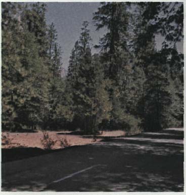
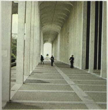
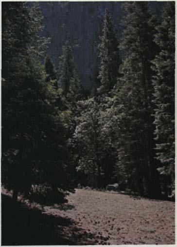
Sequence may be thought of as a progression, the visible experience of movement or change. Sequence in the visual sense is a series of events which lead the eye in a specific direction or exhibits a logical order. A line of trees becomes a sequence if the eye automatically follows from one tree to another. Designers utilize this principle to create an experience by-visually linking one event with another in order to direct the eye to a desired point. A logical sequence unconsciously builds excitement, an anticipation of something more to experience. A pleasant type of rhythm develops in a properly planned sequence which imparts the feeling that one is, in fact, progressing in some direction. A design that incorporates a sequence creates a pleasurable experience for those who move through it rather than a static feeling of monotony.
"Our impressions of an object or a space are conditioned by those objects or spaces we have already experienced or that we anticipate.... We plan, then, not a single experience alone, but rather a sequence of conditioned experiences that will heighten the interacting pleasurable impact of each."
- John 0. Simonds
"Experience, we may see, is compounded of that which we have perceived, that which we are perceiving, and that which we expect to perceive."
- John 0. Simonds
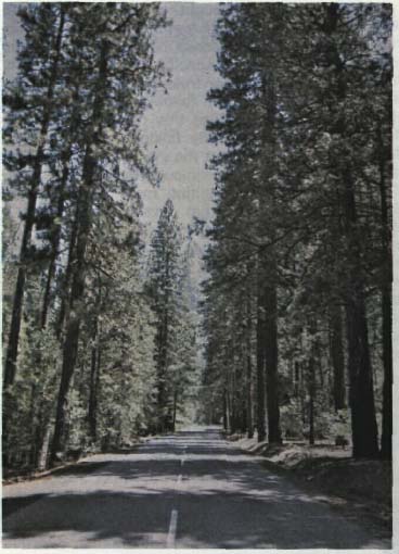
A sequence created by selective openings in a forest
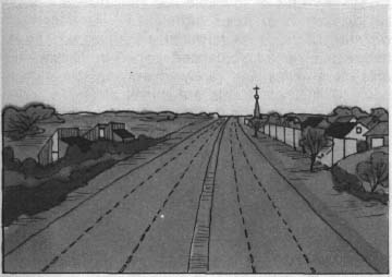
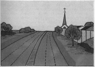
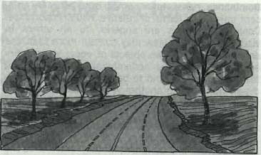
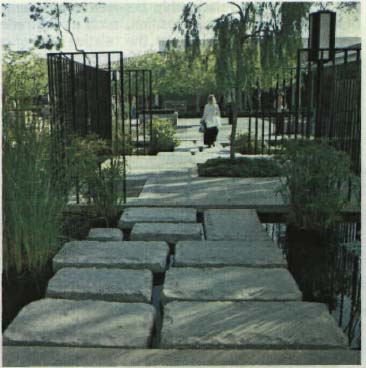
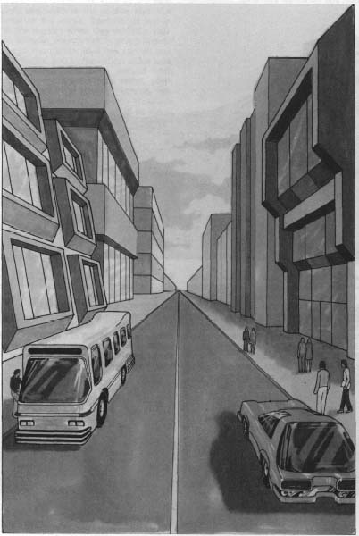
Axis is a visible or invisible line that bisects a view. An axis tends to focus attention on itself or on a distant feature which terminates the axis. Most axes divide a view into balanced parts. In nature, the axis often exists, but rarely in a symmetrical manner. Symmetrical forms are mirror images divided by an axial line which is either expressed or implied. Asymmetrical forms achieve a balance through the arrangement, location, and relative size of opposing forms divided by an axis. In an axial view, the eye of the observer is directed forward, toward the center of the view, by the converging lines of the composition, A long, straight highway, on level ground, forms a visual axis which directs the attention of the motorist in a forward direction. A symmetrical axis tends to be monotonous because all components are equal. An asymmetrical axis relieves this monotony, particularly for the moving observer. As one moves through an asymmetrical arrangement, the relationships between opposing sides of the axis constantly change while still maintaining a feeling of order and visual balance. The principles of the axis can be used by the designer to create powerful visual effects through balance achieved in a symmetrical or asymmetrical manner.
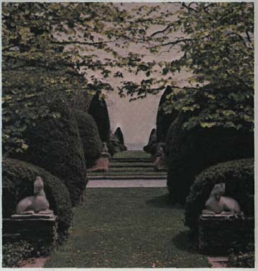
A planned axis
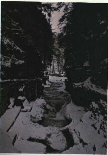
A natural axis
Asymmetrical balance
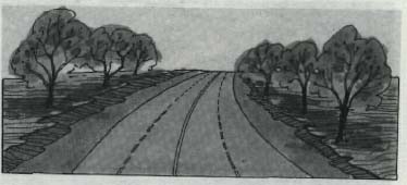
Symmetrical balance
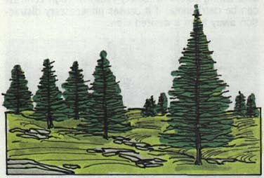
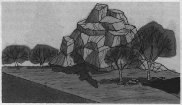
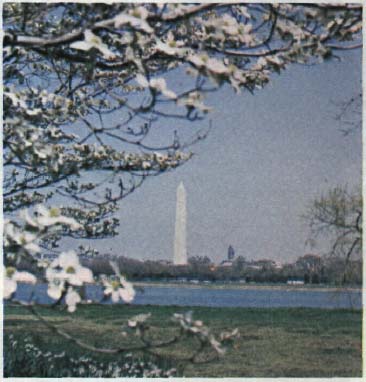
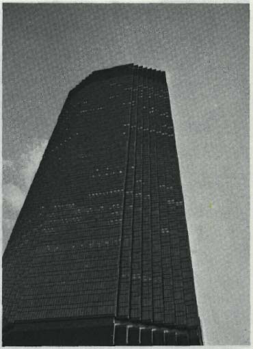
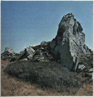
Dominance refers to a comparison between adjacent objects in terms of relative visual importance. Dominant features are superior to all others in visual influence. A view may contain more than one dominant feature: Two objects of equal visual influence are said to be codominant. Many dominant features in a view tend to be distracting; the eye is drawn from one to another without the opportunity to focus on one major element. Dominant features in nature are mountains, a single tall tree among small trees, or any feature that clearly controls the visual scene. Skyscrapers and other major man-made objects are dominant if they exert a strong visual attraction over adjacent features
A form dominant by its color and size in relation to other elements
Dominant form
A number of design components affect or modify what we see, but are not constant because they represent changeable relationships between the viewer and the scene. These relationships are called variable factors. Such factors as scale, proportion, distance, observer position, atmospheric conditions, light, seasons, and motion are important considerations which the designer should be aware of and which may be used effectively in proposed designs.
A dominant element in a composition...
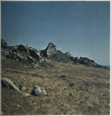
. . . becomes less dominant when viewed in relationship to other dominant elements
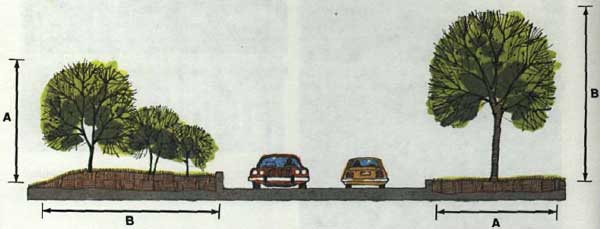
Scale is the relationship between two or more objects being compared in terms of apparent size. Objects that are in scale appear to belong together. Objects that are out of scale exhibit a visual imbalance; one or more objects appear to be extremely dominant, even overpowering. Scale is often considered to be the relationship between the human figure and other objects'. The size of a human is roughly constant; objects that fit well with human size and physical capabilities tend to be in scale.
Monumental scale - in a structure...
...in nature
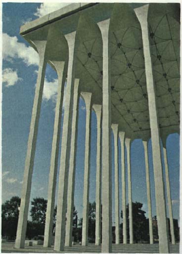
Large scale in a pedestrian space, designed to make the structure dominant
Intimate scale, related to human activity
Proportion is the relationship between components of a single object or composition, such as the ratio between height and width or the relative size of a part in relation to the whole. Components are in proportion to one another when they exhibit a visually balanced attitude; objects not in proportion do not appear to be compatible. Man has studied proportions for centuries, and mathematical ratios have been developed which have been derived from proportions existing in nature. These ratios, when applied to design, create a visually pleasing, balanced composition. For example, the ideal rectangle has been said to have a ratio of 3:5 along its sides. Many other laws of proportion have been developed and are of use to the designer in creating visually balanced, aesthetically pleasing designs.
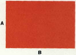
Asymmetrical and proportional balance between adjacent vertical and horizontal elements.
Distance affects our perception of detail, color, texture, and scale. Objects at close range tend to be examined by the observer, and subtle differences become apparent. At greater distance, finite differences in detail become lost, and the observer must rely on color variations or textural differences to discern one object from another. When one approaches the limits of visibility, only objects which greatly differ in contrast are visible. It is difficult to determine the size of a distant object unless one has something to relate it to, such as another person, tree, or other fairly constant figure in terms of size. Outlines of objects become the main form of identification at great distances. This basic principle is important to the designer. Objects which the designer wishes to be seen at a distance should be of bold texture, contrasting in color to their surroundings, and unique in form. Objects which need to blend with their surroundings at a distance should be similar to their environment in texture, form, and color.
Effect of distance on detail
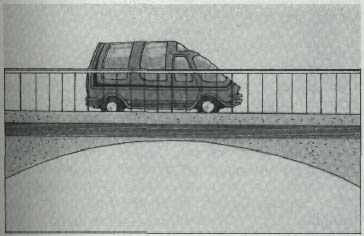
Observer position determines how much of a total object is seen at one time. Objects are most visible from a position above the object; at this position the eye has its maximum peripheral capability - we can see a wider angle and therefore more of a view. Most detail may be seen at a position near to eye level. Objects that are above the observer tend to be dominant; however, we can see less of an object, and it becomes difficult to accurately determine the shape or proportions of the object being viewed.
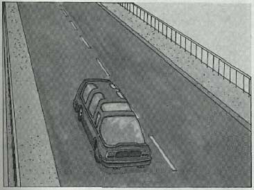
Observer above
Observer at eye level
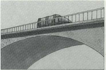
Observer below
Atmospheric conditions affect our perception of objects by increasing or decreasing visibility. Bright, sunny days maximize color variations that help us to distinguish between objects in the landscape. Cloudy days tend to reduce the contrast of objects, thereby helping to blend one with another; thus colors appear less vivid, somewhat darker. Rain, fog, smog, and falling snow also reduce our visibility and blend colors together - objects are less visible even at close distances. When choosing colors for a proposed design, consideration should be given to the prevailing atmospheric conditions regardless of whether the design is intended to blend with or contrast with the surroundings.
Bright, sunny days increase visibility.
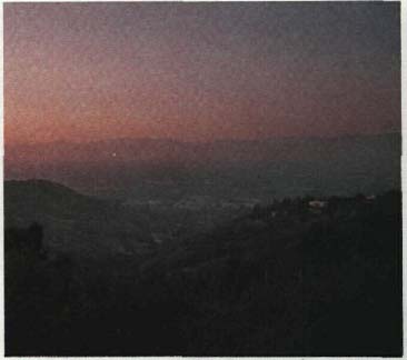
Smog and haze decrease visibility.
Side lighting - awareness of three-dimensional form of objects
Front lighting - bright color, high reflection, flat two dimensional look
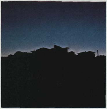
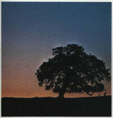
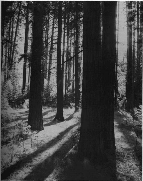
Light plays an important part in our perception of objects. Bright light aids in color reflection and general visibility. The direction in which the light source strikes the object in relation to the observer determines what we see. Objects that are back lighted are distinguished by their form - details of the object are lost; the silhouette becomes the major feature. Objects which are front lighted reflect the most light; therefore, colors become the most obvious feature. Front lighted objects tend to appear two-dimensional or flat, because little shadow exists under these conditions. Side lighted objects benefit from the shadows created, and textures are more apparent. Objects appear three dimensional; the viewer can distinguish depth at greater distance. Side lighting conditions create dramatic effects in nature in late afternoon to evening which Is one reason a drive in the outdoors is so pleasant at this time of day.
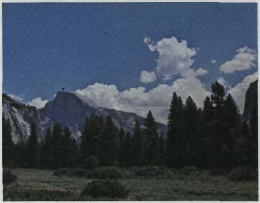
Seasons affect our visual perception due to the wide variation in color of the surrounding environment. Spring flowers and fall leaf colors tend to dominate in the environment and negate other features. In summer, green or brown colors predominate in the landscape; colors which do not harmonize well with these colors tend to become more apparent. In winter, predominant colors tend to be browns or shades of gray and white in snow country. In snow, much of the landscape and colors are negated except for major structures, trees, etc., which become more dominant as a result. Objects which have little visual impact for most of the year become major landscape features due to the heightened contrast and increased awareness of line and form.
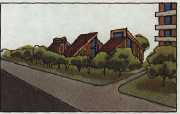
Spring
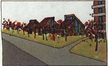
Fall
Summer
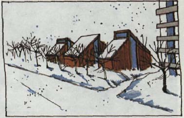
Winter
Seasonal changes produce unique visual effects.
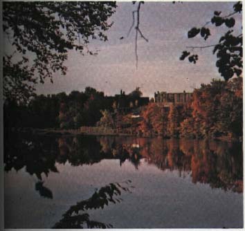
Fall colors tend to dominate in the environment.
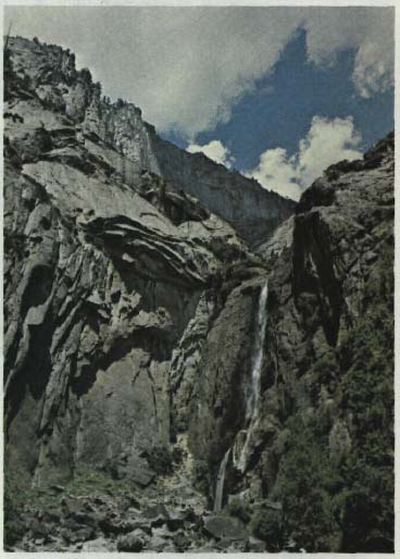
Motion affects our perception of detail. When the observer is in motion, fine detail or subtle differences in texture are lost; the observer relies on color and form as an aid to identification of objects. When the observer is stationary, motion attracts interest; the eye tends to follow the motion or to determine what is moving. Slow motion attracts attention to detail in the composition of objects rather than in the objects themselves. The motion in such things as fire and rushing water accounts for the ability of these features to attract and hold attention for long periods of time.
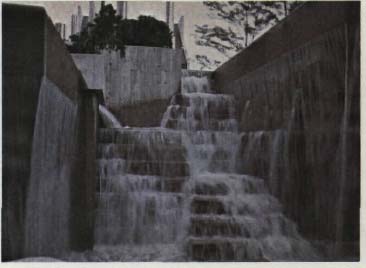
motion

