U.S. Department of Transportation
Federal Highway Administration
1200 New Jersey Avenue, SE
Washington, DC 20590
202-366-4000
Federal Highway Administration Research and Technology
Coordinating, Developing, and Delivering Highway Transportation Innovations
| REPORT |
| This report is an archived publication and may contain dated technical, contact, and link information |
|
| Publication Number: FHWA-HRT-13-097 Date: September 2014 |
Publication Number: FHWA-HRT-13-097 Date: September 2014 |
The U.S. Department of Transportation (USDOT) DMA program has identified 10 high-priority mobility applications to improve the individual mobility, safety, and environmental impacts through connecting vehicles, infrastructure, and travelers.(142) Figure 60 shows these USDOT DMA bundles. INFLO is part of these mobility applications, which includes queue warning, cooperative adaptive cruise control, and speed harmonization.(143) Among these applications, this study focuses on speed harmonization, which is an ATM strategy that adjusts the speed limit based on traffic, weather, and road surface condition to improve mobility, safety, and negative environmental impacts.(140)
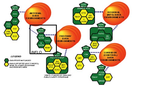
Figure 60. Illustration. USDOT DMA bundles.(144)
USDOT’s AERIS program also identifies speed harmonization as an effective application to control negative environmental impacts.(144) The AERIS program examines ways to reduce environmental impacts resulting from transportation-related emissions and fuel consumption, and as such, AERIS projects leverage other USDOT research areas for environmental management. The AERIS program has developed six transformative concepts, bundling applications to achieve additional benefits beyond what each can achieve alone. Connected vehicle technology is a central component of the AERIS program, so information and how it is communicated to travelers and their vehicles is of interest. Figure 61 shows the USDOT AERIS bundles, where speed harmonization is characterized as an eco-lanes application.
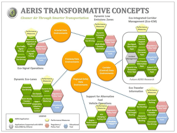
Figure 61. Illustration. USDOT AERIS application bundles.(144)
Speed harmonization was first introduced in Germany and the Netherlands in the 1970s; however, it was not widely implemented until the 2000s.(145) The literature has adopted both empirical and simulation approaches to analyze the effectiveness of speed harmonization systems. Empirical-based approaches focus on evaluating the effectiveness of the existing systems. (See references 143–150.) These studies mainly compare certain performance measures (e.g., flow rate, travel time, crash rate, etc.), based on the empirical data in a before and after study to investigate the effectiveness of speed harmonization systems. Unlike empirical-based approaches, simulation-based approaches mostly investigate the algorithms and methods with the objective of improving the performance of the speed harmonization systems. (See references 151–157.) These studies mainly focus on improving the speed limit selection algorithms.
Current practice of speed harmonization systems can benefit from connected vehicles technology. Connected vehicles technology will provide the means to detect and collect the individual vehicles’ trajectories. These trajectories can be used in traffic control algorithms to improve the performance of Intelligent Transportation Systems (ITS), enhance safety, control congestion, and reduce emissions. However, further behavioral based studies are required to incorporate the information provided by connected vehicles into speed harmonization systems.(140) The main objective of this study was to investigate the impacts of early shockwave detection based on the information from the connected vehicles on congestion and emission control using speed harmonization as the control strategy. The performance of the speed harmonization system under different drivers’ compliance levels was also investigated to understand what level of behavioral compliance was needed to achieve intervention targets. The speed harmonization system implemented in this study was first introduced by Talebpour et al.(140) This system adopts the wavelet transform method to generate a reliable shockwave detection algorithm.(158) The speed limit is selected based on a predefined decision tree.(159) The microsimulation model of Hamdar et al. was used to implement the speed harmonization system.(160)
The following section presents the effects of the speed harmonization systems on travel behavior. Formulation of the microscopic model, the logic behind the speed harmonization and ramp metering algorithms, the simulation framework, and the corresponding heterogeneity considerations are discussed next. The study sections are described followed by experimental results on each section.
Connected vehicle technology is intended to help drivers avoid making bad driving decisions en route. Speed harmonization, like ramp metering and VMSs, requires drivers to comply with the advised policy in order for it to be effective. As such, the key decision for drivers is whether to comply with this information or not (see figure 62 ). The level of compliance with advised (and in some cases required) information directly influences the acceleration and deceleration of vehicles on the network. These vehicles are then assigned to the network using multi-criterion DTA, which indirectly produces new network travel times and travel costs. Over time, these travel costs influence travelers’ mode choice utility and perceived accessibility (e.g., travel time to their preferred destinations). There is little existing research on how speed harmonization might influence travelers’ accessibility and mobility choices over time.
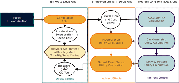
Figure 62. Illustration. Framework for evaluation of speed harmonization and related
en-route interventions.
In this study, two highway segments were selected for the simulation case studies: a hypothetical segment and a real-world segment. The hypothetical segment is a two-lane segment with a lane drop. Figure 63 illustrates the geometric characteristics of this hypothetical segment. The segment is 6 mi long, and the lane drop is located 3.5 mi downstream of the start location. The inflow rate is set to be 1,500 vehicles/h. The simple geometric characteristics of this segment provide a controlled environment to fulfill the objectives of this study.

Figure 63. Illustration. Geometric characteristics of the hypothetical two-lane highway.
A four-lane highway was also selected for the simulation case study. The segment is located on the eastbound direction of I-290 near Chicago, IL. This 3.5-mi-long segment has four on-ramps and three off-ramps, each with different characteristics and different merging length. Figure 64 and figure 65 show the geographic and geometric characteristics of this segment, respectively. The loop detector data (speed, flow, and occupancy) is only available for the main section. Therefore, the output of the DYNASMART mesoscopic model for the morning peak period was used to calculate the flow pattern in the segment. The loop detector data were then used to adjust these flows to their actual values on an average day. The individual vehicles’ paths were determined by utilizing the DYNASMART output. The information on these paths (i.e., start section, end section, and departure time) was then combined to calculate the ramps and main section entry flows.
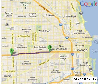
©Google Maps® 2012
Figure 64. Illustration. Geographic characterization of the selected segment in
Chicago, IL.(161)

Figure 65. Illustration. Geometric characterization of the selected segment in Chicago, IL.
In this study, the microsimulation model of Hamdar et al. was used in conjunction with the speed harmonization system introduced by Talebpour et al. to investigate the effects of speed harmonization on traffic breakdown and carbon dioxide emission.(160,140) In the following section, the formulation of the microscopic model is presented. The speed harmonization system and the logic behind the shockwave detection and speed limit selection algorithms are discussed, followed by a presentation of the ramp metering algorithm and the model calibration results.
Microscopic Model Formulation
Acceleration modeling and lane change modeling are core elements of microsimulation traffic models. Acceleration models are intended to capture the operational decisionmaking process, while lane changing models aim to capture the tactical driving decisionmaking process. This study builds on the simulation model presented by Hamdar et al., which adopts a duration-based framework at the tactical level and a utility-based framework at the operational level.(160) Additional details on the model formulation can be found in Hamdar and Hamdar and Mahmassani.(162,163)
Duration Framework
In the duration framework, the hazard-based duration models were used to capture the tactical decisionmaking process. The driving process was divided into different episodes characterized by a termination probability (given that the episode has not ended before) and an episode duration (the time elapsed before the driver enters another episode). The episodes could be divided into car-following episodes and free-flow episodes based on the corresponding inter-vehicle follower-leader interactions.
A free-flow episode ends when either the distance between the vehicle and its leader decreases to the point that the new episode can be considered as a car-following episode or the vehicle changes lane (the vehicle can enter another car-following episode or free-flow episode depending on the interaction between the vehicle and the leader). The car-following episode ends when either the vehicle changes lane (similar to the car-following episode, the outcome can be either a free-flow episode or a car-following episode) or the distance between the vehicle and its leader increases to the point that the new episode can be considered as free-flow episode.
The hazard at time u is defined as the conditional probability of termination of the current episode at small time period δ after u as follows:
![]()
Figure 66. Equation. Hazard equation for time t.
Where:
i = The driver.
q = The exit strategy of an episode.
Tiq = The duration of the episode for driver i and exit strategy q.(163)
λ0q = The base line hazard value at time u.
xiq = The vector of explanatory variables for driver i at time u.
βq = The vector of corresponding parameters to be estimated.
Hamdar and Mahmassani used the exponential form for the function of exogenous covariates shown in table 19.(163)
Table 19. External covariates and their definition.(163)
| Data Number | Data Type | Definition | Unit |
| 1 | Vehicle ID (VehID) | ID (ascending by entry time into study section). | Number |
| 2 | Episode ID (EpID) | ID (following vehicle ID ordering). | Number |
| 3 | Episode duration (duration) |
Duration of the car-following episode. | s |
| 4 | Episode type (EpType) | q = 1, . . . , Q where Q = 4. | Number |
| 5 | Left censuring variable (LeftCens) |
LeftCens = 1 if episode is the first episode corresponding to a vehicle and = 0 otherwise. | Number |
| 6 | Vehicle type x0 (VehType) |
1 = motorcycle, 2 = auto, and 3 = truck. | Number |
| 7 | x1 (LCL) | Number of leaders changing lanes during episode. | Number |
| 8 | x2 (V) | Driver’s speed. | m/s |
| 9 | x3 (DXL1) | Headway between driver i and leader i – 1 (front-to-front bumper). | m |
| 10 | x4 (DVL1) | Relative speed between driver i and leader i – 1. | m/s |
| 11 | x5 (DXF1) | Distance headway between driver i and follower i + 1 (front-to-front bumper). | m |
| 12 | x6 (DVF1) | Relative speed between driver i and follower i + 1. | m/s |
| 13 | x7 (DXL2) | Distance headway between driver i and driver i – 2 (front-to-front bumper). | m |
| 14 | x8 (DVL2) | Relative speed between driver i and driver i – 2. | m/s |
| 15 | x9 (DXL1R) | Distance headway between driver i and the leader on the right lane. | m |
| 16 | x10 (DVL1R) | Relative speed between driver i and the leader on the right lane. | m/s |
| 17 | x11 (DXF1R) | Distance headway between driver i and the follower on the right lane. | m |
| 18 | x12 (DVF1R) | Relative speed between driver i and the follower on the right lane. | m/s |
| 19 | x13 (DXL1L) | Distance headway between driver i and the leader on the left lane. | m |
| 20 | x14 (DVL1L) | Relative speed between driver i and the leader on the left lane. | m/s |
| 21 | x15 (DXF1L) | Distance headway between driver i and the follower on the left lane. | m |
| 22 | x16 (DVF1L) | Relative speed between driver i and the follower on the left lane. | m/s |
| 23 | x17 (K) | Driver’s average surrounding density. | Veh/km/lane |
| 24 | x18 (KR) | Driver’s average surrounding density in adjacent lane 1 (to the right). | Veh/km/lane |
| 25 | x19 (KL) | Driver’s average surrounding density in adjacent lane 2 (to the left). | Veh/km/lane |
| 1 m/s = 3.28 ft/s 1 m = 3.28 ft 1 km = 0.621 mi |
|||
Acceleration Framework
Drivers select their acceleration based on the evaluation of the potential gains and losses. Hamdar et al. modeled this decisionmaking process using Kahneman and Tversky’s prospect theory.(160,164) Based on this theory, the decisionmaker first assigns different utilities to different alternatives by considering corresponding gain and losses (framing or editing phase). He/she then evaluates these alternatives based on the prospect index (evaluation phase). The prospect index is calculated similar to the expected utility using subjective decision weights instead of expected probability of each outcome. Based on this theory and to evaluate the acceleration choice, the following value function is introduced by Hamdar et al.:(160)

Figure 67. Equation. Acceleration value function.
Where:
UPT = The acceleration value function.
a0 = Normalization parameter.
an = acceleration
γ > 0 and wm = Parameters to be estimated.(160)
The drivers will gain UPT by choosing an as the acceleration unless there exists a crash possibility. Hamdar et al. used the crash seriousness term, k(v, Δv), to determine the disutility resulting from the crash as follows:
![]()
Figure 68. Equation. Crash disutility.
Where pn,i is the probability of being involved in a rear-end collision.(160) UPT(an) is derived from Figure 67, and wc is a crash weighting parameter which is lower for aggressive drivers.
Capturing the stochastic nature of the acceleration choice, Hamdar et al. obtained the logistic functional form as follows:(160)

Figure 69. Equation. Stochastic nature of the acceleration.
Where:
β PT = Sensitivity of choice to the total utility.
amin, amax= Minimum and maximum vehicle acceleration.
da = Integral.
Speed Harmonization Algorithm
The model introduced in the previous section is used in a simulation framework that considers inter-driver heterogeneity. The objective is to examine the effectiveness of the speed harmonization system in improving traffic conditions, reducing the number and amplitude of the shockwaves, and delaying breakdown formation particularly under congested conditions. This section describes the speed limit selection algorithm for the speed harmonization system, as well as the approach followed in the algorithm for early determination of shockwave formation. More detail on these algorithms can be found in Talebpour et al.(151)
Shockwave Detection Framework
In this study, the wavelet transform method of Zheng et al. was used to identify the shockwave formation process based on individual vehicle information.(158) The authors defined an oscillation as a process in which an instance of acceleration behavior is followed by one of deceleration behavior, and used the wavelet-base energy to identify the location of the vehicle responsible for the start of the oscillation.
The concept of wavelet transform developed in 1980s refers to a transformation from continuous time series data into scale components based on a real or complex function, Ψ(t). The general formulation for the continuous wavelet transform (CWT) of a general signal x(t) can be written as follows:
![]()
Figure 70. Equation. CWT function.
Where:
CWT = Continuous wavelet transform function.
α = The scale parameter.
β = The translation parameter.
ω(α) = The weighting function typically set to be ![]() to normalize the energy across scales.(158)
to normalize the energy across scales.(158)
In this study, the Mexican hat wavelet, as defined in equation 71, is selected as the mother wavelet; where α = 1 and β = 0, the function is termed the mother wavelet.
![]()
Figure 71. Equation. Mother wavelet function.
Based on the work of Zheng et al., velocity is selected as the input signal to the wavelet transformation. Inserting figure 71 into figure 70, the CWT used in this study can be formulated as follows:
![]()
Figure 72. Equation. CWT function (simplified).
The dimensionless average wavelet energy can be then calculated by averaging figure 72 across different scales as follows:
![]()
Figure 73. Equation. Average wavelet energy function.
Averaging makes this method a powerful tool to analyze the non-stationary signal measures such as traffic speed and acceleration and locating the abrupt changes in the values of these measures. Based on the recommendation made by Zheng et al., for each vehicle, the upper bound for α is set to be 6.4 s, and β is calculated for all time steps during which the vehicle is present in the study segment.(158) Figure 74 through figure 77 illustrate the application of the wavelet transform to identify the abrupt changes in speed using a vehicle trajectory from I-80 Next-Generation Simulation (NGSIM) data. Figure 74 shows the actual speed diagram with small and large fluctuations. Figure 75 shows the wavelet transform coefficient, CWT ( α , β ), computed for the entire range of β and α = 4. The figure shows that fluctuations in CWT match the fluctuations in actual speed while having less noise compare to the actual speed data. Figure 76 presents the distribution of the absolute values of CWT function, |CWT( α , β )|, for the entire range of α = 1 to 64. The lighter areas in the figure correspond to the higher energy values. Finally, the distribution of the wavelet energy (figure 73) is presented in figure 77. The local peaks correspond to the abrupt speed drops in the actual time series data.

Figure 74. Graph. Wavelet energy calculation—actual speed of a vehicle.

Figure 75. Graph. Wavelet energy calculation—CWT of the actual speed data.

Figure 76. Graph. Wavelet energy calculation—absolute values of the CWT coefficient across scales.

Figure 77. Graph. Wavelet energy calculation—average wavelet energy across scales.
Detecting the shockwave in its early stages is an important first step in the implementation of the proposed speed harmonization system. In the next section, the second step of this process, speed limit selection, is discussed in detail.
Speed Limit Selection
The speed limit selection algorithm is the core component in the speed harmonization system. Several different approaches have been proposed, which can be categorized into reactive and predictive approaches. The reactive algorithms set the speed limit based on the current traffic, road, and weather conditions, while predictive algorithms use current traffic, road, and weather conditions in conjunction with a prediction module to select the speed limit.
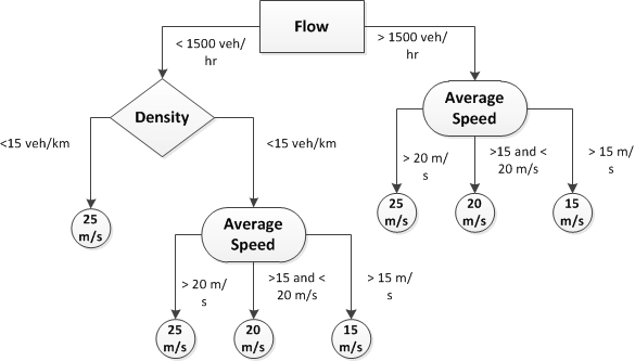
Figure 78 shows the decision tree for the speed limit selection, which is based on the decision tree introduced by Allaby et al.(159) The decision is based on the prevailing traffic condition (i.e., speed, flow, and density) at the shockwave detection point. Note that once a speed is updated on a sub-segment, it cannot be changed for 10 min to prevent rapid fluctuations in the speed limit.
1 ft = 0.305 m
Figure 78. Flowchart. Speed harmonization decision tree.
Ramp Metering Algorithm
Ramp metering is a common strategy in the current practice of congestion control in highway systems. To provide a more realistic simulation, this study incorporates Asservissement lin´eaire d’entr´ee autorouti`ere’ (ALINEA) as the ramp metering algorithm.(165) ALINEA calculates the metering rate based on the difference between the desired and measured occupancy using the following equation:
![]()
Figure 79. Equation. Ramp metering rate.
Where:
r = Ramp metering rate.
t = Time.
Kr = Regulatory parameter set to be 70 vehicles/h in this study based on recommendations presented by Chaudhary et al.(165)
O = Desired occupancy.
Oout = Measured occupancy.
Simulation Framework
The simulation framework is based on the model formulation and the speed limit selection logic presented earlier, with particular focus on the shockwave formation. The wavelet energy value is considered as an indicator of shockwave formation and computed using figure 79 for each vehicle at each time step of 0.1 s. For the purpose of early shockwave detection, the numerical derivation of the wavelet energy is calculated to find the peak points in the wavelet energy corresponding to the sudden changes in the speed as follows:
![]()
Figure 80. Equation. Wavelet energy rate.
Where:
h = Predefined value set to be 1 sec in this study.
E = Energy.
The wavelet energy is calculated and examined continuously during the simulation. Once a sudden change in speed is found for a vehicle, all the vehicles following that car in the range of 0.5 mi on that lane will be checked to find other sudden changes upstream of the original location for the next 10 seconds. Note that these values are used here primarily for illustrative purposes. It can be expected that performance could be improved adaptively in a deployment context. If these calculations indicate a shockwave occurrence (the backward moving wave is found) then the appropriate speed limit to suppress this shockwave is selected based on the speed limit selection decision tree and the traffic conditions at the shockwave occurrence point.
The experienced hazard is also considered as a safety indicator, and computed using figure 81 for individual drivers at each time step. Following the aggregation procedure presented by Talebpour et al., this study computed the weighted average of experienced hazard to evaluate safety. For a segment with length L at time step u, the average hazard is calculated as follows:

Figure 81. Equation. Average hazard.
Where:
![]() u = The average hazard at time step u.
u = The average hazard at time step u.
λiq = The hazard value vehicle i and episode type q.
δiq = A binary variable determining which exit strategy is active.
Nu = The total number of vehicles at time step u.(166)
Heterogeneity Considerations
The behavioral parameters of drivers in microscopic simulation models are expected to be correlated. Kim and Mahmassani presented a methodology to capture this correlation across the parameters of each driver.(167) They showed that sampling from the empirical data while accounting for the correlation between the parameters of each sample (individual drivers) was the best method to capture heterogeneity in microscopic simulation models. In this study and based on their findings, the NGSIM data were used to generate the correlated set of parameters. The data were previously used by Talebpour et al. to generate the set of correlated parameters and were collected on April, 13, 2005, on a segment of Interstate I-80 in San Francisco, CA, from 4:00 to 4:15 p.m. (2,052 vehicles).(166) The correlated parameters from 35 vehicles were used to generate the correlated set of parameters used in the simulation exercise. Based on the proposed method by Kim and Mahmassani, the parameters of each generated vehicle in the simulation exercise corresponded to a particular vehicle in the actual data. (167)
Table 20 shows the calibration results, and table 21 shows the correlation among the parameters of individual drivers. The Pearson correlation coefficients reveal strong correlation between the model parameters.
Table 20. Descriptive statistics of calibrated parameters.(140)
| Parameter | Mean | S.D. |
| Reaction time (Rt) | 0.86 | 0.78 |
| Sensitivity exponents of the generalized utility ( γ ) | 0.47 | 0.41 |
| Velocity uncertainty variation coefficient ( α ) | 0.10 | 0.09 |
| Logit uncertainty parameter ( β ) | 5.24 | 2.15 |
| Maximum anticipation time horizon ( τmax ) | 5.35 | 2.47 |
| Asymmetry factor for negative utilities ( ωm ) | 3.56 | 2.17 |
| Weighing factor for accidents ( ωc ) | 99,315.79 | 21,240.08 |
| Correlation time of intra-driver variability ( τcorr ) | 19.50 | 4.20 |
Table 21. Pearson correlation coefficients and p-values (in parentheses).(140)
| Rt | γ | α | β | τmax | ωm | ωc | τcorr | |
| Rt | 1.0000 | -0.0845 | 0.0792 | -0.0642 | 0.2155 | 0.1769 | -0.0020 | 0.0439 |
| (0.0000) | (0.6141) | (0.6365) | (0.7019) | (0.1939) | (0.2881) | (0.9905) | (0.7934) | |
| γ | -0.0845 | 1.0000 | -0.0005 | 0.1137 | 0.2545 | 0.2370 | -0.0336 | -0.1575 |
| (0.6141) | (0.0000) | (0.9977) | (0.4967) | (0.1231) | (0.152) | (0.8414) | (0.3450) | |
| α | 0.0792 | -0.0005 | 1.0000 | -0.1328 | -0.1606 | 0.2947 | -0.0380 | 0.0459 |
| (0.6365) | (0.9977) | (0.0000) | (0.4266) | (0.3355) | (0.0725) | (0.8210) | (0.7843) | |
| β | -0.0642 | 0.1137 | -0.1328 | 1.0000 | 0.0327 | -0.1505 | -0.3580 | -0.0887 |
| (0.7019) | (0.4967) | (0.4266) | (0.0000) | (0.8457) | (0.3670) | (0.0273) | (0.5964) | |
| τmax | 0.2155 | 0.2545 | -0.1606 | 0.0327 | 1.0000 | 0.2330 | 0.4509 | 0.1739 |
| (0.1939) | (0.1231) | (0.3355) | (0.8457) | (0.0000) | (0.1592) | (0.0045) | (0.2963) | |
| ωm | 0.1769 | 0.2370 | 0.2947 | -0.1505 | 0.2330 | 1.0000 | 0.0969 | 0.2712 |
| (0.2881) | (0.1520) | (0.0725) | (0.3670) | (0.1592) | (0.0000) | (0.5626) | (0.0995) | |
| ωc | -0.0020 | -0.0336 | -0.0380 | -0.3580 | 0.4509 | 0.0969 | 1.0000 | 0.1305 |
| (0.9905) | (0.8414) | (0.8210) | (0.0273) | (0.0045) | (0.5626) | (0.0000) | (0.4349) | |
| τcorr | 0.0439 | -0.1575 | 0.0459 | -0.0887 | 0.1739 | 0.2712 | 0.1305 | 1.0000 |
| (0.7934) | (0.3450) | (0.7843) | (0.5964) | (0.2963) | (0.0995) | (0.4349) | (0.0000) |
Numerical Experiments and Results
The purpose of the simulation experiments was to investigate the effectiveness of the proposed speed harmonization system in controlling breakdown formation, to analyze the effect of drivers’ compliance with the speed limit on the performance of the speed harmonization system, and to study the effects of the proposed speed harmonization system on the emission production. Two scenarios were designed for each segment.
The first scenario focused on the effects of the proposed speed harmonization system on the breakdown and emission control. Note that full compliance with the suggested speed limit was applied to these scenarios. The effects of ramp metering on the performance of the proposed speed harmonization system are also discussed for the segment in Chicago, IL.
The second scenario involves analysis of the effect of drivers’ compliance with the suggested speed limit on the performance of the speed harmonization system. Different levels of compliance were considered to conduct a sensitivity analysis.
Hypothetical Segment
Figure 82 through figure 87 show the fundamental diagram, hazard-density diagram, temporal evolution of speed and flow, and emission production for the sub-segment starting 0.6 mi upstream of the lane drop location with and without active speed harmonization. Note that in all of the simulations presented for the hypothetical segment, the speed limit changes were applied 0.6 mi upstream of the shockwave detection point. The figures clearly reveal the effectiveness of the speed harmonization system in controlling breakdown formation, preventing speed drop, and maintaining higher flow rates. However, the hazard values are higher for the simulation with active speed harmonization. This is mainly due to drivers’ adaptation effort to the new speed limit. It is expected that gradual change of speed over space can decrease the perceived risk by the drivers in this adaptation process. The figures also reveal the positive effect of speed harmonization on the emission production. This is mainly due to the effect of the speed harmonization system on breakdown formation. High acceleration rates, which result in more emission production, are more likely to happen in a congested condition. Thus, eliminating shockwaves and preventing breakdown formation can reduce the emission production.
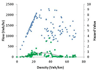
Note: Blue denotes fundamental diagram for 25 m/s speed limit and green denotes hazard value.
1 m/s = 3.28 ft/s
Figure 82. Graph. Fundamental diagram and hazard value for simulation with no active speed harmonization.
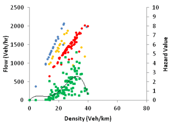
Note: Blue, orange, and red donate fundamental diagram for 25, 20, and 15 m/s speed limit, respectively, and green denotes hazard value.
1 m/s = 3.28 ft/s
Figure 83. Graph. Fundamental diagram and hazard value for simulation with active speed harmonization.
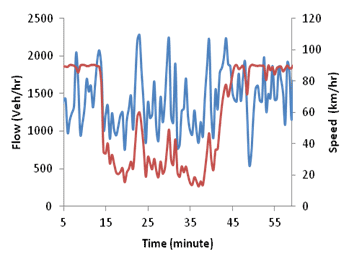
Note: Blue denotes flow, and red denotes speed.
1 km = 0.621 mi
Figure 84. Graph. Flow and speed evolution over time for simulation with no active speed harmonization.
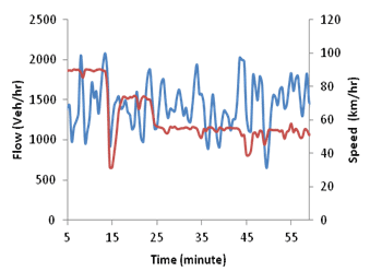
Note: Blue denotes flow, and red denotes speed.
1 km = 0.621 mi
Figure 85. Graph. Flow and speed evolution over time for simulation with active speed harmonization.
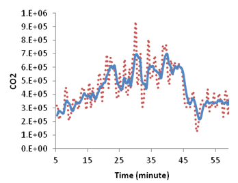
Note: Red donates actual emission, and blue denotes moving average.
Figure 86. Graph. Emission and moving average evolution over time for simulation with no active speed harmonization.
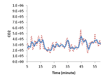
Note: Red denotes actual emission, and blue denotes moving average.
Figure 87. Graph. Emission and moving average evolution over time for simulation with active speed harmonization.
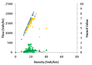
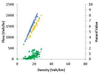
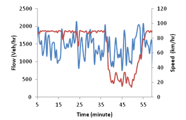
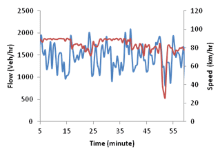
Figure 88 through figure 96 show the effects of compliance on the fundamental diagram, hazard-density diagram, temporal evolution of speed and flow, and emission production for the sub-segment starting 0.6 mi upstream of the lane drop location. Three levels of compliance with the suggested speed limit (0, 10, and 90 percent) are considered where drivers are able to drive with speeds up to 15 percent higher than the suggested speed limit. These figures reveal the importance of compliance with the suggested speed limit for the success of the speed harmonization system.
In a congested driving environment, drivers mostly operate in the car-following mode where they should either follow their leaders or change lane to avoid a crash. This implies that once a certain number of vehicles slows down to the suggested speed limit, the rest of the vehicles should slow down to the same speed to avoid a crash. The simulation results presented in figure 88 through figure 96 also confirm this hypothesis. While higher compliance levels are more favorable, the system is still capable of controlling breakdown formation at 10 percent compliance level. More detailed sensitivity analysis on the effect of compliance on the speed harmonization system is presented in the next section. Note that compliance with the posted speed limit is a major concern in speed harmonization systems. This observation can facilitate the effective implementation of these systems as attaining 10 percent compliance level is less challenging and well within the levels of compliance observed today.
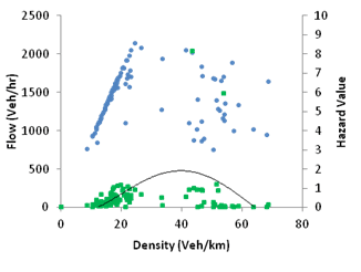
Note: Blue denotes 25 m/s speed limit, and green denotes hazard value.
1 m/s = 3.28 ft/s
1 km = 0.621 mi
Figure 88. Graph. Fundamental diagram and hazard value for simulation with active speed harmonization and 0 percent compliance.
Note: Blue and orange denote 25 and 20 m/s speed limits, respectively, and green denotes hazard value.
1 m/s = 3.28 ft/s
1 km = 0.621 mi
Figure 89. Graph. Fundamental diagram and hazard value for simulation with active speed harmonization and 10 percent compliance.
Note: Blue and orange denote 25 and 20 m/s speed limits, respectively, and green denotes hazard value.
1 m/s = 3.28 ft/s
1 km = 0.621 mi
Figure 90. Graph. Fundamental diagram and hazard value for simulation with active speed harmonization and 90 percent compliance.
Note: Blue denotes flow, and red denotes speed.
1 km = 0.621 mi
Figure 91. Graph. Flow and speed evolution over time for simulation with active speed harmonization and 0 percent compliance.
Note: Blue denotes flow, and red denotes speed.
1 km = 0.621 mi
Figure 92. Graph. Flow and speed evolution over time for simulation with active speed harmonization and 10 percent compliance.
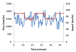
Note: Blue denotes flow, and red denotes speed.
1 km = 0.621 mi
Figure 93. Graph. Flow and speed evolution over time for simulation with active speed harmonization and 90 percent compliance.
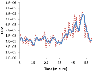
Note: Red denotes actual emission, and blue denotes moving average.
Figure 94. Graph. Emission and moving average evolution over time for simulation with active speed harmonization and 0 percent compliance.
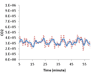
Note: Red denotes actual emission, and blue denotes moving average.
Figure 95. Graph. Emission and moving average evolution over time for simulation with active speed harmonization and 10 percent compliance.
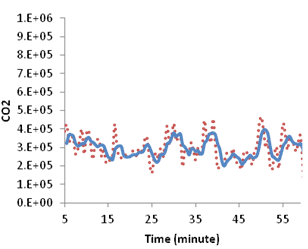
Note: Red denotes actual emission, and blue denotes moving average.
Figure 96. Graph. Emission and moving average evolution over time for simulation with active speed harmonization and 90 percent compliance.
Chicago, IL
Figure 97 through figure 100 illustrate the effectiveness of the speed harmonization system in suppressing shockwaves and preventing breakdown formation while maintaining flow rate along the segment. Note that the drivers fully complied with the suggested speed limit in these simulations. In figure 97, the shockwave starts 2 mi downstream of the start point and propagates upstream. The speed harmonization system detects this shockwave at its onset and triggers the new speed limit. Reducing the speed limit to a lower value prevents the shockwave formation and propagation (see figure 99).
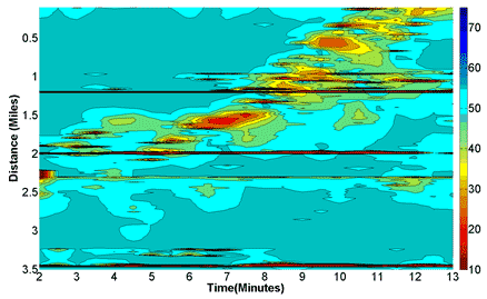
Figure 97. Graph. Smoothed speed variations in time-space diagram for simulation without active speed harmonization.
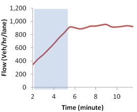
Note: Blue box shows the warm-up period.
Figure 98. Graph. Flow-time diagram for simulation without active speed harmonization.
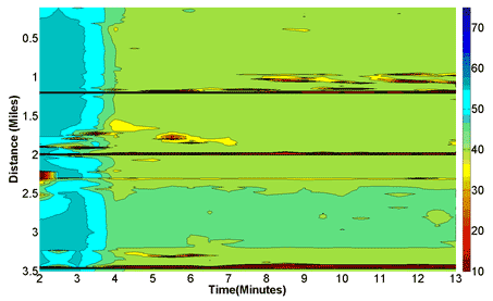
Figure 99. Graph. Smoothed speed variations in time-space diagram for simulation with active speed harmonization.
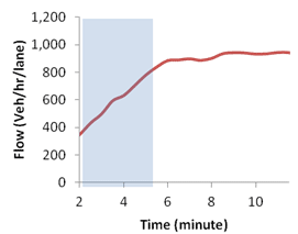
Note: Blue box shows the warm-up period.
Figure 100. Graph. Flow-time diagram for simulation with active speed harmonization.
Figure 101 through figure 115 show the effects of compliance level on the fundamental diagram, hazard-density diagram, temporal evolution of speed and flow, and emission production for the sub-segment between milepost 0.6 and 1.2 with active speed harmonization but without active ramp metering. Five levels of compliance with the suggested speed limit (0, 10, 20, 40, and 90 percent) were considered where drivers were able to drive with the speed up to 10 percent higher than the suggested speed limit. These figures clearly reveal the effectiveness of the speed harmonization system in controlling breakdown formation, preventing speed drop, maintaining higher flow rates, and controlling emission production. They confirm that once certain number of vehicles slow down to the posted speed limit, the rest of the vehicles should reduce their speed accordingly to avoid a crash. However, in this case, a minimum of 20 percent compliance is required for the success of the speed harmonization, while in the hypothetical network, the speed harmonization system is capable of controlling breakdown formation at 10 percent compliance level. This occurs due to different geometric characteristics (different number of lanes and the existence of on and off-ramps in the segment in Chicago, IL) and different flow patterns.
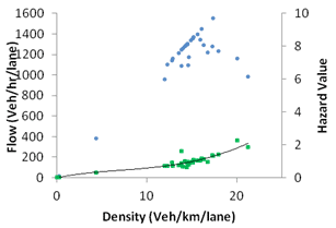
Note: Blue denotes 25 m/s speed limit, respectively, and green denotes hazard value.
1 m/s = 3.28 ft/s
1 km = 0.621 mi
Figure 101. Graph. Fundamental diagram and hazard value for simulation with active speed harmonization without active ramp metering at 0 percent compliance.
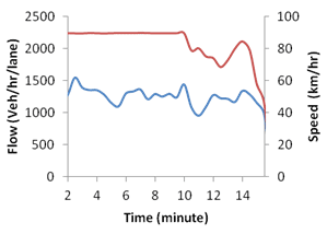
Note: Blue denotes flow, and red denotes speed.
1 km = 0.621 mi
Figure 102. Graph. Flow and speed evolution over time for simulation with active speed harmonization without active ramp metering at 0 percent compliance.
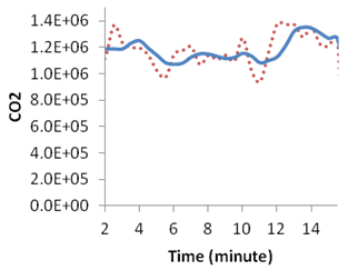
Note: Red denotes actual emission, and blue denotes moving average.
Figure 103. Graph. Emission and moving average evolution over time for simulation with active speed harmonization and without active ramp metering at 0 percent compliance.
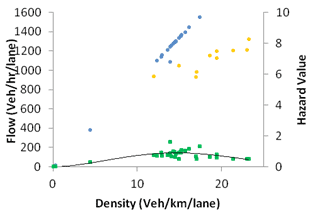
Note: Blue and orange denote 25 and 20 m/s speed limit, respectively, and green denotes hazard value.
1 m/s = 3.28 ft/s
1 km = 0.621 mi
Figure 104. Graph. Fundamental diagram and hazard value for simulation with active speed harmonization without active ramp metering at 10 percent compliance.
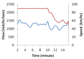
Note: Blue denotes flow, and red denotes speed.
1 km = 0.621 mi
Figure 105. Graph. Flow and speed evolution over time for simulation with active speed harmonization without active ramp metering at 10 percent compliance.
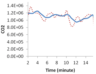
Note: Red denotes actual emission, and blue denotes moving average.
Figure 106. Graph. Emission and moving average evolution over time for simulation with active speed harmonization and without active ramp metering at 10 percent compliance.
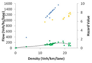
Note: Blue and orange denote 25 and 20 m/s speed limit, respectively, and green denotes hazard value.
1 m/s = 3.28 ft/s
1 km = 0.621 mi
Figure 107. Graph. Fundamental diagram and hazard value for simulation with active speed harmonization without active ramp metering at 20 percent compliance.
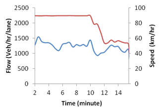
Note: Blue denotes flow, and red denotes speed.
1 km = 0.621 mi
Figure 108. Graph. Flow and speed evolution over time for simulation with active speed harmonization without active ramp metering at 20 percent compliance.
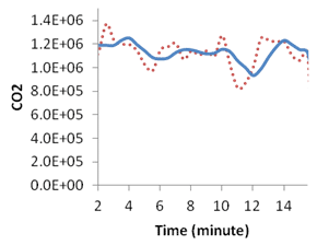
Note: Red denotes actual emission, and blue denotes moving average.
Figure 109. Graph. Emission and moving average evolution over time for simulation with active speed harmonization and without active ramp metering at 20 percent compliance.
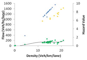
Note: Blue and orange denote 25 and 20 m/s speed limit, respectively, and green denotes hazard value.
1 km = 0.621 mi
Figure 110. Graph. Fundamental diagram and hazard value for simulation with active speed harmonization without active ramp metering at 40 percent compliance.
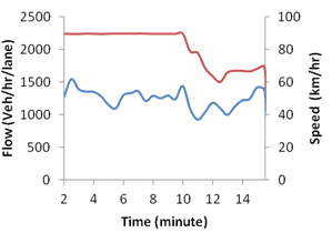
Note: Blue denotes flow, and red denotes speed.
1 km = 0.621 mi
Figure 111. Graph. Flow and speed evolution over time for simulation with active speed harmonization without active ramp metering at 40 percent compliance.
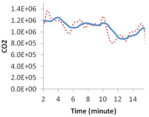
Note: Red denotes actual emission, and blue denotes moving average.
Figure 112. Graph. Emission and moving average evolution over time for simulation with active speed harmonization and without active ramp metering at 40 percent compliance.
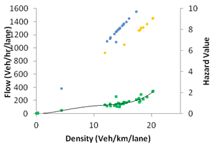
Note: Blue and orange denote 25 and 20 m/s speed limit, respectively, and green denotes hazard value.
1 m/s = 3.28 ft/s
1 km = 0.621 mi
Figure 113. Graph. Fundamental diagram and hazard value for simulation with active speed harmonization without active ramp metering at 90 percent compliance.
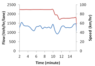
Note: Blue denotes flow, and red denotes speed.
1 km = 0.621 mi
Figure 114. Graph. Flow and speed evolution over time for simulation with active speed harmonization without active ramp metering at 90 percent compliance.
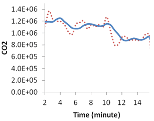
Note: Red denotes actual emission, and blue denotes moving average.
Figure 115. Graph. Emission and moving average evolution over time for simulation with active speed harmonization and without active ramp metering at 90 percent compliance.
The combined effect of ramp metering and speed harmonization on the breakdown formation and control is also investigated. Figure 116 through figure 130 show the effects of compliance level on the fundamental diagram, hazard-density diagram, temporal evolution of speed and flow, and emission production for the sub-segment between milepost 0.6 and 1.2 with active speed harmonization and active ramp metering. The combination of two systems is still capable of controlling breakdown formation; however, the performance of the combined system is lower than the performance of the speed harmonization system itself. It is important for the ramp metering system to keep the ramp flows at appropriate levels to avoid further breakdown formation while the speed harmonization system is actively controlling the breakdown formation and propagation. This implies that the speed harmonization and the ramp metering systems should be calibrated jointly to provide the required coordination.
The hazard values are higher for the simulations with higher compliance levels (see figure 105 and figure 120). This is mainly due to drivers’ adaptation effort to the new speed limit. As mentioned for the hypothetical network, it is expected that gradual change of speed over space can decrease the perceived risk by the drivers in this adaptation process.
It should be noted that the presented logic may allow optimal implementation through the connected vehicle technology. However, with current practice in implementing speed harmonization systems, it is challenging to achieve this optimality.
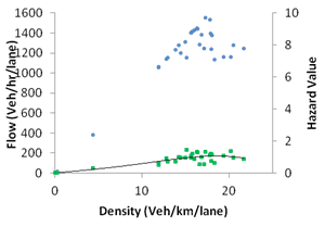
Note: Blue denotes 25 m/s speed limit, and green denotes hazard value.
1 m/s = 3.28 ft/s
1 km = 0.621 mi
Figure 116. Graph. Fundamental diagram and hazard value for simulation with active speed harmonization and active ramp metering at 0 percent compliance.
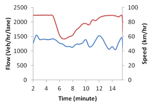
Note: Blue denotes flow, and red denotes speed.
1 km = 0.621 mi
Figure 117. Graph. Flow and speed evolution over time for simulation with active speed harmonization and active ramp metering at 0 percent compliance.
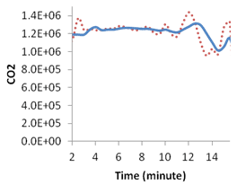
Note: Red denotes actual emission, and blue denotes moving average.
Figure 118. Graph. Emission and moving average evolution over time for simulation with active speed harmonization and active ramp metering at 0 percent compliance.
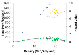
Note: Blue and orange denote 25 and 20 m/s speed limit, respectively, and green denotes hazard value.
1 m/s = 3.28 ft/s
1 km = 0.621 mi
Figure 119. Graph. Fundamental diagram and hazard value for simulation with active speed harmonization and active ramp metering at 10 percent compliance.
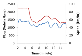
Note: Blue denotes flow, and red denotes speed.
1 km = 0.621 mi
Figure 120. Graph. Flow and speed evolution over time for simulation with active speed harmonization and active ramp metering at 10 percent compliance.
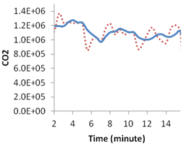
Note: Red denotes actual emission, and blue denotes moving average.
Figure 121. Graph. Emission and moving average evolution over time for simulation with active speed harmonization and active ramp metering at 10 percent compliance.
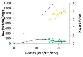
Note: Blue and orange denote 25 and 20 m/s speed limit, respectively, and green denotes hazard value.
1 m/s = 3.28 ft/s
1 km = 0.621 mi
Figure 122. Graph. Fundamental diagram and hazard value for simulation with active speed harmonization and active ramp metering at 20 percent compliance.
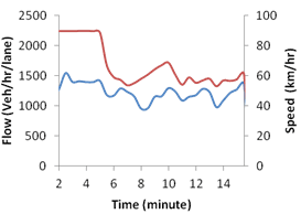
Note: Blue denotes flow, and red denotes speed.
1 km = 0.621 mi
Figure 123. Graph. Flow and speed evolution over time for simulation with active speed harmonization and active ramp metering at 20 percent compliance.
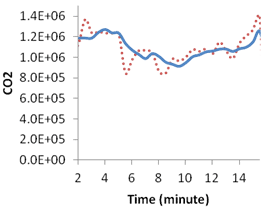
Note: Red denotes actual emission, and blue denotes moving average.
Figure 124. Graph. Emission and moving average evolution over time for simulation with active speed harmonization and active ramp metering at 20 percent compliance.

Note: Blue and orange denote 25 and 20 m/s speed limit, respectively, and green denotes hazard value.
1 m/s = 3.28 ft/s
1 km = 0.621 mi
Figure 125. Graph. Fundamental diagram and hazard value for simulation with active speed harmonization and active ramp metering at 40 percent compliance.
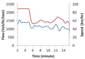
Note: Blue denotes flow, and red denotes speed.
1 km = 0.621 mi
Figure 126. Graph. Flow and speed evolution over time for simulation with active speed harmonization and active ramp metering at 40 percent compliance.
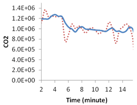
Note: Red denotes actual emission, and blue denotes moving average.
Figure 127. Graph. Emission and moving average evolution over time for simulation with active speed harmonization and active ramp metering at 40 percent compliance.
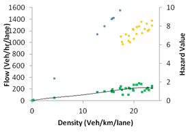
Note: Blue and orange denote 25 and 20 m/s speed limit, respectively, and green denotes hazard value.
1 m/s = 3.28 ft/s
1 km = 0.621 mi
Figure 128. Graph. Fundamental diagram and hazard value for simulation with active speed harmonization and active ramp metering at 90 percent compliance.
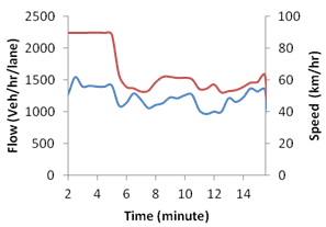
Note: Blue denotes flow, and red denotes speed.
1 km = 0.621 mi
Figure 129. Graph. Flow and speed evolution over time for simulation with active speed harmonization and active ramp metering at 90 percent compliance.
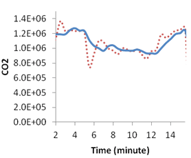
Note: Red denotes actual emission, and blue denotes moving average.
Figure 130. Emission and moving average evolution over time for simulation with active speed harmonization and active ramp metering at 90 percent compliance.
The speed harmonization system implemented in this study is primarily reactive. The performance of the proposed speed harmonization algorithm can be improved by adopting a predictive speed limit selection algorithm. It is expected that the prediction module could predict traffic evolution with greater accuracy when using the individual vehicles data.
Introducing vehicle-to-vehicle communication (which provides drivers with the information about other drivers’ decisions, road conditions, weather conditions, etc.) can also improve the performance of the proposed system. Furthermore, the potential for optimizing the speed limit for the individual vehicles can be investigated. This requires behavioral-based models with adaptation capability.
Investigating drivers’ reaction and their response time to the speed limit changes in the connected vehicle environment is also necessary to improve the performance of the system, especially in a predictive speed harmonization system.
Speed harmonization is an ATM strategy that adjusts the speed limit based on the prevailing traffic condition, road surface condition, and weather condition to improve mobility, safety, and environmental impacts.(140) This study investigated the effects of early shockwave detection based on the information from the connected vehicles on congestion and emission control using speed harmonization as the control strategy. The performance of the speed harmonization system under different drivers’ compliance levels was also investigated. The wavelet transform method was used to identify shockwaves at their early stages. This robust shockwave detection algorithm is combined by a reactive speed limit selection algorithm to provide the appropriate speed limit based on the prevailing traffic condition. The microsimulation model of Hamdar et al. was used to implement the speed harmonization system, which was calibrated against the NGSIM data.(160)
Two highway segments, a two-lane hypothetical segment and a four-lane highway segment in Chicago, IL, were selected for the simulation. The simulation results confirm the effectiveness of the speed harmonization system in controlling breakdown formation, preventing speed drop, maintaining higher flow rates, and controlling emission production.
The effect of compliance on the performance of the speed harmonization system was also studied. The results indicate that low levels of compliance with the suggested speed limit were sufficient for the success of the system. However, the minimum required compliance level varied based on the geometric characteristics of the highway segment and its flow rate.
The simulation results also confirm the importance of having a coordinated ramp metering and speed harmonization systems. The uncoordinated ramp metering system can create further congestion while speed harmonization is actively controlling the congestion.