


- National Household Travel Survey
- Long-Distance Travel
- Older Drivers: Safety Implications
- Rising Fuel Cost—A Big Impact
- How Much Will This Trip Cost?
- Who is Impacted the Most?
- Travel Characteristics of New Immigrants
- Daily Travel Differences
- Commuting
- Policy and Planning Implications
- Commuting for Life
- Urban Commutes
- Who Are the Workers With Hour-Long Commutes?
- Congestion: Non-Work Trips in Peak Travel Times
- Congestion: Who is Traveling in the Peak?
- Travel to School: The Distance Factor
National Household Travel Survey
The transportation system in the United States plays a vital role in maintaining the vigor of the economy and quality of life for the people who live here. By connecting people and places, transportation provides the American public with access to a wide array of economic, social, and cultural opportunities that allow for daily commerce, enrich and enliven leisure, and strengthen the fabric of society. This chapter describes some of the new trends in travel by the American public and the ways in which understanding travel behavior trends and forecasts is critical in the development of sound national transportation policy and programs.
The primary source of national information on the travel of people in the United States is the National Household Travel Survey (NHTS). Previously called the Nationwide Personal Transportation Survey or NPTS, with studies conducted since 1969, the NHTS is a fundamental intermodal program that provides statistical measures of system use and travel behavior of the American public. In addition to broad indicators of travel demand such as vehicle and person miles of travel (VMT and PMT), mode share, vehicle occupancy rates, travel time and distance, and trip purpose distributions, the NHTS provides detailed data on the characteristics of travelers, trips, and vehicles.1 As such, the NHTS is a critical data source for sound national transportation policy making.
The topics presented in this chapter are based on data from the 2001 NHTS and other sources. Each topic was originally discussed in a separately issued NHTS Brief as follows:
- "Long-Distance Travel" – March 2006
- "Older Drivers: Safety Implications" – May 2006
- "Rising Fuel Cost-A Big Impact" – June 2006
- "Travel Characteristics of New Immigrants" – August 2006
- "Commuting for Life" – November 2006
- "Congestion: Non-Work Trips in Peak Travel Times" – April 2007
- "Congestion: Who is Traveling in the Peak?" – August 2007
- "Travel to School: The Distance Factor." – January 2008.
Data collection for the 2008 NHTS began in March 2008 and will continue for 1 year. Data from the 2008 NHTS will be available in Summer 2009. New data topics for the 2008 NHTS include travel to school, Interstate use, tolling, work schedule flexibility, hybrid/alternative fuel vehicles, residential deliveries, and additional information on walking and biking.
In addition to understanding trends in travel behavior and developing national policy initiatives, the NHTS is used by State and local planning agencies as a vehicle for collecting robust travel data for local planning. The 2008 NHTS has local participation from 19 areas. Together with the national sample, the survey will yield travel behavior data on approximately 150,000 households—the largest sample ever.
Beyond the 2008 survey, consideration is being given to adopting a continuous survey design beginning in 2010 to support the integration with other Department of Transportation (DOT) programs such as the Fatality Analysis Reporting System (FARS) and the required annual performance measurement and reporting to Congress and the Administration.
Long-Distance Travel
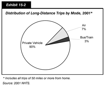
Overall, there were about 2.6 billion long-distance trips taken by U.S. residents in 2001, the last year of the NHTS survey. These were trips of 50 miles or more away from home (100 miles in round-trip distance) for people of all ages, for a wide range of purposes: commuting, business, pleasure, or personal business; and by all modes of travel: personal vehicle, air, bus, and train. Ninety percent of these long-distance trips were taken by personal vehicle, followed by trips by air at 7 percent. Many people never traveled that far from home—169 million people (61 percent of the population) did not make any long-distance trips. In fact, just 5 percent of the population took 25 percent of the long-distance trips.
|
Census Regions
|
Of the nine U.S. Census regions, people in the Mid-Atlantic region had the lowest per capita trip rates and people in the West North Central region the highest. Exhibit 15-1 shows the annual per capita trip rates for each of the Census regions.
| Census Regions of the United States | Average Number of Long-Distance Trips Per Capita, Per Year* |
|---|---|
| New England | 10.3 |
| Mid-Atlantic | 8.4 |
| East North Central | 9.3 |
| West North Central | 11.2 |
| South Atlantic | 9.3 |
| East South Central | 10.4 |
| West South Central | 10.0 |
| Mountain | 9.3 |
| Pacific | 8.7 |
| All | 9.4 |
Higher-income people in rural areas took more trips of 50 miles or more than all others (nearly 20 per year), while low-income people in large cities took the fewest long-distance trips (less than four each year).
Those living in the largest metropolitan areas (3 million or more in population) were twice as likely to take a trip of 1,000 miles or more than people in small towns or rural areas. However, the majority of the long-distance trips were not that long—58 percent were less than 250 miles in round-trip distance. The average long-distance trip by privately owned vehicle (POV) was 220 miles one way. Bus or train trips averaged 400 miles, and air trips nearly 1,500 miles.
The vast majority of long-distance travel was on the highway, as shown in Exhibit 15-2, but the choice of means was dependent on income and trip distance.
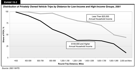
People in low-income households were more dependent on private vehicles to make long-distance trips than people in high-income households, and the gap widened as the trip length increased. For people with an annual income of $100,000 per year, air travel became a significant option for trips of 600 miles (round trip) or 300 miles away from home. For lower-income people, air travel became a significant option only when round-trip distances approached 1,000 miles. Exhibit 15-3 describes the distribution of vehicle trips for low-income and high-income Americans.
The reasons people travel vary as much as the people themselves; the data include trips for business, family vacations, weddings, or shopping. In 2001, business trips (including long commutes, conferences and meetings, and combined business and pleasure) comprised nearly 30 percent of the long-distance trips; visiting friends and relatives just over 25 percent; and leisure trips, sightseeing, and vacations nearly another 25 percent. For people who make long-distance trips, the average annual trips by purpose are shown in Exhibit 15-4.
| Mean Trips/Year | |
|---|---|
| Business and Business/Pleasure | 3.8 |
| Visit Friends and Relatives | 1.5 |
| Vacation/Leisure | 1.4 |
| Personal Business, including Shopping and Medical | 1.7 |
| Other Reasons | 1.8 |
Older Drivers: Safety Implications
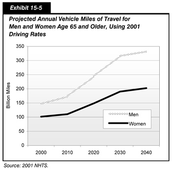
Older Americans (age 65 or over) are the fastest-growing segment of the U.S. population—in the next decades, the baby boomers will swell the ranks of the older population to one in five of all Americans.
The aging of the U.S. population has profound implications for the transportation system. As the unique source of data on travel by different population groups, the NHTS survey shows that the percentage of older people who continue to drive is growing, and the growth rate of older drivers is especially marked among older women.
Even if baby boomer men and women drive at the same (modest) rates as the current older population, their sheer numbers mean that total miles driven by those 65 and or older will increase by 50 percent by 2020 and more than double by 2040. Exhibit 15-5 shows these projections.
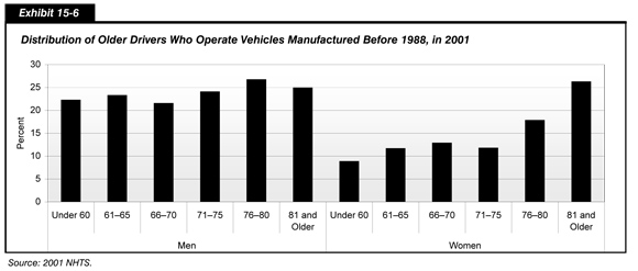
Likewise, the American vehicle fleet is aging—and older drivers are more likely to drive older cars than younger age groups. The age of a vehicle may indicate the types of safety features available. For example, in 1988 automatic seat belts became standard equipment, but 26 percent of drivers over the age of 80 are driving pre-1988 vehicles, compared with 16 percent of drivers under 60. Women are more likely than men to keep an older vehicle as they themselves get older. Exhibit 15-6 describes the distribution of older Americans who operate vehicles manufactured before 1988.
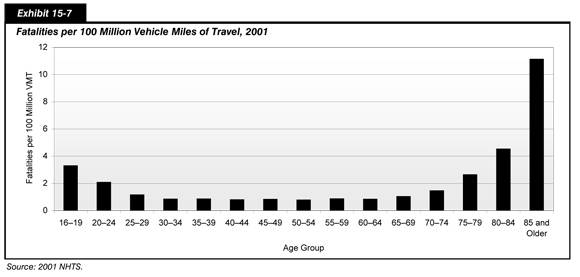
Per mile driven, elderly drivers (those over 80 years old) were more likely to die in a crash than any other age group. The importance of calculating the crash rate by miles driven, rather than by population or percentage of licensed drivers, is that it puts accidents and fatalities into the context of the amount of driving done.
Older drivers drive far fewer miles than younger drivers but are more likely to be injured or die in a crash of the same severity.
As a proportion of all crashes, only about 8.4% involve drivers age 65 and older. However, as a proportion of total vehicle miles of travel, older drivers have the greatest risk of fatality due to decline in driving skill levels and greater vulnerability to severe injury in a collision. Safety concerns will be important as the driving public includes more and more older drivers.
Exhibit 15-7 breaks down, by age group, the number of fatalities per 100 million VMT.
Rising Fuel Cost—A Big Impact
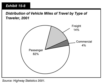
Transportation accounts for almost 70 percent of all petroleum used in the United States, and private (passenger) vehicle travel accounts for 82 percent of all vehicle miles traveled (VMT), as shown in Exhibit 15-8. Recent increases in the cost of motor fuel are raising questions about the impact of higher fuel prices on the economy and the daily travel of Americans.
Assuming that U.S. households continued to drive at the same rates, they paid more than double in annual motor fuel expenditures in 2006 compared with 2001. The average household's $1,461 expenditure on motor fuel in 2001 became $3,261 in 2006. If prices remain high, changes in daily travel and vehicle choice could result. In the long term, fuel cost may also affect work and housing location choices.
Household spending for motor fuel depends on the number and kinds of vehicles the household has, the number of miles those vehicles are driven, and local fuel costs. In 2001, private vehicle fuel cost averaged 7.0 cents per mile of travel. As shown in Exhibit 15-9, this cost grew to 15.6 cents per mile in 2006.
| Percent of Household Vehicles | Annual Miles | Average MPG | Cost per Mile in 2001 | Cost per Mile in 2006 | |
|---|---|---|---|---|---|
| Car | 59.9% | 11,678 | 22.4 | 6.3 cents | 14.1 cents |
| Van | 9.4% | 13,417 | 18.4 | 7.5 cents | 16.6 cents |
| SUV | 12.5% | 13,941 | 16.7 | 8.2 cents | 18.4 cents |
| Pickup | 18.2% | 12,552 | 16.9 | 8.3 cents | 18.3 cents |
| Overall | 100.0% | 12,291 | 20.3 | 7.0 cents | 15.6 cents |
The type of vehicle driven has a significant impact on the amount of money paid at the pump. Fuel expenditures for the average passenger car are approximately 24 percent less than the average sports utility vehicle (SUV) or pickup truck. Pickups and SUVs are less fuel-efficient and are driven more miles on average.
The introduction of SUVs, in particular, has changed the vehicle fleet. Only 12.5 percent of the total vehicle fleet is SUVs. However, SUVs make up about 20 percent of all newer vehicles (less than 2 years old).
How Much Will This Trip Cost?
Costs vary considerably across trip purpose due to differences in trip distance and vehicle types.
The most expensive single trip of the day is the longest trip for most people—the work trip. An average work trip is more than 12.1 miles, compared with 7.0 miles for the average shopping trip. On average, total fuel cost for a one-way trip to work is $1.87 per trip. As shown in Exhibit 15-10, this cost ranges from $1.71 per trip for a passenger car to $2.23 per trip for an SUV.
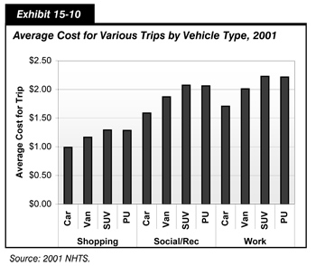
Current fuel prices put the cost of shopping trips at over $1 each way ($1.09 per trip on average). The average trip costs just under $1 ($0.99) for a passenger car and $1.30 for an SUV or pickup. Exhibit 15-10 depicts the average cost for various trips by vehicle type.
Social and recreational trips, such as to visit friends and relatives or go to a concert, ball game, or park, rival the work trip in length and therefore cost more. These types of trips often include a family or a group of friends traveling together, which may reduce the cost per traveler. The 2001 survey showed that four out of five workers drive alone to work, but the average vehicle occupancy for social and recreational trips is 2.3 people.
Many factors have contributed to the continuing growth in passenger travel on the Nation's highways—the growth in the number of people and workers (both baby boomers and immigrants); increased purchase power of U.S. households for vehicle ownership; and the continued dispersion of housing, workplace, and recreational locations.
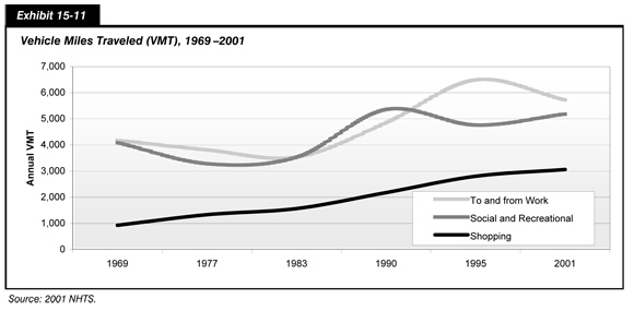
Since 1969, the average annual vehicle miles generated by American households increased from 12,423 to 21,187, a 59 percent increase. During the same time period, the increase in miles traveled for shopping nearly tripled, while miles for commuting and social/recreational travel rose by a third, as shown in Exhibit 15-11.
Who is Impacted the Most?
Rural families own twice as many vehicles as urban households—often less-efficient vehicles like pickup trucks. In fact, in 2001, 37 percent of rural households owned or leased a pickup truck compared with 17 percent of households overall. Rural families also drive more miles than suburban and urban households with average annual VMT of 28,238, well above the average of 21,187 annual vehicle miles. The lower fuel efficiency of pickups (18.3 cents per mile from Exhibit 15-9) combined with a greater VMT translates into a greater annual fuel cost for rural families, regardless of income, as shown in Exhibit 15-12.
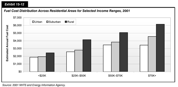
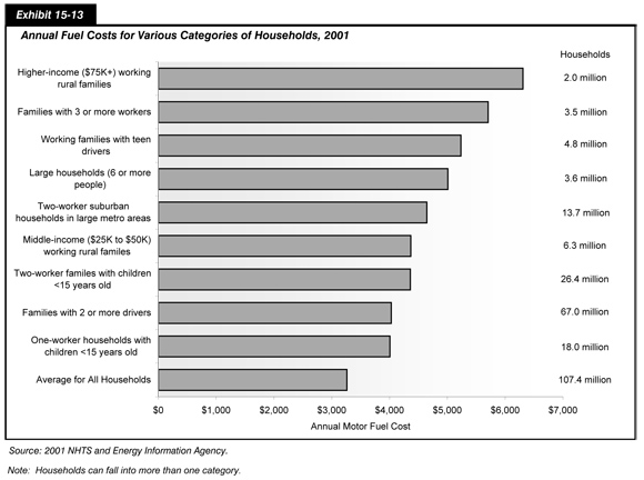
Exhibit 15-13 shows the total annual fuel cost for different types of households. Higher-income rural families have the greatest annual motor fuel cost at $6,150. However, this is a smaller percentage of their total income as compared with lower-income rural households. The 6 million households in rural areas that have incomes less than $25,000 per year average $2,500 per year in fuel costs. This represents 10 percent or more of their total household income. Compared with low-income urban households, low-income rural households travel 13 percent more miles and spend 30 percent more in fuel costs. The average annual fuel cost for all households with vehicles was $3,261 in 2006.
The highway system provides important access to airports, rail stations, and transit. According to the NHTS, more than 3.4 billion vehicle trips are made annually to access other modes of transportation for both business and leisure purposes. It is important to remember this intermodal interdependence of the transportation system, which allows it to be flexible to changing user needs.
Current counts on the roadways show a decline in the rate of growth in VMT, especially on urban highways. However, the effect of the recent rise in fuel prices on travel behavior will not be known until new detailed travel data are collected and made available.
| What Makes a Difference? | |
|
Sharing a ride. Each day American workers commute 166 million miles. If every worker in a two-worker family shared a ride to work, the Nation would save 3.1 million gallons of gas and $9.7 million in fuel costs every day.
Walking or biking. Overall, American adults travel 25 million miles a day in trips of a half mile or less, of which nearly 60 percent are vehicle trips. If people walked instead of drove for these short trips, the Nation would save 1.2 million gallons of gas and $3.9 million of motor fuel cost a day.
Linking trips together. Being efficient about planning travel also can save money. Every time workers link a shopping or errand stop to their commute instead of going home and going out again, they save over $1 in fuel cost.
Taking transit. Less than one out of 10 workers who live and work near transit actually take transit to work. For those who do, the motor fuel savings is substantial. Households with workers who take transit save $32 a week ($1,670 per year) on fuel costs compared with similar households whose workers drive to work.
Choosing the most fuel-efficient vehicle. The average American household has more than one vehicle. Drivers could save hundreds of dollars a year by driving a car instead of an SUV ($492 per year), pickup truck ($417 per year), or van ($193 per year).
|
|
Travel Characteristics of New Immigrants
Immigration promises to make the United States a more heterogeneous nation. For the first time since the early 1900s, immigrants comprise more than 10 percent of the U.S. population, a total of 32 million people.2 The national origins of immigrants have changed over the past few decades—with a significant increase in the number of Hispanic immigrants. According to the 2000 census, nearly half (49.8 percent) of recent immigrants, those who have been in the United States for 3 years or less, are Hispanic.
Predicting future growth in travel has traditionally depended on key characteristics: household income, family size, autos owned, driving ability, and employment. With the aging population (baby boomers) and a sizable influx of new immigrants into the United States, the normal distribution of key population characteristics used to forecast travel demand is changing.
Although the data shown in Exhibits 15-14 through 15-18 are for the Nation, immigration is concentrated both regionally and in major metropolitan areas. New immigrants tend to be most heavily concentrated in the West and Northeast, and least heavily in the Midwest.3 For example, 26 percent of California residents are foreign-born as compared with only 3 percent in Ohio.
Along with the rich cultures, foreign languages, and exotic cuisines, immigrants bring different habits, constraints, and needs when it comes to travel. In 2001, the NHTS collected information on place of birth and year of entry to the United States. These data allow for the analysis of travel behavior trends among the immigrant population so transportation agencies can incorporate this analysis into planning and policy activities.
In the analysis of immigrant travel data, several important differences in key travel indicators, such as household size, emerge. This is illustrated by Exhibit 15-14. While the national average household size is 2.6, immigrant households have an average size of 3.6. In areas with high concentrations of immigrant households, this difference could have a significant impact on travel demand forecasts.
| New Immigrants* | United States | |
|---|---|---|
| Average Household Size | 3.6 | 2.6 |
| Average Workers per Household | 2.0 | 1.4 |
| Average Vehicles per Household | 1.3 | 1.7 |
| Percentage of 16+ Who Drive | 60.6 | 91.5 |
| Percentage of 16+ in Labor Force | 65.2 | 69.8 |
| Percentage of Part-time Workers | 22.7 | 18.7 |
| Usual Distance to Work | 9.5 | 13.2 |
| Usual Time to Work | 24.6 | 25.5 |
| Percentage of Homeowners | 16.1 | 72.3 |
| Percentage of Renters | 82.8 | 27.2 |
| Average Daily Trips per Household | 10.2 | 9.6 |
The slow acquisition of vehicles and the larger household sizes may reflect the lower socioeconomic status of new immigrants in the United States. According to the 2000 census, a higher proportion of new immigrants (15 percent) live in poverty as compared with U.S.-born residents (12.5 percent).
Daily Travel Differences
The travel differences of new immigrants go beyond higher average workers per household, longer distances to work, and lower rates of vehicle ownership. While total household trip rates are higher for new immigrants due to higher household size, individually, new immigrants make fewer trips—about five trips a week less than U.S.-born residents.
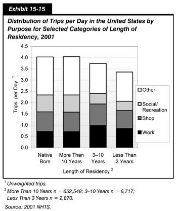
In addition, a higher proportion of their travel is work and work-related. Exhibit 15-15 illustrates this phenomenon. While immigrants who have been in the United States more than 10 years show similar trip distributions to native-born residents, new immigrants take about 50 percent fewer trips for social and recreational purposes.
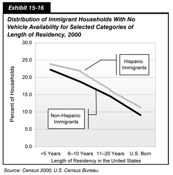
As compared with the U.S.-born population, new immigrants are also more dependent on transit and walking for all their daily travel and much less likely to drive alone. This difference in travel mode may be related to the acquisition of vehicles and driving skills. Non-Hispanic immigrants acquire vehicles faster than Hispanic immigrants, as shown in Exhibit 15-16. Even U.S.-born Hispanics are more likely to live in zero-vehicle households than other native-born residents.
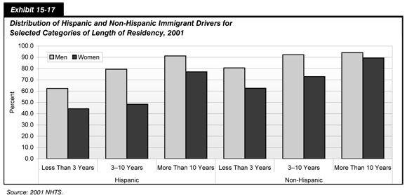
One important reason for the slow acquisition of vehicles is that only about half of new immigrants are drivers, compared with 92 percent of adults in the United States. Exhibit 15-17 shows the varied rates of drivers between Hispanic and non-Hispanic immigrants. In 2001, while non-Hispanic immigrant men reached U.S. driving rates after 3 years, Hispanic women were less likely to drive than other immigrants, even after 10 years in the United States.
Commuting
Work trips are the central focus of local transportation modeling and planning activities. In addition, congestion has become an important policy initiative at the national level. For these reasons, understanding commute patterns across population groups is important. Of great significance is the transit dependency of new immigrants. Immigrants are five times more likely to take transit to work than native-born residents. In some local areas, recent immigrants are a critical market for transit service.
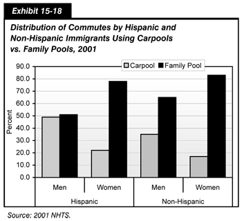
Another important insight about differences in commute patterns is the high use of carpools by Hispanic commuters, especially men. In many places, there are "formal" carpools, such as rideshares arranged through local programs consisting of workers from different households traveling together to a central location. Other arrangements include family carpools (fam-pools) that consist of people from the same household or family sharing a ride to work. Because the NHTS questionnaire specifically asks who was in the vehicle, fam-pools can be distinguished from other carpools. This differentiation is not possible with Census data.
These data shed light on the dynamics of vehicle sharing within a household. The NHTS shows that, of all multi-occupant trips to and from work, 68 percent were made up of two or more members of the same family or household. Women were more likely to be in fam-pools than men, often as part of couples traveling together.
However, as shown in Exhibit 15-18, marked differences existed between Hispanic and non-Hispanic commuters. Hispanic men are much more likely than non-Hispanic men or all women to share a ride to work.
Policy and Planning Implications
America has always been a melting pot and, if current trends continue, immigrants will be a large portion of travelers on the Nation's roads and highways. The ethnicity of new immigrants has changed, adding a strong cultural influence to the traditional assimilation process. In addition, the location of first entry has shifted from center cities to the suburbs, potentially shifting demand for nonmotorized transportation services such as transit.
In 2001, the strong economy continued to create both high-paid and low-paid jobs. Immigrants from Latin America and Asia have been drawn to fill the demand for highly qualified technicians as well as low-skilled service workers. Based on recent trends, some economists project that both highly skilled and unskilled immigrants will be providing a larger share of the labor force in the future.
Especially for travel demand forecasting, growing immigration has both policy and planning implications as states and local areas develop travel forecasts and plan new transportation programs.
For example, the increase in immigration has created diverging trends in some key indicators of travel behavior. Forecasting based on mean indicators can mask these very different patterns. For instance, overall household size is declining, but new immigrants have significantly larger households than the aging white population.
Since immigrants are more transit-dependent and have higher auto occupancies, transportation initiatives focused on high occupancy vehicle (HOV) lanes and transit development can also benefit from understanding the travel behavior of this growing portion of the U.S. population.
As the U.S. society becomes more diverse, growth in travel demand will undoubtedly come from new immigrants. Therefore, the differences in travel behavior by immigrants have wide-reaching consequences for short-term and long-term policy development, planning, and travel demand forecasting.
Commuting for Life
All across the United States, more and more workers, in large metropolitan areas and in small towns, are spending an hour or more each way in their daily commute. One in 12 U.S. workers made these long commutes in 2001 (5.3 million workers). This is a significant increase from 1995 when one in 20 (3.4 million workers) commuted to work an hour or more each way. The distance of these long commutes is not always in the 50-mile range. In large cities, one out of 10 workers spends an hour or more each way to get to work, traveling at an average speed of just 27 miles per hour to go a distance of under 38 miles. Exhibit 15-19 breaks down key characteristics for those workers with hour-long commutes.
| Small Cities | Large Cities1 | |
|---|---|---|
| Average Percentage of All Workers with Hour-Long Commutes | 4.3% | 9.9% |
| Men | 6.4% | 11.4% |
| Women | 1.8% | 8.0% |
| Average Commute Length2 | 52.2 miles | 37.7 miles |
| Average Commute Speed2 | 34.6 mph | 26.9 mph |
The number of hour-long commutes has skyrocketed, not because workers are taking jobs farther from home, but because the same commutes are taking longer. Commutes of 25 to 30 miles one way took 5 minutes more each day in 2001 than in 1995, adding up to 20 hours more commuting time over the course of a work year.
The men and women who travel at least an hour one way to work on average spent 2 hours and 48 minutes a day, or 14 hours per week, just traveling to and from work in 2001. This translates into significant time away from family, personal, community, and recreational activities for these workers.
Urban Commutes
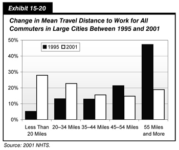
The number of workers in large cities who spend an hour or more for their commute is increasing at a faster rate than in non-urban areas. This is because the same commutes in large cities are taking significantly longer. As shown in Exhibit 15-20, change in travel distance for all commuters in large cities increased between 1995 and 2001, and trips of 55 miles or more increased from just over 80 minutes in 1995 to just over 100 minutes in 2001.
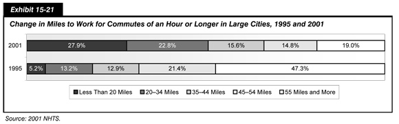
In addition, the distribution of hour-long commutes by the distance traveled has changed dramatically, as shown in Exhibit 15-21. In 1995, only 18.4 percent of hour-long commutes were less than 35 miles; but, by 2001, 50.7 percent of commutes of an hour or longer were less than 35 miles. At the same time, the proportion of hour-long commutes that are over 55 miles shrunk from 47.3 to 19 percent.
Who Are the Workers With Hour-Long Commutes?
Workers with hour-long commutes are more likely to work in manufacturing (where mega-factories draw from a wide area for workers) or in professional and managerial occupations, as shown by Exhibit 15-22. Workers spending an hour or more to get to work have higher incomes on average—perhaps they travel farther for better pay or need more money to balance out the time and expense of these very long commutes.
| Percent of Workers With Average Commutes (<60 min) | Percent of Workers With Commutes of 60 min or More | |
|---|---|---|
| Occupation | ||
| Sales and Service | 25.6% | 18.0% |
| Clerical/Admin | 13.3% | 10.8% |
| Manufacturing | 20.0% | 24.9% |
| Professional/Managerial | 40.2% | 43.9% |
| Telecommuting | ||
| Works at Home Often | 3.0% | 4.1% |
| Works at Home Occasionally | 3.6% | 6.0% |
| Life Cycle | ||
| No Children | 46.3% | 40.7% |
| Young Children | 43.6% | 50.6% |
| Teens | 10.1% | 8.7% |
| Income | ||
| $50,000 or Less | 46.9% | 43.5% |
| $50,000–$100,000 | 28.0% | 29.3% |
| $100,000 or More | 15.4% | 18.7% |
| No Report | 9.7% | 8.5% |
These workers are more likely to have children, especially young children. Suburban and rural homeowners are more likely to have hour-long commutes than urban homeowners. Workers with hour-long commutes also work at home more often than commuters who spend less time traveling for work.
The commuters who travel an hour or more one way leave earlier for work than other workers. In 2001, more than one-quarter of these workers (24 percent and 28 percent in large cities and small towns, respectively) left before 6 a.m. for their trip to work. In comparison, only 12 percent of workers with shorter commute times left this early. Although hour-long commuters were more likely to be men, the departure times for men and women are equally skewed toward the very early morning.
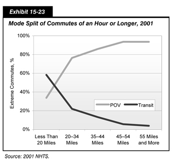
As shown by Exhibit 15-23, sixty percent of the commutes of less than 20 miles that take an hour or longer were on transit (total door-to-door time including walk, wait, and transfer times). For trips over 20 miles, however, the commutes were far more likely to be in a private vehicle.
How much time are workers losing to family and community life, let alone productive work time, due to increased travel times? The 2001 survey shows that one out of 12 commuters spent an average of 2 hours and 48 minutes a day traveling to and from work, in addition to the 8 or more hours on the job. If congestion continues to worsen, more and more workers will be experiencing the strain of an hour-long commute.
Sound congestion reduction strategies, such as those currently being implemented by the DOT, can make a real difference in the quality of life for millions of Americans. For example, one of the initiatives seeks expanded telecommuting options. If each of these workers could telecommute 1 day a week, in a year they could save over 145 hours, or the equivalent of three and a half weeks of work—more free time than most workers take for an annual vacation.
Congestion: Non-Work Trips in Peak Travel Times
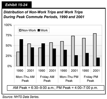
Travel to work has historically defined peak travel demand and, in turn, influenced the design of the transportation infrastructure. Commuting is a major factor in metropolitan congestion. According to the 2001 NHTS, 85 million workers (two-thirds of all commuters) usually left for work between 6 a.m. and 9 a.m., and over 88 percent of these workers traveled in private vehicles. However, as shown in Exhibit 15-24, a significant number of non-work vehicle trips were made during peak periods, which complicates the issue of congestion management.
The amount of travel for non-work purposes, including shopping, errands, and social and recreational activities, is growing faster than work travel, a shift that is important for understanding trends in congestion. Growth in these kinds of trips is expected to outpace growth in commuting in the coming decades. Understanding the overlap of work and non-work travel during the peak travel periods is critical for finding cures for congestion. Primarily, these non-work trips are to drop or pick up a passenger, shop, or run errands.
More than half of peak period person trips in vehicles were not related to work [Exhibit 15-24]. The balance has changed substantially since the 1990s. On an average weekday, non-work travel constituted 56 percent of trips during the AM peak travel period and 69 percent of trips during the PM peak.
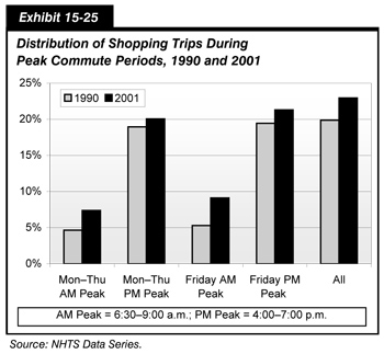
After traveling to work and giving someone a ride, the next largest single reason for travel during the peak period was to shop, including buying gas and meals. In fact, as shown in Exhibit 15-25, more than 20 percent of all trips made during peak travel periods were solely to shop, not shopping trips made during a commute.
In addition to these separate peak period shopping trips, a number of workers stopped to shop, including getting coffee or a meal, during the commute—and this behavior (trip chaining) is increasing.
The 2001 survey showed that since 1995, 25 percent more commuters stopped for incidental trips during their commutes to or from work, and stopping along the way is especially prevalent among workers with the longest commutes.
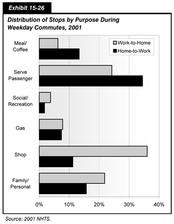
Commuters stop for a variety of reasons, such as to drop children at school or to stop at the grocery store on the way home from work. This is described by Exhibit 15-26. Real-life examples show that trip chaining is often a response to the pressures of work and home. But, the data also show that some of the growth in trip chaining results from grabbing a coffee or meal (the Starbucks effect), activities that historically were done at home and did not generate a trip.
The overall growth in travel for shopping, family errands, and social and recreational purposes reflect the busy lives and rising affluence of the traveling public. The growth in non-work travel is not only adding to the peak periods but expanding congested conditions into the shoulders of the peak and the midday. Exhibit 15-27 describes the distribution of person trips by start hour for several types of trip purpose.
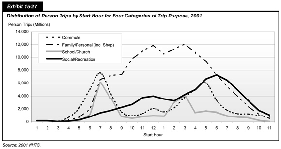
On an average weekday, the number of trips for family and personal errands, including shopping, is far greater than commutes or trips for school. This is true from 8 a.m. throughout the rest of the day. The mountain of travel during the midday builds to the PM peak, where the commute home, errands, and social/recreational travel all intersect.
The issue of urban congestion is complex, and effective solutions cannot be realized by focusing on the work trip alone. A comprehensive policy response is required. Understanding the determinants of travel demand provides a basis for developing effective congestion relief strategies.
Congestion: Who is Traveling in the Peak?
As noted above, the number of non-work trips that are occurring during peak weekday commute hours is growing. Understanding who is making these trips and for what purposes is important as the transportation community explores several congestion mitigation strategies in large urban areas and throughout the U.S. transportation system.
It is important to examine the trends, amount, and characteristics of non-work vehicle trips during the peak periods. The average American is taking approximately four more trips a week than a decade ago for non-work purposes; travel for eating out, recreational activities, and shopping have all increased.
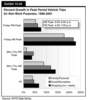
Travelers know that Friday peaks are the worst. According to the NHTS, the level of non-work travel during the Friday AM peak grew by almost 200 percent between 1990 and 2001. Surprisingly, typical workday peak periods are also experiencing increased non-work travel. As shown in Exhibit 15-28, Monday through Thursday peak period non-work vehicle trips increased by 100 percent in the AM peak and 35 percent in the PM peak.
Besides commuting to work, people travel during the peak to take their child to school, run out to buy milk before work, go to the gym, arrive at the doctor's office early to avoid a wait, or pick up their dry cleaning. Exhibit 15-29 shows the relative proportion of these kinds of vehicle trips during the AM peak that were not incidental stops during a commute. Such incidental stops are defined as 30 minutes or less. Hence, most trips to the doctor's office or gym are included in Exhibit 15-29, while a short stop to drop a child at school while the driver continues on to work is not.
Also shown in Exhibit 15-29 is a comparison of these AM peak trip purpose distributions for the 13 most highly congested areas (as defined by the Texas Transportation Institute) and other large urban areas. About 44 percent of all vehicle trips in both congested areas and other areas made during the AM peak were not to work or related to a work trip. However, the 13 areas with the worst congestion had slight shifts in the relative purposes of non-work trips. In the most congested areas, travelers were less likely to make school and shopping trips during peak periods and more likely to drive a passenger somewhere or go to the gym.
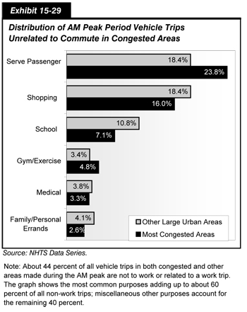
Exhibit 15-30 shows the traveler characteristics of people making non-work trips during the peak as compared with all travelers. While persons between the ages of 36 and 45 made up 23 percent of all non-work peak travelers, persons 16 to 25 and over the age of 65 were more likely to make non-work trips during peak periods as compared with their total travel.
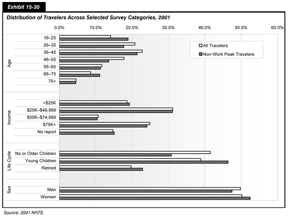
Income has little effect on the propensity to make non-work trips during peak periods; however, life-cycle is an important factor. People with young children at home made up 39 percent of all travelers and more than 46 percent of travelers making non-work trips during peak periods. In comparison, 31 percent of non-work peak travelers had no children in the home and 23 percent were retired. Women were slightly more likely than men to make non-work travel during the peak.
The number of non-work trips during the AM peak for all areas, large and small, and the average trip distances, are shown in Exhibit 15-31. Dropping a passenger was the driver's purpose for 3.6 billion vehicle trips, adding 21.2 billion VMT to the AM peak. More than 78 percent of the trips to drop someone (serve passenger) involved driving children to school. The remaining 12 percent of serve passenger trips were to drop someone at work.
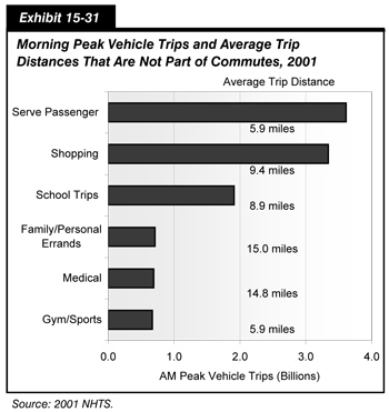
Shopping (including getting a meal) was the driver's purpose for 3.3 billion vehicle trips, adding 31 billion VMT to AM peak volumes.
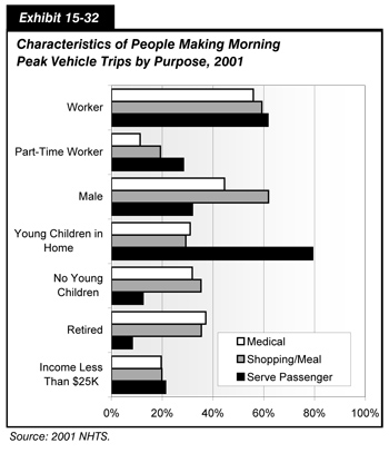
The characteristics of people who made non-work trips in the AM peak varied by the type of trip, as illustrated by Exhibit 15-32. While most were workers, a larger portion of the people dropping passengers were women, and a larger portion of the people shopping (including getting a meal) were men. Nearly 80 percent of the people who dropped a passenger during the AM peak lived in households with young children. Retired people were more likely to shop or go to the doctor's office.
The demand side of congestion begins with people—who they are, what they need to accomplish in a day, and when they choose (or have time) to travel. In dealing with daily congestion, people may change the routes or the times they travel. Some make changes in where they live or work. Every day people calculate how to accomplish all that they need to do, and understanding travel behavior means trying to understand the interrelation of people's complex choices and the transportation system.
Travel to School: The Distance Factor
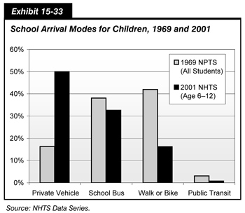
Like all trip-making, travel to school has changed dramatically over the past 40 years. The change that is most apparent is the increase in children being driven to school. In 1969, about 15 percent of school children ages 6 to 12 arrived at school in a private vehicle; in 2001, half of all school children were driven to school. Exhibit 15-33 shows how children's travel to school has changed since 1969.
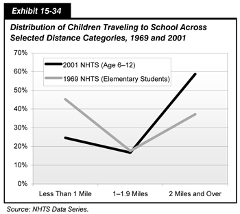
One factor underlying this change is the increased distance children travel to school. In 1969, just over half (54.8 percent) of students lived a mile or more from their schools. By 2001, three-quarters of children traveled a mile or more to school. Exhibit 15-34 shows the dramatic change in trip distance to school for children ages 6 to 12.
Some of the change in distance may result from suburbanization and larger school districts. In 2001, 21.9 percent of students ages 6 to 12 lived within a mile from school in urban areas4 compared with just 2.7 percent of students in rural areas (20 percent of the U.S. population lives in rural areas).
According to independent research using the NHTS data series, distance is one of the major factors in the shift in mode to private vehicle by schoolchildren.5 This research also found that safety and security concerns are significant factors in parents' decisions to let their children walk to school, especially girls.
Other possible factors impacting the percentage of children biking or walking to school include the use of before- and after-school child care, availability of sidewalks, and inclement weather. The importance of these issues is being examined in the Safe Routes to Schools Program and in the 2008 NHTS.
As children live farther from school than in the past, it is not surprising that the mode of travel to school has changed. Exhibit 15-35 shows the mode of travel by distance for school trips in 2001.
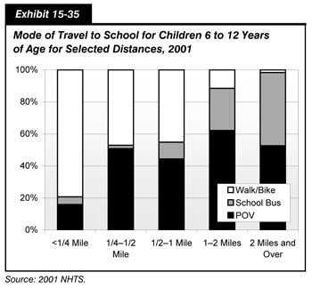
The distribution of these major modes (transit and "other" have been excluded) shows clearly that the majority of school trips of less than one-quarter mile were made by walking or biking. However, for trips between one-quarter and one-half mile, the private vehicle accounted for half, and POV was the dominant mode for school trips over 1 mile (in 2001, 75.4 percent of all school trips by children 6 to 12 were over 1 mile).
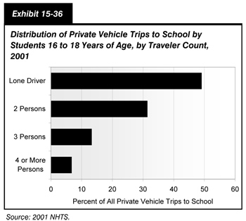
School trips by students ages 16 to 18 also were predominantly by private vehicle. Over three-quarters (76.9 percent) of all trips to school for children ages 16 to 18 were by private vehicle. This age group traveled farther to school than younger children, with an average distance of 6 miles compared with 3.6 miles for children ages 6 to 12. Exhibit 15-36 shows that, of those private vehicle trips, half were driven alone, 31.3 percent were two-party trips, 13.4 percent had three persons, and 6.6 percent had four or more people.
Policies and programs that encourage walking and biking to school, especially for grade school children, need to account for the number of eligible walkers and bikers (living within a mile of school) along with the barriers to walking and biking such as security concerns of parents.
Endnotes
1 Further information can be found on the NHTS Web site: http://nhts.ornl.gov/.
2 U.S. Census Bureau, February 2003.
3 U.S. Census Bureau, December 2003.
4 Urban areas are defined by the Census Bureau as one or more place ("central place") and the adjacent densely settled surrounding territory ("urban fringe") that together have a minimum population of 50,000 personal. All other areas are "rural."
5 McDonald, Noreen. 2008. "Children's Mode Choice for the School Trip: The Role of Distance and School Locations in Walking to School." Transportation, Springer Netherlands, January.