U.S. Department of Transportation
Federal Highway Administration
1200 New Jersey Avenue, SE
Washington, DC 20590
202-366-4000
Federal Highway Administration Research and Technology
Coordinating, Developing, and Delivering Highway Transportation Innovations
| REPORT |
| This report is an archived publication and may contain dated technical, contact, and link information |
|
| Publication Number: FHWA-HRT-12-023 Date: December 2012 |
Publication Number: FHWA-HRT-12-023 Date: December 2012 |
One important aspect of optimum deflection test spacing and frequency is the measurement accuracy. The accuracy is mainly a function of the combined effects of different sources of variability, such as number of measurements, equipment variability, and spatial variability, which is often associated with the inherent section variability.(29) In addition to measurement accuracy, optimum deflection test spacing and frequency for PMS applications is a function of the following considerations:
Structural models in pavement management systems range from the very simple to relatively complex. The simplest models utilize deflections or deflection basin parameters to characterize subgrade and pavement structural properties. For example, the outer deflections can be used to estimate subgrade stiffness, while the inner deflections are indicative of the degree of support provided by the pavement layers above the subgrade. The more complex structural models utilize pavement layer moduli (derived from deflections) and pavement layer thicknesses and material types to calculate pavement response which is then used to predict failure, much like project-level pavement design analysis. Any PMS system using the latter more complex approach would undoubtedly need more deflection information than the former more simplistic approach.
PMS inventory mileage is another consideration in deflection spacing. Texas maintains approximately 89,000 centerline mi (143,290 centerline km) of pavement, while Alaska maintains approximately 5,000 centerline mi (8,050 centerline km). Certainly, it would be easier to collect deflection data on the majority system for a State with fewer miles, and the deflection spacing could be closer.
Most States and local agencies only have a handful of FWDs, and these are mainly used to collect project-level deflection data for scoping M&R work and for research purposes. PMS deflection data collection are, in most cases, prioritized below project-level work, so the equipment availability for network level data collection is often limited.
Data collection for PMS requires equipment operators to be in the field for long periods of time, often weeks at a stretch, as it is not efficient for the operator to mobilize back and forth from the home base to the job site. Multiple operators are required, and the agency must be flexible in its overtime policies as it is more efficient to work a 10- or 12-h day in the summer as opposed to the traditional 8-h day, 40-h work week. Personnel turnover is an issue as well. Many operators are motivated by the high-tech aspects of operating the FWD. They tend to be highly capable and multitalented and, as such, are often quickly promoted through the agency, leaving a void to fill. FWD operator turnover within the agency is often higher than other positions, so the issue of training new operators must be addressed.
Traffic levels are a significant factor when determining optimum (i.e., "minimum possible") test spacing. Higher traffic facilities require expensive lane closures. Moderate traffic requires at least a sign truck and a crash attenuator mounted on a large vehicle, typically a flatbed single unit truck. These operations require three personnel, one for each vehicle. Ironically, the lowest traffic facilities are typically ranked lowest in priority in the PMS data collection effort but afford the opportunity to collect the most data.
Given the above, the annual agency budget ultimately controls the quantity of deflection data that can be collected in any given year. Objective recommendations and guidelines are provided in this report to determine optimum test spacings, but in the end, the optimum spacings for any agency, network, or portion of the network will be dictated by data collection priorities (project versus network), total mileage to be tested, equipment and personnel availability, traffic levels, and the portion of the annual budget available for network-level testing.
The objective of this analysis was to develop an approach to determine the optimum spacing between FWD tests for use in network applications. The approach is based on an evaluation of the probability of introducing errors as a function of different test spacings and pavement section lengths. Different spacings were evaluated in a probabilistic procedure, resulting in a set of expected error curves for various reliability levels that can be used in the future for determining the optimum test spacing. The error represents the expected difference between the sample of the data and the idealized true value of the population, which, in this case, is represented by the average deflection value of a homogeneous road segment. Monte Carlo simulations were used to model the error function. They are particularly useful in this type of problem in which variables are stochastically distributed and analytical solutions are difficult to obtain. The effectiveness of this approach was verified using data from various road segments in five states. The expected outcome of this study is a procedure that can be easily implemented in a pavement management system during the planning stages of the survey campaigns by simply defining an acceptable magnitude of error and a reliability level.
Modeling the Error Using a Monte Carlo Simulation
The main purpose of this task was to evaluate the sources of variability of FWD testing associated with different sampling strategies and their impact on the average deflection values measured in a road segment. This analysis also provides an opportunity to compare a desirable level of accuracy with the costs associated with the associated sampling strategy (i.e., level of expected error versus number of data points in the sample).
An assumption has to be made about the pavement segment for which the sampling strategy is being defined. The segment must be homogenous in the following characteristics:
The characteristics are likely to provide a pavement segment with a deflection profile without significant variations in deflection magnitudes. These conditions are necessary for any sampling strategy to be effective and produce meaningful results.
The basic approach involves the use of a Monte Carlo simulation to assess the effects of each source of variability. The Monte Carlo simulation is an iterative method for evaluating a deterministic model using sets of random numbers as inputs. This method is useful when the model is complex, nonlinear, or involves more than just a few uncertain parameters. By simulating the probability distributions for each source of variability, it is possible to evaluate the overall error of average FWD measurements when different sampling procedures are selected at network-level. Figure 38 represents the process to evaluate different sampling alternatives.
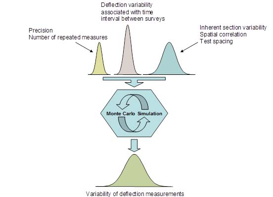
Figure 38. Illustration. Monte Carlo simulation.
To begin a Monte Carlo simulation, operators should select random deflection data that were generated for a 10-mi- (16.1-km)-long section at an assumed 0.1-mi (0.161-km) interval between test points. In each scenario, different means and standard deviations were simulated. The chosen values for means and standard deviations were selected based on observations of data in the LTPP database and State transportation department data available for this research. The interval of 0.1 mi (0.161 km) was chosen because it represents the typical spacing used at FWD surveys for project-level designs. The average deflection of this randomly generated profile was used as the true deflection value for the section (i.e., the errors associated with sampling strategies were determined in relation to this value).
First, the entire data in each randomly generated deflection profile were divided in groups of increasing spacing by skipping up to 19 deflection points, which corresponds to a 0.2- to 2-mi (0.322- to 3.22-km) spacing. These subgroups represented different sampling strategies defined by the spacing between deflection points. All possible combinations of data points that yield the target spacing were generated. For instance, the first spacing was achieved by skipping one deflection point. In this case, two combinations were possible, one starting with the first data point and skipping the second and the other by skipping the first and starting with second one. For each consequent spacing, the number of combinations was increased by one. This is exemplified in figure 39 for spacings of 0.2 and 0.3 mi (0.322 and 0.483 km).
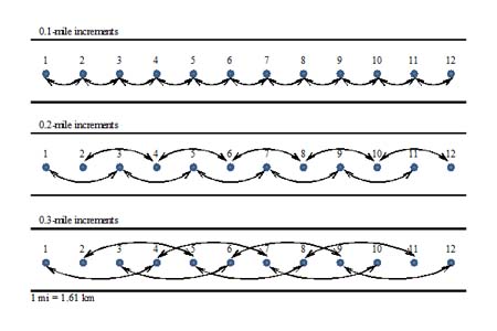
Figure 39. Illustration. Deflection measurement pairings based on 0.1-, 0.2-, and 0.3-mi (0.161-, 0.322-, and 0.483-kg) spacings.
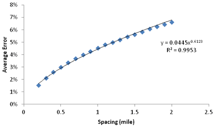
After each subgroup was defined, the mean for each spacing combination was calculated and compared to the mean of the entire dataset created at a 0.1-mi (0.161-km) spacing. (Recall that the mean of the 0.1-mi (0.161-km) spacing data was considered to be the true mean.) The errors associated with each spacing were calculated as a percentage of the true mean. This process was repeated for each random simulation in the Monte Carlo process. A total of 5,000 simulations were run, and the results were used to create a distribution of average errors with spacing. The error distribution as function of test spacing is plotted in figure 40. This graph indicates that as the spacing between test points increases, the error increases in relation to the reference value (i.e., true mean). The error is interpreted as the accuracy of the average deflection of the homogeneous segment associated with a selected sampling strategy (spacing) when compared to the true mean given by a FWD survey at a 0.1-mi (0.161-km) spacing.
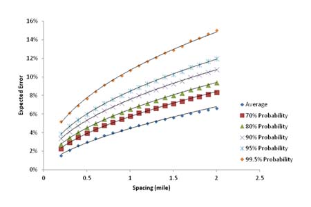
In addition to modeling the expected average error, the results from the Monte Carlo simulation can be also used to model a probabilistic component to the calculation of expected error. Therefore, expected levels of reliability can be included in the analysis, which is an important characteristic in pavement design and evaluation today (e.g., the MEPDG).(27) The standard deviation of the error was computed for each spacing combination. Normal distribution of the error was assumed, and the expected error at different spacings and different reliability levels could be calculated. The average expected error is shown in figure 41 for various spacings and different probability levels for sections that are 10 mi (16.1 km) long.
1 mi = 1.61 km
Figure 40 Graph. Expected average error as function of spacing for 10-mi (16.1-km)-long sections.
1 mi = 1.61 km
Figure 41. Graph. Expected average errors for 10-mi- (16.1-km)-long section at different spacings and probability levels
An example of how the process works is illustrated in figure 42. For a given spacing, s, the probability distribution can be computed based on the average error and standard deviation obtained from the Monte Carlo simulation. In the figure, ε90 is the error calculated for a 90 percent probability at s. This means that P (ε < ε90) = 0.9. If ε90 is an acceptable error, choosing s implies that there is a 90 percent probability that the error associated with this sampling strategy is less than ε90.
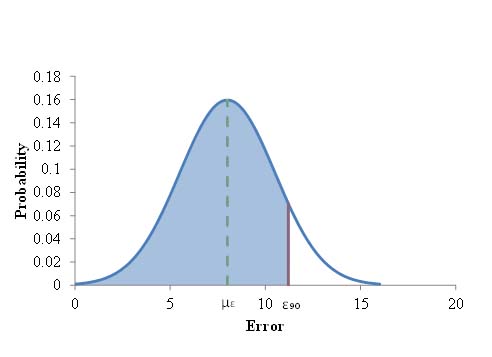
Figure 42. Graph. Normal distribution.
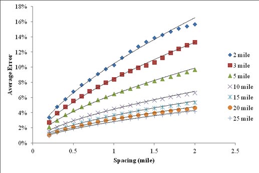
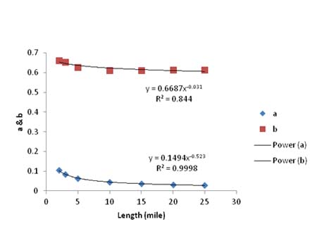
A concern was raised about the influence of the section length on the expected error, since the error in samples is a function of the number of test points in the sample. The hypothesis was that for the same spacing, errors would increase for shorter sections and decrease for longer sections. For this reason, a set of 5,000 simulations were run for sections that were 2, 3, 5, 10, 15, 20, and 25 mi (3.22, 4.83, 8.05, 16.1, 24.15, 32.2, and 40.25 km) long with deflections randomly generated every 0.1 mi (0.161 km). The average error was plotted against spacing for each length (see figure 43). Looking at the graph, it is evident that the length of the section influences the magnitude of the expected error. A power curve of the form y = a x x b was fit to all curves. Comparing the intercept, a, and the exponent, b, in each curve suggested that these values could be modeled as power functions of the section length themselves. These two functions are shown in figure 44.
1 mi = 1.61 km
Figure 43. Graph. Average error curves for different section lengths.
1 mi = 1.61 km
Figure 44. Graph. Values of a and b from the seven average error curves.
The results from figure 43 and figure 44 suggest that the expected error can be calculated for a particular section depending on its length and the chosen sampling strategy (spacing) according to the equation in figure 45.
![]()
Figure 45. Equation. Average expected error due to sampling.
Where:
µε = Expected average error (percent).
L = Length (miles).
s = Spacing (miles).
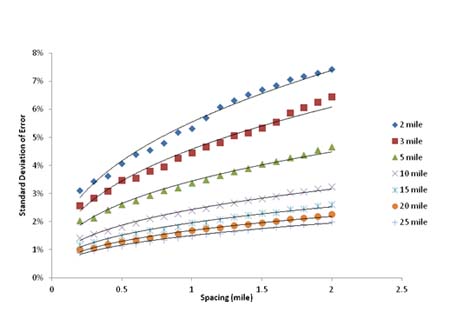
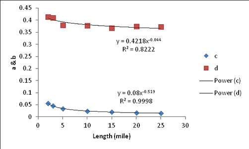
The same process was repeated for the standard deviation of the expected error, which is shown in figure 46. The two functions for the intercept, a, and exponent, b, are shown in figure 47. The standard deviation of the expected error can be calculated for a particular section depending on its length and the chosen sampling strategy (spacing) according to figure 48.
1 mi = 1.61 km
Figure 46. Graph. Standard deviation of average error curves for different section lengths.
1 mi = 1.61 km
Figure 47. Graph. Values of c and d from the seven standard deviation curves.
![]()
Figure 48. Equation. Standard deviation of the expected error due to sampling.
Where:
σ ε = Standard deviation of the expected error (percent).
L = Length (miles).
s = Spacing (miles).
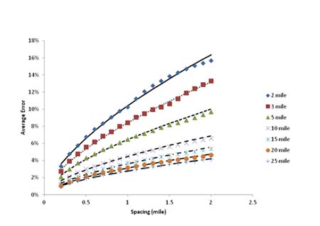
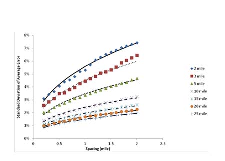
The effectiveness of these two equations is demonstrated in figure 49 and figure 50. Both figures show a good fit between the predicted error and standard deviation of error versus computed values from the Monte Carlo simulation.
1 mi = 1.61 km
Figure 49. Graph. Observed average error (data points) plotted with the computed average error (lines).
1 mi = 1.61 km
Figure 50. Graph. Observed standard deviation (data points) plotted with the computed average error (lines).
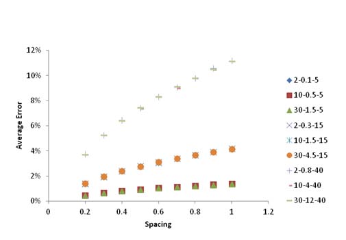
The final step in the development of these equations involved the influence of the coefficient of variation (COV) on the average error. For this purpose, simulations were run for various means and standard deviations. The results are shown in figure 51. The numbers in the legend correspond to the mean, standard deviation, and COV. For the same COV, the average error remains the same regardless of the mean and standard deviation. Also, it is important to point out that an increase in COV increases the average error significantly.
1 mi = 1.61 km
Figure 51. Graph. Calculated errors for a 10-mi- (16.1-km)-long section with different means and standard deviations of errors.
In order to consider the effect of COV, a shift factor was determined to incorporate COV into the average error equation. The equation for the COV shift factor is shown in figure 52.
![]()
Figure 52. Equation. Calculation of COV shift factor.
Although the shift factor was calculated and is available, COV will not likely be known prior to surveying the road with an FWD. Therefore, for practical applications, it is recommended that the average error should be calculated for a COV of 33 percent. This value was obtained from the FWD measurements used in this study and could be representative of the variability observed in field FWD data. This value was also used in this research for verifying the reliability approach laid out in this section. The verification of this approach is described in the following section.
Being able to predict the expected error and its standard deviation enables the development of error curves for different section lengths and reliability levels without running any more Monte Carlo simulations. Table 30 can be used to calculate the expected error in the average deflection as a result of a selected sampling strategy (spacing) for a given section length and 90 percent reliability. Additional tables were developed using this approach for a variety of section lengths and different reliability levels and are presented in appendix E.
| Probability | Length (mi) | Spacing (mi) | ||||||||
|---|---|---|---|---|---|---|---|---|---|---|
0.2 |
0.3 |
0.4 |
0.5 |
0.6 |
0.7 |
0.8 |
0.9 |
1 |
||
90 percent |
1 |
14.18 |
17.94 |
21.24 |
24.22 |
26.98 |
29.57 |
32.02 |
34.35 |
36.59 |
2 |
10.10 |
12.71 |
14.98 |
17.03 |
18.93 |
20.70 |
22.37 |
23.96 |
25.48 |
|
3 |
8.28 |
10.38 |
12.21 |
13.86 |
15.38 |
16.80 |
18.13 |
19.41 |
20.62 |
|
4 |
7.19 |
9.00 |
10.56 |
11.97 |
13.27 |
14.48 |
15.63 |
16.71 |
17.75 |
|
5 |
6.44 |
8.05 |
9.44 |
10.69 |
11.84 |
12.91 |
13.92 |
14.88 |
15.80 |
|
6 |
5.89 |
7.35 |
8.61 |
9.74 |
10.78 |
11.75 |
12.67 |
13.54 |
14.36 |
|
7 |
5.46 |
6.80 |
7.97 |
9.01 |
9.97 |
10.86 |
11.70 |
12.49 |
13.25 |
|
8 |
5.11 |
6.36 |
7.45 |
8.42 |
9.31 |
10.14 |
10.92 |
11.66 |
12.36 |
|
9 |
4.82 |
6.00 |
7.02 |
7.93 |
8.76 |
9.54 |
10.27 |
10.96 |
11.62 |
|
10 |
4.58 |
5.69 |
6.65 |
7.51 |
8.30 |
9.03 |
9.72 |
10.38 |
11.00 |
|
| 1 mi=1.61 km | ||||||||||
Comparison to Available Data
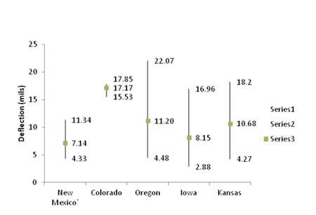
Deflection data from various roads in three States (New Mexico, Oregon, and Kansas) were obtained and analyzed. FWD data from New Mexico and Kansas were spaced at 0.1 mi (0.161 km) per test point, while Oregon was spaced at 0.05 mi (0.08 km). Overall statistics are presented in table 31. The roads were further separated into smaller sections based on the asphalt concrete layer thickness and base thickness (not available for every road) for creating homogenous sections. An overview of the deflection data for each state is given in figure 53. More detailed information is presented in appendix E.
Table 31. Deflection data for New Mexico, Oregon, and Kansas .
|
First, similar to the theoretical approach, the entire section data were divided in groups of increasing spacing by skipping up to 19 deflection points when enough data were available. The average error for each spacing was then computed for all sections. Next, the mean was compared to the mean of the entire section, which was assumed to be the true mean. Figure 54 shows the average error of means at different spacings averaged for all the sections in New Mexico. It can be noted that as the spacing increased, the difference to the true mean increased, as well, similar to the randomly generated deflections. The same trend follows for the other States.
|
| 1 μm = 0.039 mil |
Figure 53. Graph. Maximum and minimum section means and weighted mean deflection for all sections in each State.
|
|
| 1 mi=1.61 km |
Figure 54. Graph. Average error for each spacing.
The verification of the theoretical approach with field measured data was done by comparing the expected average error, computed using the equation in figure 45 and the COV shift factor equation in figure 52, with calculated values from the field distribution. Figure 55 through figure 57 show the measured error for a specific sampling strategy (spacing) and the expected error computed by the equations developed in the theoretical approach considering a reliability level of 50 percent (i.e., without including the standard deviation). As a consequence, it is expected that at least 50 percent of the sections would have errors less than or equal to thecalculated error. It can be seen from all three figures that the theoretical approach provides a reasonable estimate of the error expected when one particular sampling strategy is selected.
|
|
|
|
|
|
The recommended frequency of FWD data collection on pavements is dependent on the overall "rate of change" of structural conditions over time. Since pavement deflection measurements, particularly the deflection at the center of the load plate, are a direct measurement of the overall structural condition of a pavement, the LTPP database was evaluated to determine how quickly deflections change over the range of testing dates and pavement thicknesses contained in the database. Flexible pavements were evaluated separately from rigid pavements with recommendations given for each.
The objective of this analysis was to determine the rate of change of the center deflections over time for a variety of asphalt pavement thicknesses, traffic levels, subgrade types, and climatic conditions. The rate of change is used to determine how often deflection measurements should be taken on a network-level basis. Center deflections were used because they represent the total response of all the layers in the pavement structure.
The LTPP database contains 2,873 days of FWD tests taken for 59 State codes, 297 SHRP sites, and 8 construction cycles. Each record in the database contains the average of the deflections collected on a particular day over the entire SHRP test section along the outer wheel path. The records also contain the average air and mid-depth AC temperatures for the day of test. The deflection data were reviewed for statistical outliers, such as deflections measured on frozen pavements which were removed. In addition, those sites with too few or insufficient data collection cycles were omitted from the analysis.
The analytical process consisted of the following steps:
Sort the order of the records by the total number of test days on a particular test section, as well as the standard deviations of center deflections (D1).
Normalize the deflections to a 9,000-lbf (40,050 N) load for each SHRP section.
Determine the degree of temperature sensitivity due to the AC layer for each SHRP section by regressing D1 versus mid-depth AC temperatures.
Remove the influence of temperature from the D1 measurements by adjusting them to a reference temperature of 68 °F (20 °C).
Regress D1 versus time to determine the slope (change in D1 over time).
Determine relationship between the slope and AC thickness, traffic levels, subgrade type, and climatic conditions (WF, DF, WNF, and DNF).
This process is demonstrated in figure 58 for one particular SHRP section. In this case, the State code is 50 and the SHRP ID number is 501002, which is US-7 near New Haven, VT. This section is composed of 8.5 inches (215.9 mm) of AC over 26 inches (660.4 mm) of unbound base or subbase materials, a fine-grained subgrade, and a WF climatic designation. There were 60 days of FWD data collection available for analysis on this section, starting in September 1989 and ending in October 2003. The traffic classification for this section was high, with an AADTT of 300 and 28 percent trucks of the class 9 variety. The deflection versus temperature characteristics for log (D1) are shown in the figure 58.
|
|
|
Figure 58. Graph. Plot of log (D1) versus temperature for SHRP section 501002. |
The slope of the regression line is 0.0114 and is used in the following equation in figure 59 to adjust each deflection to the standard temperature of 68 °F (20 °C):
![]()
Figure 59. Equation. Deflection adjustment by temperatures
Where D1adj is the center deflection adjusted to 68 °F (20 °C), D1meas is the center deflection adjusted to 9,000 lb (4,086 kg), load b is the slope of the regression equation, T is the average mid-depth temperature, and Tref is the reference temperature of 68 °F (20 °C).
Figure 60 shows the center deflections plotted against test date for SHRP section 501002 before and after the temperature corrections were applied.
|
|
Note that in figure 60, a long-term trend of increasing deflections can be detected. There are some seasonal variations, but these are minor in relation to the overall trend.
By fitting a linear regression line to the temperature adjusted data, as seen in figure 61, the rate of change of structural condition on the section can be determined. Note that the change is essentially linear. The slope of the regression line, 0.0164, represents the increase in microns per day for the center deflection. This can be converted to a yearly rate by multiplying it by 365, which equals roughly 0.234 mil (6 µm ) per year.
|
|
A similar analysis was done for the remaining selected sections. Some sections displayed decreasing deflections over time, so the scalar value of the slope was used for the analysis. A summary of slope values is provided in table 32. The average slopes were grouped by traffic level, subgrade type, AC thickness, and climate classification in table 33 through table 36.
Table 32. Annual change in D1 by SHRP test section.
|
Table 33. Rate of deflection change by traffic level.
|
|||||||||||
|
|||||||||||
|
|||||||||||
|
|
From table 32 through table 36, the following can be concluded:
The annual rate of change of pavement deflections shows little correlation with traffic levels.
The annual rate of change of pavement deflections shows little correlation with subgrade type.
The annual rate of change of pavement deflections does show some correlation to AC thickness - lower thicknesses produce higher rates of change, as expected.
Dry climates seem to produce larger annual changes in pavement deflections, which is counter-intuitive.
Once temperature influences are removed, the rate of change of deflection measurements is relatively small for most pavement sections contained in the LTPP database.(1)
Based on the analysis of these pavement sections, a test frequency of 5 years between tests is recommended for flexible pavements.
The rigid pavement sections that were evaluated also exhibited temperature dependency and were adjusted to a standard temperature of 68 °F (20 °C). This dependency is most likely due to slab curling under higher temperatures. Subsequent to normalizing the deflections to 9,000 lb (4,086 kg) and then removing the temperature effects, the annual change in D1 was less overall than that observed on the flexible pavement sections. It appears that the frequency of network level testing of rigid pavements can be less than flexible sections, perhaps up to 10 years between tests.