

- Highway Operational Performance
- Congestion
- Texas Transportation Institute Performance Measures
- Average Daily Percentage of Vehicle Miles Traveled Under Congested Conditions
- Travel Time Index
- Annual Hours of Delay per Capita
- Average Length of Congested Conditions
- Cost of Congestion From TTI Urban Mobility Report
- Traditional Congestion Measures
- Relationship of Congestion to Daily Travel
- Emerging Operational Performance Measures
- System Reliability
- Bottlenecks
- Transit Operational Performance
- Average Operating (Passenger-Carrying) Speeds
- Vehicle Use
- Vehicle Occupancy
- Vehicle Utilization
- Revenue Miles per Active Vehicle (Service Use)
- Frequency and Reliability of Services
- Seating Conditions
- Comparison
Highway Operational Performance
Americans continue to grapple with congestion in the form of travel delays, wasted fuel, and billions of dollars in congestion costs. Traffic congestion has increased during the past 20 years as the Nation's population, the number of drivers and vehicles, and travel volume have continued to increase at a much faster rate than system capacity.
This chapter focuses primarily on broadly measuring operational performance trends related to congestion. Subsequent sections within this chapter cover the operational performance of transit and summarize key highway and transit statistics. Chapter 13 addresses operational issues that relate specifically to freight transportation, while Chapter 14 discusses broad strategies that can reduce congestion. Issues relating to improving the measurement of operational performance are discussed in Part IV, "Afterword."
Congestion
In general terms, highway congestion results when traffic demand approaches or exceeds the available capacity of the highway system. Exhibit 4-1 describes the typical sources of congestion. Congestion can occur when there are peaks in demand; of the total congestion experienced by Americans, it is estimated that roughly half is "recurring congestion" caused by an imbalance of routine daily demand with typical available capacity. Congestion can also occur when there are limitations on capacity, or temporary capacity reductions.
| Peaks in Demand | Recurring weekday commuting in urban areas Recurring weekend shopping in urban areas Seasonal vacation travel on rural and intercity highways Major generators of freight traffic (ports, factories, distribution centers) Large events (sporting venues, concerts, disasters) |
| Capacity Limitations | Network extent and coverage Bottlenecks (interchanges and intersections, converging lanes, steep slopes, sharp turns) Impediments (toll booths, border crossings, truck inspection stations) Poor traffic control (traffic signal coordination) Traffic calming |
| Temporary Capacity Reductions | Crashes and breakdowns Work zones Weather Street closures for events (parades, street fairs, marathons, disasters) Rail-highway grade crossings Temporary curb-side obstructions (especially curb-side parking and construction adjacent to rights-of-way) Law enforcement actions |
There is no universally accepted definition or measurement of exactly what constitutes a congestion "problem." The public's perception seems to be that congestion is getting worse, and it is by many measures. However, the perception of what constitutes a congestion problem varies from place to place. Traffic conditions that may be considered a congestion problem in a city of 300,000 may be perceived differently in a city of 3 million, based on differing congestion histories and driver expectations. These differences of opinion make it difficult to arrive at a consensus of what congestion means, the effect it has on the public, its costs, how to measure it, and how best to correct or reduce it. Because of this uncertainty, transportation professionals examine congestion from several perspectives.
Three key aspects of congestion are severity, extent, and duration. The severity of congestion refers to the magnitude of the problem at its worst. The extent of congestion is defined by the geographic area or number of people affected. The duration of congestion is the length of time that the traffic is congested, often referred to as the "peak period" of traffic flow.
Texas Transportation Institute Performance Measures
The Texas Transportation Institute (TTI) has studied congestion trends since 1982. Its study results are published annually in the Urban Mobility Report, which is cited nationwide for its list of congestion delays and potential solutions in the Nation's busiest cities. The Federal Highway Administration (FHWA) and TTI work in conjunction to establish and refine the performance metrics of congestion that provide a better indication of congestion's level of impact on the Nation's communities. Since 1982, the data source for the calculations in the Urban Mobility Report has been the FHWA Highway Performance Monitoring System (HPMS).
The 2006 C&P report relied on data computed by TTI for the FHWA using a methodology consistent with 2005 Urban Mobility Report, but which included all urbanized areas rather than the set of 85 areas covered in TTI's report. The FHWA also utilized TTI's 2005 methodology for performance measures in other documents such as the FY 2009 U.S. DOT Budget in Brief. In developing its 2007 Urban Mobility Report, TTI expanded the document's coverage to include all urbanized areas, developed new performance measures, and refined its methodology for computing several existing performance measures. This revised methodology was adopted for the FY 2008 U.S. DOT Performance and Accountability Report.
| What are the differences between the 2005 and 2007 TTI Urban Mobility Report methodologies? | |
|
TTI spent several years developing new procedures for the 2007 Urban Mobility Report. Significant changes to the 2005 methodology included:
|
|
While this chapter focuses on statistics computed using the 2007 TTI methodology, in some cases comparable statistics are presented based on the 2005 TTI methodology as well. This information is included to allow for continuity and facilitate comparisons with previous editions of the C&P report. It is anticipated that future editions of the C&P report will not include statistics based on the 2005 TTI methodology. This chapter draws upon the following performance measures from the 2007 TTI Urban Mobility Report: percentage of daily travel in congested conditions, travel delay (recurring and non-recurring), annual hours of delay per capita, time travel index, wasted fuel, and congestion cost.
The 437 urban communities for which data is analyzed by TTI represent various population sizes and locations across the Nation. TTI divides these communities into four groups, based on population size; for 2005, the 338 urbanized areas with populations of less than 500,000 are classified as "Small," the 36 areas with populations between 500,000 and 999,999 are classified as "Medium," the 26 areas with populations between 1 million and 3 million are classified as "Large," and the 14 with populations greater than 3 million are classified as "Very Large." These shorthand terms have been adopted in this section for clarity. However, it should be noted that they are not consistent with the population break of 200,000 frequently used in other FHWA applications to distinguish "Small Urbanized Areas" from "Large Urbanized Areas."
It must be noted that the results of the 2000 census have impacted the studies conducted by TTI. As urban areas increase in size, they will migrate between the four categories used by TTI to define population groups. This adjustment due to population change can have a significant impact on the results for a particular group. TTI recalculates the measures for each group for each year of data.
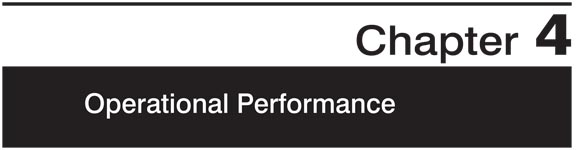
Average Daily Percentage of Vehicle Miles Traveled Under Congested Conditions
The average daily percent of vehicles miles traveled (VMT) under congested conditions is defined as the percentage of daily traffic on freeways and principal arterials in urbanized areas moving at less than free-flow speeds. Based on the 2007 TTI methodology, Exhibit 4-2 shows that this measure of extent and duration of congestion has increased from 24.9 percent in 1997 to 28.6 percent in 2006 for all urbanized areas combined, a total increase of 3.7 percentage points. As the value for 2006 matched the 28.6 percent value for 2004, this suggests that the growth in congestion may be stabilizing.
Based on the 2005 TTI methodology, the percent of congested travel increased for all communities from 27.5 percent in 1997 to 31.6 percent in 2006, an increase of 4.1 percent, as shown in Exhibit 4-2. However, the increase between 2004 and 2005 was only 0.1 percent and the rate of increase declined to 28.6 percent in 2006. Again, this suggests that the rate of growth in congestion is slowing.
As shown in Exhibit 4-3, using the 2007 TTI methodology, the greatest increase between 1997 and 2005 was experienced by communities in the Medium (population 500,000 to 999,999) category, with an increase of 4.7 percentage points, and communities in the Small (population less than 500,000) category, with an increase of 4.3 percentage points.
| Urbanized Area Population | 1997 | 1999 | 2000 | 2002 | 2004 | 2005 |
|---|---|---|---|---|---|---|
| Small (less than 500,000) | ||||||
| 2005 TTI Methodology | 12.6% | 13.7% | 14.2% | 15.4% | 16.0% | 16.1% |
| 2007 TTI Methodology* | 11.8% | 13.0% | 13.5% | 14.5% | 15.9% | 16.1% |
| Medium (500,000 to 999,999) | ||||||
| 2005 TTI Methodology | 20.6% | 22.4% | 22.6% | 23.8% | 25.3% | 25.6% |
| 2007 TTI Methodology* | 19.3% | 20.8% | 21.1% | 22.6% | 23.3% | 24.0% |
| Large (1 million to 3 million) | ||||||
| 2005 TTI Methodology | 27.5% | 29.8% | 30.5% | 31.2% | 32.9% | 33.2% |
| 2007 TTI Methodology* | 25.0% | 27.0% | 27.9% | 28.7% | 29.2% | 29.6% |
| Extra Large (more than 3 million) | ||||||
| 2005 TTI Methodology | 36.7% | 38.2% | 38.5% | 39.6% | 40.6% | 40.7% |
| 2007 TTI Methodology* | 33.9% | 35.7% | 35.9% | 37.2% | 38.0% | 38.2% |
| All Urbanized Areas | ||||||
| 2005 TTI Methodology | 27.5% | 29.1% | 29.6% | 30.7% | 31.6% | 31.8% |
| 2007 TTI Methodology* | 24.9% | 26.5% | 27.0% | 28.3% | 28.6% | 28.7% |
The 2005 TTI methodology, meanwhile, shows that communities in the Large (population 1 million to 3 million) category experienced the largest increase (5.7 percentage points from 1997 to 2005). The smallest increase was in communities in the Small (population less than 500,000) category for this same period of time, with an increase of 3.5 percentage points.
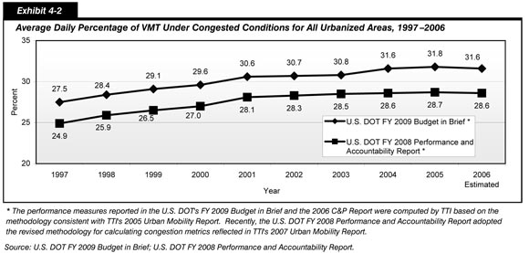
Travel Time Index
The Travel Time Index measures the additional time required to make a trip during the congested peak travel period rather than during the off-peak period in non-congested conditions, and indicates the severity and duration of congestion. The additional time required is a result of increased traffic volumes on the roadway and the additional delay caused by crashes, poor weather, special events, or other nonrecurring incidents.
Exhibit 4-4 shows the growth of the national average of the Travel Time Index for all communities evaluated by TTI since 1987. Based on the 2007 TTI methodology, a trip in 1997 that would take 20 minutes during off-peak non-congested periods would take approximately 23 percent (4.6 minutes) longer on average during the peak period. The same trip in 2005 would take 28 percent (5.6 minutes) longer during the peak period, for a total trip length of 25.6 minutes.
The 2005 TTI methodology shows that in 1997, a trip that would take 20 minutes during off-peak non-congested periods would take 30.0 percent (6.0 minutes) longer on average during the peak period. The same trip in 2005 would require 40 percent (8.0 minutes) longer during the peak period than during the off-peak period. This difference of 2.0 minutes per trip between the peak period in 1997 and the peak period in 2005 becomes significant when multiplied by the total number of trips made on a daily basis.
The Travel Time Index for all urbanized areas increased from 1.16 in 1987 to 1.28 in 2005 based on the 2007 TTI methodology; this indicates an increase from an additional 3.2 minutes to an additional 5.6 minutes. Using the 2005 TTI methodology, the Travel Time Index for all urbanized areas increased from 1.22 in 1987 to 1.40 in 2005; this indicates an increase from an additional 4.4 minutes to an additional 8.0 minutes, an increased travel time over that indicated by the 2007 TTI methodology.
Exhibit 4-5 demonstrates that the additional travel time required because of congestion tends to be higher in larger urbanized areas than smaller ones. Using the 2007 TTI methodology, the largest change between 1997 and 2005, 0.07 or 1.4 additional minutes for a 20-minute off-peak trip, was experienced in communities in the Very Large category; the extra time required for a trip under congested conditions in these communities grew from 6.6 extra minutes in 1997 to 8.0 extra minutes in 2007. However, analysis using the 2005 TTI methodology shows there was no increase in the Travel Time Index in the communities in the Very Large category between 2004 and 2005.
| Urbanized Area Population | 19872 | 1997 | 1999 | 2000 | 2002 | 2004 | 2005 |
|---|---|---|---|---|---|---|---|
| Small (less than 500,000) | |||||||
| 2005 TTI Methodology | 1.05 | 1.10 | 1.12 | 1.12 | 1.13 | 1.13 | 1.14 |
| 2007 TTI Methodology1 | 1.04 | 1.09 | 1.10 | 1.11 | 1.11 | 1.11 | 1.13 |
| Medium (500,000 to 999,999) | |||||||
| 2005 TTI Methodology | 1.10 | 1.17 | 1.19 | 1.19 | 1.21 | 1.22 | 1.25 |
| 2007 TTI Methodology1 | 1.09 | 1.15 | 1.16 | 1.16 | 1.18 | 1.18 | 1.21 |
| Large (1 million to 3 million) | |||||||
| 2005 TTI Methodology | 1.12 | 1.26 | 1.30 | 1.31 | 1.31 | 1.35 | 1.36 |
| 2007 TTI Methodology1 | 1.15 | 1.21 | 1.23 | 1.24 | 1.25 | 1.26 | 1.27 |
| Very Large (more than 3 million) | |||||||
| 2005 TTI Methodology | 1.37 | 1.46 | 1.51 | 1.53 | 1.57 | 1.61 | 1.61 |
| 2007 TTI Methodology1 | 1.26 | 1.33 | 1.36 | 1.36 | 1.39 | 1.39 | 1.40 |
| All Urbanized Areas | |||||||
| 2005 TTI Methodology | 1.22 | 1.30 | 1.34 | 1.35 | 1.37 | 1.39 | 1.40 |
| 2007 TTI Methodology1 | 1.16 | 1.23 | 1.24 | 1.25 | 1.27 | 1.27 | 1.28 |
2The base year for comparison purposes is 1987.
Based on 2007 TTI methodology, the increase in the Travel Time Index for each population group from 2004 to 2005 was greatest for Medium communities at an additional 0.6 minutes. For communities in the Very Large and Large categories, the increase was 0.2 minutes. For communities in the Small category it was 0.4 minutes.
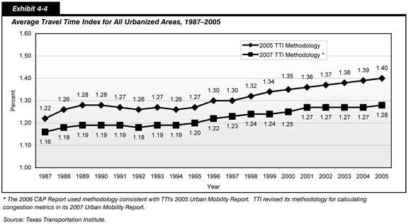
Annual Hours of Delay per Capita
Annual hours of delay per capita is another measure of the severity, duration, and extent of congestion. This metric represents the amount of lost time due to congested conditions in urbanized areas divided by the total number of urbanized area residents.
As shown in Exhibit 4-6, the annual hours of delay per capita for all urbanized areas combined has grown from 17.1 hours in 1997 to 21.8 hours in 2005. This translates into an annual rate of change of approximately 3.1 percent. Using the 2007 TTI methodology, the annual hours of delay per capita for all urbanized areas combined increased from 21.6 hours in 2004 to 21.8 hours in 2005, or approximately 0.9 percent.
Using the 2005 TTI methodology, the annual hours of delay per capita for all urbanized areas combined increased from 18.9 hours in 1997 to 24.8 hours in 2005. This translates into an annual rate of change of approximately 3.5 percent. The metric increased from 24.2 hours in 2004 to 24.8 hours in 2005, or approximately 2.5 percent.
Exhibit 4-7 presents the values of this metric by population category. All four population categories experienced an increase in this metric in this period. Using the 2007 TTI methodology, communities in the Small (population less than 500,000) category experienced the largest increase in this metric between 1997 and 2005, from 7.6 hours in 2004 to 11.4 hours in 2005, or an annual rate of change of 5.2 percent; the rate of change based on the 2005 methodology was higher, at a 5.9 percent annual rate of change. Using the 2007 TTI methodology, the annual hours of delay per capita in 2005 was 16.6 hours for communities in the Medium category, 22.3 hours for communities in the Large category, and 29.4 hours for communities in the Very Large category.
| Urbanized Area Population | 1997 | 1999 | 2000 | 2002 | 2004 | 2005 | Annual Rate of Change 2005/2004 |
Annual Rate of Change 2005/1997 |
|---|---|---|---|---|---|---|---|---|
| Small (less than 500,000) | ||||||||
| 2005 TTI Methodology | 6.4 | 7.5 | 7.8 | 8.2 | 9.6 | 10.1 | 5.2% | 5.9% |
| 2007 TTI Methodology* | 7.6 | 8.4 | 9.1 | 9.5 | 10.5 | 11.4 | 8.6% | 5.2% |
| Medium (500,000 to 999,999) | ||||||||
| 2005 TTI Methodology | 11.8 | 13.5 | 13.4 | 13.9 | 15.2 | 15.5 | 2.0% | 3.5% |
| 2007 TTI Methodology* | 12.5 | 14.3 | 14.5 | 15.4 | 16.5 | 16.6 | 0.6% | 3.6% |
| Large (1 million to 3 million) | ||||||||
| 2005 TTI Methodology | 17.0 | 19.5 | 20.5 | 19.2 | 22.0 | 23.0 | 4.5% | 3.9% |
| 2007 TTI Methodology* | 17.0 | 19.1 | 19.8 | 19.7 | 21.6 | 22.3 | 3.2% | 3.5% |
| Very Large (more than 3 million) | ||||||||
| 2005 TTI Methodology | 28.8 | 32.5 | 33.5 | 36.6 | 36.7 | 37.8 | 3.0% | 3.5% |
| 2007 TTI Methodology* | 23.5 | 25.6 | 26.2 | 28.6 | 29.1 | 29.4 | 1.0% | 2.8% |
| All Urbanized Areas | ||||||||
| 2005 TTI Methodology | 18.9 | 21.5 | 22.2 | 23.4 | 24.2 | 24.8 | 2.5% | 3.5% |
| 2007 TTI Methodology* | 17.1 | 19.0 | 19.5 | 20.7 | 21.6 | 21.8 | 0.9% | 3.1% |
Average Length of Congested Conditions
The average length of congested conditions is a measure of the duration of congestion. This is the number of hours during a 24-hour period when traffic is operating under congested conditions, which can also be expressed as enduring from one time of day to another. For example, a community with a total of 8 hours of congested conditions may have experienced 4 hours between 6:00 am and 10:00 am and 4 hours between 3:00 pm and 7:00 pm, although congested time does not normally divide evenly between times of the day. The higher the amount of congested time experienced by a community, the greater the problem of congestion is in the community.
As shown in Exhibit 4-8, based on the 2007 TTI methodology, the average congested travel time period for all urbanized areas combined has increased from 5.9 hours in 1997 to 6.4 hours in 2005—an increase of 30 minutes, or almost 8.5 percent, over a period of 8 years. The measure has stabilized in recent years, as this metric has remained at 6.4 hours per 24-hour period since 2002. Based on the 2005 TTI methodology, the average length of congestion increased from 6.2 hours in 1997 to 6.6 hours in 2005.
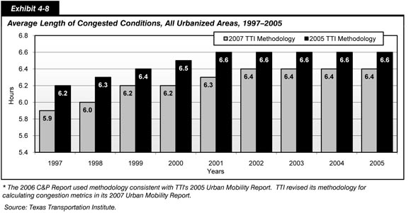
Based on the 2007 TTI methodology, the patterns observed in the average length of congested conditions in each of the four urbanized area population categories are similar to the overall average pattern, as shown in Exhibit 4-9. The patterns shown for each of the community categories is similar to the overall average. This leveling in the growth in duration of congestion is a positive development; however, the length of congested conditions, particularly in the communities in the Large (population 1 million to 3 million) and Very Large (population 3 million or more) categories remains a major problem, where the length of the congested period extends through a major portion of a normal workday. Recurring congestion is now no longer restricted to the traditional peak commuting periods, resulting in ongoing travel delays for highway users. Recurring congestion also occurs on heavily traveled routes on Saturdays and Sundays so that even shopping and recreational travel is adversely impacted in urbanized areas.
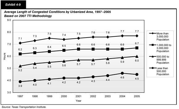
As an example, the 7.7 average hours of congested conditions identified in Exhibit 4-9 for communities in the Very Large (population 3 million or more) category could translate into congestion buildup during the morning period—from 6:00 am to 9:48 am, or 3.7 hours—and buildup during the afternoon period—for 4 hours beginning at 3:30 pm and extending to approximately 7:30 pm. The actual time of congested conditions varies by corridor and extends earlier or later than the times shown in this example. Not only are congestion periods lengthening, but more roads and lanes are affected at any one time. In the past, recurring congestion tended to occur only in one direction-toward downtown in the morning and away from it in the evening. Today, two-directional congestion is common, particularly on routes serving several major activity centers dispersed in suburban areas around the most congested metropolitan areas.
Cost of Congestion From TTI Urban Mobility Report
Congestion has an adverse impact on the American economy, which values speed, reliability, and efficiency. The problem is of particular concern to firms involved in logistics and distribution. As just-in-time delivery increases, firms need an integrated transportation network that allows for the reliable, predictable shipment of goods. If travel time increases or reliability decreases, businesses will need to increase average inventory levels to compensate, which will increase storage costs. Congestion, then, imposes a real economic cost for businesses and these costs will ultimately impact consumer prices. Chapter 14 discusses additional details on the impacts of congestion on freight transportation.
The TTI 2007 Urban Mobility Report estimates that drivers experienced more than 4.2 billion hours of delay and wasted approximately 2.9 billion gallons of fuel during delays in 2005. The total congestion cost for these areas, including wasted fuel and time was estimated to be approximately $78.2 billion, as shown in Exhibit 4-10. This is an increase of 220 million hours, 140 million gallons, and $5 billion from 2004. The Very Large category includes 14 urban areas that represent 55 percent of the population and 66 percent of the travel delays in 2005. The top 20 urban areas accounted for over 75 percent of the annual travel delays during that same period. In addition, the communities in the Very Large category accounted for about two-thirds of the wasted fuel and 60 percent of the total congestion costs, and 19 urban areas had total annual congestion costs of at least $1 billion each. It should be noted the total delay hours shown in Exhibit 4-6 and Exhibit 4-7 do not match the total delay hours shown in Exhibit 4-10, as the values for Exhibit 4-10 reflect adjustments made by TTI to account for the effects of operational improvements.
| Year | Total Delay (Billions of Hours) |
Total Fuel Wasted (Billions of Gallons) | Total Cost (Billions of 2005 Dollars) |
|---|---|---|---|
| 1982 | 0.8 | 0.5 | $16.2 |
| 1983 | 0.9 | 0.5 | $16.2 |
| 1984 | 1.0 | 0.6 | $17.7 |
| 1985 | 1.1 | 0.7 | $20.5 |
| 1986 | 1.3 | 0.8 | $23.1 |
| 1987 | 1.4 | 0.9 | $25.8 |
| 1988 | 1.7 | 1.1 | $29.7 |
| 1989 | 1.8 | 1.2 | $32.9 |
| 1990 | 1.9 | 1.3 | $35.5 |
| 1991 | 2.0 | 1.3 | $35.8 |
| 1992 | 2.1 | 1.4 | $38.0 |
| 1993 | 2.2 | 1.5 | $40.1 |
| 1994 | 2.3 | 1.5 | $41.9 |
| 1995 | 2.5 | 1.7 | $45.4 |
| 1996 | 2.7 | 1.8 | $48.5 |
| 1997 | 2.8 | 1.9 | $51.3 |
| 1998 | 3.0 | 2.0 | $53.2 |
| 1999 | 3.2 | 2.1 | $57.2 |
| 2000 | 3.2 | 2.2 | $57.6 |
| 2001 | 3.3 | 2.3 | $60.4 |
| 2002 | 3.5 | 2.4 | $63.9 |
| 2003 | 3.7 | 2.5 | $67.2 |
| 2004 | 4.0 | 2.7 | $73.1 |
| 2005 | 4.2 | 2.9 | $78.2 |
Traditional Congestion Measures
As previously noted, it is difficult to measure congestion, largely because both travel demand and the availability of capacity are variable. Traffic demands vary significantly by time of day, day of the week, and season of the year, and for special events. While capacity is often thought of as a constant, the available capacity at any given time can vary because of weather, work zones, traffic incidents, or other nonrecurring events.
Two of the most traditional approaches to measuring congestion are daily vehicle miles traveled (DVMT) and the ratio of volume to service flow (V/SF). DVMT per lane mile is a basic measure of the relationship between highway travel and highway capacity. It is directly based on actual counts of traffic rather than estimated from other data. An increase in this measure over time indicates an increase in the density of traffic, but does not indicate how this affects speed, delay, or user cost. Exhibit 4-11 shows that the volume of travel per lane mile increased between 1997 and 2006 on every functional highway system for which data were collected except Rural Major Collectors.
| Functional System | 1997 | 1999 | 2000 | 2002 | 2004 | 2006 | Annual Rate of Change 2006/2004 |
Annual Rate of Change 2006/1997 |
|---|---|---|---|---|---|---|---|---|
| Rural Areas (less than 5,000 in population) | ||||||||
| Interstate | 4,952 | 5,322 | 5,455 | 5,711 | 5,707 | 5,684 | -0.20% | 1.54% |
| Other Principal Arterial | 2,522 | 2,651 | 2,685 | 2,756 | 2,642 | 2,562 | -1.53% | 0.18% |
| Minor Arterial | 1,557 | 1,622 | 1,640 | 1,683 | 1,632 | 1,580 | -1.61% | 0.17% |
| Major Collector | 634 | 652 | 659 | 676 | 649 | 628 | -1.65% | -0.11% |
| Small Urban Areas (5,000 to 49,999 in population) | ||||||||
| Interstate | 6,842 | 7,457 | 7,545 | 7,955 | 7,925 | 7,784 | -0.89% | 1.44% |
| Other Freeway and Expressway | 5,339 | 5,639 | 5,841 | 6,106 | 5,888 | 5,668 | -1.89% | 0.67% |
| Other Principal Arterial | 4,032 | 4,173 | 4,204 | 4,258 | 4,092 | 4,035 | -0.70% | 0.01% |
| Minor Arterial | 2,488 | 2,595 | 2,601 | 2,673 | 2,529 | 2,528 | -0.02% | 0.18% |
| Collector | 1,224 | 1,254 | 1,253 | 1,306 | 1,214 | 1,260 | 1.88% | 0.33% |
| Urbanized Areas (50,000 or more in population) | ||||||||
| Interstate | 14,465 | 15,093 | 15,333 | 15,689 | 15,783 | 15,678 | -0.33% | 0.90% |
| Other Freeway and Expressway | 11,304 | 12,021 | 12,286 | 12,730 | 12,630 | 12,567 | -0.25% | 1.18% |
| Other Principal Arterial | 6,214 | 6,252 | 6,284 | 6,408 | 6,326 | 6,243 | -0.66% | 0.05% |
| Minor Arterial | 3,893 | 4,160 | 4,210 | 4,345 | 4,307 | 4,148 | -1.86% | 0.71% |
| Collector | 2,100 | 2,157 | 2,192 | 2,276 | 2,275 | 2,266 | -0.20% | 0.85% |
The largest increases between 1997 and 2006 occurred on the functional classes "Other Freeway and Expressway" and "Interstate" in urbanized areas. The DVMT per lane mile increased 1,263 on Other Freeway and Expressway and 1,213 on the Interstate in this population group. The largest percentage increase occurred on the Interstate in rural areas, where the DVMT per lane mile increased by 14.8 percent, from 4,952 to 5,684. The DVMT per lane mile on Interstates in Small Urban Areas increased 13.8 percent, from 6,842 to 7,784, in the same time period.
Note that the decreases in DVMT per lane mile between 2004 and 2006 for many functional classes are partially driven by boundary changes resulting from the 2000 decennial census, when many States adjusted their HPMS data to reflect the new boundaries. As the rural areas on the fringe of small urban or urbanized areas (which tend to have higher DVMT per lane-mile values within the rural category) were reclassified as small urban or urbanized, the average rural DVMT values decreased. The small urban averages were affected both by the addition of areas formerly classified as rural and the subtraction of areas reclassified as urbanized. The urbanized area averages were also affected by the reclassification of formerly small urban or rural areas as urbanized.
The other traditional congestion measure, V/SF, represents the number of vehicles traveling in a single lane in one hour in the peak travel hour divided by the maximum number of vehicles that could utilize the lane in an hour. Exhibit 4-12 shows the percentage of peak-hour travel meeting or exceeding a V/SF of 0.80 as well as the percentage exceeding 0.95. A level of 0.80 is frequently used as a threshold for classifying highways as "congested," while a level of 0.95 indicates "severely congested" conditions. For urbanized Interstates, 61.0 percent had peak-hour travel with a V/SF ratio of 0.80 or higher, and 36.5 percent had peak-hour travel with a V/SF ratio of 0.95 or higher. Both of these values decreased between 2004 and 2006.
| Functional System | 1997 | 2000 | 2002 | 2004 | 2006 | |||||
|---|---|---|---|---|---|---|---|---|---|---|
| V/SF ≥ 0.80 | V/SF > 0.95 | V/SF ≥ 0.80 | V/SF > 0.95 | V/SF ≥ 0.80 | V/SF > 0.95 | V/SF ≥ 0.80 | V/SF > 0.95 | V/SF ≥ 0.80 | V/SF > 0.95 | |
| Rural Areas (less than 5,000 in population) | ||||||||||
| Interstate | 11.0% | 3.6% | 10.4% | 3.3% | 15.9% | 4.8% | 15.1% | 5.6% | 15.1% | 5.3% |
| Principal Arterial | 7.0% | 3.2% | 7.4% | 3.8% | 6.9% | 3.8% | 6.3% | 2.4% | 5.6% | 2.0% |
| Minor Arterial | 4.2% | 1.9% | 4.6% | 2.2% | 4.8% | 2.2% | 4.0% | 2.1% | 3.6% | 1.8% |
| Major Collector | 2.4% | 1.2% | 2.3% | 1.0% | 2.3% | 1.4% | 1.8% | 0.9% | 1.7% | 0.6% |
| Small Urban Areas (5,000 to 49,999 in population) | ||||||||||
| Interstate | 13.2% | 4.7% | 7.7% | 3.2% | 13.2% | 5.5% | 17.8% | 3.2% | 16.6% | 5.0% |
| Other Freeway & Expressway | 11.3% | 6.6% | 12.5% | 6.3% | 17.9% | 8.9% | 17.6% | 8.7% | 17.9% | 8.1% |
| Other Principal Arterial | 11.6% | 6.4% | 13.2% | 6.0% | 9.0% | 3.8% | 8.5% | 4.1% | 7.3% | 3.3% |
| Minor Arterial | 13.1% | 6.6% | 14.3% | 8.0% | 12.3% | 6.3% | 10.7% | 4.8% | 8.7% | 4.0% |
| Collector | 9.7% | 5.6% | 9.9% | 5.7% | 8.4% | 4.9% | 7.1% | 3.8% | 6.7% | 3.3% |
| Urbanized Areas (50,000 or more in population) | ||||||||||
| Interstate | 55.0% | 30.0% | 50.0% | 26.0% | 64.3% | 40.2% | 63.5% | 38.4% | 61.0% | 36.5% |
| Other Freeway & Expressway | 47.5% | 26.4% | 46.4% | 28.3% | 56.7% | 35.4% | 55.3% | 31.9% | 51.9% | 30.1% |
| Other Principal Arterial | 29.6% | 18.1% | 29.3% | 16.4% | 22.3% | 10.2% | 21.5% | 9.4% | 20.7% | 9.5% |
| Minor Arterial | 25.2% | 14.1% | 26.4% | 14.5% | 18.6% | 9.3% | 17.1% | 9.3% | 17.3% | 9.3% |
| Collector | 21.0% | 13.4% | 20.3% | 13.7% | 18.2% | 9.3% | 15.5% | 9.6% | 15.8% | 9.3% |
For most functional classes, the percent of peak-hour travel exceeding the 0.80 and 0.95 V/SF thresholds declined from 2004 to 2006. This is partially the result of the 2000 decennial census when many States adjusted their HPMS data during this time period to reflect new boundaries. However, this is also an indication that this measure of the severity of congestion at the peak hour excludes some critical components of the Nation's congestion problems that relate to the duration and extent of congestion.
This measure of congestion is limited, because as it only addresses the severity of the congestion, and not the duration and extent of congestion. Focusing on the V/SF measure alone can lead to erroneous conclusions about highway operational performance. For example, in some communities the major operational performance issue is not that peak congestion is getting worse; it is the length of the peak period of congestion and the time needed to make a single trip that are having detrimental impacts on communities and the public.
Exhibit 4-13 summarizes these two metrics—DVMT per lane mile and the V/SF ratio—for different sizes of urbanized areas by functional classification. For each type of urbanized area, not surprisingly, Interstate highways carried the highest share of DVMT per lane mile. Interstate highways were also the most congested elements of the road network when measured by the V/SF ratio. Only in the smallest-sized communities, at the V/SF level of 0.95 or higher, was another segment of the road network as congested as Interstate highways ("other freeways and expressways").
| Functional System | DVMT per Lane-Mile | Percent of Peak-Hour Travel Exceeding V/SF Thresholds | |
|---|---|---|---|
| V/SF ≥ 0.80 | V/SF > 0.95 | ||
| Small Urbanized Areas (50,000–499,999 in population) | |||
| Interstate | 11,257 | 40.4% | 18.2% |
| Other Freeway and Expressway | 8,869 | 35.2% | 19.2% |
| Other Principal Arterial | 5,422 | 16.1% | 7.3% |
| Minor Arterial | 3,497 | 12.5% | 6.5% |
| Collector | 1,842 | 12.3% | 7.0% |
| Medium Urbanized Areas (500,000–999,999 in population) | |||
| Interstate | 14,869 | 62.2% | 37.3% |
| Other Freeway and Expressway | 10,928 | 42.1% | 21.7% |
| Other Principal Arterial | 6,257 | 21.0% | 9.0% |
| Minor Arterial | 4,277 | 18.5% | 11.1% |
| Collector | 2,333 | 15.0% | 8.9% |
| Large Urbanized Areas (1 million–3 million in population) | |||
| Interstate | 17,337 | 65.9% | 41.4% |
| Other Freeway and Expressway | 12,786 | 49.4% | 28.9% |
| Other Principal Arterial | 6,474 | 20.6% | 9.2% |
| Minor Arterial | 4,329 | 22.4% | 11.4% |
| Collector | 2,445 | 19.5% | 12.0% |
| Very Large Urbanized Areas (more than 3 million in population) | |||
| Interstate | 19,511 | 72.4% | 46.1% |
| Other Freeway and Expressway | 16,653 | 66.2% | 39.6% |
| Other Principal Arterial | 6,996 | 25.1% | 12.0% |
| Minor Arterial | 4,738 | 17.8% | 9.6% |
| Collector | 2,708 | 16.9% | 9.8% |
Relationship of Congestion to Daily Travel
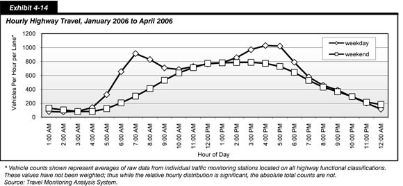
As previously noted, travel differs greatly by time of day. Exhibit 4-14 describes the distribution of travel by hour as reported by a set of traffic monitoring stations located on various highway facilities throughout the country for a 4-month period extending from January 2006 through April 2006. The most congested conditions would tend to follow peak period travel hours. On weekdays, the peak period of morning travel is between 7 am and 8 am, and the peak period of evening travel is between 5 pm and 7 pm. On Saturdays and Sundays, peak travel is spread out over many hours between noon and 5 pm. Note that these are national averages and many individual traffic monitoring stations report hourly traffic distributions that are significantly different. The vehicle counts identified in Exhibit 4-14 are raw counts of vehicles per hour per lane, and have not been weighted to reflect total VMT on different types of highway facilities.
Chapter 15 provides a more detailed look at recent changes in personal travel patterns.
Emerging Operational Performance Measures
Substantial research supports the use of delay as the definitive measure of congestion. Delay is certainly important; it exacts a substantial cost from the traveler and, consequently, from the consumer. However, it does not tell the complete story. Moreover, there currently is no direct measure of delay that can be collected both consistently and inexpensively.
Reliability is another important characteristic of any transportation system, one that industry in particular requires for efficient production. If a given trip requires 1 hour on one day and 1.5 hours on another day, an industry that is increasingly reliant on just-in-time delivery suffers. To compensate for variable trip times required to deliver products, an industry may be required to carry greater inventory than would otherwise be necessary, thereby incurring higher costs. Travel time reliability is a measure of congestion easily understood by a wide variety of audiences, and is one of the more direct measures of the effects of congestion on the highway user. However, additional research is needed to determine what measures should be used to describe congestion and what data will be required to supply these measures.
| How are the performance measures for congestion and greenhouse gas (GHG) emissions being linked? | |
|
Concern over GHG from vehicles and the potential impact on climate change has intensified in recent years. Currently, multiple transportation strategies are being used to reduce transportation-related GHG emissions including: improving system and operational efficiencies, reducing growth of VMT, reducing carbon content of fuels, and improving vehicle technologies.
In addition, work is being done to analyze the contribution of GHG emissions resulting from congestion and the potential to reduce those emissions through vehicle system and operational efficiencies such as Intelligent Transportation Systems (ITS) strategies, route optimization, and reduced engine idling.
FHWA is working with EPA on the development of the MOVES Model, which is a new emissions modeling system that will estimate emissions for both on-road and off-road mobile sources, including CO2 emissions.
The Department is currently researching effective ways to promote a more performance-based transportation system in preparation for the next transportation reauthorization.
Additional information on U.S. DOT efforts in climate change in transportation is available at: https://www.fhwa.dot.gov/hep/climate/index.cfm and http://www.climate.dot.gov/.
|
|
| How did SAFETEA-LU attempt to improve operations? | |
|
Several provisions SAFETEA-LU were designed to broaden the use of operations strategies:
High Occupancy Vehicle (HOV) Facilities and Tolling
Section 1121—HOV Facilities—Clarifies the operation of HOV facilities and provides more exceptions to vehicle occupancy requirements. States may also establish exceptions for public transportation vehicles, certified low-emission and energy-efficient vehicles, and high occupancy toll vehicles. Tolls under this section may be charged on both Interstate and non-Interstate facilities.
Section 1604—Tolling—Extends and authorizes a total of $59 million in funding for the Value Pricing Pilot Program; creates a new Express Lanes Demonstration Program to permit tolling on up to 15 demonstration projects; and creates a new Interstate System Construction Toll Pilot Program that authorizes tolling to finance construction of up to three new Interstate highway facilities.
Planning and Agreements
Section 6001—Transportation Planning—Operations—Contains a number of elements that spell out the importance of management and operations in the planning process.
Section 10204—Catastrophic Hurricane Evacuation Plans—Requires the U.S. Departments of Homeland Security and Transportation to assess evacuation plans for catastrophic events in the Gulf Coast Region. The Report to Congress on Catastrophic Hurricane Evacuation Plan Evaluation was released on June 1, 2006.
Section 5211—Multistate Corridor Operations—Encourages multistate cooperative agreements, coalitions, or other arrangements to promote regional cooperation and planning.
System Information and Technology
Section 1201—Real-Time System Management Information Program—Requires the establishment of a real-time system management information program to provide, in all States, the capability to monitor the traffic and travel conditions of the Nation's major highways and to share that information with State and local governments and the traveling public.
Section 5508—Transportation Technology Innovation and Demonstration Program—Presents a two-part intelligent transportation infrastructure program to advance the deployment of an operational intelligent transportation infrastructure system, aid in transportation planning and analysis, and provide a basic level of traveler information.
Worker Protection
Section 1402—Worker Injury Prevention and Free Flow of Vehicular Traffic—Directs issuance of regulations to decrease the likelihood of worker injury and maintain the free flow of vehicular traffic by requiring workers whose duties place them on or in close proximity to a Federal-aid highway to wear high-visibility garments. A Federal Register notice was issued in April 2006, with an effective date of November 24, 2008.
|
|
System Reliability
Travel time reliability measures are relatively new, but a few have proven effective at the local level. Such measures typically compare high-delay days with average-delay days. The simplest method identifies days that exceed the 90th or 95th percentile in terms of travel times and estimates how bad delay will be on specific routes during the worst one or two travel days each month.
The Buffer Index measures the percentage of extra time travelers must add to their average travel time to allow for congestion delays and arrive at a location on time about 95 percent of the time. The Planning Time Index represents the total travel time that is necessary to ensure on-time arrival, including both the average travel time and the additional travel time included in the Buffer Index. Generally, the Buffer Index goes up during peak periods, when congestion occurs, indicating a reliability problem.
The Planning Time Index is especially useful because it uses a numeric scale which can be directly compared to the numeric scale of the Travel Time Index presented earlier in this chapter. While data are not currently available to support these measures at the national level, data in the 2007 TTI Urban Mobility Report were collected on planning time indicators for 19 metropolitan regions. The comparison of the Travel Time Index (in average conditions) and the Planning Time Index (for an important trip) for these 19 metropolitan areas suggest that travelers should plan on twice as much extra travel time if they have an important trip than if they are traveling during average conditions. These indexes can be applied to additional cities as equipment is deployed and data are accumulated.
The importance of reliability is underscored by a November 2004 study, Temporary Losses of Highway Capacity and Impacts on Performance: Phase 2, produced for the FHWA by the Oak Ridge National Laboratory. Temporary capacity losses due to work zones, crashes, breakdowns, adverse weather, suboptimal signal timing, toll facilities, and railroad crossings caused over 3.5 billion vehicle-hours of delay on U.S. freeways and principal arterials in 1999. For journeys on regularly congested highways during peak commuting periods, temporary capacity losses added 6 hours of delay for every 1,000 miles of travel. Americans suffer 2.5 hours of delay per 1,000 miles of travel from temporary capacity loss for journeys on roads that do not experience recurring congestion.
Bottlenecks
In July 2007, the FHWA prepared a report, Traffic Bottlenecks: a Primer Focus on Low-Cost Operational Improvements, to show that, although costly major construction projects are often the first option for addressing congestion issues, there are also significant opportunities for operational and low-cost infrastructure solutions for congestion relief.
Bottlenecks have gained more notice in recent years because several national studies have identified them as a significant part of the congestion problem; bottlenecks occur when surge demands are higher than can be accommodated by base capacity. On much of our urban highway system, there are specific points that are notorious for causing congestion on a daily basis.
An October 2005 report prepared by Cambridge Systematics for the FHWA, An Initial Assessment of Freight Bottlenecks on Highways, examines bottlenecks from a freight perspective. In assessing impacts of bottlenecks on truck travel, the significant finding of this study is that bottlenecks are more than just commuter-related issues; they are also a major source of truck delay. See Chapter 13 for additional information on this report and other freight operational performance measures.
State DOTs and regions are also beginning to recognize the significance of bottlenecks and undertaking studies of their own.
Transit Operational Performance
Transit operational performance can be measured and evaluated on the basis of a number of different factors such as the speed at which a passenger travels on transit, vehicle occupancy rate, and vehicle utilization, as well as service frequency and seating availability. These measures, however, do not necessarily all lead toward a single standard of higher operational performance. For example, while higher average operating speeds are good for passengers, they may indicate that transit systems are not carrying sufficient passengers, and therefore have shorter dwell times. Conversely, while higher vehicle utilization indicates more intensive vehicle use, it may also indicate that passengers are experiencing crowded conditions. For this reason, speed, occupancy, and capacity utilization are analyzed only on the basis of the direction of their change; the optimal levels of these measures are unknown.
Average Operating (Passenger-Carrying) Speeds
Average vehicle operating speed is an approximate measure of the speed experienced by transit riders; it is not a measure of the pure operating speed of transit vehicles between stops. Rather, average operating speed is a measure of the speed passengers experience from the time they enter a transit vehicle to the time they exit it, including dwell times at stops. It does not include the time passengers spend waiting or transferring. Average vehicle operating speed is calculated for each mode by dividing annual vehicle revenue miles by annual vehicle revenue hours for each agency in each mode, weighted by the passenger miles traveled (PMT) for each agency within the mode, as reported to the National Transit Database. In cases where an agency provides both directly operated service and purchased transportation service within a mode, the speeds for each of these services are calculated and weighted separately. The results of these average speed calculations are presented in Exhibit 4-16.
| Mode | Miles per Hour |
|---|---|
| Heavy Rail | 20.0 |
| Commuter Rail | 31.3 |
| Light Rail | 14.7 |
| Other Rail1 | 7.9 |
| Motor Bus | 12.6 |
| Demand Response | 14.6 |
| Vanpool | 38.3 |
| Other Nonrail 2 | 10.7 |
2 Público and trolleybus.
The average speed of a transit mode is strongly affected by the number of stops it makes. Motor bus service, which typically makes frequent stops, has a relatively low average speed of 12.6 miles per hour. In contrast, commuter rail has high sustained speeds between infrequent stops, and a high average speed of 31.3 miles per hour. Vanpools also travel at high speeds, usually with only a few stops at each end of the route, and an average speed of 38.3 mph. Also, in many cases, modes using exclusive guideways offer more rapid travel time than modes that do not. Heavy rail, which travels exclusively on fixed guideways, has an average speed of 20.0 mph, while light rail, which often shares guideways, has an average speed of 14.7 mph.
Exhibit 4-17 provides average speed for each year from 1997 to 2006 for all rail modes, all nonrail modes, and all modes combined, as well as the overall average speed for these groups from 1997 through 2006. As speed numbers fluctuate from year to year, the relation of a given year's average speed to the long-term average provides a better indication of overall trends than comparison to an individual year. These average speeds are based on the average speed of each agency-mode weighted by the number of PMT on that agency-mode. Average transit operating speed as experienced by all transit passengers from 1997 to 2006 was 20.0 miles per hour. The average speed on nonrail modes was 14.4 miles per hour in 2006, which is slightly higher than the long-term average of 13.9 miles per hour, and indicating an overall trend of increasing speed on nonrail modes. The average speed on rail modes, however, at 24.8 miles per hour in 2006, was below the long-term average of 25.2 miles per hour, indicating an overall trend of declining average speed on rail modes.
| (Miles per Hour) | Rail | Nonrail | Total |
|---|---|---|---|
| 1997 | 26.1 | 13.8 | 20.3 |
| 1998 | 25.6 | 14.0 | 20.5 |
| 1999 | 25.5 | 14.0 | 20.1 |
| 2000 | 24.9 | 13.7 | 19.6 |
| 2001 | 25.2 | 13.7 | 19.6 |
| 2002 | 25.3 | 13.7 | 19.6 |
| 2003 | 25.4 | 13.9 | 20.1 |
| 2004 | 25.0 | 14.0 | 20.1 |
| 2005 | 24.6 | 14.2 | 19.9 |
| 2006 | 24.8 | 14.4 | 20.0 |
Vehicle Use
Vehicle Occupancy
Exhibit 4-18 shows vehicle occupancy by mode for selected years from 1997 to 2006. Vehicle occupancy is calculated by dividing PMT by vehicle revenue miles (VRMs) and shows the average number of people carried in a transit vehicle. In 2006, heavy rail carried an average of 23.2 persons per vehicle and light rail an average of 25.5 persons per vehicle. Commuter rail had an average occupancy of 36.1 persons per vehicle, motor bus had an average of 10.8 persons per vehicle, vanpool had an average of 6.3 persons per vehicle, ferryboat had an average of 130.7 persons per vehicle, and demand response had an average of 1.3 persons per vehicle.
| Mode | 1997 | 1999 | 2000 | 2002 | 2004 | 2006 |
|---|---|---|---|---|---|---|
| Rail | ||||||
| Heavy Rail | 22.3 | 23.0 | 23.9 | 22.6 | 23.0 | 23.2 |
| Commuter Rail | 35.0 | 36.0 | 37.9 | 36.7 | 36.1 | 36.1 |
| Light Rail | 25.7 | 25.2 | 26.1 | 23.9 | 23.7 | 25.5 |
| Other Rail1 | 9.5 | 8.7 | 8.4 | 8.4 | 10.4 | 8.4 |
| Nonrail | ||||||
| Motor Bus | 10.9 | 10.9 | 10.7 | 10.5 | 10.0 | 10.8 |
| Demand Response | 1.5 | 1.3 | 1.3 | 1.2 | 1.3 | 1.3 |
| Ferryboat | 126.2 | 119.0 | 120.1 | 112.1 | 119.5 | 130.7 |
| Trolleybus | 14.1 | 13.7 | 13.8 | 14.1 | 13.3 | 13.9 |
| Vanpool | 7.7 | 6.9 | 6.6 | 6.4 | 5.9 | 6.3 |
| Other Nonrail2 | 8.1 | 6.1 | 7.3 | 7.9 | 5.8 | 7.8 |
2 Aerial tramway and Público.
Exhibit 4-19 provides adjusted vehicle occupancy, or the average number of persons carried per capacity-equivalent vehicle, with the average carrying capacity of motor bus vehicles as a base. Adjusted vehicle occupancy is calculated by dividing PMT by capacity-equivalent VRMs. This measure takes into account differences in seating and standing capacities. Note that modes where standing is not possible or not allowed tend to have higher adjusted vehicle occupancies than modes where standing is possible and allowed. Commuter rail and vanpool, used primarily for commuting, have high levels of adjusted occupancy. Standing is generally not feasible in vanpool vehicles and is frequently not allowed on commuter rail vehicles.
| Mode | 1997 | 1999 | 2000 | 2002 | 2004 | 2006 |
|---|---|---|---|---|---|---|
| Rail | ||||||
| Heavy Rail | 10.2 | 10.3 | 10.5 | 9.3 | 9.3 | 8.9 |
| Commuter Rail | 15.4 | 15.3 | 15.8 | 14.6 | 14.2 | 12.4 |
| Light Rail | 11.2 | 10.4 | 10.5 | 9.6 | 8.8 | 9.5 |
| Other Rail1 | 5.4 | 5.0 | 6.3 | 6.3 | 8.3 | 6.0 |
| Nonrail | ||||||
| Motor Bus | 10.9 | 10.9 | 10.7 | 10.5 | 10.0 | 10.8 |
| Demand Response | 9.5 | 7.8 | 7.7 | 6.5 | 7.0 | 6.3 |
| Ferryboat | 10.5 | 10.0 | 9.9 | 9.4 | 11.1 | 9.8 |
| Trolleybus | 10.0 | 9.7 | 9.7 | 9.6 | 8.8 | 8.7 |
| Vanpool | 40.8 | 37.2 | 35.6 | 31.3 | 30.6 | 31.5 |
| Other Nonrail2 | 31.8 | 23.5 | 28.1 | 30.3 | 22.6 | 23.0 |
2 Aerial tramway and Público.
As discussed in Chapter 2, capacity-equivalent VRMs have been revised to reflect the actual carrying capacities that existed in each year. Prior reports had used the same factor for each mode for all years. For this reason, except for motor bus, which is the base, adjusted vehicle occupancy in this report may differ slightly from the values from C&P reports prior to 2006.
Vehicle Utilization
Exhibit 4-20 shows vehicle utilization as measured by PMT per capacity-equivalent vehicle (CEV) operated in maximum scheduled service. PMT per CEV is a measure of service effectiveness, measuring vehicle utilization by taking account of differences in vehicle carrying capacities. PMT per CEV, or capacity utilization, is calculated by dividing the total number of PMT on each mode by the total number of vehicles operated in maximum service in each mode, adjusted by the average capacity of the Nation's motor bus fleet. A high number of PMT per CEV indicates high passenger use; a low number of PMT per CEV indicates low passenger use. For example, in 2006 there were 1,644.3 thousand PMT per heavy rail vehicle, as compared with the 402.9 thousand PMT per motor bus vehicle. However, because heavy rail vehicles have, on average, two and a half times the capacity of a motor bus, heavy rail provides 632.4 thousand PMT per CEV, considerably less than on an unadjusted basis. (Note again that, due to revisions to the capacity-equivalent factors, vehicle utilization in this report may differ from the values in the 2006 C&P Report, except for motor bus, which is the base.) Commuter rail has consistently had the highest level of utilization, reflecting longer average trip lengths with seating capacity only. As shown in Exhibit 4-20, between 1997 and 2006, most modes reached their highest level of utilization in 2000 or 2001. Light rail and motor bus modes were at a higher level of capacity utilization in 2006 than the long-term average utilization from 1997 to 2006.
| What is service effectiveness and how can it be measured? | |
|
Service effectiveness measures the extent to which transit agencies are providing service that is demanded and used by consumers. This is primarily measured as "vehicle utilization"—the PMT per capacity-equivalent vehicle mile. Other measures of service effectiveness include unlinked passenger trips per VRM, unlinked passenger trips per vehicle revenue hour, annual passenger miles per actual annual VRM, and passenger miles traveled per scheduled vehicle mile.
|
|
| Mode | (Thousands of Passenger Miles) | ||||||||||
|---|---|---|---|---|---|---|---|---|---|---|---|
| 1997 | 1998 | 1999 | 2000 | 2001 | 2002 | 2003 | 2004 | 2005 | 2006 | Average | |
| Rail | |||||||||||
| Heavy Rail | 667.1 | 665.4 | 694.3 | 720.3 | 702.7 | 654.6 | 634.0 | 652.4 | 642.9 | 632.4 | 666.6 |
| Commuter Rail | 788.1 | 806.2 | 801.2 | 838.2 | 842.6 | 769.2 | 747.7 | 754.8 | 709.5 | 658.3 | 771.6 |
| Light Rail | 553.8 | 578.9 | 541.1 | 556.5 | 561.5 | 533.3 | 494.0 | 467.7 | 522.4 | 543.4 | 535.2 |
| Nonrail | |||||||||||
| Motor Bus | 400.6 | 393.4 | 397.0 | 393.2 | 397.3 | 389.3 | 382.7 | 373.5 | 390.5 | 402.9 | 392.0 |
| Demand Response | 241.6 | 206.7 | 203.7 | 206.7 | 185.3 | 167.8 | 172.0 | 180.7 | 162.0 | 162.6 | 188.9 |
| Ferryboat | 297.8 | 298.0 | 293.7 | 304.6 | 284.5 | 297.2 | 350.0 | 328.4 | 336.0 | 287.8 | 307.8 |
| Trolleybus | 266.5 | 251.6 | 257.2 | 264.1 | 287.9 | 245.7 | 235.7 | 236.7 | 239.3 | 246.2 | 253.1 |
| Vanpool | 608.7 | 621.1 | 618.3 | 591.8 | 501.1 | 498.2 | 535.4 | 501.7 | 511.8 | 490.1 | 547.8 |
Revenue Miles per Active Vehicle (Service Use)
Vehicle service use, the average distance traveled per vehicle in service, can be measured by VRMs per vehicle in active service. Exhibit 4-21 provides vehicle service use by mode for selected years from 1997 to 2006. Heavy rail, generally offering long hours of frequent service, had the highest vehicle use over this period, increasing from 53.8 thousand miles per vehicle in 1997 to 57.0 thousand miles per vehicle in 2006. Vehicle service use for light rail increased from 32.4 thousand miles per vehicle in 1997 to 37.4 thousand miles per vehicle in 2006, after reaching a peak of 41.1 in 2002. Vehicle service use for trolley bus increased from 18.1 thousand miles per vehicle in 1997 to 19.0 thousand miles per vehicle in 2006. Vehicle service use by demand response, vanpool, motor bus, and ferryboat remained relatively steady from year to year. The number of service miles provided per commuter rail vehicle in active service reached a high of 43.9 thousand in 2002, compared with 40.8 thousand in 1997 and 41.5 thousand in 2006.
| Mode | (Thousands of Vehicle Revenue Miles) | Average Annual Rate of Change | ||||||
|---|---|---|---|---|---|---|---|---|
| 1997 | 1999 | 2000 | 2002 | 2004 | 2006 | 2006/1997 | 2006/2004 | |
| Rail | ||||||||
| Heavy Rail | 53.8 | 53.8 | 55.6 | 55.1 | 57.0 | 57.0 | 0.6% | 0.0% |
| Commuter Rail | 40.8 | 40.8 | 42.1 | 43.9 | 41.1 | 41.5 | 0.2% | 0.6% |
| Light Rail | 32.4 | 32.4 | 32.5 | 41.1 | 39.9 | 37.4 | 1.6% | -3.1% |
| Nonrail | ||||||||
| Motor Bus | 28.6 | 28.6 | 28.0 | 29.9 | 30.2 | 28.6 | 0.0% | -2.6% |
| Demand Response | 18.8 | 18.8 | 17.9 | 21.1 | 20.1 | 19.0 | 0.1% | -2.8% |
| Ferryboat | 23.8 | 23.8 | 24.1 | 24.4 | 24.9 | 23.7 | 0.0% | -2.3% |
| Vanpool | 13.3 | 13.3 | 12.9 | 13.6 | 14.1 | 13.0 | -0.2% | -4.0% |
| Trolleybus | 18.1 | 18.1 | 18.9 | 20.3 | 21.1 | 19.0 | 0.5% | -5.1% |
Frequency and Reliability of Services
The frequency of transit service varies considerably according to location and time of day. Transit service is more frequent in urban areas and during rush hours, in locations where and during times when the demand for transit is highest. Studies have found that transit passengers consider the time spent waiting for a transit vehicle to be less well spent than the time spent traveling in a transit vehicle. The higher the degree of uncertainty in waiting times, the less attractive transit becomes as a means of transportation, and the fewer users it will attract. Further, the less frequently scheduled service is offered, the more important reliability becomes to users.
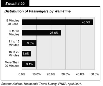
Exhibit 4-22 shows findings on waiting times from the 2001 National Household Travel Survey (NHTS) by the Federal Highway Administration (FHWA), the most recent nationwide survey of this information. As indicated in the 2004 C&P Report, the NHTS found that 48.5 percent of all passengers who ride transit wait 5 minutes or less and 75.1 percent wait 10 minutes or less. The NHTS also found that 9.1 percent of all passengers wait more than 20 minutes. A number of factors influence passenger wait-times, including the frequency of service, the reliability of service, and passengers' awareness of timetables. These factors are also interrelated. For example, passengers may intentionally arrive earlier for service that is infrequent, compared with equally reliable services that are more frequent. Overall, waiting times of 5 minutes or less are clearly associated with good service that is either frequent, reliably provided according to a schedule, or both. Waiting times of 5 to 10 minutes are most likely consistent with adequate levels of service that are both reasonably frequent and generally reliable. Waiting times of 20 minutes or more indicate that service is likely both infrequent and unreliable.
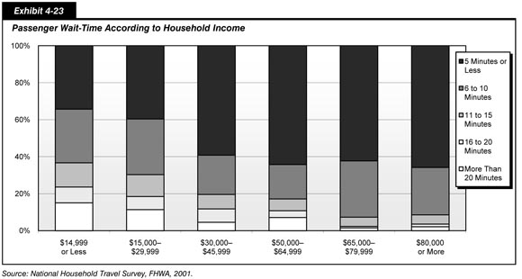
Waiting time is also correlated with income, as shown in Exhibit 4-23. Passengers from households with annual incomes of $30,000 or more are much more likely to report a waiting time of 5 minutes or less than passengers from households with incomes of less than $30,000. Additionally, passengers from households with more than $65,000 in annual income report almost never waiting more than 15 minutes for transit. This disparity is in large part due to the fact that high income riders tend to be "choice" riders who primarily ride transit on modes, routes, and at times of day when the service is frequent and reliable—and who generally substitute the use of personal automobiles for trips when these conditions aren't met. In contrast, passengers with lower incomes are more likely to use transit for basic mobility and have more limited alternative means of travel, therefore using transit even when the service is not as frequent or reliable as they may prefer.
Seating Conditions
Transit travel conditions are often crowded. Information on crowding was not collected by the 2001 NHTS. The 1995 Nationwide Personal Transportation Survey (NPTS), which was the FHWA nationwide personal travel survey preceding the NHTS and which is the most recent source of data available, found that 27.3 percent of the people sampled were unable to find a seat upon boarding a transit vehicle and that 31.3 percent were unable to find seats during rush hours.
Comparison
Exhibit 4-24 compares the key highway and transit statistics discussed in this chapter with the values shown in the last version of the C&P report. The first data column contains the values reported in the 2006 C&P Report, which were based on 2004 data. Where the 2004 data have been revised, updated values are shown in the second column. The third column contains comparable values based on 2006 or 2005 data.
| Statistic | 2004 Data | 2006 (or 2005) Data | |
|---|---|---|---|
| 2006 C&P Report | Revised | ||
| Average Daily Percent of Vehicle Miles Traveled Under Congested Conditions1 | 31.6% | 28.6% | 28.6% |
| Average Length of Congested Conditions (hours)1 | 6.6 | 6.4 | (6.4)2 |
| Travel Time Index1 | 1.39 | 1.27 | (1.28)2 |
| Annual Hours of Delay per Capita1 | 24.4 | 21.6 | (21.8)2 |
| Passenger-Mile Weighted Average Operating Speed (miles per hour) | |||
| Total | 19.9 | 20.0 | |
| Rail | 25.3 | 24.8 | |
| Nonrail | 13.7 | 14.4 | |
| Annual Passenger Miles per Capacity-Equivalent Vehicle (thousands) | |||
| Motor Bus | 373 | 402.9 | |
| Heavy Rail | 652 | 632.4 | |
| Commuter Rail | 755 | 658.3 | |
| Light Rail | 468 | 543.4 | |
| Demand Response | 181 | 162.6 | |
2Based on 2005 data.
Highways
This chapter used Average Daily Percent of Vehicle Miles Traveled Under Congested Conditions, Average Length of Congested Conditions, Travel Time Index, and Average Annual Hours of Delay per Capita metrics in the development and calculation of highway operational performance measures. The metrics were developed at the Texas Transportation Institute (TTI) to measure congestion on the Nation's highways.
TTI reports congestion trends in its Urban Mobility Report. The statistics presented in the 2006 C&P Report reflected in Exhibit 4-24 were consistent with the methodology utilized in TTI's 2005 Urban Mobility Report. The TTI 2007 Urban Mobility Report included some key methodology changes, which have been adopted by the FHWA for use in various performance planning documents. The revised 2004 data and the 2005 and 2006 data presented in Exhibit 4-24 are consistent with the revised TTI 2007 methodology.
"Average Daily Percent of Vehicle Miles Traveled Under Congested Conditions" is defined as the portion of the total vehicle miles traveled (VMT) in an urbanized area occurring during periods of less than free-flow conditions. Using the 2007 methodology, the metric remained unchanged between 2004 and 2006 at 28.6 percent.
"Travel Time Index," defined as the percentage of additional time needed to make a trip during a typical peak travel period in comparison to traveling at free-flow speeds, increased slightly from 1.27 in 2004 to 1.28 in 2005. In 2005, an average peak period trip required 28 percent longer than the same trip under nonpeak, non-congested conditions. For example, a trip that would have taken an average of 20 minutes during non-congested periods would have required 25.6 minutes during congested periods in 2005.
"Annual Hours of Delay per Capita" is defined as the amount of lost time due to congested conditions per urbanized area resident. In 2005, delay per capita experienced for all urbanized areas increased to 21.8 hours from 21.6 hours in 2004.
"Average Length of Congested Conditions" represents the number of hours during a 24-hour period during which travel at less than free-flow speeds occurs on a portion of the road system of an urbanized area. This metric remained constant at 6.4 hours between 2004 and 2005.
Transit
The operational performance of transit affects its attractiveness as a means of transportation. People will be more inclined to use transit that is frequent and reliable, travels more rapidly, has adequate seating capacity, and is not too crowded.
Vehicle utilization is one indicator of service effectiveness that measures how well a service output attracts passenger use. It is also a measure of vehicle crowding. Vehicle utilization is calculated as the ratio of the total number of passenger miles traveled annually on each mode to the total number of vehicles operated in maximum scheduled service in each mode, adjusted for the passenger-carrying capacity of the mode in relation to the average capacity of the Nation's motor bus fleet. Vehicle utilization rates have been revised using new capacity-equivalent factors as discussed in Chapter 2. These factors are based on seating and standing capacities as reported to the National Transit Database and are unique to each year. Utilization rates for light rail increased from 2004 to 2006 while utilization rates for heavy rail and commuter rail decreased over the same time period. With the exception of motor bus and trolleybus, utilization rates for nonrail modes decreased from 2004 to 2006.
Average transit operating speeds remained relatively constant between 1997 and 2006. Average operating speed measures the average speed that a passenger will travel on transit rather than the pure operational speed of transit vehicles. These speeds exclude waiting time and the time spent transferring, but are affected by changes in vehicle dwell times to let off and pick up passengers. In 2006, the average speed was 20.0 miles per hour, down from 20.1 miles per hour in 2004, and equal to the 10-year average of 20.0 miles per hour. The average operating speed as experienced by passengers on rail modes was 24.8 miles per hour in 2006, compared with 25.0 miles per hour in 2004 and the 10-year average of 25.2 miles per hour. The average operating speed of nonrail vehicles, which is affected by traffic, road, and safety conditions, was 14.4 miles per hour in 2006, up from 14.0 in 2004, and above the 10-year average of 13.9.
Most transit passengers do not experience unacceptably long waiting times. The 2001 National Household Travel Survey conducted by the FHWA, the most recent nationwide survey of passenger travel, found that 48.5 percent of all passengers who ride transit wait 5 minutes or less and 75.1 percent wait 10 minutes or less, and that wait times are inversely correlated with incomes. Higher-income passengers are more likely to be choice riders and ride only if transit is frequent and reliable. In contrast, passengers with lower incomes are more likely to use transit for basic mobility, have more limited alternative means of travel, and, therefore, use transit even when the service is not as frequent or reliable as they may prefer.