

chapter 5
Climate Change Resilience, Adaptation, and Mitigation
Climate Mitigation Tools and Resources
Building Partnerships to Improve Resilience
Climate Resilience and Adaptation Tools and Resources
Average Operating (Passenger-Carrying) Speeds
Frequency and Reliability of Service
System Coverage: Urban Directional Route Miles
Highway System Performance
Transportation is the backbone of the U.S. economy. Not only does the Nation's transportation system move people and goods, it also enables Americans to access unique economic, social, and cultural opportunities. In Transportation for a New Generation, a Strategic Plan for Fiscal Years 2014—18, DOT outlines the strategic goals and objectives for the Nation's transportation system. Among the strategic goals are achieving a state of good repair and ensuring safety, which are addressed in Chapters 3 and 4, respectively. Additional goals for economic competitiveness, quality of life, and environmental sustainability are addressed in this chapter.
- Economic Competitiveness — Promote transportation policies and investments that bring lasting and equitable economic benefits to the Nation and its citizens.
- Quality of Life in Communities — Foster improved quality of life in communities by integrating transportation policies, plans, and investments with coordinated housing and economic development policies to increase transportation choices and access to transportation services for all.
- Environmental Sustainability — Advance environmentally sustainable policies and investments that reduce carbon and other harmful emissions from transportation sources.
Economic Competitiveness
Transportation enables economic activity, quality of life, connected communities, and access to education, opportunities, and services. Both rural and urban centers require reliable multimodal transportation systems to create thriving, healthy, and environmentally sustainable communities; promote centers of economic activity; support efficient goods movement and strong financial benefits; and attract a strong workforce. The economic vitality of communities, especially in rural States, increasingly depends on the ability of businesses to access markets, not only throughout the United States, but also globally.
An efficient freight transportation system that connects population centers, economic activity, production, and consumption is critical to maintaining the competitiveness of our economy. Freight movements in the United States range from the shipment of farm products across town to the shipment of electronic components across the world. Nearly 52 million tons of freight worth more than $46 billion currently moves through the U.S. transportation system each day. Freight tonnage is forecast to increase by 1.7 percent annually to 28.25 billion tons by 2040. The value of freight moved is expected to increase faster than the weight (tonnage) is expected to grow, by 3 percent annually, from 18.0 trillion in 2013 to $39.3 trillion dollars in 2040.

Updates to some of the freight performance maps and tables presented in this chapter can be found at: http://ops.fhwa.dot.gov/Freight/freight_analysis/perform_meas/fpmdata/index.htm
By 2050, the U.S. population is projected to increase to 439 million from 310 million in 2010. The U.S. gross domestic product (GDP) is expected to almost triple from $14 trillion in 2010 to $41 trillion by 2050. Growth in exports of goods and services, which represented 19 percent of GDP in 2012, is expected to continue. More goods will be transported by land from within the country to airports and seaports and across national borders. Clearly, based on these forecasts, the movement of people and goods both within, and to and from, the United States will continue to increase. As a result, the transportation sector needs to continue to enable economic growth and job creation. The Nation must make strategic investments that enable people and goods to move more efficiently-with full use of the existing capacity across all transportation modes-to retain our economic competitiveness. In the past, a highly developed U.S. transportation system was instrumental in allowing GDP per capita to grow faster domestically than abroad. Other countries have increased their investments in transportation infrastructure, however, and closed the gap with the United States.
The strategic objectives for the Economic Competitiveness goal include:
- Improve the contribution of the transportation system to the Nation's productivity and economic growth by supporting strategic, multimodal investment decisions and policies that reduce costs, increase reliability and competition, satisfy consumer preferences more efficiently, and advance U.S. transportation interests worldwide.
- Increase access to foreign markets by eliminating transportation-related barriers to international trade through Federal investments in transportation infrastructure, international trade and investment negotiations, and global transportation initiatives and cooperative research, thereby providing additional opportunities for American business and creating export-related jobs.
- Improve the efficiency of the Nation's transportation system through transportation-related research, knowledge sharing, and technology transfer.
- Foster the development of a dynamic and diverse transportation workforce through partnerships with the public sector, private industry, and educational institutions.
Congestion Definition
Congestion, which can be recurring or nonrecurring, occurs when traffic demand approaches or exceeds the available capacity of the system. "Recurring" congestion (also known as "bottlenecks") refers to congestion taking place at roughly the same place and time every day, usually during peak traffic periods due to insufficient infrastructure or physical capacity, such as roadways too narrow to accommodate the demand.
"Nonrecurring" congestion is caused by temporary disruptions that render part of the roadway unusable. Factors that trigger nonrecurring congestion include traffic incidents, bad weather construction work, poor traffic signal timing, and special events. About half the total congestion on roadways is recurring, and half is nonrecurring.
No definition or measurement of exactly what constitutes congestion has been universally accepted. Generally, transportation professionals examine congestion from several perspectives, such as delays and variability. Increased traffic volumes and additional delays caused by crashes, poor weather, special events, or other nonrecurring incidents lead to increased travel times. This report examines congestion through indicators of duration (travel time, congestion hours, planning time, delay time) and severity (cost).
Congestion Measures
FHWA generates the Freight Performance Measures and quarterly Urban Congestion Reports. (Freight performance measures are addressed in detail later in this chapter.) The Urban Congestion Reports characterize emerging traffic congestion and reliability trends at the national and city levels using probe-based travel time data for 52 urban areas in the United States with populations above 1,000,000 in 2010. The reports address mobility, congestion, and reliability using three traffic system performance indicators: Travel Time Index, Congested Hours, and Planning Time Index. These indicators are estimated from FHWA's National Performance Management Research Data Set (NPMRDS).
The NPMRDS is a compilation of observed average travel times, date/time, direction, and location for freight, passenger, and other traffic. It covers data for the National Highway System (NHS) and 5-mile radii of arterials at border crossings. Passenger data are collected from mobile phones, portable navigation devices, and vehicle transponders. The American Transportation Research Institute accumulates fleet system data, with travel times reported in 5-minute bins by traffic segment. Monthly historical data sets then become available by the middle of the following month. FHWA provides this data set to States and metropolitan planning organizations (MPOs) for use in their performance measurement activities. (Note: The NPMRDS data are available only for 2012 onward; data from the first year-2012-are limited to the Interstate Highway System.)
Travel Time Index
The Travel Time Index is a performance indicator used to examine congestion. This index is calculated as the ratio of travel time required to make a trip during the congested peak period to travel time for the same trip during the off-peak period in noncongested conditions. The value of Travel Time Index is always greater than or equal to 1, and a greater value indicates a higher degree of congestion. For example, a value of 1.30 indicates that a 60-minute trip on a road that is not congested would take 78 minutes (30 percent longer) during the period of peak congestion.
Exhibit 5-1 indicates that the average driver spent 29 percent more time during the congested peak time compared with traveling the same distance during the noncongested period (i.e., the Travel Time Index was 1.29).
Exhibit 5-1 Travel Time Index for 52 Urban Areas, 2012
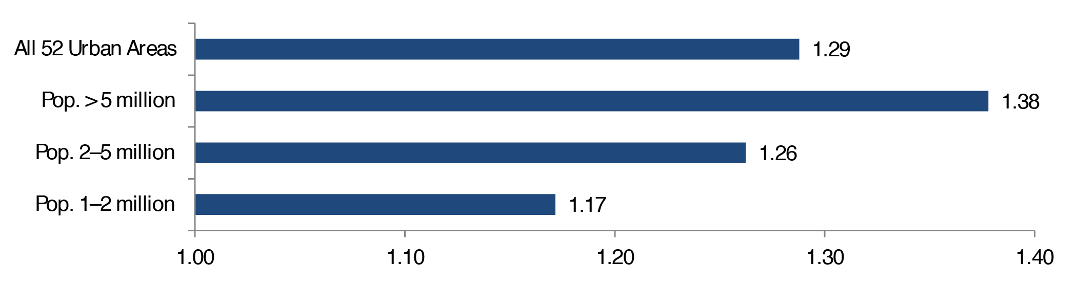
Sources: Travel Time index weighted by VMT over 52 urban areas based on the Urban Congestion Reports. Population from United States Census Bureau 2014 Metropolitan Statistical Areas Population Estimates for 2010.
Congestion occurs in urban areas of all sizes. Residents in large metropolitan areas tend to experience more severe congestion, and smaller urban areas usually experience better mobility. For example, a trip that normally takes 60 minutes on the Interstate Highway System during off-peak time would have taken 70.3 minutes (17 percent longer, or Travel Time Index 1.17) on average during the peak period for an urban area with population between 1 and 2 million. The same trip would take an average of 75.7 minutes (26 percent longer, or Travel Time Index 1.26) in a medium-sized urban area with 2—5 million population and an average of 82.7 minutes (Travel Time Index 1.38) in a metropolis with more than 5 million residents.
Road congestion also varies slightly over the course of a year. The Travel Time index increased from the first to the second quarter of 2012, and then declined slightly in the third quarter for urban areas with populations above 5 million (see Exhibit 5-2).
Exhibit 5-2 Quarterly Travel Time Index for 52 Urban Areas, 2012
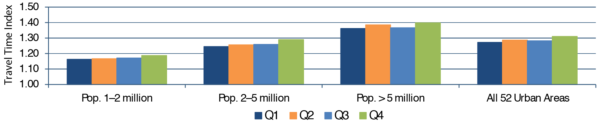
Source: Weighted average from NPMRDS; travel time weighted by VMT. Travel Time Index weighted by VMT over 52 urban areas was based on the Urban Congestion Reports. Population was obtained from United States Census Bureau 2014 Metropolitan Statistical Areas Population Estimates for 2010.
The Travel Time Index grew steadily across all four quarters for urban regions with populations less than 5 million. The quarterly trend for other urban regions was less consistent, but regardless of population size, the Travel Time Index increased in the fourth quarter relative to the first quarter.
Congested Hours
Congested Hours is another performance indicator that is used in the Urban Congestion Report. NPMRDS is used to calculate congested hours per day for the 52 major urban areas in the United States. Similar to results for the Travel Time Index, more hours of congestion were observed in larger urban areas (see Exhibit 5-3).
Exhibit 5-3 Congested Hours per Weekday for 52 Urban Areas, 2012 |
|||||
|---|---|---|---|---|---|
| Population Group | 1st Quarter | 2nd Quarter | 3rd Quarter | 4th Quarter | 2012 |
| Pop. 1—2 million | 3.45 | 3.43 | 3.55 | 3.80 | 3.55 |
| Pop. 2—5 million | 4.48 | 4.38 | 4.50 | 4.95 | 4.58 |
| Pop. > 5 million | 5.98 | 5.95 | 5.97 | 6.28 | 6.05 |
| All 52 Urban Areas | 4.83 | 4.78 | 4.87 | 5.23 | 4.93 |
|
Source: Weighted average from NPMRDS; travel time weighted by VMT. | |||||
Congested Hours in Minneapolis/St. Paul
The Minnesota Department of Transportation derived its congestion data using 3,000 surveillance detectors in roadways and field observations on Twin Cities Freeways. Based on the traffic conditions in October (a "normal" traffic month), 758 miles of urban freeways were evaluated to measure the miles congested during the morning and afternoon commutes, Monday through Friday. The Department defined congested sections as those operating at speeds below 45 miles per hour at any time during the morning and afternoon peak periods.
The results show that most congestion lasted less than 2 hours, and less than 30 miles of freeway experienced severe congestion (duration greater than 3 hours) (see Exhibit 5-4). More miles, however, were reported to have moderate (duration of 2—3 hours) to severe (duration greater than 3 hours) congestion in recent years. Additionally, more freeways were congested in the morning peak period than in the afternoon.
Exhibit 5-4 Miles by Duration of Congestion: Minneapolis/St. Paul, 2002—2012
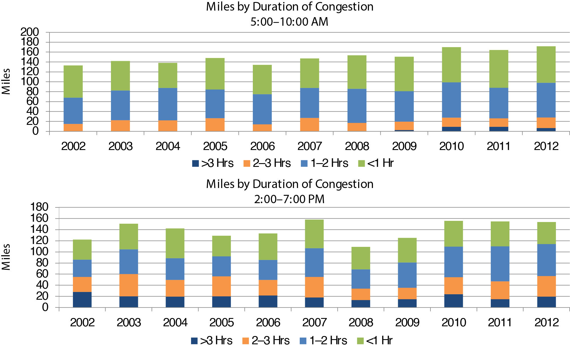
Source: Metropolitan Freeway System 2012 Congestion Report (Minnesota Department of Transportation, 2012).
In 2012, roads in very large urban areas experienced 6.05 hours of congestion on an average day, which is 70 percent higher than the 3.55 hours in a typical medium-sized urban area with population between 1 and 2 million. Congested Hours exhibited a similar pattern across different sizes of urban centers, usually dropping slightly in the second quarter and rising strongly afterwards.
Planning Time (Reliability)
Most travelers are less tolerant of unexpected delays than everyday congestion. Although drivers dislike everyday congestion, they may have an option to alter their schedules to accommodate it, or are otherwise able to factor it into their travel choices. Unexpected delays, however, often have larger consequences. Travelers also tend to remember the situations when they spent more time in traffic because of unanticipated disruptions, rather than the average time for a trip throughout the year.
Compared with simple average measures of congestion, like the Travel Time Index or Congested Hours, measures of travel time reliability provide a different perspective of improved travel. Users familiar with a route (such as commuters) can anticipate how bad traffic is during those few poor days and plan their trips accordingly. Such travelers reach their destinations on time more often or with fewer significant delays. Hence, measures of travel time reliability more accurately represent a commuter's experience than a simple average travel time.
Transportation reliability measures primarily compare high-delay days with average-delay days. The simplest methods usually identify days that exceed the 95th percentile in terms of travel times and estimate the severity of delay on specific routes during the heaviest traffic days of each month. The Planning Time Index is defined for the purpose of this report as "the ratio of travel time on the worst day of the month compared to the time required to make the same trip at 'normal travel time.'" More precisely, it is the ratio of the 95th percentile of travel time and the 50th percentile of travel time (i.e., the median). For example, a Planning Time Index of 1.60 means that, for a trip that takes 60 minutes in light traffic, a traveler should budget a total of 96 (60 × 1.60) minutes to ensure on-time arrival for 19 times of 20 trips (95 percent of the trips).
The Planning Time Index is particularly useful because it can be compared directly to the Travel Time Index (a measure of average congestion) on similar numeric scales. The Planning Time Index is usually higher than the Travel Time Index. This difference is because, in most cases, travel time follows a normal distribution (bell curve). Statistically, the mean of travel time (Travel Time Index) is close to the median (50th percentile), and the median is always less than the 95 percentile value used to determine the Planning Time Index.
Exhibit 5-5 indicates that ensuring on-time arrival 95 percent of the time in 2012 required planning for 2.51 times the travel time that would be necessary under median traffic conditions (i.e., the Planning Time Index was 2.51). Similar to average travel time during congested periods (Travel Time Index), travel time reliability is worse, on average, in larger urban areas than in smaller urban areas. The average Planning Time Index was 2.89 in major cities with more than 5 million residents, which is 39 percent higher than the index for small urban areas with populations between 1 and 2 million (Planning Time Index 2.09).
Exhibit 5-5 Planning Time Index for 52 Urban Areas (95th Percentile)
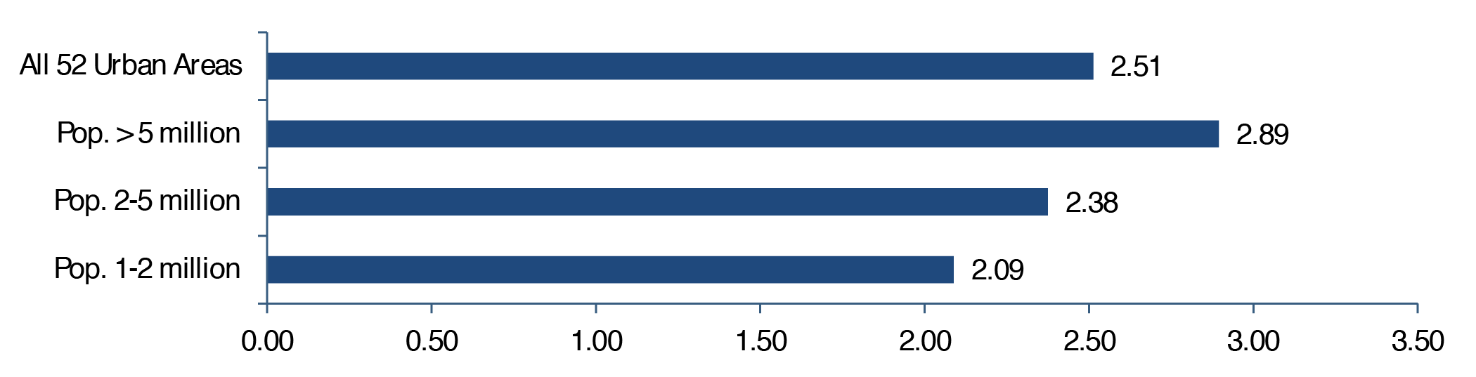
Sources: Weighted average from NPMRDS; travel time weighted by VMT. Planning Time Index weighted by VMT over 52 urban areas was based on the Urban Congestion Reports. Population was obtained from United States Census Bureau 2014 Metropolitan Statistical Areas Population Estimates for 2010.
Congestion in Atlanta
The Georgia Regional Transportation Authority calculated several mobility measures to track highway system performance.
The freeway travel index is calculated as the weighted average of the travel time indices for each freeway segment with vehicle miles traveled used as the weight. As with the simple Travel Time Index, the higher the weighted Travel Time Index, the worse the congestion. The average morning peak-period Travel Time Index barely increased from 1.24 in 2009 to 1.25 in 2010, and during the afternoon peak period the Travel Time Index worsened from 1.32 to 1.35 (see Exhibit 56).
Exhibit 5-6 Congestion in Atlanta, 2009—2010 |
||||
|---|---|---|---|---|
| Time Index | Morning Peak (7:45—8:45 a.m.) | Afternoon Peak (5:00—6:00 p.m.) | ||
| 2009 | 2010 | 2009 | 2010 | |
| Freeway Travel Time Index | 1.24 | 1.25 | 1.32 | 1.35 |
| Freeway Planning Time Index | 1.67 | 1.68 | 1.91 | 1.98 |
| Freeway Buffer Time Index | 36.0 | 34.4 | 43.2 | 46.1 |
|
Source: 2011 Transportation MAP Report: A Snapshot of Atlanta's Transportation System Performance (Georgia Regional Transportation Authority, 2012). | ||||
The freeway Planning Tim class="no-border-left"e Index at the 95th percentile provides a benchmark for the travel time reliability of the road network. Compared with the 2009 base year, planning time index in 2010 increased marginally during the morning peak period, but the drop in road reliability was more noticeable during the afternoon peak period.
The buffer time index is another measure of travel reliability. It represents the extra time (or buffer) that a traveler would need to add to the time for a congested trip to arrive on time consistently 19 of 20 times (95 percent of the trips). The Buffer Time Index is expressed as a percentage of the average congested trip time. So, for the same trip that takes an average of about 8.6 minutes, a traveler should allow for a buffer of 87 percent (16 minutes = 8.6 × 1.87) if he or she wants to be on time 19 of 20 times. A deeper decline in buffer time index is observed for the afternoon peak period in the Atlanta area.
Congestion Trends
Although the NPMRDS is currently FHWA's official data source for measuring congestion and the Urban Congestion Report is the official program for measuring congestion, the data used in the current edition started in 2012. Hence, examining other data sources is necessary to observe trends over a longer period. The 2015 Urban Mobility Scorecard, developed by the Texas Transportation Institute, provides time series data for selected congestion measures starting in 1982. The report includes data for all 471 U.S. urbanized areas, including small urbanized areas with populations less than 500,000. The report's estimated congestion trends are based on the speed data provided by INRIX®, which contains historical traffic information from more than 1.5 million global positioning system (GPS)-enabled vehicles and mobile devices for every 15-minute period every day for all major U.S. metropolitan areas.
Although the Texas Transportation Institute produces measures of congestion similar to those generated from the NPMRDS, the measures differ in geographic coverage and are calculated using a different method. Consequently, the Texas Transportation Institute's values for measures such as the Travel Time Index deviate somewhat from those presented above for 2012 based on NPMRDS data.
Exhibit 5-7 shows changes in the national average of the Travel Time Index since 2002 for all urbanized area categories. The Travel Time Index rose steadily until 2008 and started to increase again after a brief drop during the Nation's recent economic recession. By 2012, the Travel Time Index had risen close to its prerecession level across different sizes of urban area, indicating that congestion had worsened since 2009. Urbanized areas with higher populations have longer travel times. For example, in 2012, the Travel Time Index was 1.13 in small urbanized areas from 2002 to 2012, 1.18 in medium-sized urbanized areas, 1.23 in large urbanized areas, and 1.32 in very large metropolitan areas.
Exhibit 5-7 Travel Time Index for All Urbanized Areas, 2002—2012
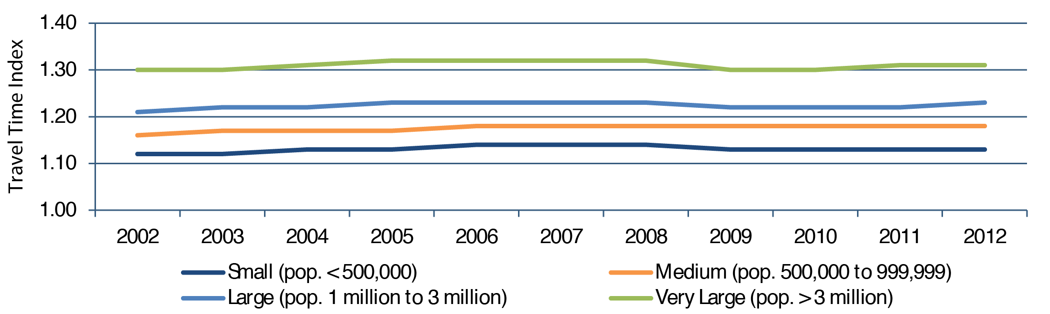
Source: Texas Transportation Institute (2015), population based on the U.S. Census Bureau estimates.
Cost of Delay
Congestion adversely affects the American economy and results in a massive waste of time, fuel, and money. When travel time increases or reliability decreases, businesses need to increase average inventory levels to compensate, leading to higher overall costs. Congestion imposes an economic drain on businesses, and the resulting increased costs negatively affect producer and consumer prices.
Although automobile and truck congestion currently imposes a relatively small cost on the GDP (about 0.8 percent of GDP), the cost of congestion is growing faster than GDP. If current trends continue, congestion is expected to impose a larger proportional cost in the future. The cost of congestion has risen almost 5 percent per year over the past 25 years, almost double the growth rate of GDP.
Exhibit 5-8 National Congestion Measures, 2002—2012 |
|||
|---|---|---|---|
| Year | Delay per Commuter (Hours) | Total Delay (Billions of Hours) | Total Cost (Billions of 2014 Dollars) |
| 2002 | 39 | 5.6 | $124 |
| 2003 | 40 | 5.9 | $128 |
| 2004 | 41 | 6.1 | $136 |
| 2005 | 41 | 6.3 | $143 |
| 2006 | 42 | 6.4 | $149 |
| 2007 | 42 | 6.6 | $154 |
| 2008 | 42 | 6.6 | $152 |
| 2009 | 40 | 6.3 | $147 |
| 2010 | 40 | 6.4 | $149 |
| 2011 | 41 | 6.6 | $152 |
| 2012 | 41 | 6.7 | $154 |
|
Source: Texas Transportation Institute, 2015. | |||
As shown in Exhibit 5-8, the Texas Transportation Institute estimates that each auto commuter averaged an extra 41 hours traveling during the peak traveling period in 2012. Together, congestion wastes 6.7 billion hours of travel time for the society collectively. Combining wasted time with approximately 3 billion gallons of wasted fuel, the total cost of congestion was estimated to reach $154 billion in 2012. (The Texas Transportation Institute assumed an average cost of time of $17.67 per hour, which differs from the value used in the analyses reflected in Part II of this report.)
Total delay time increased from 5.6 billion hours in 2002 to 6.7 billion hours in 2012. Total costs rose at an average annual rate of 1.9 percent per year from 2002 to 2012. The estimated total cost of delay declined during the most recent recession but by 2012 had risen to the 2007 pre-recession level.
Travel Delays in Puget Sound of Washington State
Washington State Department of Transportation used maximum throughput speeds to measure delays relative to the highway's most efficient operating condition. Maximum throughput is achieved when vehicles travel at speeds between 42 and 51 miles per hour (below the posted speed of 60 miles per hour). At maximum throughput speeds, highways are operating at peak efficiency because more vehicles are passing through the segment than when they are traveling at posted speeds. This situation occurs because drivers operating at maximum throughput speeds can travel more safely with a shorter distance between vehicles than at posted speeds.
Maximum throughput speeds vary from one highway segment to another, depending on prevailing roadway design (roadway alignment, lane width, slope, shoulder width, pavement conditions, presence or absence of median barriers) and traffic conditions (traffic composition, conflicting traffic movements, heavy truck traffic, etc.). The maximum throughput speed is not static and depends on traffic conditions.
On an average weekday, each Washingtonian spent an estimated extra 4 hours and 30 minutes delayed due to traffic in 2012, which is below the prerecession levels in 2007 (see Exhibit 5-9). Despite a decline in statewide travel delay, congestion still caused drivers to waste 30.9 million hours in 2012 due to increased travel time. Combined with increased vehicle operating expense, total travel costs of delay reached $780 million in 2012.
Exhibit 5-9 Annual Delay: Washington State, 2007—20121 |
||||||
|---|---|---|---|---|---|---|
| Annual Delay Statewide | 2007 | 2008 | 2009 | 2010 | 2011 | 2012 |
| Per Person Travel Delay (Hours) | 5.4 | 5.3 | 4.2 | 4.7 | 4.8 | 4.5 |
| Total Travel Delay (Millions of Hours) | 35.1 | 34.8 | 28.1 | 31.6 | 32.5 | 30.9 |
| Cost of Delay (Millions of Dollars) | $931 | 4890 | $721 | $800 | $821 | $780 |
1 The annual delay is defined as total hours of annual travel delay divided by total population in the State. Source: The 2012 Corridor Capacity Report (Washington Department of Transportation 2013). | ||||||
Freight Performance
When travel time increases or reliability decreases, businesses need to adjust average inventory levels to compensate for delays in receipt and shipment of goods. This situation leads to higher overall operating costs, which imposes an economic drain on business and a rise in producer and consumer prices. Although congestion might minimally affect the overall economy relative to other factors, the 2012 Urban Mobility Report estimates costs of overall truck congestion to be $27 billion per year. Such inefficiency increases production costs and consumer prices, and contributes to businesses' moving their operations and jobs to locations where they can achieve more efficient supply chains, resulting in regional and national job losses.
Freight Performance Measurement (FPM)
FHWA has been collecting and analyzing data for freight-significant Interstate corridors since 2002. FHWA continues to collect travel time information on key Interstates and domestic freight corridors, at border crossings, in metropolitan areas, and at intermodal connectors. The objectives of the current FPM research program are to expand on the existing data sources, further develop and refine methods for analyzing data, derive national measures of congestion and reliability, analyze freight bottlenecks and intermodal connectors, and develop data products and tools that will help DOT, FHWA, and State and local transportation agencies address surface transportation congestion. FHWA sponsors research to develop performance measure approaches and tools and provides a national travel time data set (which includes freight and passenger traffic data) to States and metropolitan planning organizations to support performance measurement and management programs. Additionally, FHWA partners with other operating administrations, Federal agencies, and international agencies to evaluate and advance multimodal freight performance for North American corridors and critical supply chains.
Effect of Congestion on Freight Travel
FHWA monitors performance indicators for the freight system as part of its Freight Performance Measure (FPM) program to analyze impacts of congestion and determine the operational capacity and efficiency of key freight routes in the United States.
FHWA measures freight highway congestion using truck probe data from more than 600,000 trucks equipped with GPS. These trucks provide billions of position signals that FHWA analyzes to determine truck freight performance, both for routine monitoring and for ad hoc analysis to understand truck movements and impacts, such as when an incident compromises highway network reliability. Having used these data since 2002, FHWA actively seeks to increase the number of probes to improve data availability. FHWA estimates that the current number of probes represents approximately 30 percent of the truck population for Classes 6, 7, and 8 (i.e., trucks with gross vehicle weight exceeding 19,500 pounds). In addition to the FPM truck probe data, FHWA uses information from the Freight Analysis Framework tool for tonnage and volume flows.
FPM's routine monitoring of truck freight performance is principally for monitoring congestion, using measures of travel time reliability and speed for corridors, border crossings, urban areas, freight intermodal connections, and freight bottlenecks. FHWA produces quarterly performance monitoring reports that provide insight into these areas. More information is available on FHWA's website at http://ops.fhwa.dot.gov/freight/freight_analysis/perform_meas/. Specifically, FHWA produces a Freight Movement Efficiency Index (FMEI) that combines measures of speeds and travel times for intermodal locations, urban areas, bottlenecks, and border crossings. FHWA monitors travel times for the top 25 freight corridors in the United States.
FHWA has found that much of the current congestion negatively influencing truck carrier operations happens on a recurring basis during peak periods, particularly in and near major metropolitan areas. The map in Exhibit 5-10 shows the location of this peak-period congestion on high-volume truck portions of the NHS in 2011. Overall, peak-period congestion created stop-and-go conditions on 5,800 miles of the NHS and caused traffic to travel below posted speed limits on an additional 4,500 miles of the high-volume truck portions of the NHS.
Exhibit 5-10 Peak-Period Congestion on the High-Volume Truck Portions1 of the National Highway System, 20112,3
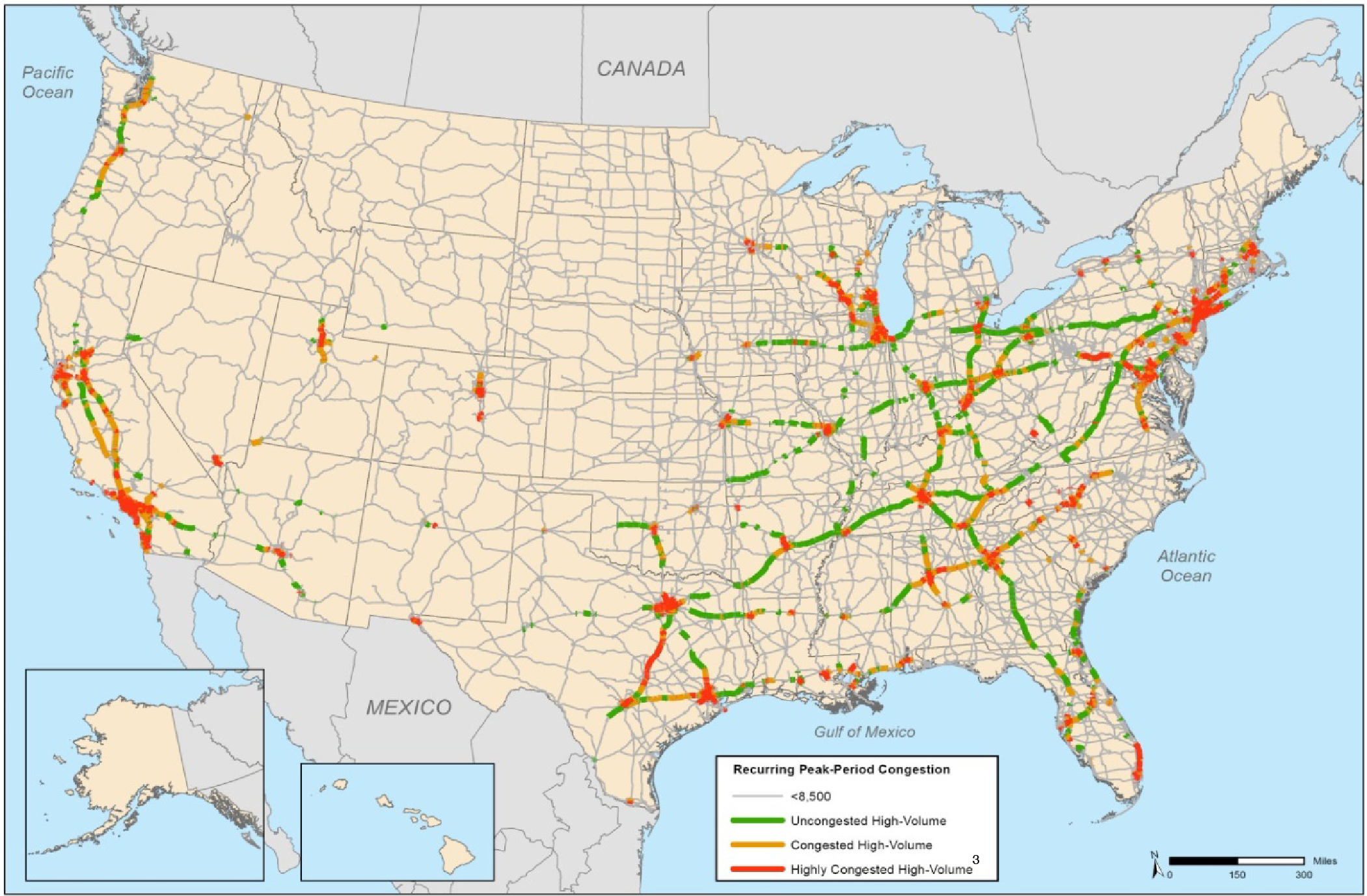
1 High-volume truck portions of the National Highway System carry more than 8,500 trucks per day, including freight-hauling long-distance trucks, freight-hauling local trucks, and other trucks with six or more tires.
2 The volume/service flow ratio is estimated using the procedures outlined in the HPMS Field Manual, Appendix N. NHS mileage as of 2011, prior to MAP-21 system expansion.
3 Highly congested segments are stop-and-go conditions with volume/service flow ratios greater than 0.95. Congested segments have reduced traffic speeds with volume/service flow ratios between 0.75 and 0.95.
Sources: U.S. Department of Transportation, Federal Highway Administration, Office of Freight Management and Operations, Freight Analysis Framework, version 3.4, 2013.
Exhibits 5-11 and 5-12 show some of the results of FHWA's analyses using truck probe data indicating the most congested, freight-significant locations in the United States and average truck travel speeds on Interstate highways, respectively. Reduced travel speeds for trucks most commonly occur in large metropolitan areas. They can also occur at international border crossings and gateways, in mountainous areas that require trucks to climb steep inclines, and in areas frequently prone to poor visibility driving conditions.
Exhibit 5-11 Top 25 Congested Freight-Significant Locations, 20131 |
|||||
|---|---|---|---|---|---|
| Ranking2 | Location3 | Average Speed4 | Peak-Hour Speed | Non-Peak-Hour Speed | Peak/Off-Peak Ratio |
| 1 | Fort Lee, NJ: I-95 at NJ 4 | 36 | 30 | 38 | 1.25 |
| 2 | Chicago, IL: I-290 at I-90/I-94 | 30 | 23 | 33 | 1.42 |
| 3 | Atlanta, GA: I-285 at I-85 (North) | 42 | 30 | 49 | 1.61 |
| 4 | Cincinnati, OH: I-71 at I-75 | 47 | 39 | 50 | 1.27 |
| 5 | Houston, TX: I-45 at US 59 | 39 | 29 | 44 | 1.52 |
| 6 | Houston, TX: I-610 at US 290 | 42 | 34 | 46 | 1.34 |
| 7 | St. Louis, MO: I-70 at I-64 (West) | 43 | 39 | 45 | 1.14 |
| 8 | Diamond Bar, CA: CA 60 at CA 57 | 47 | 39 | 50 | 1.27 |
| 9 | Louisville, KY: I-65 at I-64/I-71 | 47 | 41 | 49 | 1.21 |
| 10 | Austin, TX: I-35 | 36 | 22 | 43 | 1.93 |
| 11 | Chicago, IL: I-90 at I-94 (North) | 35 | 21 | 41 | 1.94 |
| 12 | Dallas, TX: I-45 at I-30 | 42 | 33 | 46 | 1.39 |
| 13 | Houston, TX: I-10 at I-45 | 46 | 36 | 50 | 1.38 |
| 14 | Atlanta, GA: I-75 at I-285 (North) | 48 | 37 | 52 | 1.39 |
| 15 | Denver, CO: I-70 at I-25 | 43 | 37 | 46 | 1.26 |
| 16 | Houston, TX: I-10 at US 59 | 47 | 36 | 52 | 1.46 |
| 17 | Lynwood, CA: I-710 at I-105 | 45 | 36 | 49 | 1.37 |
| 18 | Baton Rouge, LA: I-10 at I-110 | 44 | 36 | 48 | 1.33 |
| 19 | Bloomington, MN: I-35W at I-494 | 46 | 36 | 50 | 1.40 |
| 20 | Seattle, WA: I-5 at I-90 | 38 | 29 | 42 | 1.47 |
| 21 | Hartford, CT: I-84 at I-91 | 47 | 37 | 51 | 1.36 |
| 22 | Houston, TX: I-45 at I-610 (North) | 48 | 38 | 52 | 1.36 |
| 23 | Decatur, GA: I-20 at I-285 (East) | 49 | 44 | 51 | 1.18 |
| 24 | Auburn, WA: WA 18 at WA 167 | 48 | 42 | 51 | 1.23 |
| 25 | Atlanta, GA: I-20 at I-285 (West) | 50 | 45 | 52 | 1.15 |
1 Using data associated with the FHWA-sponsored Freight Performance Measures (FPM) initiative, the American Transportation Research Institute (ATRI) provides a yearly analysis to quantify the impact of traffic congestion on truck-borne freight at 250 specific locations throughout the United States. 2 The ranking analysis factors in the number of trucks using a particular highway facility and the impact that congestion has on average commercial vehicle speed in each of the 250 study areas. These data represent truck travel during weekdays at all hours of the day in 2014. 3 These locations were identified over several years through reviews of past research, available highway speed and volume data sets, and surveys of private and public sector stakeholders. 4 Average speeds below a free flow of 55 miles per hour indicate congestion. Source: American Transportation Research Institute (ATRI), Congestion Impact Analysis of Freight Significant Highway Locations, 2013. | |||||
Exhibit 5-12 Average Truck Speeds on Selected Interstate Highways, 2012
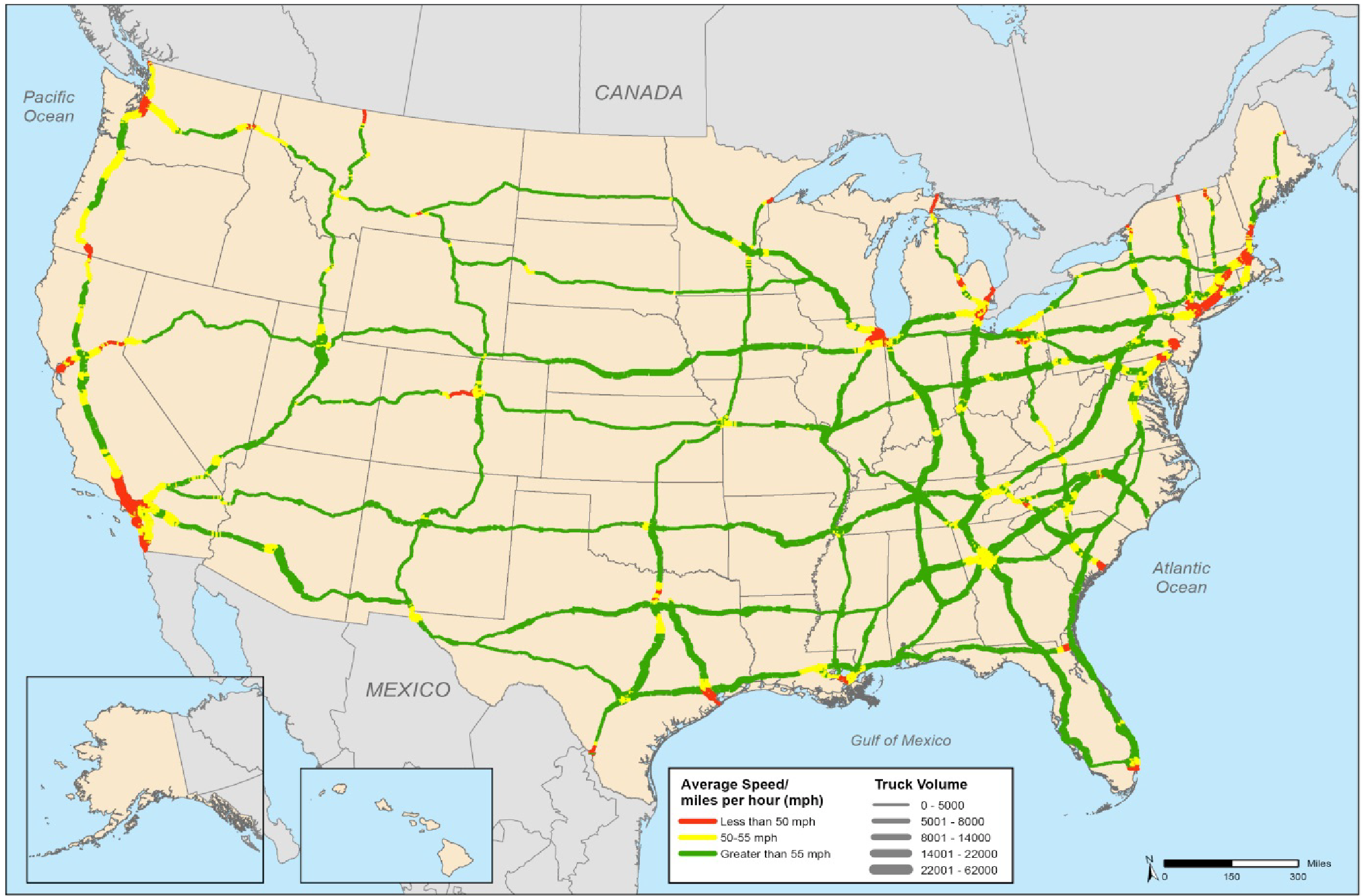
Sources: U.S. Department of Transportation, Federal Highway Administration, Office of Freight Management and Operations, Freight Performance Measurement Program, 2013.
To understand freight performance on critical freight routes, FHWA monitors performance using the truck probe data on the top 25 domestic freight corridors. As noted earlier in this section, FHWA uses a derivative of the truck probe data, the NPMRDS, to monitor these corridors using the Planning Time Index to evaluate average speeds.
Determination of Top 25 Domestic Freight Corridors
To determine the top 25 domestic freight corridors, FHWA used its Freight Analysis Framework (FAF 3.4) data to identify the top 10 percent of the FAF highway segments by tonnage. Exhibit 5-13 identifies the corridors with the most freight tonnage, that is, the top 10 percent . The corridors that handle the top 10 percent of U.S. freight tonnage are shown in thick, dark blue lines on the map at the top of the exhibit, while all other corridors are shown in thin, lighter blue lines.
Exhibit 5-13 FAF Network Commodity Tonnage
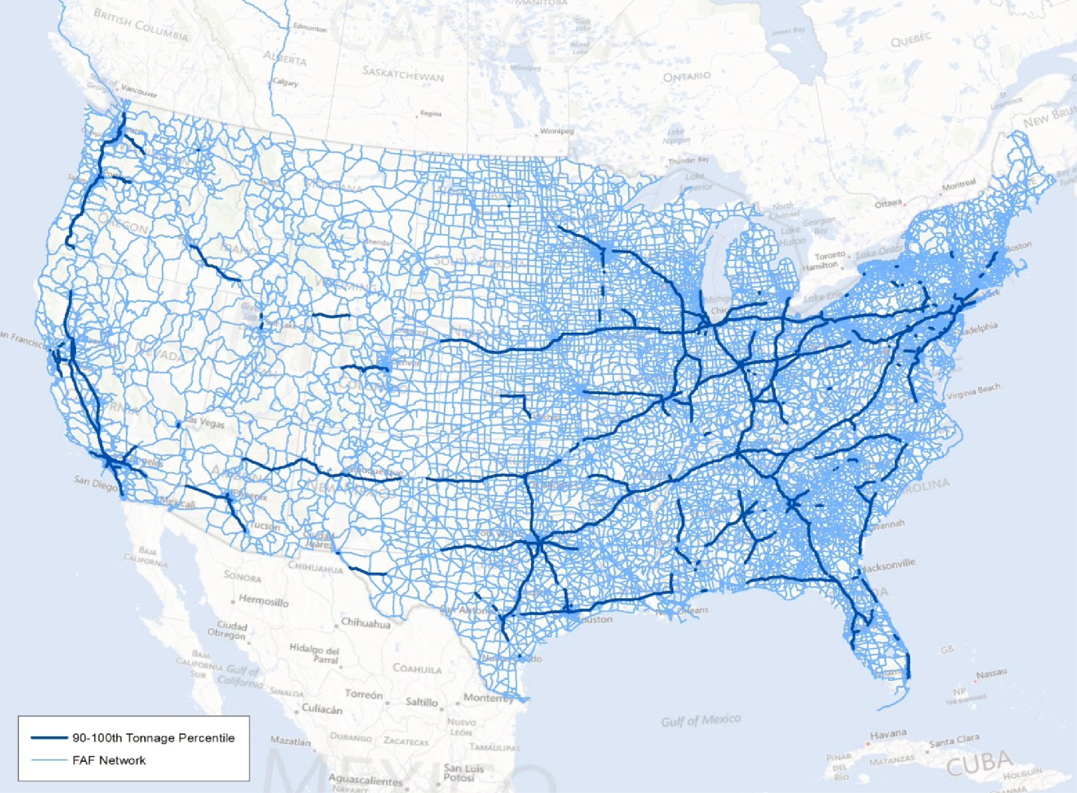
Source: FHWA Freight Management and Operations, Freight Analysis Framework and Freight Performance Measure Program, 2014.
From the network shown in Exhibit 5-13, FHWA connected segments with the highest tonnage and with known freight generators (land uses or groups of land uses that generate high freight transportation volumes, such as truck terminals, intermodal rail yards, water ports, airports, warehouses and distribution centers, or large manufacturing facilities) or population centers (origins and destinations) to identify 25 corridors that have the greatest freight movement. These corridors are illustrated in Exhibit 5-14.
Exhibit 5-14 Top 25 Intercity Truck Corridors
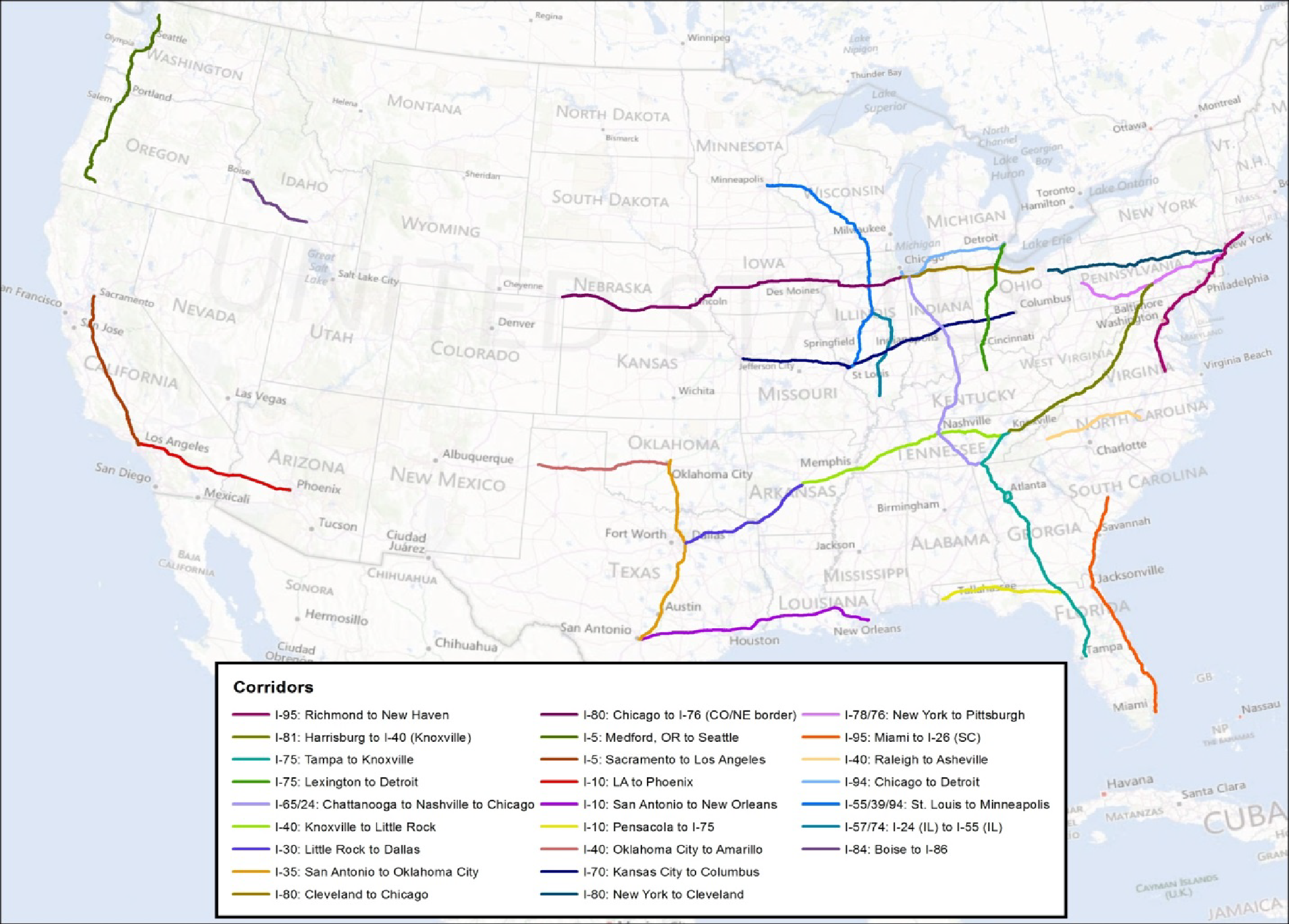
Source: FHWA Freight Management and Operations, Freight Analysis Framework and Freight Performance Measure Program, 2014.
The NPMRDS truck probe data also measure corridor-level travel time reliability. Travel time reliability is derived from measured average speeds of commercial vehicles for the top 25 domestic freight corridors annually. Exhibit 5-15 shows the Planning Time Index for the 25 most significant intercity truck corridors in the United States.
Exhibit 5-15 Travel Time Reliability Planning Time Index for the Top 25 Intercity Truck Corridors in the United States, 2011—2014 |
||||
|---|---|---|---|---|
| Freight Corridor | Planning Time Index (95th PCTL/50th PCTL) | |||
| 2011 | 2012 | 2013 | 2014 | |
| 1. I-5: Medford, OR to Seattle | 1.31 | 1.34 | 1.37 | 1.41 |
| 2. I-5/CA 99: Sacramento to Los Angeles | 1.28 | 1.33 | 1.34 | 1.33 |
| 3. I-10: Los Angeles to Tucson | 1.24 | 1.21 | 1.26 | 1.27 |
| 4. I-10: San Antonio to New Orleans | 1.23 | 1.28 | 1.30 | 1.31 |
| 5. I-10: Pensacola to I-75 | 1.06 | 1.06 | 1.06 | 1.07 |
| 6. I-30: Little Rock to Dallas | 1.21 | 1.15 | 1.14 | 1.17 |
| 7. I-35: Laredo to Oklahoma City | 1.24 | 1.24 | 1.28 | 1.30 |
| 8. I-40: Oklahoma City to Flagstaff | 1.10 | 1.12 | 1.11 | 1.11 |
| 9. I-40: Knoxville to Little Rock | 1.17 | 1.18 | 1.20 | 1.24 |
| 10. I-40: Raleigh to Asheville | 1.11 | 1.12 | 1.14 | 1.15 |
| 11. I-55/I-39/I-94: St. Louis to Minneapolis | 1.15 | 1.13 | 1.14 | 1.14 |
| 12. I-57/I-74: I-24 (IL) to I-55 (IL) | 1.09 | 1.12 | 1.15 | 1.14 |
| 13. I-70: Kansas City to Columbus | 1.21 | 1.18 | 1.20 | 1.20 |
| 14. I-65/I-24: Chattanooga to Nashville to Chicago | 1.26 | 1.26 | 1.29 | 1.34 |
| 15. I-75: Tampa to Knoxville | 1.16 | 1.16 | 1.20 | 1.21 |
| 16. I-75: Lexington to Detroit | 1.26 | 1.24 | 1.26 | 1.30 |
| 17. I-78/I-76: New York to Pittsburgh | 1.18 | 1.20 | 1.20 | 1.21 |
| 18. I-80: New York to Cleveland | 1.23 | 1.19 | 1.19 | 1.20 |
| 19. I-80: Cleveland to Chicago | 1.18 | 1.14 | 1.17 | 1.21 |
| 20. I-80: Chicago to I-76 (CO/NE border) | 1.13 | 1.12 | 1.12 | 1.12 |
| 21. I-81: Harrisburg to I-40 (Knoxville) | 1.11 | 1.12 | 1.11 | 1.11 |
| 22. I-84: Boise to I-86 | 1.14 | 1.08 | 1.09 | 1.14 |
| 23. I-94: Chicago to Detroit | 1.09 | 1.08 | 1.10 | 1.15 |
| 24. I-95: Miami to I-26 (SC) | 1.17 | 1.18 | 1.21 | 1.23 |
| 25. I-95: Richmond to New Haven | 1.62 | 1.59 | 1.69 | 1.85 |
|
Source: NPMRDS truck probe data. | ||||
In Exhibit 5-15, values greater than 1.00 illustrate travel time variability in the given corridors. Higher numbers indicate greater variability, and the portions of the numbers after the decimal points can be treated as percentages. As an example, for number 25, the I-95 corridor between Richmond and New Haven, the Travel Time Reliability Planning Time Index in 2011 was 1.62, meaning travel times were 62 percent longer on heavy travel days, compared to normal days, for drivers traveling the entire length of the corridor. More unpredictable travel times are problematic for truck drivers and freight receivers because they have a harder time optimizing the transportation portion of their supply chains.
Finally, the NPMRDS truck probe data are used to determine the average speed for the top 25 domestic highway freight corridors. The average speeds shown in Exhibit 5-16 serve as an indicator of congestion for each corridor and should not be interpreted as the average speed expected at any location on any given corridor.
Exhibit 5-16 Average Travel Speeds for the Top 25 Intercity Truck Corridors in the United States, 2011—2014 |
||||
|---|---|---|---|---|
| Freight Corridor | Average Speed (24/7) | |||
| 2011 | 2012 | 2013 | 2014 | |
| 1. I-5: Medford, OR to Seattle | 56.64 | 56.33 | 56.12 | 54.94 |
| 2. I-5/CA 99: Sacramento to Los Angeles | 56.19 | 56.05 | 56.11 | 55.99 |
| 3. I-10: Los Angeles to Tucson | 59.53 | 59.42 | 59.42 | 58.60 |
| 4. I-10: San Antonio to New Orleans | 61.79 | 61.45 | 61.77 | 60.82 |
| 5. I-10: Pensacola to I-75 | 64.69 | 63.90 | 64.03 | 63.99 |
| 6. I-30: Little Rock to Dallas | 61.78 | 62.64 | 62.82 | 62.13 |
| 7. I-35: Laredo to Oklahoma City | 61.06 | 61.45 | 61.05 | 59.76 |
| 8. I-40: Oklahoma City to Flagstaff | 63.99 | 63.86 | 64.15 | 64.31 |
| 9. I-40: Knoxville to Little Rock | 62.34 | 62.24 | 62.14 | 61.53 |
| 10. I-40: Raleigh to Asheville | 62.42 | 62.36 | 62.32 | 61.62 |
| 11. I-55/I-39/I-94: St. Louis to Minneapolis | 62.00 | 62.37 | 62.16 | 62.10 |
| 12. I-57/I-74: I-24 (IL) to I-55 (IL) | 62.86 | 62.71 | 62.56 | 62.76 |
| 13. I-70: Kansas City to Columbus | 61.51 | 61.94 | 61.81 | 61.50 |
| 14. I-65/I-24: Chattanooga to Nashville to Chicago | 60.97 | 61.04 | 60.85 | 59.57 |
| 15. I-75: Tampa to Knoxville | 62.74 | 62.47 | 62.39 | 61.67 |
| 16. I-75: Lexington to Detroit | 60.18 | 60.76 | 60.66 | 59.30 |
| 17. I-78/I-76: New York to Pittsburgh | 59.59 | 59.94 | 59.88 | 59.34 |
| 18. I-80: New York to Cleveland | 60.78 | 61.12 | 61.13 | 60.68 |
| 19. I-80: Cleveland to Chicago | 61.86 | 62.26 | 61.99 | 61.57 |
| 20. I-80: Chicago to I-76 (CO/NE border) | 62.96 | 63.16 | 63.36 | 63.39 |
| 21. I-81: Harrisburg to I-40 (Knoxville) | 62.38 | 62.42 | 62.60 | 62.60 |
| 22. I-84: Boise to I-86 | 61.81 | 62.53 | 62.53 | 62.43 |
| 23. I-94: Chicago to Detroit | 59.89 | 60.54 | 59.95 | 58.74 |
| 24. I-95: Miami to I-26 (SC) | 63.07 | 62.63 | 62.48 | 61.77 |
| 25. I-95: Richmond to New Haven | 55.36 | 55.52 | 54.70 | 51.72 |
|
Source: NPMRDS truck probe data. | ||||
Quality of Life
Fostering quality of life is a continued goal of DOT. DOT's Strategic Plan for Fiscal Years 2014-2018 addresses the strategic goal to "Foster improved quality of life in communities by integrating transportation, policies, plans, and investments with coordinated housing and economic development policies to increase transportation choices and access to transportation services for all."
To achieve this goal, DOT will strive to:
- Expand convenient, safe, and affordable transportation choices for all users by directing Federal investments in infrastructure toward projects that more efficiently meet transportation, land use, goods movement, and economic development goals developed through integrated planning approaches.
- Ensure Federal transportation investments benefit all users by emphasizing greater public engagement, fairness, equity, and accessibility in transportation investment plans, policy guidance, and programs.
Building quality of life in communities involves a multiagency approach, so DOT is collaborating across lines of authority to leverage related Federal investments. The Interagency Partnership for Sustainable Communities includes DOT (https://www.sustainablecommunities.gov/), the U.S. Department of Housing and Urban Development, and the U.S. Environmental Protection Agency. Through this Partnership, DOT has provided grants and technical assistance to ensure that its policies and investments promote quality of life; developed and provided tools for communities to assess, plan, and design sustainable communities; increased flexibility to use Federal funds; promoted safe and accessible transportation choices for all users; supported disaster recovery and resiliency planning in impacted communities; and convened leaders at all levels to share lessons learned by communities and to engage stakeholders to help shape partnership efforts.
Strategies to Increase Access to Convinient and Affordable Transportation Choices
DOT's FY 2014—2018 Strategic Plan identifies the following strategies to increase access to convenient and affordable transportation choices:
- Continue to encourage States and metropolitan planning organizations to consider the impact of transportation investments on local land use, affordable housing, scenic and historic resources, access to recreation, people, and goods movement;
- Continue to invest in high-speed and intercity passenger rail to complement highway, transit, and aviation networks and encourage projects that improve transit connectivity to intercity and high-speed rail, airports, roadways, and walkways;
- Increase the capacity and reach of public transportation, improve the quality of service, and increase travel time reliability through deployment of advanced technologies and significant gains in the state of good repair of transit infrastructure; and
- Advocate for transportation investments that strategically improve community design and function by providing an array of safe transportation options, such as vanpools, smart paratransit, car sharing, bike sharing, and pricing strategies that, in conjunction with transit services, reduce single-occupancy driving.
Measuring Quality of Life
Progress is being made on measuring the impact of transportation investments on livability. Several tools, such as the Sustainable Communities Indicator Catalog, Infrastructure Voluntary Evaluation Sustainability Tool (INVEST), and the Community Vision Metrics Web Tool have been developed to measure the impact of transportation investments on quality of life in communities.
Livability Defined
The terms "Quality of life" and "livability" are used interchangeably in this report. Livability in transportation concerns tying the quality and location of transportation facilities to broader opportunities, such as access to good jobs, affordable housing, quality schools, and safer streets and roads.
Communities can measure progress toward quality of life goals using the Sustainable Communities Indicator Catalog. Indicators in the catalog focus on the relationships among land use, housing, transportation, human health, and the environment. The user can choose an indicator type related to housing, transportation, or land use and identify the geographic scale; level of urbanization and issues of concern such as access to equity, affordability, community, and sense of place; economic competitiveness; environmental quality; and public health. The tool provides a summary of how the indicators chosen relate to quality of life, an approach to measuring the indicator, and a case study of a community that uses the chosen indicator (see Exhibit 5-17).
Exhibit 5-17 Examples of Sustainable Community Indicators |
||||
|---|---|---|---|---|
| Indicator Name | Indicator Topic | Issue of Concern | Level of Urbanization | Geographic Scale |
| Intersection density | Land use, transportation | Access and equity, community and sense of place, environmental quality, public health | Rural, suburban, urban | Neighborhood/ corridor, project |
| Access to transit: percentage of jobs within walking distance of transit service | Land use, transportation | Access and equity, Affordability, economic competitiveness, environmental quality | Rural, suburban, urban | County, municipality, region |
| City fleet: gas mileage | Transportation | Economic competitiveness, environmental quality | Rural, suburban, urban | County, municipality, region |
| Walkability | Land use, transportation | Access and equity, community and sense of place, environmental quality, public health | Rural, suburban, urban | County, municipality, neighborhood/ corridor |
| Fuel consumption/ purchase | Transportation | Economic competitiveness, environmental quality | Rural, suburban, urban | County, municipality, region |
| Access to safe parks and recreation areas: percentage of residents within walking distance of recreation land | Housing, land use, transportation | Access and equity, community and sense of place, public health | Suburban, urban | County, municipality, neighborhood/ corridor, project, region |
| Access to healthy food options | Housing, land use, transportation | Access and equity, public health | Rural, suburban, urban | County, municipality, neighborhood/ corridor, region |
| Bike parking per capita | Land use, transportation | Access and equity, community and sense of place, environmental quality, public health | Rural, suburban, urban | County, municipality, neighborhood/ corridor, project, region |
| Access to transit: Percentage of population within walking distance of frequent transit service | Housing, land use, transportation | Access and equity, affordability, environmental quality | Rural, suburban, urban | County, municipality, region |
| Percentage of population served by transit | Housing, land use, transportation | |||
|
Source: Partnership for Sustainable Communities, https://cms.sustainablecommunities.gov/indicators/discover. | ||||
FHWA has developed the Web-based INVEST tool that allows decision makers to evaluate and improve sustainable practices in their transportation projects and programs. The tool has a collection of voluntary best practices, called criteria, designed to help transportation agencies integrate sustainability into their programs (policies, processes, procedures, and practices) and projects. INVEST considers the full life cycle of projects and has three modules to self-evaluate the entire life cycle of transportation services, including System Planning (SP), Project Development, and Operations and Maintenance. Each module, based on a separate collection of criteria, can be evaluated separately. More information on INVEST is available at www.sustainablehighways.org.
Sustainable Communities Indicator Catalog — Pedestrian Infrastructure Indicator
The City of Indianapolis has used the pedestrian infrastructure indicator. The City's Office of Sustainability along with the Indianapolis Bicycle Advocacy/INDYCOG, and Health by Design conducted a bicycle and pedestrian documentation count. The purpose of the count was to provide the City with data on the total number of people walking and biking in their city. Volunteers were located in various areas around Indianapolis, including the downtown area, where they counted bicyclists in bike lanes and pedestrians on sidewalks for 2 hours. The results were used as benchmarks for the City of Indianapolis and the Office of Sustainability. The City will continue the counting exercise biannually in the spring and fall. By investing in infrastructure and affording citizens options, the City has confirmed residents are using the bicycle and pedestrian facilities. The City will continue to encourage residents to take advantage of the bicycle and pedestrian infrastructure improvements.
The SP module in INVEST has several quality-of-life-related items that are used in scoring. Examples of quality-of-life-related criteria in the SP module include:
- SP-01 Integrated Planning: Economic Development and Land Use — Integrate statewide and metropolitan Long Range Transportation Plans (LRTP) with statewide, regional, and local land use plans and economic development forecasts and goals. Proactively encourage and facilitate sustainability through the coordination of transportation, land use, and economic development planning.
- SP-03 Integrated Planning: Social — The agency's LRTP is consistent with and supportive of the community's vision and goals. When considered from an integrated perspective, these plans, goals, and visions provide support for sustainability principles. The agency applies context-sensitive principles to the planning process to achieve solutions that balance multiple objectives to meet stakeholder needs.
- SP-04 Integrated Planning: Bonus — The agency has a continuing, cooperative, and comprehensive (3-C) transportation planning process. Planners and professionals from multiple disciplines and agencies (e.g., land use, transportation, economic development, energy, natural resources, community development, equity, housing, and public health) work together to incorporate and apply all three sustainability principles when preparing and evaluating plans.
- SP-05 Access and Affordability — Enhance accessibility and affordability of the transportation system for all users by multiple modes.
- SP-07 Multimodal Transportation and Public Health — Expand travel choices and modal options by enhancing the extent and connectivity of multimodal infrastructure. Support and enhance public health by investing in active transportation modes.
Quality of Life Performance Indicators in Transportation Planning
The Community Vision Metrics Web Tool enables practitioners to search for quality-of-life indicators relevant to their specific circumstances, community, and quality-of-life goals to track the success of plans and projects in their communities. The indicators can be used to compare the status of different places or track change over time for an issue of importance. This information helps people understand the results of policies, identify where progress has been made, and highlight changes or disparities that are inconsistent with community goals. The tool includes specific quality-of-life areas of interest such as community amenities, community engagement, economics, housing, land use, housing, public health, and safety.
INVEST Use by KACTS
Kittery Area Comprehensive Transportation System (KACTS) is the metropolitan planning organization (MPO) for the Maine portion of the urbanized areas of Kittery-Portsmouth and Dover-Rochester, New Hampshire. KACTS used the INVEST System Planning (SP) module to score their approved 2010 Long Range Transportation Plan (LRTP) and used the results to identify opportunities to highlight and more fully integrate sustainability principles in their 2014 LRTP. After drafting the 2014 LRTP, KACTS used the SP module to evaluate the draft plan and compare the results with the 2010 LRTP. KACTS recognized that the new plan should be more informative and useful for the public to illustrate their sustainability-related practices, partnerships, policies, and programs more clearly.
Key outcomes noted in using INVEST were as follows:
- The criteria in the SP module helped enrich and improve the draft KACTS LRTP.
- The collaborative approach to scoring resulted in productive conversations about the LRTP and elucidated ways to increase the public visibility of KACTS.
- The exercise helped KACTS engage their partners more directly in the planning process and the connections of specific activities to broader outcomes.
- The SP module's emphasis on performance measures was very useful in helping KACTS prepare for performance management requirements stemming from the Moving Ahead for Progress in the 21st Century Act.
- KACTS has recommended improvements to INVEST so that it can consider the work of a small MPO more appropriately.
Location Affordability Portal
The Location Affordability Portal provides individuals with reliable, user-friendly data and resources on combined housing and transportation costs. This portal helps consumers, policy makers, and developers make more informed decisions about where to live, work, and invest. Vignettes are included to show how families and organizations can use the portal to make such decisions. The Location Affordability Portal features two tools: the Location Affordability Index (LAI) and My Transportation Calculator.
The LAI was developed to help individuals, planners, developers, and researchers gain a complete understanding of the costs of living in a given location by accounting for variations among households, neighborhoods, and region. All of these factors influence affordability. The LAI provides estimates of the percentage of a family's income dedicated to the combined cost of housing and transportation in a given location. Users can choose from among eight different family profiles-defined by household income, size, and number of commuters-and observe the affordability landscape for each one in a neighborhood, city, or region.
The My Transportation Cost Calculator enables a user to customize information from the LAI by entering basic information about their family's income, housing, cars, and travel patterns. The customized estimates offer a more thorough understanding of an individual's or household's transportation costs, how much they vary in different locations, and how much they are influenced by individual choices. This enables users to make more informed decisions about where to live and work.
The University of Florida's Southeastern Transportation Research, Innovation, Development and Education (STRIDE) Center used the Community Vision Metrics Web Tool during five workshops in the southeastern United States to help localities develop performance measures for use in transportation and comprehensive planning. The tool was used to identify context specific to quality-of-life indicators. Criteria to help participants critically evaluate the performance indicators were selected through the Community Vision Metrics Web Tool. Participants at all five workshops commented on the importance of identifying measures relevant to both the planning process and quality-of-life outcomes. The STRIDE report concluded that the Community Vision Metrics Web Tool provides an important starting point for practitioners to begin investigating quality-of-life indicators that can be used in the planning process. The report noted that the tool is essential for taking the first step toward evaluating performance measures.
Environmental Sustainability
The FY 2014-2018 DOT Strategic Plan includes the strategic goal to advance environmentally sustainable policies and investments that reduce carbon and other harmful emissions from transportation sources and increase resilience to climate change.
To achieve this goal, the DOT will undertake efforts to:
- Reduce oil dependence and carbon emissions through research and deployment of new technologies, including alternative fuels, and by promotion of more energy-efficient modes of transportation.
- Avoid and mitigate transportation-related impacts to climate, ecosystems, and communities by helping partners make informed project planning decisions through an analysis of acceptable alternatives, balancing the need to obtain sound environmental outcomes with demands to accelerate project delivery.
- Promote infrastructure resilience and adaptation to extreme weather events and climate change through research, guidance, technical assistance, and direct federal investment.
Climate Change Resilience, Adaptation, and Mitigation
Climate change and extreme weather events present significant and growing risks to the safety, reliability, and sustainability of the Nation's transportation infrastructure and operations. The impacts of a changing climate, such as higher temperatures, sea level rise, and changes in seasonal precipitation and intensity of rain events, are affecting the life cycle of transportation systems and are expected to intensify. Sea level rise coupled with storm surges can inundate coastal roads, necessitate more emergency evacuations, and require costly (and sometimes recurring) repairs to damaged infrastructure. Inland flooding from unusually heavy downpours can disrupt traffic, damage culverts, and reduce service life. High heat can degrade materials, resulting in shorter replacement cycles and higher maintenance costs. Although transportation infrastructure is designed to handle a broad range of impacts based on historic climate, preparing for climate change and extreme weather events is critical to protecting the integrity of the transportation system.
Given the long life span of transportation assets, planning for system preservation and safe operation under current and future conditions constitutes responsible risk management. In December 2014, FHWA issued Order 5520-Transportation System Preparedness and Resilience to Climate Change and Extreme Weather Events. The Order states that FHWA's policy is to strive to identify the risks of climate change and extreme weather events to current and planned transportation systems and that the agency will work to integrate consideration of these risks into its planning, operations, and policies.
With over a fourth of the climate change-causing greenhouse gas (GHG) emissions in the United States coming from the transportation sector, FHWA is committed to reducing GHG pollution from vehicles traveling on our Nation's highways. FHWA is establishing resources to help State DOTs and local agencies better analyze GHGs and energy use, weigh GHG reduction strategies, and integrate climate change considerations into the transportation planning process.
Greenhouse Gas Emissions
Transportation is the leading consumer of U.S. petroleum and a major source of GHG emissions. In 2013, tailpipe emissions from the U.S. transportation sector directly accounted for over 31 percent of total U.S. carbon pollution and 27 percent of total U.S. GHG emissions. On-road vehicles (including cars, light-duty trucks, and freight trucks) are the primary source of transportation GHGs, accounting for more than 80 percent of the sector total and almost one-quarter of the total across all sectors. Other sources of transportation GHGs include aircraft, rail, ships and boats, pipelines, and lubricants (see Exhibit 5-18).
Exhibit 5-18 Transportation-related Greenhouse Gas Emissions By Mode, 2013 |
||||||
|---|---|---|---|---|---|---|
| Transportation Type | 1990 | 2005 | 2010 | 2011 | 2012 | 2013 |
| On-Road Transportation | ||||||
| Light-Duty Vehicles | 992.3 | 1264.5 | 1132.6 | 1106.4 | 1094.2 | 1086.7 |
| Medium- and Heavy-Duty Trucks | 231.1 | 409.8 | 403 | 401.3 | 401.4 | 407.7 |
| Buses | 8.4 | 12.1 | 15.9 | 16.9 | 18 | 18.3 |
| Motorcycles | 1.8 | 1.7 | 3.7 | 3.6 | 4.2 | 4 |
| Total On-Road | 1233.6 | 1688.1 | 1555.2 | 1528.2 | 1517.8 | 1516.7 |
| Non-Road Transportation | ||||||
| Commercial Aircraft | 110.9 | 133.9 | 114.3 | 115.6 | 114.3 | 115.4 |
| Other Aircraft | 78.3 | 59.6 | 40.4 | 34.2 | 32.1 | 34.7 |
| Ships and Boats | 44.9 | 45.2 | 45 | 46.7 | 40.4 | 39.6 |
| Rail | 39 | 53.3 | 46.5 | 48.1 | 46.8 | 47.5 |
| Pipelines | 36 | 32.2 | 37.1 | 37.8 | 40.3 | 47.7 |
| Lubricants | 11.8 | 10.2 | 9.5 | 9 | 8.3 | 8.8 |
| Total Transportation | 1554.4 | 2022.5 | 1848.1 | 1819.7 | 1799.8 | 1810.3 |
| Total, All Sectors | 6301.1 | 7350.2 | 6989.8 | 6776.6 | 6545.1 | 6673.0 |
|
Source: Inventory of U.S. Greenhouse Gas Emissions and Sinks 1990—2013, Table 2-13 (transportation sources) and Table 2-1 (U.S. total). | ||||||
On-road vehicles also have been a major contributor to the net change in U.S. GHG emissions, especially between 1990 and 2005 when on-road GHGs increased by 37 percent , compared with 11 percent for all other sources across the U.S. economy. Both on-road and economy-wide emissions were driven significantly lower by the recession of 2007-2009, and by 2012, on-road GHGs were roughly 9 percent below 2005 levels. This decrease reflected declining per capita passenger VMT, increased consumer preference for smaller passenger vehicles (resulting from higher fuel prices), and improvements in new vehicle fuel economy resulting from Phase I light-duty CAFE (Corporate Average Fuel Economy) standards. On-road GHGs in 2013 were virtually unchanged from 2012 levels. Light-duty GHGs decreased by 0.7 percent , reflecting further improvements in new vehicle fuel economy that were offset in part by an increase in light-duty VMT. Truck GHG emissions increased by 1.6 percent , reflecting a 2.2-percent increase in truck VMT and a slight improvement in overall truck fuel efficiency.
Climate Mitigation Tools and Resources
FHWA has developed several tools and resources to help State DOTs and local agencies better analyze GHG emissions and energy use, calculate GHG reduction strategies, and integrate climate change considerations into the transportation planning process.
- Carbon Estimator (ICE) Tool-FHWA created a spreadsheet tool to help practitioners gauge life-cycle energy and GHG emissions from transportation infrastructure, including roads, bridges, transit facilities, and bike/pedestrian infrastructure. The tool also is intended to help weigh the emissions benefits of alternative construction and maintenance practices. The tool can be found at: http://www.fhwa.dot.gov/environment/climate_change/mitigation/publica tions_and_tools/carbon_estimator/.
- Handbook for Estimating GHG Emissions in the Transportation Planning Process-This handbook is a reference for State DOTs and MPOs to document available tools, methods, and data sources that can be used to generate GHG emission inventories, forecasts, and analyses of GHG plans and mitigation strategies. The handbook can be found at: http://www.fhwa.dot.gov/environment/climate_change/mitigation/publications/ghg_handbook/index.cfm.
- Energy and Emissions Reduction Policy Analysis Tool (EERPAT)-EERPAT was developed for State DOTs to model many inputs and policy scenarios to support strategic transportation and visioning, including GHG emissions reduction alternatives. State DOTs can use the tool to analyze GHG reduction scenarios and alternatives for use in the transportation planning process, climate action plan development, and scenario planning exercises for meeting State GHG reduction targets and goals. FHWA piloted the tool at four State DOTs (Colorado, Washington, Vermont, and Maryland). The pilot studies helped assess the sensitivity of EERPAT to various mitigation strategies and identified future enhancements to the model that might be needed. The tool can be found at: http://www.planning.dot.gov/FHWA_tool/.
- A Performance-Based Approach to Addressing Greenhouse Gas Emissions in Transportation Planning-This handbook is a resource for State DOTs and MPOs interested in addressing GHG emissions through performance-based planning and programming. It discusses techniques for integrating GHG emissions in such planning, considerations for selecting relevant GHG performance measures, and ways of using GHG performance measures to support investment choices and enhance decision-making. The handbook can be found at http://www.fhwa.dot.gov/environment/climate_change/mitigation/publications_and_tools/ ghg_planning/index.cfm.
Greenhouse Gas/Energy Analysis Demonstration Projects
In fall 2014, FHWA funded one State DOT and three metropolitan planning organizations (MPOs) to perform a planning-level GHG/energy analysis. The effort was undertaken to encourage State DOTs and MPOs to incorporate GHG and energy considerations in the transportation planning process and to use several new FHWA study tools and methods. The study approach and focus varied by organization based on their individual needs and interests, but each effort will improve the assessment and quantification of transportation-related GHG emissions for use in the transportation planning process.
Massachusetts DOT used the FHWA funding to analyze and quantify GHG emissions benefits from current activities and to estimate the impact of a set of potential future policies and strategies designed to help the State meet their GHG targets and goals. The project is using FHWA's Energy and Emissions Reduction Policy Analysis Tool.
The Delaware Valley Regional Planning Council is updating an evaluation of electric vehicle ownership. The Council is developing a spreadsheet tool to determine the changes in energy use and GHG emissions associated with different deployment scenarios of electric vehicles and compressed natural gas vehicles. Other transportation agencies around the country can use the scenarios to help reduce vehicle-related emissions and energy use.
The East-West Gateway Council of Governments is estimating GHG emissions from on-road vehicles at the regional and subregional scales and analyzing future emissions for multiple policy and land use scenarios. The project includes an analysis of the feasibility of corridor-level GHG analysis on the I-70 corridor. The review will increase the agency's capacity to integrate GHG considerations into decision-making processes and programs, advance the agency's transportation and sustainability goals, and serve as a case study for other regions.
The Southern California Association of Governments is undertaking an effort to advance methods of analyzing GHG emissions generated from multimodal transit trips, including first-last mile access and egress from transit stations. The findings will be used to prioritize the most effective transportation and land-use planning strategies for optimizing GHG reductions achieved from transit investments.
Building Partnerships to Improve Resilience
FHWA is partnering with State DOTs, MPOs, and Federal Land Management Agencies to pilot approaches for conducting vulnerability assessments of climate change and extreme weather for transportation infrastructure and to analyze options for adapting and improving resiliency.
Since 2010, FHWA has worked with 24 climate resilience pilots in two rounds. In the first round of pilot projects, FHWA funded five partnerships, including State DOTs, MPOs, and other agencies to test a draft framework for conducting vulnerability and risk assessments of transportation infrastructure given the projected impacts of climate change. FHWA used the experiences of these five pilots and other studies to update the draft framework. In 2012, FHWA formed 19 more partnerships with States and MPOs to use and build on the framework and to address previous gaps, such as evaluations of inland area impacts and actionable adaptation solutions.
FHWA has also worked with Federal, State, and local transportation agencies as part of four cooperative projects in the Gulf Coast, Northeast, New Mexico, and Southeast. Each area's approach differed and contributed significantly to the Agency's understanding of potential climate change impacts on its transportation assets and to the body of knowledge of the transportation community as a whole.
Central New Mexico Climate Change Scenario Planning Project
The transportation planning body for the Albuquerque, New Mexico region-the Mid Region Council of Governments (MRCOG)-embarked on a planning effort to test the impact of different transportation and land use scenarios on community goals. Federal grant funding and technical assistance enabled the region to integrate into the scenario planning an examination of strategies to reduce greenhouse gas emissions and improve resilience to climate change impacts, such as wildfires and flooding.
The goals of this Central New Mexico Climate Change Scenario Planning Project (CCSP) were to help the region improve sustainability through its metropolitan transportation plan and to demonstrate a process that could be replicated in other regions of the country (especially inland areas) for using scenario planning to respond to the challenges of climate change in conjunction with other community goals. The CCSP successfully integrated climate change consideration into the region's scenario planning process, and this analysis was then incorporated into the 2040 metropolitan transportation plan. The project enabled MRCOG to introduce the idea to stakeholders that some growth patterns are more sustainable and are more robust to climate change impacts than others are. In addition, the project helped make connections between local and Federal agencies with diverse missions and helped supply basic climate data for the Central New Mexico region that multiple sectors can now use. The CCSP also developed an integration plan that provides guidance to MRCOG in implementing several of the GHG reduction and climate resilience strategies discussed in the scenario-planning project.
Climate Resilience and Adaptation Tools and Resources
FHWA is working with Federal, State, and local partners by furnishing tools and resources to enable transportation agencies to increase the resilience of the transportation system to climate change. FHWA has designed an interactive online framework for use as a guide to assess the vulnerability of transportation assets to climate change and extreme weather events. The results of recent FHWA pilot and research projects informed this Virtual Framework for Vulnerability assessment. Each step of the framework includes case studies, videos, and other associated resources. The Virtual Framework, which includes several vulnerability assessment tools, can be found here: http://www.fhwa.dot.gov/environment/climate_change/adaptation/adaptation_fra mework/.
- Climate Data Processing Tool (CMIP) -CMIP processes data sets that are publicly available, large, and complicated into local temperature and precipitation projections tailored to transportation practitioners.
- Sensitivity Matrix -This spreadsheet tool documents the sensitivity of roads, bridges, airports, ports, pipelines, and rail to 11 climate impacts.
- Vulnerability Assessment Scoring Tool (VAST) -VAST is a spreadsheet tool that guides the user through conducting a quantitative, indicator-based vulnerability screen. The tool is intended for agencies assessing the vulnerability of their transportation system components to climate stressors.
Gulf Coast Study
The groundbreaking DOT Gulf Coast Study produced tools and lessons learned that transportation agencies across the country are using to assess vulnerabilities and build resilience to climate change. Phase 1 of the study, completed in 2008, examined the impacts of climate change on transportation infrastructure at a regional scale. Phase 2, completed in early 2015, focused on the Mobile, Alabama region with the goal of enhancing regional decision makers' ability to understand potential impacts on specific critical components of infrastructure and to gauge adaptation options. In Mobile, DOT assessed the vulnerability of the most critical transportation assets to climate change impacts and then cultivated risk management tools to help transportation system planners, owners, and operators determine which systems and assets to protect and how. The methods and tools developed under Phase 2 are intended to be replicable in other regions throughout the country. Reports include (1) synthesis of lessons learned and methods applied, (2) criticality assessment, (3) climate projections and sensitivity assessment, (4) vulnerability assessment, and (5) engineering assessment of adaptation options. All of the reports can be found here: http://www.fhwa.dot.gov/environment/climate_change/adaptation/ongoing_and_current_research/gulf_coast_study/index.cfm.
Transit System Performance
Basic goals all transit operators share include minimizing travel times, making efficient use of vehicle capacity, and providing reliable performance. The Federal Transit Administration (FTA) collects data on average speed, how full the vehicles are on average (utilization), and how often they break down (mean distance between failures) to characterize how well transit service meets these goals. These data are reported here; safety data are reported in Chapter 4.
| FTA Livable Communities Outcomes and Performance Measures | |
| Modal Network | Demand Response |
|
|
|
|
Customer satisfaction issues that are more subjective, such as how easy accessing transit service is (accessibility) and how well that service meets a community's needs, are harder to measure. Data from the FHWA 2009 National Household Travel Survey, reported here, provide some insights, but are not available on an annual basis and so do not support time series analysis.
The following analysis presents data on average operating speeds, average number of passengers per vehicle, average percentage of seats occupied per vehicle, average distance traveled per vehicle, and mean distance between failures for vehicles. Average speed, seats occupied, and distance between failures address efficiency and customer service issues; passengers per vehicle and miles per vehicle are primarily effectiveness and efficiency measures, respectively. Financial efficiency metrics, including operating expenditures per revenue mile or passenger mile, are discussed in Chapter 6.
The National Transit Database (NTD) includes urban data reported by mode and type of service. As of December 2010, NTD contained data for 16 modes. Beginning in January 2011, new modes were added to the NTD urban data, including
- streetcar rail — previously reported as light rail,
- hybrid rail — previously reported as light rail and commuter rail,
- commuter bus — previously reported as motor bus,
- bus rapid transit — previously reported as motor bus, and
- demand-response taxi — previously reported as demand response.
Data from NTD are presented for each new mode for analyses specific to 2012. For NTD time series analysis, however, streetcar rail and hybrid rail are included as light rail, commuter bus and bus rapid transit as fixed-route bus, and demand response-taxi as demand response.
Average Operating (Passenger-Carrying) Speeds
Average vehicle operating speed is an approximate measure of the speed transit riders experience; it is not a measure of the operating speed of transit vehicles between stops. More specifically, average operating speed is a measure of the speed passengers experience from the time they enter a transit vehicle to the time they exit it, including dwell times at stops. It does not include the time passengers spend waiting or transferring. Average vehicle operating speed is calculated for each mode by dividing annual vehicle revenue miles by annual vehicle revenue hours for each agency in each mode, as reported to NTD. When an agency contracts with a service provider or provides the service directly, the speeds for each service within a mode are calculated and weighted separately. Exhibit 5-19 presents the results of these average speed calculations.
Exhibit 5-19 Average Speeds for Passenger-Carrying Transit Modes, 20121
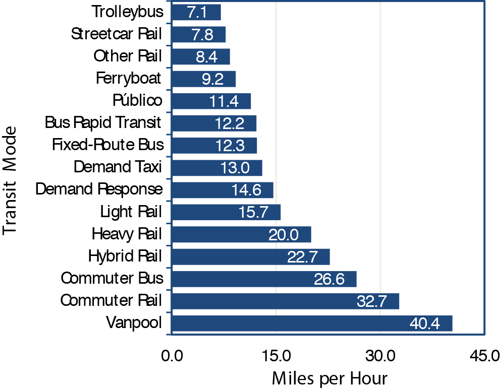
1The "other rail" transit mode includes Alaska railroad, monorail/automated guideway, cable car, and inclined plane.
Source: National Transit Database.
The number and distance between stops and the time required for boarding and alighting of passengers strongly influence the average speed of a transit mode. Fixed-route bus service, which typically makes frequent stops, has a relatively low average speed. In contrast, commuter rail has sustained high speeds between infrequent stops, and thus a relatively high average speed. Vanpools also travel at high speeds, usually with only a few stops at each end of the route. Modes using exclusive guideway can offer more rapid travel time than similar modes that do not. Heavy rail, which travels exclusively on dedicated guideway, has a higher average speed than streetcar, which often shares its guideway with mixed traffic. These average speeds have not changed significantly over the past decade.
Vehicle Use
Vehicle Occupancy
Exhibit 5-20 shows vehicle occupancy by mode for selected years from 2002 to 2012. Vehicle occupancy is calculated by dividing passenger miles traveled (PMT) by vehicle revenue miles (VRMs), resulting in the average passenger load in a transit vehicle. Vehicle occupancy has changed little between 2002 and 2012, indicating sustained ridership levels across all types of transit. In 2010—2012, average passenger load for all major transit modes increased, especially heavy rail (8.7 percent ) and light rail (6.3 percent ), which indicates increased demand in large urbanized areas.
Exhibit 5-20 Unadjusted Vehicle Occupancy: Passenger Miles per Vehicle Revenue Mile, 2002—2012 |
||||||
|---|---|---|---|---|---|---|
| Mode | 2002 | 2004 | 2006 | 2008 | 2010 | 2012 |
| Rail | ||||||
| Heavy Rail | 22.6 | 23.0 | 23.2 | 25.7 | 25.3 | 27.5 |
| Commuter Rail | 36.7 | 36.1 | 36.1 | 35.7 | 34.2 | 35.0 |
| Light Rail1 | 23.9 | 23.7 | 25.5 | 24.1 | 23.7 | 25.2 |
| Other Rail2 | 8.4 | 10.4 | 8.4 | 9.3 | 10.7 | 8.1 |
| Nonrail | ||||||
| Fixed-Route Bus3 | 10.5 | 10.0 | 10.8 | 10.8 | 10.7 | 11.2 |
| Demand Response/ Demand Taxi | 1.2 | 1.3 | 1.3 | 1.2 | 1.2 | 1.2 |
| Ferryboat | 112.1 | 119.5 | 130.7 | 118.1 | 119.3 | 125.2 |
| Trolleybus | 14.1 | 13.3 | 13.9 | 14.3 | 13.6 | 14.3 |
| Vanpool | 6.4 | 5.9 | 6.3 | 6.3 | 6.0 | 6.1 |
| Other Nonrail4 | 7.9 | 5.8 | 7.8 | 8.2 | 7.4 | 10.6 |
1 Includes light rail, streetcar rail, and hybrid rail. 2 Includes Alaska railroad, monorail/automated guideway, cable car, and inclined plane. 3 Includes bus, commuter bus, and bus rapid transit. 4 Includes Público. Source: National Transit Database. | ||||||
An important metric of vehicle occupancy is weighted average seating capacity utilization. This average is calculated by dividing passenger load by the average number of seats in the vehicle (or passenger car for rail modes). The weighting factor is the number of active vehicles in the fleet. The weighted average seating capacity for some modes are vanpool, 10; heavy rail, 53; light rail, 65; trolleybus, 48; ferryboat, 473; commuter rail, 113; fixed-route bus, 39; and demand response, 11.
As shown in Exhibit 5-21, the average seating capacity utilization ranges from 11.2 percent for demand response to 59.9 percent for vanpools. At first glance, the data seem to indicate excess seating capacity for all modes. Several factors, however, explain these apparent low utilization rates. For example, the low utilization rate for fixed-route bus, which operates in large and small urbanized areas, can be explained partially by low average passenger loads in urbanized areas with low ridership. For heavy rail and light rail, factors could include (1) high passenger demand in one direction, and small or very small demand in the opposite direction during peak periods; and (2) sharp drops in loads beyond segments of high demand, with limited room for short turns, and other factors.
Exhibit 5-21 Average Seat Occupancy Calculations for Passenger-Carrying Transit Modes, 20121,2
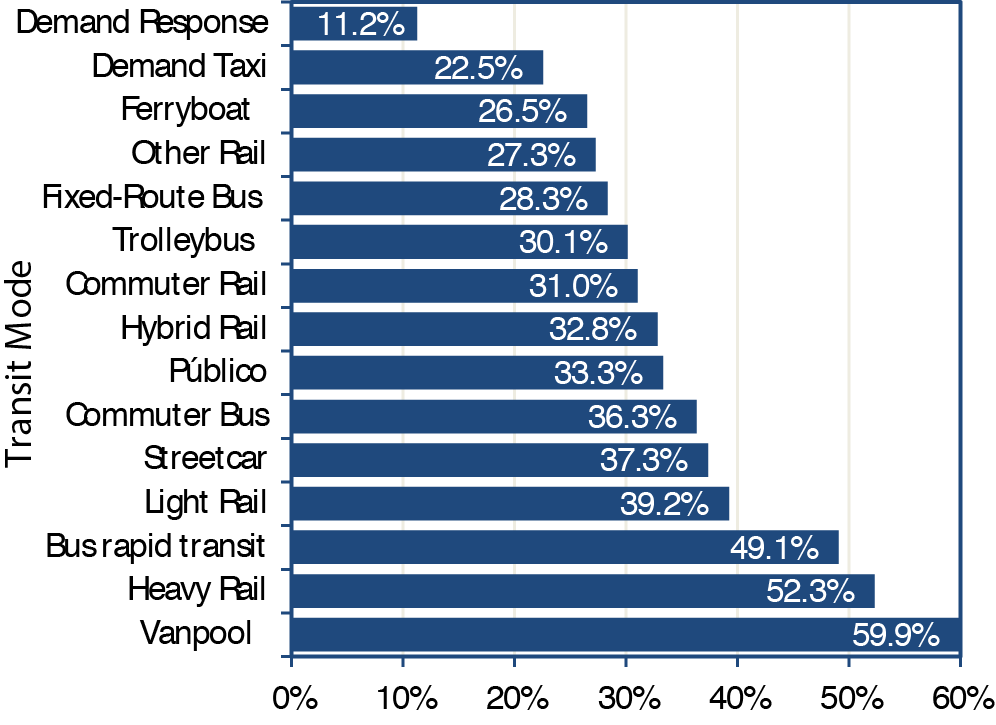
1The "other rail" transit mode includes Alaska railroad, monorail/automated guideway, cable car, and inclined plane.
2Some modes also have substantial standing capacity that is not considered here, but which can allow the measure of the percentage of seats occupied to exceed 100 percent for a full vehicle.
Source: National Transit Database; does not include agencies who qualified and opted to use the small systems waiver of the National Transit Database.
Vehicles also tend to be relatively empty at the beginning and ends of their routes. For many commuter routes, a vehicle that is crush-loaded (i.e., filled to maximum capacity) on part of the trip ultimately might achieve only an average occupancy of around 35 percent (as shown by analysis of the Washington Metropolitan Area Transit Authority peak-period data). Revenue miles per active vehicle (service use), defined as average distance traveled per vehicle in service, can be measured by the ratio of VRMs per active vehicles in the fleet. Exhibit 5-22 provides vehicle service use by mode for selected years from 2002 to 2012. Heavy rail, generally offering long hours of frequent service, had the highest vehicle use during this period. Vehicle service use for vanpool and demand response shows an increasing trend. Vehicle service use for other nonrail modes appears to be relatively stable over the past few years with no apparent trends in either direction.
Frequency and Reliability of Service
The frequency of transit service varies considerably according to location and time of day. Transit service is more frequent in urban areas and during rush hours-namely, where and when the demand for transit is highest. Studies have found that transit passengers consider the time spent waiting for a transit vehicle to be less well spent than the time spent traveling in a transit vehicle. The higher the degree of uncertainty in waiting times, the less attractive transit becomes as a means of transportation-and it will attract fewer users. To minimize this problem, many transit systems have implemented in recent years technologies to track vehicle location (automatic vehicle location systems) that, combined with accessed operating speeds, enable agencies to estimate the amount of time required for arrival of vehicles at stations and stops. This information is displayed in platforms and bus stops in real time. By knowing the waiting time, passengers are less frustrated and might be more willing to use transit.
Transit System Resiliency
Transit systems practice resiliency by operating through all but the worst weather on a daily basis. Most are instrumental in community emergency-response plans. Dispatchers and vehicle operators receive special training for these circumstances. All bus systems maintain a small fleet of spare buses that enables them to schedule maintenance activities while maintaining regular service levels. These "spare buses" also can be used to replace damaged vehicles on short notice. Rail systems have contingency plans for loss of key assets and most can muster local resources to operate bus bridges in emergencies. Operationally speaking, transit providers are some of the most resilient community institutions. Much transit infrastructure, however, has not yet been upgraded to address changing climactic patterns. FTA does not collect systematic data on these upgrades, but significant grant money has been made available for transit systems to upgrade their structures and guideways to be more resistant to extreme precipitation events, sea level rise, storm surge, heat waves, and other environmental stressors. This is particularly evident in the aftermath of Superstorm Sandy. Addressing such issues is a common use of FTA grant funds.
Exhibit 5-23 Distribution of Passengers by Wait Time
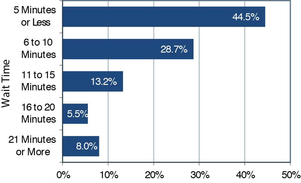
Source: National Household Travel Survey, FHWA, 2009.
Exhibit 5-23 shows findings on wait times from the 2009 FHWA National Household Travel Survey, the most recent nationwide survey of this information. The survey found that 44.5 percent of passengers who ride transit wait 5 minutes or less and 73.2 percent wait 10 minutes or less. The survey also found that 8.0 percent of passengers wait 21 minutes or more. Several factors influence passenger wait times, including the frequency and reliability of service and passengers' awareness of timetables. These factors are also interrelated. For example, passengers might intentionally arrive earlier for service that is infrequent, compared with equally reliable services that are more frequent. Overall, waiting times of 5 minutes or less are clearly associated with good service that is either frequent, reliably provided according to a schedule, or both. Wait times of 5 to 10 minutes are most likely consistent with adequate levels of service that are both reasonably frequent and generally reliable. Wait times of 21 minutes or more indicate that service is likely less frequent or less reliable.
Access to transit service varies by location. Exhibit 5-24 shows the share of working-age residents that have access to transit in 100 selected metropolitan areas. The study evaluated census block groups and counted block groups with at least one transit stop within three-fourths of a mile of their population-weighted centroid as having access. Cities in the western United States tend to enjoy higher rates of coverage, while those in the Southeast tend to have a lower percentage of residents with access to transit.
Exhibit 5-24 Share of Working-Age Residents with Access to Transit, 100 Metropolitan Areas
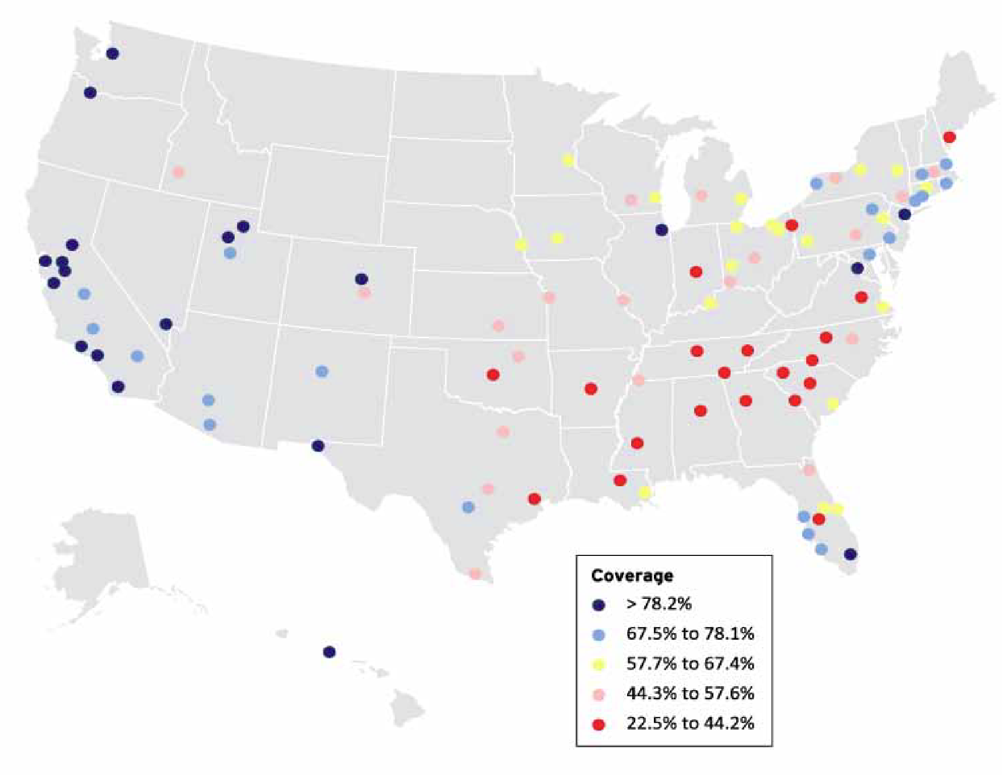
Source: Brookings Institution, Missed Opportunity: Transit and Jobs in Metropolitan America, May 2011 report citing Brookings Institution analysis of transit agency data and Nielson Pop-Facts 2010 data.
Of note is that accessibility to transit depends to some extent on geographical constraints such as mountains, deserts, and other natural obstacles. These constraints affect western cities more than they do eastern cities, yet western cities enjoy higher rates of accessibility.
Mean distance between failures is shown in Exhibit 5-25. The mean distance between failures is calculated by the ratio of VRMs per mechanical (major) and other (minor) failures. FTA does not collect data on delays due to guideway conditions, which would include congestion for roads and slow zones (due to system or rail problems) for track. Miles between failures for all modes combined decreased between 2004 and 2006 by 13 percent . Between 2006 and 2012, the ratio increased steadily to reach a level similar to 2004. The trend for fixed-route bus is nearly identical to all modes combined.
Exhibit 5-25 Mean Distance between Failures, Directly Operated Service, 2004—20121
1Includes both major and minor failures. Does not include agencies who qualified and opted to use the small systems waiver of the National Transit Database. Years 2002 and 2003 not included due to questionable data.
Source: National Transit Database.
System Coverage: Urban Directional Route Miles
The extent of the Nation's transit system is measured in directional route miles, or simply "route miles." Route miles measure the distance covered by a transit route. Even though transit routes might use the same road or track, but in the opposite direction, they are counted separately. Data associated with route miles are not collected for demand-response and vanpool modes because these transit modes do not travel along specific predetermined routes. Route mile data are also not collected for jitney services because these transit modes often have highly variable route structures.
Exhibit 5-26 shows directional route miles by mode over the past 10 years. Growth in both rail (27.3 percent ) and nonrail (6.2 percent ) route miles is evident over this period. The average 6.0percent rate of annual growth for light rail clearly outpaces the rate of growth for all other modes due to the large increase in new systems in the past 10 years.
System Capacity
Exhibit 5-27 provides reported VRMs for both rail and nonrail modes. These numbers are interesting because they show the actual number of miles each mode travels in revenue service. VRMs that fixed-route bus services and rail services provide both show consistent growth, with light-rail and vanpool miles growing somewhat faster than the other modes. Overall, the number of VRMs has increased by 15.6 percent since 2002, with an average annual rate of change of 1.4 percent.
Exhibit 5-26 Transit Urban Directional Route Miles, 2002—20121 |
||||||||
|---|---|---|---|---|---|---|---|---|
| Average Annual Rate of Change | ||||||||
| Transit Mode | 2002 | 2004 | 2006 | 2008 | 2010 | 2012 | 2012/2002 | |
| Rail | 9,484 | 9,782 | 10,865 | 11,270 | 11,735 | 12,072 | +2.4% | |
| Commuter Rail2 | 6,923 | 6,968 | 7,930 | 8,219 | 8,590 | 8,682 | +2.3% | |
| Heavy Rail | 1,572 | 1,597 | 1,623 | 1,623 | 1,617 | 1,622 | +0.3% | |
| Light Rail3 | 960 | 1,187 | 1,280 | 1,397 | 1,497 | 1,724 | +6.0% | |
| Other Rail4 | 30 | 30 | 31 | 30 | 30 | 44 | +4.1% | |
| Nonrail5 | 225,820 | 216,619 | 223,489 | 212,801 | 237,580 | 239,957 | +0.6% | |
| Fixed-Route Bus6 | 224,838 | 215,571 | 222,445 | 211,664 | 236,434 | 238,806 | +0.6% | |
| Ferryboat | 513 | 623 | 620 | 682 | 690 | 695 | +3.1% | |
| Trolleybus | 468 | 425 | 424 | 456 | 456 | 456 | -0.3% | |
| Total | 235,304 | 226,401 | 234,354 | 224,071 | 249,314 | 252,029 | +1.5% | |
| percent Nonrail | 96.0% | 95.7% | 95.4% | 95.0% | 95.3% | 95.2% | ||
1 2012 data does not include agencies who qualified and opted to use the small systems waiver of the National Transit Database. 2 Includes Alaska railroad. 3 Includes light rail, streetcar rail, and hybrid rail. 4 Includes monorail/automated guideway, inclined plane, and cable car. 5 Excludes jitney, Público, and vanpool6 Includes bus, bus rapid transit, and commuter bus. Source: National Transit Database. | ||||||||
Exhibit 5-27 Rail and Nonrail Vehicle Revenue Miles, 2002—2012 |
|||||||
|---|---|---|---|---|---|---|---|
| Miles (Millions) | Average Annual Rate of Change | ||||||
| Transit Mode | 2002 | 2004 | 2006 | 2008 | 2010 | 2012 | 2012/2002 |
| Rail | 925 | 963 | 997 | 1,054 | 1,056 | 1,061 | 1.4% |
| Heavy Rail | 603 | 625 | 634 | 655 | 647 | 638 | 0.6% |
| Commuter Rail | 259 | 269 | 287 | 309 | 315 | 318 | 2.1% |
| Light Rail1 | 60 | 67 | 73 | 86 | 92 | 99 | 5.1% |
| Other Rail2 | 3 | 2 | 3 | 3 | 2 | 6 | 7.4% |
| Nonrail | 2,502 | 2,586 | 2,674 | 2,841 | 2,863 | 2,900 | 1.5% |
| Fixed-Route Bus3 | 1,864 | 1,885 | 1,910 | 1,956 | 1,917 | 1,892 | 0.1% |
| Demand Response/Demand Taxi | 525 | 561 | 607 | 688 | 718 | 759 | 3.8% |
| Vanpool | 71 | 78 | 110 | 157 | 181 | 207 | 11.3% |
| Ferryboat | 3 | 3 | 3 | 3 | 3 | 3 | 0.6% |
| Trolleybus | 13 | 13 | 12 | 11 | 12 | 11 | -1.4% |
| Other Nonrail4 | 26 | 46 | 32 | 25 | 32 | 27 | 0.5% |
| Total | 3,427 | 3,549 | 3,671 | 3,895 | 3,920 | 3,960 | 1.4% |
1 Includes light rail, streetcar rail, and hybrid rail. 2 Includes Alaska railroad, monorail/automated guideway, cable car, and inclined plane. 3 Includes bus, commuter bus, and bus rapid transit. 4 Includes Público. Source: National Transit Database. | |||||||
Transit system capacity, particularly in cross-modal comparisons, is typically measured by capacity-equivalent VRMs. This parameter measures the distances transit vehicles travel in revenue service and adjusts them by the passenger-carrying capacity of each transit vehicle type, with the average carrying capacity of fixed-route bus vehicles representing the baseline. To calculate capacity-equivalent VRMs, the number of revenue miles for a vehicle is multiplied by the bus-equivalent capacity of that vehicle. Thus, a heavy rail car that seats 2.5 times more people than a full-size bus provides 2.5 capacity-equivalent miles for each revenue mile it travels.
Exhibit 5-28 shows the 2012 capacity-equivalent factors for each mode. Unadjusted VRMs for each mode are multiplied by a capacity-equivalent factor to calculate capacity-equivalent VRMs. These factors are equal to the average full-seating and full-standing capacities of vehicles in active service for each transit mode divided by the average full-seating and full-standing capacities of all motor bus vehicles in active service. The average capacity of the national motor bus fleet changes slightly from year to year as the proportion of large, articulated, and small buses varies. The average capacity of the bus fleet in 2012 was 39 seated and 23 standing, or 62 riders.
Exhibit 5-28 Capacity-Equivalent Factors by Mode1
1Data do not include agencies who qualified and opted to use the small systems waiver of the National Transit Database.
Source: National Transit Database.
Exhibit 5-29 shows total capacity-equivalent VRMs. Vanpools show the most rapid expansion in capacity-equivalent VRMs from 2002 to 2012, followed by light rail, demand response, and commuter rail. Annual VRMs for monorail/automated guideway more than doubled, resulting in an increase in capacity-equivalent VRMs for the other rail category. Total capacity-equivalent revenue miles increased from 4,311 million in 2002 to 5,003 million in 2012, an increase of 16 percent.
Exhibit 5-29 Capacity-Equivalent Vehicle Revenue Miles, 2002—20121 |
||||||||
|---|---|---|---|---|---|---|---|---|
| Average Annual Rate of Change | ||||||||
| Transit Mode | 2002 | 2004 | 2006 | 2008 | 2010 | 2012 | 2012/2002 | |
| Rail | 2,274 | 2,413 | 2,681 | 2,799 | 2,714 | 2,728 | 1.8% | |
| Heavy Rail | 1,469 | 1,546 | 1,648 | 1,621 | 1,599 | 1,580 | 0.7% | |
| Commuter Rail | 652 | 685 | 832 | 940 | 860 | 888 | 3.1% | |
| Light Rail2 | 150 | 179 | 197 | 235 | 252 | 252 | 5.3% | |
| Other Rail3 | 3 | 3 | 4 | 3 | 3 | 8 | 9.4% | |
| Nonrail | 2,037 | 2,064 | 2,118 | 2,152 | 2,131 | 2,275 | 1.1% | |
| Fixed-Route Bus4 | 1,864 | 1,885 | 1,910 | 1,956 | 1,917 | 2,052 | 1.0% | |
| Demand Response/ Demand Taxi | 100 | 101 | 121 | 115 | 124 | 132 | 2.8% | |
| Vanpool | 15 | 15 | 22 | 27 | 30 | 34 | 8.7% | |
| Ferryboat | 32 | 32 | 37 | 32 | 35 | 34 | 0.5% | |
| Trolleybus | 20 | 20 | 19 | 16 | 17 | 16 | -1.7% | |
| Other Nonrail5 | 7 | 12 | 10 | 6 | 8 | 7 | 0.3% | |
| Total | 4,311 | 4,478 | 4,800 | 4,951 | 4,845 | 5,003 | 1.5% | |
1 2012 data does not include agencies who qualified and opted to use the small systems waiver of the National Transit Database. 2 Includes light rail, streetcar rail, and hybrid rail. 3 Includes Alaska railroad, monorail/automated guideway, cable car, and inclined plane. 4 Includes bus, commuter bus, and bus rapid transit. 5 Includes Público. Source: National Transit Database. | ||||||||
Ridership
The two primary measures of transit ridership are unlinked passenger trips and passenger miles traveled (PMT). An unlinked passenger trip, sometimes called a boarding, is defined as a journey on one transit vehicle. PMT is calculated based on unlinked passenger trips and estimates of average trip length. Either measure provides an appropriate time series because average trip lengths, by mode, have not changed substantially over time. Comparisons across modes, however, might differ substantially, depending on which measure is used due to large differences in the average trip length for the various modes.
Exhibits 5-30 and 5-31 show the distribution of unlinked passenger trips and PMT by mode. In 2012, urban transit systems provided 10.4 billion unlinked trips and 55.2 billion PMT across all modes. Heavy rail and fixed-route bus modes continue to be the largest segments of both measures. Commuter rail supports relatively more PMT due to its greater average trip length (23.7 miles compared to 4.0 for fixed-route bus, 4.7 for heavy rail, and 5.0 for light rail).
Exhibit 5-30 Unlinked Passenger Trips (Total in Millions and percent of Total) by Mode, 20121
1"Other" includes Alaska railroad, cable car, ferryboat, inclined plane, monorail/automated guideway, and Público; "demand response" includes demand response and demand response taxi.
Source: National Transit Database.
Exhibit 5-31 Passenger Miles Traveled (Total in Billions and percent of Total) by Mode, 20121,2
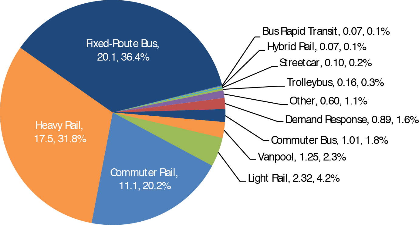
12012 data does not include agencies who qualified and opted to use the small systems waiver of the National Transit Database.
2"Other" includes Alaska railroad, cable car, ferryboat, inclined plane, monorail/automated guideway, and Público; "demand response" includes demand response and demand response taxi.
Source: National Transit Database.
Exhibit 5-32 provides total PMT for selected years between 2002 and 2012, showing steady growth in all major modes. Demand response, light-rail, and vanpool modes grew at the highest rates. Growth in demand response (up 3.1 percent per year) might be a response to demand from the growing number of elderly citizens. Light rail (up 5.7 percent per year) enjoyed increased capacity during this period due to expansions and addition of new systems. The rapidly increasing popularity of vanpools (up 10.7 percent per year), particularly the surge between 2006 and 2008 (up 20 percent per year), can be partially attributed to rising gas prices-regular gasoline sold for more than $4 per gallon in July of 2008. FTA has also encouraged vanpool reporting during this period, successfully enrolling numerous new vanpool systems to report to NTD.
Exhibit 5-32 Transit Urban Passenger Miles, 2002—20121 |
|||||||
|---|---|---|---|---|---|---|---|
| Average Annual Rate of Change | |||||||
| Transit Mode | 2002 | 2004 | 2006 | 2008 | 2010 | 2012 | 2012/2002 |
| Rail | 24,617 | 25,667 | 26,972 | 29,989 | 29,380 | 31,176 | 2.4% |
| Heavy Rail | 13,663 | 14,354 | 14,721 | 16,850 | 16,407 | 17,516 | 2.5% |
| Commuter Rail | 9,500 | 9,715 | 10,359 | 11,032 | 10,774 | 11,121 | 1.6% |
| Light Rail2 | 1,432 | 1,576 | 1,866 | 2,081 | 2,173 | 2,489 | 5.7% |
| Other Rail3 | 22 | 22 | 25 | 26 | 26 | 50 | 8.6% |
| Nonrail | 21,328 | 20,879 | 22,533 | 23,723 | 23,247 | 23,993 | 1.2% |
| Fixed-Route Bus4 | 19,527 | 18,921 | 20,390 | 21,198 | 20,570 | 21,142 | 0.8% |
| Demand Response5 | 651 | 704 | 753 | 844 | 874 | 887 | 3.1% |
| Vanpool | 455 | 459 | 689 | 992 | 1,087 | 1,255 | 10.7% |
| Ferryboat | 301 | 357 | 360 | 390 | 389 | 402 | 2.9% |
| Trolleybus | 188 | 173 | 164 | 161 | 159 | 162 | -1.5% |
| Other Nonrail6 | 206 | 265 | 176 | 138 | 169 | 145 | -3.4% |
| Total | 45,945 | 46,546 | 49,504 | 53,712 | 52,627 | 55,169 | 1.7% |
| percent Rail | 53.6% | 55.1% | 54.5% | 55.8% | 55.8% | 56.5% | |
1 2012 data does not include agencies who qualified and opted to use the small systems waiver of the National Transit Database. 2 Includes light rail, streetcar rail, and hybrid rail. 3 Includes Alaska railroad, monorail/automated guideway, cable car, and inclined plane. 4 Includes bus, commuter bus, and bus rapid transit. 5 Includes demand response and demand response taxi. 6 Público. Source: National Transit Database. | |||||||
Exhibit 5-33 depicts average passenger trip length (defined as passenger miles traveled per unlinked passenger trips) versus revenue speed, defined as train miles per train hours for rail, and vehicle revenue miles per vehicle revenue hours for nonrail modes. Note that average passenger trip length is the average distance traveled of one unlinked trip. Most riders use more than one mode to commute from origin to destination (linked trip), which might include other transit modes, car, or other modes such as bicycle, walking, etc. Therefore, the average trip length of an individual mode as depicted in Exhibit 5-33 is the lower bound of the total average distance traveled. The total trip distance is a function of a linked trip factor that varies from mode to mode and is not available in NTD.
Demand-response and vanpool systems are modes with linked factors close to 1, that is, the average trip length of one unlinked trip should be close to the total length of the linked trip. This is because vanpools and demand response are "by-demand" modes, and the routes can be set up to optimize the proximity from the origin and destination.
Exhibit 5-33 Transit Urban Average Unlinked Passenger Trip Length vs. Average Revenue Speed for Selected Modes
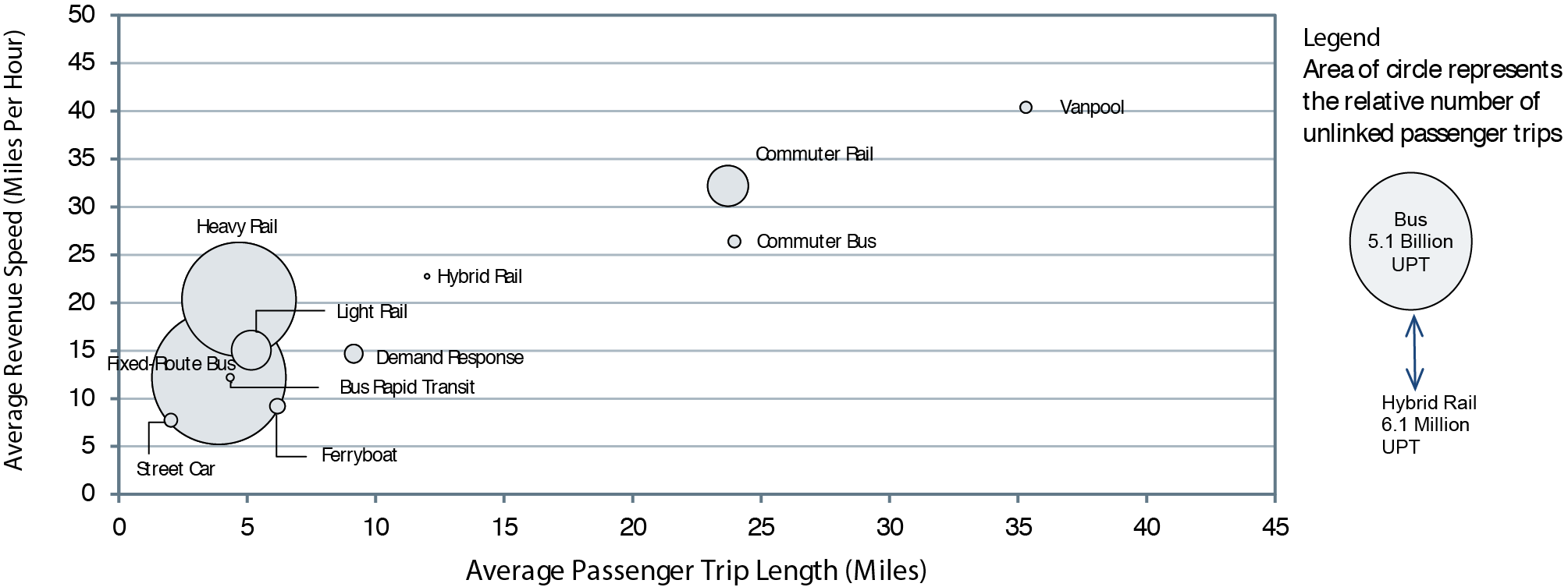
Source: National Transit Database.
Commuter bus and commuter rail, on the other hand, are fixed-route modes, and a high percentage of commuters require other modes to reach their final destinations. Additionally, commuter bus and commuter rail are not as fast as vanpools due to more frequent stops near areas of attraction and generation of trips, among other factors.
Operating Characteristics of Hybrid Rail
Hybrid rail, introduced in 2011, was reported prior to 2011 as commuter rail and light rail. Hybrid rail has quite different operating characteristics than commuter rail and light rail. It has higher average station density (stations per track mileage) than commuter rail and a lower average station density than light rail. This results in revenue speeds that are lower than commuter rail and higher than light rail. Hybrid rail has smaller average peak-to-base ratio (number of trains during peak service per number of trains during midday service) than commuter rail, which indicates higher demand at off-peak hours.
Several modes (heavy rail, light rail, fixed-route bus, bus rapid transit, streetcar, and ferryboat) cluster within a narrow range for average passenger trip length (less than 5 miles) and a wider range for average revenue speed (10 to 20 miles per hour). Heavy rail and light rail have higher average speed than nonrail modes for operating in exclusive right-of-ways. The modes in this cluster serve areas with high population density and significant average number of boarding and alighting per station or stop, which results in shorter average trip lengths than modes with a commuter orientation. These modes should have similar link factors but smaller than commuter rail and commuter bus.
Exhibit 5-34 shows the complex relationship among an index of rolling 12-month transit ridership, gasoline prices, and employment rates.
On the most basic level, the effectiveness of transit operations can be gauged by the demand for transit services. People choose to use transit if they perceive that it meets their needs as well as, or better than, the alternatives. These choices occur in an economic context in which the need for transportation and the cost of that transportation are constantly changing due to factors that have very little to do with the characteristics of transit.
Exhibit 5-34 Transit Ridership vs. Employment, 2006—2012
Source: National Transit Database, U.S. Energy Information Administration's Gas Pump Data History, and Bureau of Labor Statistics' Employment Data.
The relationship between employment and transit is well established. According to the May 2007 American Public Transportation Association report, A Profile of Public Transportation Passenger Demographics and Travel Characteristics Reported in On-Board Surveys : "Commuting to work is the most common reason a person rides public transportation, accounting for 59.2 percent of all transit trips reported in on-board surveys." The corollary of this statement is that transit ridership should decrease during periods of high unemployment. In fact, until 2008, the correlation between transit ridership and employment levels was so strong that FTA corrected ridership to account for employment levels. From early 2007 through summer of 2008, however, transit ridership increased in the absence of employment growth. This anomaly could be due to dramatic increases in the price of gas during this period; gas prices increased in average from around $2.35 per gallon to more than $4.00 per gallon. Since the start of 2009, gas prices have eased and then grown again gradually, but without influencing transit ridership in the same way (perhaps due to a concurrent decline in employment). Since 2010, ridership has once again been tracking employment levels but has retained some of its 2007—2008 gains. In December of 2012, transit ridership was up 7 percent over its July 2006 level while employment was still down 1 percent from its July 2006 level.