


| AP | Availability Payment |
| BCA | Benefit Cost Analysis |
| BS | Balance Sheet |
| CF | Cash Flow |
| CFADS | Cash Flows Available to Debt Service |
| DSCR | Debt Service Coverage Ratio |
| DSRA | Debt Service Reserve Account |
| GPL | General Purpose Lanes |
| IRI | International Roughness Index |
| IRR | Internal Rate of Return |
| ML/TL | Managed Lanes or Tolled Lanes |
| MMRA | Major Maintenance Reserve Account |
| O&M | Operations and Maintenance |
| PDBCA | Project Delivery Benefit-Cost Analysis |
| P&L | Profit & Loss |
| PSC | Public Sector Comparator or Conventional Delivery |
| P3 | Public-Private Partnership |
| V/C | Volume/Capacity Ratio |
| VDF | Volume Delay Function |
| WACC | Weighted Average Cost of Capital |
Based on the inputs provided, P3-VALUE 2.2 performs the calculations detailed in the previous chapter. This chapter presents the various outputs for the risk assessment, financial viability assessment, VfM analysis and PDBCA. These outputs help the user understand what financial and economic differences to expect from a public-private partnership compared to Conventional Delivery.
Based on the risk inputs and calculation, the model provides separate risk outputs for VfM and PDBCA. Table 3 below shows sample outputs for VfM.
Table 3: Sample Risk Assessment Outputs for VfM
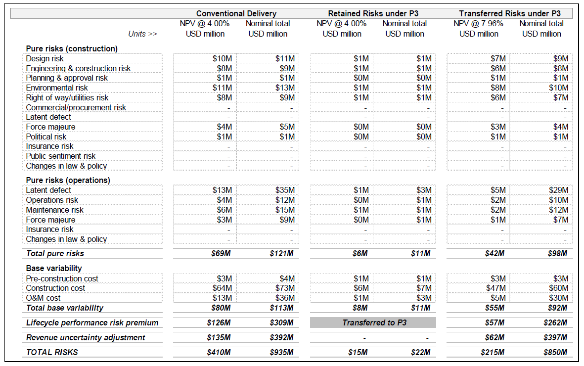
| Conventional Delivery | Retained Risks under P3 | Transferred Risks under P3 | ||||
|---|---|---|---|---|---|---|
| Units >> | NPV @ 4.00% USD million | Nominal total USD million | NPV @ 4.00% USD million | Nominal total USD million | NPV @ 7.96% USD million | Nominal total USD million |
| Pure risks (construction) | ||||||
| Design risk | $10M | $11M | $1M | $1M | $7M | $9M |
| Engineering & construction risk | $8M | $9M | $1M | $1M | $6M | $8M |
| Planning & approval risk | $1M | $1M | $0M | $0M | $1M | $1M |
| Environmental risk | $11M | $13M | $1M | $1M | $8M | $10M |
| Right of way/utilities risk | $8M | $9M | $1M | $1M | $6M | $7M |
| Commercial/procurement risk | - | - | - | - | - | - |
| Latent defect | - | - | - | - | - | - |
| Force majeure | $4M | $5M | $0M | $0M | $3M | $4M |
| Political risk | $1M | $1M | $0M | $0M | $1M | $1M |
| Insurance risk | - | - | - | - | - | - |
| Public sentiment risk | - | - | - | - | - | - |
| Changes in law & policy | - | - | - | - | - | - |
| Pure risks (operations) | ||||||
| Latent defect | $13M | $35M | $1M | $3M | $5M | $29M |
| Operations risk | $4M | $12M | $0M | $1M | $2M | $10M |
| Maintenance risk | $6M | $15M | $1M | $1M | $2M | $12M |
| Force majeure | $3M | $9M | $0M | $1M | $1M | $7M |
| Insurance risk | - | - | - | - | - | - |
| Changes in law & policy | - | - | - | - | - | - |
| Total pure risks | $69M | $121M | $6M | $11M | $42M | $98M |
| Base variability | ||||||
| Pre-construction cost | $3M | $4M | $1M | $1M | $3M | $3M |
| Construction cost | $64M | $73M | $6M | $7M | $47M | $60M |
| O&M cost | $13M | $36M | $1M | $3M | $5M | $30M |
| Total base variability | $80M | $113M | $8M | $11M | $55M | $92M |
| Lifecycle performance risk premium | $126M | $309M | Transferred to P3 | $57M | $262M | |
| Revenue uncertainty adjustment | $135M | $392M | - | - | $62M | $397M |
| TOTAL RISKS | $410M | $935M | $15M | $22M | $215M | $850M |
Table 4 shows sample risk assessment outputs for PDBCA.
Table 4: Sample Risk Assessment Outputs for PDBCA
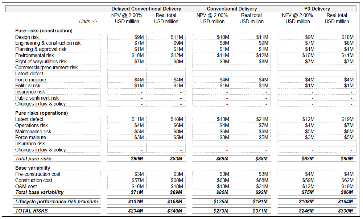
| Delayed Conventional Delivery | Conventional Delivery | P3 Delivery | ||||
|---|---|---|---|---|---|---|
| Units >> | NPV @ 2.00% USD million | Real total USD million | NPV @ 2.00% USD million | Real total USD million | NPV @ 2.00% USD million | Real total USD million |
| Pure risks (construction) | ||||||
| Design risk | $9M | $11M | $10M | $11M | $9M | $10M |
| Engineering & construction risk | $7M | $9M | $8M | $9M | $7M | $8M |
| Planning & approval risk | $1M | $1M | $1M | $1M | $1M | $1M |
| Environmental risk | $10M | $12M | $11M | $12M | $10M | $11M |
| Right of way/utilities risk | $7M | $8M | $8M | $8M | $7M | $7M |
| Commercial/procurement risk | - | - | - | - | - | - |
| Latent defect | - | - | - | - | - | - |
| Force majeure | $4M | $4M | $4M | $4M | $4M | $4M |
| Political risk | $1M | $1M | $1M | $1M | $1M | $1M |
| Insurance risk | - | - | - | - | - | - |
| Public sentiment risk | - | - | - | - | - | - |
| Changes in law & policy | - | - | - | - | - | - |
| Pure risks (operations) | ||||||
| Latent defect | $11M | $18M | $13M | $21M | $12M | $19M |
| Operations risk | $4M | $6M | $4M | $7M | $4M | $7M |
| Maintenance risk | $5M | $8M | $6M | $9M | $5M | $8M |
| Force majeure | $3M | $5M | $3M | $5M | $3M | $5M |
| Insurance risk | - | - | - | - | - | - |
| Changes in law & policy | - | - | - | - | - | - |
| Total pure risks | $60M | $83M | $69M | $88M | $63M | $80M |
| Base variability | ||||||
| Pre-construction cost | $3M | $3M | $3M | $3M | $4M | $4M |
| Construction cost | $57M | $68M | $63M | $68M | $59M | $62M |
| O&M cost | $10M | $18M | $13M | $21M | $12M | $19M |
| Total base variability | $71M | $89M | $80M | $92M | $75M | $86M |
| Lifecycle performance risk premium | $102M | $168M | $125M | $191M | $108M | $164M |
| TOTAL RISKS | $234M | $340M | $273M | $371M | $246M | $330M |
Based on the financial inputs and calculation, the model provides the following financial outputs for both the Conventional Delivery and P3:
Furthermore, the model provides a number of additional outputs for the private financing structure. Please note that the financial viability assessment outputs can be found under the VfM outputs in the model.
Figure 13 shows a sample debt service profile for either Conventional Delivery or P3.
Figure 13: Sample Conventional Delivery or P3 Debt Service Profile
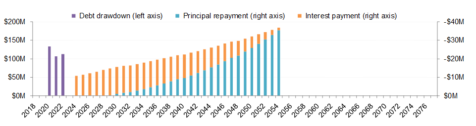
Text description of Figure 13.
Sample Conventional Delivery or P3 debt service profile
This chart shows increasing Principal Repayment over time, while Interest Payments are reduced drastically in that same timeframe.
Table 5 below shows sample key financial outputs under Conventional Delivery.
Table 5: Sample Conventional Delivery Key Financial Outputs
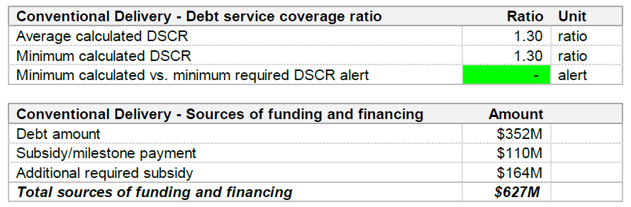
| Conventional Delivery - Debt service coverage ratio | Ratio | Unit |
|---|---|---|
| Average calculated DSCR | 1.30 | ratio |
| Minimum calculated DSCR | 1.30 | ratio |
| Minimum calculated vs. minimum required DSCR alert | - | alert |
| Conventional Delivery - Sources of funding and financing | Amount | |
| Debt amount | $352M | |
| Subsidy/milestone payment | $110M | |
| Additional required subsidy | $164M | |
| Total sources of funding and financing | $627M | |
Table 6 below shows sample key financial outputs under P3:
Table 6: Sample P3 Key Financial Outputs
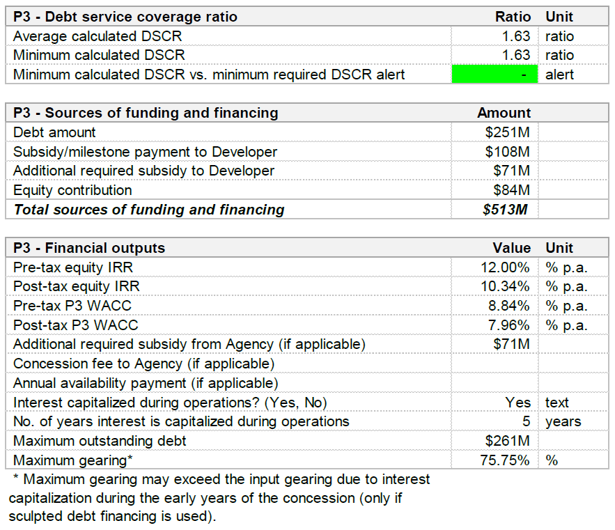
| P3 - Debt service coverage ratio | Ratio | Unit |
|---|---|---|
| Average calculated DSCR | 1.63 | ratio |
| Minimum calculated DSCR | 1.63 | ratio |
| Minimum calculated DSCR vs. minimum required DSCR alert | - | alert |
| P3 - Sources of funding and financing | Amount | |
| Debt amount | $251M | |
| Subsidy/milestone payment to Developer | $108M | |
| Additional required subsidy to Developer | $71M | |
| Equity contribution | $84M | |
| Total sources of funding and financing | $513M | |
| P3 - Financial outputs | Value Unit | |
| Pre-tax equity IRR | 12.00% | % p.a. |
| Post-tax equity IRR | 10.34% | % p.a. |
| Pre-tax P3 WACC | 8.84% | % p.a. |
| Post-tax P3 WACC | 7.96% | % p.a. |
| Additional required subsidy from Agency (if applicable) | $71M | |
| Concession fee to Agency (if applicable) | ||
| Annual availability payment (if applicable) | ||
| Interest capitalized during operations? (Yes, No) | Yes | text |
| No. of years interest is capitalized during operations | 5 | years |
| Maximum outstanding debt | $261M | |
| Maximum gearing* | 75.75% | % |
| * Maximum gearing may exceed the input gearing due to interest capitalization during the early years of the concession (only if sculpted debt financing is used). | ||
This section presents the VfM outputs. Figure 14 shows the Model Navigator's high-level view pane with the different VfM output sheets listed.
Figure 14: Model Navigator's High-level View Pane with List of VfM Output Sheets
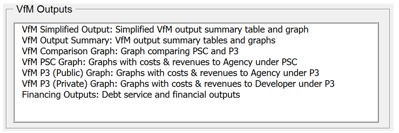
Text description of Figure 14.
VfM Outputs
This screenshot of the model navigator shows the VfM Output sheets, including: VfM simplified outputs, VfM output summary, VfM comparison graph, VfM PSC graph, VfM P3 public graph, VfM P3 private graph, and financing outputs.
As shown in Table 7, the VfM Simplified Output sheet provides the user with a high-level table comparing Conventional Delivery to P3. As shown in Figure 15 , the sheet also shows a visual representation of the VfM results.
Table 7: Sample Revenues and Costs Under PSC and P3
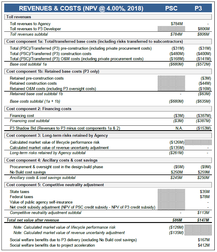
| REVENUES & COSTS (NPV @ 4.00%, 2018) | PSC | P3 |
|---|---|---|
| Toll revenues | ||
| Toll revenues to Agency | $784M | - |
| Toll revenues to P3 Developer | ////////// | $806M |
| Toll revenues subtotal | $784M | $806M |
| Cost component 1a: Total/transferred base costs (including risks transferred to subcontractors) | ||
| Total (PSC)/Transferred (P3) pre-construction (including private procurement costs) | ($31M) | ($31M) |
| Total (PSC)/Transferred (P3) construction costs | ($480M) | ($400M) |
| Total (PSC)/Transferred (P3) O&M costs (including private procurement costs) | ($168M) | ($141M) |
| Base cost subtotal 1a | ($680M) | ($572M) |
| Cost component 1b: Retained base costs (P3 only) | ||
| Retained O&M costs (including P3 oversight costs) | ////////// | ($3M) |
| Retained construction costs | ////////// | ($44M) |
| Retained O&M costs (including P3 oversight costs) | ////////// | ($16M) |
| Retained base cost subtotal 1b | - | ($63M) |
| Base costs subtotal (1a + 1b) | ($680M) | ($635M) |
| Cost component 2: Financing costs | ||
| Financing cost | ($3M) | ($387M) |
| Financing cost subtotal | ($3M) | ($387M) |
| P3 Shadow Bid (Revenues to P3 minus cost components 1a & 2) | N.A. | ($153M) |
| Cost component 3: Long-term risks retained by Agency | ||
| Calculated market value of lifecycle performance risk | ($126M) | ////////// |
| Calculated market value of revenue uncertainty adjustment | ($135M) | - |
| Long-term risks retained by Agency subtotal | ($261M) | - |
| Cost component 4: Ancillary costs & cost savings | ||
| Procurement & oversight cost in the design-build phase | ($5M) | ($9M) |
| No Build Cost Savings | $250M | $259M |
| Ancillary costs & cost savings subtotal | $245M | $250M |
| Cost component 5: Competitive neutrality adjustment | ||
| State taxes | ////////// | $35m |
| Federal taxes | ////////// | $78m |
| Value of public agency self-insurance | ////////// | - |
| Net credit subsidy adjustment (NPV of PSC credit subsidy - NPV of P3 credit subsidy) | ////////// | - |
| Competitive neutrality adjustment subtotal | - | $113M |
| Total net value after revenue | $86M | $147M |
| Note: Calculated market value of lifecycle performance risk | ($126M) | ////////// |
| Note: Calculated market value of revenue uncertainty adjustment | ($135M) | ////////// |
| Social welfare benefits due to P3 delivery (excluding No Build cost savings) | $167M | |
| Social welfare benefits due to project acceleration | $412M | |
Figure 15: Visual Representation of Sample VfM Results
Text description of Figure 15.
Visual Representation of Sample VfM Results
This screen capture shows the detailed visual representation of various cost components and revenues.
The VfM Output Summary sheet contains a summary of all relevant cash flows to either the Agency or the P3 concessionaire under Conventional Delivery and P3:
Sample outputs for a conventionally procured project are presented in the Figure 16 and Table 8 below.
Figure 16: Sample Cash Flows Under Conventional Delivery
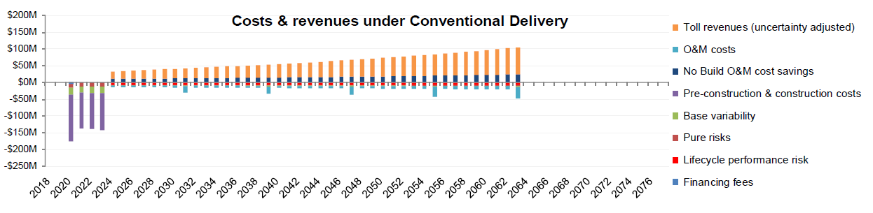
Text description of Figure 16.
Sample Cash Flows Under Conventional Delivery
This bar chart shows various items of cash flow over time, such as Toll Revenues, O&M costs, No Build O&M Cost Savings, Pre-construction & Construction costs, Base variability, Pure risks, Lifecycle performance risk, and Financing Feeds, with costs remaining relatively stable after initial startup, but Revenues increasing over time.
Table 8: Sample Costs & Revenues Under Conventional Delivery
| Costs & revenues under Conventional Delivery | NPV @ 4.00% | Nominal total |
|---|---|---|
| Toll revenues | $784M | $2,274M |
| Pre-construction & construction costs | ($406M) | ($464M) |
| O&M costs | ($129M) | ($363M) |
| No Build O&M cost savings | $250M | $680M |
| Base variability | ($80M) | ($113M) |
| Pure risks | ($69M) | ($121M) |
| Financing fees | ($3M) | ($4M) |
| Unadjusted net revenues / (costs) under Conventional Delivery | $346M | $1,890M |
| Calculated market value of revenue uncertainty adjustment | ($135M) | ($392M) |
| Calculated market value of lifecycle performance risk | ($126M) | ($309M) |
| Adjusted net revenues / (costs) under Conventional Delivery | $86M | $1,189M |
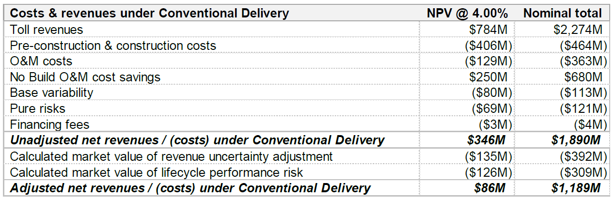
If the project is procured as a P3, a distinction can be made between cash flows (and costs/revenues) to the Agency and to the Developer (i.e., Concessionaire). First, the Agency's perspective is presented, as in Figure 17 and Table 9 below.
Figure 17: Sample Cash Flows to Agency Under P3
Text description of Figure 17.
Sample Cash Flows Under Conventional Delivery
This bar chart shows various items of cash flow over time, such as Toll revenues for public side, O&M costs, No Build O&M cost savings, Pre-construction & construction costs, Base variability, Pure risks, Net subsidy from Agency to Developer, and Competitive neutrality adjustment, with costs remaining relatively stable after initial startup, but savings increasing gradually over time.
Table 9: Sample Costs & Revenues to Agency Under P3
| Costs & revenues to Agency under P3 | NPV @ 4.00% | Nominal total |
|---|---|---|
| Toll revenues (for public side) | - | - |
| Pre-construction & construction costs (retained) | ($46M) | ($51M) |
| O&M costs (retained) | ($12M) | ($33M) |
| No Build O&M cost savings | $259M | $691M |
| Base variability (retained) | ($8M) | ($11M) |
| Pure risks (retained) | ($6M) | ($11M) |
| Net subsidy from Agency to Developer | ($153M) | ($179M) |
| Unadjusted total net revenues / (costs) to Agency under P3 | $33M | $406M |
| Calculated market value of revenue uncertainty adjustment (for public side | - | - |
| Competitive neutrality adjustment | $113M | $410M |
| Adjusted total net revenues / (costs) to Agency under P3 | $147M | $816M |
Next, the Developer's perspective is presented as in Figure 18 and Table 10 below.
Figure 18: Sample Cash Flows to Developer Under P3
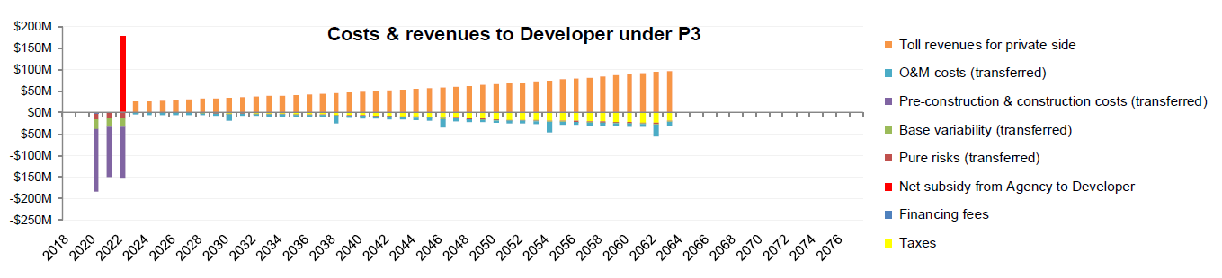
Text description of Figure 18.
Sample Cash Flows to Developer Under P3
This bar chart shows various items of cash flow over time, such as Toll revenues for private side, O&M costs, Pre-construction & construction costs, Base variability, Pure risks, Net subsidy from Agency to Developer, Financing Fees, and Taxes, with costs remaining relatively stable after initial startup, but savings increasing gradually over time.
Table 10: Sample Costs & Revenues to Developer Under P3
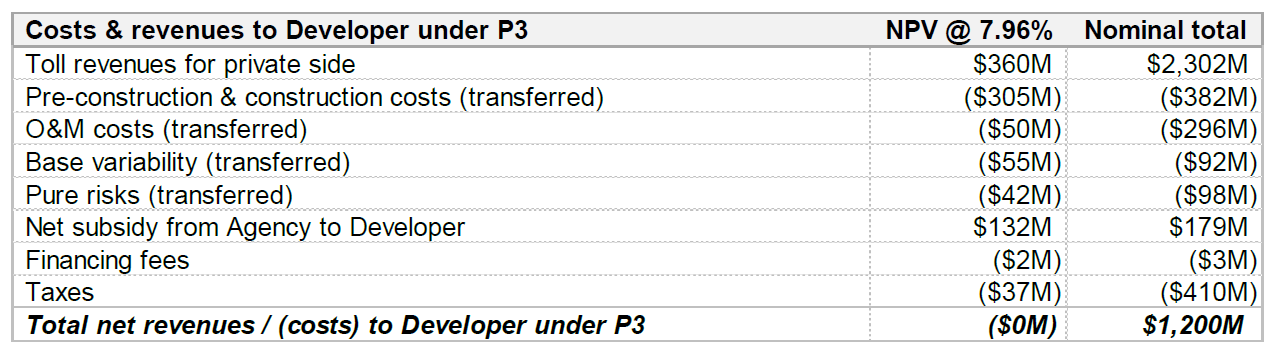
| Costs & revenues to Developer under P3 | NPV @ 7.96% | Nominal total |
|---|---|---|
| Toll revenues for private side | $360M | $2,302M |
| Pre-construction & construction costs (transferred) | ($305M) | ($382M) |
| O&M costs (transferred) | ($50M) | ($296M) |
| Base variability (transferred) | ($55M) | ($92M) |
| Pure risks (transferred) | ($42M) | ($98M) |
| Net subsidy from Agency to Developer | $132M | $179M |
| Financing fees | ($2M) | ($3M) |
| Taxes | ($37M) | ($410M) |
| Total net revenues / (costs) to Developer under P3 | ($0M) | $1,200M |
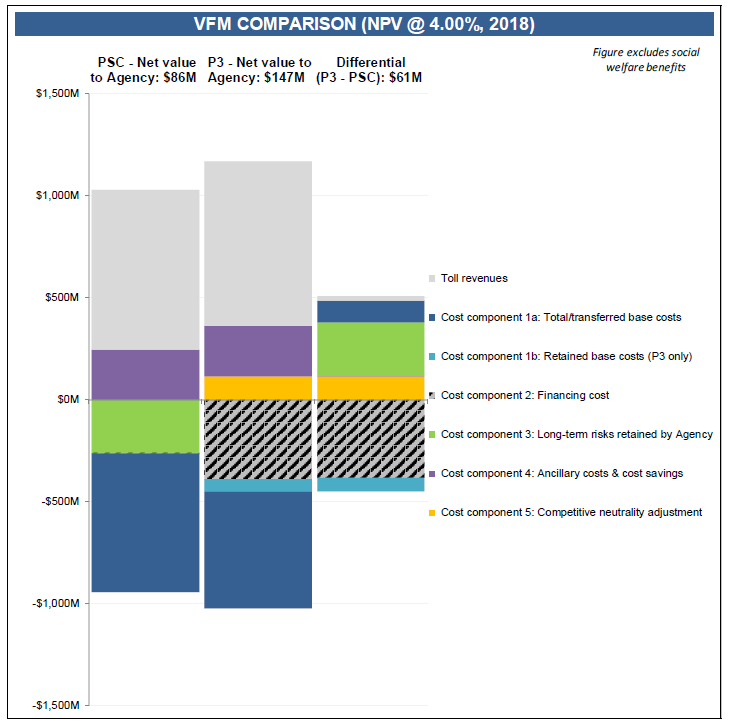
The next element in the VfM outputs is the VfM Comparison Graph. This graph visually compares the net present value of costs and revenues to the Agency and provides a clear indication to users whether P3 delivery is expected to yield Value-for-Money to the Agency.
Sample outputs are presented in Figure 19 below.
Figure 19: Sample VfM Comparison Graph
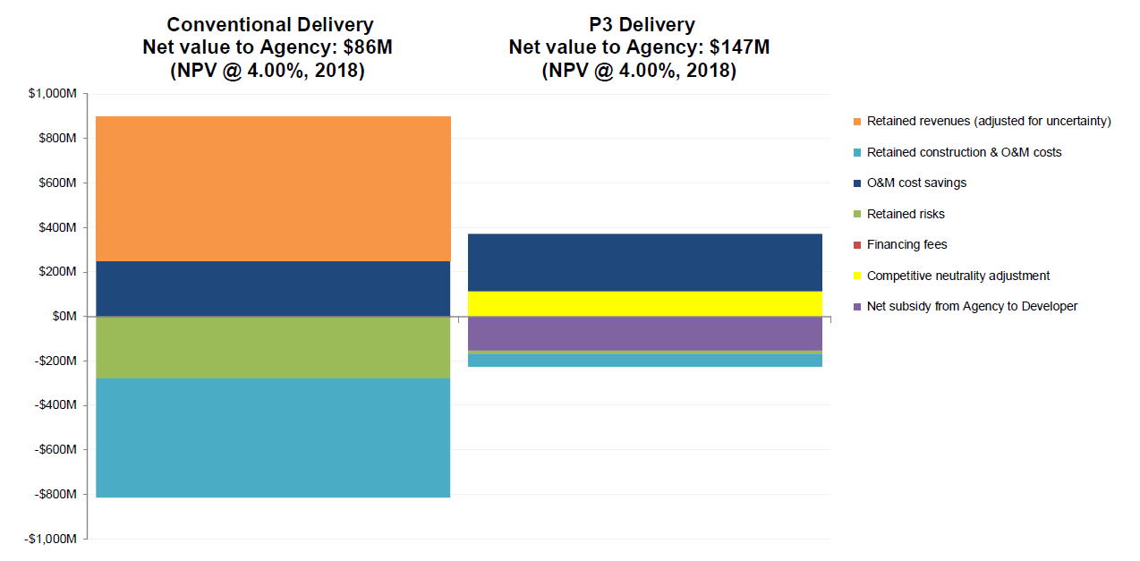
Text description of Figure 19.
Sample VfM Comparison Graph
This bar chart shows a comparison of Conventional Delivery to P3 Delivery, considering elements of Retained revenues, Retained construction, O&M cost savings, Retained risks, Financing fees, Competitive neutrality adjustment, and Net subsidy from Agency to Developer. The Conventional Delivery model has significantly higher costs and profits, especially with revenues.
Lastly, the model provides three detailed cost and revenue graphs showing the relevant cash flows to either the Agency or the P3 concessionaire under Conventional Delivery and P3:
These are the same graphs as those included on the VfM Output Summary sheet, but are larger to enable users to better identify the timing and size of various cost items.
This section presents the PDBCA outputs. Figure 20 shows the Model Navigator's high-level view pane with the different PDBCA output sheets listed.
Figure 20: Model Navigator's High-level View Pane with List of PDBCA Output Sheets
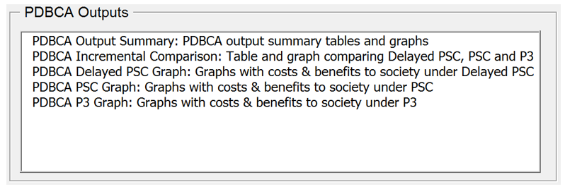
Text description of Figure 20.
PDBCA Outputs
This screenshot lists the PDBCA output sheets, including: PDBCA Output summary, PDBCA incremental comparison, PDBCA delayed PSC graph, PDBCA PSC graph, and PDBCA P3 graph.
The PDBCA Output Summary sheet contains a summary of all relevant costs and benefits under Delayed Conventional Delivery, Conventional Delivery, and P3:
Sample benefits and costs for the three delivery models are presented in Figure 21, Figure 22, and Figure 23 below.
Figure 21: Sample Benefits and Costs Under Delayed Conventional Delivery
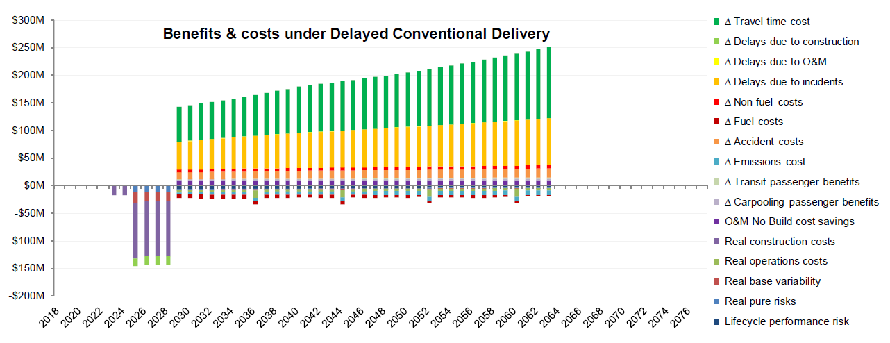
Text description of Figure 21.
Sample Benefits and Costs Under Delayed Conventional Delivery
This screen capture shows the various benefits and costs found under delayed conventional delivery over time.
Figure 22: Sample Benefits and Costs Under Conventional Delivery
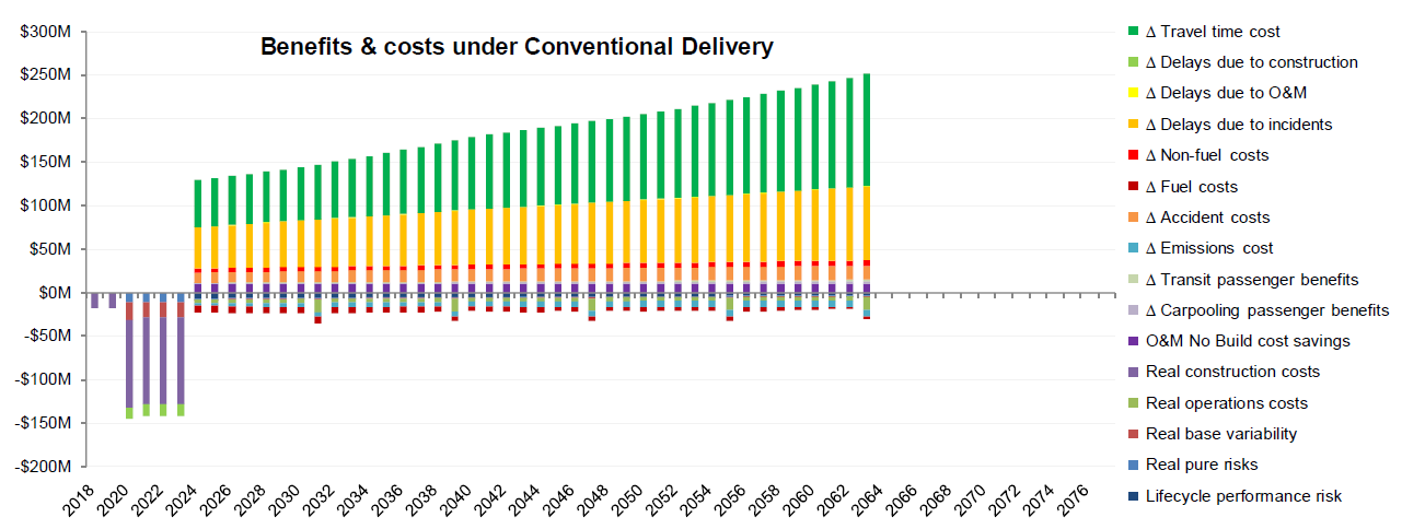
Text description of Figure 22.
Sample Benefits and Costs Under Conventional Delivery
This screen capture shows the various benefits and costs found under conventional delivery over time.
Figure 23: Sample Benefits and Costs Under P3
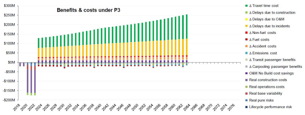
Text description of Figure 23.
Sample Benefits and Costs Under P3 Delivery
This screen capture shows the various benefits and costs found under P3 delivery over time
Table 11, Table 12, and Table 13 below present the same benefits and costs for the three delivery models.
Table 11: Sample Benefits and Costs Under Delayed Conventional Delivery
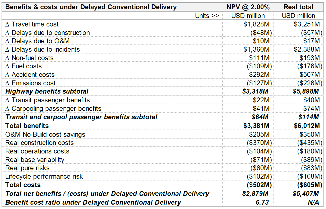
| Benefits & costs under Delayed Conventional Delivery | NPV @ 2.00% | Real total |
|---|---|---|
| Units >> | USD million | USD million |
| Δ Travel time cost | $1,828M | $3,251M |
| Δ Delays due to construction | ($48M) | ($57M) |
| Δ Delays due to O&M | $10M | $17M |
| Δ Delays due to incidents | $1,360M | $2,388M |
| Δ Non-fuel costs | $111M | $193M |
| Δ Fuel costs | ($109M) | ($176M) |
| Δ Accident costs | $292M | $507M |
| Δ Emissions cost | ($127M) | ($226M) |
| Highway benefits subtotal | $3,318M | $5,898M |
| Δ Transit passenger benefits | $22M | $40M |
| Δ Carpooling passenger benefits | $41M | $74M |
| Transit and carpool passenger benefits subtotal | $64M | $114M |
| Total benefits | $3,381M | $6,012M |
| O&M No Build cost savings | $205M | $350M |
| Real construction costs | ($370M) | ($435M) |
| Real operations costs | ($104M) | ($180M) |
| Real base variability | ($71M) | ($89M) |
| Real pure risks | ($60M) | ($83M) |
| Lifecycle performance risk | ($102M) | ($168M) |
| Total costs | ($502M) | ($605M) |
| Total net benefits / (costs) under Delayed Conventional Delivery | $2,879M | $5,407M |
| Benefit cost ratio under Delayed Conventional Delivery | 6.73 | N/A |
Table 12: Sample Benefits and Costs Under Conventional Delivery
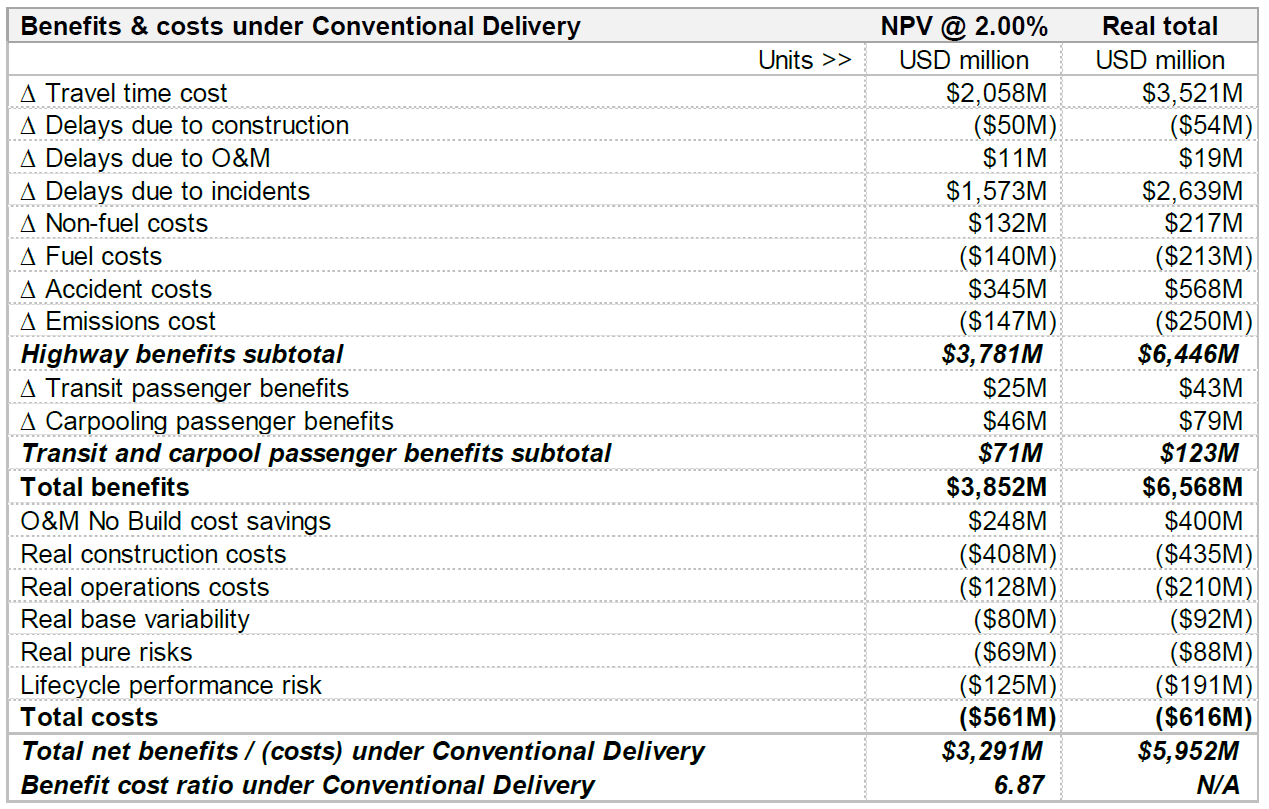
| Benefits & costs under Conventional Delivery | NPV @ 2.00% | Real total |
|---|---|---|
| Units >> | USD million | USD million |
| Δ Travel time cost | $2,058M | $3,521M |
| Δ Delays due to construction | ($50M) | ($54M) |
| Δ Delays due to O&M | $11M | $19M |
| Δ Delays due to incidents | $1,573M | $2,639M |
| Δ Non-fuel costs | $132M | $217M |
| Δ Fuel costs | ($140M) | ($213M) |
| Δ Accident costs | $345M | $568M |
| Δ Emissions cost | ($147M) | ($250M) |
| Highway benefits subtotal | $3,781M | $6,446M |
| Δ Transit passenger benefits | $25M | $43M |
| Δ Carpooling passenger benefits | $46M | $79M |
| Transit and carpool passenger benefits subtotal | $71M | $123M |
| Total benefits | $3,852M | $6,568M |
| O&M No Build cost savings | $248M | $400M |
| Real construction costs | ($408M) | ($435M) |
| Real operations costs | ($128M) | ($210M) |
| Real base variability | ($80M) | ($92M) |
| Real pure risks | ($69M) | ($88M) |
| Lifecycle performance risk | ($125M) | ($191M) |
| Total costs | ($561M) | ($616M) |
| Total net benefits / (costs) under Conventional Delivery | $3,291M | $5,952M |
| Benefit cost ratio under Conventional Delivery | 6.87 | N/A |
Table 13: Sample Benefits and Costs Under P3
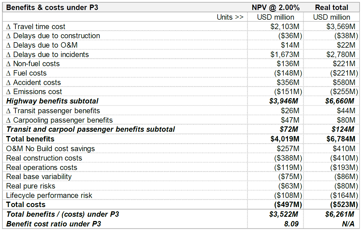
| Benefits & costs under P3 | NPV @ 2.00% | Real total |
|---|---|---|
| Units >> | USD million | USD million |
| Δ Travel time cost | $2,103M | $3,569M |
| Δ Delays due to construction | ($36M) | ($38M) |
| Δ Delays due to O&M | $14M | $22M |
| Δ Delays due to incidents | $1,673M | $2,780M |
| Δ Non-fuel costs | $136M | $221M |
| Δ Fuel costs | ($148M) | ($221M) |
| Δ Accident costs | $356M | $580M |
| Δ Emissions cost | ($151M) | ($255M) |
| Highway benefits subtotal | $3,946M | $6,660M |
| Δ Transit passenger benefits | $26M | $44M |
| Δ Carpooling passenger benefits | $47M | $80M |
| Transit and carpool passenger benefits subtotal | $72M | $124M |
| Total benefits | $4,019M | $6,784M |
| O&M No Build cost savings | $257M | $410M |
| Real construction costs | ($388M) | ($410M) |
| Real operations costs | ($119M) | ($193M) |
| Real base variability | ($75M) | ($86M) |
| Real pure risks | ($63M) | ($80M) |
| Lifecycle performance risk | ($108M) | ($164M) |
| Total costs | ($497M) | ($523M) |
| Total benefits / (costs) under P3 | $3,522M | $6,261M |
| Benefit cost ratio under P3 | 8.09 | N/A |
The PDBCA Incremental Comparison sheet provides an incremental BCA analysis of the different delivery models. It first compares the Delayed Conventional Delivery to the No Build (Step 1) to determine whether the project's benefits outweigh its costs. Next, the model compares the Conventional Delivery to the Delayed Conventional Delivery to analyze the impact of the funding constraint (Step 2). Lastly, it compares P3 to Conventional Delivery to determine the impact of P3 delivery (Step 3). Sample output tables for the incremental analysis are shown below in Table 14, Table 15, and Table 16.
Table 14: Compare Delayed Conventional Delivery to No Build (Step 1)
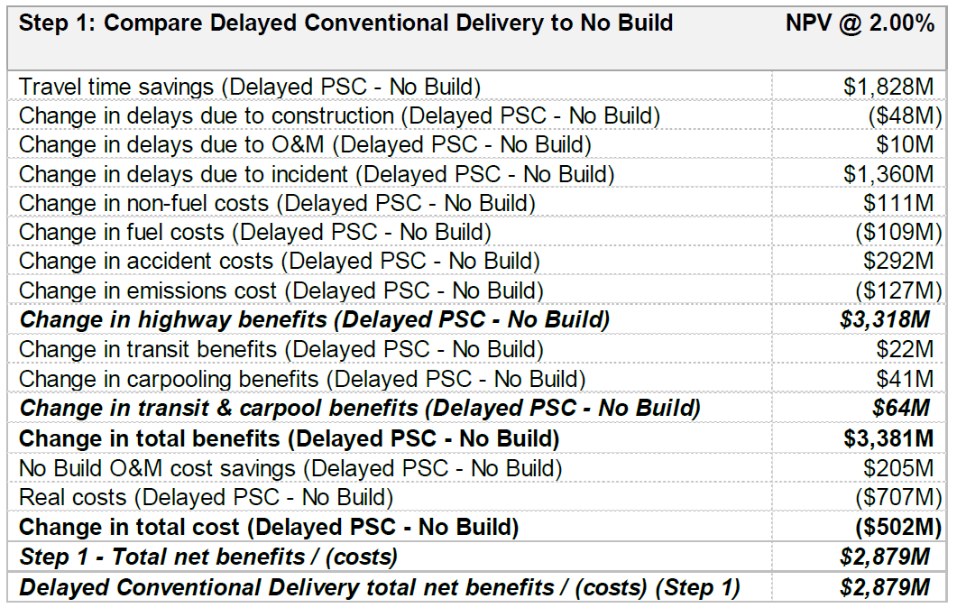
| Step 1: Compare Delayed Conventional Delivery to No Build | NPV @ 2.00% |
|---|---|
| Travel time savings (Delayed PSC - No Build) | $1,828M |
| Change in delays due to construction (Delayed PSC - No Build) | ($48M) |
| Change in delays due to O&M (Delayed PSC - No Build) | $10M |
| Change in delays due to incident (Delayed PSC - No Build) | $1,360M |
| Change in non-fuel costs (Delayed PSC - No Build) | $111M |
| Change in fuel costs (Delayed PSC - No Build) | ($109M) |
| Change in accident costs (Delayed PSC - No Build) | $292M |
| Change in emissions cost (Delayed PSC - No Build) | ($127M) |
| Change in highway benefits (Delayed PSC - No Build) | $3,318M |
| Change in transit benefits (Delayed PSC - No Build) | $22M |
| Change in carpooling benefits (Delayed PSC - No Build) | $41M |
| Change in transit & carpool benefits (Delayed PSC - No Build) | $64M |
| Change in total benefits (Delayed PSC - No Build) | $3,381M |
| No Build O&M cost savings (Delayed PSC - No Build) | $205M |
| Real costs (Delayed PSC - No Build) | ($707M) |
| Change in total cost (Delayed PSC - No Build) | ($502M) |
| Step 1 - Total net benefits / (costs) | $2,879M |
| Delayed Conventional Delivery total net benefits / (costs) (Step 1) | $2,879M |
Table 15: Compare Conventional Delivery to Delayed Conventional Delivery (Step 2)
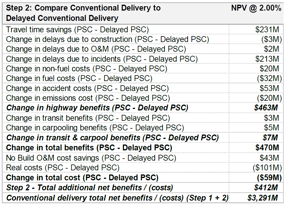
| Step 2: Compare Conventional Delivery to Delayed Conventional Delivery | NPV @ 2.00% |
|---|---|
| Travel time savings (PSC - Delayed PSC) | $231M |
| Change in delays due to construction (PSC - Delayed PSC) | ($3M) |
| Change in delays due to O&M (PSC - Delayed PSC) | $2M |
| Change in delays due to incidents (PSC - Delayed PSC) | $213M |
| Change in non-fuel costs (PSC - Delayed PSC) | $20M |
| Change in fuel costs (PSC - Delayed PSC) | ($32M) |
| Change in accident costs (PSC - Delayed PSC) | $53M |
| Change in emissions cost (PSC - Delayed PSC) | ($20M) |
| Change in highway benefits (PSC - Delayed PSC) | $463M |
| Change in transit benefits (PSC - Delayed PSC) | $3M |
| Change in carpooling benefits (PSC - Delayed PSC) | $5M |
| Change in transit & carpool benefits (PSC - Delayed PSC) | $7M |
| Change in total benefits (PSC - Delayed PSC) | $470M |
| No Build O&M cost savings (PSC - Delayed PSC) | $43M |
| Real costs (PSC - Delayed PSC) | ($101M) |
| Change in total cost (PSC - Delayed PSC) | ($59M) |
| Step 2 - Total additional net benefits / (costs) | $412M |
| Conventional delivery total net benefits / (costs) (Step 1 + 2) | $3,291M |
Table 16: Compare P3 to Conventional Delivery (Step 3)
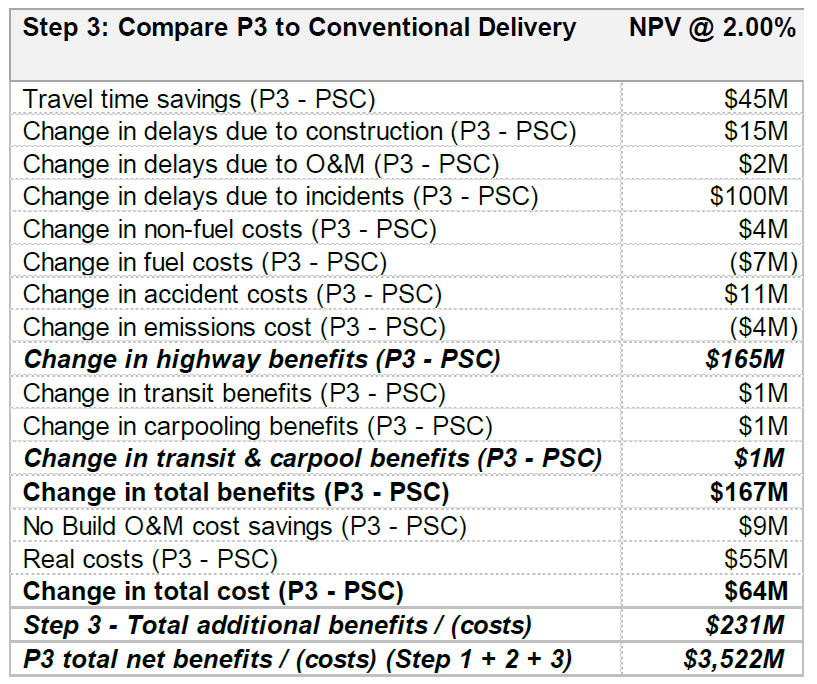
| Step 3: Compare P3 to Conventional Delivery | NPV @ 2.00% |
|---|---|
| Travel time savings (P3 - PSC) | $45M |
| Change in delays due to construction (P3 - PSC) | $15M |
| Change in delays due to O&M (P3 - PSC) | $2M |
| Change in delays due to incidents (P3 - PSC) | $100M |
| Change in non-fuel costs (P3 - PSC) | $4M |
| Change in fuel costs (P3 - PSC) | ($7M) |
| Change in accident costs (P3 - PSC) | $11M |
| Change in emissions cost (P3 - PSC) | ($4M) |
| Change in highway benefits (P3 - PSC) | $165M |
| Change in transit benefits (P3 - PSC) | $1M |
| Change in carpooling benefits (P3 - PSC) | $1M |
| Change in transit & carpool benefits (P3 - PSC) | $1M |
| Change in total benefits (P3 - PSC) | $167M |
| No Build O&M cost savings (P3 - PSC) | $9M |
| Real costs (P3 - PSC) | $55M |
| Change in total cost (P3 - PSC) | $64M |
| Step 3 - Total additional benefits / (costs) | $231M |
| P3 total net benefits / (costs) (Step 1 + 2 + 3) | $3,522M |
The above tables are then summarized and visually presented in Figure 24 below.
Figure 24: Sample Incremental PDBCA Comparison
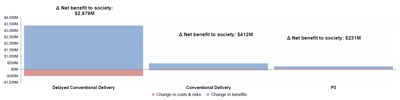
Text description of Figure 24.
Sample Incremental PDBCA Comparison
This bar chart visually represents the data found in the tables above. Delayed Conventional Delivery has a net benefit to society of $2,879M. Conventional Delivery has a net benefit to society of $412M, and P3 delivery has a net benefit to society of $23.1M.
For the hypothetical project depicted in the figures above, the P3 has the highest net benefit to society.
Lastly, the model provides three detailed benefit and cost graphs:
These are the same graphs as those included on the PDBCA Output Summary sheet, but they are larger to enable users to better identify the timing and size of various cost and benefit items.