

Chapter 3: Travel

Key Takeaways
- Vehicle miles traveled (VMT) has rebounded from the 2008–2009 recession. Nationally, transit passenger miles traveled reached 55.7 billion, and unlinked passenger trips 10.5 billion.
- In 2014, licensed drivers accounted for about 70 percent of the population, and there have been more vehicles than licensed drivers since 2000. The average number of vehicles per household increased over the past three decades, as more households owned more than two vehicles.
- In 2009, Americans took 191 billion person trips for all purposes. Driving is the dominant mode of travel. Single-occupant vehicles accounted for 42 percent of all person trips, followed by carpools (40 percent), walking (10 percent), bicycle (2 percent), and transit (2 percent).
- From 1995 to 2009, people logged lower mileage and average annual driving distance decreased.
National and Household Travel Trends
Over the past 100 years, the national transportation system has transformed the economy and society in profound ways. Highway transportation facilitates the production and movement of commodities, supports trade in goods and services, and shapes the landscape of the Nation in the formation of industrial clusters and urban centers. Households and individuals benefit from improved mobility, expanded employment opportunities, and an increasing selection of consumer goods, all facilitated by the Nation’s highways, bridges, and transit systems.
This chapter will first describe national trends in surface transportation, including travel on highways and public transit. Because passenger vehicles are the largest component of vehicle miles traveled (VMT), the discussion on highway travel will focus on household-level analysis. Trends and patterns of freight movement will be presented in detail in Part III of this report.
Significant changes in travel behavior can be associated with demographic, economic, technological, and social change. These changes affect both commuting and leisure travel. This chapter includes a section examining the distribution of household travel across income levels. Previous C&P Reports discussed other factors that affect travel patterns. The 2010 C&P Report discussed trends in demographics and immigration. Travel trends of two major age groups—baby boomers and millennials—were analyzed in the 2013 C&P Report. The 2015 C&P Report focused on emerging technologies related to travel, including broadband access, electronic payment systems, the sharing economy, and telecommuting.
Data Sources
Data used in this chapter were compiled from multiple sources. Historical data are presented as far back as possible to reflect the long-term trends. Three nationally representative household surveys were used in this analysis: The annual American Community Surveys (ACS) for 2005–2014 (vehicle ownership 2000–2014), the Consumer Expenditure Surveys (CES) for selected years for 1972–2014, and the FHWA-managed survey series—the Nationwide Personal Transportation Survey (NPTS) for 1995 and the National Household Travel Survey (NHTS) for 2001 and 2009. These surveys capture household socioeconomic condition such as annual income. They also cover different aspects of household travel behavior: ACS focuses on commuter travel, CES on spending, and NPTS and NHTS on the purpose, length, and other details of each trip segment. These surveys supplement each other and enabled readers to attain a deeper understanding of household travel and its association with household income level. Information on the latest available year is reported in this C&P Report, which was 2014 for ACS and CES and 2009 for NHTS. Sometimes information for a selected year may be reported for data comparability. For example, data from ACS of 2009 are presented alongside data from NHTS 2009 in examining mode choice.
Highway Vehicle Miles Traveled
VMT reflects the movement of vehicles on U.S. highways. Historically, national VMT experienced strong and continuous growth from the construction of the Interstate System in the 1960s to mid-2000s, followed by a period of stagnation and recovery after the recession hit in 2008 (Exhibit 3-1). In 2014, total VMT was 3.03 trillion miles, about the same level as in 2007.
Exhibit 3-1 shows that the composition of VMT has changed over time. The proportion of VMT from heavy-duty vehicles (trucks and buses) increased from 6 percent of total VMT in 1966 to 10 percent in 2014. While VMT of both light- and heavy-duty vehicles has grown rapidly since 1966, VMT of heavy-duty vehicles, propelled by surging freight movement, has grown at a faster rate. Light-duty vehicles (passenger cars, light trucks, vans, and sport utility vehicles) represented about 90 percent of national VMT in 2014.
Exhibit 3-1: Light Duty and Heavy Duty VMT Trends, 1966–2014
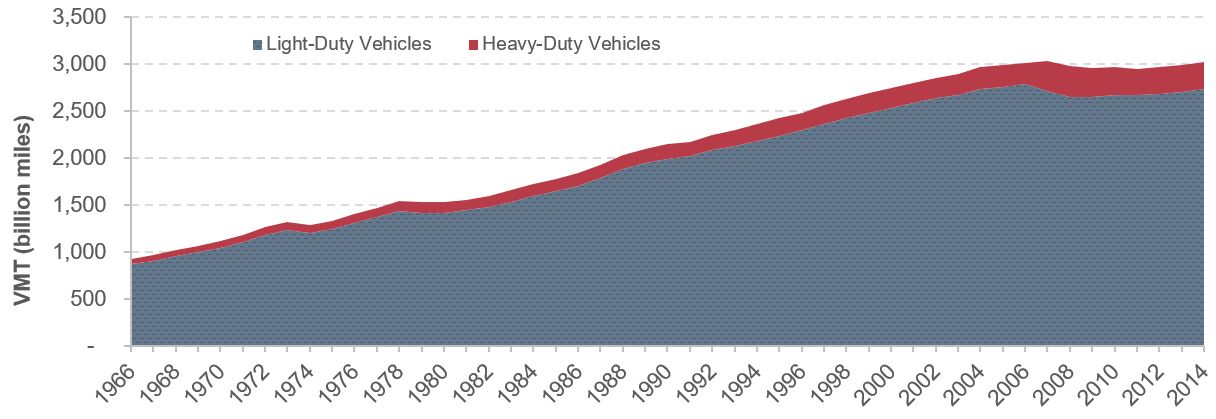
Note: Light-duty vehicles include passenger cars, motorcycles, light trucks, vans, and sport utility vehicles. Heavy-duty vehicles include single-unit trucks, combination trucks, and buses.
Source: Highway Statistics Table VM-1.
Highway VMT Compared with Other Indicators
Since 1929, national VMT growth has outpaced expansion of the economy and the U.S. population. On average, VMT rose by 3.3 percent per year from 1929–2014, while national real gross domestic product (GDP) and population grew at annualized rates of 3.2 percent and 1.1 percent, respectively. Given a system of public roads that increased its mileage by 0.3 percent per annum over this 85-year period, the steep rise of VMT indicates intensified road use by American drivers (Exhibit 3-2).
Exhibit 3-2: Growth of Real GDP, Population, VMT, and Road Length, 1929–2014
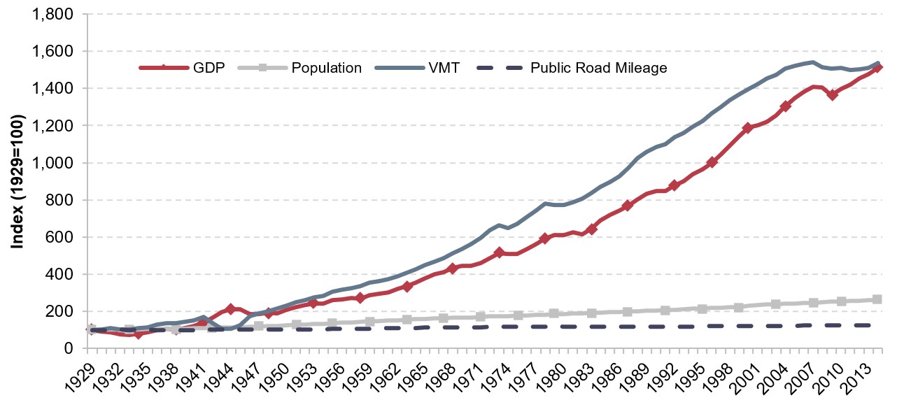
Source: VMT and public road mileage from Highway Statistics, GDP from Bureau of Economic Analysis, and population from Census Bureau.
Before its peak in 2007, VMT tracked closely with economic growth. After 2007, however, U.S. travel trends did not follow the trends of GDP as closely. This divergence was especially noticeable after the last recession in 2008–2009. After bottoming out in 2009, economic activity picked up again at 2.1 percent per annum over the period of 2009–2014, but VMT rose at a far more modest rate of 0.4 percent annually (Exhibit 3-3). The physical stock of roads, measured in public road mileage, expanded at a much lower rate from 2009–2014 (0.6 percent) compared with trends in socioeconomic indicators such as GDP or population.
Exhibit 3-3: Growth of Real GDP, Population, VMT, Road Length, and Lane-Miles, 1980–2014
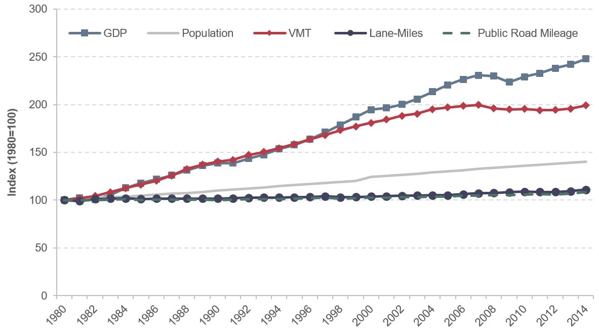
Note: Lane-miles data not available prior to 1980.
Source: VMT, public road mileage and lane-miles from Highway Statistics, GDP from Bureau of Economic Analysis, and population from Census Bureau.
Spatial Distribution of VMT
Comparing the level of VMT in 2004 with the level in 2014, several northern and western States experienced brisk growth: North Dakota, Nevada, and Utah all exhibited annual VMT growth rates above 1 percent, along with North Carolina and Alabama (Exhibit 3-4). States in the Northeast and the Great Lakes regions reported negative VMT growth, consistent with lesser economic growth: annual GDP growth rate was the lowest in these regions between 2004 and 2014, less than half of the national average. VMT also dropped in Georgia, Oregon, and Alaska.
Exhibit 3-4: VMT Annual Growth by State, 2004–2014
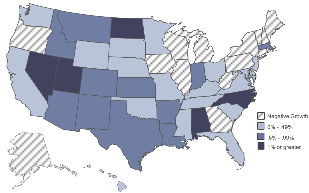
Source: Highway Statistics.
Licensed Drivers and Registered Vehicles
The number of drivers and registered vehicles are two indicators related to travel on the highway system. Since the 1960s the numbers of licensed drivers and vehicles has continued to climb, but the growth rate in licensed drivers has lagged behind total population growth. The data in Exhibit 3-5 indicate that the share of licensed drivers in the total population grew steadily from 1960 to 1990. Afterward, the licensure level stabilized at 0.7, suggesting about 70 percent of the population held valid driver’s licenses. Private vehicle ownership, measured as the number of vehicles per person, has expanded at roughly the same pace as population growth since the turn of this century, with the ratio of vehicles to total population plateauing at slightly below 0.8 since the 1990s. Drivers used to have very limited options about which household vehicle to drive in 1960, because there were fewer automobiles than licensed drivers (the vehicle-to-driver ratio was below 1.0). The situation has reversed since 1980, with the average ratio of vehicles per licensed driver remaining close to 1.2, indicating on average more than one vehicle available per licensed driver.
Exhibit 3-5: Ratios of Drivers, Vehicles and Population, Selected Years
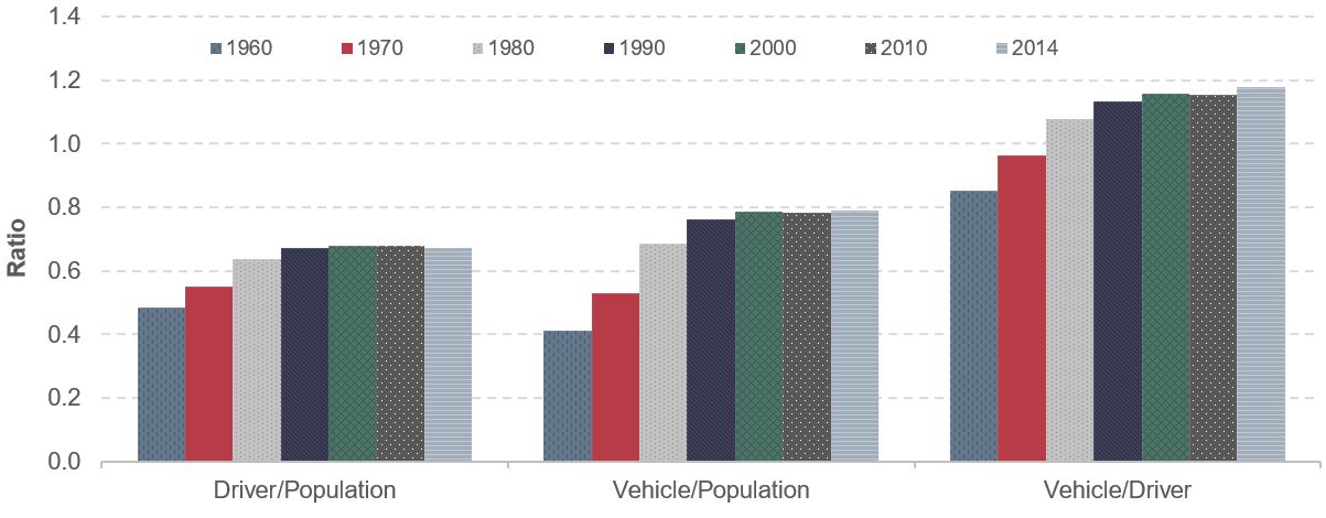
Note: Licensed drivers and vehicle registration not available prior to 1960.
Source: Highway Statistics.
Transit Travel Trends
Two indicators are used in this chapter to measure the movement of passengers through transit systems: passenger miles traveled (PMT) and unlinked passenger trips (UPT). A UPT refers to a journey on one transit vehicle. PMT is estimated based on the number of UPTs and average trip length.
As shown in Exhibit 3-6, UPT trends since 1991 have generally mirrored those of PMT, increasing and decreasing in the same years. From 1991 to 2014 PMT increased by 1.8 percent annually, outpacing UPT, which grew by 1.3 percent per year. This was reflected in an increase in average passenger trip lengths. In 1991 the average transit trip was 4.8 miles. By 2014, the average transit trip increased to 5.4 miles.
Exhibit 3-6: PMT and UPT in Billions, 1991–2014
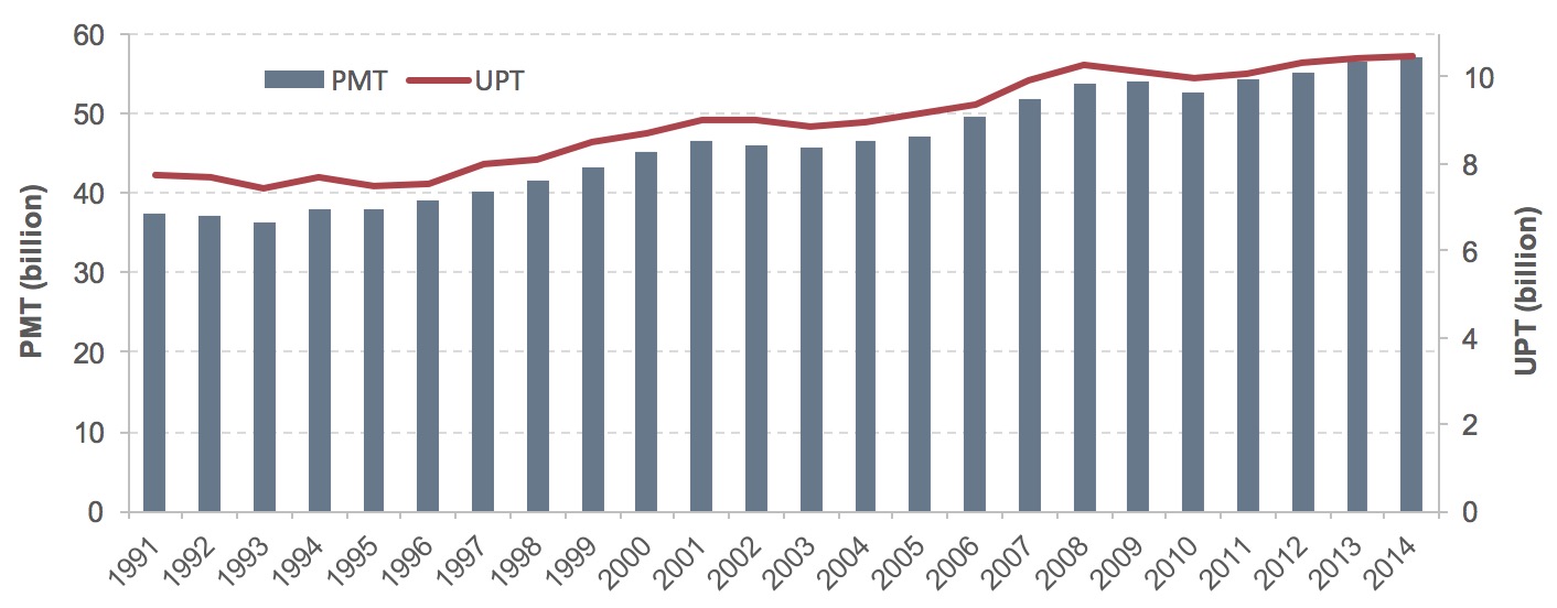
Source: National Transit Database, Federal Transit Administration.
Mode Choice
Choice of travel modes is critical in understanding household and individual travel behavior, which has great implications in transportation policy design. Mode use can inform policy makers on the need for highway and transit infrastructure and services or multimodal transportation hubs. It is also a key input in many public policies, including those related to safety, emissions, and fuel consumption.
A person trip is defined in the NHTS as a trip from one address to another by one person in any mode of transportation. This is the most basic and universal measure of personal travel. In 2009, Americans took 191 billion person trips; 84 percent were in personal vehicles (Exhibit 3-7).
Single-occupant vehicles (a person driving alone) accounted for 40 percent of all person trips, and carpools (two or more persons sharing a vehicle) an additional 44 percent. The remaining 16 percent of person trips were made using modes other than personal vehicles, such as walking, transit, biking, and taxi. People walked to their destinations in about 10 percent of personal trips and biked in about 1 percent. Trips made through transit accounted for about 2 percent of total person trips. Trips made via other modes such as ferry, intercity train, or airplanes were less common.
Exhibit 3-7: Person Trips By Transportation Modes in 2009
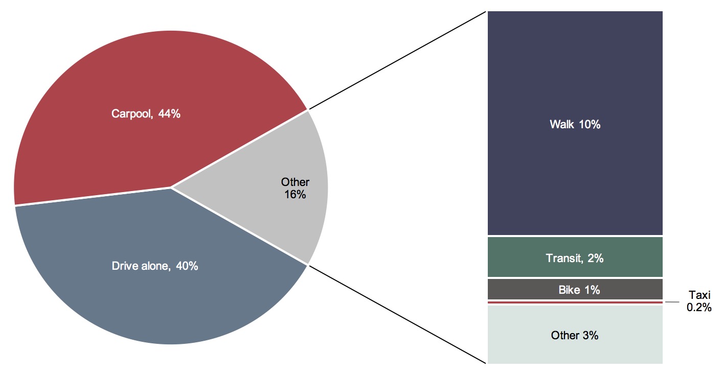
Source: National Household Travel Survey 2009.
The dominant role of vehicles was more pronounced when measured by person miles traveled. Person miles traveled refers to the number of miles traveled by each person on a trip; it accounts for all miles traveled by all people during one shared trip. In 2009, about half of total person miles traveled were in shared passenger vehicles (carpool), followed by 39 percent of miles traveled driving alone (Exhibit 3-8). Walking or transit represented a small portion of person miles traveled, each contributing about 1 percent of total person miles traveled. This is partially due to trip distance variations by mode and location. For example, the average distance was above 5 miles per trip when traveling in vehicles, either driving alone, carpooling, or taking a taxi. On the other hand, trips made by active modes, such as walking or biking, were for much closer destinations: a walk trip only averaged 0.7 miles and a bike trip 2.2 miles. Most transit trips are likely taking place in heavily congested urban corridors.
Exhibit 3-8: Travel by Mode in 2009
| Mode | Percent of total person trips |
Percent of total person miles |
Average trip distance (miles per trip) |
|---|---|---|---|
| Drive alone | 40% | 39% | 9.3 |
| Carpool | 44% | 50% | 10.8 |
| Walk | 10% | 1% | 0.7 |
| Transit | 2% | 1% | 7.2 |
| Bike | 1% | 0.2% | 2.2 |
| Taxi | 0.2% | 0.1% | 5.2 |
| Other | 3% | 9% | 30.8 |
| All | 100% | 100% | 9.5 |
Source: National Household Travel Survey 2009.
Although commuting was responsible for only 27.8 percent of total estimated VMT in the 2009 NHTS, it has significant influence on many aspects of travel planning. Work trips are usually the anchor of overall travel because commuting often determines the travel schedule of an individual or a household. The geographic distribution of noncommuting trips often falls in the area between home and work. Trips to and from work shape peak transportation needs, define infrastructure capacity requirements, and affect congestion time and length, travel time delay, and travel time reliability.
Exhibit 3-9 shows that solo automobile travel was the primary mode for commuters. NHTS reported that 84 percent of person trips were vehicle-based in 2009, comparable with findings from the American Community Survey (ACS) conducted in the same year. ACS estimated that approximately the same proportion of trips (86 percent) was made in private vehicles for commuting. According to ACS, a larger share of workers commuted driving alone (76.1 percent of all workers) in 2009, compared with 40 percent for trips of all purposes in 2009 as reported in NHTS in Exhibit 3-7. About 5 percent of workers traveled to work using transit, making transit the largest commuting mode not using personal vehicles. People walked in 10 percent of person trips for all purposes, but walking to work made up only 2.9 percent of commuting trips. About 4.3 percent of workers chose to work from home.
Exhibit 3-9: Workers By Commuting Modes in 2009
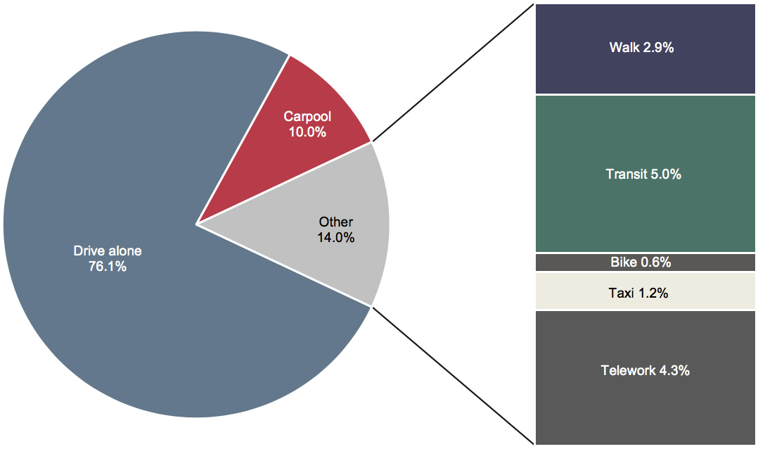
Source: American Community Survey 2009.
Examined over a longer period, the share of workers driving alone remained constant at 76–77 percent since 2005 (Exhibit 3-10). Carpooling became less popular: its share of workers slipped from 10.7 percent in 2005 to 9.2 percent in 2014. Together, about 87 percent of all trips to work were in private vehicles, but average vehicle occupancy for commuting declined continuously over time due to the reduced utilization of carpooling.
Exhibit 3-10: Share of Worker Commuting Modes, 2005–2014
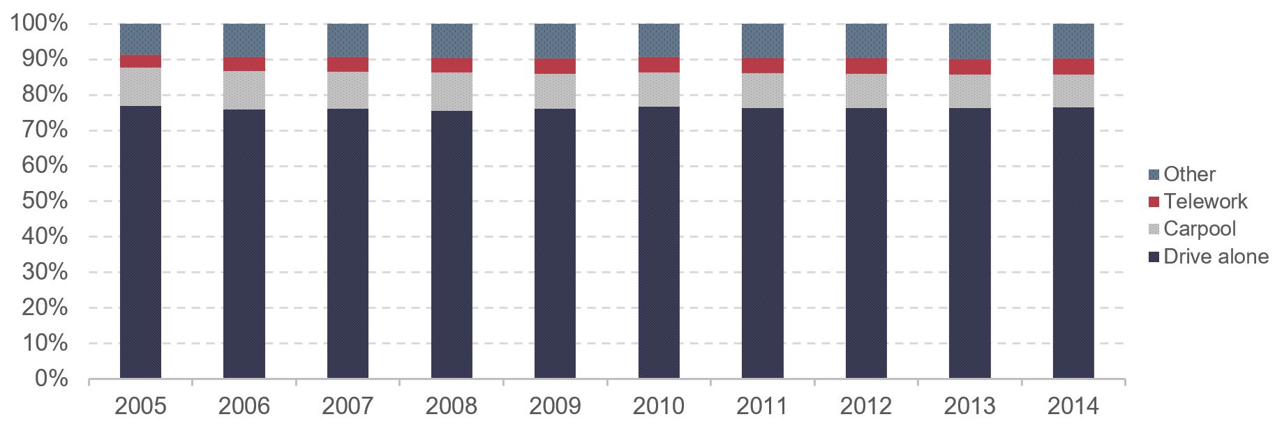
Source: American Community Surveys.
Nonvehicular modes, including telework, (“Other” in Exhibit 3-10 above) accounted for a modest share of modes used across the total labor force (less than 15 percent of workers in 2014). The proportion of workers who opted to telework on average expanded from 3.6 percent in 2005 to 4.5 percent in 2014, while the share of workers using transit rose from 4.7 percent to 5.2 percent over the same period (Exhibit 3-11). Workers who commute by walking or biking are still a small part of the entire commuting labor force, and their mode shares barely changed during the study period.
Exhibit 3-11: Share of Worker Non-Vehicle Commuting Modes, 2005–2014
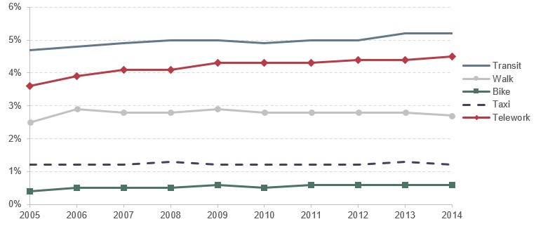
Source: American Community Surveys.
Transit Share of Commute Trips Since 2014
In 2015, the share of workers that commuted using transit was 5.2 percent, similar to the transit share of commute trips in 2013 and 2014. However, the share of workers that commuted via transit subsequently declined to 5.1 percent in 2016 and 5.0 percent in 2017.
Exhibit 3-12 shows the market share of transit by metro area for workers 16 years or older. The data were estimated based on a 5-year aggregate sample derived from the American Community Survey for the period 2010–2014. A high share of workers who commuted by public transit (the dark color in the exhibit) was concentrated along the coastal and Chicago metropolitan areas to meet demands from high population densities and dynamic economies.
Exhibit 3-12: Percent of Workers Commuting by Public Transportation in Metro Areas, 2010–2014
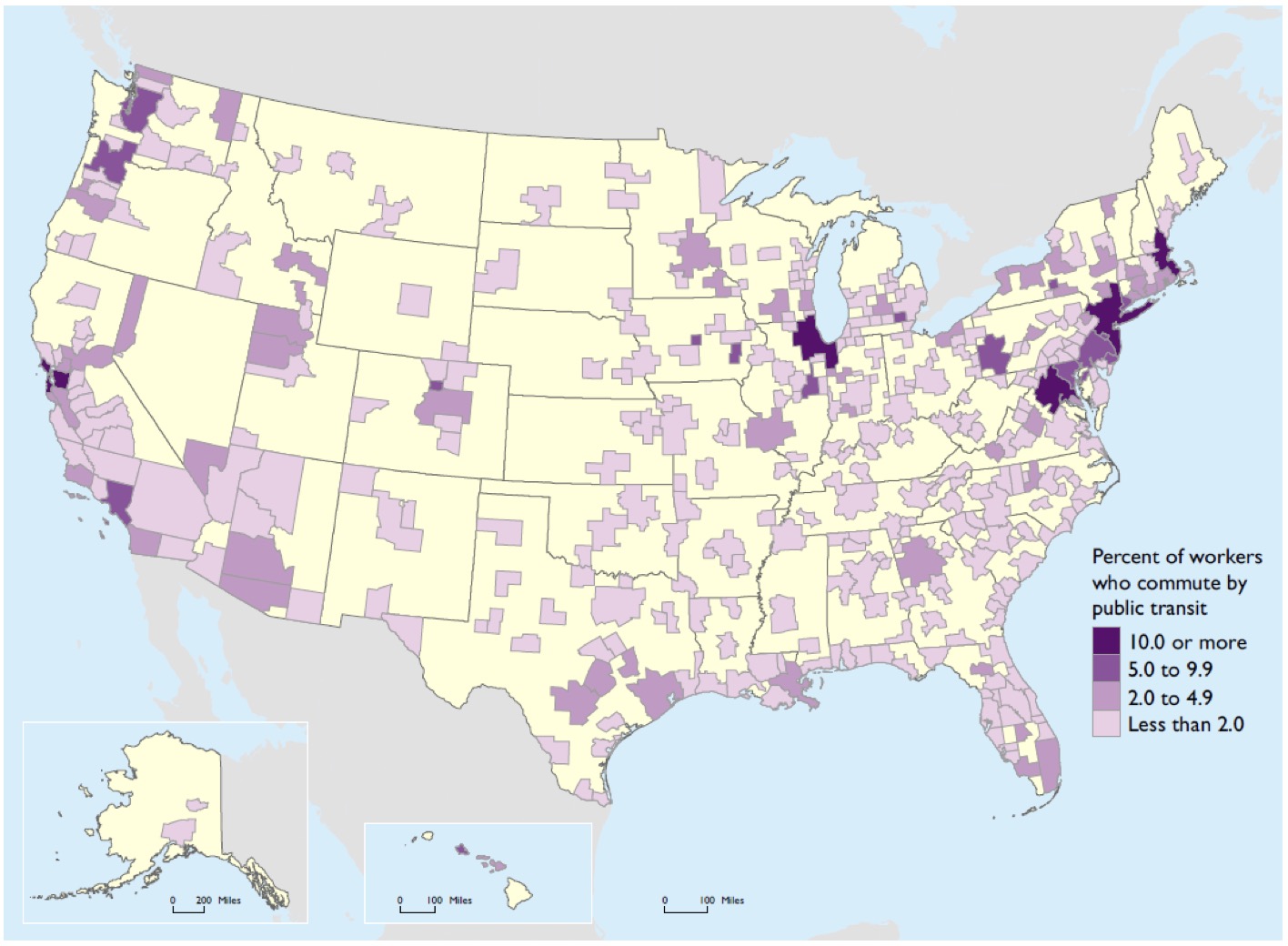
Source: U.S. Department of Commerce, Census Bureau, 2010–2014 American Community Survey 5-Year Estimates, available at (www.census.gov/acs as of March 2016).
Key Takeaways
- Income is a crucial factor in determining travel behavior.
- High-income populations usually own more vehicles, drive farther, and represent a relatively larger proportion of national VMT and person miles traveled than the rest of the population.
- The affluent population also spends more on transportation, especially on new vehicles and air travel. The divergence between travel spending by the highest income group and that of the rest of the population has widened over time.
Impact of Income Distribution on Travel
Income is a crucial factor in determining mode use. For low-income households at or below the poverty level1, 74 percent of all-purpose trips were in private vehicles (47 percent by sharing vehicles and 27 percent by driving alone; see Exhibit 3-13). In contrast, households with annual income levels above poverty but below $100,000 used private vehicles for 86 percent of their all-purpose trips (drive-alone or carpooling). Walking accounted for a higher share of person trips among low-income households (15 percent) than among middle- and high-income households (9–10 percent). Given the relative short travel distance of walking trips, the reliance on walking implies lower mobility for the low-income population.
Exhibit 3-13: Person Trips by Modes and Poverty Status, 2009
Source: National Household Travel Survey 2009.
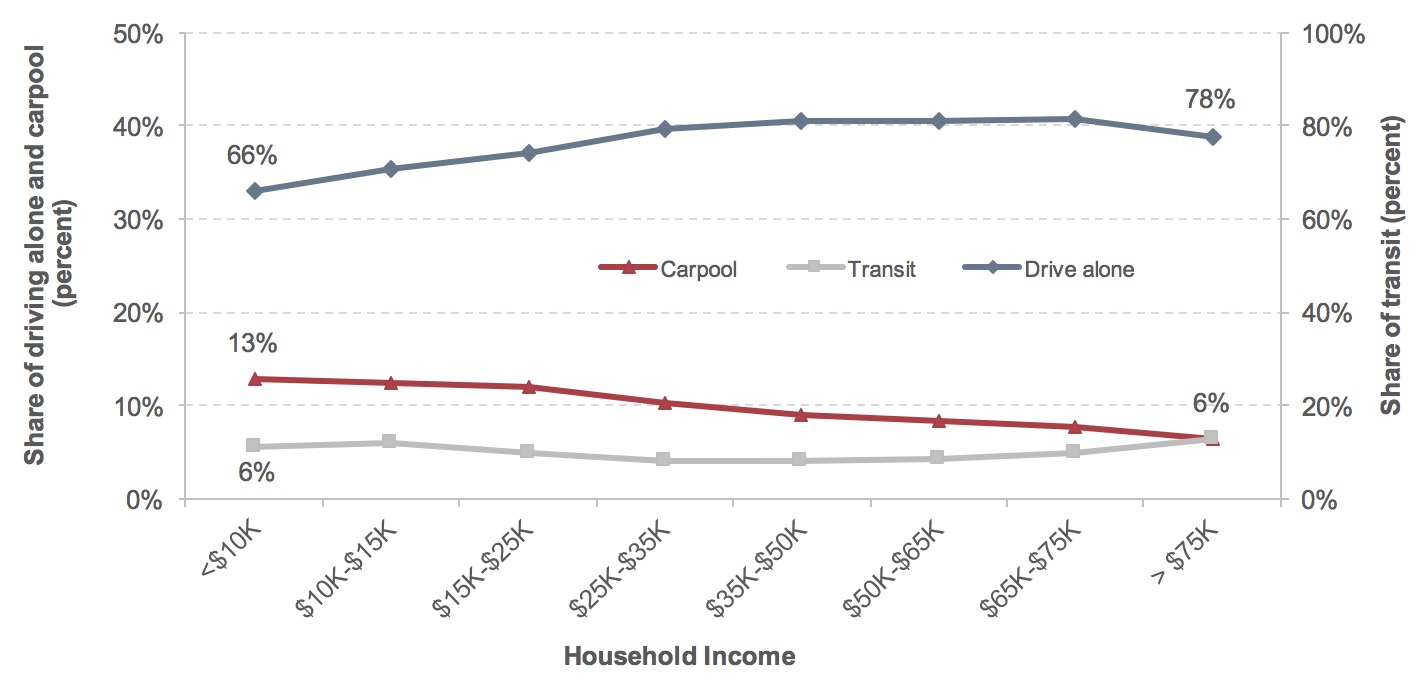
The pattern of mode use across household annual income levels was similar among workers’ commuting trips in the same year from ACS (Exhibit 3-14). Lower income groups often resorted to non-drive-alone means of transportation, such as carpooling, to go to work. The commuting shares for workers driving to and from work alone rose from 66 percent in the lowest income group to 78–81 percent in the higher income groups, while the share of workers who carpooled shrank steadily. Although driving alone remained the main means of commuting, higher income groups had a greater tendency to use transit to go to work than the middle-income group, which is indicative of higher income white-collar workers taking advantage of available transit serving clusters of jobs in downtown urban areas.
Exhibit 3-14: Workers by Commuting Modes and Household Income, 2009
Source: American Community Survey 2009.
Exhibit 3-15 shows the commuting market share of transit for the top 10 urbanized areas, ranked by their market shares. Most of these areas have large populations and high population density, and account for the majority of transit service in the United States (Concord, California and Bridgeport-Stamford, New York-Connecticut are smaller, but are also suburban areas of the larger San Francisco and New York metropolitan areas, respectively, with direct heavy rail and/or commuter rail access into the urban cores).
Exhibit 3-15: Commuting Market Share of Public Transportation for the Top 10 Urbanized Areas
| Rank | Urbanized Area | Market Share |
|---|---|---|
| 1 | New York–Newark, NY–NJ–CT | 32.1% |
| 2 | San Francisco–Oakland, CA | 17.8% |
| 3 | Washington, DC–VA–MD | 16.4% |
| 4 | Boston, MA–NH–RI | 13.3% |
| 5 | Chicago, IL–IN | 12.5% |
| 6 | Philadelphia, PA–NJ–DE–MD | 10.4% |
| 7 | Concord, CA | 10.0% |
| 8 | Bridgeport–Stamford, CT–NY | 9.8% |
| 9 | Seattle, WA | 9.4% |
| 10 | Urban Honolulu, HI | 9.2% |
Note: Urbanized area refers to a Census-designated urban area with 50,000 residents or more.
Source: American Community Survey 2010–2014.
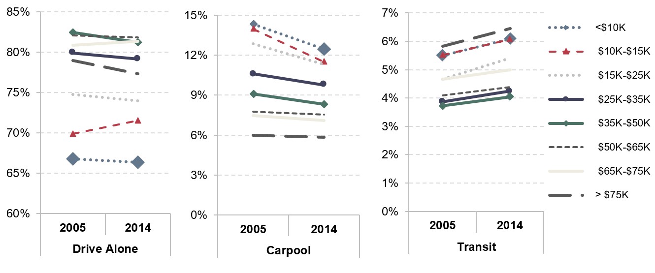
Workers became less dependent on private vehicles in the decade of 2005–2014. The share of workers driving a private vehicle alone contracted in most cases (Exhibit 3-16). For example, 66.8 percent of workers with household annual income below $10,000 (approximately 13.4 million workers) chose to drive alone to work in 2005, but this share declined to 66.3 percent (13.2 million workers) in 2014. The shares of workers using carpooling as the means of transportation to work shrank in both low- and high-income households.
Exhibit 3-16: Change in Share of Commuting Mode by Household Income, 2005–2014
Source: American Community Surveys.
Access to Vehicles
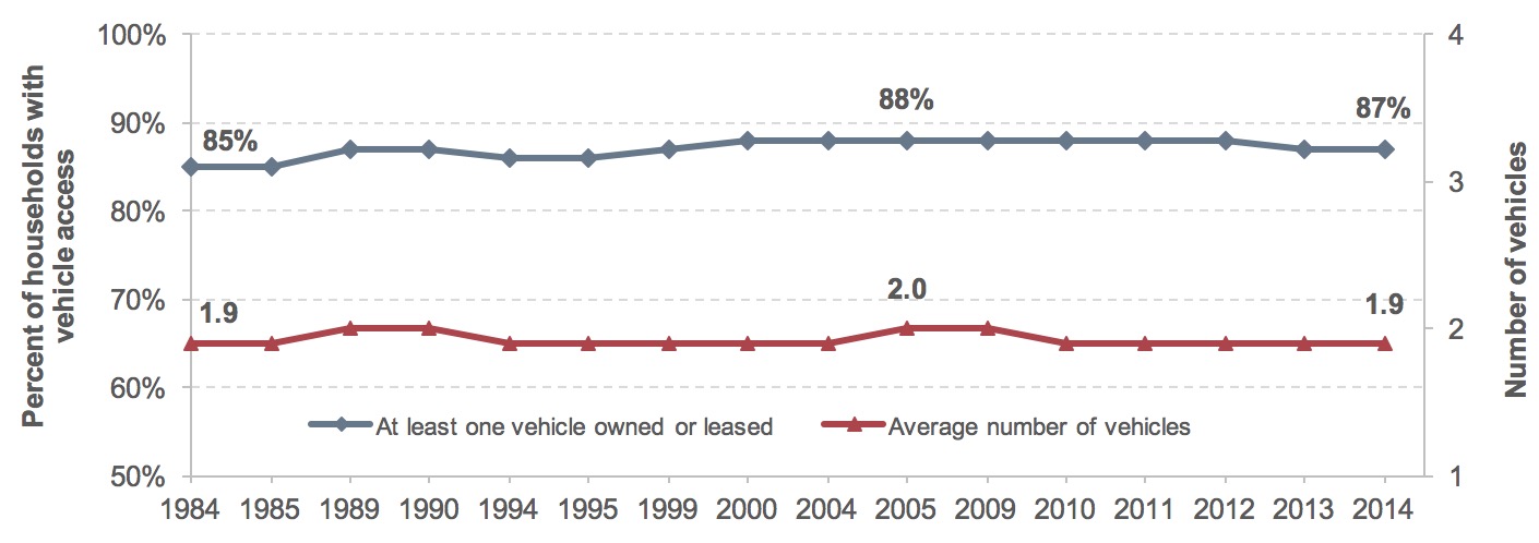
Exhibit 3-17 presents the trend in household vehicle access, which has remained stable over 30 years. The share of households that owned or leased at least one vehicle has fluctuated within a tight band of 87–88 percent since the 1990s. The average number of vehicles in a household remained roughly constant at around 1.9 for most of the study period.
Exhibit 3-17: Household Vehicle Access, 1984–2014
Source: Consumer Expenditure Surveys.
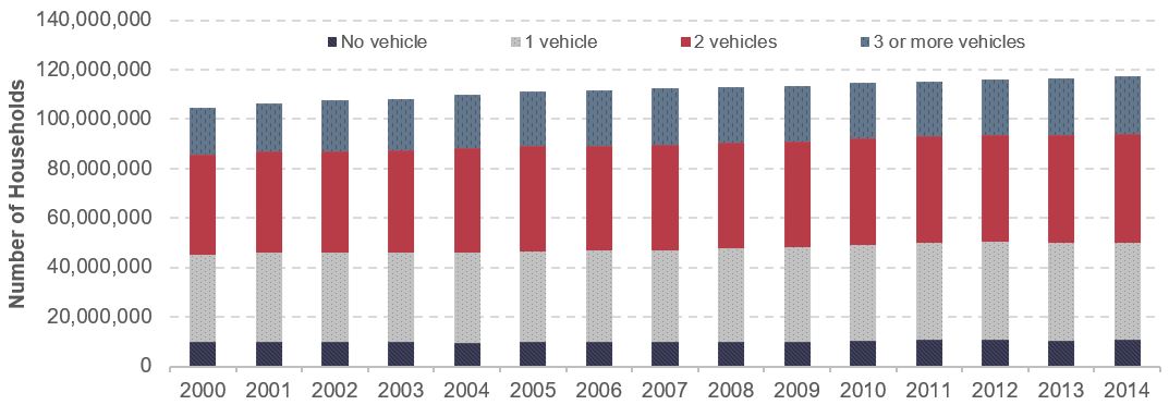
The average number of vehicles that households could access increased marginally from 1.66 in 2000 to 1.68 in 2014, while the total number of vehicles in the country went up from 174 million to 197 million (Exhibit 3-18). This fleet expansion was driven primarily by an increase in the number of households with three or more vehicles, expanding from 19 to 23 million. Households with a single vehicle rose at a rate above the national average, partly attributable to the rising number of single-member households.
Exhibit 3-18: Number of Vehicles Available to the Households, 2000–2014
Source: American Community Surveys.
Motor vehicles are very expensive purchases, and it would thus be natural to expect that higher income households would have greater vehicle access (the number of vehicles in the household) than lower income households. Exhibit 3-19 demonstrates a sharp increase in vehicle access across the spectrum of household annual income levels. The bottom 20 percent of income earners generally had the lowest number of vehicles, averaging less than one automobile per household. The number of vehicles per household increased steadily as income moved from low-income quintiles to high-income quintiles. Average household vehicle access was below 1.0 for the lowest income quintile, but reached 2.8 vehicles per household for the highest income quintile.
Exhibit 3-19: Average Number of Vehicles per Household by Income Quintile, Selected Years
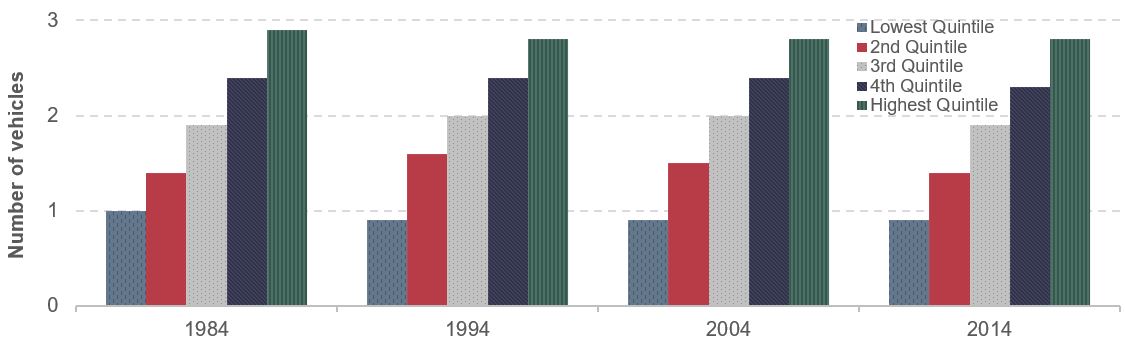
Source: Consumer Expenditure Surveys.
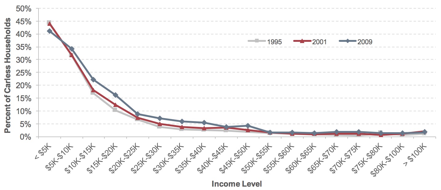
Owning or leasing vehicles (vehicle access) was found to be positively correlated with household income, and poor households were less likely to have access to a household vehicle. Among households facing absolute poverty with annual incomes below $5,000, more than 40 percent lacked a private vehicle (Exhibit 3-20). The share of carless households quickly dwindled along income brackets. Less than 2 percent of households reported not having a vehicle when household income reached $50,000. Another notable trend is that the share of households without vehicle access increased from 1995 to 2009 (except for the extremely low-income group), suggesting that many low- and middle-income households are increasingly dependent on other modes—biking, walking, ride sharing, and transit—to move around.
Carless households were concentrated in households with fewer financial resources. An annual income level of $50,000 represents an approximate midpoint: about half (54 percent) of households earned less than this amount in 2009, and the other half (46 percent) earned more. About 91 percent of all households without vehicles in 2009 fell in the lower income group, and only 9 percent in the higher income group (Exhibit 3-21).
Exhibit 3-20: Percent of Carless Households by Income Level, 1995–2009
Source: National Household Travel Surveys.
The issue of household vehicle availability is particularly acute among households at extremely low income levels. For example, households with annual income below $5,000 represented 3 percent of total households in 2009, but they accounted for 14 percent of carless households. In this income bracket, more than one-third of households (41 percent) did not own or lease a vehicle. The proportion of carless households diminished quickly to below 10 percent once income reached above $20,000, although this share was still high compared with 2 percent among households with income above $50,000.
Exhibit 3-21: Carless Households by Income Group, 2009
| Income Group | Share of total households | Share of total carless households | Share of the income bracket |
|---|---|---|---|
| <$5K | 3% | 14% | 41% |
| $5K-$10K | 5% | 22% | 34% |
| $10K-$15K | 7% | 18% | 22% |
| $15K-$20K | 7% | 13% | 16% |
| $20K-$25K | 5% | 6% | 9% |
| $25K-$30K | 7% | 6% | 7% |
| $30K-$35K | 4% | 3% | 6% |
| $35K-$40K | 6% | 4% | 6% |
| $40K-$45K | 4% | 2% | 4% |
| $45K-$50K | 6% | 3% | 4% |
| <$50K Total | 54% | 91% | 14% |
| >$50K | 46% | 9% | 2% |
| Total | 100% | 100% | 8% |
Source: National Household Travel Survey 2009.
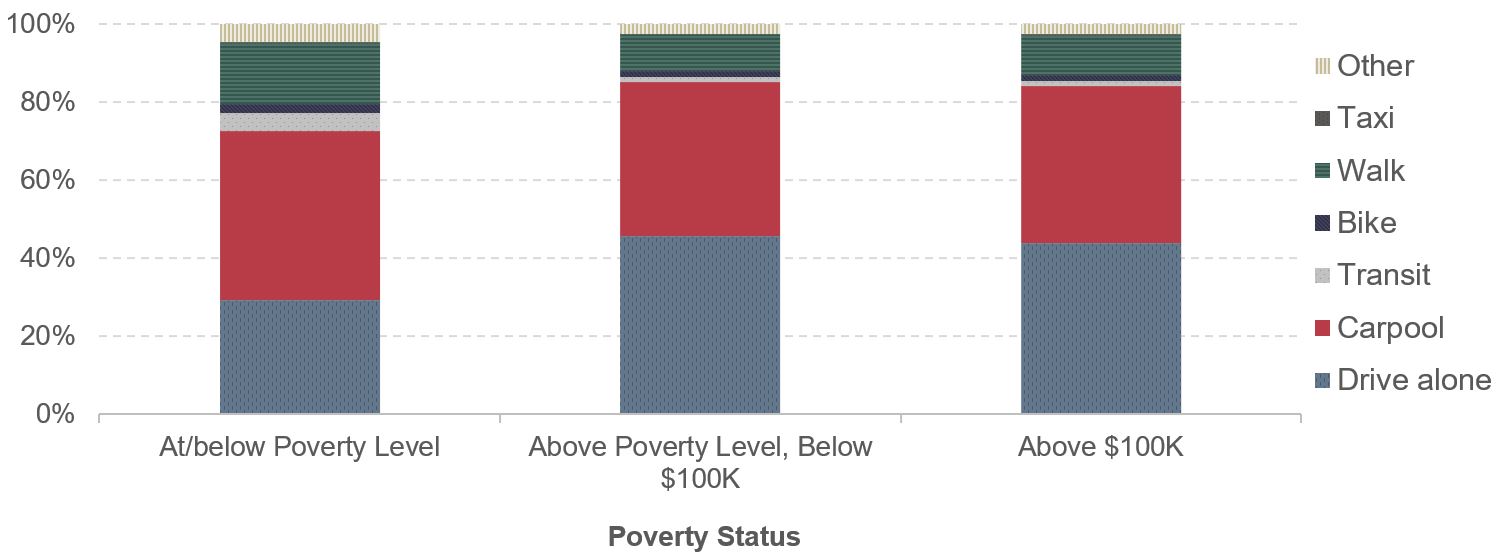
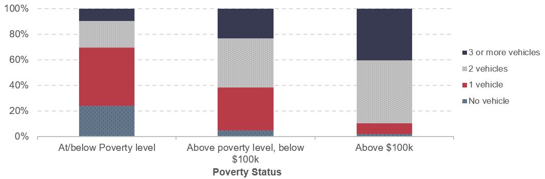
The close relationship between household income and vehicle access was even more evident after factoring in the adjustments for household size and location used to determine poverty status. In Exhibit 3-22, around 24 percent of households at or below poverty level had no vehicle. The share of households without a vehicle fell below 5 percent for households whose adjusted annual income were above poverty threshold but below $100,000, and less than 2 percent for households with adjusted annual income above $100,000.
Exhibit 3-22: Household Vehicle Access by Poverty Status, 2009
Source: National Household Travel Survey 2009.
VMT and Person Miles Traveled
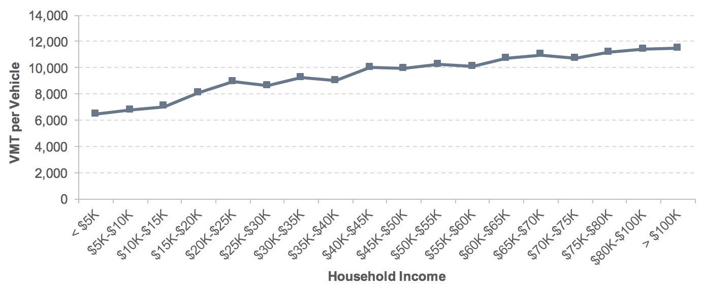
The discussion above on vehicle ownership points out a positive correlation between household income and vehicle access, with carless households concentrated in low-income groups. Exhibit 3-23 shows that there is also a strong income effect on VMT. Average annual VMT per vehicle rose rapidly among low-income households, but this comparative growth slowed as household annual income reached $35,000–$40,000.
Exhibit 3-23: Average Annual VMT per Vehicle, 2009
Source: National Household Travel Surveys.
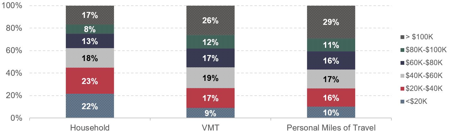
Exhibit 3-24 further underscores the uneven distribution of road use by annual household income groups in 2009. The wealthiest group (annual household income above $100,000) represented 17 percent of households, but represented 26 percent of total national VMT and 29 percent of total person miles traveled. At the other end of the income range, about 22 percent of households were classified as lowest income, with annual incomes below $20,000. This group of households drove much less, contributing only 9 percent of national VMT and 10 percent of person miles traveled. This skewed distribution indicates that the poor did not benefit as much from highway connectivity as did their wealthy counterparts, partly due to limited vehicle availability.
Exhibit 3-24: Distribution of Households, VMT, and Person Miles Traveled by Income, 2009
Source: National Household Travel Survey 2009.
Trip Characteristics
Exhibit 3-25 shows a decline in travel time and distance from 2001 to 2009. Drivers spent slightly less time traveling on average in 2009, including time spent in vehicles. Trips were also likely to be shorter: the average miles driven per driver per day decreased from 33 miles in 2001 to 29 miles in 2009. This decrease was due partly to weakening economic conditions and a high unemployment rate during the recession that was underway in 2009.
Exhibit 3-25: Trip Characteristics, 2001–2009
| 2001 | 2009 | |
|---|---|---|
| Average Time Spent Traveling Per Day (Minutes) | 88 | 86 |
| Average Time Spent in Vehicle Per Day (Minutes) | 83 | 80 |
| Average Miles Driven Per Day Per Driver (Miles) | 33 | 29 |
Source: National Household Travel Surveys.
Nationwide, more than 60 percent of person trips were vehicle trips. This share was much lower for low-income groups than for high income groups (Exhibit 3-26). The share of vehicle trips increased from the lowest income levels to households earning between $25,000 and $30,000, and then remained roughly constant as income increased to the highest category of over $100,000. People earning less than $5,000 in 2009 reported that about 36 percent of person trips were made in vehicles. The share of vehicle trips increased to 60 percent when household income reached $30,000.
Exhibit 3-26: Share of Travel Day Person Trips Made by Vehicle, by Income, 1995–2009
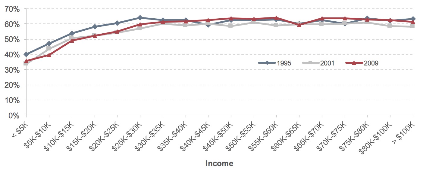
Source: National Household Travel Surveys.
Vehicle trips represented a less important mode for trips among low-income residents over time. For example, about 40 percent of person trips were made by vehicle in 1995 in the sample of households with income below $5,000 (in nominal terms in the survey year); by 2009 only 36 percent of person trips by households in this income group were vehicle trips. In other words, low-income groups were shifting toward nonvehicular options to move around.
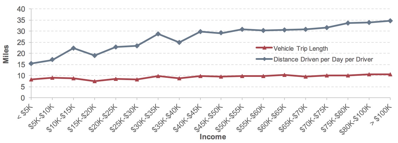
Average distances of vehicle trips also differed across the levels of annual household income. An average vehicle trip was 8.3 miles for the lowest income group (below $5,000), and rose to over 10 miles when household annual income surpassed $70,000, an increase of more than 25 percent (Exhibit 3-27). More affluent drivers tended to drive farther. Average high-income drivers (household annual income above $70,000) drove more than 30 miles per day, approximately twice the distance driven by drivers from households with income below $10,000.
Exhibit 3-27: Vehicle Travel Distances and Income, 2009
Source: National Household Travel Survey 2009.
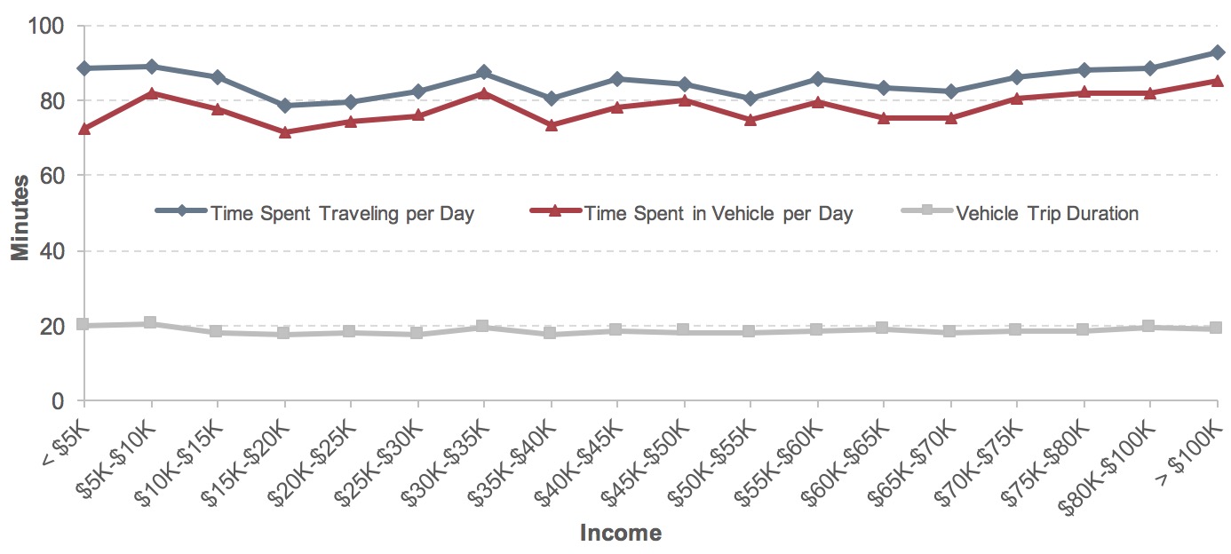
Generally speaking, there was no obvious correlation between income and time spent traveling per day, as shown in the top line of Exhibit 3-28, although higher-income groups did spend more time in vehicles. Average time spent in vehicle per day (middle line of Exhibit 3-28) increased by 18 percent when household income shifted tenfold from $10,000 to $100,000. At the same time, average vehicle trip duration remained steady. The poor households spent approximately the same amount of time traveling but were less time-reliant on vehicles. If the poor chose to travel in vehicles, their average trip duration was similar to that of their wealthy counterparts. On the other hand, the higher income households tended to spend more time traveling in vehicles than did their low-income neighbors, despite spending approximately the same amount of time traveling per day.
There is a clear distinction in commute time by the modes of travel. It took approximately 48 minutes, on average, for the population using transit to travel to work (Exhibit 3-29). The commute time was about half that for people commuting in vehicles, averaging about 24 minutes for driving alone and 28 minutes in shared vehicles. (It should be noted that a significant portion of transit ridership is occurring in congested urban corridors where vehicle travel times may be closer to transit travel times.) The average commute travel time grew longer in recent years: an average transit trip averaged 47.8 minutes in 2005 and rose to 49.2 minutes in 2014. Factors such as transit service availability and commute distance could influence the commute time. Congestion on highways also worsened over the same period: average vehicle commute time decreased by 1.0 minutes per trip for a single occupancy vehicle. Average travel time to work by carpooling dipped by 0.3 minutes per trip, less than the decrease in commute time by driving alone.
Exhibit 3-28: Vehicle Travel Time and Income, 2009
Source: National Household Travel Survey 2009.
Exhibit 3-29: Average Travel Time to Work, 2005–2014

Source: American Community Surveys.
Transportation Expenditures
According to the Consumer Expenditure Survey, transportation is the second-largest household expenditure item (after housing expenses) for an average American household, and together housing and transportation make up about half of household expenditures. Although the nominal amount spent on transportation surged (multiplied by almost six times in nominal terms) from 1972 to 2014, transportation’s share of total household expenditure declined over this period, dipping sharply between 2004 and 2009 (coinciding with the 2008–2009 recession) and then rebounding (but not fully recovering to pre-recession levels). The trends in Exhibit 3-30 imply that while both total and transportation expenditure grew, transportation spending grew at a slower pace than total household expenditures.
Exhibit 3-30: Transportation Component of Household Expenditure, 1972–2014
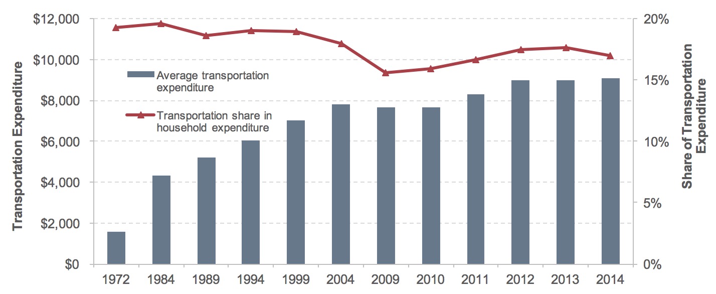
Source: Consumer Expenditure Survey.
Exhibit 3-31 provides the composition of annual transportation expenditures by main spending categories in 2014. Vehicle purchase was the top-ticket item at $3,301, representing 36 percent of overall transportation expenditure. Each year, an average household spent $2,468 on gasoline and motor oil, about 27 percent of transportation expenditure. Vehicle operation costs comprised another 30 percent of transportation expenditure, including 12 percent for insurance and 9 percent for maintenance and repairs. Paid transportation (all the modes that required a ticket purchase for use, including transit, intercity bus, rail, air, cruise ships, and taxi) made up 7 percent of annual household transportation expenditure, or $581.
Exhibit 3-31: Composition of Household Transportation Expenditure, 2014
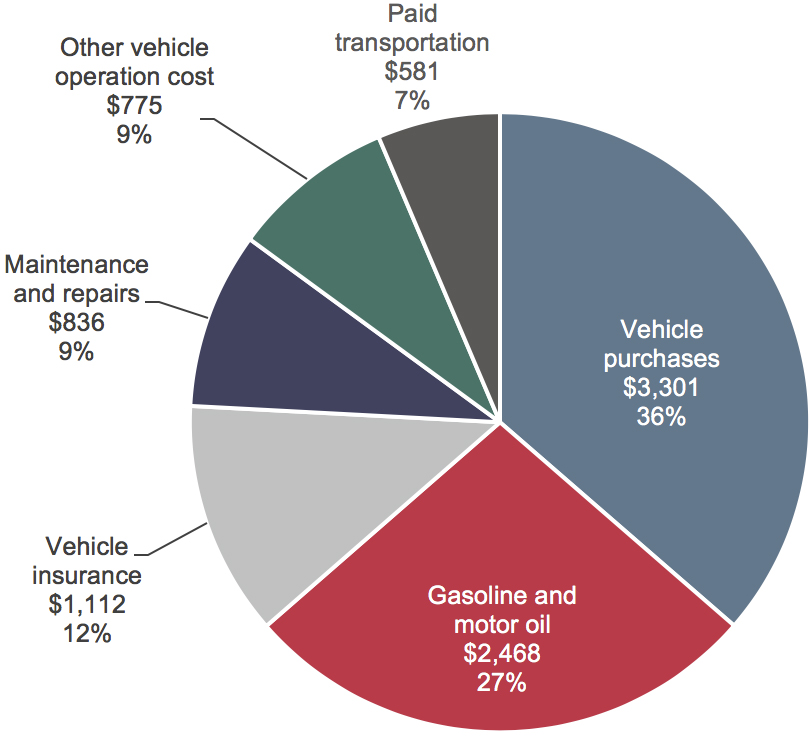
Source: Consumer Expenditure Surveys.
The composition of transportation expenditure items changed over time. Vehicle purchases accounted for around 45 percent of transportation expenditure from 1972 to 1999, then declined to around 36 percent in the period of 2012–2014 (Exhibit 3-32). The share of fuel costs expanded from 22 percent in 1972 to above 30 percent in 2011–2012. A higher portion of transportation budgets went to fuel purchase around 2012, when fuel price reached its height. Fuel cost represented 27 percent of transportation spending in 2014. Over time, purchased transportation expenditure increased from $63 in 1972 to $581 in 2014 (growing by 9.2 times in nominal terms), and the rampant growth in this category outstripped that of overall transportation spending (growing by 5.7 times in nominal terms).
Exhibit 3-32: Composition of Household Transportation Expenditure, 1972–2014
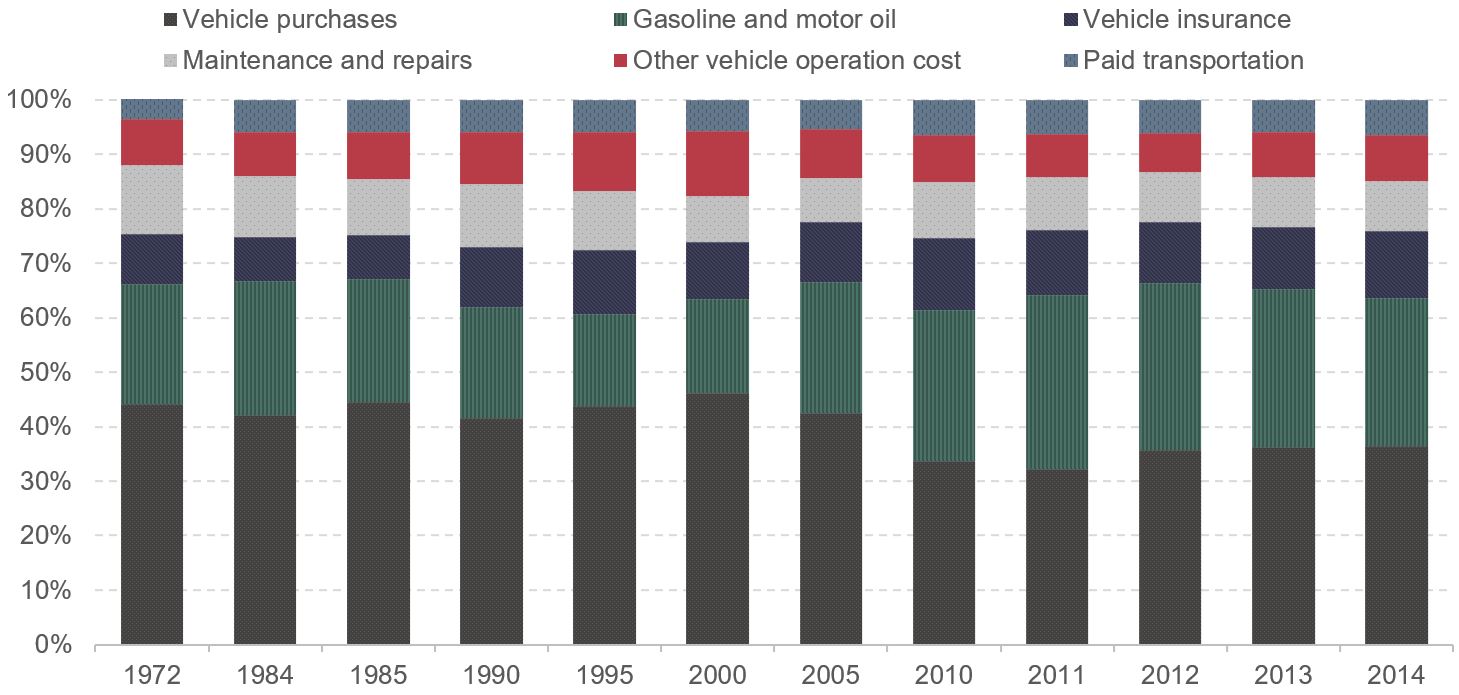
Source: Consumer Expenditure Surveys.
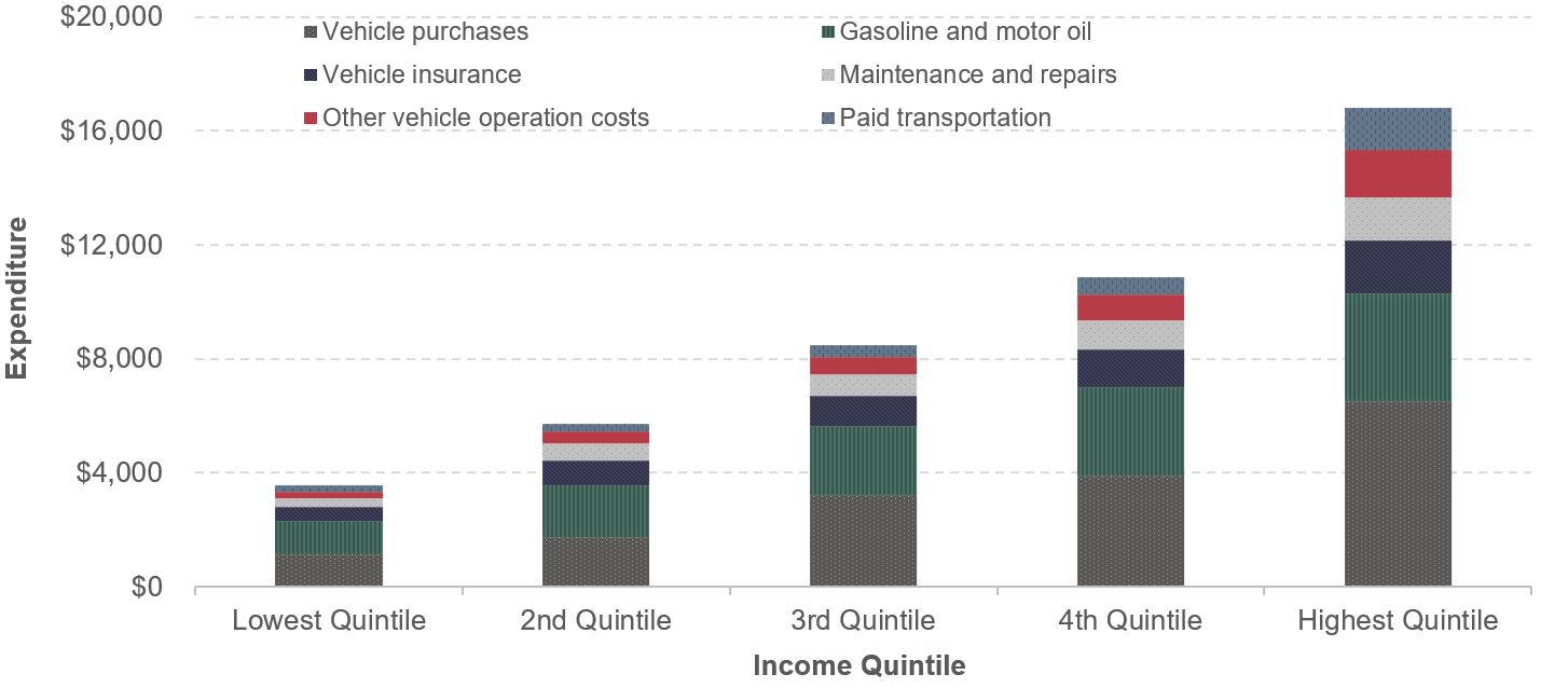
Historically, expenditures for transportation followed a standard pattern when examined across income quintiles: the level of transportation expenditure increased as household income rose, as did the share of transportation in total expenditure (Exhibit 3-33). High-income households tended to spend more on transportation than did their low-income peers. For example, the average annual transportation expenditure for households in the highest 20 percent of income (highest quintile) was $16,788 in 2014, which was 4.7 times the amount spent by households in the lowest income quintile ($3,555). This ratio of expansion is slightly higher than the ratio of the average household incomes between the two groups (4.4).
The composition of transportation expenditure also changes across income levels. Affluent households in the highest income quintile spent almost 40 percent of their transportation budgets on purchasing vehicles, and 23 percent on gasoline. Low-income households generally exhibited the opposite pattern, allocating a lower portion of their transportation budget to purchasing vehicles (32 percent) but a higher portion for gasoline (33 percent). At the same time, the condition of purchased vehicles also changed. In the top income quintile, new vehicles captured almost 60 percent of total vehicle purchase expenditure ($3,856), with the remaining 40 percent ($2,551) for used vehicles. This pattern was reversed for the bottom income quintile, where about one-third of vehicle purchase budget ($411) was spent on purchases of new cars and trucks, and two-thirds ($738) on used vehicles.
Purchased transportation also accounted for a larger portion of high-income households’ transportation expenditure. The lowest income quintile reported an average spending of $207 on transportation purchase that required a ticket (including transit, intercity bus, rail, air, cruise ships, and taxi) in 2014. The amount increased to $583 for a typical household in the 4th income quintile, or 5 percent of transportation expenditure. Purchased transportation more than doubled to $1,456 for households in the highest quintile, accounting for 9 percent of transportation spending. This pattern suggests that purchased transportation has been treated as a discretionary good whose consumption increases with income. Intercity travel—mostly air travel—was more popular among high-income groups, leading to higher purchased transportation expenditures from more expensive recreational travel.
Exhibit 3-33: Average Transportation Expenditure and its Components, by Income Quintile, 2014
| Lowest Quintile | 2nd Quintile | 3rd Quintile | 4th Quintile | Highest Quintile | Ratio Between Highest and Lowest Quintile |
|
|---|---|---|---|---|---|---|
| Total Expenditure | $23,713 | $33,546 | $45,395 | $60,417 | $104,363 | 4.4 |
| Transportation Expenditure | $3,555 | $5,696 | $8,475 | $10,844 | $16,788 | 4.7 |
| Share of Transportation in Total Expenditure | 15% | 17% | 19% | 18% | 16% | 0.0 |
| Vehicle Purchases | $1,149 | $1,737 | $3,207 | $3,905 | $6,503 | 5.7 |
| New vehicle | $411 | $550 | $1,327 | $1,661 | $3,856 | 9.4 |
| Old vehicle | $738 | $1,162 | $1,812 | $2,183 | $2,551 | 3.5 |
| Gasoline and Motor Oil | $1,160 | $1,842 | $2,437 | $3,111 | $3,789 | 3.3 |
| Vehicle Insurance | $501 | $853 | $1,038 | $1,311 | $1,857 | 3.7 |
| Maintenance and Repairs | $311 | $590 | $761 | $1,009 | $1,507 | 4.8 |
| Other Vehicle Operation Costs | $228 | $426 | $621 | $925 | $1,674 | 7.3 |
| Paid Transportation | $207 | $250 | $412 | $583 | $1,456 | 7.0 |
Source: Consumer Expenditure Survey 2014.
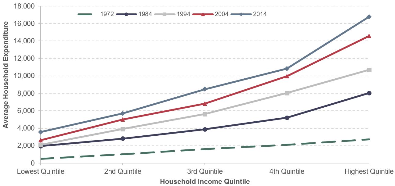
Average household expenditures for all income quintiles has risen over time (Exhibit 3-34). In each year, the higher earning quintiles had higher expenditures. However, the divergence between the highest income group and the rest of the population widened over time, as demonstrated in the kinked line between the 4th and 5th quintile. This can be attributed mainly to new vehicle purchase and purchased transportation, as discussed above.
Exhibit 3-34: Average Household Expenditure on Transportation by Income Quintile, 1972–2014
Source: Consumer Expenditure Surveys.
1 The poverty level is defined per the poverty guidelines issued each year in the Federal Register by the Department of Health and Human Services. It varies by family size and is used for administrative purposes such as determining financial eligibility for certain Federal programs. Poverty guidelines include adjustments in the poverty measure that account for increments across family size and are widely used by many federal programs for administrative purposes. In 2009, the poverty level ranged from $10,830 in one-person households to $37,010 for households with eight persons. The poverty guidelines also adjust for location by providing alternative income levels for Alaska and Hawaii. The Federal Register notice of the 2009 poverty guidelines is available at (https://aspe.hhs.gov/2009-poverty-guidelines-federal-register-notice). [Return to Section]