

Chapter 8: Supplemental Analysis
- Highway Supplemental Analysis
- Comparison of Scenarios with Previous Reports
- Timing of Investment
- Change in Past Construction Cost Inflation Estimates
- Transit Supplemental Analysis
- Asset Condition Forecasts and Expected Useful Service Life Consumed
- Impact of New Technologies on Transit Investment Scenarios
- Forecasted Expansion Investment
- Backlog Estimates across Recent C&P Reports

Key Takeaways
- The gap between the average annual investment level under the Improve Conditions and Performance scenario and base-year spending level have continually declined since the 2008 C&P Report.
- The gap between the average annual investment level under the Maintain Conditions and Performance scenario and base-year spending shrank in this edition but remains negative (i.e., base-year spending is bigger).
- The 1995 C&P Report predicted urban VMT that was close to actual traffic in 2013, but overpredicted rural VMT.
- Actual spending from 1994 through 2013 was lower than the amount estimated as being required to maintain conditions and performance in the 1995 C&P Report, consistent with deterioration in operational performance (e.g., increases in congestion) observed since 1993. However, physical conditions (pavement quality, bridge condition) have nevertheless improved since 1993.
- Timing of investment is not very significant in terms of conditions and performance results after 20 years; the advantage of front-loading highway investment comes mainly from allowing users to enjoy the benefits from improved system conditions and performance earlier.
- Applying the recently updated version of the National Highway Construction Cost Index (NHCCI), rather than the original NHCCI values, substantially changed the average annual investment levels associated with the Maintain Conditions and Performance scenario but not the Improve Conditions and Performance scenario.
Highway Supplemental Analysis
This chapter explores the implications of the highway investment scenarios considered in Chapter 7, starting with a comparison of the scenario investment levels with those presented in previous C&P Reports. This section also includes a look back at the projections reported in the 1995 C&P Report and compares them with actual performance over 20 years.
Next, this chapter explores alternative assumptions about the timing of investment over the 20-year analysis period. The following section also discusses the impacts that switching to a new cost inflation index series, the National Highway Construction Cost Index (NHCCI) 2.0, have had on estimated investment needs on highways and bridges. A subsequent section of this chapter provides supplementary analysis regarding the transit investment scenarios.
Comparison of Scenarios with Previous Reports
Each edition of this report presents various projections of travel growth, pavement conditions, and bridge conditions under different performance scenarios. The projections cover 20-year periods, beginning the first year after the data presented on current conditions and performance. Although the scenario names and criteria have varied over time, the C&P Report traditionally has included highway investment scenarios corresponding in concept to the Maintain Conditions and Performance scenario and the Improve Conditions and Performance scenario presented in Chapter 7.
Comparison With 2015 C&P Report
While there are some minor definitional differences between the capital investments scenarios presented in this 23rd edition of the C&P Report and the 2015 edition, the general concepts behind the Maintain Conditions and Performance scenario and the Improve Conditions and Performance scenario remain the same. The time periods analyzed differ, as this report covers a 20-year period of 2015 through 2034, rather than of 2013 through 2032 in the 2015 C&P Report.
The Maintain Conditions and Performance scenario identifies a level of investment associated with keeping overall conditions and performance at their base-year levels in 20 years. As discussed in Chapter 7, instead of assuming investment would grow at a constant rate, for the 23rd edition the investment level is set to stay at a fixed level in constant dollar terms over the analysis period. The target of the Maintain scenario component derived from the National Bridge Investment Analysis System (NBIAS) was changed from maintaining the percentage of total deck area on bridges classified as structurally deficient or functionally obsolete in the 2015 C&P Report to maintaining the share of total deck area on bridges classified as poor in this current edition. This change incorporates new metrics established under the PM-2 rulemaking described in the Introduction to Part I and Chapter 3. The PM-2 rule redefined the criteria for the structurally deficient classification and made it equal to the criteria used to classify bridges as in poor condition. As referenced in Chapter 4, functionally obsolete bridges are no longer identified in the National Bridge Inventory (NBI).
The Improve Conditions and Performance scenario sets a level of spending sufficient to fund all potential highway and bridge projects that are cost-beneficial over 20 years. Rather than gradually addressing these projects over 20 years based on a ramped investment pattern, the scenario in this 23rd edition assumes that cost-beneficial investments will be addressed immediately as they are identified.
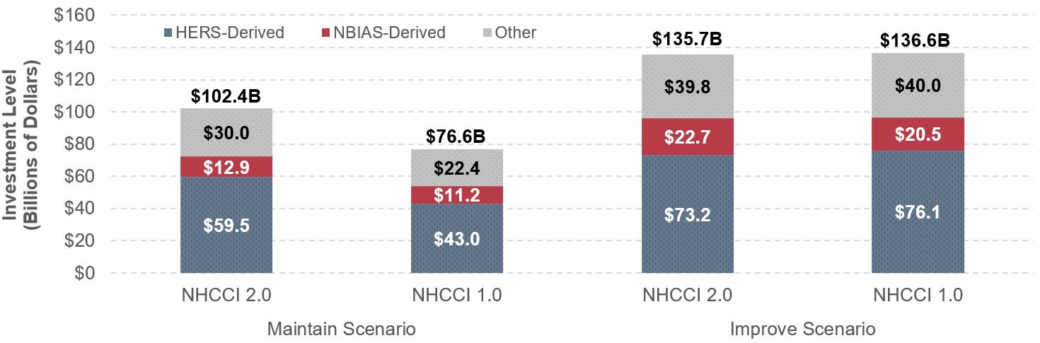
As discussed in Chapter 2, in this edition highway construction costs were converted to constant dollars using the Federal Highway Administration’s (FHWA’s) NHCCI 2.0, which increased by 5.0 percent between 2012 and 2014. Consequently, adjusting the 2015 C&P Report’s scenario figures from 2012 constant dollars to 2014 dollars causes the observed and projected highway construction costs to increase by 5 percent. Exhibit 8-1 shows that the 2015 C&P Report estimated the average annual investment level in the current Maintain Conditions and Performance scenario at $89.9 billion in 2012 dollars; adjusting for inflation shifts this figure to $94.4 billion in 2014 dollars. The comparable amount for the Maintain Conditions and Performance scenario presented in Chapter 7 of this edition is $102.4 billion in 2014 dollars, approximately 8.5 percent higher than the adjusted 2015 C&P Report estimate.
Similarly, the average annual investment level in the 2015 C&P Report for the Improve Conditions and Performance scenario was estimated to be $142.5 billion in 2012 dollars, the equivalent of $149.7 billion in 2014 dollars after adjusting for inflation. The comparable amount for the Improve Conditions and Performance scenario presented in Chapter 7 of this edition is $135.7 billion, 9.3 percent lower than the adjusted annual investment level based on the 2015 C&P Report.
Exhibit 8-1: Selected Highway Investment Scenario Projections from this 23rd Edition Compared with Projections from the 2015 C&P Report
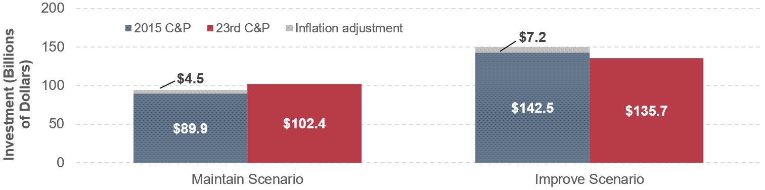
Note: Inflation adjustment refers to the investment levels for the highway and bridge scenarios adjusted for inflation using the FHWA National Highway Construction Cost Index.
Sources: Highway Economic Requirements System and National Bridge Investment Analysis System.
Comparisons of Implied Funding Gaps
Exhibit 8-2 compares the funding gaps implied by the analysis in the current report with those implied by previous C&P Report analyses. The funding gap is measured as the percentage by which the estimated average annual investment needs for a specific scenario exceeds the base-year level of investment. The scenarios examined are this report’s Maintain Conditions and Performance scenario and Improve Conditions and Performance scenario and their counterparts in previous C&P Reports.
Exhibit 8-2: Comparison of Average Annual Highway and Bridge Investment Scenario Estimates with Base-Year Spending, 1997 to 23rd C&P Editions
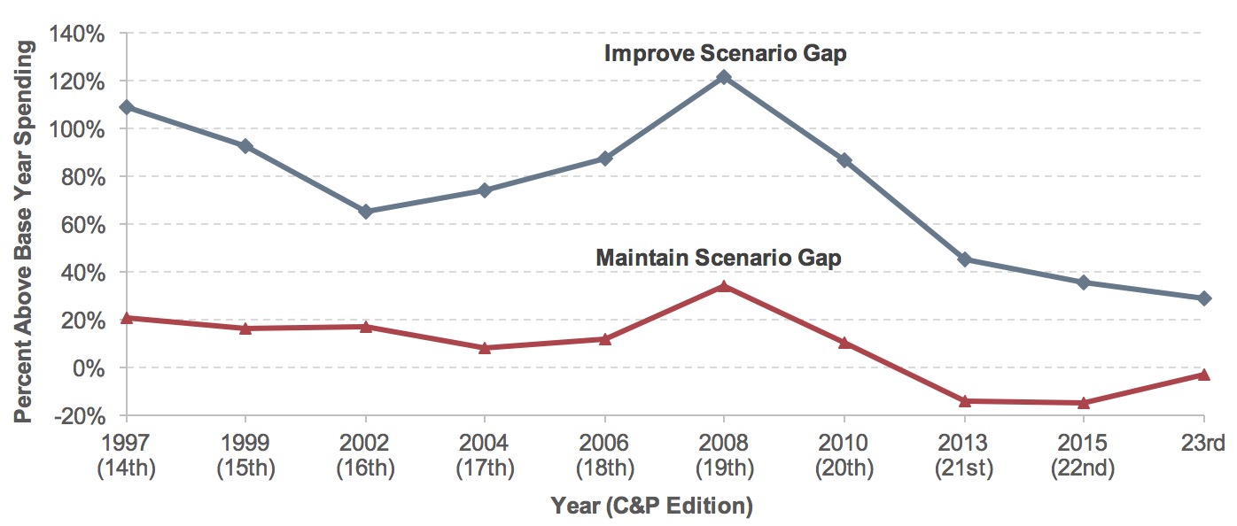
Note: Amounts shown correspond to the primary investment scenario associated with maintaining or improving the overall highway system in each C&P Report; the definitions of these scenarios are not fully consistent among reports. The values shown for this report reflect the Maintain Conditions and Performance and the Improve Conditions and Performance scenarios. Negative numbers signify that the investment scenario estimate was lower than base-year spending.
Sources: Highway Economic Requirements System and National Bridge Investment Analysis System.
Prior to the 2013 C&P Report, each C&P Report edition showed that actual annual spending in the base year for that report had been below the estimated average investment level required to maintain conditions and performance at base-year levels over 20 years. Beginning with the 2013 C&P Report, the trend was reversed, and gaps between actual and required amounts for the primary “Maintain” scenario became negative. This result dramatically differed from the positive numbers estimated in pre-2013 C&P Reports, indicating that base-year spending reported in recent C&P Reports was higher than the average annual spending levels identified for the Maintain Conditions and Performance scenario. The primary “Improve” scenario follows a similar trend, where the funding gap has dropped steadily since its peak in the 2008 C&P Report.
Changes in actual capital spending by all levels of government combined can substantially alter these spending gaps, as can sudden, large swings in construction costs. The large increase in the gap between base-year spending and the primary “Maintain” and “Improve” scenarios presented in the 2008 C&P Report coincided with a large increase in construction costs experienced between 2004 and 2006 (the base year for the 2008 C&P Report). On the other hand, the decreases in the gaps presented in recent editions coincided with subsequent declines in construction costs. As discussed in greater detail later in this section, the adoption of NHCCI 2.0 in this edition had a downward impact on construction costs in the Improve scenario and an upward impact in the “Maintain” scenario.
The differences among C&P Report editions in the implied gaps reported in Exhibit 8-2 are not a consistent indicator of change over time in how effectively highway investment needs are addressed. FHWA continues to enhance the methodology used to determine scenario estimates for each edition of the C&P Report to provide a more comprehensive and accurate assessment. In some cases, these refinements have increased the level of investment in one or both of the scenarios (the “Maintain” or “Improve” scenarios, or their equivalents); other refinements have reduced this level. For example, the small deviations of investment level from base-year spending in this edition can be partially attributed to the change in the calculation of the cost index.
Comparisons with 1995 C&P Report
The 1995 C&P Report provided forecasts for vehicle miles traveled (VMT) as well as for required investment to maintain and improve system conditions and performance over the period of 1993 to 2013. Comparing projections from previous C&P Reports with what actually happened can provide useful insights in assessing the information presented in this 23rd edition.
Travel Forecasts Compared with Actual Travel Growth
Transportation professionals agree that projecting future traffic is essential for evaluating investment needs based on travel demand models. However, forecasting is extremely difficult because of uncertainties in factors such as economic conditions, demographic shifts, and policy changes. Deviation from actual VMT can occur when the prediction models fail to capture changes in traveler behavior, such as changed preferences or new technologies.
The 1995 C&P Report provided two travel forecasts: the Highway Performance Monitoring System (HPMS) forecast and a forecast that was consistent with projections by metropolitan planning organizations (MPOs). HPMS predicted that traffic would grow by 2.23 percent per annum from 1993 to 2013 on highway sections in the 33 most populous urbanized areas. The MPOs derived another travel forecast based on local planning processes to reflect potential future policy changes and social, fiscal, and environmental constraints on capacity expansion. The HPMS travel forecast was thus adjusted using a factor to generate an MPO-consistent forecast for the underlying investment requirement estimation. The HPMS forecast of VMT growth was adjusted downward and highway travel was projected to increase at a dampened rate of 1.50 percent per annum, instead of 2.23 percent in the HPMS forecast, in the 33 most populous urbanized areas. No adjustments were made to the HPMS sections outside those urbanized areas. The overall impact on the national level VMT forecasts for all urbanized areas was a reduction from 2.32 percent per annum in HPMS to 1.91 percent. The impact on the VMT forecast for all rural and urban travel combined was a reduction from 2.37 percent per annum value from HPMS to a 2.15 percent per annum value.
The 1995 C&P Report noted that the average annual VMT growth rate was 3.5 percent from 1966 to 1993. While the 1995 report’s projected growth rate of 2.15 percent from 1993 to 2013 was a step downward, it significantly overestimated actual VMT growth over that period, which was 1.33 percent per annum. This finding is consistent with an analysis of travel forecasts for all editions, presented in the 2015 C&P Report, which suggested that States have tended to underestimate future VMT during times of rapid travel growth and tended to overestimate future VMT at times when travel growth was slowing.
As shown in Exhibit 8-3, the overprediction of future travel in the 1995 C&P Report is more noticeable in rural VMT: the HPMS forecast projected annual growth of 2.45 percent in rural VMT between 1993 and 2013, far above the actual annual VMT growth rate of 0.30 percent. In urban areas (including both small urban areas and urbanized areas), actual VMT increased at 1.88 percent per year from 1993 to 2013, almost exactly equal to the MPO-adjusted forecast of 1.91 percent for all urbanized areas and well below the HPMS forecasts of 2.32 percent for all urbanized areas and 2.37 percent for small urban areas. Although the comparison is complicated by altered classification of some highways from rural to urban due to changes in urban boundaries that have occurred since 1993, the models used to develop the scenario estimates would not have taken such changes into account in their estimates of rural versus urban investment needs.
Exhibit 8-3: Rural and Urban VMT Projections from the 1995 C&P Report Compared with Actual VMT, 1985–2013
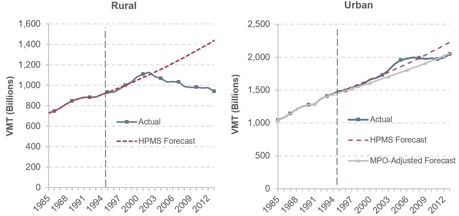
Note: HPMS forecast is 20-year forecast of future highway VMT in the HPMS submitted by States. MPO forecast is adjusted 20-year travel forecast in the 33 most populous urbanized areas of HPMS highway sections. A factor was applied to each target year HPMS travel forecast to ensure the adjusted average compound annual travel growth rate through 2013 was the same as the average compound annual travel growth rate projected by the MPOs for highways in the 33 urbanized areas. No adjustments were made to HPMS sections outside the 33 urbanized areas.
Source: 1995 Status of the Nation's Highways and Bridges: Conditions and Performance Report to Congress; Highway Statistics various years, Table VM202.
Scenario Investment Levels Compared to Actual Spending
Exhibit 8-4 shows the estimated average annual and cumulative 20-year highway and bridge needs associated with the two scenarios presented in the 1995 C&P Report. The cumulative values are also adjusted for inflation to 2014 constant dollars using the FHWA composite Bid Price Index (BPI) over the period of 1994–2003 and the NHCCI 2.0 for subsequent years.
Assuming an annual travel growth rate of 2.15 percent, the 1995 C&P Report estimated the average annual cost to maintain overall 1993 highway conditions and performance through 2013 at $54.8 billion in 1993 dollars. The cumulative 20-year value was $1.096 trillion in 1993 dollars, equivalent to $2.366 trillion 2014 constant dollars after inflation adjustment. The average annual cost of the “Improve” scenario, called “economic efficiency” in the report, was estimated at $74.0 billion 1993 dollars, with a cumulative value of $3.195 trillion in 2014 constant dollars. The estimated spending requirements under both scenarios in the 1995 C&P Report exceeded the actual cumulative capital outlay of $2.063 trillion in 2014 constant dollars. Actual capital outlay was 15 percent below the estimate under the Maintain Conditions and Performance scenario, and 55 percent below the estimate under the Improve Conditions and Performance scenario. (It should be noted that the scenarios presented in the 1995 C&P Report were not adjusted to account for types of capital spending that were not modeled in the report; these gaps between the scenario investment levels and actual spending would be larger if nonmodeled spending had been taken into account.)
Exhibit 8-4: 1995 C&P Report Highway and Bridge Investment Scenario Estimates Versus Cumulative Spending, 1994 Through 2013
| 1994–2013 Projection From 1995 C&P Report | Adjusted for Inflation | ||
|---|---|---|---|
| Average Annual (Billions of 1993 Dollars) | Cumulative 20 Years (Billions of 1993 Dollars) | Cumulative 20 Years (Billions of 2014 Dollars) | |
| 20-Year Highway Capital Investment Scenarios (Assuming 2.15 Percent Annual VMT Growth from 1994 to 2013) | |||
| Maintain Conditions and Performance Scenario | $54.8 | $1,096.0 | $2,366.0 |
| Improve Conditions and Performance Scenario | $74.0 | $1,480.0 | $3,195.0 |
| Actual 20-Year Highway Capital Investment (VMT Grew 1.33 Percent per Year from 1993 to 2013) | |||
| Cumulative Capital Outlay, 1994 through 20131 | $2,063.0 | ||
1 Highway capital outlay by all levels of government combined totaled $1.467 trillion in nominal dollar terms over the 20-year period from 1994 through 2013. This equates to $2.063 trillion in constant 2014 dollars.
Sources: 1995 Status of the Nation's Highways and Bridges: Conditions and Performance Report to Congress; Highway Statistics, various years, Tables HF-10A, HF-10, PT-1, and SF-12A; and unpublished FHWA data.
Changes in Operational Performance
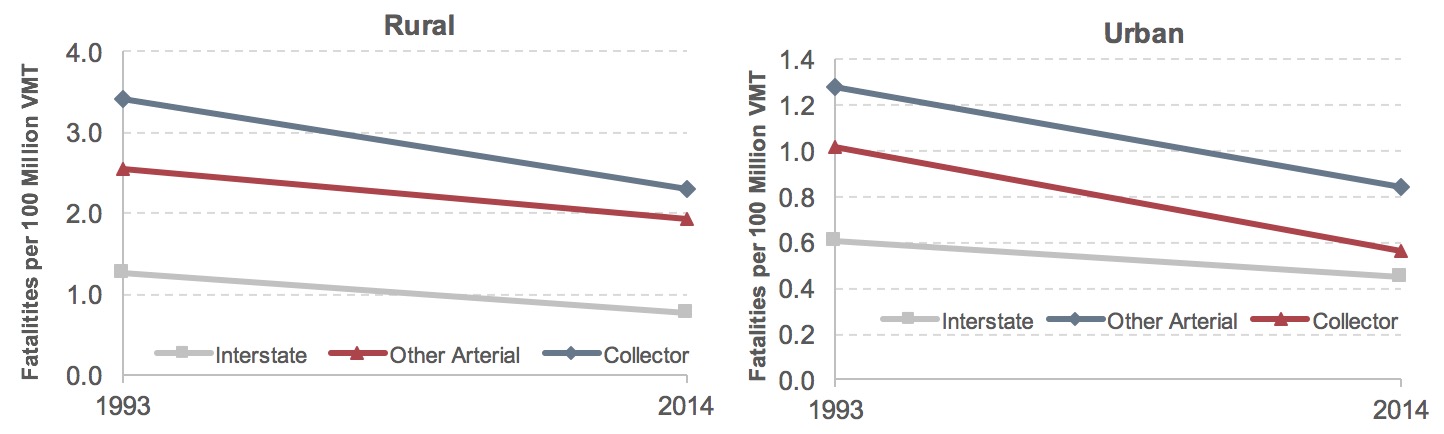
The gap between actual spending from 1994 through 2013 and the spending in the 20-year Maintain Conditions and Performance scenario from the 1995 C&P Report adjusted for inflation would suggest that overall system conditions and performance should have deteriorated over time. The 1995 C&P Report measured operational performance using indicators such as levels of service and volume-to-service-flow ratios that are not reported in the current report, rendering direct comparison impossible. However, as discussed in Chapter 4, the Texas A&M Transportation Institute produces a set of congestion measures for the Nation’s 471 urbanized areas that facilitate comparison over time. Congestion worsened quickly over the 20-year period, leading to lower productivity and wasted fuel. Total annual delay was 89 percent higher in 2013 than in 1993 due to congestion (Exhibit 8-5). Congestion also resulted in a surge of 121 percent in wasted fuel. Collectively, the societal cost of congestion increased by 103 percent from 1993 to 2013. This increase in delay far outpaced the 30 percent expansion of VMT during the same period.
The 1995 C&P Report aggregated bridge data into functional system groupings of Interstate, other arterial, and collector. Exhibit 8-6 compares these data with data from Chapter 4 of this report aggregated into the same groupings. (See the “Functionally Obsolete Bridges” section in Chapter 4 for a discussion of the criteria used to classify a bridge as functionally obsolete.) Based on bridge count, the percentage of bridges classified as functionally obsolete increased in urban areas from 1994 to 2014, though the percentage in rural areas declined.
Coupled with the results shown in Exhibit 8-5, this suggests that capital investment over the 20-year period was not sufficient to maintain operational performance at base-year levels (1993 for pavements, 1994 for bridges) in urban areas. This appears consistent with the gap identified in Exhibit 8-4 between actual 20-year spending and the investment level identified for the Maintain Conditions and Performance scenario in the 1995 C&P Report.
Exhibit 8-5: Growth of Delay, Fuel Wasted, and Congestion Cost in Urbanized Areas (Relative to 1993 Values), 1993–2013
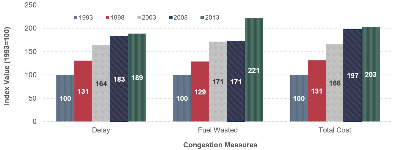
Note: To facilitate comparisons of trends, each performance metric was mathematically converted so that its value for the year 1993 would be equal to 100.
Source: Texas Transportation Institute 2015 Urban Mobility Scorecard (2015), https://mobility.tamu.edu/ums/report/.
Exhibit 8-6: Percentage of Functionally Obsolete Bridges, 1994 and 2014
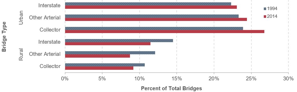
Source: 1995 Status of the Nation's Highways and Bridges: Conditions and Performance Report to Congress; National Bridge Inventory.
Changes in Physical Condition
While operational performance as measured by congestion got worse during the 20-year analysis period, key measures of physical conditions improved. Exhibit 8-7 shows significant declines in the percentage of bridges classified as structurally deficient on the Nation’s highways. (See the Summary of Current Highway and Bridge Conditions section in Chapter 6 for a discussion of the criteria used to classify bridges as structurally deficient.) The largest declines were on bridges on urban Interstates, other urban arterials, and other rural arterials, where the share of structurally deficient bridges was cut by more than half from 1994 to 2014. The smallest improvement occurred on rural Interstate bridges (where the percentage of bridges classified as structurally deficient declined from 4.0 percent in 1994 to 3.6 percent in 2014), but these bridges were in the best shape to start with among the functional classes.
Exhibit 8-7: Percentage of Structurally Deficient Bridges, 1994 and 2014
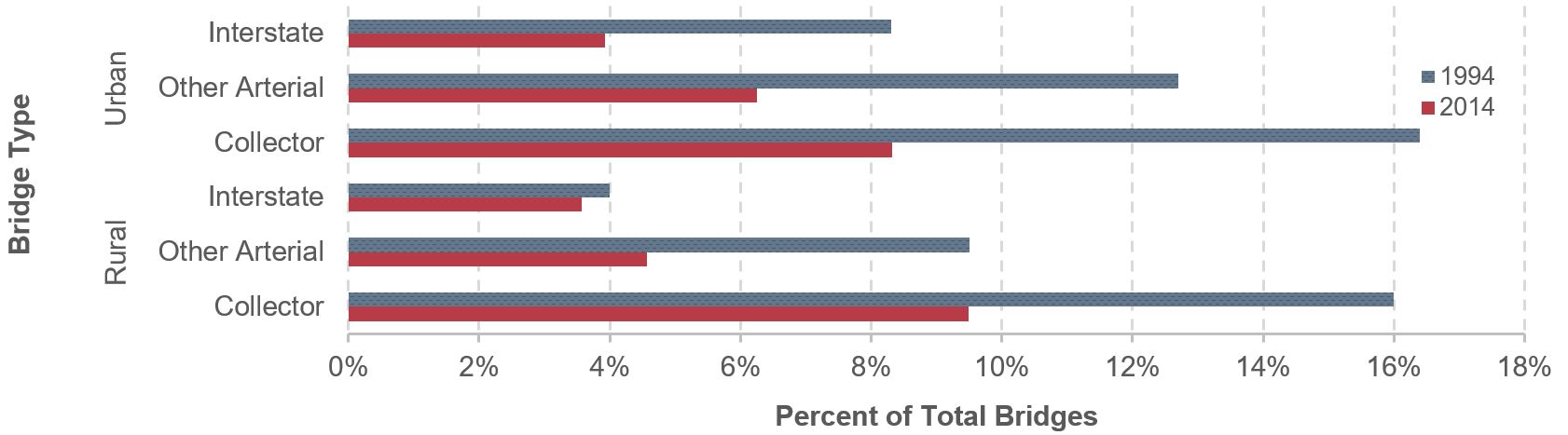
Source: 1995 Status of the Nation's Highways and Bridges: Conditions and Performance Report to Congress; National Bridge Inventory.
Functional Obsolete Bridge Trends vs. Structurally Deficient Bridge Trends
Although the share of bridges classified as structurally deficient declined in both rural and urban areas from 1994 to 2014, this was not the case for bridges classified as functionally obsolete, where the share declined in rural areas but rose in urban areas. In some cases, the lack of available right-of-way in urban areas may make it cost-prohibitive to bring a bridge up to current design standards relative to the volume of traffic that it carries. This can result in situations in which a bridge rehabilitation or replacement project corrects a structural deficiency while leaving the bridge functionally obsolete.
If a bridge has issues that would warrant classification as both structurally deficient and functionally obsolete, the standard NBI convention is to identify the bridge as structurally deficient because structural deficiencies are considered more critical.
The categories of pavement condition shown in the 1995 C&P Report differ from those in this report; the 1993 data reported in Exhibit 8-8 have been regrouped to be consistent with the good, fair, and poor classifications based on International Roughness Index (IRI) thresholds referenced in Chapter 6 of this edition.
Pavement ride quality improved remarkably on rural arterials and on higher functional classes of urban areas. For example, the percentage of VMT on pavement identified as good, with an IRI score below 95, increased from 56.6 percent of rural Interstate in 1993 to 80.7 percent in 2014. The trend of better ride quality in higher functional classes remains unchanged in urban areas. Furthermore, the percentage of travel on pavement identified as poor also declined. About 5.6 percent of rural Interstate was rated as poor in 1994; this share fell to 2.6 percent in 2014.
Coupled with the results shown in Exhibit 8-7, this suggests that capital investment over the 20-year period was more than sufficient to maintain physical conditions at base-year levels (1993 for pavements, 1994 for bridges), despite having been less than the investment level identified for the Maintain Conditions and Performance scenario in the 1995 C&P Report. However, as noted above (see Changes in Operational Performance section), capital investment over the 20-year period was not sufficient to maintain operational performance at base-year levels.
Exhibit 8-8: Percentages of Vehicle Miles Traveled on Pavements with Good and Poor Ride Quality by Functional System, 1993 and 2014
| Functional System | Good (IRI<95) | Poor (IRI>170)1 | ||
|---|---|---|---|---|
| 1993 | 2014 | 1993 | 2014 | |
| Rural Interstate | 56.6% | 80.7% | 5.6% | 2.6% |
| Rural Other Freeway and Expressway2 | 77.4% | 2.4% | ||
| Rural Other Principal Arterial2 | 68.3% | 3.9% | ||
| Rural Other Principal Arterial2 | 46.8% | 29.4% | ||
| Rural Minor Arterial | 40.5% | 55.8% | 28.0% | 6.6% |
| Rural Major Collector | 43.0% | 40.1% | 17.5% | 15.7% |
| Urban Interstate | 45.8% | 64.2% | 8.9% | 7.2% |
| Urban Other Freeway and Expressway | 38.6% | 54.3% | 36.7% | 10.1% |
| Urban Other Principal Arterial | 37.8% | 36.0% | 39.8% | 24.8% |
| Urban Minor Arterial | 38.7% | 25.2% | 20.5% | 31.3% |
| Urban Collector2 | 35.1% | 24.9% | ||
| Urban Major Collector2 | 20.3% | 37.5% | ||
| Urban Minor Collector2 | 32.2% | 24.8% | ||
1 HPMS pavement reporting requirements were modified in 2009 to include bridges; features such as open grated bridge decks or expansion joints can greatly increase the IRI for a given section.
2 The HPMS functional classifications were revised in 2010. Rural Other Freeways and Expressways were split out of the Rural Other Principal Arterial category, and Urban Collector was split into Urban Major Collector and Urban Minor Collector.
Source: 1995 Status of the Nation's Highways and Bridges: Conditions and Performance Report to Congress; Highway Performance Monitoring System.
Fatality Rate Trends
While the models used to develop the Maintain Conditions and Performance scenario for the 1995 C&P Report did not consider the full range of potential investments that would impact highway safety, it is important to note the considerable improvements that have subsequently occurred. Exhibit 8-9 displays rates of highway fatalities resulting from vehicle crashes for the years 1993 and 2014, for rural and urban highways respectively. As discussed in Chapter 5, fatality rates are commonly measured as the number of persons fatally injured per 100 million VMT. Fatality rates declined for each of the functional system categories during these two decades, consistent with an overall improvement in highway safety, even though actual highway spending over this period was less than the investment level identified for the Maintain Conditions and Performance scenario in the 1995 C&P Report.
Exhibit 8-9: Fatality Rates by Functional System, 1993 and 2014
Source: 1995 Status of the Nation's Highways and Bridges: Conditions and Performance Report to Congress; Fatality Analysis Reporting System/National Center for Statistics and Analysis, NHTSA.
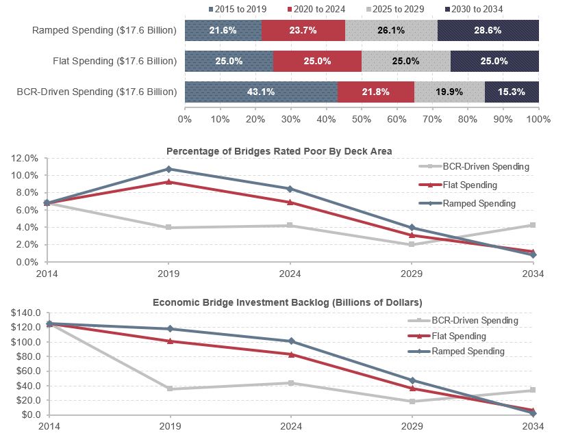
Timing of Investment
The investment-performance analyses presented in this report focus mainly on how alternative average annual investment levels over 20 years might impact system performance at the end of this period. Within this period, the timing of investment can significantly influence system performance. The following discussion explores the impacts of three alternative assumptions about the timing of future investment—ramped spending, flat spending, or spending driven by BCR—on system performance within the 20-year period analyzed. These patterns can be related to the capital investment scenarios described in Chapter 7, where the spending levels are set flat in the Sustain 2014 Spending scenario and the Maintain Conditions and Performance scenario and BCR-driven in the Improve Conditions and Performance scenario.
The ramped spending assumption is that any change from the combined investment level by all levels of government would occur gradually over time and at a constant growth rate. The constant growth rate of the ramped analysis measures future investment in real terms; thus, the distribution of spending among funding periods is driven by the annual growth of spending. To ensure higher overall growth rates for a given amount of total investment, a smaller portion of the 20-year total investment would occur in the earlier years than in the later years. All scenarios presented in the 2015 C&P Report were ramped.
The flat spending assumption is that combined investment would immediately jump to the average annual level being analyzed, then remain fixed at that level for 20 years. The Maintain Conditions and Performance scenario and the Sustain 2014 Spending scenario presented in Chapter 7 each assume flat spending. Because spending would stay at the same level in each of the 20 years, the distribution of spending within each 5-year period comprises one-quarter of the total.
The Improve Conditions and Performance scenario presented in Chapter 7 was tied directly to a BCR cutoff of 1.0, rather than to a particular level of investment in any given year. This BCR-driven approach resulted in significant front-loading of capital investment in the early years of the analysis, as the existing backlog of potential cost-beneficial investments was first addressed, followed by a sharp decline in later years.
Alternative Timing of Investment in HERS
This section presents information regarding how the timing of investment would impact the distribution of spending among the four 5-year funding periods considered in HERS and how these spending patterns could impact performance. Because the timing of investment is varied for any given capital investment level, pavement condition and delay per VMT will change accordingly.
Alternative Investment Patterns
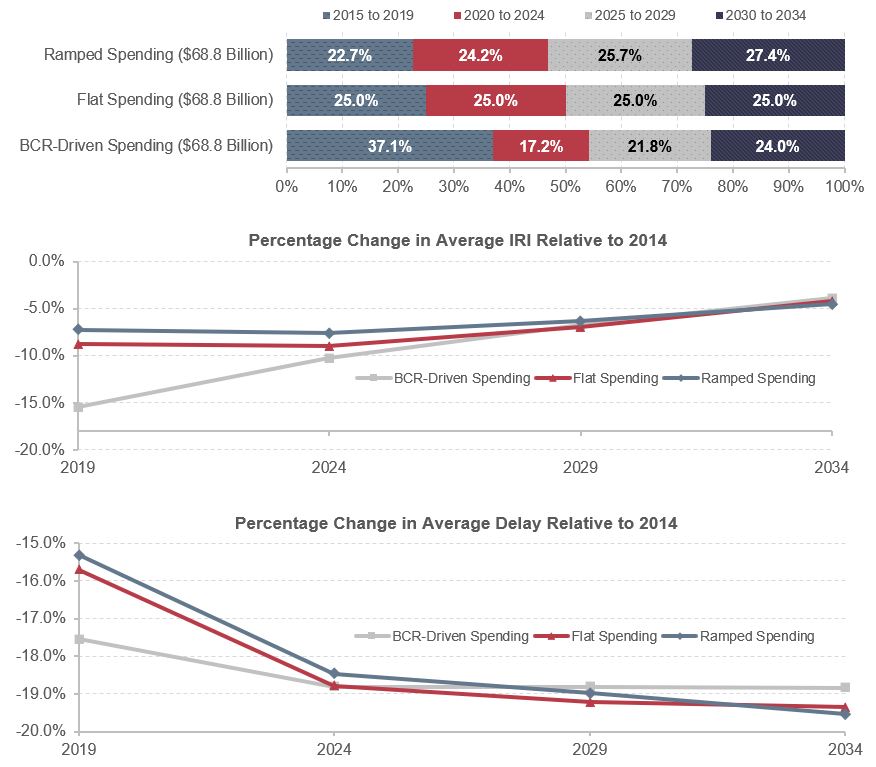
Exhibit 8-10 indicates how alternative assumptions regarding the timing of investment would impact the distribution of spending among the four 5-year funding periods considered in HERS, and how these spending patterns could affect pavement condition (measured using the IRI) and average delay per VMT. Three investment patterns—ramped spending, flat spending, and BCR-driven spending—were analyzed based on a uniform average annual investment level of $68.8 billion.
As shown in the top panel of Exhibit 8-10, the level of investment grows over time in the ramped spending case, assuming a constant growth of real investment. Under this scenario, annual investment would grow by 1.26 percent per year, which totals $1.376 trillion over 20 years or $68.8 billion per year in constant 2014 dollars. Only 22.7 percent of the total 20-year investment occurs in the first 5-year period, 2015 to 2019, while 27.4 percent of total investment occurs in the last 5-year period, 2030 to 2034. Under the flat spending alternative, investment is equally distributed over time so that each 5-year period accounts for exactly one-quarter of the total 20-year investment, and annual spending is at $68.8 billion in 2014 constant dollars.
The BCR-driven spending alternative displays a different investment pattern. A high proportion of total spending, 37.1 percent of total investment, would occur in the first 5-year period to partially address the large backlog of cost-beneficial investment the system is facing now (see the backlog discussion in Chapter 7). Under this alternative, investment needs in the second 5-year period would drop to 17.2 percent of the total 20-year need. Investment needs would increase in the last two 5-year periods because many roadways that were rehabilitated in the first 5-year period would need to be resurfaced or reconstructed again.
Exhibit 8-10: Impact of Investment Timing on HERS Results For a Selected Investment Level—Effects on Pavement Roughness and Delay per VMT
Source: Highway Economic Requirements System.
Impacts of Alternative Investment Patterns
An obvious difference among the three alternative investment patterns is that the higher the level of investment within the first 5-year analysis period, the better the level of performance achieved by 2017.
The middle panel of Exhibit 8-10 presents percentage changes of average pavement roughness as measured by IRI compared with the 2014 level under the three investment cases. A reduction in average IRI represents improvement in pavement conditions. The graph shows that the BCR-driven spending case yields the greatest improvement in pavement conditions in the first 5-year period, represented by a large drop in average IRI by 15.5 percent from its 2014 level. The improvement under the BCR-driven spending alternative shrinks to 3.9 percent by the last 5-year period. Steady pavement improvement over time is achieved in ramped spending and flat spending assumptions. In the first 10 years, average IRI decreases by 8.8–8.9 percent (relative to the 2014 level) under the flat spending case. The benefit of pavement improvement quickly declined to 4.2 percent by the last 5-year period. The ramped spending assumption leads to a 7.2-percent drop in average IRI in the first 5-year period and further improvement in pavement afterward, but the improvement is not as pronounced as for the flat spending alternative. The decreases of average IRI are similar by 2034 under all three cases, despite an initial large improvement in pavement condition in the BCR-driven case.
The bottom panel of Exhibit 8-10 illustrates the progress in average delay reduction across three investment cases. The percentage change of average delay, relative to its 2014 level, remains negative, indicating a decrease in average delay of travelers. In the first 5 years, the BCR-driven spending approach results in the largest reduction in average delay per VMT, 17.5 percent, and the ramped spending the smallest reduction, 15.3 percent. The percentages of delay reduction grow over time under all three cases, suggesting sustained benefits through capital investment to improve capacity. The percentage change of average delay is stable under BCR-driven spending. By the end of the 20-year analysis period, the difference between projected average delay and the 2014 delay will be approximately 19 percent under all three alternatives.
These results show that the BCR-driven approach achieves the highest IRI and delays reduction in the medium run (the first 5-year period) because existing backlog is addressed first. The ramped spending approach results in the smallest pavement and delay improvement over the same period. System performance, however, does not differ substantially across investment timing in the long run of 20 years. Based on this analysis, the key advantage to front-loading highway investment is not in reducing 20-year total investment needs; instead, the strength of BCR-driven spending lies in the years of additional benefits that highway users would accrue over time if system conditions and performance were improved earlier in the 20-year analysis period.
Alternative Timing of Investment in NBIAS
Exhibit 8-11 identifies the impacts of alternative investment timing on the share of bridges that are structurally deficient by deck area using the three investment assumptions described above: ramped spending, flat spending, and BCR-driven spending. An average annual investment level of $17.6 billion was assumed for each alternative analyzed.
Similar to the results of pavement investment in HERS presented earlier, investment timing has an impact on structurally deficient bridges. The ramped case for the NBIAS Improve Conditions and Performance scenario assumes constant annual spending growth of 1.9 percent, with a total 20-year investment of $352 billion and an average annual investment of $17.6 billion in constant 2014 dollars. The top panel of Exhibit 8-11 indicates that more investment occurs in the later years under the ramped case of gradual and constant growth—from 21.6 percent in the initial 5-year period to 28.6 percent in the last 5-year period. The BCR-driven spending case requires a large portion of the total 20-year investment in the first 5-year period (43.1 percent) and declines sharply to 15.3 percent in the last 5-year period. Spending levels remain constant in the flat spending case.
A different investment pattern produces substantially different outcomes. The middle panel of Exhibit 8-11 shows that the greatest bridge improvement in the first 5-year period occurs under the BCR-driven spending assumption, as the share of structurally deficient bridges by deck area drops from 6.8 percent in 2014 to 4.0 percent in 2019. During the same period, the share of structurally deficient bridges increases to 9.2 percent under the flat spending assumption and 10.7 percent under the ramped spending assumption. In the next 15 years, however, this pattern is reversed. At an average annual investment level of $17.6 billion, NBIAS projects that the lowest share of structurally deficient bridges in 2034 would be achieved under the ramped spending approach with only 0.8 percent of bridges that are structurally deficient, compared with 1.2 percent assuming flat spending and 4.2 percent for the BCR-driven spending alternative.
Exhibit 8-11: Impact of Investment Timing on NBIAS Results For a Selected Investment Level—Effects on Bridges Rated as Poor and Economic Bridge Investment Backlog
Source: National Bridge Investment Analysis System.
The economic bridge investment backlog also exhibits different trends under the alternative investment timing. The lower panel of Exhibit 8-11 indicates that, from 2014 to 2019, the average backlog declines significantly under the BCR-driven alternative, with slower declines under the flat spending alternative and ramped spending. The rate of decline is determined by the investment timing. High bridge investment in later years under ramped spending leads to a small economic backlog of $2.2 billion in 2014 constant dollars by 2034, while the projected backlog would be $5.9 billion and $33.5 billion under the flat spending and BCR-driven spending assumptions, respectively.
Change in Past Construction Cost Inflation Estimates
As described in Chapter 2, the average annual change in highway construction costs was calculated based on the new FHWA NHCCI in 2003–2014, called NHCCI 2.0. The NHCCI 2.0 shows much more growth in highway construction cost than did the original NHCCI (NHCCI 1.0). Exhibit 8-12 demonstrates the impact on needs estimation from different cost inflation assumptions.
NHCCI 1.0 showed index values of 124.8 for rural highways and 121.1 for urban highways in 2014. Using the same base quarter (2003 Q1=100), NHCCI 2.0 shows much higher values of 168.6 for rural (35.1 percent higher than NHCCI 1.0) and 168.9 for urban highways (39.5 percent higher) in 2014.
These changes in the NHCCI had implications for the HERS and NBIAS analyses, since they are used to inflate cost data collected in previous years. In the case of HERS, the NHCCI was used to inflate a set of typical costs per mile for different types of highway pavement and capacity improvements that date back to 2002. For NBIAS, the NHCCI was used to inflate estimates of typical costs for certain types of bridge maintenance, repair, and rehabilitation costs that date back to 2008 (estimated bridge replacement costs do not rely on the NHCCI). The switch to the higher index values in NHCCI 2.0 resulted in higher construction costs and reduced the number of projects that were estimated to be cost-beneficial; that is, those with a BCR greater than or equal to 1.
Exhibit 8-12: Impact of Using NHCCI 2.0 to Inflate Historical Capital Costs on Highway Investment Scenario Average Annual Investment Levels
Note: The NHCCI 2.0 levels shown correspond to the systemwide scenarios presented in Chapter 7. The investment levels shown are average annual values for the period from 2015 through 2034.
Sources: Highway Economic Requirements System and National Bridge Investment Analysis System.
The index change had a more significant impact on the average annual investment levels for the Maintain Condition and Performance scenario than for the Improve Conditions and Performance scenario. The average annual investment level associated with the Maintain Conditions and Performance scenario in Chapter 7 was $102.4 billion per year in constant 2014 dollars, based on NHCCI 2.0. Alternatively, the average annual investment level would have been $76.6 billion if NHCCI 1.0 were used. The Maintain Conditions and Performance scenario requires HERS and NBIAS to keep overall conditions and performance at 2014 levels over 20 years. Given higher construction costs from switching to NHCCI 2.0, it is expected that the investment will increase substantially to meet these pre-set targets of conditions and performance.
Under the Maintain Conditions and Performance scenario, the change was more significant from the HERS-derived component, where annual investment needs rose from $43.0 billion using NHCCI 1.0 to $59.5 billion using NHCCI 2.0, a 38.4 percent increase. The NBIAS-derived component estimated that annual investment would increase by 15.6 percent when updated to the new NHCCI 2.0. Much of the relative difference in the impacts on HERS versus NBIAS can be attributed to the fact that only a portion of the NBIAS unit costs are affected by the NHCCI, and those were affected for a shorter period of time.
The switch from NHCCI 1.0 to NHCCI 2.0 had a much smaller impact on the Improve Conditions and Performance scenario, as the average annual investment level dropped from $136.6 billion to $135.7 billion. The average annual investment level for the HERS-derived portion of this scenario would be $2.9 billion (3.8 percent) lower using NHCCI 2.0, while the NBIAS-derived portion would be $2.2 billion (11.2 percent) higher.
Under the Improve Conditions and Performance scenario, there will be fewer eligible projects that meet the BCR threshold, but each project that is implemented would be more expensive. Hence, while the overall average annual investment level was not significantly affected by switching to the NHCCI 2.0, the total number of projects implemented was reduced, as was their cumulative impact on overall system conditions and performance.
Key Takeaways
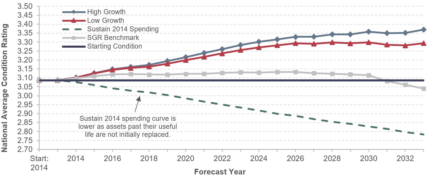
The national condition level of transit assets in 2014 stood at 3.1 (on a scale from 1 to 5), which is in the low range of the adequate condition(3.0–3.9).
Asset Conditions under Investment Scenarios
- Low- and High-Growth Investment Scenarios: Under these scenarios, after an initial jump, the average condition in 2034 is projected to be in the 3.3–3.5 range, a slight increase from the 2014 level.
- Sustain 2014 Spending: Under this scenario, the average condition is predicted to decrease consistently from the 2014 level (3.1) to 2.8, in the top of the marginal condition range (2.0–2.9). The main reason for this result is that assets past their useful life are not initially replaced because investment in replacement is constrained, and insufficient to fully address the backlog.
- To support a ridership increase in the range of 3.0 to 4.6 billion additional annual boardings by 2034, the following expansion investments would be required:
- Fleet: 60,400 to 85,900 additional vehicles (35 percent to 49 percent increase from 2014)
- Rail Guideway: 2,300 to 2,800 additional route miles (18 percent to 23 percent increase)
- Stations: 2,800 to 4,300 additional stations (83 percent to 130 percent increase)
New Technologies in Bus Fleets
The projected backlog in 2034 might increase slightly if bus fleets running on standard diesel engines are replaced by alternative compressed natural gas (CNG) fleets and/or other alternative technologies for propulsion, as newer technologies are more expensive to acquire and maintain than older ones.
Transit Supplemental Analysis
This section provides a detailed discussion of the assumptions underlying the scenarios presented in Chapter 7 and of the real-world issues that affect transit operators’ ability to address their outstanding capital needs. Specifically, this section discusses the following topics:
- asset condition forecasts under three scenarios: (1) Sustain 2014 Spending, (2) Low-Growth, and (3) High-Growth; in addition, the analysis includes a discussion of the State of Good Repair benchmark;
- a comparison of recent historical passenger miles traveled (PMT) growth rates with the revised Low-Growth and High-Growth scenario projections;
- an assessment of the impact on the backlog estimate of purchasing hybrid vehicles; and
- the forecast of purchased transit vehicles, route miles, and stations under the Low- and High-Growth scenarios.
- A comparison of backlog estimates across recent C&P Reports.
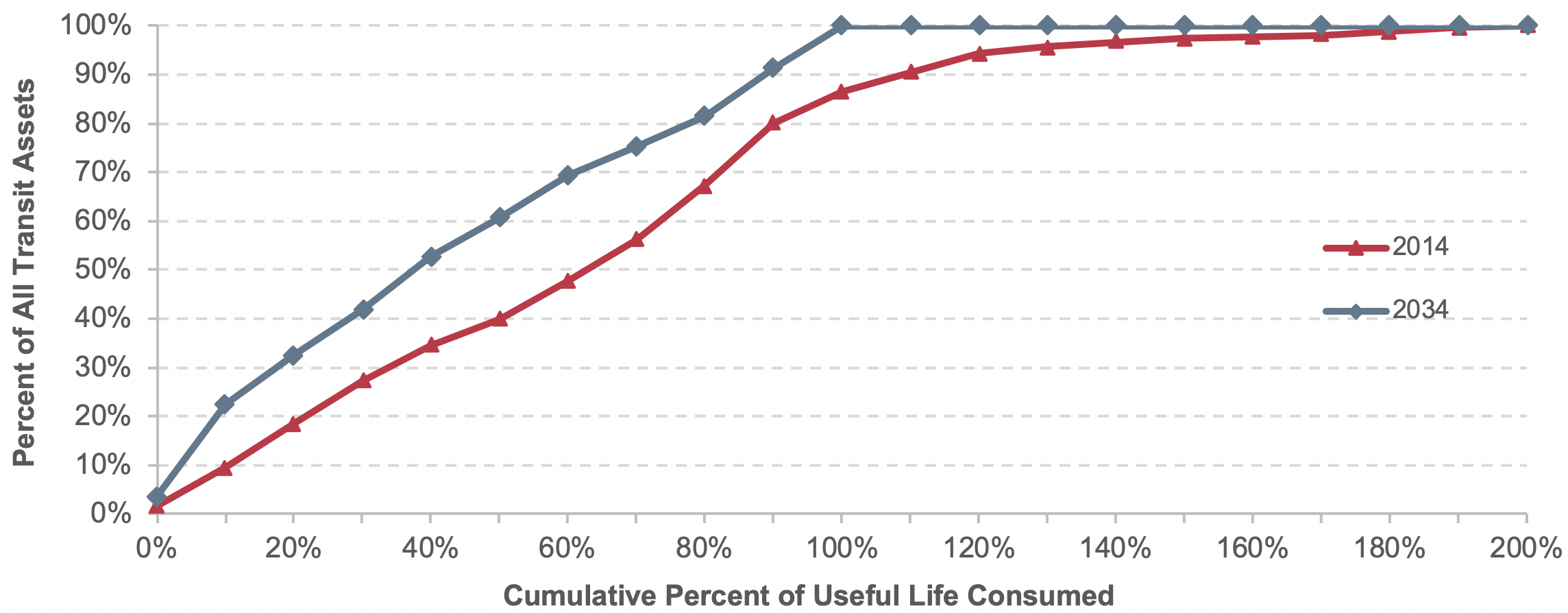
Asset Condition Forecasts and Expected Useful Service Life Consumed
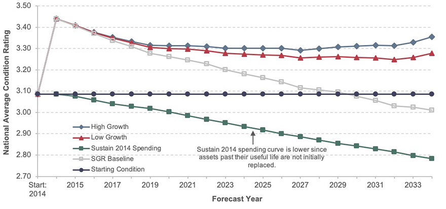
Exhibit 8-13 presents the condition projections for each of the three investment scenarios and the SGR benchmark. Note that these projections predict the condition of all transit assets in service during each year of the 20-year analysis period, including transit assets that exist today and any investments in additional assets under these scenarios The Sustain 2014 Spending, Low-Growth, and High-Growth scenarios each make investments in additional assets whereas the SGR benchmark reinvests only in existing assets. Note that the estimated current average condition of the Nation’s transit assets is 3.09. As discussed in Chapter 7, expenditures under the financially constrained Sustain 2014 Spending scenario are not sufficient to address potential replacement needs as they arise, leading to a predicted increase in the investment backlog. This increasing backlog is a key driver in the decline in average condition of transit assets, as shown for this scenario in Exhibit 8-13.
Exhibit 8-13: Asset Condition Forecast for All Existing and Expansion Transit Assets
Source: Transit Economic Requirements Model.
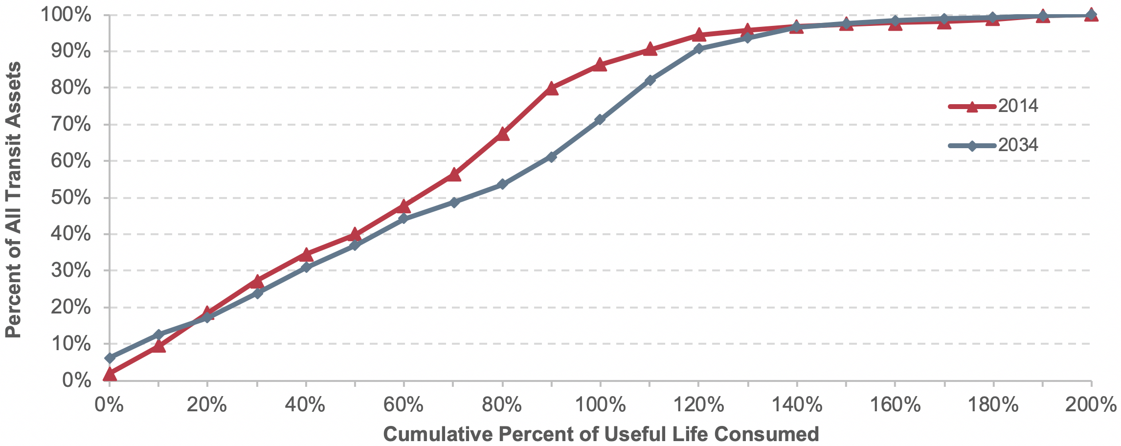
Under the Sustain 2014 Spending scenario, some rehabilitation actions and replacing of assets are assumed to occur at later ages, in worse conditions, and potentially well after the end of their useful life, as shown in Exhibit 8 14. Expenditures on asset reinvestment for the Sustain 2014 Spending scenario are insufficient to address ongoing reinvestment needs, leading to an increase in the size of the backlog. Note that the forecast for 2034 for the Sustain 2014 Spending scenario shown in Exhibit 8-14 indicates that a larger portion assets under this scenario will be closer to or beyond the end of their useful lives, when compared with the other scenarios.
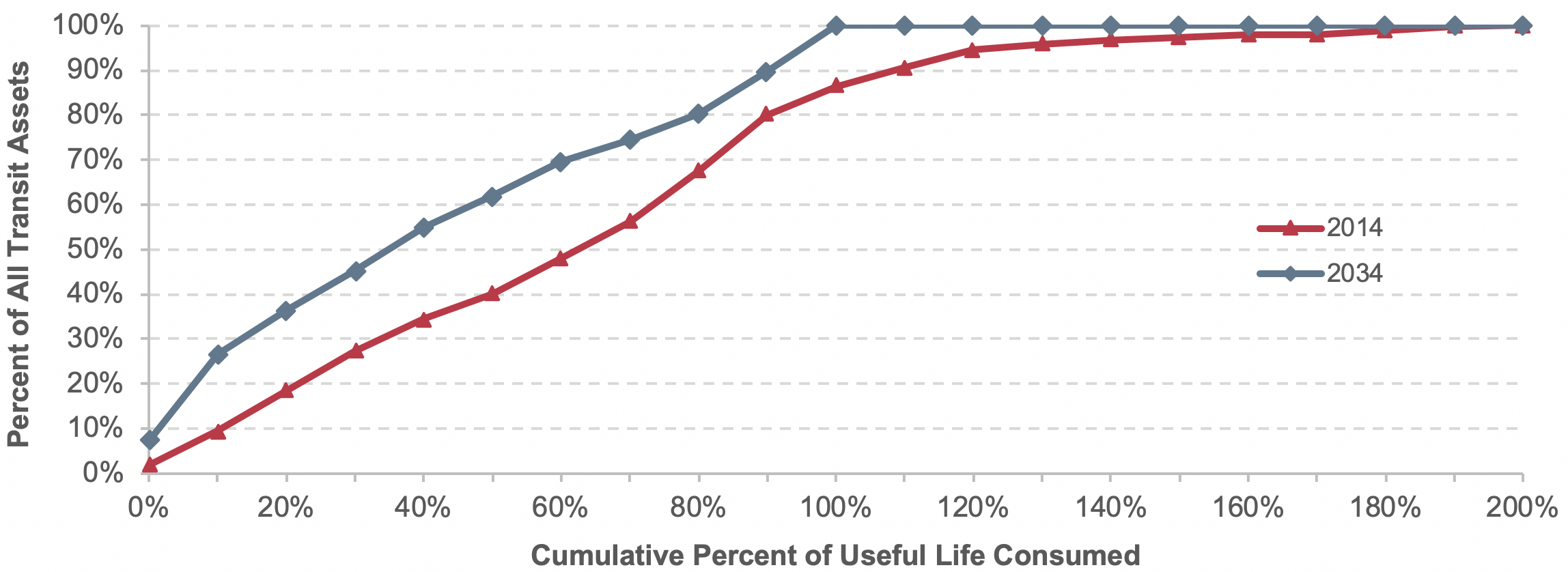
In contrast to the Sustain 2014 Spending scenario, the SGR benchmark is financially (and economically) unconstrained, relying solely on engineering considerations to estimate the level of investment required to both eliminate the current investment backlog and to address all ongoing reinvestment needs as they arise such that all assets remain in an SGR (i.e., a condition of 2.5 or higher). Despite adopting the objective of maintaining all assets in an SGR throughout the forecast period, average conditions under the SGR benchmark ultimately decline to levels below the current average condition value of 3.09.
Exhibit 8-14: Sustain 2014 Spending Scenario: Cumulative Distribution of Transit Asset Ages Relative to their Expected Useful Life
Source: Transit Economic Requirements Model.
This result, although perhaps counterintuitive, is explained by a high proportion of long-lived assets (e.g., guideway structures, facilities, and stations) that currently have high average condition ratings and a significant amount of useful life remaining, as shown in Exhibit 8-15. The exhibit shows the distribution of all transit assets (equal to approximately $858 billion in 2014) in relation to their expected useful life. Eliminating the current SGR backlog replaces or rehabilitates a significant number of over-age assets (resulting in an initial jump in asset conditions). The ongoing aging of the longer-lived assets, however, ultimately will draw the average asset conditions down to a long-term condition level that is consistent with the objective of SGR (and hence sustainable) but ultimately slightly below current average aggregate conditions.
Exhibit 8-15: SGR Baseline Scenario: Cumulative Distribution of Transit Asset Ages Relative to their Expected Useful Life
Source: Transit Economic Requirements Model.
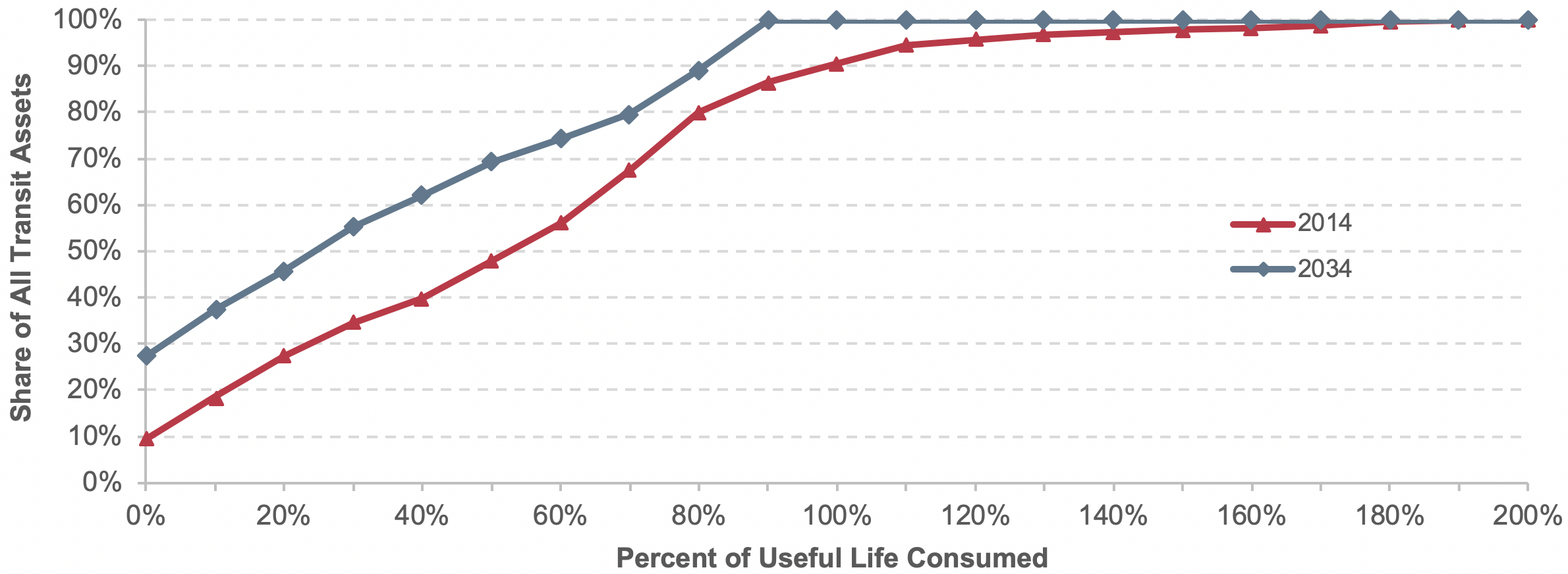
To underscore these findings, note that the Low- and High-Growth scenarios include unconstrained investments in both asset replacements and asset expansions. Hence, not only would older assets be replaced at an aggressive reinvestment rate under this scenario, but new expansion assets would also be continually added to support ongoing growth in travel demand. Although initially insufficient to arrest the decline in average conditions completely, the impact of these expansion investments ultimately would reverse the decline in average asset conditions in the final years of the 20-year projections. A higher proportion of long-lived assets with more useful life remaining in 2034 than in 2014 also would result, as illustrated in Exhibit 8-16 and Exhibit 8-17, respectively. Furthermore, the High-Growth scenario (Exhibit 8-17) adds newer expansion assets at a higher rate than does the Low-Growth scenario (Exhibit 8-16), ultimately yielding higher average condition values for that scenario (and average condition values that exceed the current average of 3.09 throughout the entire forecast period).
Exhibit 8-16: Low Growth Scenario: Cumulative Distribution of Transit Asset Ages
Source: Transit Economic Requirements Model.
Exhibit 8-17: High Growth Scenario: Cumulative Distribution of Transit Asset Ages Relative to their Expected Useful Life
Source: Transit Economic Requirements Model.
Alternative Methodology
When current transit investment practices are considered, the level of investment needed to eliminate the SGR backlog in 1 year is likely infeasible. Thus, the SGR Benchmark, Low-Growth, and High-Growth scenarios’ financially unconstrained assumptions (e.g., spending of unlimited transit investment funds each year) are unrealistic. As indicated in Exhibit 8-13, the elimination of the backlog in the first year and the resulting jump in asset conditions in year 1 can be attributed to this unconstrained assumption.
An alternative methodology is to have all three scenarios use a financially constrained reinvestment rate to eliminate the SGR backlog by year 20 while maintaining the collective national transit assets at a condition rating of 2.5 or higher. This analysis indicates that investing $17.5 billion annually in preservation would eliminate the backlog in 20 years.
Exhibit 8-18 presents the condition projections for the two scenarios and the benchmark using this alternative methodology. The Low- and High-Growth scenarios and SGR Benchmark scenario are financially constrained so the investment strategies result in replacing assets at later ages, in worse conditions, and potentially after the end of their useful lives.
Exhibit 8-18: Asset Condition Forecast for All Existing and Expansion Transit Assets, Using Alternative Methodology
Source: Transit Economic Requirements Model.
Impact of New Technologies on Transit Investment Scenarios
The investment scenarios presented in Chapter 7 implicitly assume that all replacement and expansion assets will use the same technologies that are currently in use today (i.e., all asset replacement and expansion investments are “in kind”). As with most other industries, however, the existing stock of assets used to support transit service is subject to ongoing technological change and improvement, and this change tends to result in increased investment costs (including future replacement needs). Although many improvements are standardized and hence embedded in the asset (i.e., the transit operator has little or no control over this change), it is common for transit operators to select technology options that are significantly more costly than preexisting assets of the same type. A key example is the frequent decision to replace diesel motor buses with compressed natural gas or hybrid buses. Although such options offer clear environmental benefits (and compressed natural gas might decrease operating costs), acquisition costs for these vehicle types are 20 to 60 percent higher than diesel. This increase in the cost of new assets would tend to increase current and long-term reinvestment costs and, in a budget-constrained environment, would increase the expected future size of the investment backlog. This increase might be offset by lower operating costs from more reliable operation, longer useful lives, and improved fuel efficiency, but this possible offset is not captured in this assessment of capital investment scenarios under current methodologies used in this report.
In addition to improvements in preexisting asset types, transit operators periodically expand their existing asset stock to introduce new asset types that take advantage of technological innovations. Examples include investments in intelligent transportation system technologies such as real-time passenger information systems and automated dispatch systems—assets and technologies that are common today but were not available 15 to 20 years ago. These improvements typically yield improvements in service quality and efficiency, but they also tend to yield increases in asset acquisition, maintenance, and replacement costs, resulting in an overall increase in reinvestment costs and the expected future size of the SGR backlog.
Impact of Compressed Natural Gas and Hybrid Buses on Future Investment Scenarios
To provide a better sense of the impact of new technology adoption on long-term needs, the analysis below presents estimates of the long-term cost impact of the shift from diesel to compressed natural gas and hybrid buses on long-term capital investment (including the possible consequences of not capturing this impact in the Transit Economic Requirements Model’s (TERM) needs estimates). This assessment does not consider the full range of operational, environmental, or other potential costs and benefits arising from this shift, and hence it does not evaluate the merits of any decisions to invest in specific technologies.
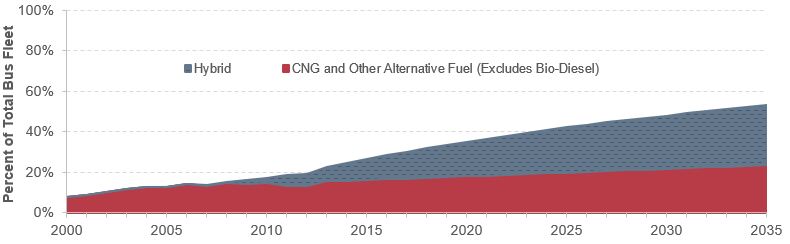
Exhibit 8-19 presents historical (2000–2014) and forecast (2015–2035) estimates of the share of transit buses that rely on compressed natural gas, other alternative fuels, and on hybrid power sources. The forecast estimates assume the current trend rate of increase in alternative and hybrid vehicle shares, as observed from 2007 to 2014. Based on this projection, the share of vehicles powered by these alternative fuels is estimated to increase from 24.4 percent in 2014 to 52.9 percent in 2035. During the same period, the share of hybrid buses is estimated to increase from 9 percent to 29 percent. This results in diesel shares declining from roughly 75.6 percent today to about 47 percent by 2035.
Exhibit 8-19: Hybrid and Alternative Fuel Vehicles: Share of Total Bus Fleet, 2000–2035
Source: Transit Economic Requirements Model.
Impact on Costs
According to a 2007 report by the Federal Transit Administration (FTA), Transit Bus Life Cycle Cost and Year 2007 Emissions Estimation, the average unit cost of an alternative-fuel bus plus its share of cost for the required fueling station is 15.5 percent higher than that of a standard diesel bus of the same size. Similarly, hybrid buses cost an average of 65.9 percent more than standard diesel buses of the same size. When combined with the current and projected mix of bus vehicle types presented above in Exhibit 8-19, these cost assumptions yield an estimated increase in average capital costs for bus vehicles of 14.3 percent from 2014 to 2035 (using the mix of bus types from 2014 as the basis of comparison). (Note that this cost increase represents a shift in the mix of bus types purchased and not the impact of underlying inflation, which will affect all vehicle types, including diesel, alternative fuels, and hybrid.) Reductions in operating costs due to the new technology are not shown in this analysis of capital needs, but are presumably part of the motivation for agencies that purchase these vehicles.
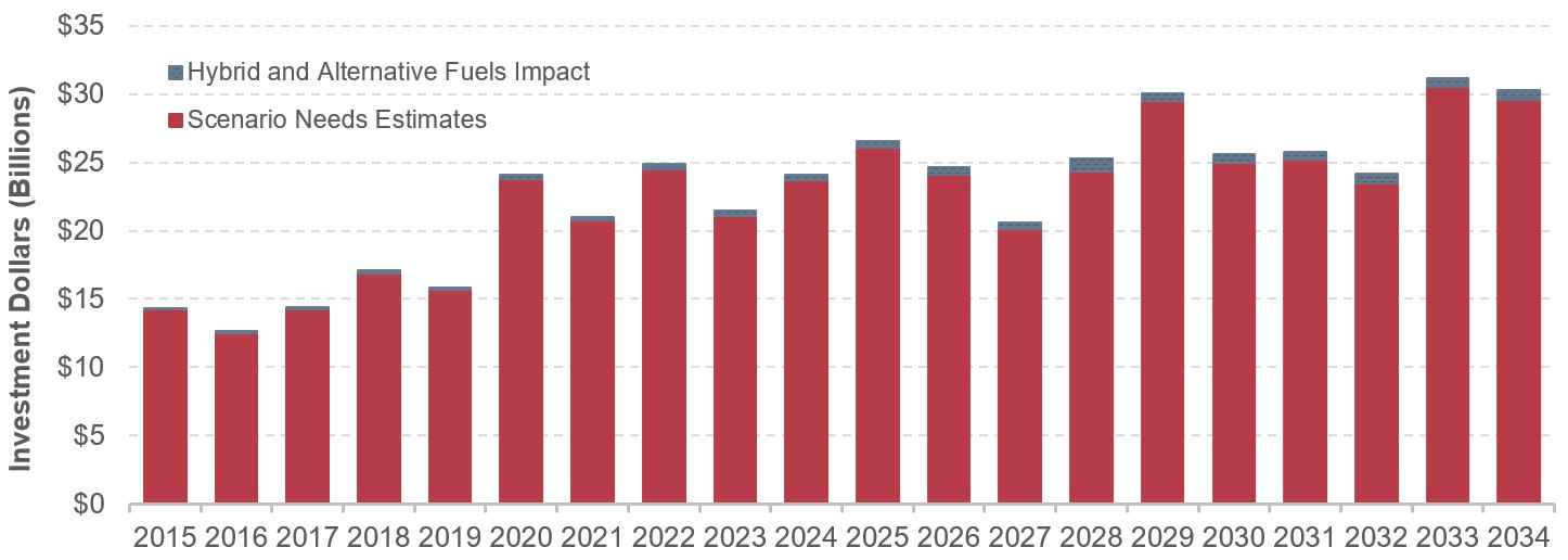
Impact on Investment Scenarios
What, then, is the impact of this cost increase on long-term transit capital investment under the scenarios presented in Chapter 7? Exhibit 8-20 presents the impact of this potential cost increase on annual transit investment as estimated for the Low-Growth scenario presented in Chapter 7. For this scenario, the cost impact is negligible in the early years of the projection period but grows over time as the proportion of buses using alternative fuel and hybrid power increases. (Note that the investment backlog is not included in this depiction.) The impact on total investment needs for Chapter 7 investment scenarios (Low-Growth and High-Growth) and the SGR Benchmark scenario are presented in dollar and percentage terms in Exhibit 8-21. Note that the shift to alternative fuels and hybrid buses is estimated to increase average annual replacement investment costs by $0.1 billion to $0.4 billion, yielding no greater than a 0.15 percent increase in investment costs. To provide perspective for these estimated amounts, noting the following is helpful: (1) the shift from diesel to alternative-fuel and hybrid buses is only one of several technology changes that might affect long-term transit reinvestment needs, but (2) reinvestment in transit buses likely represents the largest share of transit needs subject to this type of significant technological change. Hence, the impact of all new technology adoptions (not accounted for in the Chapter 7 scenarios and including new bus propulsion systems) might add 5–10 percent to long-term transit capital investment requirements.
Exhibit 8-20: Impact of Shift to Vehicles Using Hybrid and Alternative Fuels on Investment Needs: Low-Growth Scenario
Source: Transit Economic Requirements Model.
Exhibit 8-21: Impact of Shift from Diesel to Alternative Fuels and Hybrid Vehicles on Average Annual Investment Scenarios
| Measure | SGR Baseline | Low Growth | High Growth |
|---|---|---|---|
| Average Annual Needs ($ Billions) | $0.36 | $0.43 | $0.45 |
| Percent Increase | 1.26% | 1.41% | 1.48% |
Source: Transit Economic Requirements Model.
Impact on Backlog
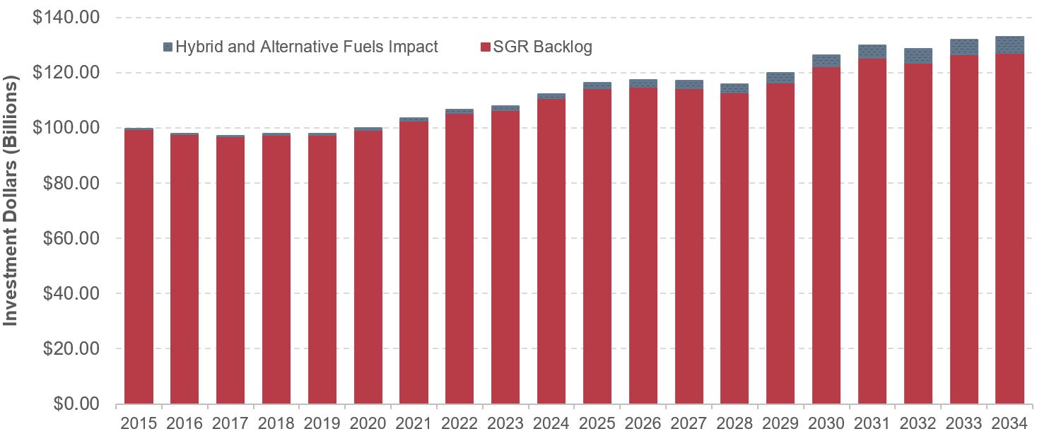
Finally, in addition to affecting unconstrained capital needs, the shift from diesel to hybrid and alternative-fuel vehicles also can affect the size of the future backlog. For example, Exhibit 8-22 shows the estimated impact of this shift on the SGR backlog as estimated for the Sustain 2014 Spending scenario from Chapter 7. Under this scenario, long-term spending is capped at current levels such that any increase in costs over the analysis period must necessarily be added to the backlog. Moreover, given that the useful lives of buses as estimated by TERM are roughly 7–14 years, all existing and many expansion vehicles will need to be replaced over the 20-year analysis period. This means that any increase in costs for this asset type will be added to the backlog for the period of analysis.
As with the analysis above, Exhibit 8-22 suggests that the initial impact of the shift to hybrid and alternative-fuel vehicles is small but increases over time as the share of the Nation’s bus fleet made up by these vehicle types increases. By 2034, this shift is estimated to increase the size of the backlog to $123.5 billion versus $116.2 billion under the original Sustain 2014 Spending scenario, an increase of $7.3 billion or 6.3 percent.
Exhibit 8-22: Impact of Shift to Vehicles Using Hybrid and Alternative Fuels on Backlog Estimate: Sustain Average 2000 to 2014 Spending Scenario
Source: Transit Economic Requirements Model.
Forecasted Expansion Investment
This section compares key characteristics of the national transit system in 2014 to their forecasted TERM results over the next 20 years for different scenarios. It also includes expansion projections of fleet size, guideway route miles, and stations broken down by scenario to understand better the expansion investments that TERM forecasts.
TERM’s projections of fleet size are presented in Exhibit 8-23. The projections for the Low- and High-Growth scenarios create upper and lower targets around the projected Sustain 2014 Spending scenario to preserve existing transit assets at a condition rating of 2.5 or higher and expand transit service capacity to support differing levels of ridership growth while passing TERM’s benefit-cost test.
Exhibit 8-23: Projection of Fleet Size by Scenario
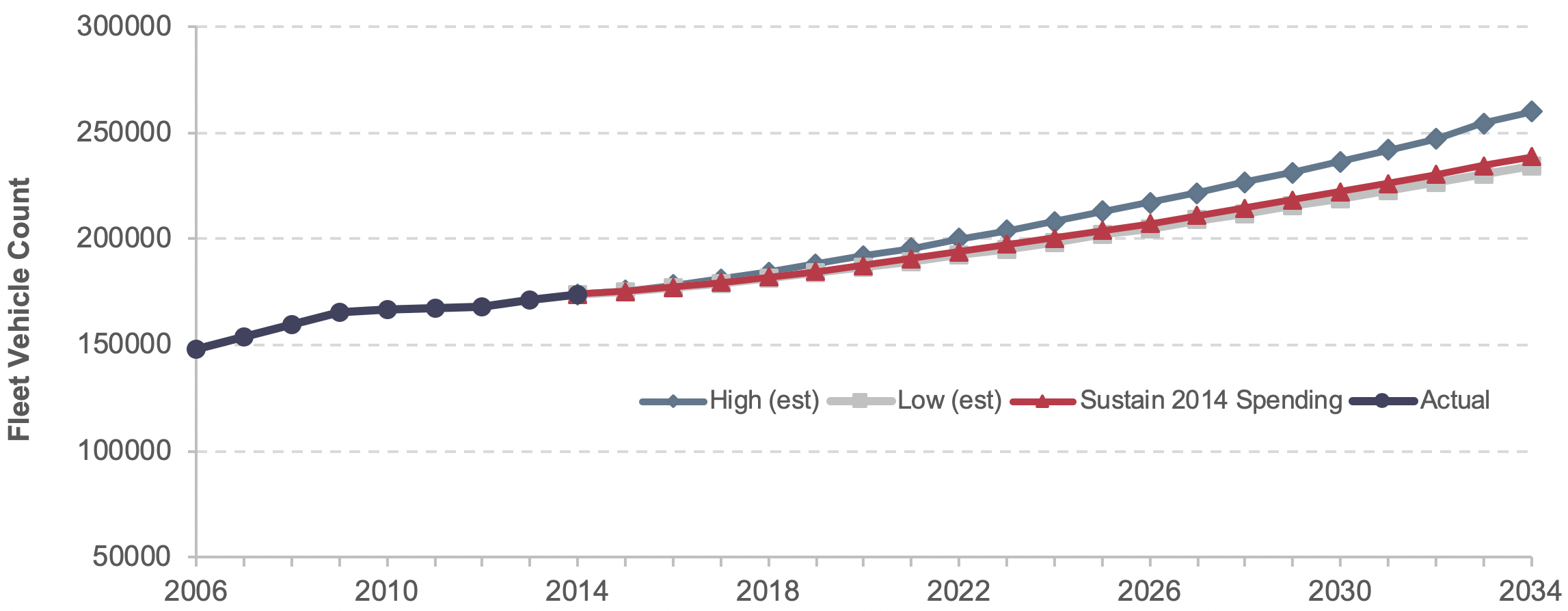
Note: Data through 2014 are actual; data after 2014 are estimated based on trends.
Source: Transit Economic Requirements Model.
The projected guideway route miles for the Sustain 2014 Spending scenario are less than those for the projected High-Growth scenario, as shown in Exhibit 8-24. (Note that TERM’s projections of guideway route miles for the Sustain 2014 Spending and Low-Growth scenarios are nearly identical.)
TERM’s expansion projections of stations by scenario needed to preserve existing transit assets at a condition rating of 2.5 or higher and to expand transit service capacity to support differing levels of ridership growth (while passing TERM’s benefit-cost test) are presented Exhibit 8-25. TERM’s Low-Growth estimates generally are in line with the historical trend, indicating that expansion projections of stations under the Low-Growth scenario could maintain current transit conditions.
For each scenario, TERM estimates future investment in fleet size, guideway route miles, and stations for each of the next 20 years. Exhibit 8-26 presents TERM's projection for total fixed guideway route miles under the Low-Growth scenario by rail mode. TERM projects different investment needs for each year, which are added to the 2014 actual total stock.
Exhibit 8-24: Projection of Guideway Route Miles by Scenario
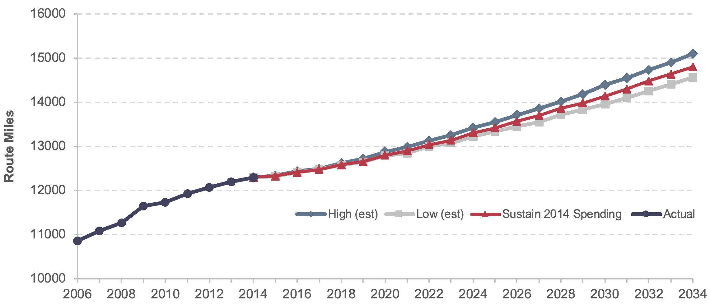
Note: Data through 2014 are actual; data after 2014 are estimated based on trends.
Source: Transit Economic Requirements Model.
Exhibit 8-25: Projection of Rail Stations by Scenario
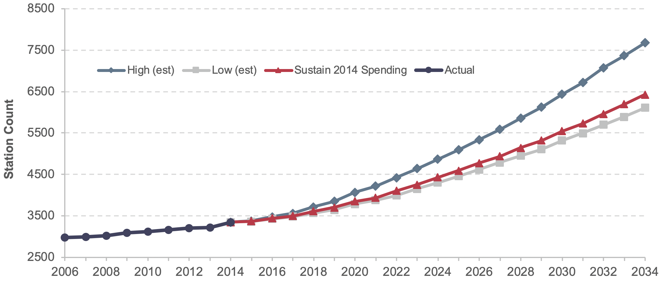
Note: Data through 2014 are actual; data after 2014 are estimated based on trends.
Source: Transit Economic Requirements Model.
Exhibit 8-26: Stock of Fixed Guideway Miles by Year Under Low-Growth Scenario, 2014–2034
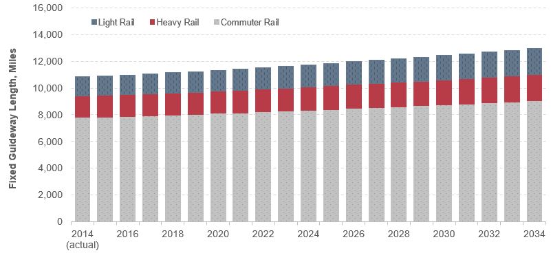
Source: Transit Economic Requirements Model.
Backlog Estimates across Recent C&P Reports
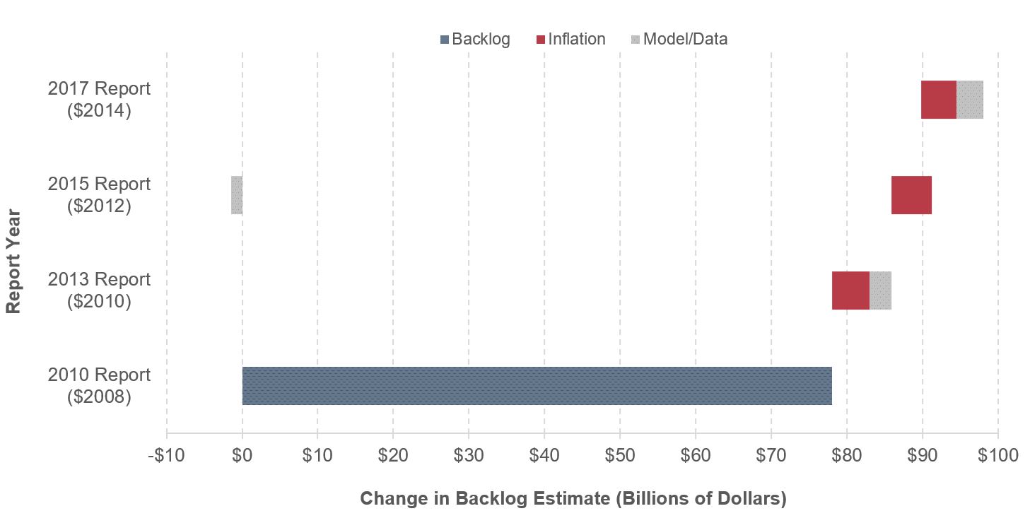
The backlog estimate has been increasing steadily since the first estimate was published in the 2010 C&P Report. Changes in the backlog over that period are a function of four causes:
- Inflation: C&P Report editions are typically published every two years. Therefore, backlog increases should be expected due to inflation alone. Most of the backlog increase between the 2010 and 2017 reports (74 percent) is caused by inflation, as shown in Exhibit 8-27.
- Additional assets exceeding services lives: Additional assets have reached the end of their useful life (i.e., they have fallen below condition 2.5) since the last period of analysis and have yet to be replaced.
- Changes to inventory data: Inventory data are updated between C&P Reports based on new NTD fleet data and new data submitted by grantees. Updated inventory submissions can capture recent asset replacements, the acquisition of additional (expansion) assets, changes in unit cost and quantity assumptions, and changes in the level of reported detail (including the addition or deletion of some asset types).
- Changes to TERM methodology/assumptions: Changes in asset decay curves are the primary source of model-based changes.
Given these sources of change, the current backlog estimate should be viewed as an independent best estimate of the current SGR backlog, as opposed to the most recent data point of a long-term trend.
Exhibit 8-27: Change in Backlog Estimate Since the 2010 Report
Source: Transit Economic Requirements Model.