

Chapter 4: Mobility and Access
- Highway Mobility and Access
- Congestion
- Highway and Bridge Geometry
- Transit Mobility and Access
- Average Operating (Passenger-Carrying) Speeds
- System Capacity
- Vehicle Use
- Ridership
- Vehicle Reliability
- Transit System Characteristics for Americans with Disabilities and the Elderly
- Transit System Coverage and Frequency

Key Takeaways
- Travel Time Index averaged 1.32 for Interstate highways and 1.37 for other freeways and expressways in 2015, meaning that the average peak-period trip took 32 and 37 percent longer than the same trip under free-flow traffic conditions.
- Planning Time Index averaged 2.52 for Interstate highways and 2.98 for other freeways and expressways in 2015, meaning that ensuring on-time arrival 95 percent of the time required planning for 2.52 and 2.98 times the travel time under free-flow traffic conditions.
- Travel Time Index was 1.45 in the largest metropolitan areas with population above 5 million, but 1.18 in metropolitan areas with populations of 1–2 million in 2015.
- Congestion wasted 6.8 billion hours of travel time and 3 billion gallons of fuel in 2014.
- Total cost of congestion rose from $136 billion in 2004 to $160 billion in 2014, despite a decrease in congestion during the economic recession in 2009–2010.
Highway Mobility and Access
Transportation infrastructure, such as highways, bridges, and public transportation, provides lasting economic benefits to the Nation and its citizens over decades through improved mobility. Mobility increases productivity through enhanced employment opportunities, lower business costs, and faster product deliveries, which are essential drivers of business expansion and economic growth. In addition, consumers benefit from the increase in available product variety and convenience of product delivery.
In urban areas, congestion is often the biggest impediment to maintaining transportation mobility. Despite past capacity expansions on highways, the system has had difficulties keeping up with rising mobility demands and thus congestion has worsened over time. This deficiency in capacity and reliability can have economic costs, such as reduced or missed opportunities and lower quality of life.
This section discusses the problem of congestion and the Federal Highway Administration’s (FHWA’s) diversified strategies to reduce it, followed by a discussion of mobility issues pertaining to the geometric design of highways and bridges. Operational performance of public transit will be presented later in this chapter. Freight-specific mobility issues are addressed in Part III, Chapters 11 and 12.
Congestion
Congestion on highways and bridges occurs when traffic demand approaches or exceeds the available capacity of the system. “Recurring” congestion refers to congestion routinely taking place at roughly the same place and time—usually during peak traffic periods—due to insufficient infrastructure or physical capacity, such as roadways without enough lanes to accommodate high levels of demand. The congested highway is in a condition of degraded service, causing additional and unnecessary delay for motorists. Recurring congestion may extend beyond traditional peak traffic windows and create delays for motorists who arrive before or after the traditional rush hour period.
“Nonrecurring” congestion refers to less predictable congestion occurring due to factors such as accidents, construction, inclement weather, and surging demand associated with special events. Such disruptions can take away part of the roadway from use and dramatically reduce the available capacity and/or reliability of the entire transportation system. About half the total congestion occurrences on roadways is recurring, with the other half nonrecurring.
No definition or measurement of exactly what constitutes congestion has been universally accepted. Generally, transportation professionals examine congestion from several perspectives, such as delays and variability. Increased traffic volumes and additional delays caused by crashes, poor weather, special events, or other nonrecurring incidents lead to increased travel times. This report examines congestion through indicators of duration and severity, including travel time, congestion hours, and planning time.
Measuring Congestion
The National Performance Management Research Data Set (NPMRDS) is FHWA’s official data source for measuring congestion and is provided to States and metropolitan planning organizations (MPOs) on a monthly basis for their performance measurement activities. It is a compilation of vehicle probe-based travel time data of observed travel times, date/time, direction, and location for freight, passenger, and other traffic. The data are collected from a variety of sources including mobile devices, connected autos, portable navigation devices, commercial fleet, and sensors. The NPMRDS provides historical average travel times in 5-minute intervals by traffic segment in both rural and urban areas on the National Highway System, as well as over 25 key Canadian and Mexican border crossings. Based on the NPMRDS, the Urban Congestion Reports estimate mobility, congestion, and reliability on Interstate highways and other limited-access highways in the 52 largest metropolitan areas.
An alternative source of congestion measures is the Urban Mobility Scorecard developed by the Texas Transportation Institute. The report’s estimated congestion trends are based on the speed data provided by INRIX®, which contains historical traffic information on freeways and other major roads and streets. Data are collected from more than 1.5 million global positioning system (GPS)-enabled vehicles and mobile devices for every 15-minute period every day for all major U.S. metropolitan areas.
Both the Urban Congestion Reports and the Urban Mobility Scorecard report traffic system performance indicators, such as the Travel Time Index (TTI), congested hours, and the Planning Time Index (PTI). However, these congestion measures differ in coverage and estimation methodology. Consequently, the values of these measures in one report could deviate from the other, despite the similarities of their names.
The Urban Congestion Report from NPMRDS provides selected congestion measures starting in 2012 for the Interstate functional class and starting in 2013 for the Other Freeway and Expressway functional class, while time series data in the Urban Mobility Scorecard started in 1982. (See Chapter 1 for a description of functional classes.) The boundaries of the 52 metropolitan areas used in the Urban Congestion Report are based on metropolitan statistical areas with populations above 1,000,000 in 2010. The Urban Mobility Scorecard includes data for 471 U.S. urbanized areas (defined by the Census Bureau as an urban area of 50,000 or more people).
In the Urban Congestion Report, the peak period includes the AM peak period (6 a.m. to 9 a.m.) and PM peak period (4 p.m. to 7 p.m.) on weekdays. For purposes of computing free-flow speed, the off-peak period is defined as 9 a.m. to 4 p.m. and 7 p.m. to 10 p.m. on weekdays, as well as 6 a.m. to 10 p.m. on weekends. The free-flow speed is calculated as the 85th percentile of off-peak speeds based on the previous 12 months of data. A road is classified as congested if traveling speed is below 90 percent of free-flow speed on weekdays (6 a.m. to 10 p.m.).
The Urban Mobility Scorecard assigned peak hours as 6 a.m. to 10 a.m. and 3 p.m. to 7 p.m. on weekdays, and the free-flow travel time is calculated during the light traffic hours (for example, 10 p.m. to 5 a.m.). Congestion occurs if traveling speed is below a congestion threshold, usually defined as the free-flow speed with an upper limit of 65 mph on the freeways.
Both NPMRDS and the Texas Transportation Institute use vehicle miles traveled as weights to aggregate values. This report presents congestion measures mainly from the aggregate 52 metropolitan areas derived from NPMRDS, supplemented with information from the Urban Mobility Scorecard for longer-term analysis.
TTI is a performance indicator used to examine congestion severity. This index is calculated as the ratio of the peak-period travel time to the free-flow travel time for the AM and PM peak periods on weekdays. The value of TTI is always greater than or equal to 1, with a higher value indicating more severe congestion. For example, a value of 1.30 indicates that a 60-minute trip on a road that is not congested would take 78 minutes (30 percent longer) during the period of peak congestion.
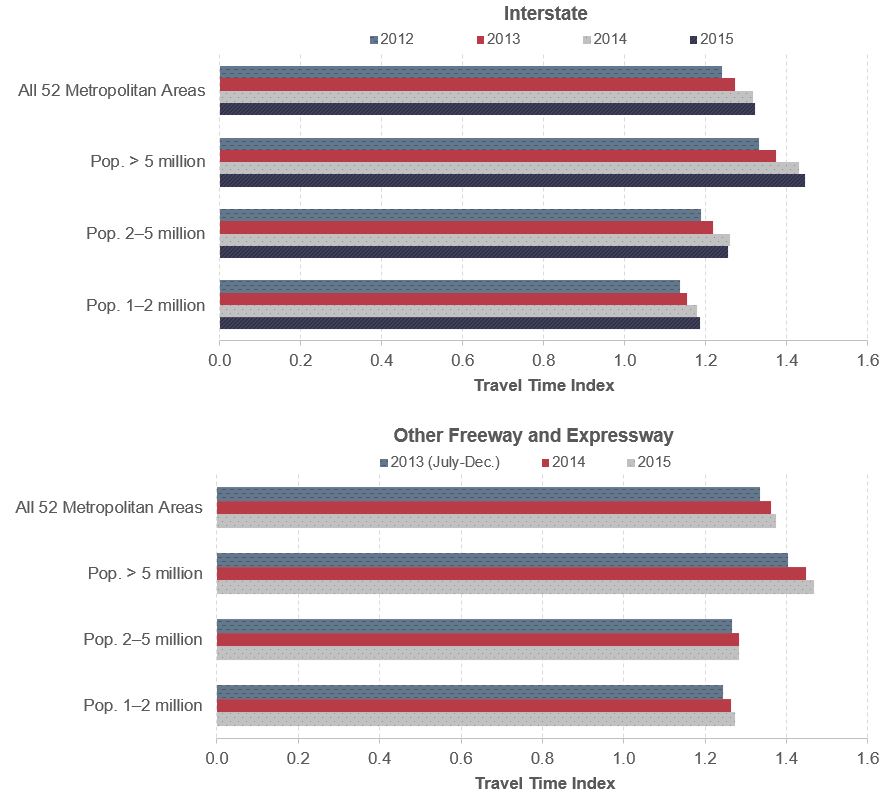
Exhibit 4-1 indicates that the average driver spent roughly one-third more time during the congested peak time compared with traveling the same distance during the non-congested period. Congestion became more pronounced over time, as TTI climbed continuously from 2012 to 2015. TTI increased from 1.24 in 2012 to 1.32 in 2015 on Interstate highways and 1.34 in 2013 to 1.37 in 2015 for other freeways and expressways.
Residents in the largest metropolitan areas tend to experience more severe congestion, and those with more moderate populations usually report better mobility. For example, a trip that normally takes 60 minutes on the Interstate highway system during off-peak time in 2015 would have taken 71.1 minutes (18 percent longer, or TTI 1.18) on average during the peak period in a metropolitan area with population between 1 and 2 million. The same trip would take an average of 75.3 minutes (26 percent longer, or TTI 1.26) in a medium-sized metropolitan area with a population of 2–5 million and an average of 86.7 minutes (TTI 1.45) in a metropolis with more than 5 million residents. In 2015, TTI was 1.27, 1.28, and 1.47 on other freeways and expressways in metropolitan areas with population between 1 and 2 million, metropolitan areas with population between 2 and 5 million, and metropolitan areas with population greater than 5 million, respectively.
Exhibit 4-1: Travel Time Index for 52 Metropolitan Areas, 2012–2015
Note: TTI is averaged across metropolitan areas, road sections, and periods weighted by VMT using volume estimates derived from FHWA's HPMS over the 52 largest metropolitan areas. Data cover all Interstate highways (Interstate functional class) and other limited-access highways (Other Freeway and Expressway functional class) in these areas. Data on Interstate highways start in January 2012 and other freeways and expressways start in July 2013. Population is from United States Census Bureau 2014 Metropolitan Statistical Areas Population Estimates for 2010.
Source: FHWA staff calculation from the NPMRDS.
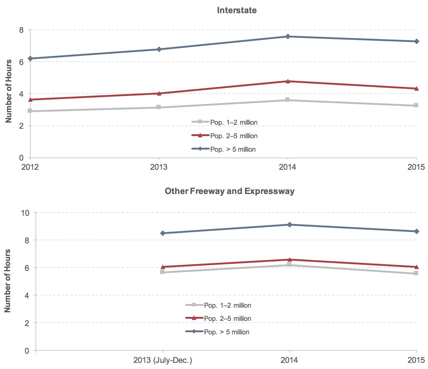
Congested Hours is another performance indicator computed from NPMRDS for the 52 largest metropolitan areas in the United States. It is computed as the average number of hours when road sections are congested from 6 a.m. to 10 p.m. on weekdays. This is different from the TTI, which only looks at congestion in a set time window for these areas. It is worth noting that congested hours climbed to a high level in 2014 then decreased in 2015 (see Exhibit 4-2). On both Interstate highways and other freeways and expressways, the lines for different-sized metropolitan areas tend to move in tandem.
Exhibit 4-2: Congested Hours per Weekday for 52 Metropolitan Areas, 2012–2015
Note: Congested hours are averaged across metropolitan areas, road sections, and periods weighted by VMT using volume estimates derived from FHWA's HPMS over the 52 largest areas. Data cover all Interstate highways (Interstate functional class) and other limited-access highways (Other Freeway and Expressway functional class) in these areas. Data on Interstate highways start in January 2012 and other freeways and expressways start in July 2013. Population is from United States Census Bureau 2014 Metropolitan Statistical Areas Population Estimates for 2010.
Source: FHWA staff calculation from the NPMRDS.
Similar to the trend for TTI, longer congestion was observed in larger metropolitan areas, where average congested hours exceeded 6 hours on Interstate highways and 8 hours on other freeways and expressways on weekdays. Residents in metropolitan areas with population between 1 and 2 million experienced the lowest congested hours, averaging 3.3 hours on Interstate highways and 5.6 hours on other freeways and expressways in 2015, which was only 45 percent and 65 percent of the congested hours in metropolitan areas with more than 5 million population.
In 2015, Interstate highways in metropolitan areas with population above 5 million recorded 7.3 hours of congestion on an average weekday, which is 68 percent higher than the 4.3 hours in a typical metropolitan area with 2–5 million population. In metropolitan areas with populations of 1–2 million, Interstate highways were congested for an average of 3.3 hours, less than half of the average congested hours in the metropolitan areas with more than 5 million population. Road congestion was much worse on other freeways and expressways, where the average hours of congestion were 19–71 percent higher than those on Interstate highways, for the 52 metropolitan areas with population above 1 million, respectively.
Most travelers are less tolerant of unexpected delays than everyday congestion. Although drivers dislike everyday congestion, they may have an option to alter their schedules to accommodate it, or are otherwise able to factor it into their travel and residential location choices. Unexpected delays, however, often have larger consequences and cause more disruptions in business operations and people’s lives. Travelers also tend to better remember spending more time in traffic due to unanticipated disruptions, rather than the average time for a trip throughout the year.
Compared with simple average measures of congestion, such as TTI or Congested Hours, measures of travel time reliability—the certainty (or variability) of travel conditions from day to day—provide a different perspective of improved travel beyond a simple average travel time. From an economic perspective, low reliability requires travelers to budget extra time in planning trips or to suffer the consequences of being delayed. Hence, travel time reliability influences travel decisions.
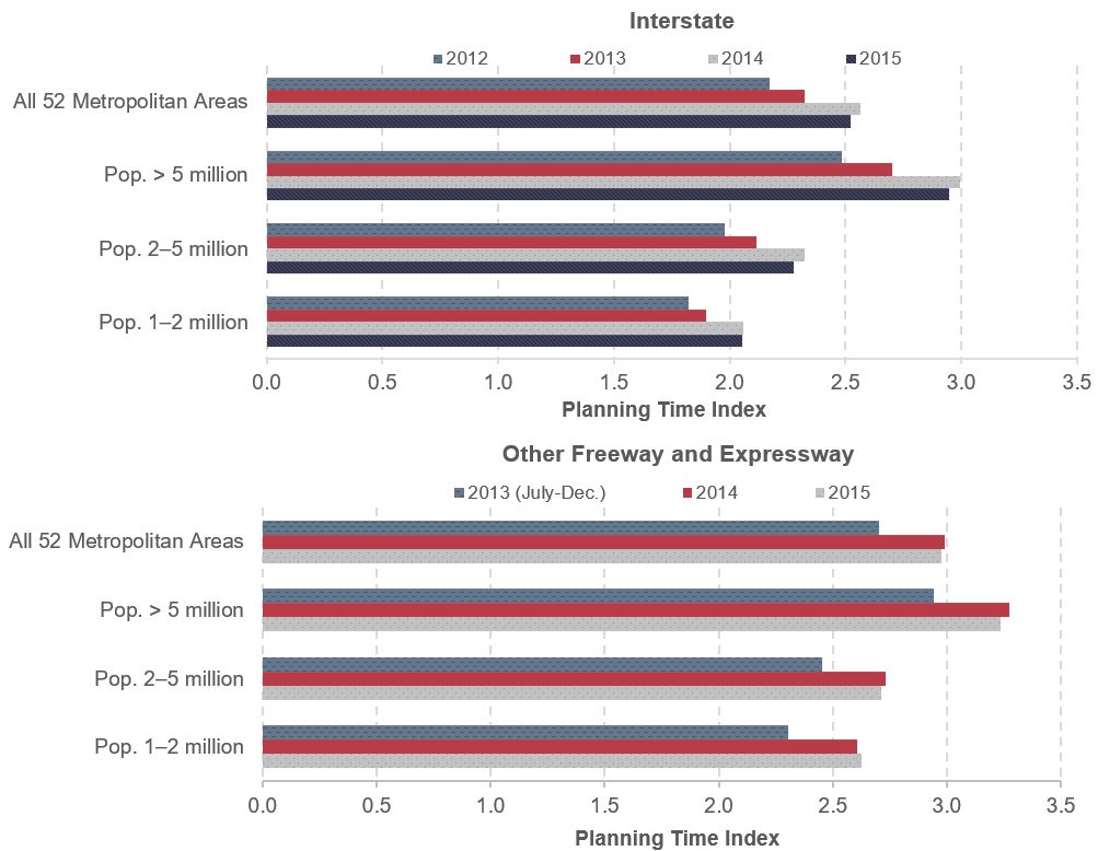
Transportation reliability measures primarily compare high-delay days with average-delay days. The simplest methods usually identify days that exceed the 95th percentile in terms of travel times and estimate the severity of delay on specific routes during the heaviest traffic days of each year. (These days could be spread over the course of a year or could be concentrated in the same month or week, such as a week with severe weather.) The Planning Time Index (PTI), used to measure travel time reliability in this report, is defined as the ratio of the 95th percentile of travel time during the AM and PM peak periods and the free-flow travel time. For example, a PTI of 1.60 means that, for a trip that takes 60 minutes in light traffic, a traveler should budget a total of 96 (60 × 1.60) minutes to ensure on-time arrival for 19 out of 20 trips (95 percent of the trips).
Exhibit 4-3 indicates that ensuring on-time arrival 95 percent of the time on Interstate highways in 2015 required planning for 2.52 times the travel time that would be necessary under free-flow traffic conditions (i.e., PTI was 2.52). Travel time reliability was worse, on average, on other freeways and expressways with PTI valued at 2.98.
Similar to average travel time during congested periods measured in TTI, PTI was consistently higher in the largest metropolitan areas with greater than 5 million population than in their less populated counterparts. In 2015, the average PTI was 2.95 on Interstate highways in major cities with more than 5 million residents, which was 30–43 percent higher than the index for those in metropolitan areas with population of 2–5 million (PTI was 2.27) and in metropolitan areas with population of 1–2 million (PTI was 2.06). Similarly, PTI in 2015 on other freeways and expressways in metropolitan areas with population more than 5 million was 3.24, much higher than those in metropolitan areas with populations of 1–2 million (2.63) and with populations of 2–5 million (2.71). Travel time reliability fluctuated in metropolitan areas: PTI swelled from 2012 through 2014 then reversed the trend marginally in 2015, regardless of the size of the metropolitan area.
Exhibit 4-3: Planning Time Index for 52 Metropolitan Areas, 2012–2015
Note: PTI is averaged across metropolitan areas, road sections, and periods weighted by VMT using volume estimates derived from FHWA's HPMS over the 52 largest metropolitan areas. Data cover all Interstate highways (Interstate functional class) and other limited-access highways (Other Freeway and Expressway functional class) in these areas. Data on Interstate highways start in January 2012 and other freeways and expressways start in July 2013. Population is from United States Census Bureau 2014 Metropolitan Statistical Areas Population Estimates for 2010.
Source: FHWA staff calculation from the NPMRDS.
Exhibits 4-4, 4-5, and 4-6 present estimated TTI, congested hours, and PTI in 2015 for the 52 largest metropolitan areas covered by the NPMRDS. Six metropolitan areas did not have sufficient data coverage on the Other Freeway and Expressway functional class.
The highest Interstate TTI was observed in major metropolitan areas in California, including Los Angeles, San Francisco, and San Jose, where over 50 percent more time was needed to travel during peak hours (TTI around 1.50) than off-peak. These areas also reported the highest PTI values, greater than 3.0, implying that more than three times the amount of free-flow travel time was needed for on-time arrivals. Interstate highways were congested during half or more of the 16-hour period from 6 a.m. to 10 p.m. on weekdays in major cities, including Los Angeles (9 hours); New York (8 hours); Denver (7.8 hours); Chicago (7.5 hours); Portland, Oregon (7.2 hours); San Francisco (7.2 hours); and Washington, DC (7.1 hours).
Exhibit 4-4: Congestion for Metropolitan Areas with Population Greater Than 5 Million, 2015
| Metropolitan Area | Travel Time Index | Planning Time Index | Congested Hours | |||
|---|---|---|---|---|---|---|
| Interstate | Other Freeway and Expressway | Interstate | Other Freeway and Expressway | Interstate | Other Freeway and Expressway | |
| Atlanta, GA | 1.27 | 1.41 | 2.29 | 3.22 | 3:49 | 6:18 |
| Chicago, IL | 1.39 | 1.22 | 2.51 | 2.52 | 7:32 | 9:16 |
| Dallas-Fort Worth, TX | 1.33 | 2.93 | 6:15 | |||
| Houston, TX | 1.40 | 3.05 | 5:49 | |||
| Los Angeles, CA | 1.66 | 1.58 | 3.56 | 3.60 | 9:04 | 8:27 |
| Miami, FL | 1.25 | 1.38 | 2.49 | 2.95 | 4:47 | 5:55 |
| New York, NY | 1.31 | 1.38 | 2.40 | 2.95 | 7:57 | 10:19 |
| Philadelphia, PA | 1.25 | 1.14 | 2.25 | 1.97 | 5:13 | 4:50 |
| Washington, DC | 1.43 | 1.40 | 2.91 | 3.54 | 7:05 | 9:05 |
Note: TTI, PTI, and congested hours are averaged across road sections, and periods are weighted by VMT using volume estimates derived from FHWA's HPMS in the 9 metropolitan areas with population above 5 million. Data cover all Interstate highways (Interstate functional class) and other limited-access highways (Other Freeway and Expressway functional class) in these areas. Data on Interstate highways start in January 2012 and other freeways and expressways start in July 2013. All roads are combined in the Interstate functional class for Dallas-Fort Worth, TX and Houston, TX. Population is from United States Census Bureau 2014 Metropolitan Statistical Areas Population Estimates for 2010.
Source: FHWA staff calculation from the NPMRDS.
Exhibit 4-5: Congestion for Metropolitan Areas with Population 2–5 Million, 2015
| Metropolitan Area | Travel Time Index | Planning Time Index | Congested Hours | |||
|---|---|---|---|---|---|---|
| Interstate | Other Freeway and Expressway |
Interstate | Other Freeway and Expressway |
Interstate | Other Freeway and Expressway |
|
| Baltimore, MD | 1.24 | 2.25 | 5:07 | |||
| Boston, MA | 1.42 | 3.01 | 6:22 | |||
| Charlotte, NC | 1.19 | 1.31 | 2.00 | 3.94 | 3:00 | 9:21 |
| Cincinnati, OH | 1.17 | 1.16 | 1.99 | 2.28 | 3:06 | 7:02 |
| Cleveland, OH | 1.14 | 1.15 | 1.90 | 2.16 | 2:35 | 4:17 |
| Denver, CO | 1.42 | 1.26 | 2.98 | 2.93 | 7:46 | 7:08 |
| Detroit, MI | 1.20 | 1.21 | 2.38 | 2.75 | 4:00 | 5:08 |
| Kansas City, MO | 1.12 | 1.15 | 1.76 | 2.31 | 2:29 | 5:29 |
| Minneapolis-St. Paul, MN | 1.26 | 1.37 | 2.35 | 2.82 | 5:00 | 7:39 |
| Orlando, FL | 1.33 | 1.06 | 2.54 | 1.64 | 6:40 | 1:39 |
| Phoenix, AZ | 1.27 | 1.24 | 2.23 | 2.56 | 3:01 | 3:48 |
| Pittsburgh, PA | 1.13 | 1.20 | 1.80 | 2.71 | 2:46 | 8:48 |
| Portland, OR | 1.47 | 1.53 | 3.03 | 3.79 | 7:13 | 9:23 |
| Riverside-San Bernardino, CA | 1.20 | 1.43 | 1.84 | 2.78 | 4:48 | 7:18 |
| Sacramento, CA | 1.17 | 1.33 | 1.86 | 2.78 | 3:44 | 4:57 |
| San Antonio, TX | 1.19 | 0.00 | 2.18 | 0.00 | 3:28 | 0:00 |
| San Diego, CA | 1.26 | 1.29 | 2.45 | 2.89 | 3:39 | 5:47 |
| San Francisco, CA | 1.51 | 1.49 | 3.24 | 3.42 | 7:12 | 7:29 |
| San Juan, PR | 1.49 | 0.00 | 2.66 | 0.00 | 3:22 | 0:00 |
| Seattle, WA | 1.44 | 1.32 | 2.82 | 2.83 | 6:50 | 9:34 |
| St Louis, MO | 1.15 | 1.18 | 1.98 | 3.25 | 2:59 | 6:16 |
| Tampa, FL | 1.22 | 1.17 | 2.21 | 2.42 | 2:45 | 3:23 |
Note: TTI, PTI, and congested hours are averaged across road sections, and periods are weighted by VMT using volume estimates derived from FHWA's HPMS in 22 metropolitan areas with population 2–5 million. Data cover all Interstate highways (Interstate functional class) and other limited-access highways (Other Freeway and Expressway functional class) in these areas. Data on Interstate highways start in January 2012 and other freeways and expressways start in July 2013. All roads are combined in the Interstate functional class for Dallas-Fort Worth, TX and Houston, TX. Population is from United States Census Bureau 2014 Metropolitan Statistical Areas Population Estimates for 2010.
Source: FHWA staff calculation from the NPMRDS.
Exhibit 4-6: Congestion for Metropolitan Areas with Population 1–2 Million, 2015
| Metropolitan Area | Travel Time Index | Planning Time Index | Congested Hours | |||
|---|---|---|---|---|---|---|
| Interstate | Other Freeway and Expressway |
Interstate | Other Freeway and Expressway |
Interstate | Other Freeway and Expressway |
|
| Austin, TX | 1.39 | 2.88 | 5:06 | |||
| Birmingham, AL | 1.04 | 1.35 | 0:37 | |||
| Buffalo, NY | 1.15 | 1.20 | 1.91 | 2.18 | 4:47 | 9:17 |
| Columbus, OH | 1.13 | 1.17 | 1.85 | 2.37 | 2:23 | 4:39 |
| Hartford, CT | 1.15 | 1.13 | 1.93 | 2.05 | 2:53 | 4:07 |
| Indianapolis, IN | 1.11 | 1.25 | 1.55 | 2.89 | 2:43 | 12:19 |
| Jacksonville, FL | 1.14 | 1.25 | 1.87 | 3.23 | 2:35 | 8:56 |
| Las Vegas, NV | 1.17 | 1.21 | 1.92 | 2.15 | 3:13 | 4:04 |
| Louisville, KY | 1.15 | 1.22 | 2.02 | 3.46 | 3:18 | 5:14 |
| Memphis, TN | 1.17 | 1.22 | 1.80 | 2.59 | 3:56 | 6:05 |
| Milwaukee, WI | 1.23 | 1.17 | 2.27 | 1.92 | 3:55 | 3:33 |
| Nashville, TN | 1.19 | 1.19 | 2.03 | 2.23 | 2:58 | 5:32 |
| New Orleans, LA | 1.12 | 1.58 | 1.95 | 5.51 | 2:51 | 11:46 |
| Oklahoma City, OK | 1.12 | 1.12 | 1.78 | 1.98 | 2:31 | 3:07 |
| Providence, RI | 1.17 | 1.20 | 1.98 | 2.28 | 4:08 | 7:56 |
| Raleigh, NC | 1.12 | 1.13 | 1.83 | 2.07 | 2:11 | 3:17 |
| Richmond, VA | 1.06 | 1.12 | 1.51 | 1.73 | 1:38 | 5:26 |
| Rochester, NY | 1.08 | 1.17 | 1.64 | 1.96 | 2:27 | 5:33 |
| Salt Lake City, UT | 1.15 | 1.15 | 1.90 | 2.15 | 3:00 | 5:43 |
| San Jose, CA | 1.49 | 1.42 | 3.54 | 3.17 | 5:56 | 5:18 |
| Virginia Beach, VA | 1.22 | 1.23 | 2.52 | 2.77 | 5:34 | 7:55 |
Note: TTI, PTI, and congested hours are averaged across road sections, and periods are weighted by VMT using volume estimates derived from FHWA's HPMS in 21 metropolitan areas with population 1–2 million. Data cover all Interstate highways (Interstate functional class) and other limited-access highways (Other Freeway and Expressway functional class) in these areas. Data on Interstate highways start in January 2012 and other freeways and expressways start in July 2013. All roads are combined in the Interstate functional class for Dallas-Fort Worth, TX and Houston, TX. Population is from United States Census Bureau 2014 Metropolitan Statistical Areas Population Estimates for 2010.
Source: FHWA staff calculation from the NPMRDS.
Severe congestion on other freeways and expressways spread to some smaller metropolitan areas. During peak hours, congestion forced drivers to spend more than 50 percent more time on other freeways and expressways in Los Angeles, New Orleans, and Portland. Large PTI values in New Orleans, Charlotte, and Portland highlighted highly inconsistent and unpredictable traffic condition in those areas. In addition to New York City, Chicago, and Washington, DC, users in Indianapolis, Seattle, and Buffalo also experienced more than 9 hours of congestion on other freeways and expressways.
The least-congested Interstate highways were found in Birmingham and Richmond, and the least-congested other freeways and expressways were in Orlando and Richmond. Measured in the length of highway congestion time, roads were congested for less than 2 hours per day in Orlando.
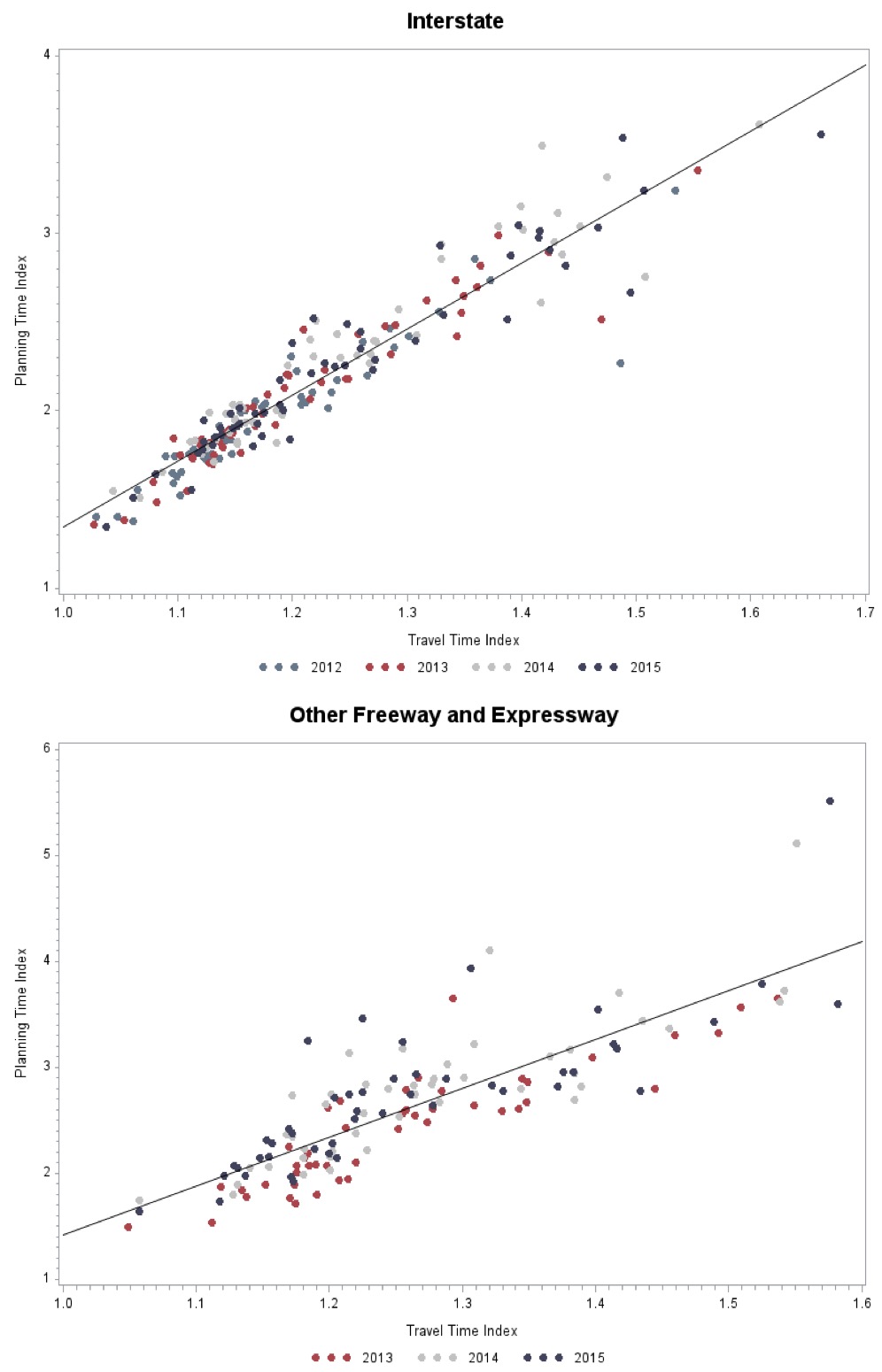
Exhibit 4-7 presents the linear correlation between TTI and PTI. It indicates that higher levels of recurring congestion are associated with non-recurring congestion as well. Freeways that routinely experience severe congestion are also more vulnerable to extreme congestion when conditions deteriorate unexpectedly.
Exhibit 4-7: Correlation between TTI and PTI in 52 Metropolitan Areas, 2012–2015
Note: TTI and PTI are averaged across metropolitan areas, road sections, and periods weighted by VMT using volume estimates derived from FHWA's HPMS over the 52 largest metropolitan areas. Data cover all Interstate highways (Interstate functional class) and other limited-access highways (Other Freeway and Expressway functional class) in these areas. Data on Interstate highways start in January 2012 and other freeways and expressways start in July 2013. Population is from United States Census Bureau 2014 Metropolitan Statistical Areas Population Estimates for 2010.
Source: FHWA staff calculation from the NPMRDS.
The correlation coefficient between TTI and PTI was 0.946 on Interstate highways and 0.830 on other freeways and expressways. The high and positive values of correlation coefficients suggest a strong linear relationship between TTI and PTI, especially on Interstate highways. There appears to be no significant year-to-year variation in the distribution of the ratios between PTI and TTI on the graph.
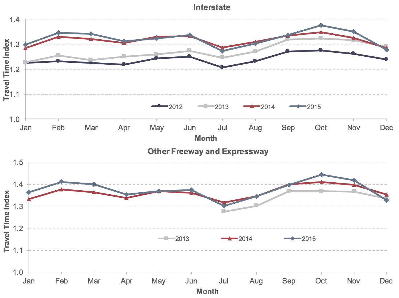
Road congestion varies over the course of a year. For each year from 2012 to 2015, TTI on Interstate highways fluctuated slightly in the first half of the year, dropped to a lower level in July, quickly rose to the highest yearly value in October, and dropped again in the last two months of the year (see Exhibit 4-8).
Exhibit 4-8: Monthly Travel Time Index in 52 Metropolitan Areas, 2012–2015
Note: TTI is averaged across metropolitan areas, road sections, and periods weighted by VMT using volume estimates derived from FHWA's HPMS over the 52 largest metropolitan areas. Data cover all Interstate highways (Interstate functional class) and other limited-access highways (Other Freeway and Expressway functional class) in these areas. Data on Interstate highways start in January 2012 and other freeways and expressways start in July 2013. Population is from United States Census Bureau 2014 Metropolitan Statistical Areas Population Estimates for 2010.
Source: FHWA staff calculation from the NPMRDS.
This is consistent with the public’s perception of better travel conditions in summer during vacation season, with congestion rising in September as schools are again in session. Additionally, the line for Interstate TTI in 2012 was the lowest in the graph, but the highest in 2015, confirming the results in Exhibit 4-1 where TTI rose over time.
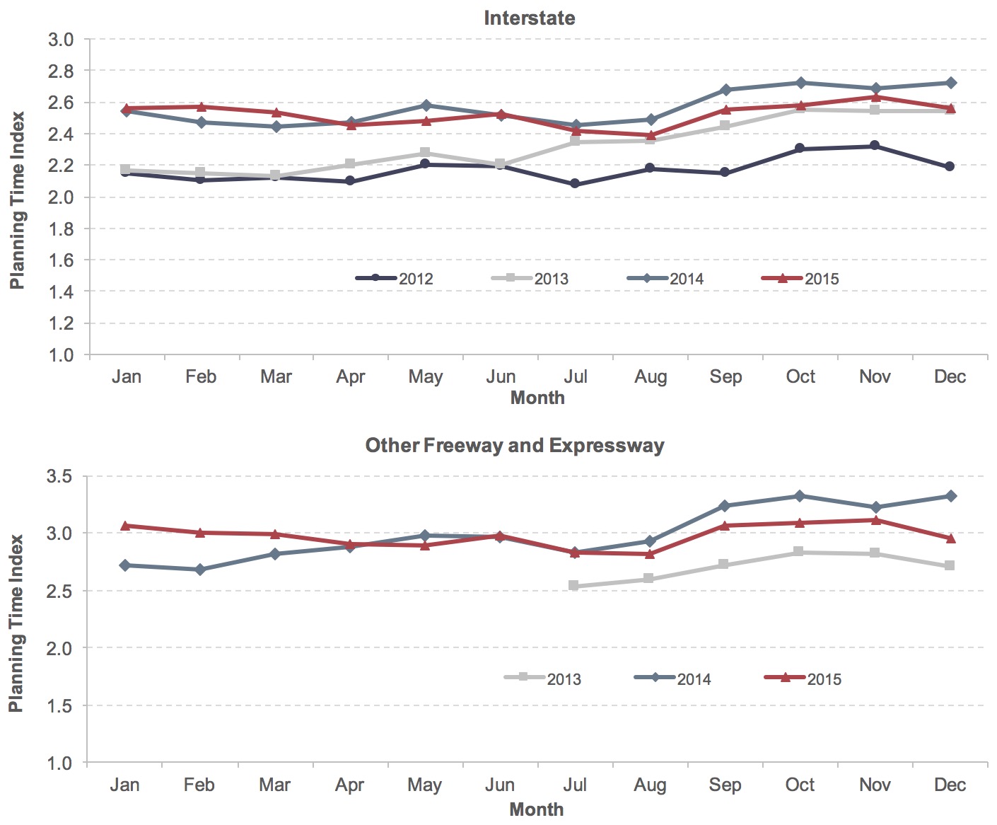
PTI generally fluctuated less in the first half of the year than the second, for each year from 2012 to 2015. PTI reached its lowest point in July or August, implying more consistency in travel times during the summer months (See Exhibit 4-9). The upward trend of PTI in the second half of the year implies that travel time reliability worsened in fall and winter. This seasonal pattern is more evident on other freeways and expressways, where PTI swelled to a yearly high in October or November.
Exhibit 4-9: Monthly Planning Time Index in 52 Metropolitan Areas, 2012–2015
Note: PTI is averaged across metropolitan areas, road sections, and periods weighted by VMT using volume estimates derived from FHWA's HPMS over the 52 largest metropolitan areas. Data cover all Interstate highways (Interstate functional class) and other limited-access highways (Other Freeway and Expressway functional class) in these areas. Data on Interstate highways start in January 2012 and other freeways and expressways start in July 2013. Population is from United States Census Bureau 2014 Metropolitan Statistical Areas Population Estimates for 2010.
Source: FHWA staff calculation from the NPMRDS.
Travel conditions tended to be stable in the first half of the year, as both TTI and PTI exhibited low volatility. Between July and September, peak-hour travel conditions worsened substantially due to decreased speed, extended travel time, and extra time to ensure on-time arrival. In the last quarter, although average travel time during peak hours decreased, the uncertainty of traffic flow remained elevated.
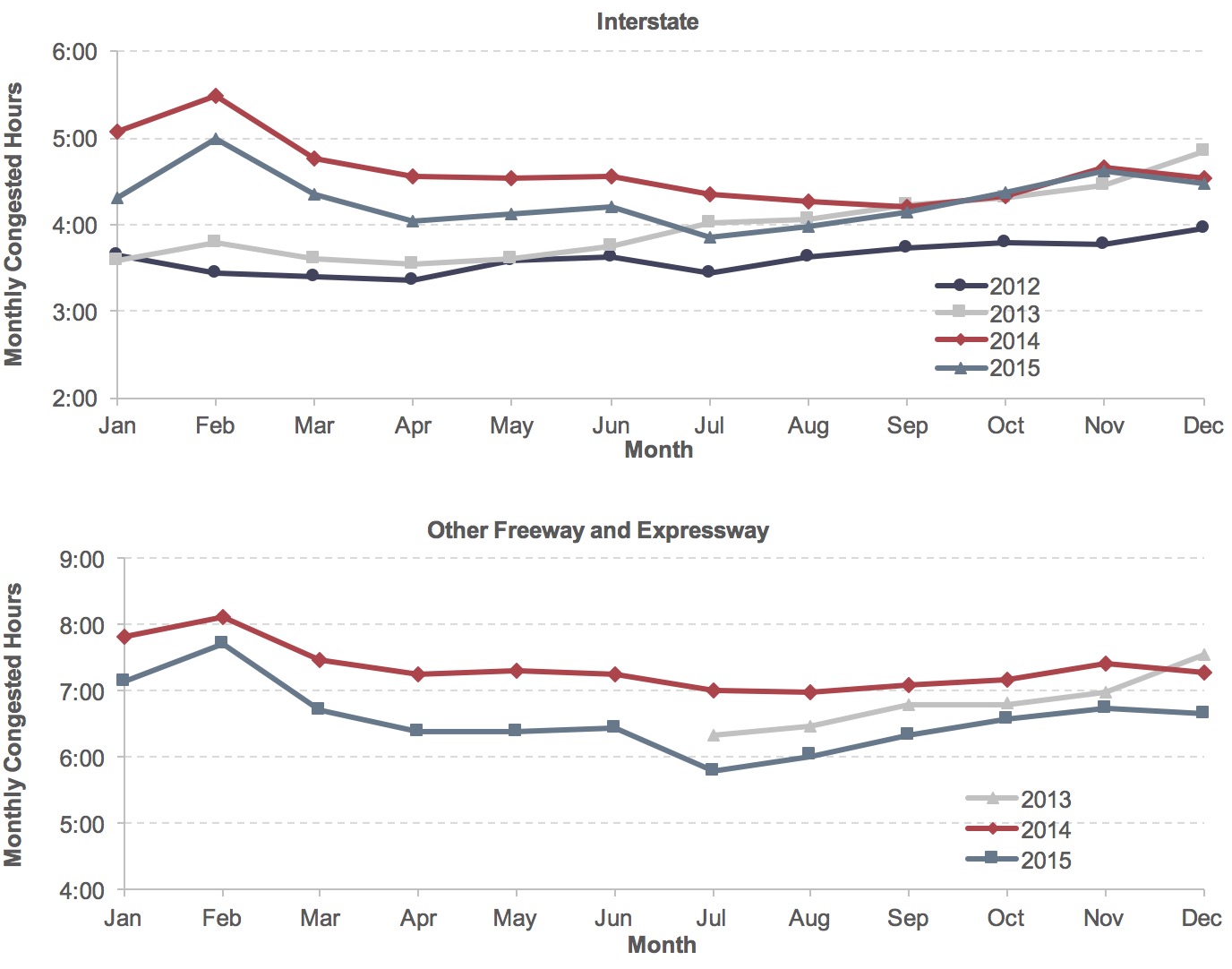
Congested Hours revealed a different monthly pattern. Highways usually experienced longer periods of congestion in winter months and shorter periods of congestion in warmer months (see Exhibit 4-10). Average length of congestion was lower on Interstate highways than on other freeways and expressways.
Exhibit 4-10: Monthly Congested Hours in 52 Metropolitan Areas, 2012–2015
Note: Congested hours are averaged across metropolitan areas, road sections, and periods weighted by VMT using volume estimates derived from FHWA's HPMS over the 52 largest metropolitan areas. Data cover all Interstate highways (Interstate functional class) and other limited-access highways (Other Freeway and Expressway functional class) in these areas. Data on Interstate highways start in January 2012 and other freeways and expressways start in July 2013. Population is from United States Census Bureau 2014 Metropolitan Statistical Areas Population Estimates for 2010.
Source: FHWA staff calculation from the NPMRDS.
Congestion Trends
Since the NPMRDS provides data starting only in 2012, the Urban Mobility Scorecard (which includes data back to 1982) is best used to examine longer-term congestion trends. It is important to note that congestion measures from the Urban Mobility Scorecard were calculated using a different methodology and a different data source than the NPMRDS and thus are not comparable with the indicators reported above, although they represent similar concepts. This section focuses on examining congestion development from 2004 to 2014 and is based exclusively on the latest Urban Mobility Scorecard.
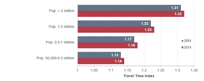
Compared with 2004, travelers experienced somewhat longer delays in 2014, as TTI for 471 urbanized areas increased from 1.25 to 1.26 (Exhibit 4-11). Average TTI increased for all sizes of urbanized areas, including small urbanized areas with populations between 50,000 and 500,000.
Exhibit 4-11: Travel Time Index for Urbanized Areas, 2004–2014
Source: Texas Transportation Institute (2015); population is based on the U.S. Census Bureau estimates.
People living in large urbanized areas with more than 1 million population tended to spend more travel time during peak hours than people living in small and medium urban areas with population below 1 million. Average TTI was 1.32 in 2014 in very large urbanized areas with population above 3 million, much higher than that of urbanized areas with population between 0.5 and 1 million (1.18) or urbanized areas with population below 0.5 million (1.14).
Congestion adversely affects the American economy and results in loss of time, fuel, and missed opportunities. When travel time increases or reliability decreases, businesses need to increase average inventory levels to compensate, leading to higher overall costs. Congestion imposes an economic drain on businesses, and the resulting increased costs negatively affect producer and consumer prices.
The Urban Mobility Scorecard reported on travel delay and its associated costs. Travel delay, the amount of extra time spent traveling due to congestion, was calculated at the individual roadway section level and for both weekdays and weekends. Annual delay per auto commuter is a measure of the extra travel time endured throughout the year by auto commuters who make trips during the peak period. Each auto commuter logged 42 additional hours traveling during the peak traveling period in 2014, as shown in Exhibit 4-12. Over the 10-year period of 2004–2014, total delay time increased from 6.1 billion hours in 2004 to 6.8 billion hours in 2014. Although national VMT grew at an annualized rate of 0.2 percent (see Chapter 1), annual average commuter delay rose by 1 hour—equivalent to 0.7 billion hours for the country. Combining wasted time with approximately 3 billion gallons of wasted fuel, the total cost of congestion was estimated to reach $160 billion in 2014, $24 billion higher than 2004. (Average cost of time was assumed to be $17.67 per hour in 2014 constant dollars, which differs from the value used in the analyses reflected in Part II of this report.)
Empirical studies have identified demographic and economic growth as main drivers of traffic (hence congestion). The cost of congestion rose by 1.1 percent per year from 2004 to 2014, above population growth of 0.9 percent but commensurate with the pace of economic growth of 1.2 percent (see Chapter 3). Automobile and truck congestion currently imposes a relatively small cost on the economy (about 0.8 percent of gross domestic product). But if the current trend continues, congestion could be detrimental to future economic expansion.
Exhibit 4-12: National Congestion Measures, 2004–2014
| Year | Delay per Commuter (Hours) | Total Delay (Billions of Hours) | Total Cost (Billions of 2014 Dollars) |
|---|---|---|---|
| 2004 | 41 | 6.1 | $136 |
| 2005 | 41 | 6.3 | $143 |
| 2006 | 42 | 6.4 | $149 |
| 2007 | 42 | 6.6 | $154 |
| 2008 | 42 | 6.6 | $152 |
| 2009 | 40 | 6.3 | $147 |
| 2010 | 40 | 6.4 | $149 |
| 2011 | 41 | 6.6 | $152 |
| 2012 | 41 | 6.7 | $154 |
| 2013 | 42 | 6.8 | $156 |
| 2014 | 42 | 6.8 | $160 |
Source: Texas Transportation Institute (2015).
Congestion Mitigation
Highway congestion is generally caused by an imbalance between travel demand and available capacity, reflecting inefficient use of existing capacity and unmet capacity needs. Vehicle “throughput” on a highway is the number of vehicles that get through over a specific period, such as an hour. Once highway traffic exceeds a certain threshold level, vehicle travel speeds drop below free flow speeds and congestion occurs. In project planning, programming, and selection processes, transportation planners and operators need to consider the extra economic costs of delayed and unreliable travel on highway users.
Mitigation options for recurring congestion include capacity expansion (i.e., increasing the number of lanes), operational improvements (such as traffic signal retiming and ramp meters), and travel demand management (incentives to shift demand). Strategies to mitigate nonrecurring delays usually include actions to reduce the incidence of disruptions and expedite the restoration of roadway capacity.
Congestion can also be caused by operational deficiencies when the existing operational control system is not working as designed, or when substandard roadway geometrics prevent efficient traffic flow. One operational mitigation approach is to adjust supply and demand through congestion pricing using tolls or fees. Technology-based operational solutions are another approach to reducing congestion. Examples of such applications include connected vehicles, integrated corridor management, and Intelligent Transportation Systems (ITS), which can include vehicle detection technologies, vehicle monitoring and tracking technologies, communications technologies, dynamic message signs, video camera technology, and Road Weather Information System (RWIS) applications.
Congestion pricing projects can be grouped into two broad categories: (1) projects involving tolls, and (2) projects not involving tolls. Strategies involving tolls are of five types, the first two of which involve “partial” pricing of one or more lanes on existing toll-free facilities:
- high occupancy toll (HOT) lanes (partial facility pricing);
- express toll lanes (partial facility pricing);
- pricing on entire roadway facilities;
- zone-based pricing, including cordon and area pricing; and
- regionwide pricing.
Strategies not involving tolls may include:
- parking pricing;
- priced vehicle sharing and dynamic ridesharing; and
- pay as you drive.
FHWA’s congestion pricing website provides information and resources to help State agencies and practitioners implement congestion pricing projects and incorporate pricing into transportation planning. It also presents some examples of projects using congestion pricing strategies.
The Fixing America’s Surface Transportation (FAST) Act established the Advanced Transportation and Congestion Management Technologies Deployment Program to make annual competitive grants for the development of model deployment sites for large-scale installation and operation of advanced transportation technologies to improve safety, efficiency, system performance, and infrastructure return on investment in both large and small local communities across the country.
ATCMTD Grants
The grants under this program will enable cities and rural communities to draw upon advanced technologies to tackle universal issues such as reducing congestion, connecting people to mass transit, and enhancing safety. Communities receiving grants in FY2016 include:
- Pittsburgh, Pennsylvania, received nearly $11 million to deploy smart traffic signal technology—proven to reduce congestion at street lights by up to 40 percent—along major travel corridors.
- Denver, Colorado, will use some of its approximately $6 million grant to deploy connected vehicle technologies, helping to alleviate the congestion caused by a daily influx of 200,000 commuters each workday.
Highway and Bridge Geometry
Previous editions of the C&P Report discussed geometric issues as part of the chapter dealing with physical conditions. For this edition, this material has been moved in recognition of the impact that highway and bridge geometry can have on mobility. While design standards for both roads and bridges have evolved to facilitate the movement of passengers and goods through the network, some facilities have not been updated to meet current standards or certain situations (such as prohibitively expensive potential right-of-way acquisition costs) might prevent the owners from completely adhering to the standards. It is important to note that facilities built to outdated standards are not necessarily poorly maintained. This section discusses geometric issues as they pertain to functionally obsolete bridges, roadway alignment, and lane width.
Functional obsolescence is generally determined by the geometrics of a bridge in relation to the geometrics required by current design standards. Functional obsolescence generally results from changing traffic demands on the structure. The classification of “functionally obsolete” is determined by the National Bridge Inventory (NBI) appraisal ratings for structural evaluation, waterway adequacy, deck geometry, alignment of the approach roadway, and underclearances. Appraisal ratings are used to compare existing characteristics of a bridge to the current standards used for highway and bridge design. Existing bridges constructed before the establishment of more stringent design standards are more likely to be classified as functionally obsolete when compared with newer bridges.
Facilities, including bridges, will generally conform to the design standards in place at the time they are designed. Over time, design requirements improve. For example, a bridge designed in the 1930s would have shoulder widths that conform with 1930s design standards. Current design standards, however, are based on different criteria, and current safety standards require wider bridge shoulders. The difference between the required, current-day shoulder width and the shoulder width designed in the 1930s represents a deficiency. The magnitudes of such deficiencies determine whether a bridge is classified as functionally obsolete.
Across all roadway bridges in the Nation, the share of functionally obsolete bridges by bridge count decreased from 15.2 percent in 2004 to 13.8 percent in 2015, as shown in Exhibit 4-13. When weighted by average daily traffic (ADT), the share of functionally obsolete bridges decreased slightly from 21.9 percent in 2004 to 21.7 percent in 2015. The share remained at 20.5 percent when weighted by deck area.
Exhibit 4-13: Functionally Obsolete Bridges—All Bridges, 2004–2015
| 2004 | 2006 | 2008 | 2010 | 2012 | 2014 | 2015 | |
|---|---|---|---|---|---|---|---|
| Count | |||||||
| Total Bridges | 594,100 | 597,561 | 601,506 | 604,493 | 607,380 | 610,749 | 611,845 |
| Functionally Obsolete | 90,076 | 89,591 | 89,189 | 85,858 | 84,748 | 84,525 | 84,124 |
| Percent Functionally Obsolete | |||||||
| By Bridge Count | 15.2% | 15.0% | 14.8% | 14.2% | 14.0% | 13.8% | 13.8% |
| Weighted by Deck Area | 20.5% | 20.3% | 20.5% | 19.8% | 20.1% | 20.3% | 20.5% |
| Weighted by ADT | 21.9% | 21.9% | 22.2% | 21.5% | 21.3% | 21.4% | 21.7% |
Source: National Bridge Inventory.
Exhibit 4-14 provides the share of functionally obsolete bridges on the National Highway System (NHS). The share of functionally obsolete bridges on the NHS based on bridge count decreased slightly from 16.9 percent in 2004 to 16.8 percent in 2015. Weighted by deck area, the share of functionally obsolete bridges increased from 20.9 percent in 2004 to 22.5 percent in 2015. The share of functionally obsolete bridges based on ADT increased from 19.8 percent in 2004 to 20.4 percent in 2015. The share of functionally obsolete bridges on the NHS in 2015 was 16.8 percent, compared with 13.8 percent for all bridges systemwide.
Exhibit 4-14: Functionally Obsolete Bridges on the National Highway System, 2004–2015
| 2004 | 2006 | 2008 | 2010 | 2012 | 2014 | 2015 | |
|---|---|---|---|---|---|---|---|
| Count | |||||||
| Total Bridges | 115,103 | 115,202 | 116,523 | 116,669 | 117,485 | 143,165 | 143,139 |
| Functionally Obsolete | 19,408 | 19,368 | 19,707 | 19,061 | 19,075 | 24,098 | 24,026 |
| Percent Functionally Obsolete | |||||||
| By Bridge Count | 16.9% | 16.8% | 16.9% | 16.3% | 16.2% | 16.8% | 16.8% |
| Weighted by Deck Area | 20.9% | 20.8% | 21.4% | 20.3% | 21.0% | 22.3% | 22.5% |
| Weighted by ADT | 19.8% | 20.1% | 20.5% | 19.7% | 19.5% | 20.3% | 20.4% |
Source: National Bridge Inventory.
Most functionally obsolete bridges are located in urban environments. As shown in Exhibit 4-15, urban minor arterials had the highest share of functionally obsolete bridges at 27.2 percent in 2015. In the rural setting, Interstate bridges had the highest share of functionally obsolete bridges at 11.5 percent.
It should be noted that “functionally obsolete” is a legacy classification that was used to implement the Highway Bridge Program, which was discontinued as a standalone program with the enactment of MAP-21. As a result, fiscal year 2015 was the last year in which outstanding Highway Bridge Program funds could be obligated on eligible projects, including ones with bridges that were once classified as functionally obsolete. In the absence of a programmatic reason to collect the data necessary to support this classification, some of the data needed to compute it have been removed from the NBI, and future editions of the C&P Report thus will not contain this information.
Exhibit 4-15: Functionally Obsolete Bridges by Functional Class, 2004–2015
| Functional System | Percentages of Functionally Obsolete Bridges by Year | ||||||
|---|---|---|---|---|---|---|---|
| 2004 | 2006 | 2008 | 2010 | 2012 | 2014 | 2015 | |
| Rural | |||||||
| Interstate | 12.8% | 12.0% | 11.8% | 11.6% | 11.6% | 11.5% | 11.5% |
| Other Principal Arterial | 9.9% | 9.4% | 9.3% | 8.5% | 8.3% | 8.0% | 7.8% |
| Minor Arterial | 11.6% | 11.0% | 10.6% | 10.2% | 9.7% | 9.4% | 9.3% |
| Major Collector | 11.0% | 10.5% | 10.1% | 9.3% | 8.9% | 8.7% | 8.5% |
| Minor Collector | 12.1% | 11.9% | 11.4% | 10.6% | 10.4% | 10.2% | 9.9% |
| Local | 13.2% | 12.8% | 12.4% | 11.7% | 11.3% | 11.3% | 11.2% |
| Subtotal Rural | 12.2% | 11.7% | 11.4% | 10.7% | 10.4% | 10.2% | 10.1% |
| Urban | |||||||
| Interstate | 23.3% | 23.6% | 23.9% | 23.0% | 22.9% | 23.1% | 22.8% |
| Other Freeway and Expressway | 23.2% | 23.1% | 22.9% | 22.0% | 22.1% | 22.4% | 22.3% |
| Other Principal Arterial | 25.4% | 24.5% | 24.5% | 23.8% | 23.4% | 22.7% | 22.5% |
| Minor Arterial | 29.3% | 29.4% | 29.3% | 28.6% | 28.2% | 27.5% | 27.2% |
| Collector | 28.6% | 28.7% | 28.5% | 28.1% | 27.4% | 26.8% | 26.5% |
| Local | 22.0% | 21.9% | 21.4% | 20.5% | 20.7% | 20.0% | 19.9% |
| Subtotal Urban | 25.1% | 25.0% | 24.9% | 24.2% | 24.0% | 23.6% | 23.4% |
| Total | 15.2% | 15.0% | 14.8% | 14.2% | 14.0% | 13.9% | 13.7% |
Source: National Bridge Inventory.
The term “roadway alignment” refers to the curvature and grade of a roadway, i.e., the extent to which it bends left or right and/or slopes-up or down. The term “horizontal alignment” relates to curvature (the sharpness of curves), while the term “vertical alignment” relates to gradient (the steepness of slopes). Alignment adequacy affects the level of service and safety of the highway system. Inadequate alignment can result in speed reductions and impaired sight distance. Truck speeds are particularly affected by inadequate vertical alignment. Alignment adequacy is evaluated on a scale from Code 1 (best) to Code 4 (worst).
Alignment adequacy is more important on roads with higher travel speeds or higher volumes (e.g., the Interstate System). Because alignment generally is not a major issue in urban areas, only rural alignment statistics are presented in this section. The amount of change in roadway alignment over time is gradual and occurs only during major reconstruction of existing roadways. New roadways are constructed to meet current vertical and horizontal alignment criteria, and thus generally have no alignment problems except under extreme conditions.
As shown in Exhibit 4-16, in 2014, approximately 80.7 percent of rural Interstate System miles were classified as Code 1 (best) and 17.0 percent as Code 4 (worst) for horizontal alignment. On rural minor arterial, 65.6 percent of miles were classified as Code 1 and 22.6 percent classified as Code 4 for horizontal alignment. As for vertical alignment, 85.6 percent of rural Interstate miles met appropriate design standards (Code 1) and only 0.2 percent were in Code 4. The shares were 67.4 percent in Code 1 and 4.9 percent in Code 4 on rural minor arterial.
The distributional pattern indicates that, while the majority of rural highways met the appropriate curve and grade standard in 2014, there were more highways with unsafe or uncomfortable curves or limited speed (horizontal alignment) than highways with grades that could affect traveling speed (vertical alignment). Additionally, highways in higher functional classes, like Interstate, reported a high proportion of roads with better alignment than their counterparts in lower functional classes.
Exhibit 4-16: Percentage of Rural Highway Alignment by Functional Class, 2014
| Code 1 | Code 2 | Code 3 | Code 4 | ||
|---|---|---|---|---|---|
| Horizontal | |||||
| Interstate | 80.7% | 0.7% | 1.5% | 17.0% | |
| Other Freeway and Expressway | 68.9% | 2.5% | 1.9% | 26.7% | |
| Other Principal Arterial | 68.3% | 7.9% | 5.3% | 18.5% | |
| Minor Arterial | 65.6% | 5.8% | 6.0% | 22.6% | |
| Major Collector | 77.1% | 1.1% | 1.3% | 20.5% | |
| Vertical | |||||
| Interstate | 85.6% | 13.1% | 1.1% | 0.2% | |
| Other Freeway and Expressway | 87.7% | 9.4% | 1.7% | 1.2% | |
| Other Principal Arterial | 72.3% | 18.5% | 6.5% | 2.7% | |
| Minor Arterial | 67.4% | 18.7% | 9.0% | 4.9% | |
| Major Collector | 89.7% | 5.3% | 3.1% | 1.8% | |
Code 1 All curves and grades meet appropriate design standards.
Code 2 Some curves or grades are below design standards for new construction, but curves can be negotiated safely at prevailing speed limits. Truck speed is not substantially affected.
Code 3 Infrequent curves or grades occur that impair sight distance or severely affect truck speeds. May have reduced speed limits.
Code 4 Frequent grades occur that impair sight distance or severely affect truck speeds. Generally, curves are unsafe or uncomfortable at prevailing speed limit, or the speed limit is severely restricted due to the design speed limits of the curves.
Source: Highway Performance Monitoring System.
Travel lanes are striped to define the intended path of travel for vehicles along a corridor. Lane width affects highway capacity, traffic operation, speed, and safety. Wider travel lanes (11–13 feet) create a more forgiving buffer to drivers, especially in high-speed environments. Narrow lanes (less than 10 feet) have less capacity and can increase the potential for crashes and side-swipe collisions. There are recommended widths for different types of lanes. The American Association of State Highway and Transportation Officials (AASHTO) provides guidance for lane widths: 12 feet for freeways, 10–12 feet for arterial and collector roads, and 9–12 for local roads (https://safety.fhwa.dot.gov/geometric/pubs/mitigationstrategies/chapter3/3_lanewidth.cfm).
As with roadway alignment, lane width is more crucial on functional classifications that have higher travel volumes and speed limits. Exhibit 4-17 shows that approximately 95.2 percent of rural Interstate System miles and 98.0 percent of urban Interstate System miles had minimum 12-foot lane widths in 2014. Highways on Other Freeway and Expressway (including Interstate) also generally met the lane width standard, with associated shares at 97.0 percent in rural areas and 96.4 in urban areas.
Highways of lower functional classification were less likely to meet the lane width standard. In 2014, approximately 52.0 percent of urban collectors had lane widths of 12 feet or greater, but approximately 19.4 percent had 11-foot lanes and 21.1 percent had 10-foot lanes; the remaining 7.6 percent had lane widths of 9 feet or less. Among rural major collectors, 41.6 percent had lane widths of 12 feet or greater, but approximately 27.5 percent had 11-foot lanes and 22.7 percent had 10-foot lanes. Roughly 8.3 percent of rural major collector mileage had lane widths of 9 feet or less.
Exhibit 4-17: Lane Width by Functional Class, 2014
| ≥12 foot | 11 foot | 10 foot | 9 foot | <9 foot | |
|---|---|---|---|---|---|
| Rural | |||||
| Interstate | 95.2% | 4.6% | 0.1% | 0.1% | 0.0% |
| Other Freeway and Expressway | 97.0% | 3.0% | 0.0% | 0.0% | 0.0% |
| Other Principal Arterial | 89.3% | 9.2% | 1.4% | 0.2% | 0.0% |
| Minor Arterial | 71.2% | 19.3% | 8.9% | 0.7% | 0.1% |
| Major Collector | 41.6% | 27.5% | 22.7% | 6.1% | 2.2% |
| Urban | |||||
| Interstate | 98.0% | 1.4% | 0.3% | 0.1% | 0.1% |
| Other Freeway and Expressway | 96.4% | 2.8% | 0.8% | 0.0% | 0.0% |
| Other Principal Arterial | 81.8% | 13.0% | 4.5% | 0.4% | 0.3% |
| Minor Arterial | 65.9% | 19.1% | 12.0% | 2.1% | 0.9% |
| Collector | 52.0% | 19.4% | 21.1% | 5.7% | 1.9% |
Source: Highway Performance Monitoring System.
Key Takeaways
- The average speed of transit modes varies considerably. Modes such as trolleybus and streetcar operate mostly in mixed traffic rights-of-way, serving downtown areas. The average speed of these modes is less than 10 mph.
- Rail modes operate at average speeds of over 15 mph, and modes with a long-distance commuter orientation such as commuter rail average over 30 mph.
- The average vehicle occupancy of heavy rail systems increased by 16 percent, from 23 passengers per car in 2004 to 28 in 2014, more than any other mode.
- The length of the rail network increased annually at an average of 2.5 percent per year. Light rail and commuter rail systems accounted for most of this increase.
- The mean distance between vehicle failures of fixed-route bus systems decreased by 9 percent, from 4,040 miles in 2004 to 3,673 in 2014.
- Based on data from 2009, 44.5 percent of transit passengers wait 5 minutes or less for transit vehicles to arrive and 73.2 percent wait 10 minutes or less. Another 8.0 percent wait 21 minutes or more.
- The level of ADA accessibility to transit service vehicles rose from 93 percent in 2004 to 96 percent in 2014.
Transit Mobility and Access
The basic goal of all transit operators is to connect people to the places they want to go in a safe and efficient manner, while minimizing travel times, making effective use of vehicle capacity, and providing reliable performance. The Federal Transit Administration (FTA) collects data on average speed, how full the vehicles are on average (utilization), and how often they break down (mean distance between failures) to characterize how well transit service meets these goals. These data are reported here; transit safety data are reported in Chapter 5.
The following analysis presents data on average operating speeds, average number of passengers per vehicle, average percentage of seats occupied per vehicle, average distance traveled per vehicle, and mean distance between vehicle failures. Average speed, seats occupied, and distance between failures provide metrics for evaluating efficiency and customer service issues; passengers per vehicle and miles per vehicle are primarily effectiveness and efficiency measures, respectively. Financial efficiency metrics, including operating expenditures per revenue mile or passenger mile, are discussed in Chapter 2.
This chapter also discusses transit accessibility for persons with disabilities and the elderly. Transit access and accessibility are central elements of a multimodal transportation system that meets the needs of people of all ages and abilities. Analysis is presented on the progress made to improve accessibility to transit for the elderly and disabled through enforcement of the Americans with Disability Act of 1990 (ADA) by evaluating the number of ADA-accessible transit services. This chapter concludes with an analysis of transit system coverage (route-miles), frequency (wait time) and infrastructure resilience.
Average Operating (Passenger-Carrying) Speeds
Average vehicle operating speed is an approximate measure of the in-vehicle service experienced by transit riders; it is not a measure of the operating speed of transit vehicles between stops. More specifically, average operating speed is a measure of the speed passengers experience from the time they enter a transit vehicle to the time they exit it, including dwell times at stops. It does not include the time passengers spend waiting or transferring. Average vehicle operating speed is calculated for each mode by dividing annual vehicle revenue miles by annual vehicle revenue hours for each agency in each mode, as reported to NTD. When an agency contracts with a service provider or provides the service directly, the speeds for each service within a mode are calculated and weighted separately. Exhibit 4-18 presents the results of these average speed calculations.
Exhibit 4-18: Average Speeds for Passenger-Carrying Transit Modes, 2014
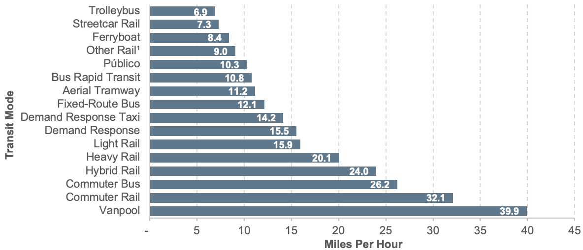
1Includes monorail/automated guideway, cable car, and inclined plane.
Source: National Transit Database.
The number of and distance between stops and the time required for boarding and alighting of passengers strongly influence the average speed of a transit mode. Fixed-route bus service, which typically makes frequent stops, has a relatively low average speed. In contrast, commuter rail has sustained high speeds between infrequent stops, and thus a relatively high average speed. Vanpools also travel at high speeds, usually with only a few stops at each end of the route. Modes using exclusive guideway (including HOV lanes) can offer more rapid travel time than similar modes that do not. Heavy rail, which travels exclusively on dedicated guideway, has a higher average speed than streetcar, which often shares its guideway with mixed traffic. These average speeds have not changed significantly over the past decade.
One of the reasons for creating new modal categories in the NTD for commuter bus and hybrid rail in 2011 was the significantly higher speeds these systems attain. For example, commuter bus systems typically operate with very few intermediate stops, and often use limited-access highways, allowing them to achieve average speeds more than double those of traditional fixed-route bus systems.
Hybrid rail systems typically operate in a suburban environment with longer distances between stops, allowing them to achieve average speeds that are significantly higher than those for light rail.
It is worth noting that the bus rapid transit systems in the NTD are currently reporting an average speed that is slightly lower than that of regular fixed-route bus and light rail. This is in part because bus rapid transit systems typically operate in the highest-density urban environments where speeds are lower. Nevertheless, the average speed for bus rapid transit is still nearly 50 percent higher than that of streetcar rail, which also tends to operate in the highest-density areas.
System Capacity
Exhibit 4-19 provides reported vehicle revenue miles (VRMs) for both rail and nonrail modes. These numbers show the actual number of miles each mode travels in revenue service. (A mode is in revenue service when it is open to the general public and running with the expectation of carrying passengers who directly pay fares, or whose fares are subsidized by public policy, or provide payment through some contractual arrangement).
VRMs provided by fixed-route bus services and rail services show consistent growth, with light rail and vanpool miles growing somewhat faster than the other modes. Overall, the number of VRMs has increased by 28.8 percent since 2004, with an average annual rate of change of 2.6 percent.
Exhibit 4-19: Rail and Nonrail Vehicle Revenue Miles, 2004–2014
| Mode | Vehicle Revenue Miles (in Millions) | Average Annual Rate of Change 2014 to 2004 |
|||||
|---|---|---|---|---|---|---|---|
| 2004 | 2006 | 2008 | 2010 | 2012 | 2014 | ||
| Rail | 962 | 997 | 1,052 | 1,056 | 1,056 | 1,109 | 1.4% |
| Heavy Rail | 625 | 634 | 655 | 647 | 638 | 657 | 0.5% |
| Commuter Rail | 269 | 287 | 307 | 315 | 318 | 339 | 2.3% |
| Light Rail1 | 67 | 73 | 86 | 92 | 99 | 112 | 5.3% |
| Other Rail2 | 2 | 3 | 3 | 2 | 1 | 1 | -4.8% |
| Nonrail | 2,591 | 2,671 | 3,167 | 3,231 | 3,269 | 3,467 | 3.0% |
| Fixed-Route Bus3 | 1,891 | 1,910 | 2,025 | 1,994 | 1,977 | 2,044 | 0.8% |
| Demand Response4 | 560 | 606 | 945 | 1,008 | 1,042 | 1,155 | 7.5% |
| Ferryboat | 3 | 2 | 3 | 3 | 3 | 3 | 1.9% |
| Trolleybus | 13 | 12 | 11 | 12 | 11 | 11 | -1.7% |
| Vanpool | 78 | 110 | 158 | 181 | 207 | 228 | 11.3% |
| Other Nonrail5 | 45 | 32 | 25 | 32 | 27 | 25 | -5.8% |
| Total | 3,553 | 3,668 | 4,218 | 4,287 | 4,325 | 4,575 | 2.6% |
1Includes light rail, hybrid rail, and streetcar rail.
2Includes Alaska railway, monorail/automated guideway, cable car, and inclined plane.
3Includes bus, commuter bus, and bus rapid transit.
4Includes demand response and demand response taxi.
5Includes aerial tramway and públicos.
Source: National Transit Database.
Transit system capacity, particularly in cross-modal comparisons, is typically measured by capacity-equivalent VRMs. This parameter measures the distances transit vehicles travel in revenue service and adjusts them by the passenger-carrying capacity of each transit vehicle type, with the average carrying capacity of fixed-route bus vehicles representing the baseline. To calculate capacity-equivalent VRMs, the number of revenue miles for a vehicle is multiplied by the bus-equivalent capacity of that vehicle. Exhibit 4-20 identifies average vehicle capacity by mode.
Exhibit 4-21 shows the 2014 capacity-equivalent factors for each mode. VRMs for each mode are multiplied by a capacity-equivalent factor to calculate capacity-equivalent VRMs. These factors are equal to the average full-seating and full-standing capacities of vehicles in active service for each transit mode divided by the average full-seating and full-standing capacities of all motor bus vehicles in active service. The average capacity of the national fixed-route bus fleet changes slightly from year to year as the proportion of large, articulated, and small buses varies. The average capacity of bus mode fleet in 2014 was 36 seated and 59 seating and standing.
Exhibit 4-20: Average Vehicle Capacity by Mode
| Mode | Active Fleet | Average Seating Capacity | Total Capacity (Seating and Standing) |
|---|---|---|---|
| Bus | 68,345 | 36 | 59 |
| Demand Response | 52,393 | 11 | 11 |
| Vanpool | 15,395 | 10 | 10 |
| Heavy Rail | 11,841 | 51 | 141 |
| Commuter Rail | 7,211 | 110 | 174 |
| Commuter Bus | 6,553 | 46 | 58 |
| Demand Response - Taxi | 6,534 | 5 | 5 |
| Publico | 2,310 | 10 | 10 |
| Light Rail | 2,129 | 65 | 189 |
| Trolleybus | 761 | 45 | 81 |
| Bus Rapid Transit | 655 | 49 | 82 |
| Streetcar Rail | 361 | 46 | 92 |
| Ferryboat | 179 | 432 | 586 |
| Monorail/Automated Guideway | 163 | 27 | 91 |
Note: Modes not included: hybrid rail, cable car, aerial tramway and inclined plane.
Source: National Transit Database.
Exhibit 4-21: Capacity-Equivalent Factors (Seating plus Standing) by Mode
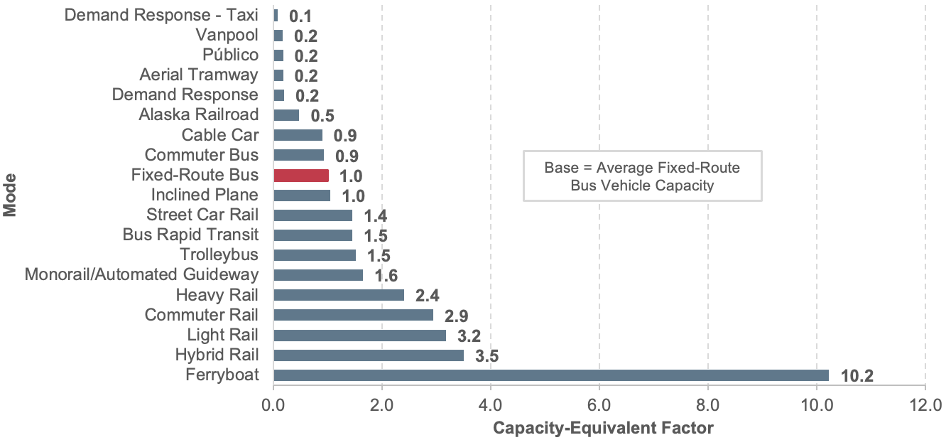
Note: Factors based on seating plus standing capacity. Data do not include agencies that qualified for and opted to use the small systems waiver of the National Transit Database.
Source: National Transit Database.
Exhibit 4-22 shows total capacity-equivalent VRMs. Other rail modes show the most rapid expansion in capacity-equivalent VRMs from 2004 to 2014, followed by light rail, demand-response, and commuter rail. Annual VRMs for monorail/automated guideway more than doubled, resulting in an increase in capacity-equivalent VRMs for the “other” rail category. Total capacity-equivalent revenue miles increased from 4,520 million in 2004 to 5,438 million in 2014, an increase of 20 percent.
Exhibit 4-22: Capacity-Equivalent Vehicle Revenue Miles, 2004–2014
| Mode | 2004 | 2006 | 2008 | 2010 | 2012 | 2014 | Average Annual Rate of Change 2014 to 2004 |
|---|---|---|---|---|---|---|---|
| Rail | 2,418 | 2,576 | 2,703 | 2,714 | 2,760 | 2,932 | 1.9% |
| Heavy Rail | 1,550 | 1,592 | 1,621 | 1,599 | 1,580 | 1,582 | 0.2% |
| Commuter Rail | 687 | 777 | 844 | 860 | 887 | 996 | 3.8% |
| Light Rail1 | 180 | 201 | 235 | 252 | 284 | 345 | 6.7% |
| Other Rail2 | 3 | 6 | 4 | 3 | 9 | 9 | 13.8% |
| Nonrail | 2,076 | 2,091 | 2,265 | 2,259 | 2,253 | 2,349 | 1.2% |
| Fixed-Route Bus3 | 1,891 | 1,910 | 2,025 | 1,994 | 1,979 | 2,038 | 0.7% |
| Demand Response4 | 105 | 113 | 158 | 176 | 182 | 218 | 7.5% |
| Ferryboat | 33 | 22 | 32 | 35 | 35 | 35 | 0.5% |
| Trolleybus | 20 | 18 | 16 | 17 | 16 | 17 | -1.7% |
| Vanpool | 15 | 20 | 27 | 30 | 34 | 38 | 9.8% |
| Other Nonrail5 | 12 | 8 | 6 | 8 | 7 | 4 | -9.4% |
| Total | 4,494 | 4,667 | 4,968 | 4,973 | 5,013 | 5,281 | 1.6% |
1Includes light rail, hybrid rail, and streetcar rail.
2Includes Alaska railway, monorail/automated guideway, cable car, and inclined plane.
3Includes bus, commuter bus, and bus rapid transit.
4Includes demand response and demand response taxi.
5Includes aerial tramway and públicos.
Note: 2012 data do not include agencies that qualified for and opted to use the small systems waiver of the National Transit Database.
Source: National Transit Database.
Vehicle Use
Vehicle Occupancy
Exhibit 4-23 shows vehicle occupancy by mode for selected years from 2004 to 2014. Vehicle occupancy is calculated by dividing passenger miles traveled (PMT) by VRMs, resulting in the average passenger load in a transit vehicle. From 2004 to 2014, average passenger load for most major transit modes have not changed significantly.
An important metric of vehicle occupancy is weighted average seating capacity utilization. This average is calculated by dividing passenger load by the average number of seats in the vehicle (or passenger car for rail modes). The weighting factor is the number of active vehicles in the fleet. Exhibit 4-20 shows the average seating capacity for some modes are vanpool, 10; heavy rail, 51; light rail, 65; ferryboat, 432; commuter rail, 110; fixed-route bus, 36; demand-response, 11.
As shown in Exhibit 4-24, the average seating capacity utilization ranges from 10.9 percent for demand-response to 59.2 percent for vanpools. At first glance, the data seem to indicate excess seating capacity for all modes. Several factors, however, explain these apparent low utilization rates. For example, the low utilization rate for fixed-route bus, which operates in large and small urbanized areas, can be explained partially by low average passenger loads in urbanized areas. Other factors could include high passenger demand in one direction, and small or very small demand in the opposite direction during peak periods; and sharp drops in loads beyond segments of high demand, with limited room for short turns, and other factors.
Exhibit 4-23: Average Vehicle Occupancy: Passenger Miles per Vehicle Revenue Mile, 2004–2014
| Mode | 2004 | 2006 | 2008 | 2010 | 2012 | 2014 |
|---|---|---|---|---|---|---|
| Rail | ||||||
| Heavy Rail | 23.0 | 23.2 | 25.7 | 25.3 | 27.5 | 27.9 |
| Commuter Rail | 36.1 | 36.1 | 35.6 | 34.2 | 35.0 | 34.3 |
| Light Rail1 | 23.7 | 25.6 | 24.1 | 23.7 | 25.2 | 24.0 |
| Other Rail2 | 9.4 | 8.8 | 9.3 | 10.7 | 8.1 | 9.2 |
| Non-Rail | ||||||
| Fixed-Route Bus3 | 10.0 | 10.7 | 10.8 | 10.7 | 11.2 | 11.1 |
| Demand-Response4 | 1.3 | 1.2 | 1.2 | 1.2 | 1.2 | 1.1 |
| Ferryboat | 126.7 | 111.9 | 118.1 | 119.3 | 125.2 | 127.8 |
| Trolleybus | 13.3 | 13.9 | 14.3 | 13.6 | 14.3 | 14.3 |
| Vanpool | 5.9 | 6.2 | 6.3 | 6.0 | 6.1 | 5.9 |
| Other Nonrail5 | 5.8 | 5.5 | 5.5 | 5.2 | 5.3 | 5.2 |
1Includes light rail, hybrid rail, and streetcar rail.
2Includes Alaska railway, monorail/automated guideway, cable car, and inclined plane.
3Includes bus, commuter bus, and bus rapid transit.
4Includes demand response and demand response taxi.
5Includes aerial tramway and públicos.
Source: National Transit Database.
Exhibit 4-24: Average Seat Occupancy Rates for Passenger-Carrying Transit Modes, 2014
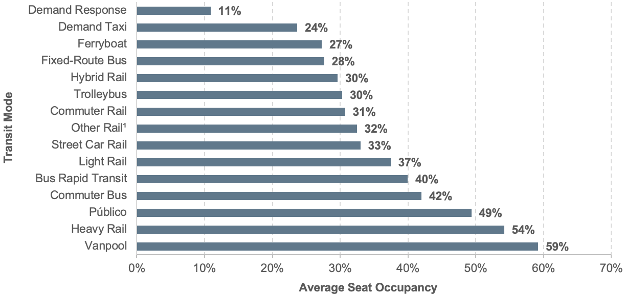
1Includes cable car, inclined plane, and monorail/automated guideway.
Note: Aerial tramway mode has substantial standing capacity that is not considered here, but which can allow the measure of the percentage of seats occupied to exceed 100 percent for a full vehicle.
Note: Does not include agencies that qualified for and opted to use the small systems waiver of the National Transit Database.
Source: National Transit Database.
Vehicles also tend to be relatively empty at the beginning and ends of their routes. For many commuter routes, a vehicle that is crush-loaded (i.e., filled to maximum capacity) on part of the trip ultimately might only achieve an average occupancy of around 35 percent (as shown by analysis of the Washington Metropolitan Area Transit Authority peak period data).
Finally, it is worth noting that the average occupancy for a highway vehicle in 2014 was only 1.1 passengers per vehicle. Assuming an average of roughly five seats per highway vehicle, that worked out to a capacity utilization of only 22 percent, which was just below typical transit capacity utilization.
Vehicle Use
Revenue miles per active vehicle (service use), defined as average distance traveled per vehicle in service, can be measured by the ratio of VRMs per active vehicles in the fleet. Exhibit 4-25 provides vehicle service use by mode for selected years from 2004 to 2014. Heavy rail, generally offering long hours of frequent service, had the highest vehicle use during this period. Vehicle service use for vanpool and demand-response shows an increasing trend. Vehicle service use for other nonrail modes appears to be relatively stable over the past few years with no apparent trends in either direction.
Exhibit 4-25: Vehicle Service Utilization: Average Annual Vehicle Revenue Miles per Active Vehicle by Mode, 2004–2014
| Mode | Vehicle Revenue Miles (in Millions) | Average Annual Rate of Change 2014 to 2004 |
|||||
|---|---|---|---|---|---|---|---|
| 2004 | 2006 | 2008 | 2010 | 2012 | 2014 | ||
| Rail | |||||||
| Heavy Rail | 57 | 57 | 58 | 57 | 56 | 57 | -0.1% |
| Commuter Rail | 41 | 43 | 45 | 45 | 44 | 46 | 1.2% |
| Light Rail1 | 40 | 40 | 44 | 43 | 42 | 46 | 1.4% |
| Non-Rail | |||||||
| Fixed-Route Bus3 | 30 | 30 | 31 | 31 | 31 | 28 | -0.5% |
| Demand-Response4 | 20 | 22 | 29 | 28 | 28 | 20 | 0.3% |
| Ferryboat | 27 | 22 | 22 | 25 | 23 | 20 | -2.6% |
| Trolleybus | 21 | 19 | 19 | 20 | 20 | 20 | -0.4% |
| Vanpool | 14 | 14 | 14 | 15 | 15 | 15 | 0.7% |
1Includes light rail, hybrid rail, and streetcar rail.
2Includes bus, bus rapid transit, and commuter bus.
3Includes demand-response and demand-response taxi.
Note: 2014 data do not include agencies that qualified and opted to use the small systems waiver of the National Transit Database.
Note: Rail category does not include Alaska railroad, cable car, inclined plane, or monorail/automated guideway. Nonrail category does not include aerial tramway or público.
Source: National Transit Database.
Ridership
The two primary measures of transit ridership are unlinked passenger trips and PMT. An unlinked passenger trip, sometimes called a boarding, is defined as a journey on one transit vehicle. PMT is calculated based on unlinked passenger trips and estimates of average trip length. Either measure provides a similar picture of ridership trends because average trip lengths, by mode, have not changed substantially over time. Comparisons across modes, however, could differ substantially, depending on which measure is used, due to large differences in the average trip length for the various modes.
Unlinked Passenger Trips and Passenger Miles
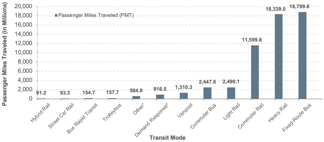
Exhibits 4-26 and 4-27 show the distribution of unlinked passenger trips (UPT) and PMT by mode. In 2014, urban transit systems provided 10.6 billion unlinked trips and 57.0 billion PMT across all modes. The fixed-route bus and heavy rail modes continue to be the largest segments of both measures. Commuter rail supports relatively more PMT due to its greater average trip length (23.9 miles compared with 3.7 for fixed-route bus, 4.7 for heavy rail, and 5.2 for light rail).
Exhibit 4-26: Unlinked Passenger Trips by Mode, 2014
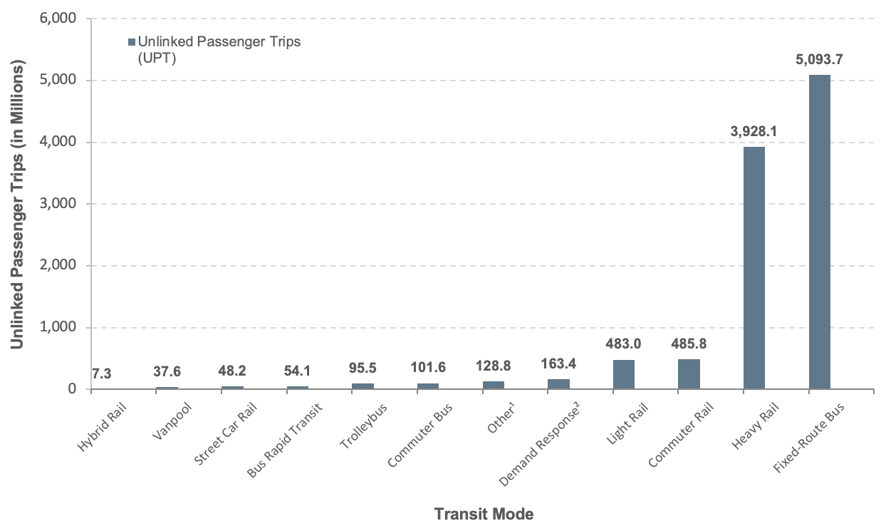
1Includes aerial tramway, Alaska railroad, cable car, ferryboat, inclined plane, monorail/automated guideway, and público.
2Includes demand-response and demand-response taxi.
Source: National Transit Database.
Exhibit 4-28 provides total PMT for selected years between 2004 and 2014, showing steady growth in all major modes. The light rail, other rail, and vanpool modes grew at the highest rates. Growth in demand-response (up 2.7 percent per year) could be a response to demand from the growing number of elderly citizens. Light rail (up 5.4 percent per year) enjoyed increased capacity during this period due to expansions and addition of new systems. The rapidly increasing popularity of vanpools (up 11.1 percent per year), particularly the surge between 2006 and 2008 (up 44 percent over that period), can be partially attributed to rising gas prices: regular gasoline sold for more than $4 per gallon in July of 2008. FTA has also encouraged vanpool reporting during this period, successfully enrolling many new vanpool systems to report to NTD.
Exhibit 4-27: Passenger Miles Traveled by Mode, 2014
1Includes aerial tramway, Alaska railroad, cable car, ferryboat, inclined plane, monorail/automated guideway, and público.
2Includes demand-response and demand-response taxi.
Source: National Transit Database.
Exhibit 4-28: Transit Passenger Miles Traveled, 2004–2014
| Mode | Vehicle Revenue Miles (in Millions) | Average Annual Rate of Change 2014 to 2004 |
|||||
|---|---|---|---|---|---|---|---|
| 2004 | 2006 | 2008 | 2010 | 2012 | 2014 | ||
| Rail | 25,668 | 26,972 | 29,882 | 29,380 | 31,176 | 32,672 | 2.4% |
| Heavy Rail | 14,354 | 14,721 | 16,850 | 16,407 | 17,516 | 18,339 | 2.5% |
| Commuter Rail | 9,715 | 10,359 | 10,925 | 10,774 | 11,121 | 11,600 | 1.8% |
| Light Rail1 | 1,576 | 1,866 | 2,081 | 2,173 | 2,489 | 2,675 | 5.4% |
| Other Rail2 | 22 | 25 | 26 | 26 | 50 | 59 | 10.4% |
| Nonrail | 20,941 | 22,346 | 23,721 | 23,245 | 23,991 | 24,312 | 1.5% |
| Fixed-Route Bus3 | 18,989 | 20,390 | 21,197 | 20,569 | 21,142 | 21,402 | 1.2% |
| Demand-Response4 | 703 | 752 | 842 | 873 | 885 | 916 | 2.7% |
| Ferryboat | 354 | 175 | 390 | 389 | 402 | 414 | 1.6% |
| Trolleybus | 173 | 164 | 161 | 159 | 162 | 158 | -0.9% |
| Vanpool | 459 | 689 | 992 | 1,087 | 1,254 | 1,310 | 11.1% |
| Other Nonrail5 | 265 | 176 | 138 | 169 | 145 | 112 | -8.3% |
| Total | 46,609 | 49,318 | 53,603 | 52,625 | 55,167 | 56,985 | 2.0% |
| Percent Rail | 55.1% | 54.7% | 55.7% | 55.8% | 56.5% | 57.3% | |
1Includes light rail, hybrid rail, and streetcar rail.
2Includes Alaska railway, monorail/automated guideway, cable car, and inclined plane.
3Includes bus, commuter bus, and bus rapid transit.
4Includes demand response and demand response taxi.
5Includes aerial tramway and públicos.
Source: National Transit Database.
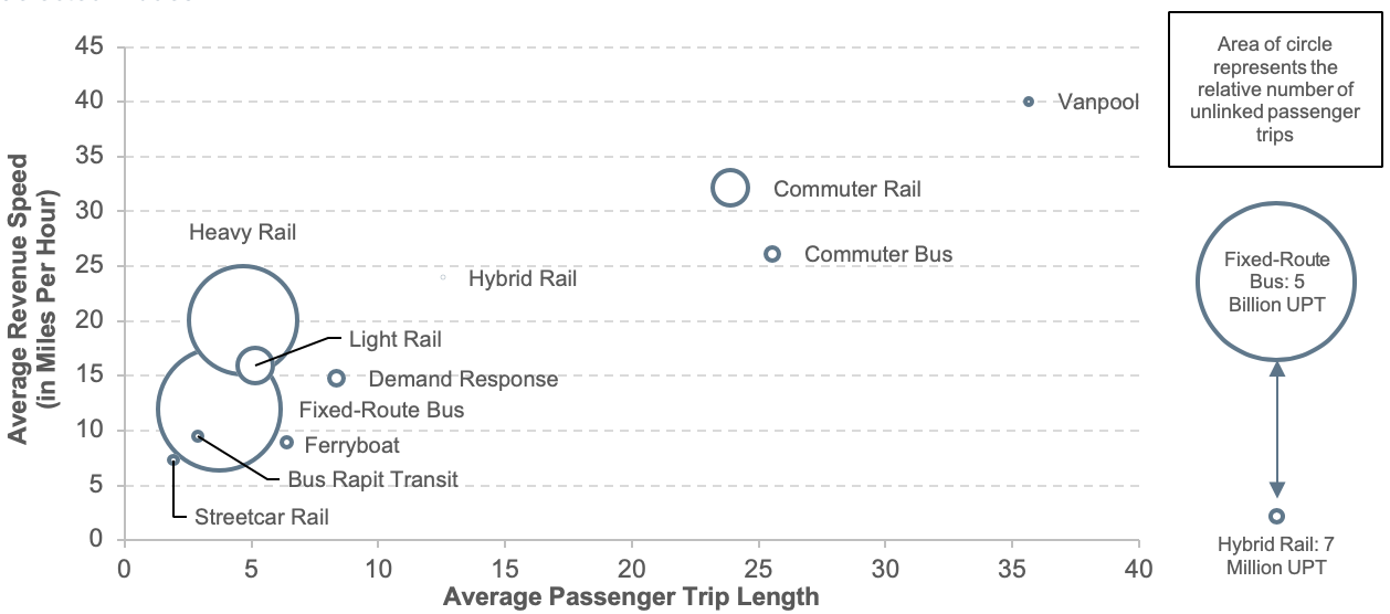
Average Trip Length
Exhibit 4-29 depicts average passenger trip length (defined as PMT per unlinked passenger trips) versus revenue speed (defined as VRMs per vehicle revenue hours), and unlinked passenger trips for transit modes. Note that average passenger trip length is the average distance traveled of one unlinked trip. Most riders use more than one mode to commute from origin to destination (linked trip), which could include other transit modes, car, or other modes such as bicycle, walking, etc. Therefore, the average trip length of an individual mode as depicted in Exhibit 4-29 is the lower bound of the total average distance traveled. The total trip distance is a function of a linked trip factor that varies from mode to mode and is not available in the NTD to better capture the scope of transit service in the United States.
Exhibit 4-29: Transit Urban Average Unlinked Passenger Trip Length vs. Average Revenue Speed for Selected Modes
Source: National Transit Database.
A linked passenger trip is a trip from origin to destination on the transit system. Even if a passenger must make several transfers during a one-way journey, the trip is counted as one linked trip on the system. Unlinked passenger trips count each boarding as a separate trip regardless of transfers. A linked factor is the ratio of linked per unlinked trip. Thus, a factor of 1 means that the passenger did not make any intermodal or intramodal transfers.
Demand-response and vanpool systems are modes with linked factors close to 1; that is, the average trip length of one unlinked trip should be close to the total length of the linked trip. This is because vanpools and demand-response are “by-demand” modes, and the routes can be set up to optimize the proximity from the origin and destination.
Commuter bus and commuter rail, on the other hand, are fixed-route modes, and a high percentage of commuters require other modes to reach their final destinations. Additionally, commuter bus and commuter rail are not as fast as vanpools due to more frequent stops near areas of attraction and generation of trips, among other factors. Hybrid rail, introduced in 2011, was reported prior to 2011 as commuter rail and light rail. Hybrid rail has quite different operating characteristics than commuter rail and light rail. It has higher average station density (stations per track mileage) than commuter rail and a lower average station density than light rail. This results in revenue speeds that are lower than commuter rail and higher than light rail. Hybrid rail has smaller average peak-to-base ratio (number of trains during peak service per number of trains during midday service) than commuter rail, which indicates higher demand at off-peak hours.
Several modes (heavy rail, light rail, fixed-route bus, bus rapid transit, streetcar, and ferryboat) cluster within a narrow range for average passenger trip length (less than 5 miles) and a wider range for average revenue speed (10 to 20 miles per hour). Heavy rail and light rail have higher average speed than nonrail modes for operating in exclusive rights-of-way. The modes in this cluster serve areas with high population density and significant average number of boarding and alighting per station or stop, which results in shorter average trip lengths than modes with a commuter orientation. These modes should have similar link factors but smaller than commuter rail and commuter bus.
Vehicle Reliability
Vehicle reliability data available in the NTD relate solely to vehicle service interruptions due to major and minor mechanical failures. By definition, major mechanical failures prevent the vehicle from continuing the trip. Passengers are thus transferred to the next vehicle or a spare vehicle is sent to pick up these passengers. Minor mechanical failures do not prevent the vehicle from continuing the trip, but local policies may require termination of the trip anyway.
Mean distance between failures is defined as the ratio of service miles per number of major mechanical failures, by mode. The larger the ratio, the more reliable is the service.
Mean distance between failures is shown in Exhibit 4-30. The mean distance between failures is calculated by the ratio of VRMs per mechanical (major) and other (minor) failures for directly operated vehicles in urban areas. FTA does not collect data on delays due to guideway conditions, which would include congestion for roads and slow zones (due to system or rail problems) for track. Miles between failures for all modes combined decreased 21 percent between 2004 and 2009. Between 2006 and 2014, the ratio increased steadily at roughly 2.8 percent annually to reach a level similar to that before 2006. The trend for fixed-route bus is nearly identical to all modes combined.
Exhibit 4-30: Mean Distance Between Urban Vehicle Failures, 2004–2014
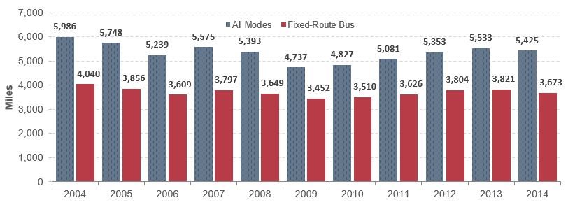
Note: Only directly operated vehicle data were used to calculate mean distance between failures.
Note: 2014 data do not include agencies that qualified and opted to use the small systems waiver of the National Transit Database.
Source: National Transit Database.
Transit System Characteristics for Americans with Disabilities and the Elderly
DOT seeks to promote accessible transportation systems that meet the needs of people of all ages and abilities through ADA compliance. The ADA is a comprehensive civil rights law that prohibits discrimination based on disability. Compliance with the ADA is a condition of eligibility to receive certain Federal funding. Title II of ADA applies to all programs, services, and activities provided or made available by public entities, including State and local governments or any of their instrumentalities or agencies. The scope of Title II coverage extends to the entire operations of a public entity and includes public transportation services, vehicles, and facilities; airport services and facilities; intercity rail travel, railcars, and facilities; passenger vessel services and facilities; and roadway facilities, including sidewalks and pedestrian crosswalks.
FTA reviews grant applications for evidence of ADA compliance in capital projects and vehicle acquisition. FTA also conducts triennial reviews for compliance with Federal requirements of ADA. In addition, FTA conducts approximately 8–10 targeted, in-depth compliance reviews each year to determine compliance with specific ADA provisions, including paratransit requirements, fixed-route accessibility, and rail station accessibility. In Fiscal Year 2016, FTA published comprehensive guidance to transit agencies on how to comply with ADA’s provisions. This guidance, FTA Circular 4710.1, thoroughly explains ADA requirements for public transit, providing real-life situations as examples of good practices for the transit industry to ensure accessible services for riders.
ADA requirements ensure that transit services, vehicles, and facilities are accessible to and usable by persons with disabilities, including wheelchair users, and provide for complementary paratransit service for those individuals whose disabilities prevent the use of an accessible fixed-route system.
Exhibit 4-31 presents the change in the level of ADA accessibility of transit service vehicles from 2004 to 2014. The level of accessibility of the Nation’s transit bus fleet rose from 93 percent in 2004 to 96 percent in 2014. The most significant increase was commuter rail passenger and self-propelled cars, from approximately 50 percent in 2004 to over 80 percent in 2014. In 2004, commuter rail had the smallest share of ADA-accessible passenger cars compared with other rail modes such as heavy rail and light rail.
Exhibit 4-32 depicts the trends in total active commuter rail fleet and ADA-accessible fleet for 2004–2014. The data show that the ADA-accessible commuter rail fleet increased steadily from 2004 to 2012, at an average rate of approximately 88 passenger cars per year, while the total fleet increased at an average of 78 percent per year. This corresponded to a period that saw a geographic expansion of service, with the introduction of four new systems. Some of the largest agencies replaced or rehabilitated their old fleets during this period, bringing the accessibility rate from 54 percent to 76 percent in just 2 years. Due to the long service life of rail vehicles, 100 percent fleet accessibility is a long-term goal that will not be achievable until the last inaccessible cars from the oldest fleets are retired or remanufactured. In the case of remanufacturing, there are provisions for inaccessible cars to remain in service if making them accessible would harm the structural integrity of the vehicles.
Exhibit 4-31: ADA Accessibility by Vehicle Type, 2004–2014
| Vehicle Type | Active Fleet 2004 | ADA Fleet 2004 | ADA Fleet Share 2004 | Active Fleet 2014 | ADA Fleet 2014 | ADA Fleet Share 2014 | Increase in Fleet | % Increase in Share |
|---|---|---|---|---|---|---|---|---|
| Buses, Cutaways, and Over-the-road Buses | 66,198 | 64,892 | 98.0% | 78,204 | 77,130 | 98.6% | 18.1% | 0.6% |
| Vans (Demand-Response Service) | 11,934 | 10,593 | 88.8% | 12,324 | 10,687 | 86.7% | 3.3% | -2.0% |
| Heavy Rail Passenger Cars | 10,965 | 10,418 | 95.0% | 11,623 | 11,272 | 97.0% | 6.0% | 2.0% |
| Articulated Buses | 2,591 | 2,586 | 99.8% | 4,886 | 4,885 | 100.0% | 88.6% | 0.2% |
| Commuter Rail Passenger Coaches | 3,439 | 1,724 | 50.1% | 3,675 | 3,044 | 82.8% | 6.9% | 32.7% |
| Commuter Rail Self-Propelled Passenger Cars | 2,441 | 1,340 | 54.9% | 2,912 | 2,478 | 85.1% | 19.3% | 30.2% |
| Light Rail Vehicles and Streetcars | 1,665 | 1,257 | 75.5% | 2,340 | 2,014 | 86.1% | 40.5% | 10.6% |
| All Other Rail Vehicles1 | 752 | 653 | 86.8% | 916 | 861 | 94.0% | 21.8% | 7.2% |
| All Other Non-Rail Vehicles2 | 844 | 711 | 84.2% | 897 | 829 | 92.4% | 6.3% | 8.2% |
| Total | 100,829 | 94,174 | 93.4% | 117,777 | 113,200 | 96.1% | 16.8% | 2.7% |
1Monorail vehicles, automated guideway vehicles, Inclined plane vehicles, and cable cars.
2Ferryboats, trolleybuses, school buses and other vehicles.
Source: National Transit Database.
The ADA requires that new transit facilities and alterations to existing facilities be accessible to and usable by persons with disabilities, including wheelchair users. Exhibit 4-33 presents the change in the number of urban transit ADA-compliant stations and percentage of total ADA-compliant stations by mode. In 2014, 78.3 percent of total transit stations were either 100 percent accessible or self-certified as accessible, an increase from 70 percent in 2004.
Exhibit 4-32: Total Active Fleet and ADA Fleet for Commuter Rail, 2004–2014
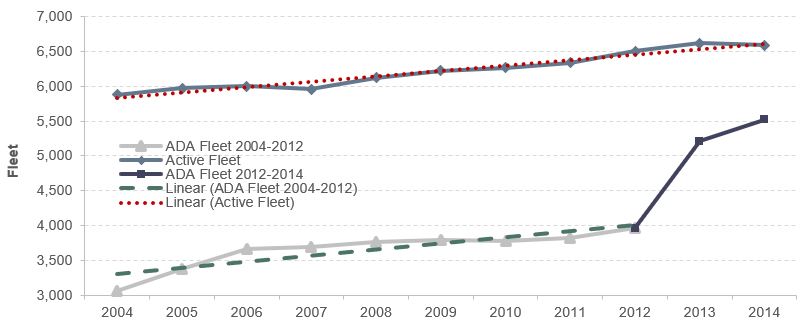
Source: National Transit Database.
Exhibit 4-33: ADA Accessibility of Stations, 2004 and 2014
| Mode Category | 2004 Stations | 2004 ADA Stations | 2004 ADA Stations Share |
2014 Stations | 2014 ADA Stations | 2014 ADA Stations Share |
|---|---|---|---|---|---|---|
| Fixed Route Bus | 1,459 | 1,334 | 91.4% | 1,736 | 1,683 | 96.9% |
| Other Non-Rail1 | 82 | 76 | 92.7% | 106 | 96 | 90.6% |
| Commuter Rail | 1,153 | 666 | 57.8% | 1,245 | 849 | 68.2% |
| Heavy Rail | 1,023 | 428 | 41.8% | 1,130 | 558 | 49.4% |
| Light Rail | 723 | 589 | 81.5% | 828 | 762 | 92.0% |
| Other Rail2 | 62 | 60 | 96.8% | 216 | 171 | 79.2% |
| Total | 4,502 | 3,153 | 70.0% | 5,261 | 4,119 | 78.3% |
1Includes ferryboat and trolleybus.
2Includes hybrid rail, automated guideway, monorail, and inclined plane.
Source: National Transit Database.
The ADA also required existing rail transit systems to identify “key” rail stations that would be made accessible by July 26, 1993. Rail stations identified as “key” have the following characteristics:
- The number of passengers boarding exceeds the average number of passengers boarding on the rail system by at least 15 percent.
- The station is a major point where passengers shift to other transit modes.
- The station is at the end of a rail line, unless it is close to another accessible station.
- The station serves a “major” center of activities, including employment or government centers, institutions of higher education, and major health facilities.
Although the statute established a deadline of July 23, 1993, for completion of alterations to these key stations, it also permitted the Secretary of Transportation to grant extensions until July 26, 2020, for stations that required extraordinarily expensive structural modifications to achieve compliance. Of the 680 stations designated as key, 607 were accessible and fully compliant, 22 were accessible but not fully compliant, and 45 were self-certified as accessible as of November 16, 2017, but had not yet been certified as fully compliant by FTA. “Accessible but not fully compliant” means that these stations are functionally accessible (i.e., persons with disabilities, including wheelchair users, can make use of the station), but minor outstanding issues must be addressed for the station to be fully compliant; example issues include missing or misallocated signage and parking-lot striping errors.
In addition to the services that urban and rural transit operators provide through FTA’s core Formula programs, approximately 4,800 providers operate in rural and urban areas through FTA’s Formula Grants for Special Services for the Elderly and Disabled. This funding supports primarily demand-response services. Of these, FTA estimates that approximately 700 providers offer public transportation service to the public. The remainder are primarily nonprofit social service organizations, for which transportation is a secondary activity relative to their primary mission. Nevertheless, services provided by these private organizations help relieve the demand for trips on demand-response public transportation services. Nonprofit providers include religious organizations, senior citizen centers, rehabilitation centers, nursing homes, community action centers, sheltered workshops, and coordinated human services transportation providers. FTA estimates that approximately 40 percent of these providers are true public transit providers, and will begin reporting asset inventory data for the NTD in 2018.
Transit System Coverage and Frequency
The extent of the Nation’s transit system is measured in directional route miles, or simply “route miles.” Route miles measure the distance covered by a transit route. Transit routes that use the same road or track, but in the opposite direction, are counted separately. Data associated with route miles are not collected for demand-response and vanpool modes because these transit modes do not travel along specific predetermined routes. Route mile data are also not collected for jitney services because these transit modes often have highly variable route structures.
Exhibit 4-34 shows directional route miles by mode over the past 10 years. Growth in both rail (28.4 percent) and nonrail (10.7 percent) route miles is evident over this period. The average 7.9-percent rate of annual growth for light rail clearly outpaces the rate of growth for all other modes due to the large increase in new systems in the past 10 years.
The frequency of transit service varies considerably based on location and time of day. Transit service is more frequent in urban areas and during rush hours, corresponding to the places and times with the highest demand for transit. Studies have found that transit passengers consider the time spent waiting for a transit vehicle to be less well spent than the time spent traveling in a transit vehicle. The higher the degree of uncertainty in waiting times, the less attractive transit becomes as a means of transportation—and the fewer users it will attract. To minimize this problem, many transit systems have recently begun implementing technologies to track vehicle location (automatic vehicle location systems) that, combined with data on operating speeds, enable agencies to estimate the amount of time required for arrival of vehicles at stations and stops. This information is displayed in platforms and bus stops in real time. By knowing the waiting time, passengers are less frustrated and could be more willing to use transit.
Exhibit 4-34: Transit Directional Route Miles, 2004–2014
| Mode | 2004 | 2006 | 2008 | 2010 | 2012 | 2014 | Average Annual rate of change 2014 to 2004 |
|---|---|---|---|---|---|---|---|
| Rail | 9,572 | 9,812 | 10,797 | 11,340 | 12,001 | 12,290 | 2.5% |
| Heavy Rail | 1,590 | 1,617 | 1,617 | 1,617 | 1,622 | 1,622 | 0.2% |
| Commuter Rail | 6,130 | 6,268 | 7,094 | 7,532 | 7,674 | 7,795 | 2.4% |
| Light Rail1 | 881 | 956 | 1,114 | 1,220 | 1,709 | 1,877 | 7.9% |
| Other Rail2 | 971 | 971 | 971 | 971 | 996 | 996 | 0.3% |
| Non-Rail | 215,812 | 226,497 | 228,851 | 235,995 | 239,539 | 238,831 | 1.0% |
| Fixed-Route Bus3 | 214,956 | 225,863 | 227,796 | 234,920 | 238,291 | 237,654 | 1.0% |
| Ferryboat | 430 | 209 | 599 | 619 | 793 | 719 | 5.3% |
| Trolleybus | 425 | 425 | 456 | 456 | 456 | 458 | 0.7% |
| Total | 225,383 | 236,309 | 239,648 | 247,335 | 251,540 | 251,121 | 1.1% |
| Percent Nonrail | 95.8% | 95.8% | 95.5% | 95.4% | 95.2% | 95.1% |
1Includes light rail, hybrid rail, and streetcar rail.
2Includes Alaska railway, monorail/automated guideway, cable car, and inclined plane.
3Includes bus, commuter bus, and bus rapid transit.
Note: Nonrail excludes demand-response and demand-response taxi, aerial tramway, and público.
Note: 2012 data do not include agencies that qualified and opted to use the small systems waiver of the National Transit Database.
Source: National Transit Database.
Transit System Resilience
Transit systems are managed to be resilient because they are required to operate through all but the worst weather on a daily basis. Most are instrumental in community emergency-response plans. Dispatchers and vehicle operators receive special training for these circumstances. All bus systems maintain a small fleet of spare buses that enables them to schedule maintenance activities while maintaining regular service levels. These “spare buses” also can be used to replace damaged vehicles on short notice. Rail systems have contingency plans for loss of key assets and most can muster local resources to operate bus bridges in emergencies. Operationally speaking, transit providers are some of the most resilient community institutions. Much transit infrastructure, however, has not yet been upgraded to address current or projected changes in climate. FTA does not collect systematic data on these upgrades, but significant grant money has been made available for transit systems to upgrade their structures and guideways to be more resistant to extreme precipitation events, sea level rise, storm surge, heat waves, and other environmental stressors. Efforts to improve resilience have been particularly evident in the aftermath of Superstorm Sandy and its impact on the Mid-Atlantic area. Addressing such issues is a common use of FTA grant funds.
Exhibit 4-35 shows findings on wait times from the 2009 FHWA National Household Travel Survey. The survey found that 44.5 percent of passengers who ride transit wait 5 minutes or less and 73.2 percent wait 10 minutes or less. The survey also found that 8.0 percent of passengers wait 21 minutes or more. Several factors influence passenger wait times, including the frequency and reliability of service and passengers’ awareness of timetables. These factors are interrelated. For example, passengers could intentionally arrive earlier for service that is infrequent, compared with equally reliable services that are more frequent. Overall, waiting times of 5 minutes or less are clearly associated with good service that is either frequent, reliably provided according to a schedule, or both. Wait times of 5 to 10 minutes are most likely consistent with adequate levels of service that are both reasonably frequent and generally reliable. Wait times of 21 minutes or more indicate that service is likely less frequent or less reliable.
Exhibit 4-35: Distribution of Passengers by Wait Time
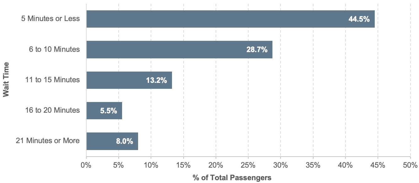
Source: National Household Travel Survey, FHWA, 2009.
Access to Transit
In 2011, The Brookings Institution published Missed Opportunity: Transit and Jobs in Metropolitan America.1 To date, this is the most comprehensive study of physical access to transit systems in the United States. To investigate the effectiveness of transit in providing access to employment, Brookings Metropolitan Policy Program researchers compiled and compared transit data from the largest 100 metropolitan areas as measured by population. This database includes geospatial and schedule details of routes for 371 transit providers in 2008, in addition to income and employment data at the neighborhood level. It provides indicators to measure the effectiveness and accessibility of transit services.
Averaged across the 100 metropolitan areas examined by Brookings, nearly 70 percent of working-age people lived in a neighborhood with transit service. This equals approximately 128 million working-age people. Conversely, this also means about 39 million working-age people did not live near transit access. There was significant variation in the percentage of people covered by transit services among the top 100 metro areas. (See Exhibit 4-36).
Accessibility to transit depends to some extent on geographical constraints such as mountains, deserts, and other natural obstacles. These constraints, which in some cases promote a more compact urban form that promotes accessibility, affect western cities more than they do eastern cities. Metro areas in the West provided 85 percent of working-age people with access to transit service, compared with 78 percent in the Northeast, 63 percent in the Midwest, and just 55 percent in the South. These differences can be attributed to metropolitan age, local geography, and local public policies.
Despite the differences in overall coverage across the metro areas, Brookings found similarities throughout coverage areas. Neighborhood income level is a determining factor in access to transit. In low-income areas, 89 percent of working-age people have access to transit, compared to 70 percent for middle-income and 53 percent for high-income neighborhoods. Population density is also a significant determining factor, with 94 percent of city residents having access to transit compared to 58 percent of suburban residents. Just as important as transit access is the frequency of service vehicles. During Monday morning commutes, city transit service is more frequent, with an average of 6.9 minutes between vehicles, as opposed to 12.6 minutes for suburban, with an average across all metro areas of 10.1 minutes.
National Transit Map
In 2016, the Federal Transit Administration partnered with the Bureau of Transportation Statistics to begin collection of data for a National Transit Map. Participation in the National Transit Map is voluntary, but the goal is to collect route and schedule information for every fixed-route transit provider in the country. Data are collected using the General Transit Feed Specification (GTFS) data model, and the information will be updated multiple times per year from the GTFS data that transit systems are already making publicly available. Eventually, the National Transit Map will allow FTA to replicate the analyses first completed in the “Missed Opportunities” report, and also to eventually develop national performance measures for access to fixed-route transit. As of February 12, 2019, the National Transit Map included 60,955 routes, 493,718 bus stops, and train stations for 241 agencies. The National Transit Map is available at (https://www.rita.dot.gov/bts/ntm).
Exhibit 4-36: 2010 Share of Working-Age Residents with Access to Transit, 100 Metropolitan Areas
Source: Brookings Institution, Missed Opportunity: Transit and Jobs in Metropolitan America, May 2011 report citing Brookings Institution analysis of transit agency data and Nielson Pop-Facts 2010 data.
Access to Employment
Many transit trips are used for commuting to work, and the Brookings report investigated the types of jobs with access to transit. Brookings found that, within a 90-minute transit commute, 30 percent of metro area jobs could be accessed by residents. This average increased to 36 percent for residents of low-income areas, dropping to 28 percent for middle-income and 23 percent for high-income. The types of jobs accessible to transit were split into categories based on the educational attainment of their workers. About a quarter of low- and middle-skilled jobs were accessible by transit, compared with about a third of high-skilled jobs. This speaks to the concentration of higher-skilled jobs in urban centers, and points to an issue where the individuals who are most dependent on transit have the least access. For example, low-income suburban areas had transit access to only 22 percent of low- and middle-skilled jobs.