

Executive Summary
- Part I: Moving a Nation
- CHAPTER 1: System Assets – Highways
- CHAPTER 1: System Assets – Transit
- CHAPTER 2: Funding – Highways
- CHAPTER 2: Funding – Transit
- CHAPTER 3: Travel – National and Household Trends
- CHAPTER 3: Travel – Impact of Income Distribution
- CHAPTER 4: Mobility and Access – Highways
- CHAPTER 4: Mobility and Access – Transit
- CHAPTER 5: Safety – Highways
- CHAPTER 5: Safety – Transit
- CHAPTER 6: Infrastructure Conditions – Highways
- CHAPTER 6: Infrastructure Conditions – Transit
- Part II: Investing for the Future
- CHAPTER 7: Capital Investment Scenarios – Highways
- CHAPTER 7: Capital Investment Scenarios – Transit
- CHAPTER 8: Supplemental Analysis – Highways
- CHAPTER 8: Supplemental Analysis – Transit
- CHAPTER 9: Sensitivity Analysis – Highways
- CHAPTER 9: Sensitivity Analysis – Transit
- CHAPTER 10: Impacts of Investment – Highways
- CHAPTER 10: Impacts of Investment – Transit
- CHAPTER 11: Freight Transportation
- CHAPTER 12: Conditions and Performance of the National Highway Freight Network
Part I: Moving a Nation
Part I includes six chapters, each of which describes the current system from a different perspective:
- Chapter 1, Assets, describes the existing extent of the highways, bridges, and transit systems. Highway and bridge data are presented for system subsets based on functional classification and Federal system designation, while transit data are presented for different types of modes and assets.
- Chapter 2, Funding, provides detailed data on the revenue collected and expended by different levels of governments to fund transportation construction and operations. The chapter also explores alternative financing and delivery of transportation projects.
- Chapter 3, Travel, discusses vehicle miles traveled and passenger miles traveled on highways and transit, drivers’ licensing levels, and commute times. The chapter also analyzes the impact of income levels on travel.
- Chapter 4, Mobility and Access, covers highway congestion and reliability in the Nation’s urban areas, and the economic costs of congestion. The transit section explores ridership, average speed, vehicle utilization, and maintenance reliability. The chapter also looks at accessibility to transit for persons with disabilities and the elderly, as well as transit accessibility more generally.
- Chapter 5, Safety, presents statistics on highway safety performance, focusing on the most common roadway factors that contribute to roadway fatalities and injuries. The transit section summarizes safety and security data by mode and type of transit service.
Chapter 6, Infrastructure Conditions, presents data on the current physical conditions of the Nation’s highways, bridges, and transit assets.
Transportation Performance Management
A key change under the Moving Ahead for Progress in the 21 Century Act (MAP-21), and the Fixing America’s Surface Transportation (FAST) Act, is the transition to a performance- and outcome-based program. Performance measures will be established through rulemakings; grant recipients will set performance targets based on these measures, and will periodically report on their progress toward meeting these targets. FHWA has finalized six related rulemakings to implement the transportation performance management (TPM) framework established by MAP-21 and the FAST Act:
- Statewide and Metropolitan/Nonmetropolitan Planning Rule (defines coordination in the selection of targets, linking planning and programming to performance targets).
- Safety Performance Measures Rule (PM-1) (establishes performance measures to assess fatalities and serious injuries).
- Highway Safety Improvement Program (HSIP) Rule (integrates performance measures, targets, and reporting requirements into the HSIP).
- Pavement and Bridge Performance Measures Rule (PM-2) (defines pavement and bridge condition performance measures, along with minimum condition standards).
- Asset Management Plan Rule (defines the contents and development process for an asset management plan).
- System Performance Measures Rule (PM-3) (includes measures for performance, freight movement, and the Congestion Mitigation and Air Quality program).
CHAPTER 1: System Assets – Highways
In 2014, local governments owned 77.4 percent of the Nation’s 4,177,074 miles and 74.8 percent of its 8,766,049 lane miles. However, State-owned roads carried a disproportionate share of the Nation’s travel, accounting for 72.4 percent of the 3.040 trillion vehicle miles traveled (VMT) in 2014.
Ownership of bridges is more evenly split, as local governments owned slightly more (49.8 percent) of the Nation’s 610,749 bridges in 2015 than did State governments (48.3 percent). Although the Federal government provides significant financial support for the Nation’s highways and bridges, it owns relatively few of these facilities.
Highway (2014) and Bridge (2015) Ownership by Level of Government
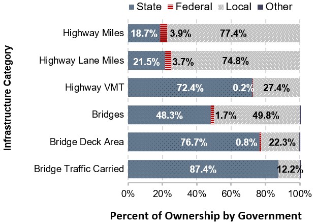
Sources: HPMS and NBI.
Roadways are categorized by functional classifications based on the degree to which they provide access relative to the degree to which they provide mobility. Arterials serve the longest distances with the fewest access points; roads classified as local (which are not all owned by local governments) are greatest in number and provide the most access to the system, while collectors funnel traffic from local roads to arterials.
Nearly half the Nation’s road mileage was classified as rural local in 2014, part of the 71.2 percent of mileage located in rural areas. Although only 28.8 percent of the road mileage is located in urban areas, these roads carry 69.7 percent of VMT.
Highway Extent and Travel By Functional System, 2014
| Functional System | Highway Miles | Highway VMT |
|---|---|---|
| Rural Areas (4,999 or less in population) | ||
| Interstate | 0.7% | 7.6% |
| Other Freeway and Expressway | 0.1% | 0.9% |
| Other Principal Arterial | 2.2% | 6.2% |
| Minor Arterial | 3.2% | 4.6% |
| Major Collector | 9.8% | 5.2% |
| Minor Collector | 6.2% | 1.6% |
| Local | 49.1% | 4.1% |
| Subtotal Rural Areas | 71.2% | 30.3% |
| Urban Areas (5,000 or more in population) | ||
| Interstate | 0.4% | 17.3% |
| Other Freeway and Expressway | 0.3% | 7.5% |
| Other Principal Arterial | 1.6% | 15.5% |
| Minor Arterial | 2.7% | 12.9% |
| Major Collector | 3.1% | 6.4% |
| Minor Collector | 0.3% | 0.4% |
| Local | 20.4% | 9.7% |
| Subtotal Urban Areas | 28.8% | 69.7% |
| Total | 100.0% | 100.0% |
Sources: HPMS and NBI.
In general, public roads that are functionally classified as arterials, urban collectors, or rural major collectors are eligible for Federal-aid highway funding (and are described as “Federal-aid highways”). MAP-21 expanded the National Highway System (NHS) to include almost all principal arterials; the NHS also includes collector and local mileage that connect principal arterials to other transportation modes and defense installations.
CHAPTER 1: System Assets – Transit
Most transit systems in the United States report to the National Transit Database (NTD). In 2014, 849 systems served 497 urbanized areas, which have populations greater than 50,000. In rural areas, 1,684 systems were operating. Thus, the total number of transit systems reporting to NTD in 2014 was 2,533.
Modes. Transit is provided through nine distinct modes in two major categories: rail and nonrail. Rail modes include heavy rail, light rail, streetcar, commuter rail, and other less common modes that run on fixed tracks, such as hybrid rail, inclined plane, monorail, and cable car. Nonrail modes include bus, commuter bus, bus rapid transit, demand response, vanpools, other less common rubber-tire modes, ferryboats, and aerial tramways. This edition of the C&P Report includes one new mode: aerial tramway.
Organization Structure of Urban and Rural Agencies. Nearly 50 percent of transit agencies in the United States are transportation units or departments of cities, counties, and local government units. Independent public authorities or agencies account for 24 percent. Eighteen percent are private operators, and the remaining 13 percent are other organizational structures such as state governments, area agencies on aging, MPOs, planning agencies, tribes, and universities.
National Transit Assets
- Of the 849 urban reporters, 428 were cities, counties, and local government transportation units.
- Of the 169,197 transit vehicles in urban and rural areas, most are nonrail vehicles (buses, demand response, and vanpool), while most rail vehicles are either heavy, commuter, or light rail passenger cars.
- Rail systems operate on 12,793 miles of track, of which 7,760 miles are for commuter rail. Bus systems operate over 237,654 directional route miles.
- Urban and rural areas have 5,264 stations, of which 1,245 are for commuter rail, and 2,451 maintenance facilities.
- Full-size 40-foot buses (seating 45 people) are the most common road vehicle in transit, accounting for 37 percent of the national road fleet. Full- and mid-size buses are used primarily as fixed-route bus service. Small buses (seating 25 people) and cutaways (seating 15 people) are split between low-demand fixed-route systems and demand response. Vans are used mostly as vanpools and demand response.
Composition of Transit Road Vehicle Fleet, 2014
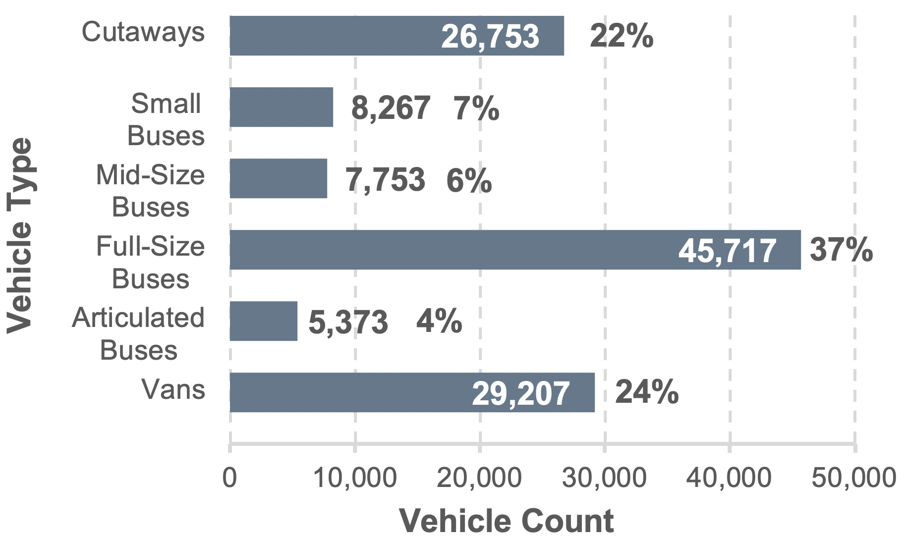
Sources: Highway Statistics 2015, Table HF-10A (preliminary), and unpublished FHWA data.
Note: There is not a one-to-one map between modes and vehicle types. For instance, cutaways are used for both fixed-route bus and demand response.
Source: Transit Economic Requirements Model (TERM) and National Transit Database.
ADA Compliance. The Americans with Disabilities Act of 1990 (ADA) prohibits discrimination and ensures equal opportunity and access for persons with disabilities. ADA requires transit agencies to ensure that vehicles and facilities are accessible to and usable by persons with disabilities, including wheelchair users. The level of accessibility is high for the national fleet, but lower for older heavy-rail systems built before the enactment of ADA.
CHAPTER 2: Funding – Highways
Combined expenditures for highways by all levels of government totaled $222.6 billion in 2014, with the Federal government funding $47.3 billion, States $111.2 billion, and local governments $64.1 billion. Most of the Federal funding was in the form of grants to State and local governments; direct Federal expenditures for federally owned roads, highway research, and program administration totaled $3.2 billion.
Highway capital spending totaled $105.4 billion, or 47.4 percent of total highway spending in 2014. Spending on maintenance totaled $38.2 billion, $13.2 billion was for highway and traffic services, $16.4 billion was for administrative costs (including planning and research), $19.8 billion was spent on highway patrol and safety, $11.5 billion was for interest on debt, and $17.9 billion was used to retire debt.
Highway Expenditure by Type, 2014
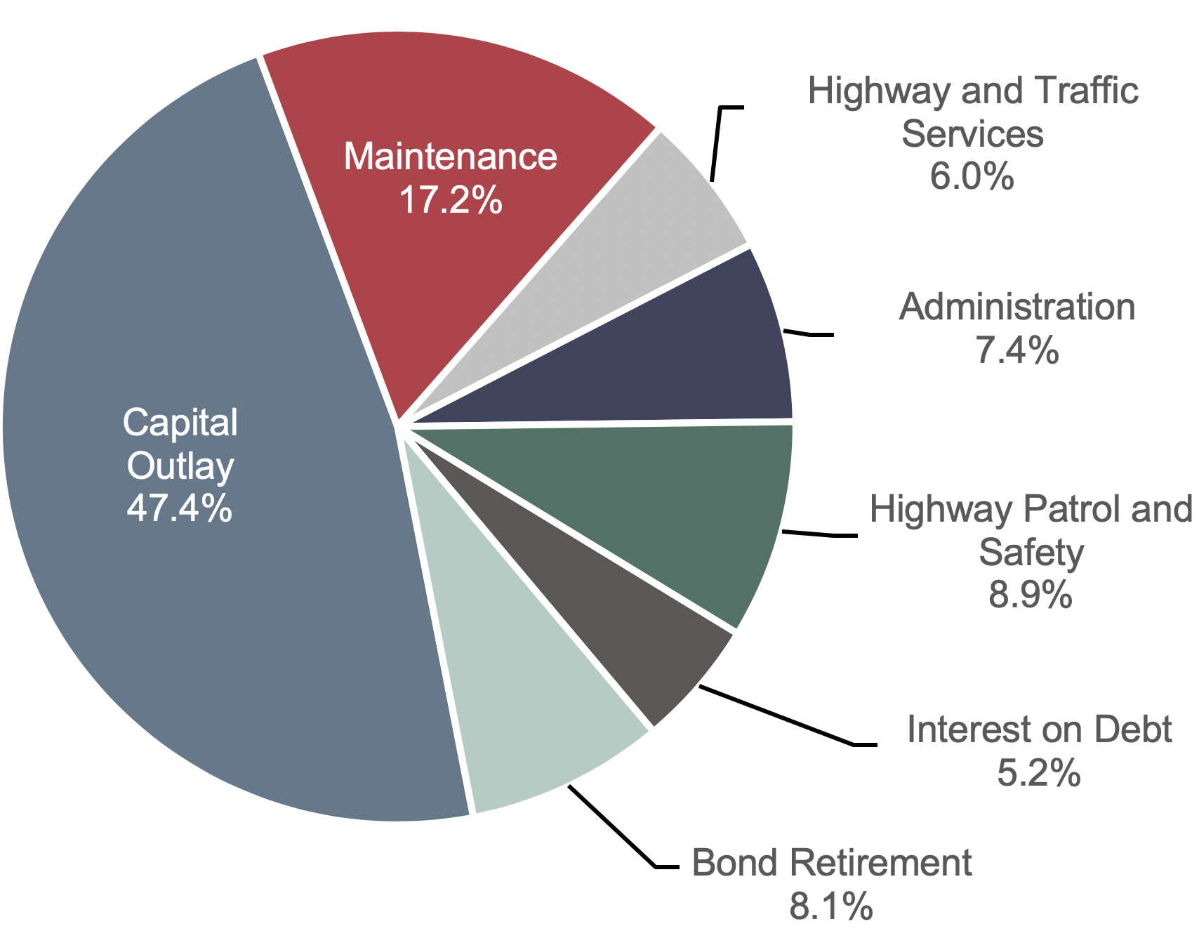
Sources: Highway Statistics 2015, Table HF-10A (preliminary), and unpublished FHWA data.
Total highway spending increased by 50.9 percent from 2004 to 2014, averaging 4.2 percent per year. (In inflation-adjusted constant-dollar terms, highway spending grew by 0.9 percent per year.) Expenditures funded by local governments grew by 4.4 percent per year, outpacing annual increases at the State and Federal levels of 4.3 percent and 3.6 percent, respectively. Over this period, the share of total highway expenditures funded by the Federal government dropped from 22.4 percent to 21.2 percent, while the federally funded share of highway capital spending declined from 43.8 percent to 42.5 percent.
Combined revenues generated for use on highways by all levels of government totaled $241.1 billion in 2014 (the $18.6 billion difference between expenditures and receipts is the amount placed in reserves for future use). In 2014, $106.4 billion (44.1 percent) of total highway revenues came from highway user charges, including motor-fuel taxes, motor-vehicle fees, and tolls. Other major sources for highways included general fund appropriations of $56.5 billion (23.4 percent) and bond proceeds of $29.2 billion (12.1 percent). All other sources, such as property taxes, other taxes and fees, investment income, and other receipts, totaled $49.0 billion (20.3 percent).
Revenue Sources for Highways, 2014
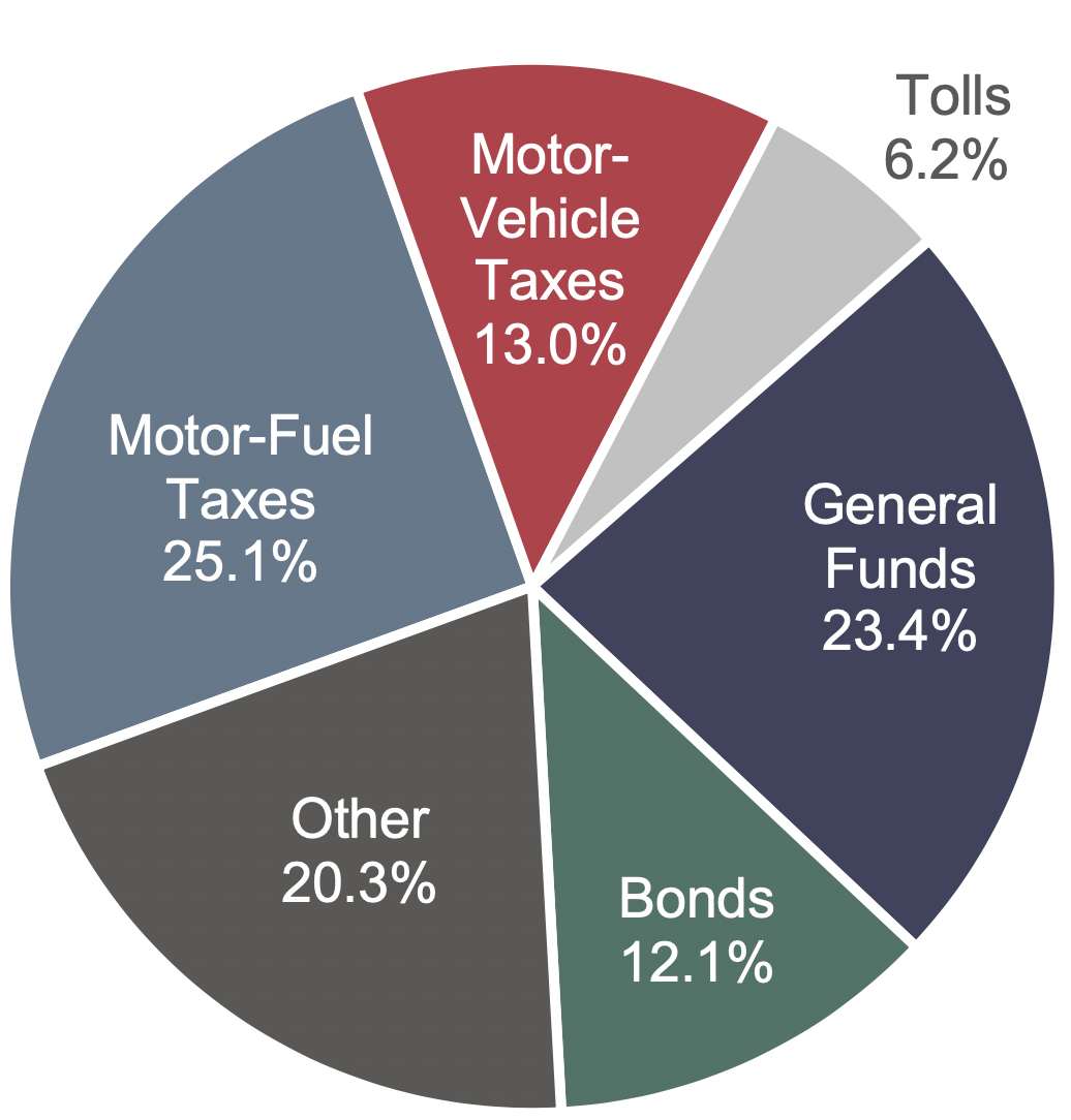
Sources: Highway Statistics 2015, Table HF-10A (preliminary), and unpublished FHWA data.
CHAPTER 2: Funding – Transit
In 2014, $65.2 billion was generated from all sources to fund urban and rural transit. Transit funding comes from public funds that Federal, State, and local governments allocate, and from system-generated revenues that transit agencies earn from the provision of transit services. Of the funds generated in 2014, 71 percent came from public sources and 29 percent came from system-generated funds (passenger fares and other system-generated revenue sources). The Federal share was $11.6 billion (25 percent of total public funding and 17.7 percent of all funding).
In 2014, operating expenses consumed $47.5 billion (73 percent) of all funding devoted to transit ($65.2 billion).
Guideway assets use the largest share of capital—36 percent ($6.4 billion)—for expansion and rehabilitation projects.
Urban Capital Expenditure by Asset Category, 2014
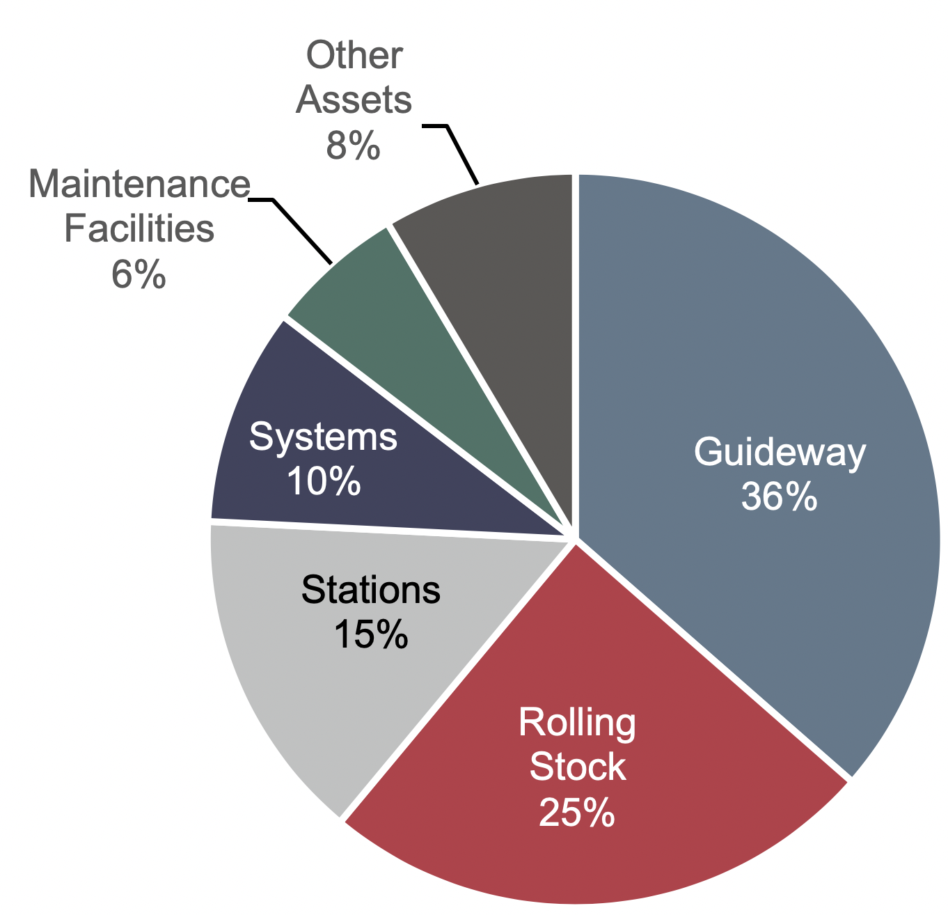
Source: National Transit Database.
Between 2004 and 2014, all sources of public funding for transit increased by over 2.5 percent per year. The Federal share remained relatively stable, varying in the range of 16–20 percent.
Funding for Urban Transit by Government Jurisdiction, 2004–2014
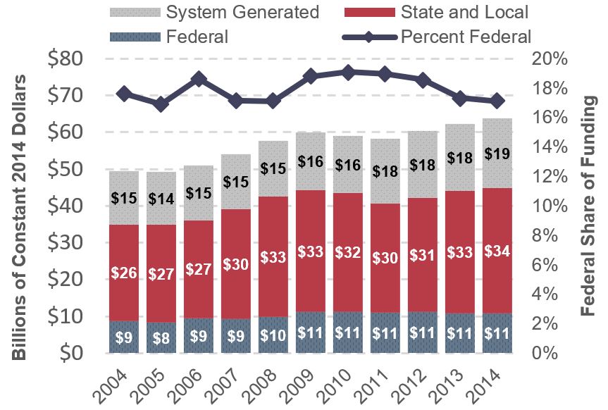
Source: National Transit Database.
From 2004 to 2014, for the top 10 transit agencies, fringe benefits increased at the highest rate of any operating cost category on a per-mile basis. Over this period, fringe benefits increased at an annual compound average rate of 1.3 percent. Meanwhile, salaries and wages decreased by nearly 1 percent.
Salaries and Wages and Fringe Benefits, Average Cost per Mile—Top 10 Transit Agencies, 2004–2014
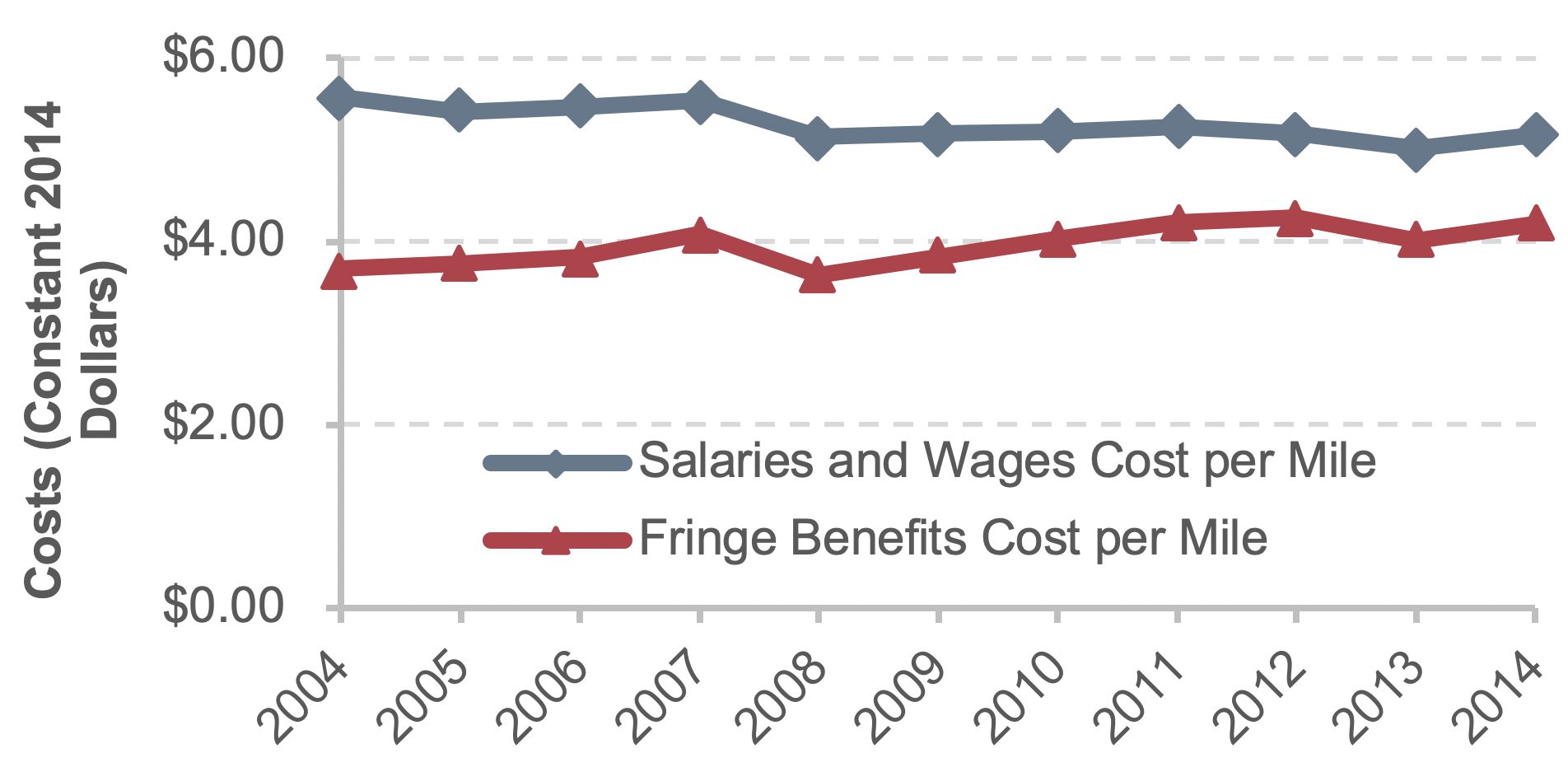
Source: National Transit Database.
CHAPTER 3: Travel – National and Household Trends
Total VMT on the Nation’s roads has rebounded from declines during and following the 2008–2009 recession, rising back above previous levels. Total VMT in 2014 was 3.03 trillion miles, dominated by passenger vehicles (81.4 percent) and personal purposes (81.7 percent). Approximately 90 percent of 2014 VMT was in light-duty vehicles (passenger cars, light trucks, vans, and sport utility vehicles).
Nationally, transit passenger miles traveled (PMT) reached 55.7 billion in 2014, as unlinked passenger trips (each journey on one transit vehicle) totaled 10.5 billion. Average passenger trip length increased from 4.8 miles in 1991 to 5.4 miles in 2014, as growth in PMT (2.1 percent annually) outpaced growth in unlinked passenger trips (1.7 percent).
The share of licensed drivers in the total population grew steadily from 1960 to 1990, and subsequently stabilized at about 70 percent. In 1960, drivers had very limited options in terms of which household vehicle to drive, because there were fewer automobiles than licensed drivers (the vehicle-to-driver ratio was below 1.0). The situation has reversed since 1980, with the average ratio of vehicles per licensed driver remaining close to 1.2, indicating on average more than one vehicle available per licensed driver.
Choice of travel modes is critical in understanding household travel behavior, which has great implications for transportation policy design. The 2009 National Household Travel Survey showed Americans took 191 billion person trips for all purposes. Driving was the dominant mode of household travel. Multi-occupant vehicles (carpools) accounted for 44 percent of all person trips, followed by single-occupant vehicles (40 percent), walking (10 percent), transit (2 percent) and bicycling (1 percent).
Person Trips By Transportation Modes, 2009
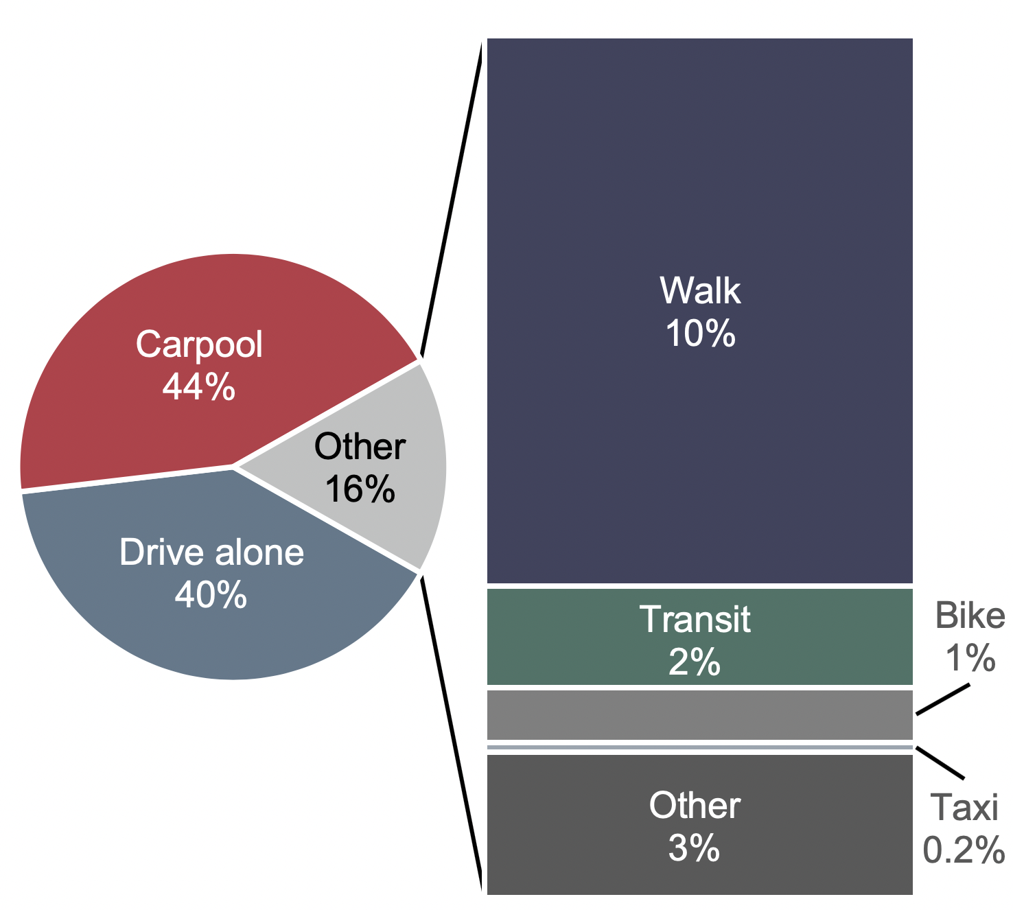
Source: National Household Travel Survey 2009.
Commuting was responsible for 28 percent of total personal VMT in 2009. The 2009 American Community Survey showed that approximately 86 percent of commuting trips were made in private vehicles for commuting (76 percent driving alone, 10 percent carpool). About 5 percent of workers traveled to work using transit, 2.9 percent walked, and 4.3 percent of workers teleworked from home.
Examined over a longer period, the share of workers driving alone was relatively constant at 76 to 77 percent from 2005 to 2014, while carpooling became less popular as its share slipped from 10.7 percent to 9.2 percent. The proportion of teleworkers expanded from 3.6 percent to 4.5 percent over the same period. The share of workers using transit rose from 4.7 percent to 5.2 percent from 2005 to 2014 (subsequently declining to 5.0 percent in 2017). Workers who commute by walking or biking are still a small part of the entire commuting labor force, and their mode shares barely changed.
CHAPTER 3: Travel – Impact of Income Distribution
Household income is a crucial factor in determining travel behavior. Only 74 percent of low-income households used a private vehicle in 2009, compared with 86 percent of households with incomes above poverty level. Walking accounted for a higher share of total personal trips among low-income households.
The average number of vehicles that households could access increased marginally from 1.66 in 2000 to 1.68 in 2014, while the total number of vehicles in the country went up from 174 million to 197 million.
Around 24 percent of households at or below poverty level in 2009 had no vehicle. The share of households without a vehicle was below 5 percent for households whose annual income was above poverty level but below $100,000, and less than 2 percent for households with annual income above $100,000.
Household Vehicle Access by Poverty Status, 2009
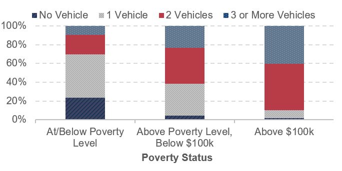
Source: National Household Travel Survey 2009.
Higher-income households benefited more from highway access compared with their lower-income counterparts. The 17 percent of households with an income above $100,000 owned more vehicles, drove further, and represented a larger proportion of national vehicle miles and person miles of travel than any other income class.
Distribution of Households, VMT, and Person Miles Traveled by Income, 2009
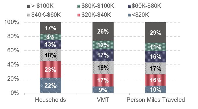
Source: National Household Travel Survey 2009.
The average American household spent $9,073 on transportation in 2014, about 17 percent of total household expenditures. The average annual transportation expenditure for households with the highest 20 percent of income was $16,788 in 2014, 4.7 times the amount spent by households with the lowest 20 percent of income ($3,555). High-income households tended to spend a higher proportion on paid transportation such as intercity travel than did low-income households.
Average Transportation Expenditure by Income Quintile, 2014
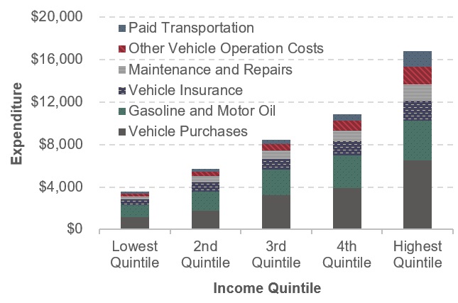
Source: Consumer Expenditure Survey 2014.
CHAPTER 4: Mobility and Access – Highways
Based on the National Performance Management Research Data Set (NPMRDS), the Travel Time Index (TTI) was 1.32 in 2015 for Interstate highways in the 52 largest metropolitan areas, meaning that the average peak-period trip took 32 percent longer than the same trip under free-flow traffic conditions. The TTI value for 2012 (the first year data are available) was only 1.24, indicating that travel time delays increased from 2012 to 2015.
Among these 52 areas, larger areas experienced more severe congestion during this period. The 2015 TTI values were 1.45, 1.26, and 1.18 for areas with population greater than 5 million, between 2 to 5 million, and between 1 and 2 million, respectively.
Travel Time Index for Interstate Highways in the 52 Largest Metropolitan Areas, 2012–2015
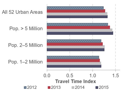
Source: FHWA staff calculation from the NPMRDS.
The average number of hours per weekday that Interstate highways are congested also varies by size of area among these 52 metropolitan areas. Congested hours per weekday totaled 7.3, 4.3, and 3.3 for areas with population greater than 5 million, between 2 to 5 million, and between 1 and 2 million, respectively.
The Planning Time Index (PTI) is a measure of travel time reliability, capturing the amount of time drivers would need to plan for to ensure on-time arrival 95 percent of the time. In 2015, the average PTI of Interstate highways in the 52 largest metropolitan areas was 2.52, meaning that drivers making a trip would need to leave early enough each day to account for it taking 2.52 times longer than it would under free-flow traffic conditions, if they wanted to get to their destination on time 19 days out of 20. For example, if an Interstate trip takes 30 minutes on average, a traveler would need to plan for it by taking 75 minutes each time in order to arrive on time 19 out of 20 trips.
Travel delays and reliability for these 52 areas vary over the course of a year. For each year from 2012 to 2015, the TTI on Interstate highways dropped to a lower level in July then quickly rose to the highest monthly value in October, then dropped again in the last two months of the year. The PTI reached its lowest point in July or August, then moved up. Interstate highways usually experienced longer periods of congestion in winter and shorter periods in warmer months.
The NPMRDS also captures data on other freeways and expressways not on the Interstate System, dating back to 2013. Among the 52 largest metropolitan areas, average congestion and reliability for these routes appear worse than on Interstate highways, resulting in higher TTI and PTI values. The TTI for other freeways and express-ways was 1.37 in 2015, while the PTI was 2.98.
The Texas Transportation Institute’s 2015 Urban Mobility Scorecard indicates that congestion in the Nation’s 471 urbanized areas added 6.8 billion hours to travelers’ time in 2014, and the total cost of this congestion was $160 billion. The annual average delay per commuter in these areas was 42 hours in 2014, up from 41 hours in 2004.
CHAPTER 4: Mobility and Access – Transit
Transit data from the end of the past decade show steady increases in service provided and consumed, commensurate with the growth of the urbanized population.
Between 2004 and 2014, the geographic coverage of transit increased significantly. New and extended commuter modes, such as vanpools and commuter rail, reached areas with significant transit demand that were previously accessible only by automobile. Revenue service hours and unlinked passenger trips increased by 12 and 19 percent respectively, and passenger miles by 22 percent. The higher increase in ridership compared with service hours is indicative of the better service effectiveness of these modes, and the larger increase in passenger miles compared with unlinked trips is indicative of a growing demand for commuter trips to outlying suburbs and neighboring cities.
The vehicle utilization of commuter rail also increased, indicating higher passenger loads.
Vehicle Service Utilization: Average Annual Vehicle Revenue Miles per Active Vehicle by Mode, 2004–2014
| Mode | Vehicle Revenue Miles per Vehicle (Thousands of Miles) | % Change | |
|---|---|---|---|
| 2004 | 2014 | ||
| Rail | |||
| Heavy Rail | 57.0 | 56.5 | -0.7% |
| Commuter Rail | 41.1 | 46.3 | 12.9% |
| Light Rail1 | 39.9 | 45.6 | 14.4% |
| Nonrail | |||
| Fixed-Route Bus2 | 29.8 | 28.4 | -4.7% |
| Vanpool | 14.1 | 15.2 | 7.5% |
| Demand-Response3 | 19.8 | 20.4 | 3.3% |
1Includes light rail, hybrid rail, and streetcar rail.
2Includes bus, bus rapid transit, and commuter bus.
3Includes demand-response and demand-response taxi.
Note: Rail category does not include Alaska railroad, cable car, inclined plane, or monorail/automated guideway. Nonrail category does not include aerial tramway or público.
Source: National Transit Database.
Vanpool vehicle utilization also increased, but at a smaller rate because vanpool expansion requires relatively more vehicles than in any other mode.
Light rail (including standard light rail, streetcars and hybrid rail) also expanded service significantly, both geographically and/or in terms of service intensity, and vehicle utilization increased by 14 percent. Fixed-route bus had a significant decrease in service utilization, and heavy rail decreased slightly.
Vehicle reliability is an important performance measure for analysis of replacement and rehabilitation needs of the national transit fleet. In 2004–2014, vehicle reliability fluctuated (based on vehicle revenue miles between mechanical failures). Over these 10 years, the average number of miles between failures decreased by nearly 1 percent, annually. Bus interruptions account on average for 65–70 percent of all interruptions.
Mean Distance Between Urban Vehicle Failures, 2004–2014
Note: Only directly operated vehicle data were used to calculate mean distance between failures.
Note: The data for all years do not include agencies that qualified and opted to use the small systems waiver of the National Transit Database in 2014.
Source: National Transit Database.
CHAPTER 5: Safety – Highways
DOT’s top priority is to make the U.S. transportation system the safest in the world. Three operating administrations within the DOT (FHWA, NHTSA, and FMCSA) have specific responsibilities for addressing highway safety. This balance of coordinated efforts, coupled with a comprehensive focus on shared, reliable safety data, enables these DOT administrations to concentrate on their areas of expertise while working toward the Nation’s safety goal.
Overall Fatalities and Injuries
There has been great progress in reducing overall roadway-related fatalities and injuries during the past two decades, despite increases in population and travel. Consistent with other data in this report, the focus here is on trends that occurred from 2004 to 2014.
- From 2004 to 2014, traffic fatalities decreased by nearly 24 percent despite an almost 9-percent increase in population and a 2-percent increase in travel.
- During the same period, pedestrian and bicyclists fatalities increased by 5.5 percent.
- From 2004 until 2009, pedestrian and bicyclist fatalities experienced a decreasing trend, declining by 11.8 percent. The trend shifted direction dramatically from 2009 to 2014, increasing by 19.6 percent over that time.
- In 2004, pedestrian and bicycle fatalities accounted for 12.9 percent of total roadway-related fatalities; this share rose to 17.8 percent in 2014.
- In 2014, rural roads accounted for 30.4 percent of travel and 51.3 percent of roadway fatalities, whereas urban roads accounted for 69.6 percent of travel and 48.6 percent of roadway fatalities.
- From 2004 to 2014, fatalities on rural roadways decreased by 33.3 percent and fatalities on urban roadways decreased by 9.5 percent.
Pedestrian, Bicyclist, and Other Nonmotorist Traffic Fatalities, 2004–2014
Source: Fatality Analysis Reporting System/National Center for Statistics and Analysis, NHTSA.
Focused Approach to Safety
The Focused Approach to Safety addresses the most critical safety challenges surrounding roadway departure, intersection, and pedestrian/bicyclist-involved crashes. These three areas account for nearly 90 percent of traffic fatalities and represent an opportunity to significantly reduce the number of fatalities and serious injuries.
- In 2014, roadway departure, intersection, and pedestrian/bicyclist-involved crashes accounted for 54.4 percent, 26.5 percent, and 17.8 percent, respectively, of the 32,744 total roadway-related fatalities.
- From 2004 to 2014, fatalities involving roadway departures and intersections decreased by 24.8 percent and 17.0 percent, but fatalities involving pedestrians and bicyclists increased by 5.5 percent.
CHAPTER 5: Safety – Transit
Rates of injuries and fatalities on public transportation generally are lower than for other modes of surface transportation. Nonetheless, serious incidents do occur, and the potential for catastrophic events remains.
Most victims of injuries and fatalities in rail transit are not passengers or patrons. They are pedestrians, automobile drivers, bicyclists, or trespassers. Patrons are individuals in stations who are waiting to board or just got off transit vehicles. In 2014, of the 236 fatalities, only 10 percent were passengers.
Annual Transit Fatalities, Including Suicides, 2004–20141
1Per 100 million PMT Including suicides.
Note: Fatality totals include both directly operated (DO) and purchased transportation (PT) service types.
Source: National Transit Database, Transit Safety and Security Statistics and Analysis Reporting.
Collisions are the most common type of fatal incident in rail transit. In 2014, 147 persons, or 62 percent of all fatalities (excluding commuter rail), died in collision incidents. Suicides were the second most common type, with 61 fatalities in 2014.
Commuter rail fatalities accounted on average for 38 percent of all rail fatalities during the period 2004–2014.
Transit Fatality Event Types, 20141
1Exhibit includes data for all transit modes, excluding commuter rail.
Note: Other Event Type includes fatalities due to smoke inhalation, slips & falls, electric shock events, and trespassers with an unknown cause of death.
Source: National Transit Database.
Annual Fatalities, Including Suicides and Commuter Rail, 2004–2014
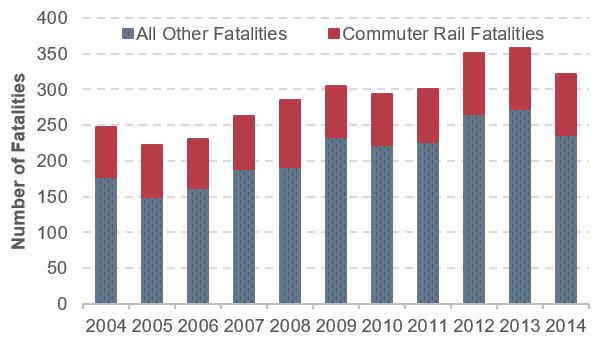
Note: Fatality totals include both directly operated (DO) and purchased transportation (PT) service types.
Note: Data on commuter rail fatalities are not available by victim type and type of incident.
Note: Other fatalities include all other modes.
Sources: Federal Railroad Administration, Railroad Right-of-Way Incident Analysis Research (for commuter rail fatalities) and National Transit Database, Transit Safety and Security Statistics and Analysis Reporting (for all other rail fatalities).
CHAPTER 6: Infrastructure Conditions – Highways
FHWA is transitioning to a new set of condition measures based on categorical ratings of good, fair, and poor for pavements and bridges. HPMS contains data on multiple types of pavement distresses. Data on pavement roughness are used to assess the quality of the ride that highway users experience. Other measures of pavement distress include pavement cracking, pavement rutting (surface depressions in the vehicle wheel path, generally relevant only to asphalt pavements), and pavement faulting (the vertical displacement between adjacent jointed sections on concrete pavements).
Weighted by lane miles, 17.1 percent of pavements on Federal-aid highways for which data were available had poor ride quality in 2014; the comparable shares for cracking, rutting, and faulting were 8.4 percent, 2.8 percent, and 20.7 percent, respectively.
Federal-aid Highway Pavement Conditions, 2014
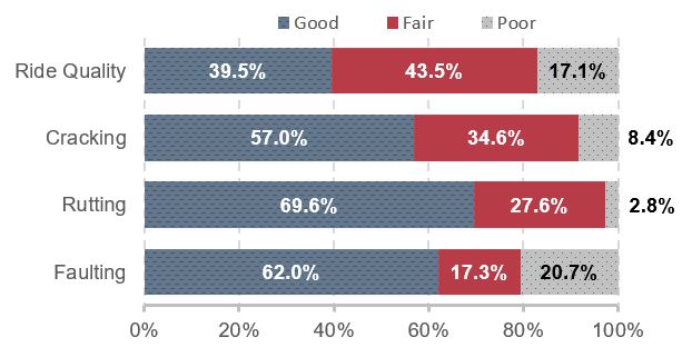
Source: Highway Performance Monitoring System.
FHWA currently uses the share of VMT on NHS pavements with good ride quality as a metric for performance planning purposes; this rose from 52 percent in 2004 to 58.7 percent in 2014. This gain came despite the significant expansion of the NHS under MAP-21, as pavement conditions on the additions to the NHS were not as good as those on the pre-expansion NHS.
NHS Pavement Ride Quality, Weighted by VMT, 2004–2014
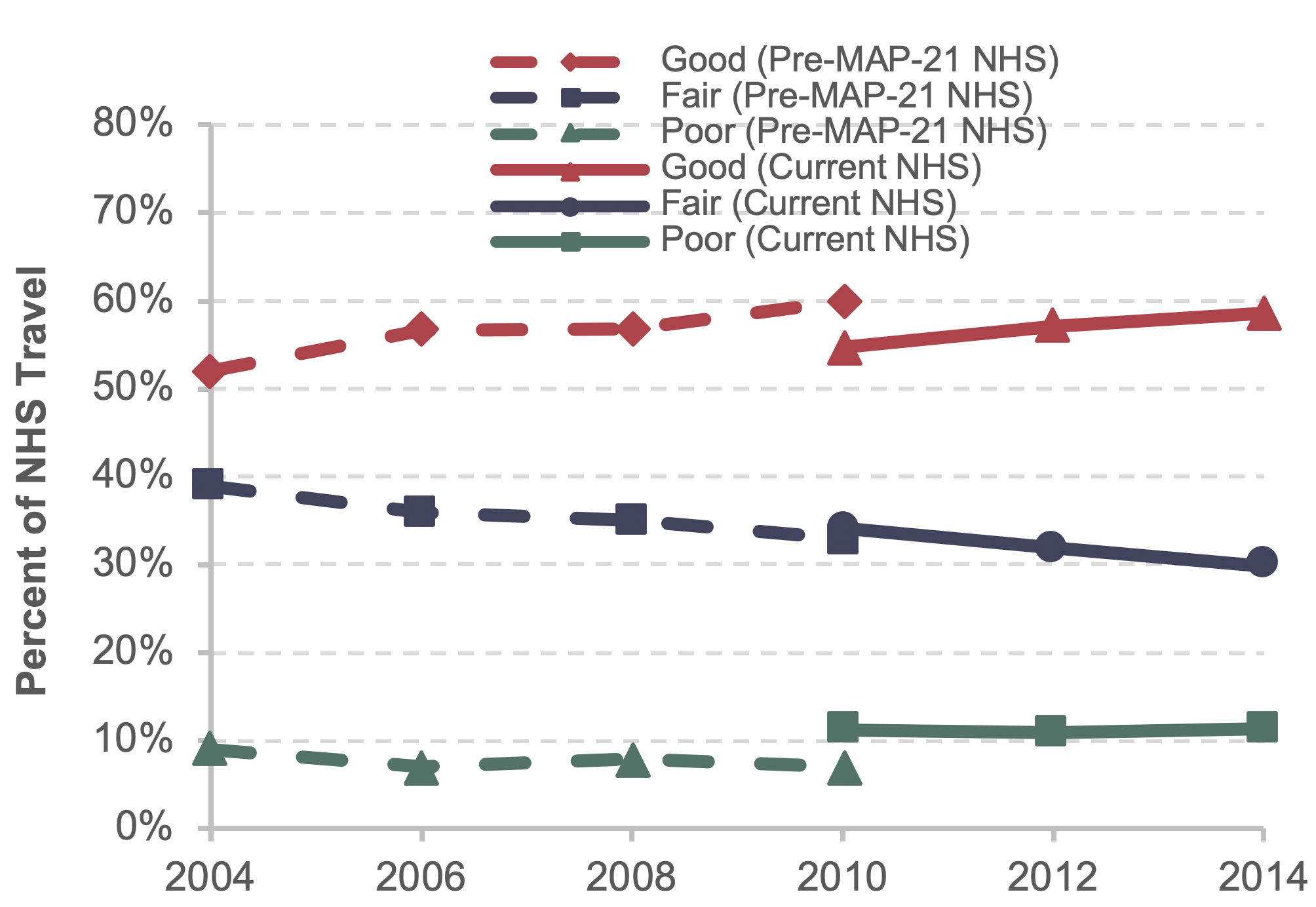
Source: Highway Performance Monitoring System.
NBI contains data on bridge decks, superstructures, substructures, and culverts that can be combined to form an overall bridge condition rating. While the share of bridges rated good has gone down since 2004, the share rated as poor has been reduced even faster. It should be noted that a poor condition rating does not mean that a bridge is unsafe.
Systemwide Bridge Conditions, 2004–2015
| 2004 | 2014 | 2015 | |
|---|---|---|---|
| Percent Good | |||
| By Bridge Count | 48.2% | 47.1% | 47.3% |
| Weighted by Deck Area | 46.1% | 44.7% | 45.5% |
| Weighted by Traffic | 46.4% | 44.5% | 45.8% |
| Percent Fair | |||
| By Bridge Count | 40.6% | 44.2% | 44.4% |
| Weighted by Deck Area | 44.3% | 48.3% | 48.2% |
| Weighted by Traffic | 46.1% | 50.6% | 49.8% |
| Percent Poor | |||
| By Bridge Count | 11.0% | 8.7% | 8.3% |
| Weighted by Deck Area | 9.4% | 6.7% | 6.4% |
| Weighted by Traffic | 7.3% | 4.7% | 4.4% |
Source: National Bridge Inventory.
CHAPTER 6: Infrastructure Conditions – Transit
Transit asset infrastructure in the C&P Report includes five major asset groups.
Major Asset Categories
| Asset Category | Components |
|---|---|
| Guideway Elements | Tracks, ties, switches, ballasts, tunnels, elevated structures, bus guideways |
| Maintenance Facilities | Bus and rail maintenance buildings, bus and rail maintenance equipment, storage yards |
| Stations | Rail and bus stations, platforms, walkaways, shelters |
| Systems | Train control, electrification, communications, revenue collection, utilities, signals and train stops, centralized vehicle/train control, substations |
| Vehicles | Large buses, heavy rail, light rail, commuter rail passenger cars, nonrevenue vehicles, vehicle replacement parts |
Source: Transit Economic Requirements Model.
Condition Rating. FTA uses a capital investment needs tool, TERM, to measure the condition of transit assets. The model uses a numeric scale that ranges from 1 to 5. When an asset crosses the middle of the scale (condition 2.5), which is based on age, it is assigned by TERM for replacement or rehabilitation.
Definition of Transit Asset Conditions
| Rating | Condition | Description |
|---|---|---|
| Excellent | 4.8–5.0 | No visible defects, near-new condition |
| Good | 4.0–4.7 | Some slightly defective or deteriorated components |
| Adequate | 3.0–3.9 | Moderately defective or deteriorated components |
| Marginal | 2.0–2.9 | Defective or deteriorated components in need of replacement |
| Poor | 1.0–1.9 | Seriously damaged components in need of immediate repair |
Source: Transit Economic Requirements Model.
The replacement value of the Nation’s transit assets was $894.8 billion in 2014, 43 percent of which was guideway elements. Rail modes account for 88 percent of the guideway element amount.
The relatively large proportion of facilities elements and systems assets that are in poor condition (rated 2.0 or below) and the magnitude of the $174-billion investment required to replace them, represent major challenges to the rail transit industry.
Asset Categories in Poor Condition (Rated 2.0 or Below), 2014
| Asset Category | Percentage in Poor Condition |
|---|---|
| Guideway Elements | 6.4 |
| Systems | 21.4 |
| Facilities | 36.4 |
| Vehicles | 18.5 |
| Stations | 5.3 |
Source: Transit Economic Requirements Model.
State of Good Repair (SGR). An asset is deemed in a state of good repair if its condition rating is 2.5 or higher. An agency mode is in SGR if all its assets are rated 2.5 or higher.
Trends in Urban Bus and Rail Transit Fleet not in SGR. The average condition rating for bus and rail fleets did not change much between 2004 and 2014, ranging between 3.0 and 3.3 for buses and remaining relatively constant for rail, ranging between 3.5 and 3.6. The percentage of the bus fleet not in SGR also did not change much, ranging between 15 and 18.8 percent. For rail, the percentage not in SGR decreased during the 2004–2014 timeframe overall, although it increased slightly between 2012 and 2014.
Part II: Investing for the Future
The four chapters in Part II of this report present and analyze general scenarios for future capital investment in highways, bridges, and transit. Each scenario is geared toward maintaining some indicator of physical condition or operational performance at its 2014 level, or achieving some objective linked to benefits versus costs. The average annual investment level over the 20 years from 2015 through 2034 is presented for each scenario, stated in constant 2014 dollars.
This report does not attempt to address issues of cost responsibility. The scenarios do not address how much different levels of government might contribute to funding the investment, nor do they directly address the potential contributions of different public or private revenue sources.
Chapter 7, Selected Capital Investment Scenarios, defines the core scenarios and examines the associated projections for condition and performance. The scenarios are intended to be illustrative and do not represent comprehensive alternative transportation policies; the U.S. Department of Transportation does not endorse any scenario as a target level of investment.
Chapter 8, Supplemental Scenario Analysis, explores some implications of the scenarios presented in Chapter 7 and contains some additional policy-oriented analyses. As part of this analysis, highway projections from previous editions of the C&P Report are compared with actual outcomes to illuminate the value and limitations of the projections presented in this edition. Chapter 9, Sensitivity Analysis, explores the impacts on scenario projections of changes to several key assumptions. Lastly, Chapter 10, Impacts of Investment, explains the derivation of the scenario projections from results obtained with the models that have been developed over the years to support the C&P Report.
A comprehensive benefit-cost analysis of a transportation investment considers all impacts of potential significance for society and values them in monetary terms, to the extent feasible. For some types of impacts, monetary valuation is facilitated by the existence of observable market prices. Such prices are generally available for inputs to the provision of transportation infrastructure, such as concrete for building highways or buses purchased for a transit system. The same is true for some types of benefits from transportation investments, such as savings in business travel time, which are conventionally valued at a measure of average hourly labor cost of the travelers.
For some other types of impacts for which market prices are not directly observable, monetary values can be reasonably inferred from behavior or expressed preferences. In this category are savings in personal travel time and reductions in the risk of crash-related fatality or other injury.
For other impacts, monetary valuation may not be possible because of problems with reliably estimating the magnitude of the improvement, placing a monetary value on the improvement, or both. Even when possible, reliable monetary valuation may require time and effort that would be out of proportion to the likely importance of the impact concerned.
Each of the models used in this report—the Highway Economic Requirements System (HERS), the National Bridge Investment Analysis System (NBIAS), and the Transit Economic Requirements Model (TERM)—omits various types of investment impacts from its benefit-cost analyses. To some extent, this omission reflects the national coverage of the models’ primary databases. Such broad geographic coverage requires some sacrifice of detail to stay within feasible budgets for data collection.
Types of Capital Spending Projected by HERS and NBIAS
NBIAS relies on the NBI, which covers bridges on all highway functional classes and evaluates improvements that generally fall within the system rehabilitation category defined in Chapter 2. HERS evaluates pavement improvements and highway widening; the types of improvements included in these categories roughly correspond to system rehabilitation and system expansion categories. Coverage of the HERS analysis is limited to Federal-aid highways, as the HPMS sample does not include data for rural minor collectors, rural local roads, or urban local roads. The term “nonmodeled spending” refers in this report to spending on highway and bridge capital improvements that are not evaluated in HERS or NBIAS. This includes capital improvements on highway classes omitted from the HPMS sample and expenditures classified in Chapter 2 as system enhancements.
Distribution of 2014 Capital Expenditures by Investment Type
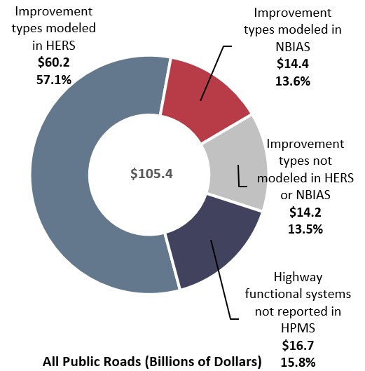
Source: Highway Statistics 2014 (Table SF-12A) and unpublished FHWA data.
In 2014, highway capital spending was $105.4 billion. Of that spending, $60.2 billion was for the types of improvement that HERS models and $14.4 billion was for the types of improvement NBIAS models. The other $30.9 billion was for nonmodeled improvement types.
Types of Capital Spending Projected by TERM
TERM is designed to forecast the following types of investment needs:
- Preservation: The level of investment in the rehabilitation and replacement of existing transit capital assets required to attain specific investment goals (e.g., to attain a state of good repair [SGR]) subject to potentially limited capital funding.
- Expansion: The level of investment in the expansion of transit fleets, facilities, and rail networks required to support projected growth in transit demand (i.e., to maintain performance at current levels as demand for service increases).
As reported to NTD, the level of transit capital expenditures peaked in 2009 at $16.8 billion, experienced a slight decrease in 2011 to $15.6 billion, and increased again in 2014 to $17.7 billion. Although the annual transit capital expenditures averaged $15.2 billion from 2004 to 2014, expenditures averaged $16.8 billion in the most recent 5 years of NTD reporting (2010–2014).
Annual Transit Capital Expenditures, 2004–2014
| Year | (Billions of Current-Year Dollars) | (Billions of Constant 2014 Dollars) | ||
|---|---|---|---|---|
| Preservation | Expansion | Total | Total | |
| 2004 | $9.4 | $3.2 | $12.6 | $15.8 |
| 2005 | $9.0 | $2.9 | $11.8 | $14.3 |
| 2006 | $9.2 | $3.5 | $12.7 | $14.9 |
| 2007 | $9.6 | $4.0 | $13.6 | $15.5 |
| 2008 | $11.0 | $5.1 | $16.0 | $17.6 |
| 2009 | $11.3 | $5.5 | $16.8 | $18.6 |
| 2010 | $10.3 | $6.2 | $16.6 | $18.0 |
| 2011 | $9.9 | $5.7 | $15.6 | $16.5 |
| 2012 | $9.7 | $7.1 | $16.8 | $17.4 |
| 2013 | $10.8 | $6.4 | $17.1 | $17.4 |
| 2014 | $11.0 | $6.4 | $17.4 | $17.4 |
| Average | $10.1 | $5.1 | $15.2 | $16.7 |
Source: National Transit Database.
CHAPTER 7: Capital Investment Scenarios – Highways
This report presents a set of illustrative 20-year capital investment scenarios based on simulations developed using HERS and NBIAS, with scaling factors applied to account for types of capital spending that are not currently modeled.
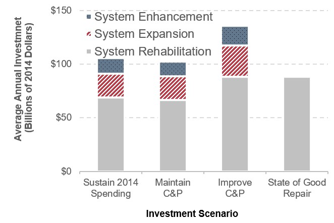
The Sustain 2014 Spending scenario assumes that annual capital spending is sustained in constant-dollar terms at the 2014 level of $105.4 billion from 2015 through 2034. (In other words, spending would rise by exactly the rate of inflation during that period.) The model results suggest that it would be economically advantageous to slightly increase the share of total capital spending directed to system rehabilitation (improvements to the physical condition of existing infrastructure assets) from the 62.0 percent observed in 2014 to 64.9 percent ($68.8 billion per year) under this scenario.
The Maintain Conditions and Performance scenario seeks to identify the level of investment needed to keep selected measures of overall system conditions and performance unchanged after 20 years. The average annual investment level associated with this scenario is $102.4 billion; this suggests that sustaining spending at the 2014 level of $105.4 billion should result in improved overall conditions and performance in 2034 relative to 2014.
The Improve Conditions and Performance scenario seeks to identify the level of investment needed to implement all potential investments estimated to be cost-beneficial. This scenario can be viewed as an “investment ceiling,” above which it would not be cost-beneficial to invest. Of the $135.7 billion average annual investment level under the Improve Conditions and Performance scenario, $88.4 billion would be directed toward system rehabilitation; this portion is identified as the State of Good Repair benchmark. This scenario also includes $29.1 billion directed toward system expansion and $18.3 billion for system enhancement.
Highway Capital Investment Scenarios
Sources: HERS and NBIAS.
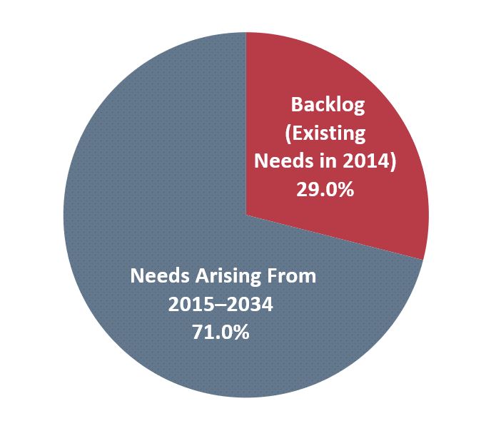
Cumulative 20-year investment under the Improve Conditions and Performance scenario would total $2.7 trillion. This includes an estimated $786.4 billion (29.0 percent) needed to address an existing backlog of cost-beneficial highway and bridge investments as of 2014. The remainder would address future highway and bridge needs as they arise over 20 years.
Composition of 20-Year Improve Conditions and Performance Scenario, Backlog vs. Emerging Needs
Source: HERS and NBIAS.
CHAPTER 7: Capital Investment Scenarios – Transit
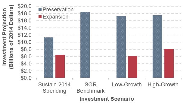
Chapter 7 presents three transit investment scenarios covering all capital spending, and one benchmark covering only preservation spending.
Sustain 2014 Spending: Under this scenario, 2014 spending on transit asset preservation and expansion ($11.3 billion and $6.4 billion respectively) is sustained for the next 20 years.
- Backlog: $11.3 billion in annual investment is insufficient to cover the cost of new preservation needs as they arise, resulting in a projected increase in the backlog from $98.2 billion to $116.2 billion by 2034 (an increase of $18.0 billion or 19 percent).
- Asset Conditions: The backlog increase and the ongoing aging of rail systems results in an overall decline in asset conditions (from 3.1 to 2.8 by 2034).
- Ridership: The $6.4 billion annual rate of investment is estimated to support a 1.3 percent annual increase in ridership, or 0.2 percent below the 1.5 percent rate of growth experienced since 2000—potentially resulting in increased vehicle crowding if such ridership growth were to continue in the future.
Scenarios Expenditures
Source: Transit Economic Requirements Model.
SGR Benchmark: The level of preservation expenditures required to eliminate the state of good repair (SGR) backlog over 20 years (by 2034).
- Expenditures: An estimated $18.4 billion in annual reinvestment is required to fully eliminate the SGR backlog by 2034. This is 63 percent higher than actual 2014 reinvestment.
- Asset Conditions: Despite elimination of the backlog, average asset conditions are projected to remain near the lower bound of the adequate range (3.0–3.9).
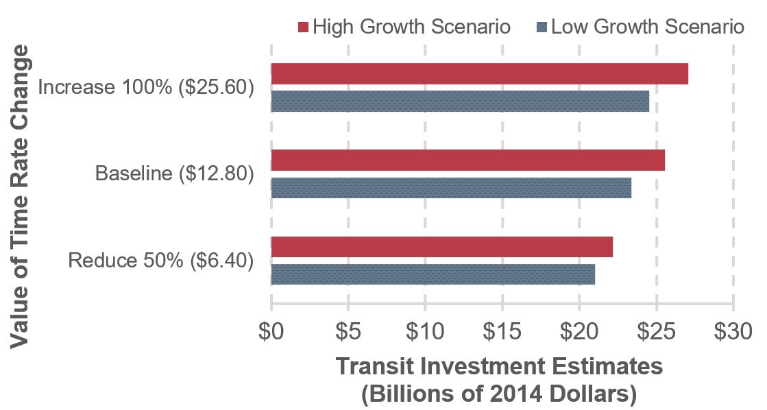
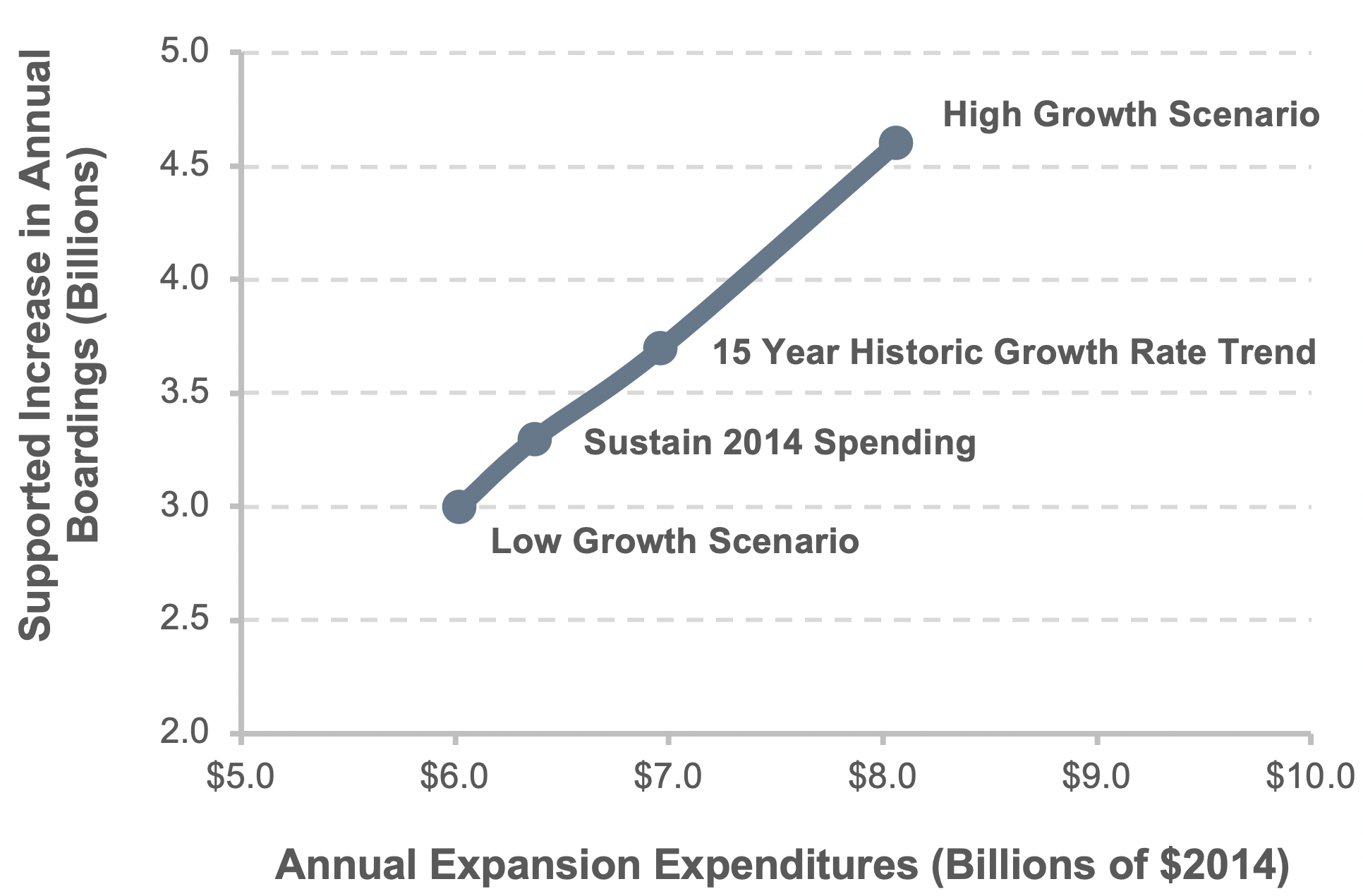
Low- and High-Growth Scenarios1: The level of investment required both to eliminate the backlog by 2034 and to support ridership growth within ±0.3 percent of the 1.5 percent average annual rate experienced since 2000.
- Ridership: The estimated annual rate of expansion investment ranges from $6.0 billion to $8.1 billion under the Low- and High-Growth scenarios respectively. This range encompasses the $6.4 billion expended on expansion in 2014. These investments support an additional 3.0 to 4.6 billion annual boardings by 2034.
CHAPTER 8: Supplemental Analysis – Highways
The 2015 C&P Report estimated the average annual investment level for the Maintain Conditions and Performance scenario as $89.9 billion in 2012 dollars, or $94.4 billion in 2014 dollars after adjusting for inflation. The comparable amount in this 23rd edition is $102.4 billion in 2014 dollars, approximately 8.5 percent higher than the adjusted 2015 C&P Report estimate. The average annual investment level under the Improve Conditions and Performance scenario in this edition was 9.3 percent lower than the adjusted annual investment level based on the 2015 C&P Report.
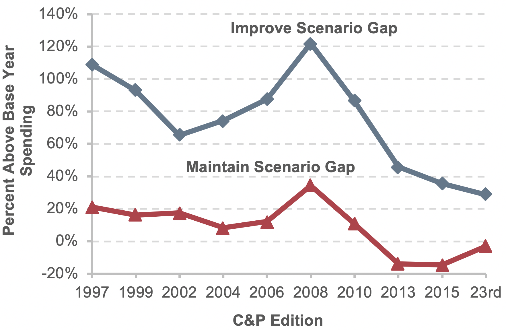
Since the 1997 C&P Report, the “gap” between base-year spending and the average annual investment level for the primary “Maintain” and “Improve” scenarios has varied, reaching the highest level in the 2008 C&P Report. The gap under the Maintain Conditions and Performance scenario shrank in the 23rd edition, but remains negative (i.e., base-year spending is higher). The gap under the Improve Conditions and Performance scenario and base-year spending has declined continually since the 2008 C&P Report.
Comparison of Average Annual Highway and Bridge Investment Scenario Estimates with Base-Year Spending, 1997 to 23rd C&P Editions
Sources: HERS and NBIAS.
The pattern of investment assumed for the scenarios in this edition differed from that in the 2015 C&P Report, which assumed “ramped” highway capital investment, increasing at a constant annual rate starting with the base year. For this edition, the “Maintain” scenario assumes spending will remain constant at $102.4 billion in each year, while the “Improve” scenario assumes all cost-beneficial investments will occur in the year in which they are identified. This benefit-cost ratio-driven approach resulted in a significant frontloading of investment in the early years of the analysis, due to the existence of a large existing backlog of potential cost-beneficial investments. Supplemental analyses of alternative investment timing patterns did not show significant variation in terms of system conditions and performance results after 20 years.
This edition includes a look back to the projections from the 1995 C&P Report, and compares them with actual performance over 20 years. The investment scenarios presented in the 1995 C&P Report assumed VMT would grow by 2.15 percent per year from 1993 to 2013, significantly higher than the actual annual VMT growth over that period of 1.33 percent. However, the predicted urban VMT growth was relatively close to actual VMT; most of the difference was due to a significant overprediction of rural VMT. Adjusted for inflation, actual highway capital spending for 1994 through 2013 was 15 percent below the level estimated for the Maintain Conditions and Performance scenario in the 1995 C&P Report, suggesting that conditions and performance would have been expected to decline. This proved to be true in terms of operational performance in urban areas from 2003 to 2013, as various congestion measures got worse. However, key measures of physical conditions and safety showed improvements over this 20-year period.
CHAPTER 8: Supplemental Analysis – Transit
Chapter 8 covers analyses designed to help better understand the assumptions and outcomes underlying the scenarios presented in Chapter 9.
Impact of the Sustain 2014 Spending scenario on asset conditions. Continued reinvestment in preservation at the 2014 annual spending level yields a decline in overall asset conditions (from 3.1 in 2014 to 2.8 in 2034) and an increase in the backlog (from $98.8 billion in 2014 to $102.5 billion in 2018). This decline is due in part to deferred investments in rehabilitation and replacement, and in part on the aging of assets that will reach the end of their useful lives after 2034. The share of assets beyond their useful life would increase from 14 percent in 2014 to 19 percent in 2034 if the spending level is kept constant over the 20-year project horizon.
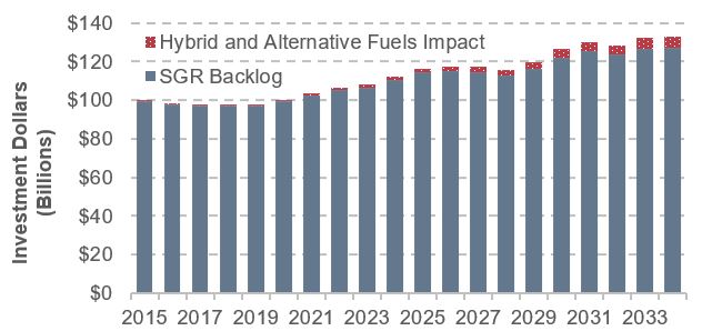
New technologies impact transit investment needs. New technologies often increase the cost of replacement assets and, in the absence of additional funding, the size of the state of good repair (SGR) backlog. As an example, alternative fuel buses add an additional cost as depicted in the figure below.
Impact of Technological Change on Backlog
Source: Transit Economic Requirements Model.
As the chart shows, the cost impact on the backlog is negligible in the early years of the projection period but grows over time as the proportion of buses using alternative fuel and hybrid power increases. By 2034, the size of the backlog would increase to $123.5 billion, an increase of $7.3 billion above the original $116.2 billion under the Sustain 2014 Spending scenario.
Investment in expansion assets.2 Chapter 8 assesses the increase in transit assets required to support the additional 3.0 to 4.6 billion annual boardings by 2034, as projected by the Low- and High-Growth scenarios. This increase includes:
- Fleet: 60,400 to 85,900 additional vehicles (a 35-percent to 49-percent increase from 2014)
- Rail Guideway: 2,300 to 2,800 additional route miles (an 18-percent to 23-percent increase)
- Stations: 2,800 to 4,300 additional stations (an 83-percent to 130-percent increase)
Growth Scenario Investment in Stations
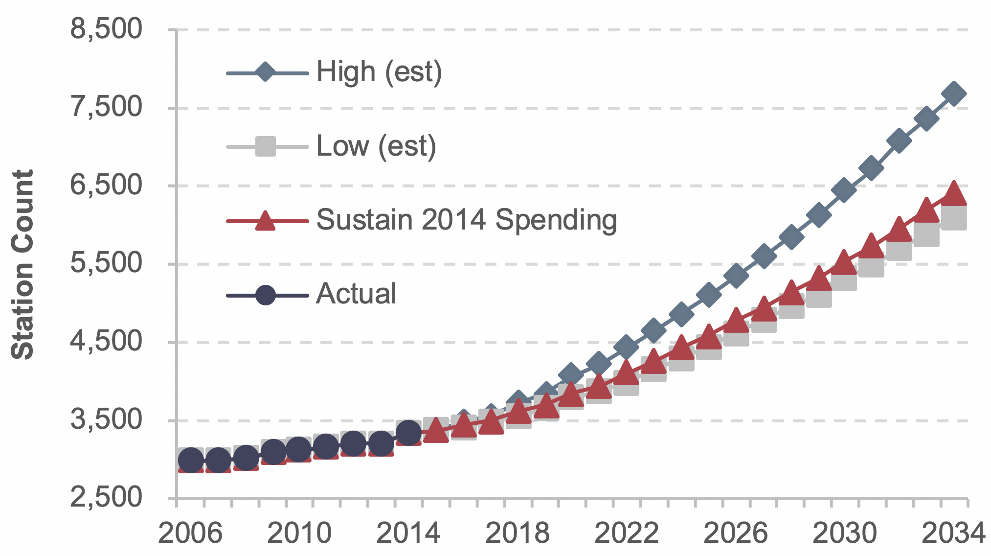
Note: Data through 2014 are actual; data after 2014 are estimated based on trends.
Source: Transit Economic Requirements Model.
CHAPTER 9: Sensitivity Analysis – Highways
Sound practice in modeling includes analyzing the sensitivity of key results to changes in assumptions. Chapter 9 analyzes how the baseline scenarios presented in Chapter 7 would be affected by changing some HERS and NBIAS parameters.
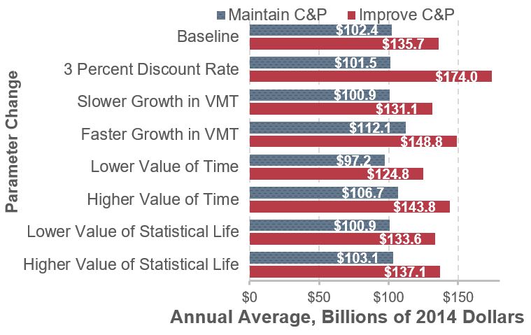
Among the parameters analyzed, the Improve Conditions and Performance scenario is most sensitive to changes in the discount rate, a value used in benefit-cost analyses to scale down benefits and costs arising later in the future relative to those arising sooner. Changing the discount rate from the 7 percent assumed in the baseline analysis to 3 percent would increase the average annual investment level under this scenario from $135.7 billion to $174.0 billion.
For purposes of computing the baseline scenarios, future travel forecasts for individual highway sections and bridges reported by States in the HPMS and NBI were each proportionally reduced so that the national average annual growth over 20 years would match the 1.07 percent figure from the May 2017 release of the FHWA National Vehicle Miles Traveled projection. Had the 0.92 percent annual growth figure from the May 2016 release been used instead, the average annual investment level under the Improve Conditions and Performance scenario would have decreased to $131.1 billion annually. Eliminating this proportional adjustment and directly applying the annual growth forecasts from the HPMS (1.40 percent on average) and the NBI (1.45 percent) increases the annual cost of this scenario to $148.8 billion.
The valuation of travel time savings assumed in the baseline scenarios is linked to average hourly income; personal travel is valued at 50 percent of income, while business travel is valued at 100 percent. Alternative tests were run reducing these shares to 35 percent and 80 percent, respectively, and increasing them to 60 percent and 120 percent. Applying a lower value of time reduces the benefits associated with travel time savings and reduces the average annual investment level under the Improve Conditions and Performance scenario to $124.8 billion. Assuming a higher value of time increases the annual cost of this scenario to $143.8 billion.
The baseline scenarios assume the value of a statistical life is $9.4 million when computing safety-related benefits, consistent with DOT guidance. Reducing this value to $5.2 million would reduce the annual cost of the Improve Conditions and Performance scenario to $133.6 billion; increasing the value to $13.0 million would increase the annual cost to $137.1 billion.
Sensitivity of Highway Scenarios to Alternative Assumptions
Note: Data through 2014 are actual; data after 2014 are estimated based on trends.
Sources: Highway Economic Requirements System and National Bridge Investment Analysis System.
The impacts of alternative assumptions on the Maintain Conditions and Performance scenario are generally smaller and are linked to the models’ distribution of spending among different capital improvement types. Among the parameters analyzed, this scenario was most sensitive to higher assumptions about future VMT.
CHAPTER 9: Sensitivity Analysis – Transit
The Transit Economics Requirements Model (TERM) relies on several key input parameters, variations of which can significantly influence the model’s needs and backlog estimates.
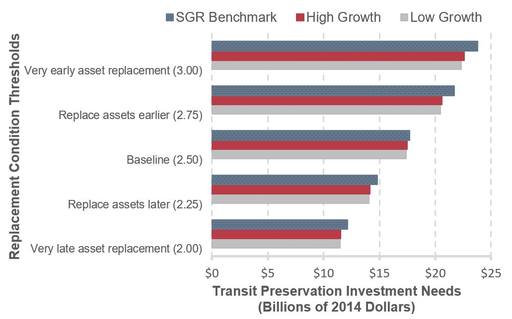
Impact of alternative replacement thresholds on transit preservation needs. TERM uses a “replacement threshold” to specify the condition at which aging assets are replaced. The benchmark threshold value is 2.5. A 0.5-point change in the thresholds yields a roughly ±30-percent change in replacement needs.
Sensitivity to Replacement Threshold
Source: Transit Economic Requirements Model.
Impact of increases in capital costs on transit preservation needs. The sensitivity of scenario needs estimates to changes in capital costs is dependent on whether TERM’s benefit-cost test is applied for that scenario. Under the Low- and High-Growth scenarios, which both apply the test, a 25-percent increase in asset costs yields 20.3-percent to 18.5-percent increases in needs, as the cost increase forced some reinvestment actions to fail the benefit-cost test.
Impact of changes in the value of time on preservation needs. The per-hour value of travel time for transit riders is a key model input, and a key driver of total investment benefits. Increasing this rate results in greater benefits, allowing more projects to pass the benefit-cost test, leading to higher needs estimates. Decreasing the rate has the opposite effect. Doubling the rate results in increases of 5.0 percent and 6.0 percent in needs for the Low- and High-Growth scenarios, respectively. Reducing the rate by half results in decreases of 10.1 percent and 13.2 percent, respectively.
Sensitivity to Value of Time
Source: Transit Economic Requirements Model.
Impact of discount rate. TERM’s benefit-cost test is sensitive to the discount rate used to calculate the present value of investment costs and benefits. TERM’s analysis uses a rate of 7.0 percent in accordance with Office of Management and Budget guidance. The analysis using a rate of 3 percent (57 percent smaller) leads to an increase of 4.0 percent in investment needs in the High-Growth scenario, and a 5.6 percent increase in the Low-Growth scenario.
CHAPTER 10: Impacts of Investment – Highways
Of the $135.7 billion average annual investment level for all public roads under the Improve Conditions and Performance scenario presented in Chapter 7, 16.7 percent ($22.7 billion) was derived from NBIAS estimates of rehabilitation and replacement needs for all bridges. HERS evaluates needs on Federal-aid highways associated with pavement resurfacing or reconstruction and widening, including those associated with bridges; 54.0 percent ($73.2 billion) of this scenario was derived from HERS. The remaining 29.3 percent was nonmodeled; this includes estimates for system enhancements on all public roads plus pavement resurfacing or reconstruction and widening not on Federal-aid highways. Nonmodeled spending was scaled so that its share of the total scenario investment level would match its share of actual 2014 spending.
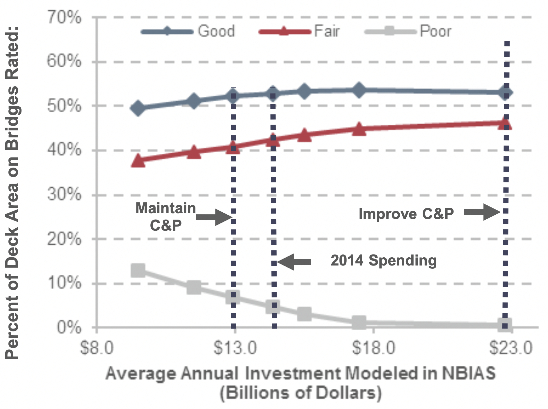
Sustaining NBIAS-modeled investment at $14.4 billion (the portion of 2014 spending directed toward improvement types modeled in NBIAS) in constant-dollar terms over 20 years is projected to result in deck area-weighted bridge conditions of
Projected Impact of Alternative Investment Levels on 2034 Bridge Condition Ratings
Source: National Bridge Investment Analysis System.
52.9 percent good, 40.8 percent fair, and 6.3 percent poor. Increasing annual investment to $22.7 billion would increase the deck area-weighted share rated as good to 53.9 percent, and reduce the share rated as poor to 0.5 percent.
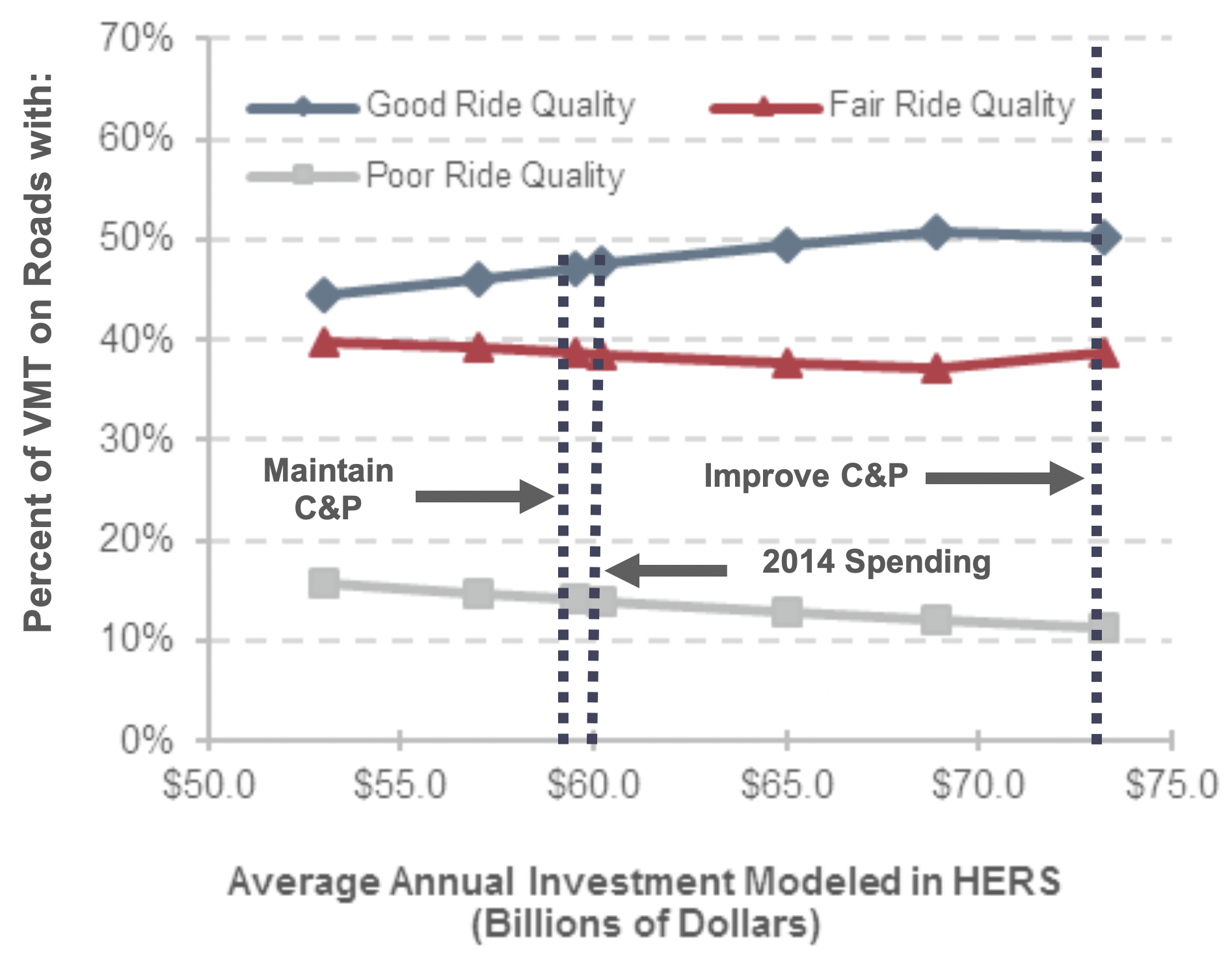
Sustaining HERS-modeled investment at $60.2 billion (the portion of 2014 spending directed toward improvement types modeled in HERS) in constant-dollar terms over 20 years is projected to result in 47.5 percent of VMT in 2034 occurring on pavements with good ride quality, 38.5 percent on pavements with fair ride quality, and 13.9 percent occurring on pavements with poor ride quality. Increasing annual investment to $73.2 billion would increase the VMT-weighted share rated as good to 50.2 percent and reduce the share rated as poor to 11.2 percent.
Projected Impact of Alternative Funding Levels on 2034 Federal-aid Highway Pavement Ride Quality
Source: Highway Economic Requirements System.
Other projected impacts of investing at the Improve scenario level include reducing VMT-weighted average pavement roughness by 5.6 percent in 2034 relative to 2014 and reducing average delay per VMT by 19.3 percent.
CHAPTER 10: Impacts of Investment – Transit
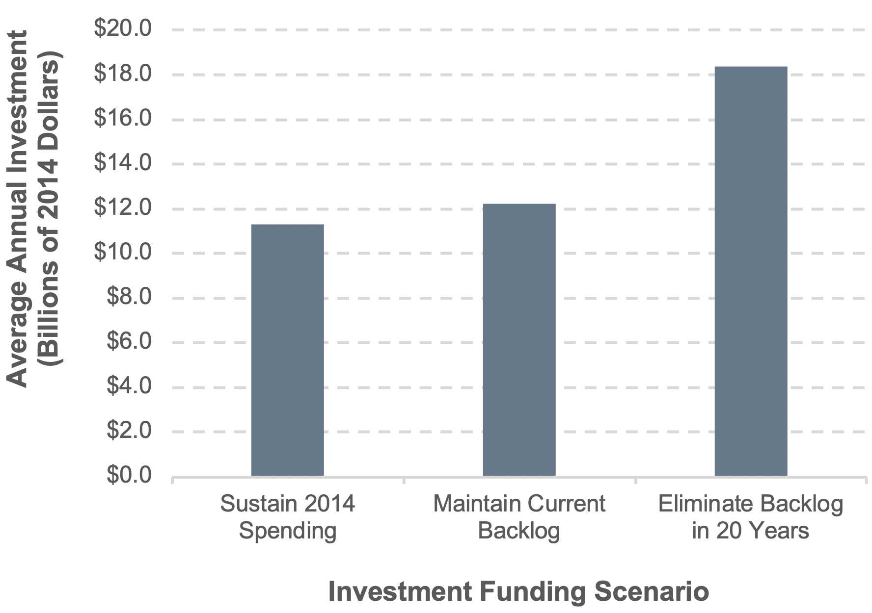
The current level of investment in transit asset preservation is insufficient to prevent ongoing growth in the state of good repair (SGR) backlog. Assuming preservation expenditures are sustained at the 2014 level ($11.3 billion annually), the backlog is projected to increase from $98.8 billion to $116.2 billion by 2034. Based on current estimates, $12.2 billion in annual investment is required to prevent further increases in the SGR backlog, while $18.2 billion in annual investment is required to fully eliminate the SGR backlog in 20 years (by 2034).
Investment Funding Scenarios
Source: Transit Economic Requirements Model.
A much higher rate of investment is required to maintain the current average condition rating of all transit assets nationwide than is required to maintain the size of the current SGR backlog.
If the current rate of reinvestment is sustained at the 2014 level ($11.3 billion), overall average asset conditions are projected to decline from 3.1 in 2014 to 2.8 by 2034 (near the upper bound of the “marginal” range). In contrast, annual preservation expenditures of $18.2 billion are required to sustain an overall average condition of 3.1, with higher rates of annual investment required to attain significant improvements in overall asset conditions.
The 2014 level of expansion investment supports ridership growth that is marginally below the historical rate.4 Investment in transit expansion investments was $6.4 billion in 2014. If maintained into the future, this annual investment amount is estimated to support roughly 1.3 percent in annual ridership growth, which is marginally below the 1.5 percent average rate experienced since 2000. Assuming this historical trend continues (it has not since 2014), the limited underinvestment could result in a gradual increase in vehicle occupancy rates through 2034, with increasing incidences of vehicle crowding and longer dwell times during this period.
The Low-Growth and High-Growth scenarios in this report are based on 15-year ridership trends as of 2014, the cut-off year for this report. The Department does note that transit ridership has, in fact, not increased since 2014 through the early months of 2019. The causes of the decreased transit ridership since 2014 will be analyzed in the next edition of this report. The ridership trends since that time will also be incorporated into the capital investment needs forecasts presented in future editions of this report.
Growth Scenarios: Expansion Expenditures vs. Increase in Annual Boardings
Source: Transit Economic Requirements Model.
CHAPTER 11: Freight Transportation
Freight transportation is vital to the U.S. economy and the daily needs of Americans throughout the country. Households and businesses depend on the efficient and reliable delivery of freight to both urban and rural areas. Federal support for freight increased under the Fixing America’s Surface Transportation (FAST) Act, as the FAST Act included provisions to define, establish, and provide funding for a national highway freight program. The FAST Act freight provisions were designed to address significant needs in the transportation system to ensure that projected increases in freight volumes can be handled efficiently across all transportation modes.
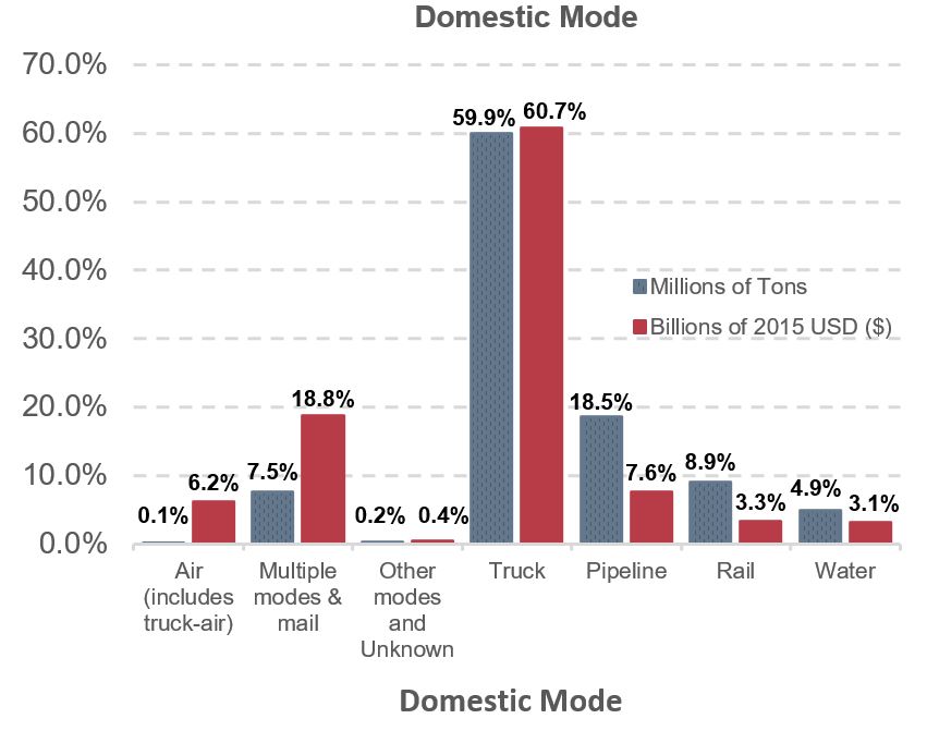
In 2015, the transportation system handled a record amount of freight—including a daily average of approximately 55 million tons of freight, worth approximately $49.5 billion. The freight transportation industry employed 4.6 million workers and contributed 9.5 percent of the Nation’s economic activity as measured by gross domestic product (GDP).
Although freight moves on all modes of transportation, trucks are involved in the movement of most goods. The highway system is the most-used mode of transport for freight by tonnage and value of goods moved. Commodities moved by truck have a higher value per weight, which gives trucking a higher share of freight dollar value.
Trucking accounted for nearly 30.5 percent of total transportation and warehousing sector employment. Truck driving is by far the largest freight transportation occupation, with approximately 2.83 million truck drivers. About 57.5 percent of these professional truck drivers operate heavy trucks and 28.2 percent drive light trucks.
As freight movements increase, the number of available safe truck parking spaces diminishes and is a growing concern.
Mode Share by Tonnage and Value, 2015
Note: USD=U.S. dollars
Source: Bureau of Transportation Statistics and FHWA, Freight Analysis Framework, version 4.2, 2016.
Truck Parking
Truck drivers need safe, secure, and accessible truck parking. With the projected growth in truck traffic, demand for truck parking will continue to outpace supply. In 2014, FHWA worked with States and industry partners on the Jason’s Law Truck Parking Survey Results and Comparative Analysis to assess these needs. The resulting information quantified the commercial motor vehicle parking shortage at public and private facilities along the National Highway System. The survey provided direct insight into parking issues: more than 75 percent of truck drivers surveyed said they regularly experienced problems with finding “safe parking locations when rest was needed.”
CHAPTER 12: Conditions and Performance of the National Highway Freight Network
The Fixing America’s Surface Transportation (FAST) Act designated the National Highway Freight Network (NHFN) and established a national policy of maintaining and improving the conditions and performance of this new network. Furthermore, it required the development of a regular report on the conditions and performance of the NHFN. This chapter serves as the first of these reports.
Conditions
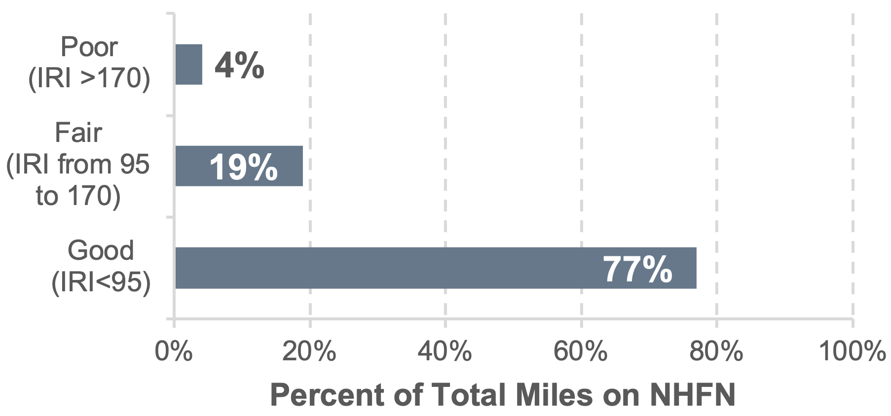
In 2012, the NHFN consisted of 51,029 centerline miles, including 46,947 centerline miles of Interstate and 4,082 centerline miles of non-Interstate roads. Based on 2014 international roughness index (IRI) data from the Highway Performance Monitoring System (HPMS), approximately 77 percent of pavement miles were rated as having good ride quality, 19 percent had fair ride quality, and 4 percent had poor ride quality.
Pavement Ride Quality (IRI) Based on Mileage on NHFN
Source: IRI data in 2014 HPMS files.
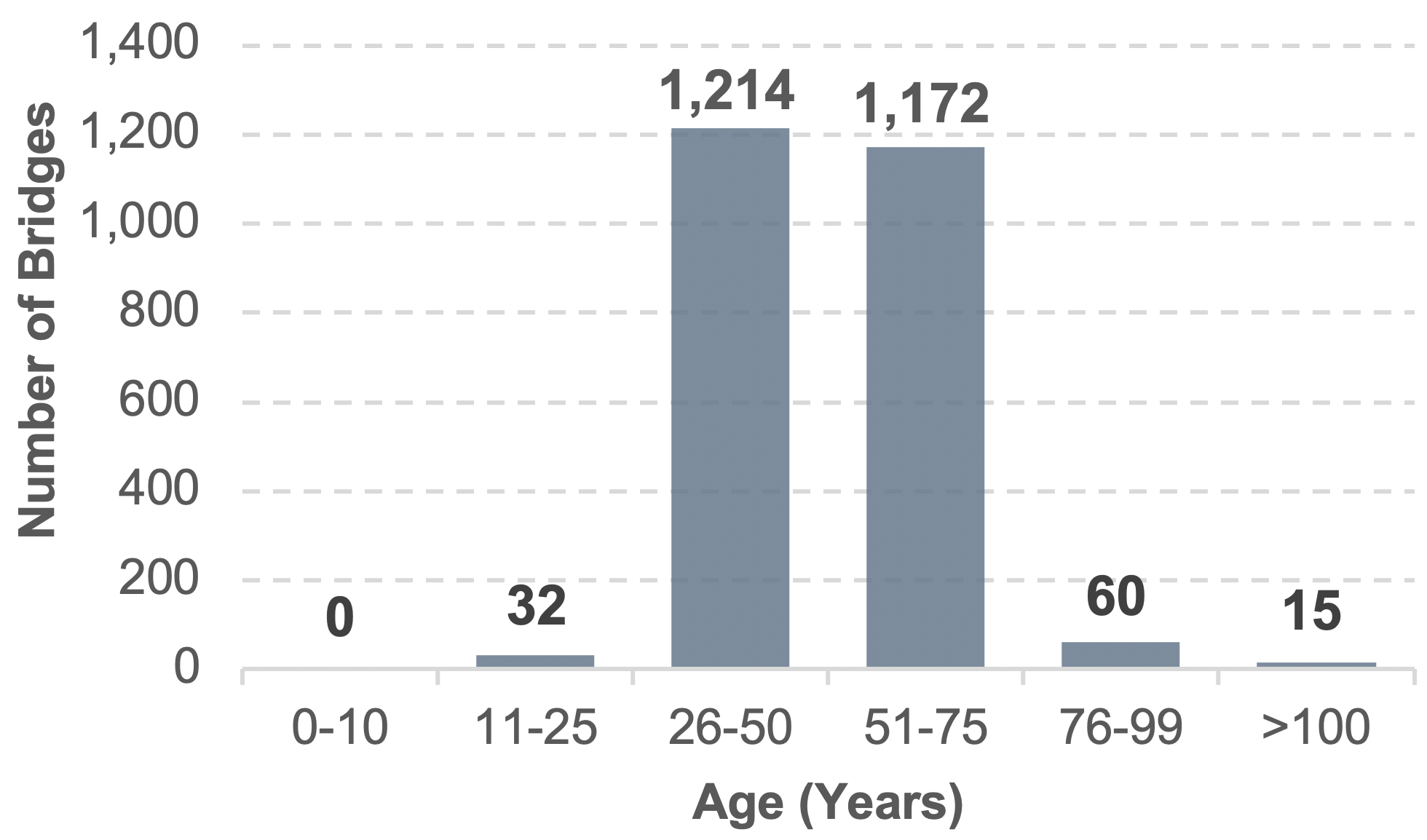
The National Bridge Inventory is used to identify current bridge ratings for bridges on the NHFN. This analysis showed there are approximately 57,600 bridges on the NHFN. Around 4.3 percent of those bridges were rated as structurally deficient. Most of these structurally deficient bridges are 25 years and older, and over half are more than 50 years old. These findings have implications for future maintenance and funding needs as well as impacts to operations.
Age of Structurally Deficient Bridges on NHFN, 2014
Source: Bridge condition data contained in 2014 NBI files.
Performance
Travel time, speed, and safety are three measures of performance. Slower speeds and unreliable travel times caused by congestion increase fuel cost and affect operations and productivity, which adds expense to the freight transportation system. In 2014, congestion created stop-and-go conditions on 5,800 miles of the NHFN and caused traffic to travel below posted speed limits on an additional 4,500 miles of the high-volume truck portions of the NHFN. The projected growth in freight and its reliance on trucks will increase congestion and make it more difficult and costly to move freight.
A total of 3,633 fatal crashes occurred on the Interstate portion of the NHFN in 2014, resulting in 4,094 fatalities. In 2015, fatal crashes and fatalities increased by 5.7 percent and 6.1 percent, respectively.